







Presentations have long been the backbone of corporate communication, yet they are frequently maligned as a source of "death by PowerPoint." However, the modern professional landscape is shifting. Presentations are no longer merely about sharing raw data; they are about crafting a narrative, evoking emotion, and leaving a lasting impression that lingers long after the projector is switched off. To achieve this, the reliance on default, stock slide designs is rapidly becoming a relic of the past.
In today’s competitive environment, the visual architecture of your pitch, proposal, or project report is as critical as the content itself. A well-designed, unique template acts as a silent ambassador for your brand, signaling professionalism, creativity, and attention to detail. This article explores the evolution of presentation design, the impact of high-end templates on audience engagement, and a curated collection of cutting-edge designs that can transform your next presentation from a standard report into an unforgettable experience.
The Evolution of the Pitch: Why Aesthetics Matter
The psychology of a presentation is rooted in visual cognition. Studies have consistently shown that humans process visual information significantly faster than text. When a presenter utilizes a generic, tired template, the audience subconsciously labels the information as "standard" or "unimportant." Conversely, when a speaker leverages a bespoke or highly creative layout, they signal that the content has been curated with care.
This transition from "information dumping" to "visual storytelling" is the hallmark of modern business communication. Whether you are a startup founder seeking venture capital, an agency pitching a new branding strategy, or an educator preparing a module, the visual medium sets the stage for trust.
Chronology of Presentation Design: From Static to Dynamic
The history of presentation software is a journey of increasing complexity and accessibility.
- The Early Era (1990s): Presentations were dominated by high-contrast, static backgrounds and aggressive transition effects. The focus was on the software’s capability to display text rather than the elegance of the design.
- The Standardization Era (2000s): With the proliferation of corporate templates, uniformity became the standard. This led to the "sea of sameness" where every boardroom presentation looked identical, leading to cognitive fatigue among stakeholders.
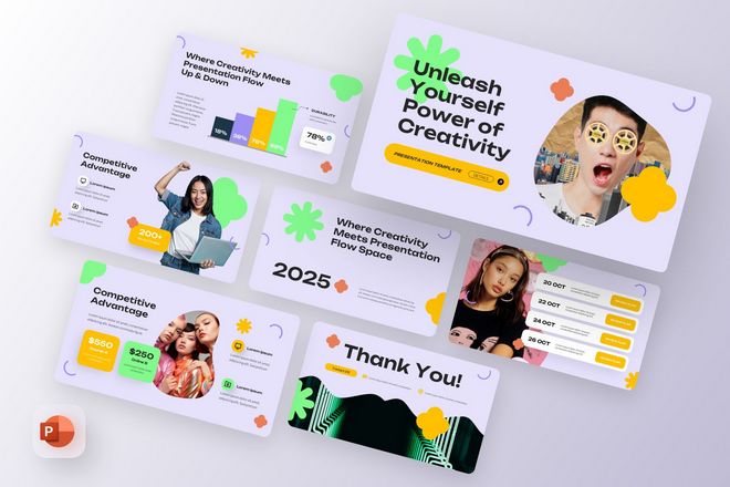
- The Modern Era (2020s–Present): Today, we are in the era of "Design-Led Storytelling." Modern templates prioritize whitespace, typography, high-fidelity imagery, and, most importantly, modularity. These designs are built to be fluid, allowing users to move beyond the traditional "title-and-body" slide structure into interactive, non-linear, and highly animated experiences.
The Power of Bespoke Design: Premium Template Spotlights
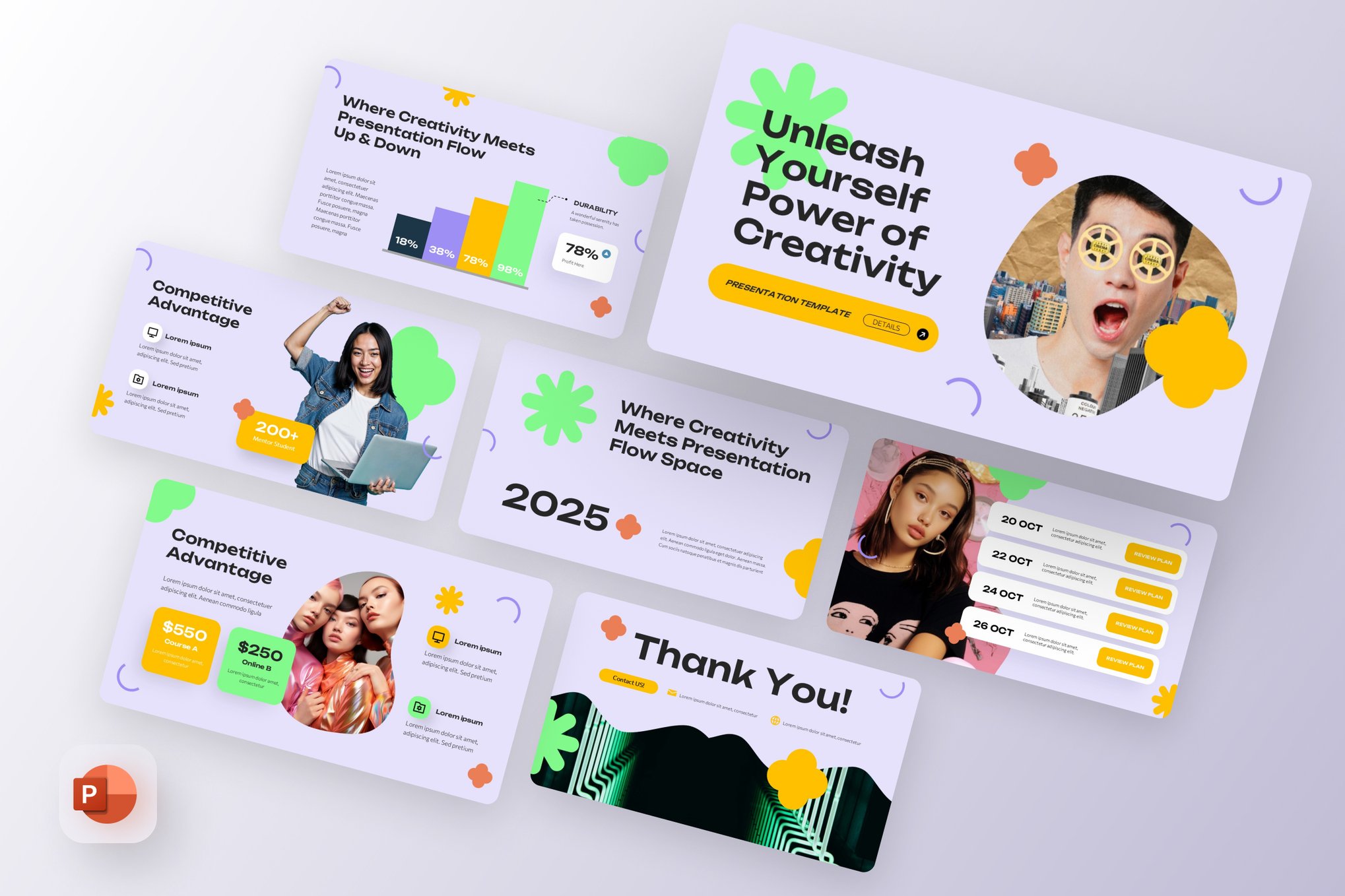
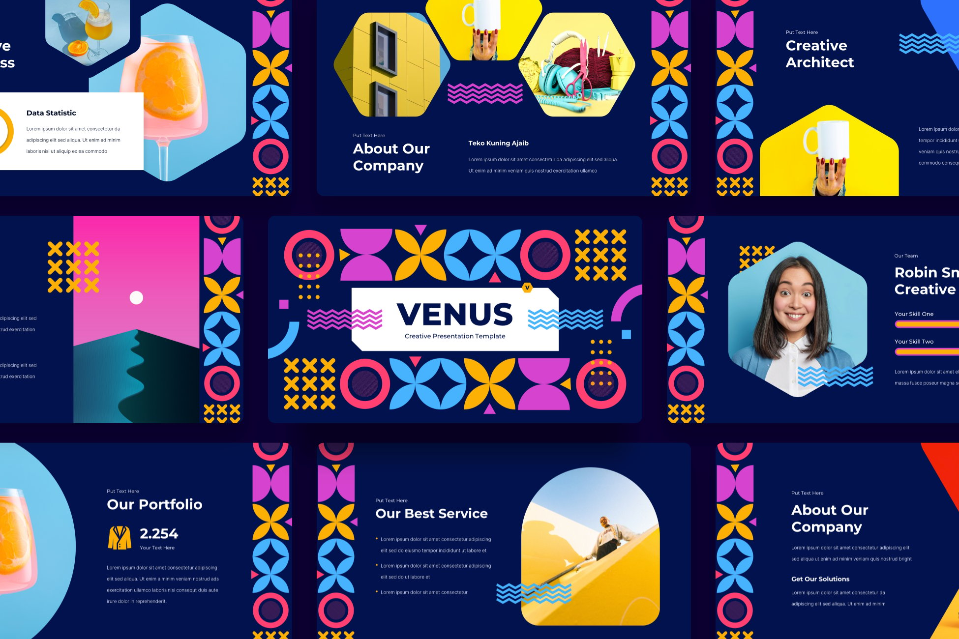
To stand out, professionals are increasingly turning to specialized templates that offer more than just a color change. Here are some of the most impactful, unique templates currently shaping the industry:
1. Agency-Focused Aesthetics
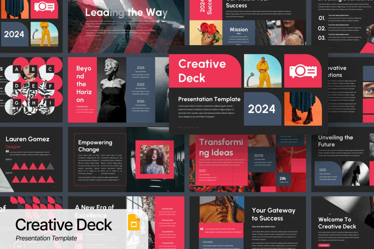
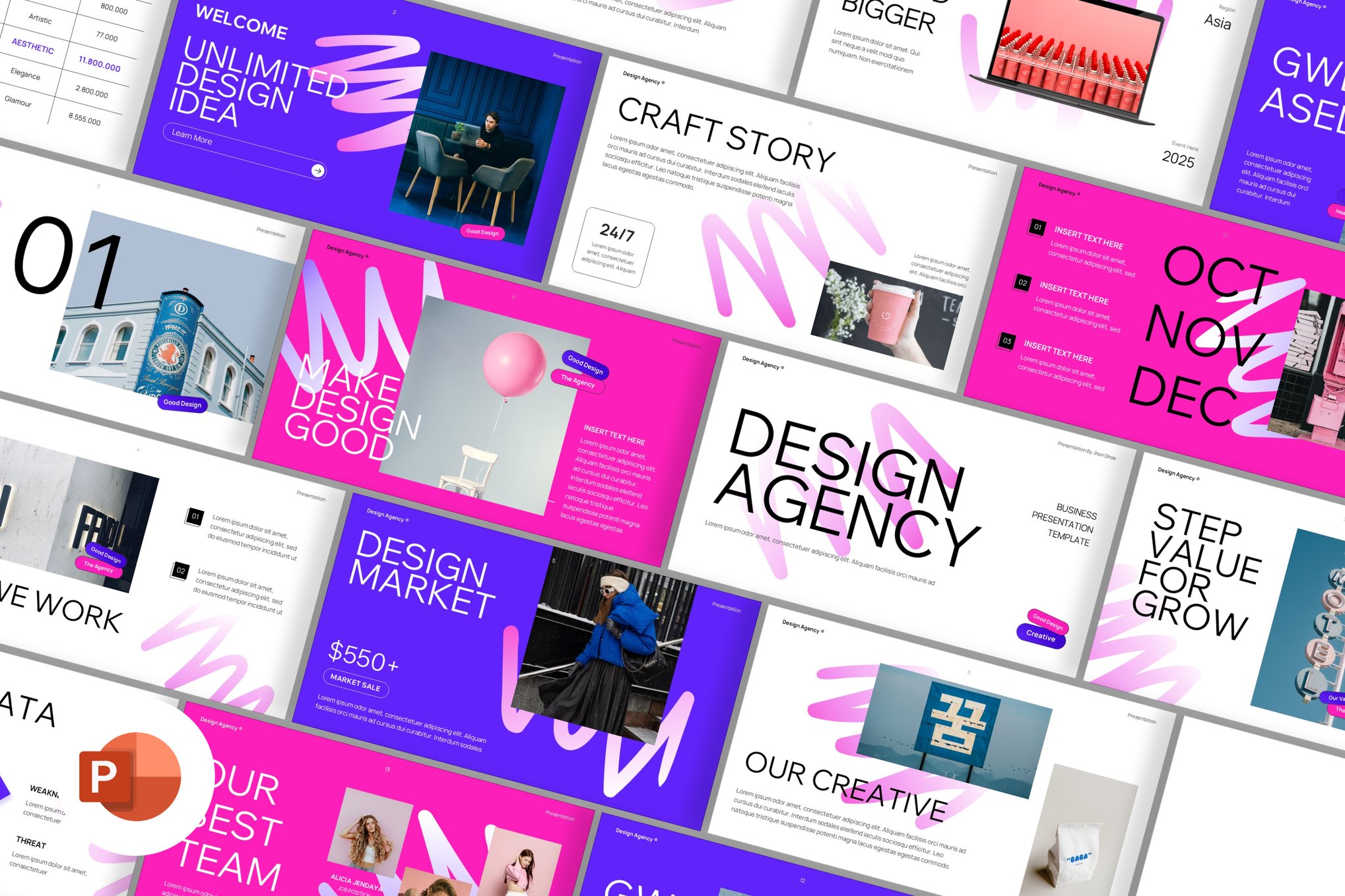
For agencies and creative studios, the Unique PowerPoint Template for Agencies and the Creative Design Agency PowerPoint Template serve as foundational tools. These sets are built with a focus on portfolio showcases. They emphasize large-scale imagery, minimal text overlays, and "white-space" heavy layouts that allow a creative’s work to breathe.
2. High-Energy & Edgy Narratives
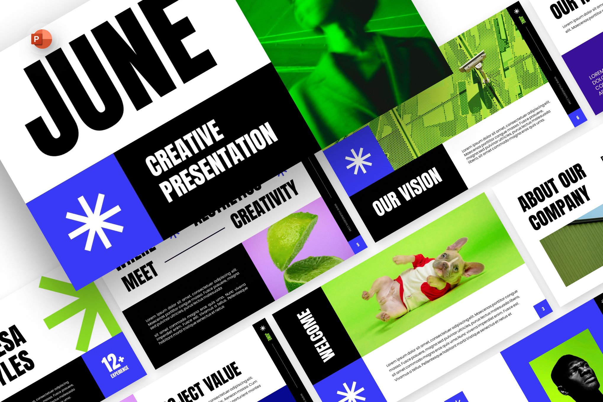
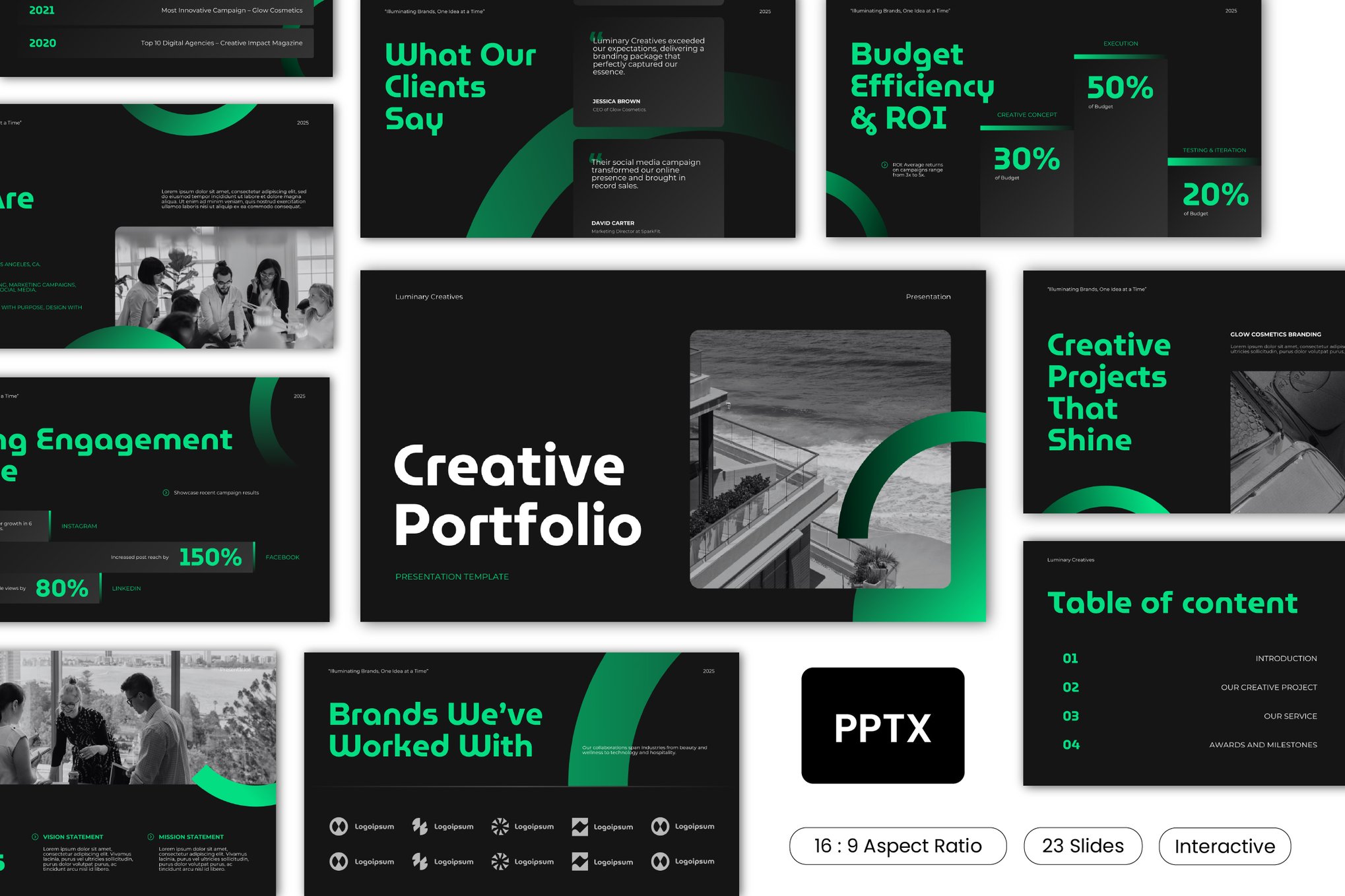
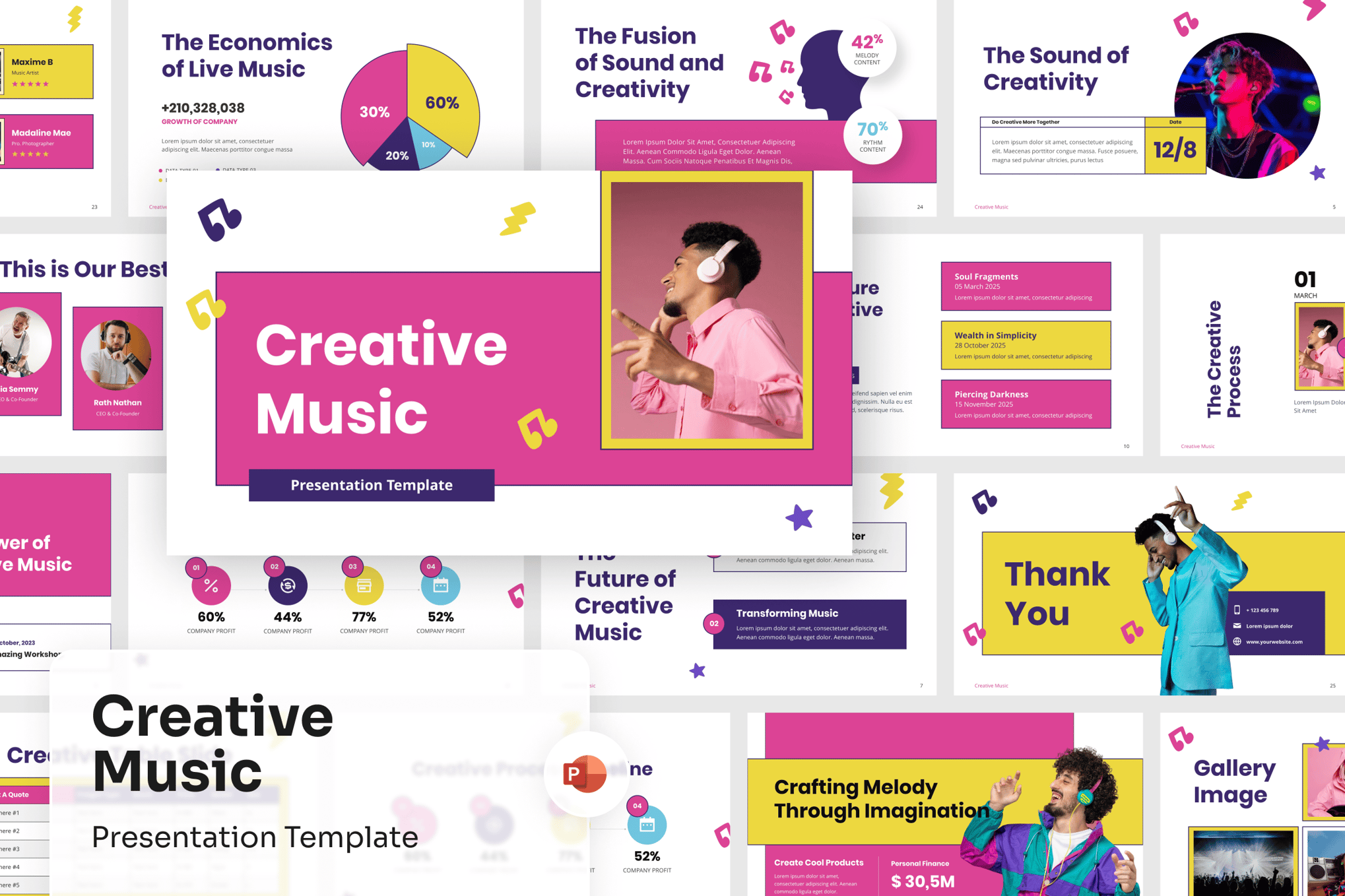
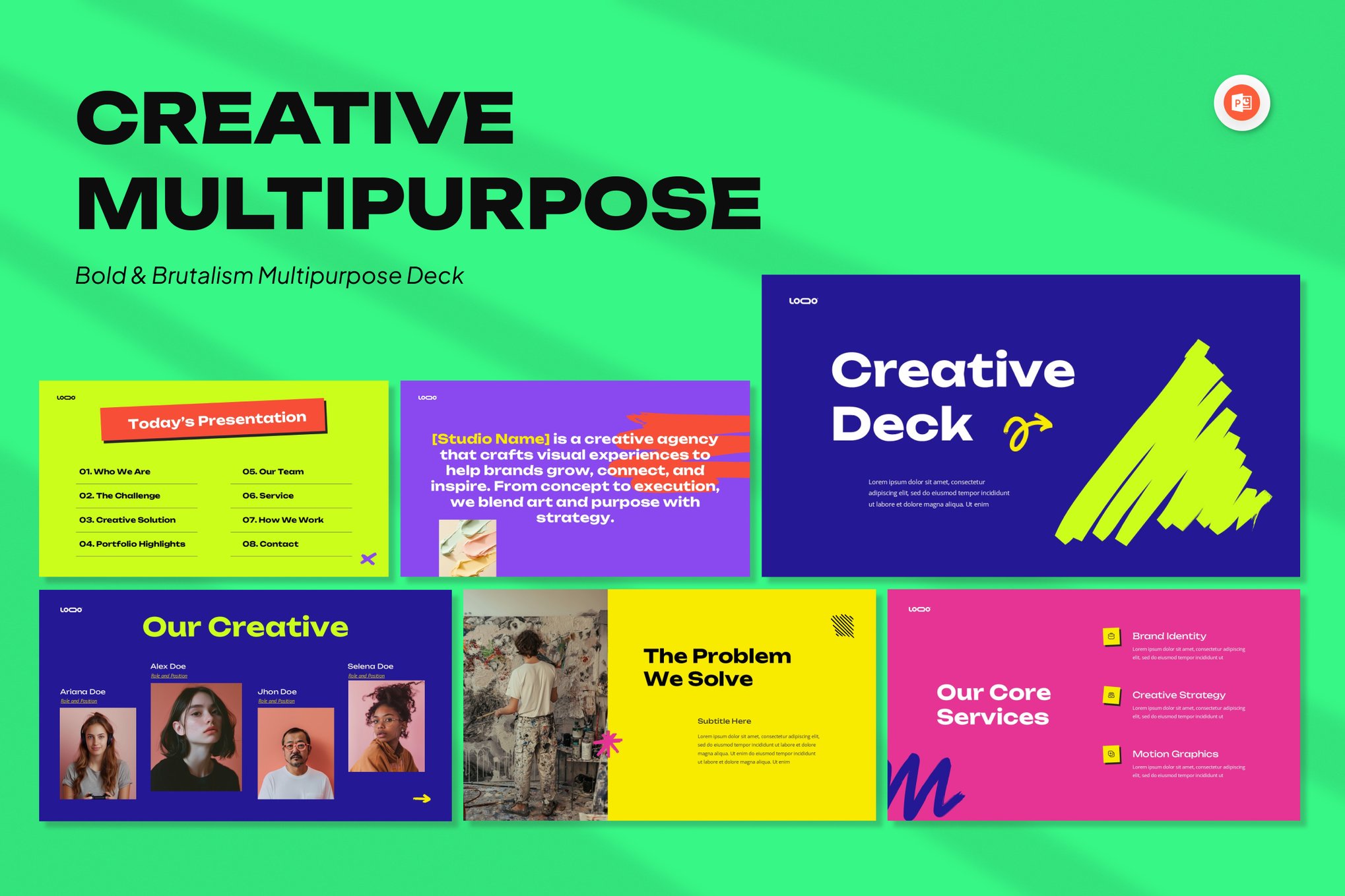
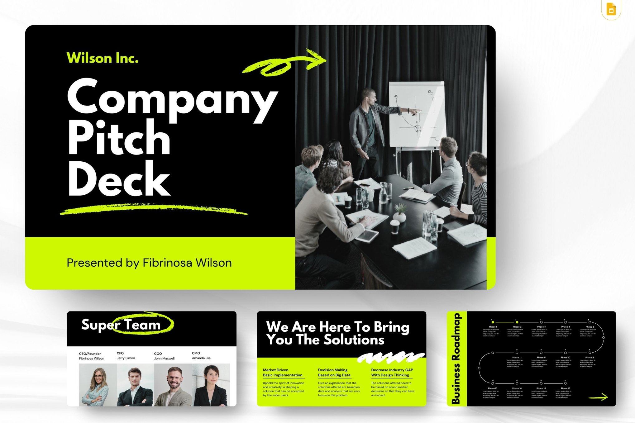
For those looking to disrupt the status quo, the Neobrutalism Unique PowerPoint Template offers a rebellious, high-contrast aesthetic. By utilizing aggressive typography and unconventional geometric arrangements, this style is perfect for tech startups and firms that want to project a sense of raw energy and innovation. Similarly, the Neon Pitch Deck template leverages high-impact color palettes to ensure that, in a sea of grayscale, your brand remains the focal point.
3. The Minimalist Professional
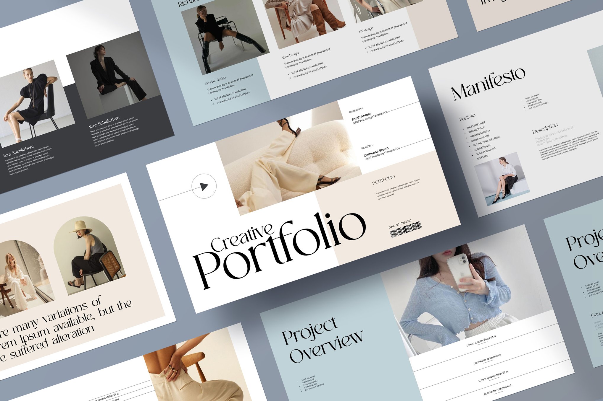
Not every presentation needs to be loud. The Minimal Portfolio Unique PowerPoint Template and Reccent provide a clean, refined alternative. These templates are essential for annual reports and long-form business strategies where the data must speak for itself. By stripping away visual clutter, these templates allow for the sophisticated presentation of complex financial or operational data.
Supporting Data: The ROI of Good Design
While the "quality of design" is often viewed as subjective, the impact on business outcomes is measurable. According to data gathered by various communication platforms, presenters who use professionally designed templates see a 30% increase in audience retention compared to those using standard, pre-installed software themes.
Furthermore, the "Confidence Gap"—the difference between how a presenter feels and how they are perceived—is narrowed significantly when the visual aid is high-quality. A speaker who knows their slides look professional is statistically more likely to speak with authority, make better eye contact, and handle Q&A sessions with greater agility.
Navigating the Free vs. Premium Landscape
The market for templates is split between premium, high-fidelity assets and free, accessible resources.
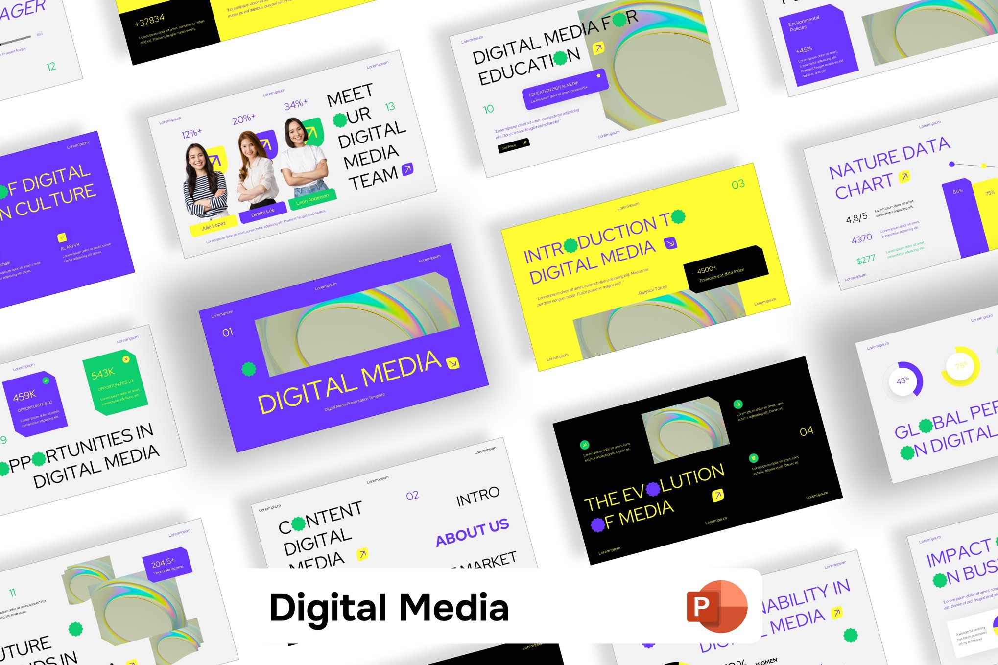
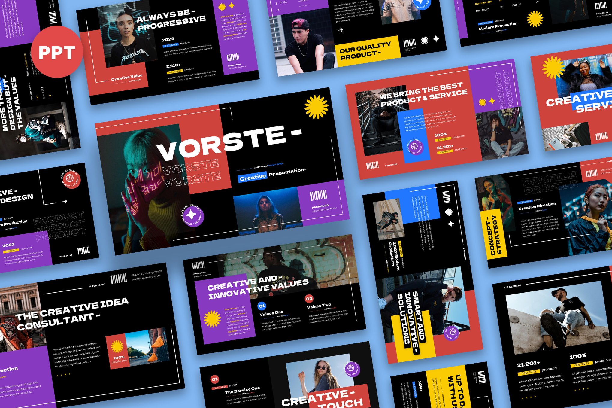
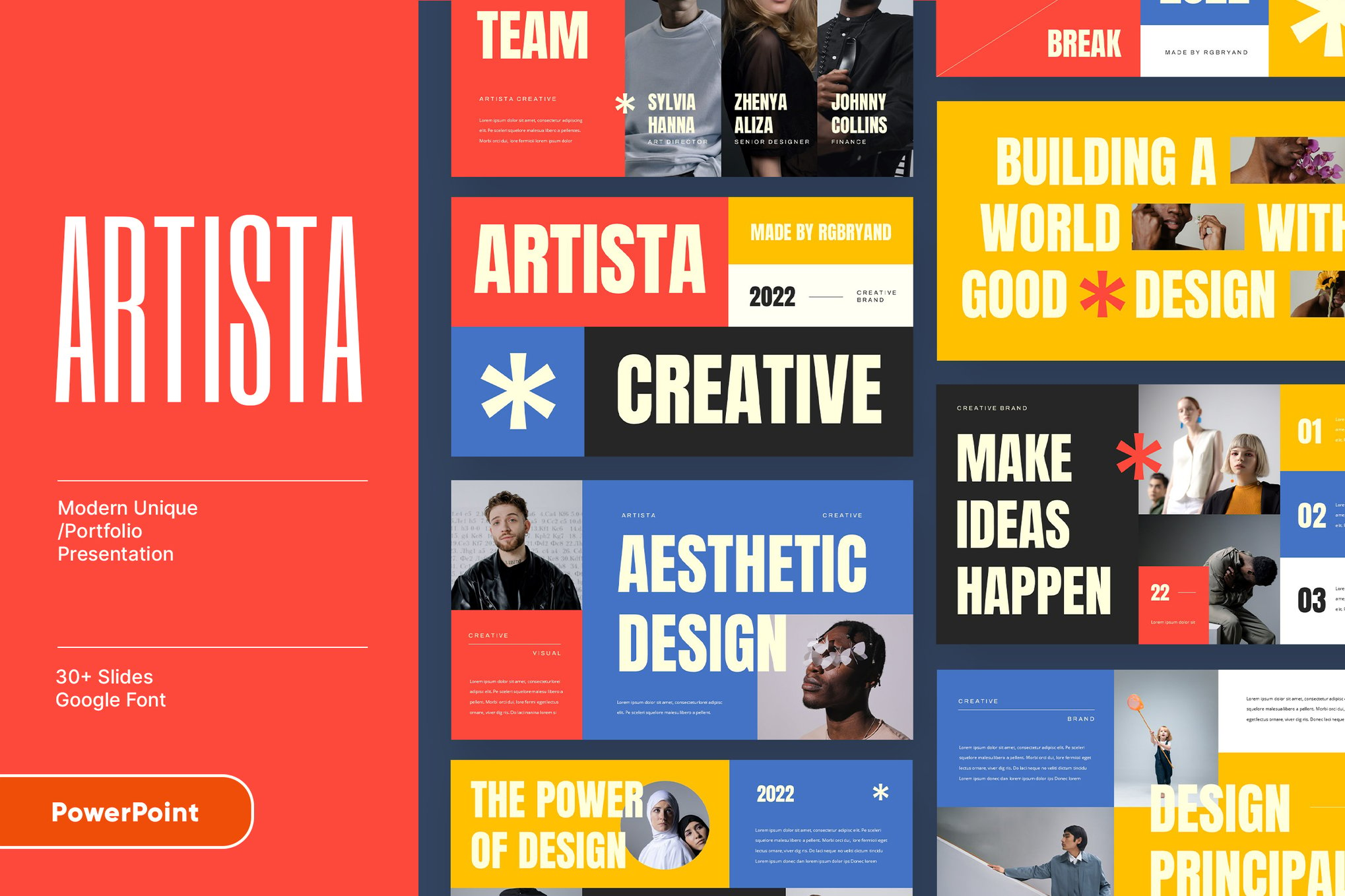
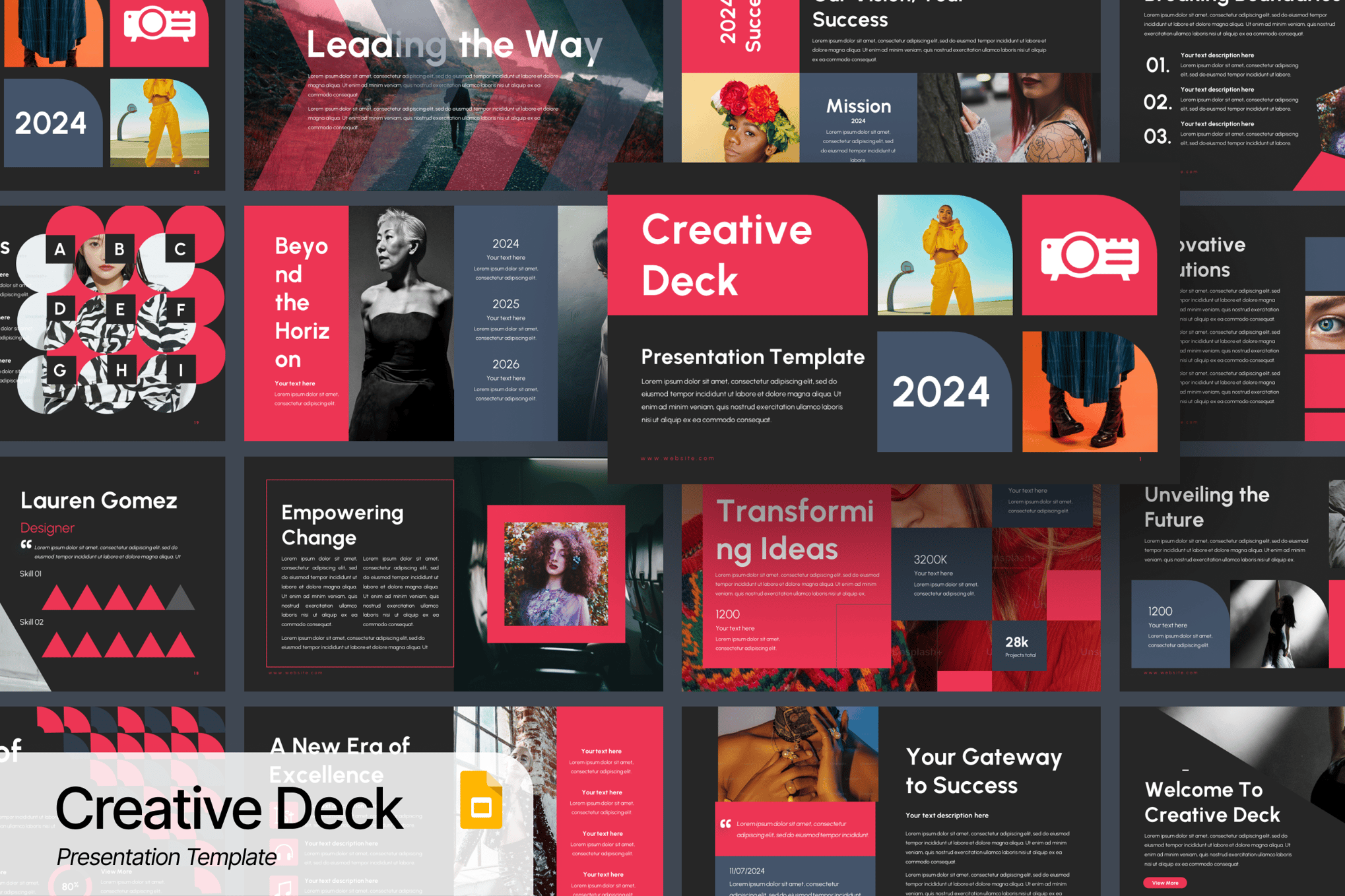
- Premium Assets: These typically offer better support, consistent grid systems (essential for maintaining alignment), and a wider array of infographics. The Vorste and ARTISTA templates are prime examples of premium offerings that provide deep customization—including resizable vector graphics that don’t lose quality when scaled.
- Free Resources: The democratization of design has led to incredible free options like Aqua Marketing and Coding Workshop. These templates, often found on platforms like Slidesgo, prove that you do not need a massive budget to achieve a high-end look. They are perfect for students, non-profits, and early-stage entrepreneurs who need to prioritize capital for product development over design software.
Official Responses and Trends: The Shift Toward Flexibility
Industry leaders in the design space are reporting a massive shift in how these files are used. The rise of cross-platform compatibility—specifically the ability to move between Microsoft PowerPoint and Google Slides—has become the top feature requested by users.
"The goal is no longer just to make a pretty slide," notes one lead designer from a top-tier template marketplace. "The goal is to create a ‘system.’ Users want a library of elements—icons, charts, and layout blocks—that they can mix and match to build a deck that feels bespoke to their specific meeting."
Implications for the Future of Work
As we look toward the future, the implications for these tools are clear:
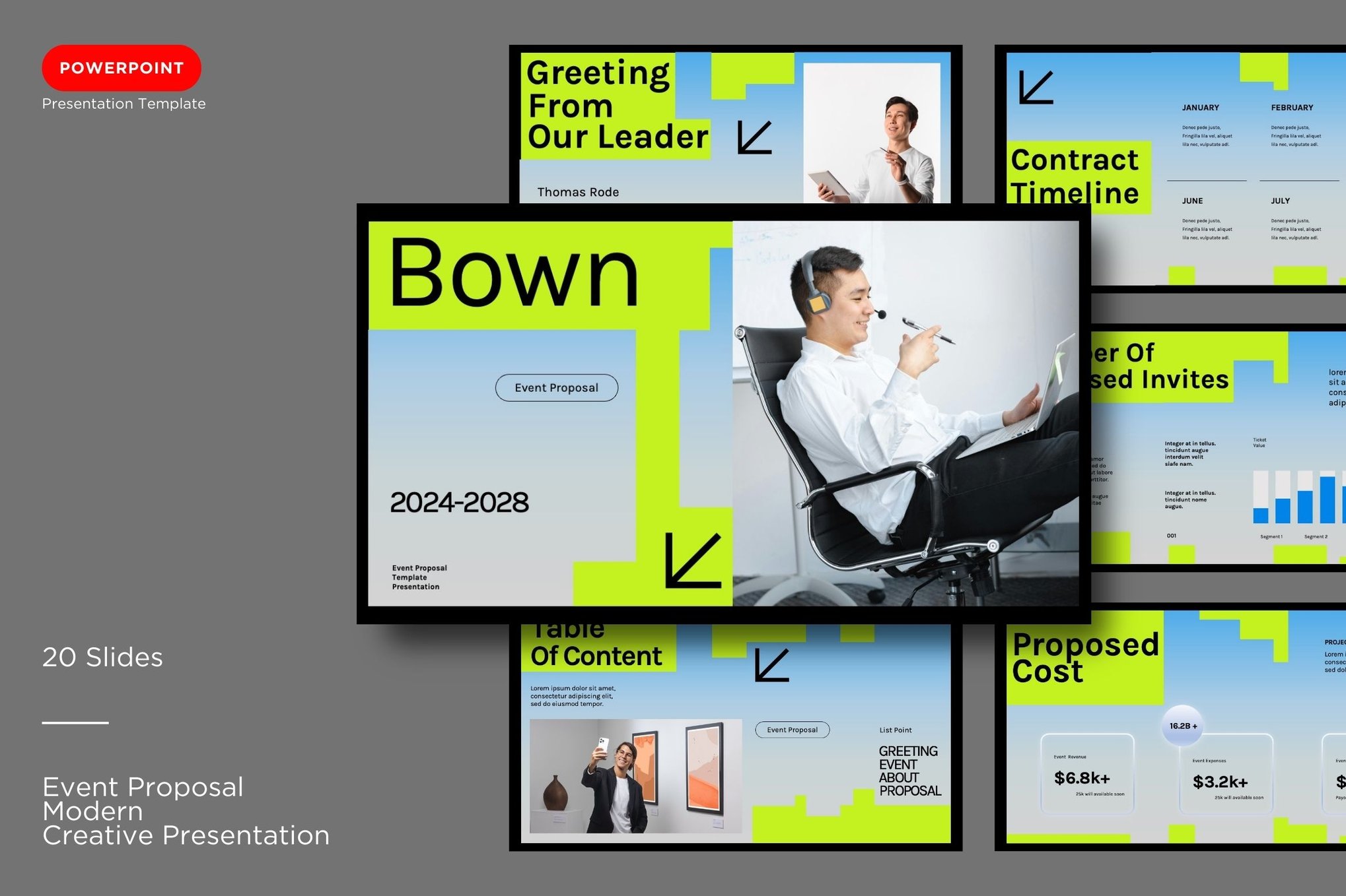
- Democratization of Design: The "average" presenter is becoming a "designer." With drag-and-drop interfaces and pre-made components, the barrier to entry for high-quality visual communication has vanished.
- Emphasis on Storytelling: As AI begins to handle the data-crunching and initial drafting of slides, the human element—the narrative arc—becomes the differentiator. Templates are evolving to support this, with "chapter" slides and "story" layouts becoming more common than traditional bullet points.
- The Rise of Interactive Media: We are seeing a move toward embedded multimedia. Templates that support integrated video backgrounds, 3D elements, and interactive infographics are the new gold standard for high-stakes presentations.
Conclusion: Making Your Message Unforgettable
In the final analysis, a template is only as good as the presenter using it. However, the right design acts as a catalyst. When you choose a template that resonates with your brand identity, you are removing the friction between your idea and your audience’s understanding of that idea.
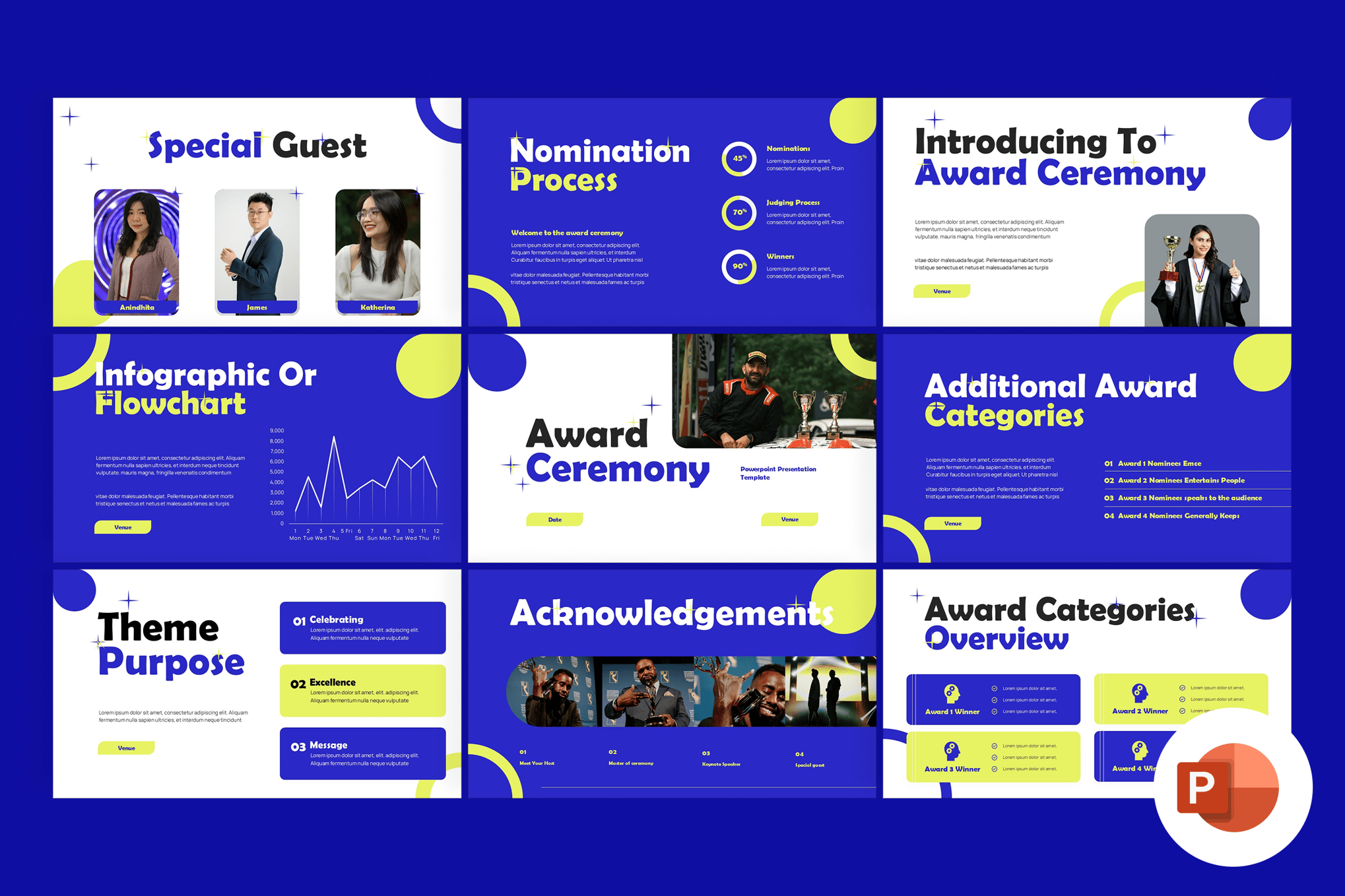
Whether you choose the rebellious edge of a neobrutalist layout or the clean, calming efficiency of a minimalist portfolio, remember the ultimate goal: clarity. By choosing a template that is as unique as your project, you ensure that your message doesn’t just get heard—it gets remembered.
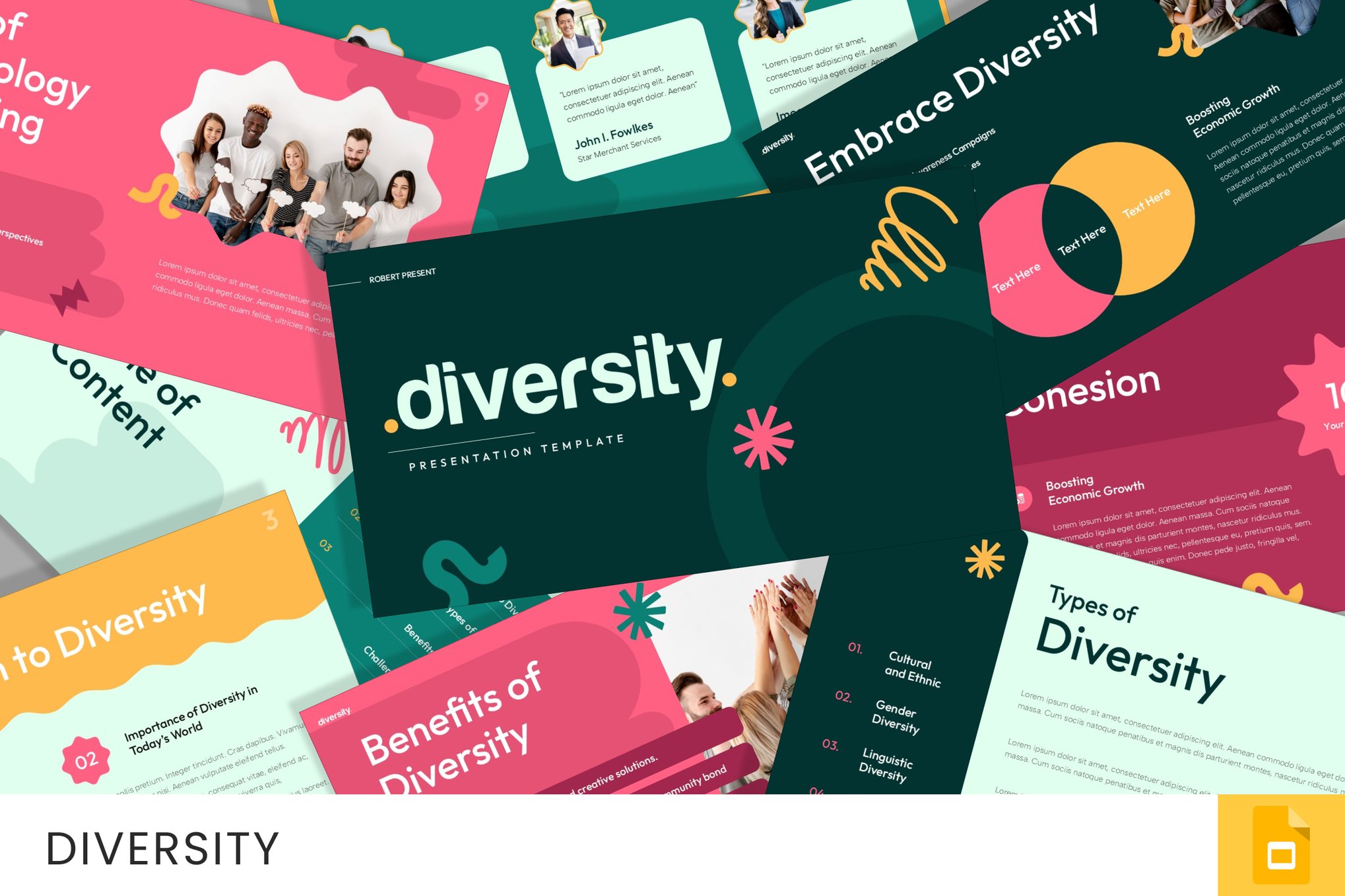
In a world where attention is the scarcest currency, investing in the visual presentation of your ideas is not an optional luxury. It is a strategic imperative for anyone looking to lead, persuade, or inform. Select your template wisely, customize it to your narrative, and walk into your next presentation with the confidence that your slides are working as hard as you are.