








In the world of digital and print design, the most critical decisions often happen at the smallest scales. Whether you are crafting a complex dashboard, an intricate mobile application interface, a dense legal document, or a minimalist ebook, the ability to maintain legibility at reduced sizes is the hallmark of a master typographer. When text shrinks, the margin for error evaporates; a font that appears sophisticated at 72pt can become a muddy, unreadable mess at 8pt.
This guide explores the essential components of choosing fonts for small-scale applications, providing a curated list of professional-grade typefaces that balance aesthetic personality with uncompromising clarity.
The Core Philosophy: Why Readability Rules
The fundamental challenge of micro-typography is the physical limit of the human eye and the technical constraints of display technology. As font size decreases, the brain requires higher contrast between the stroke and the background, as well as distinct letterforms that prevent characters like ‘i’, ‘l’, and ‘1’ from bleeding into one another.
Professional designers prioritize "functional beauty." A font meant for small text must possess open counters (the negative space inside letters like ‘o’ and ‘e’) and a generous x-height. When these elements are present, the text remains legible even in challenging conditions, such as low-resolution mobile screens or cheap newsprint.
A Curated Selection of High-Performance Small Text Fonts
The following typefaces have been engineered to maintain their structural integrity at reduced sizes, offering designers a toolkit for every project type.
1. Quarty: The Serif for Refined Detail
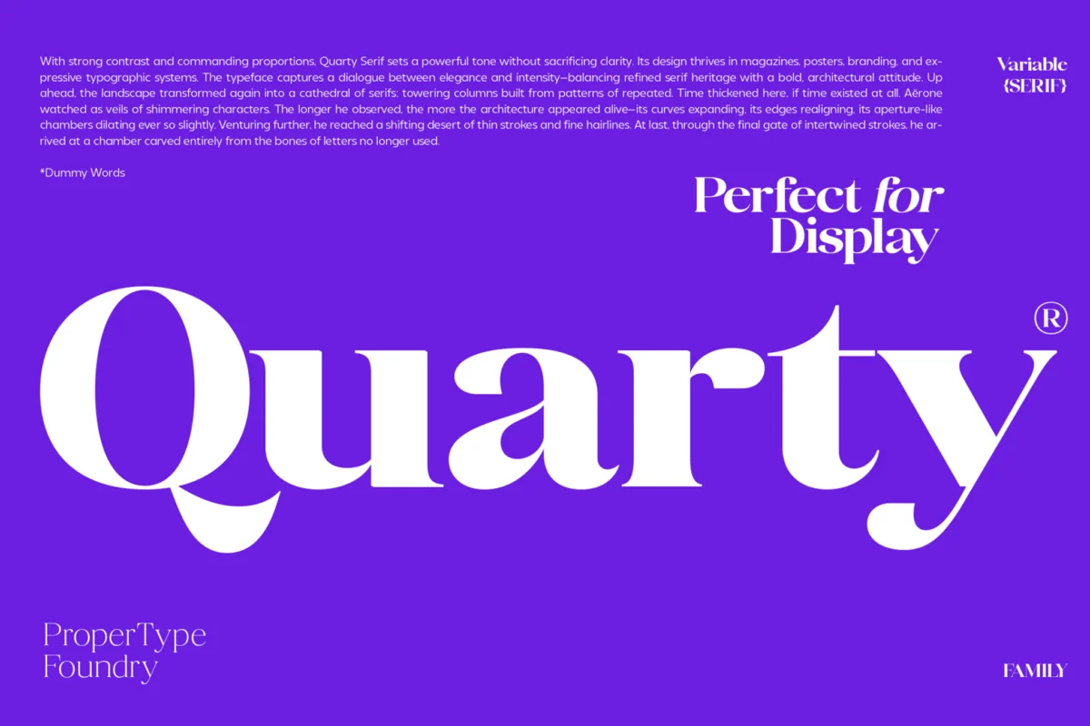
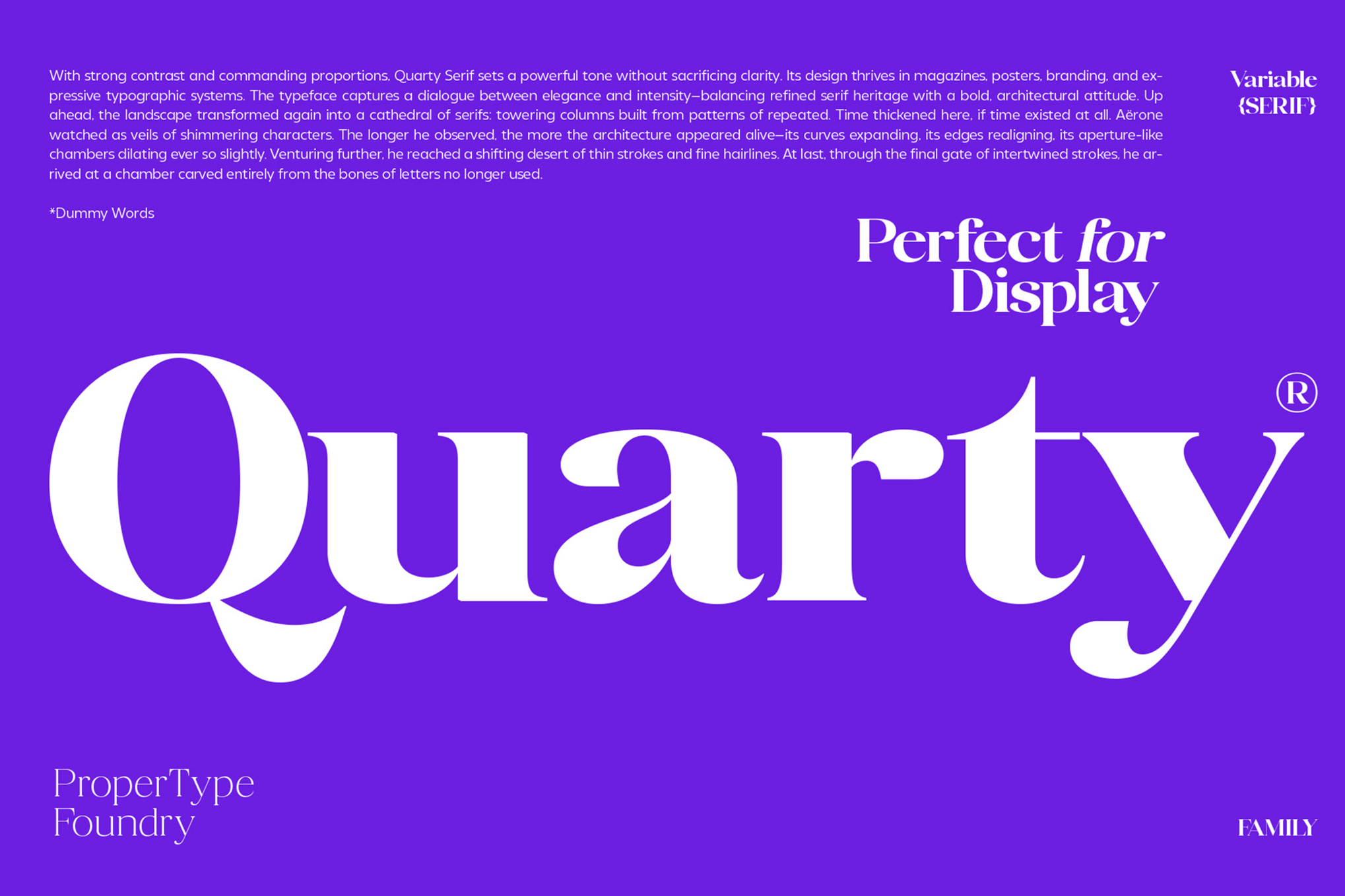
Quarty is a testament to the fact that serifs can work brilliantly at small scales. By blending geometric precision with graceful curves, Quarty avoids the "clutter" often associated with traditional serif fonts. It provides a sophisticated, academic look that remains sharp and readable, making it ideal for high-end editorial layouts and formal documents.
2. Carlgine: Versatility in 18 Weights
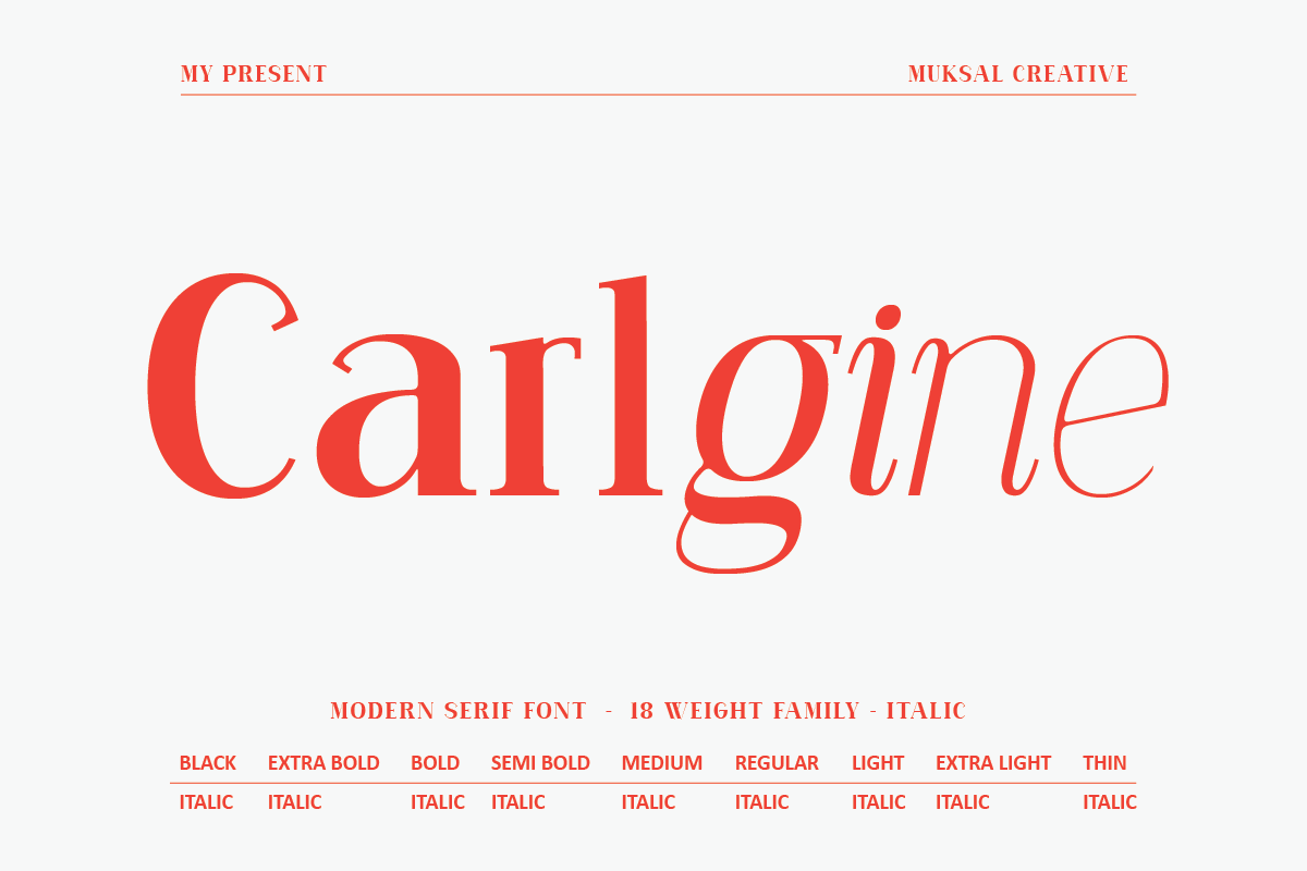
When consistency is key, Carlgine offers an expansive ecosystem. With 18 weights—ranging from the delicate "Thin" to the commanding "Black"—it allows designers to maintain a single visual identity across an entire project. Its stylistic glyphs are designed with open shapes, ensuring that even the thinnest weights do not disappear against a solid background.
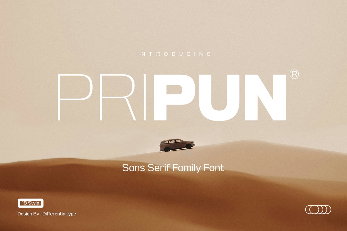
3. Pripun: The Sans-Serif Standard
Pripun stands as a masterclass in clean, modern sans-serif design. By stripping away unnecessary flourish, Pripun relies on mathematically precise letterforms. It is particularly effective for UI/UX designers who need to display dense data without overwhelming the user. Its support for WOFF2 formats makes it a performance-oriented choice for web development.
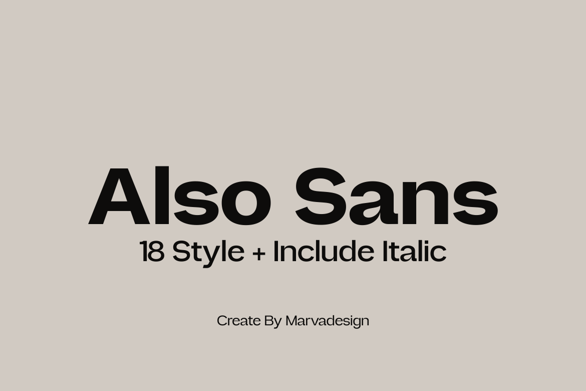
4. Also Sans: Simplicity and Open Counters
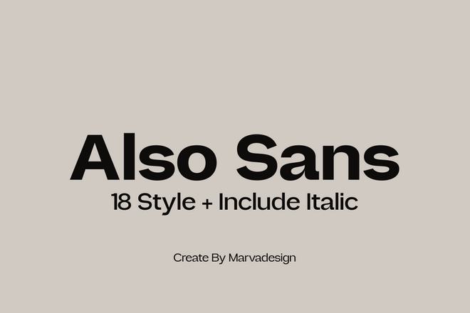
Also Sans is built for the reader who needs to process information quickly. Its hallmark is its exceptionally "open" letter structure, which prevents the blurring effect that occurs when pixels are squeezed together on smaller screens. Its smooth, rounded curves provide a friendly, approachable aesthetic for branding and digital platforms.
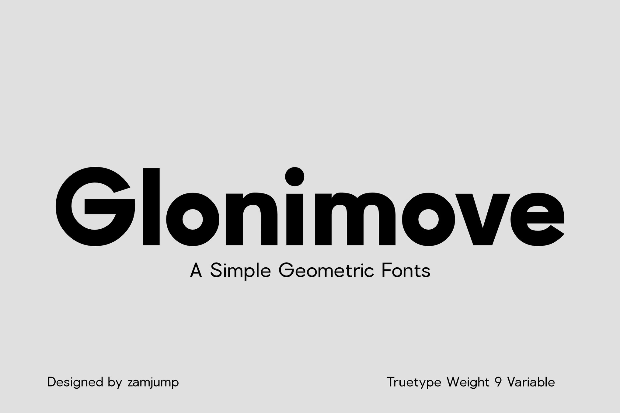
5. Glonimove: Modern Geometric Precision
For projects that demand a contemporary, tech-forward feel, Glonimove is an essential tool. Its geometric construction ensures that every letter sits perfectly on the baseline, providing a rhythmic, uniform reading experience that is particularly pleasing for signage and mobile interfaces.
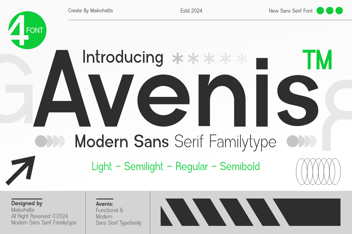
6. Avenis: The Modernist Choice
Avenis offers a restrained, modern aesthetic. Its lighter weights are particularly impressive, maintaining high contrast without resorting to hairline strokes that vanish on low-DPI monitors. It is the ideal typeface for applications where white space and minimalism are the primary drivers of the design.
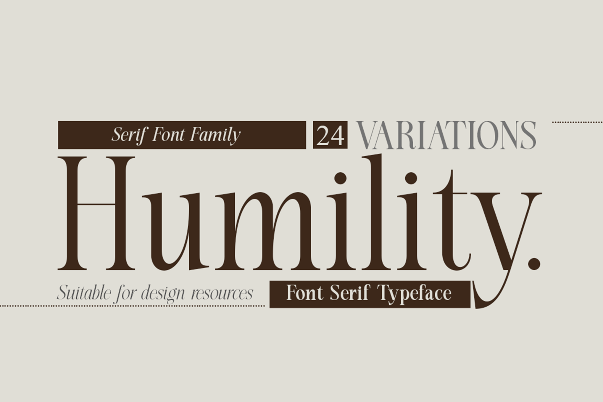
7. Humility: Classic Serif Elegance
Humility bridges the gap between vintage charm and modern technical requirements. Despite its classic look, the font is remarkably robust. With 24 variations, it allows for a nuanced hierarchy of text, making it a favorite for fashion publications where the text must be both elegant and functional.
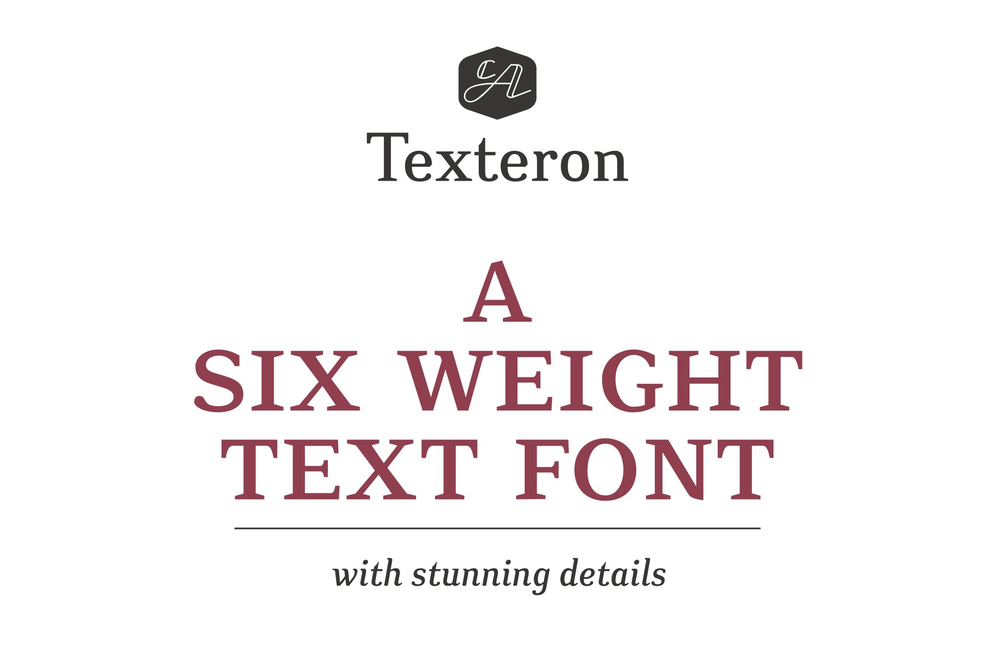
8. Texteron: The Traditionalist’s Tool
Texteron is a nod to classical typography, updated for the digital age. It is specifically designed to prevent "letter-clumping," using a unique balance of round and edgy forms to ensure that every word remains crisp, even when printed in small footnotes or fine-print legal disclosures.
Complementary Selections: Free Fonts for Small-Scale Use
For independent designers or those working on budget-constrained projects, several high-quality free options provide professional-grade legibility:
- Caviler: A narrow, efficient sans-serif that maximizes screen real estate without sacrificing clarity.
- Orbito: Features soft, rounded shapes that reduce visual fatigue during long-form reading.
- Gudlak: A highly disciplined font that excels in dense text blocks, ensuring that even long paragraphs remain navigable.
- Groza: A refined, low-contrast font that feels airy and open—perfect for minimalist UI labels and mobile captions.
The Science of Scale: 8 Essential Rules for Success
Selecting the right font is only half the battle. To ensure your text remains legible at small sizes, follow these expert-tested principles:
1. Prioritize Clarity Over Personality
It is tempting to choose a typeface with "character," but at 8pt, character often becomes noise. Choose fonts that prioritize the user’s ability to decode symbols quickly.
2. The x-Height Advantage
Look for fonts with a large x-height (the height of the lowercase ‘x’ relative to the capital letters). A larger x-height makes lowercase letters appear bigger and more legible at a distance or at a small scale.
3. Avoid Extreme Stroke Contrast
Typefaces with high contrast—where the thick parts of the letter are significantly wider than the thin parts—tend to break down. The thin parts will inevitably vanish when printed or rendered on low-resolution screens.
4. Optimize Letter Spacing and Counters
"Tracking" or letter spacing should be slightly increased for very small text. Additionally, ensure the font has wide, open counters (the holes in letters like ‘a’, ‘e’, and ‘o’) to prevent them from filling in.
5. Test at Actual Output Sizes
Never trust a font preview on a 27-inch monitor. If you are designing for a mobile app, test the font on a mobile device. If you are designing for print, print the document at 100% scale to see how the ink bleeds or how the pixels align.
6. Utilize Web-Optimized Typefaces
For digital projects, prefer fonts that include "hinting"—instructions that tell the computer how to align the font to the pixel grid. This is crucial for maintaining sharp lines on screens.
7. Strip Away Decorative Flourish
Decorative swashes, ligatures, and ornamental flourishes are the enemies of small-text readability. Save the flair for headlines and display text; keep body copy utilitarian.
8. Weight Matters: The "Optical Size" Factor
A font that is "Medium" in a desktop font viewer might be the "Regular" of a well-designed typeface family. Often, a slightly heavier font weight will read better at small sizes, as it adds the necessary visual weight to remain distinct from the background.
Implications for Future Design
As our devices become more diverse—from high-density wearable smartwatches to massive, low-density industrial displays—the demand for high-performance small text fonts will only increase. Designers who master these principles will ensure that their work remains accessible and professional across every medium.
The fonts listed in this guide are not just aesthetic choices; they are functional solutions to the universal design challenge of readability. By understanding the interplay between weight, spacing, and letter construction, you can ensure that your content is not just seen, but clearly understood, regardless of the size at which it is rendered.