


For over fifteen years, the web has been held captive by the gentle curve of the border-radius property. While it brought a necessary softness to the rigid, box-heavy layouts of the early 2000s, it also created a design monoculture. If you wanted a corner that wasn’t a standard circular arc—be it a beveled edge, a […]
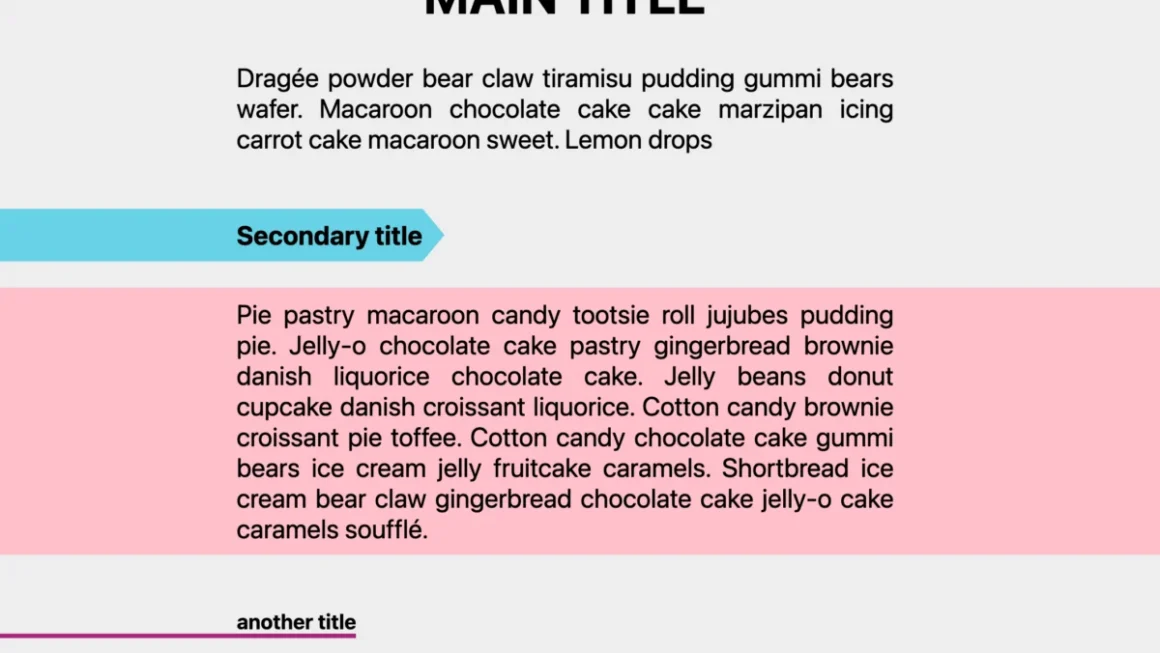
The Future of CSS Geometry: Unlocking the Potential of border-shape
For years, web developers have relied on a patchwork of clever hacks, complex clip-path declarations, and SVG overlays to achieve non-rectangular design elements. While CSS has steadily evolved to provide better control over visual aesthetics, the fundamental challenge of creating complex shapes while maintaining standard UI features—like borders, shadows, and outlines—has remained a persistent pain […]
Beyond the Round: How corner-shape is Redefining CSS Design
For over a decade and a half, the web’s visual language has been constrained by the dominance of the humble border-radius. Since its inception, this property has been the singular tool for softening the harsh edges of the digital grid. While it brought a collective sigh of relief to developers who once spent hours managing […]
Beyond border-radius: What The CSS corner-shape Property Unlocks For Everyday UI — Smashing Magazine
/* top-left, top-right, bottom-right, bottom-left */ You can also use the superellipse() function with a numeric parameter for fine-grained control. .element border-radius: 25px; corner-shape: superellipse(0); /* equal to ‘bevel’ */ So the question here might be: why not call this property “border-shape†instead? Well, first of all, that is something completely different that we’ll get […]