





In the high-stakes world of real estate, the first impression is often the only one that counts. Whether a prospective client is scrolling through a digital listing, walking past a sleek property sign, or reviewing a high-end investment prospectus, the visual language of your brand sets the tone for the entire transaction. At the heart of this visual identity lies the typeface. Far from being a mere aesthetic detail, the choice of font is a foundational element of marketing strategy, capable of communicating luxury, reliability, efficiency, or warmth before a single word is read.
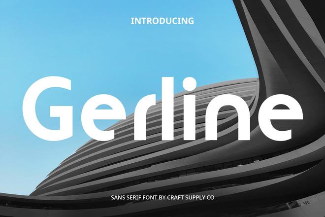
The Architectural Influence of Typeface
Typography in real estate serves as the silent bridge between the property and the client. A bold, geometric sans-serif can evoke the clean, structural lines of a modern architectural project, while a sophisticated, high-contrast serif can convey the historical gravitas and timeless value of a heritage home. When real estate professionals select a typeface, they are not just choosing letters; they are selecting the "voice" of their firm.
Research indicates that consistent branding—including the strategic use of typography—can increase brand recognition by up to 80%. For real estate agents, agencies, and developers, maintaining a cohesive visual identity across flyers, websites, and signage is essential for building trust in an industry where the stakes are often measured in millions of dollars.
Chronology: The Evolution of Real Estate Branding
The evolution of real estate typography has mirrored the broader shifts in marketing. Decades ago, real estate advertising relied heavily on traditional, high-legibility serifs, which were chosen to convey stability and legacy. However, as the industry pivoted toward digital platforms and mobile-first listing experiences, the "clean-tech" aesthetic took over.
- The Early Era (Print-Dominant): Dominated by classic, high-contrast serif fonts that mimicked newspaper headlines and formal contracts.
- The Digital Shift (2000s): The rise of web browsers forced a shift toward screen-friendly sans-serifs, prioritizing pixel-perfect readability over ornamental flourish.
- The Modern Era (Present Day): The current landscape favors "Geometric Humanist" fonts. These typefaces combine the clarity of modern engineering with the personality of human-written scripts, allowing for a brand identity that is both approachable and highly professional.
Curating the Professional Palette: Top-Tier Real Estate Fonts
To help you navigate the crowded landscape of digital typography, we have curated a selection of the most impactful fonts currently shaping the real estate market.
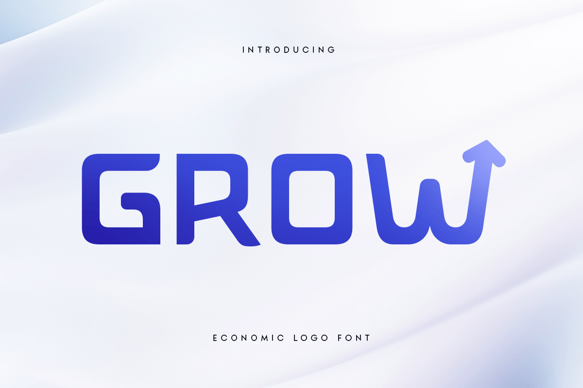
1. Grow: The Economic Powerhouse
Grow is a masterclass in modern corporate utility. Its design is rooted in the "less is more" philosophy, blending elegant proportions with a practical, sturdy structure. It is particularly effective for large-scale logos and corporate identity systems where a brand needs to appear established yet innovative.
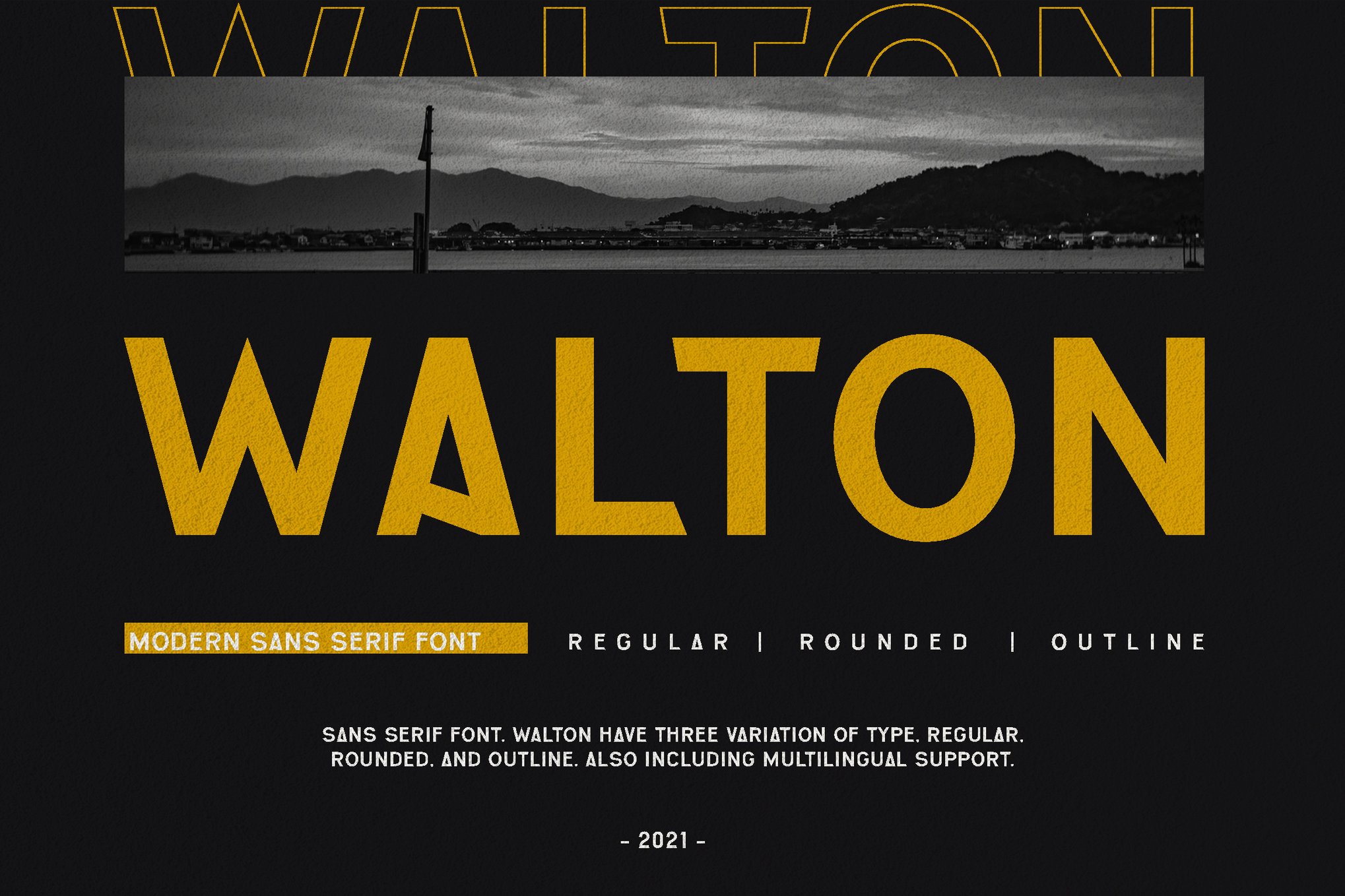
2. WALTON: Sophistication Defined
For luxury real estate, WALTON provides a refined, elegant sans-serif aesthetic. It excels in white-space-heavy designs, making it the perfect choice for high-end brochure covers or minimalist property landing pages. It suggests a brand that values quality over quantity.
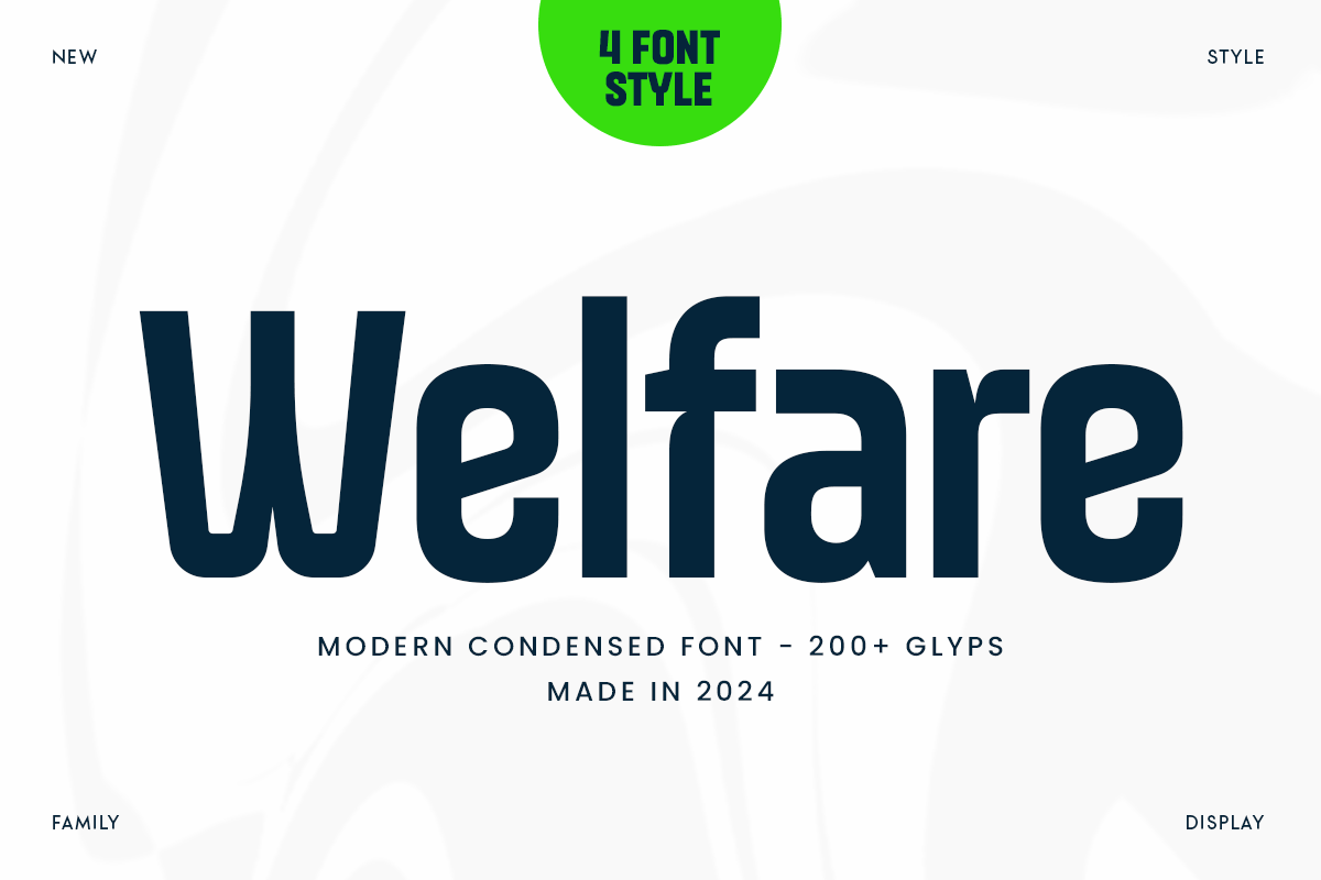
3. Welfare: The Minimalist’s Choice
In a market where information overload is common, Welfare stands out through its condensed, sleek forms. By maximizing the amount of text that can fit into a compact space without sacrificing legibility, it is the ideal typeface for property listings and technical data sheets.
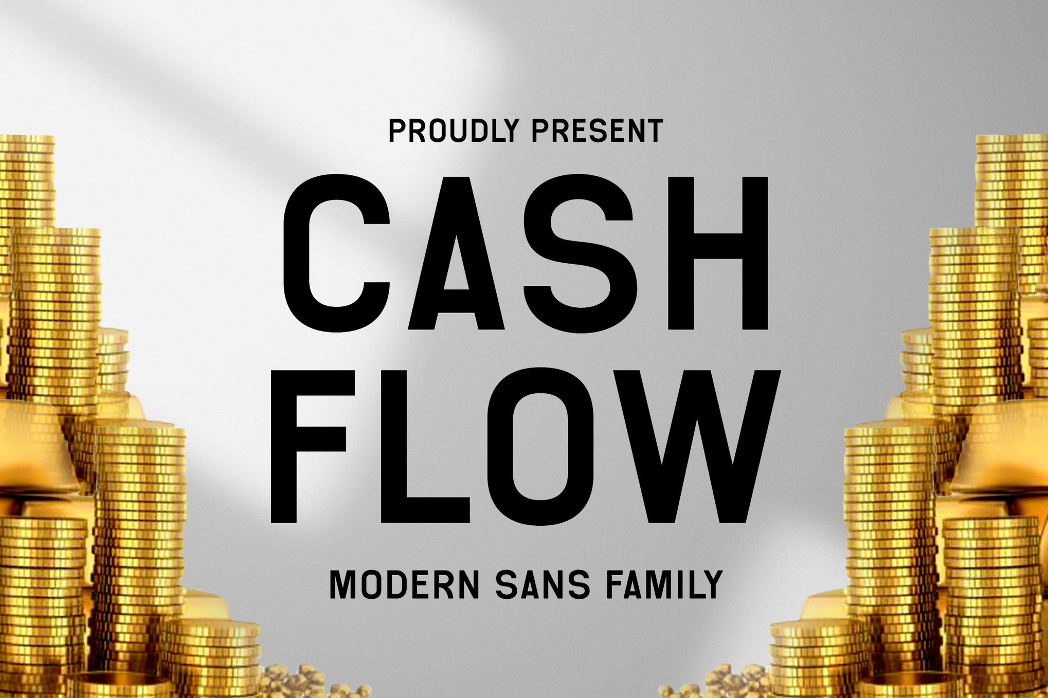
4. Cash Flow: The Versatile Communicator
True to its name, Cash Flow is designed to facilitate the flow of information. It acts as a bridge between high-fashion editorial design and corporate reporting, making it a reliable choice for agencies that handle both high-end residential and commercial portfolios.
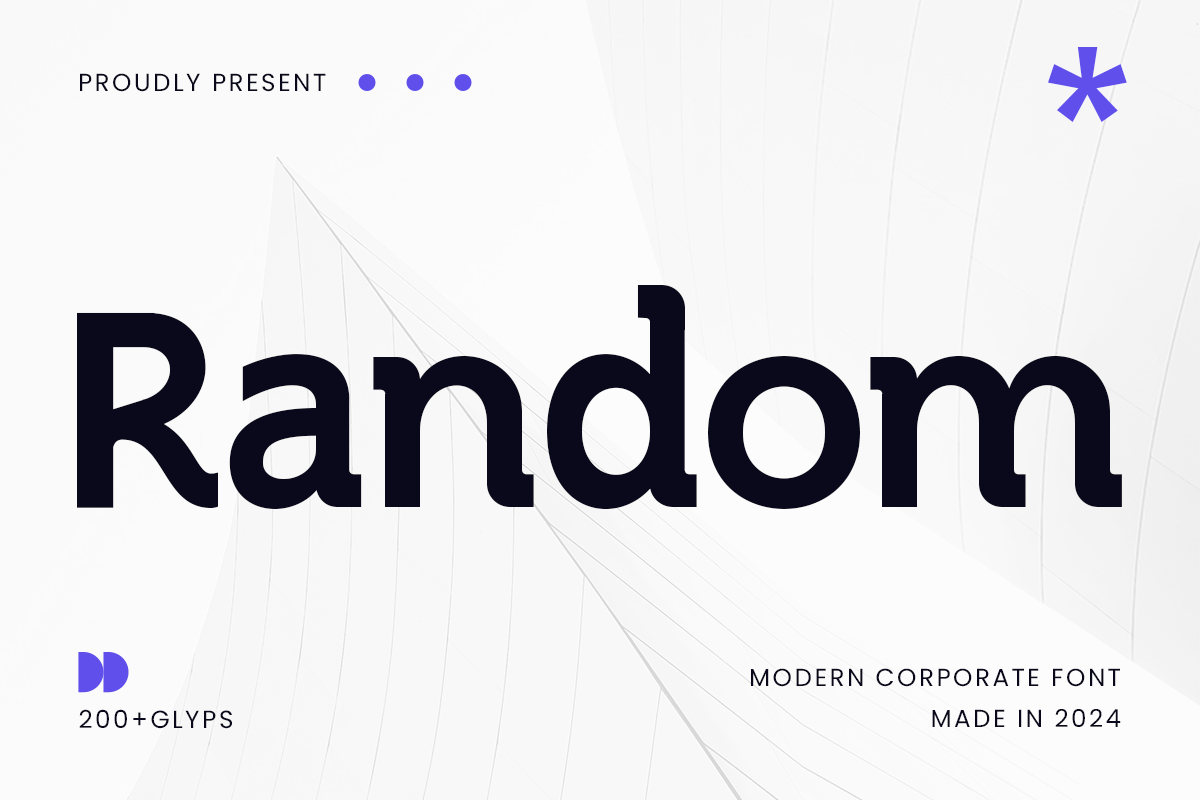
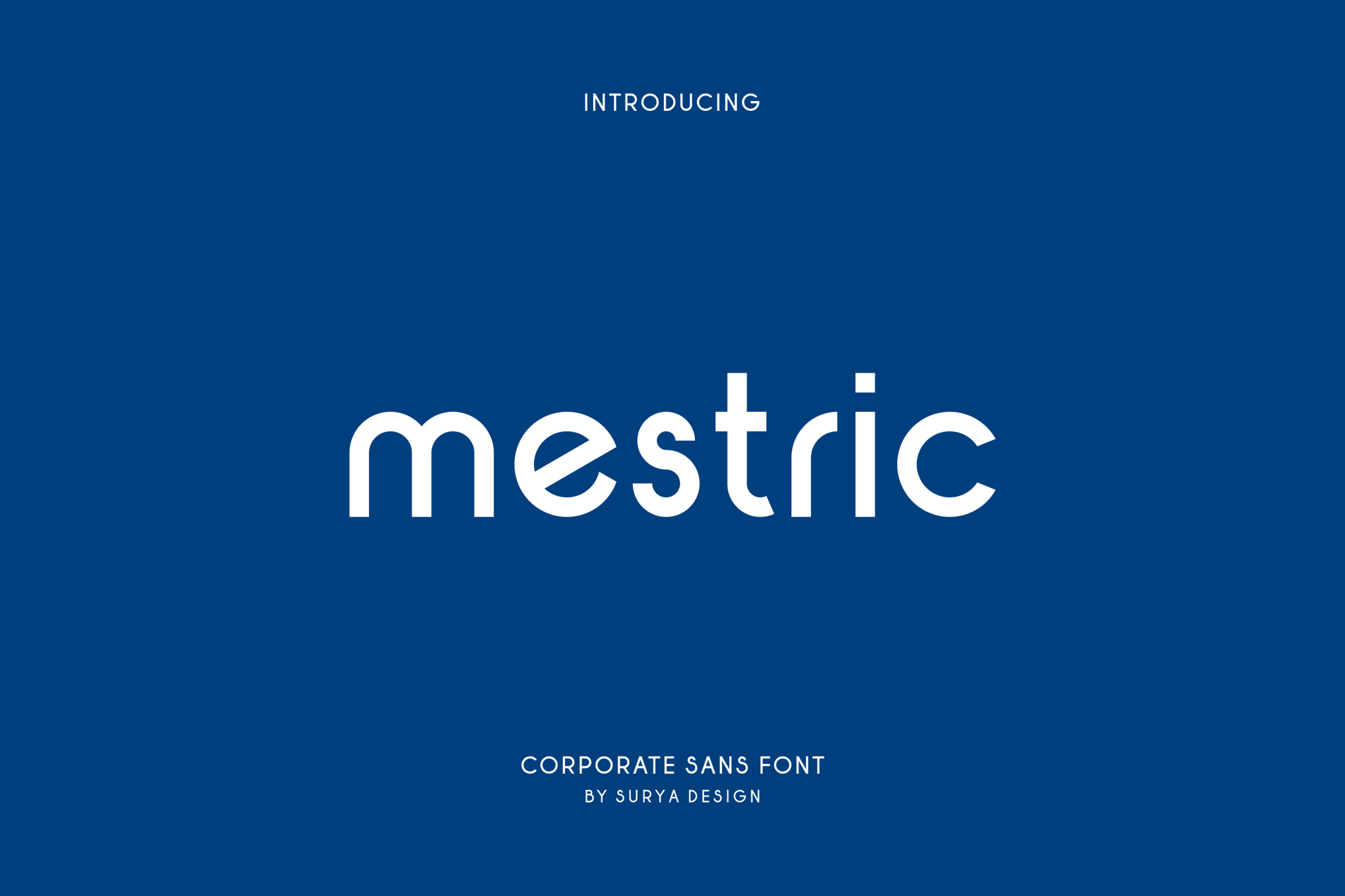
5. Random: The Modern Corporate Standard
Random represents the pinnacle of modern, authority-driven design. It is built to project trust. In the world of real estate, where the client is entrusting an agent with their most significant life investment, a font like Random helps build an immediate, psychological foundation of competence.
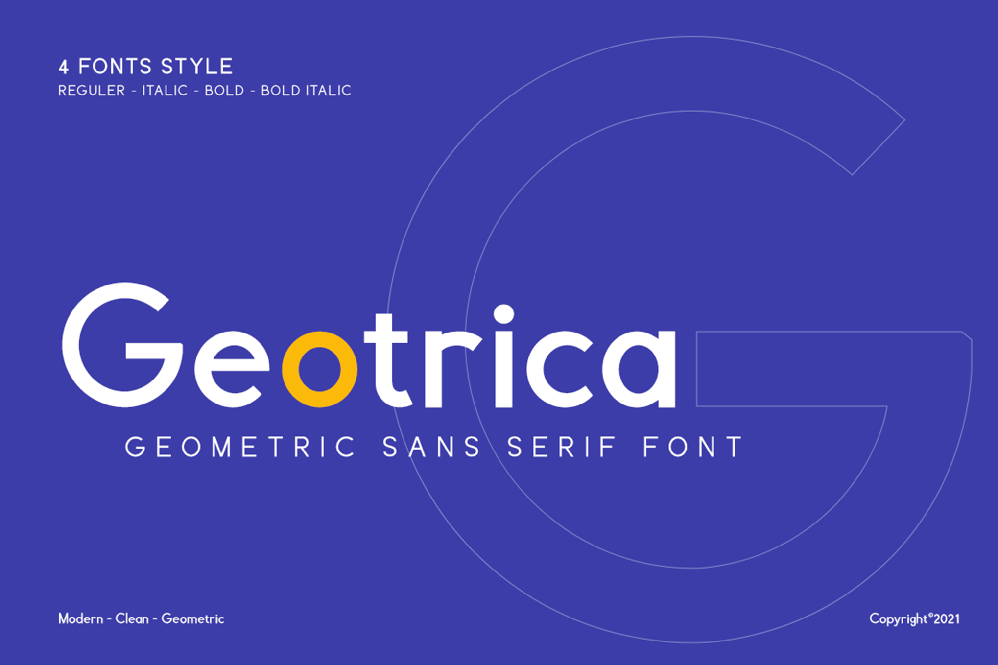
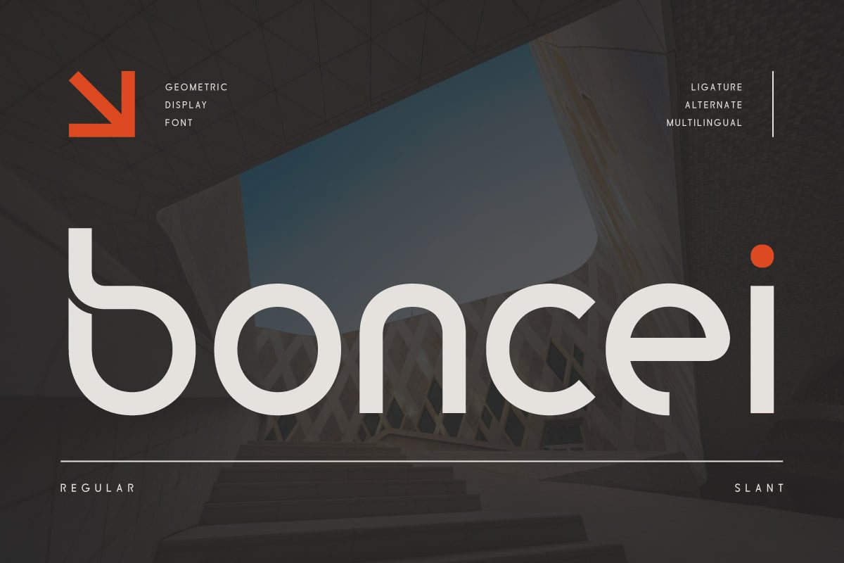
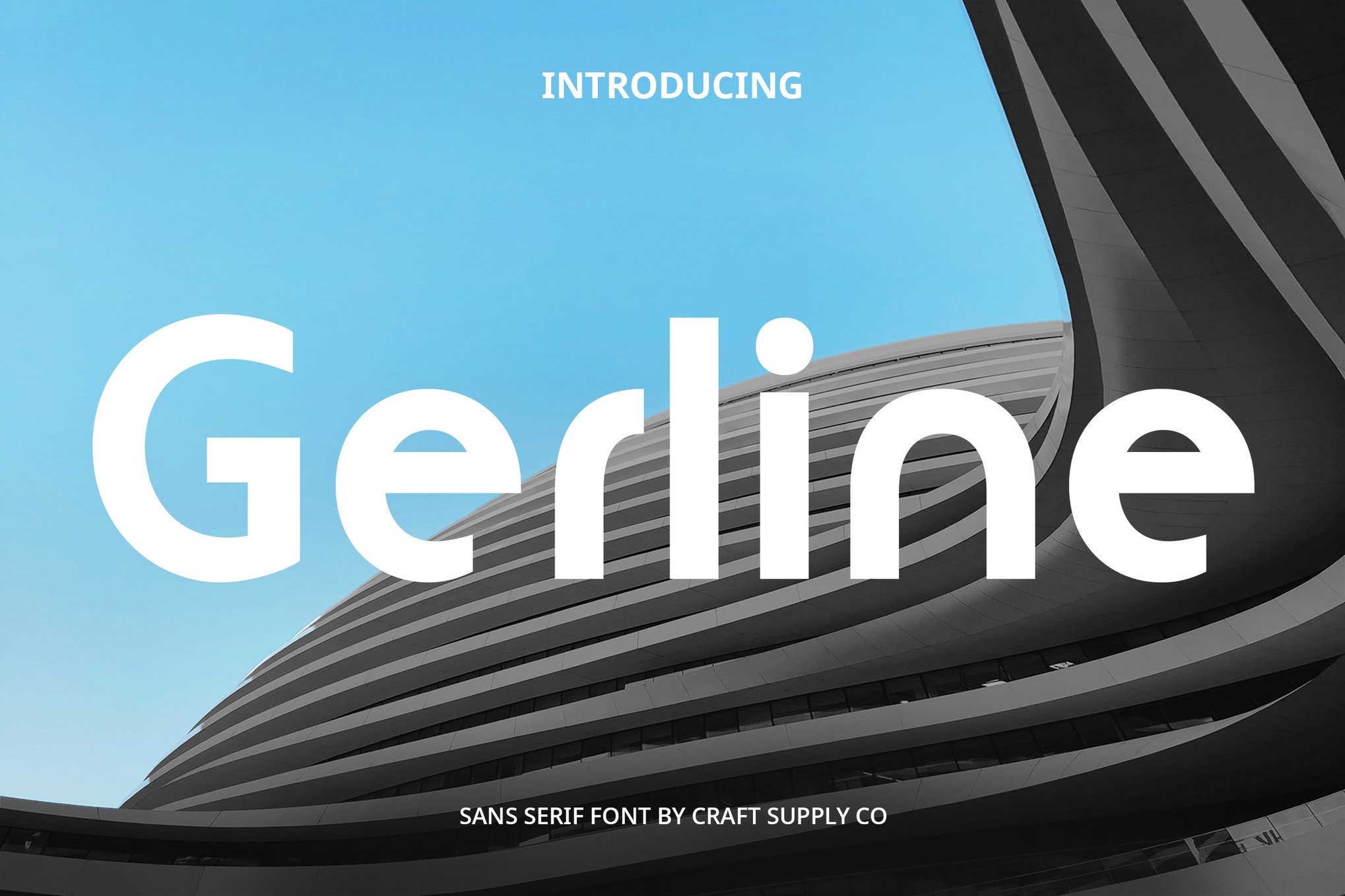
6. Boncei: Geometric Precision
Boncei is a geometric sans-serif that speaks to the sensibilities of technology-driven startups and modern property developers. Its balanced shapes and clean lines are perfect for digital interfaces and mobile apps where legibility across varying screen resolutions is a non-negotiable requirement.
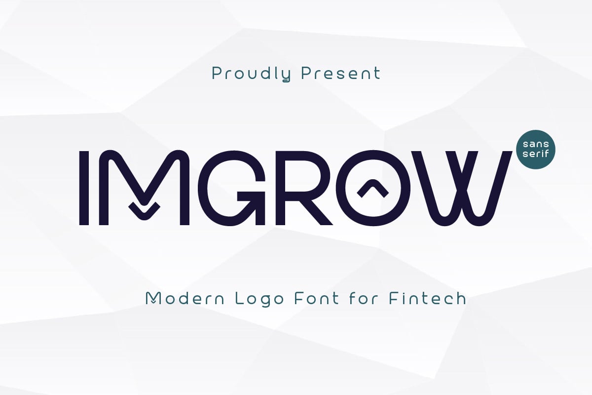
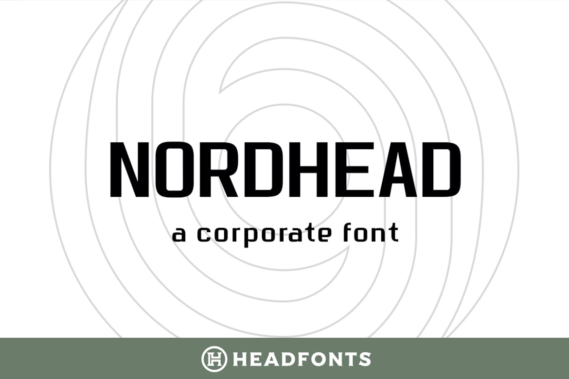
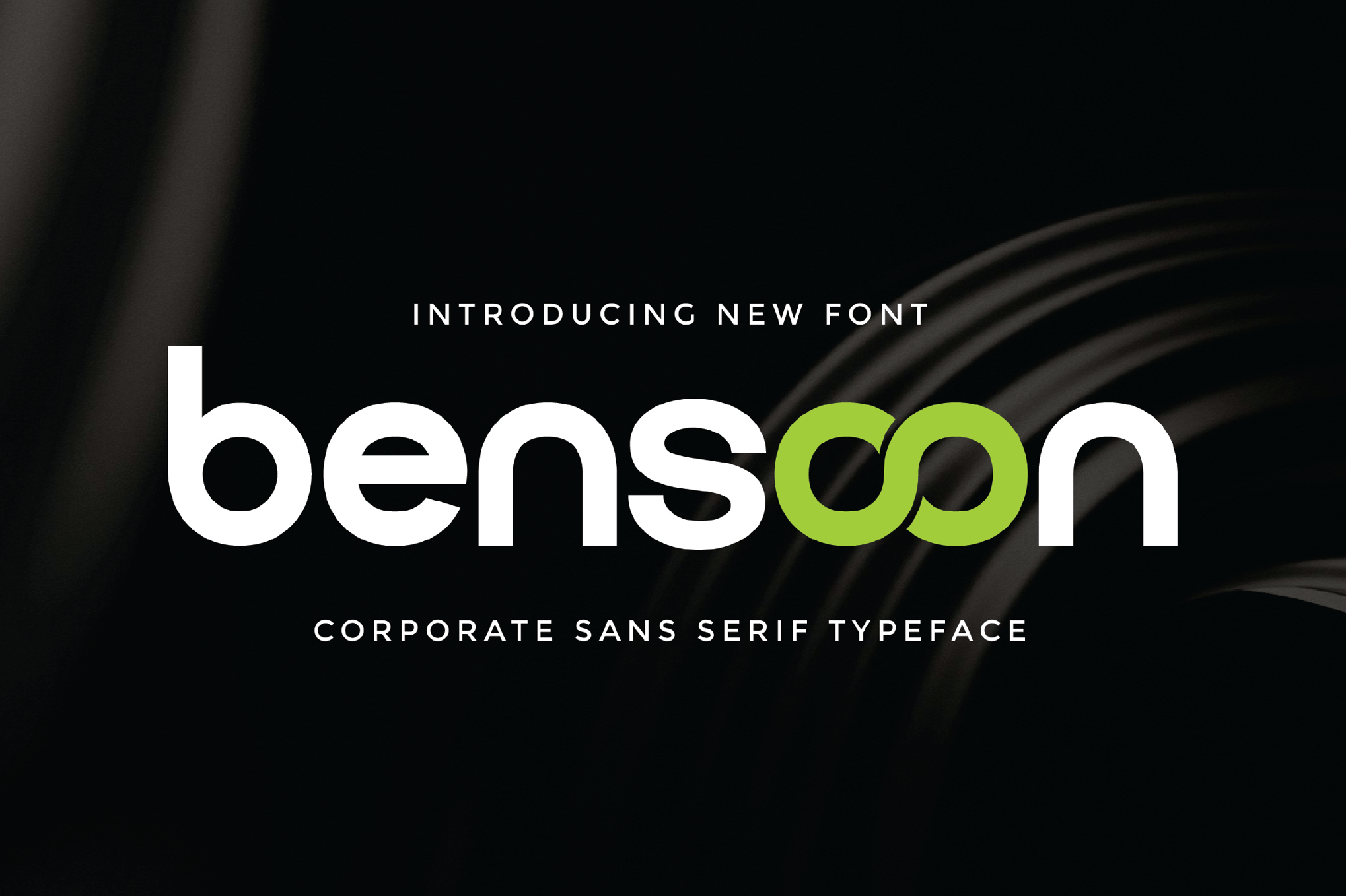
7. Nordhead: The Professional Foundation
With 258 glyphs and extensive Latin script support, Nordhead is a workhorse. Its gentle curves offer a humanizing touch to what is otherwise a very sharp, bold font. It is particularly well-suited for small-print articles and "About Us" sections where long-form readability is critical.
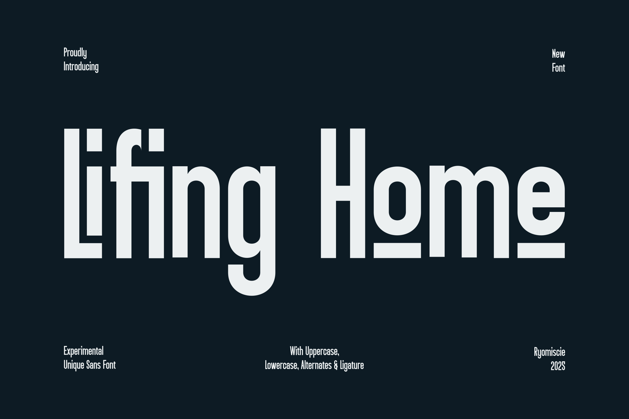
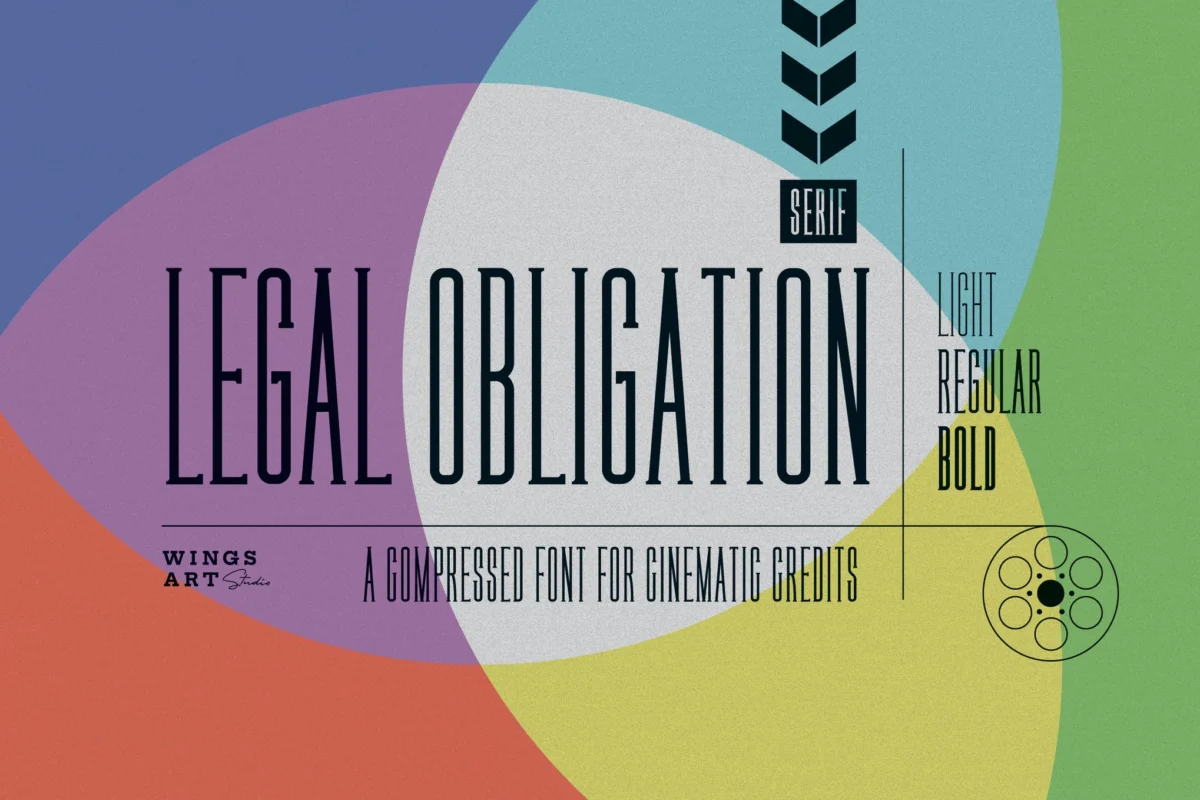
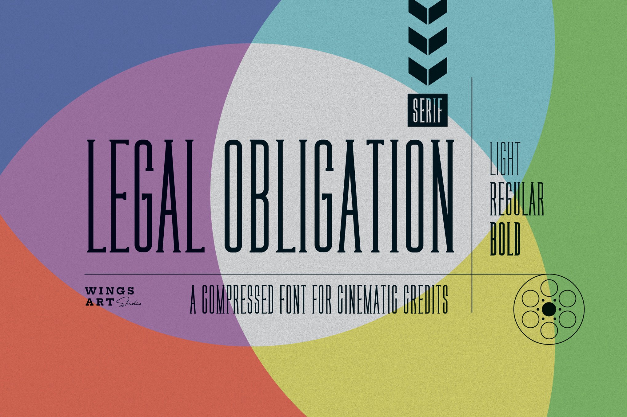
8. Legal Obligation: The Serif Reimagined
Sometimes, the best way to stand out is to return to the roots of typography. Legal Obligation brings a modern, clean approach to the classic serif. It provides a sense of legality and gravitas, perfect for contracts, official listings, or branding that focuses on the "proven track record" of an agent.
Supporting Data: The Impact of Readability
Data from UX (User Experience) studies consistently shows that typography directly influences conversion rates. A study on digital reading patterns revealed that fonts with optimal character spacing and height-to-width ratios—like those featured in this list—reduce the cognitive load on the reader. In a real estate context, this means that a potential buyer is more likely to read the entirety of a property description if the font is inviting and easy to process, directly increasing the time-on-page metric—a key factor for SEO and lead generation.
Official Perspectives: What Designers Say
Leading branding experts often argue that real estate typography should follow the "70/30 rule." Seventy percent of your brand’s type usage should be highly legible, clean, and functional (like the sans-serif options listed here), while thirty percent should be reserved for the personality-driven elements—the logo, the taglines, and the accent headers.
"The font choice is the visual handshake," says one industry designer. "If the handshake is weak or confusing, the client subconsciously doubts the strength of the firm."
Implications for Your Brand
When selecting a font, you are making a long-term commitment. A brand identity built on a typeface that feels "trendy" rather than "timeless" risks becoming obsolete within a few years. When choosing from the list above, consider the following implications:
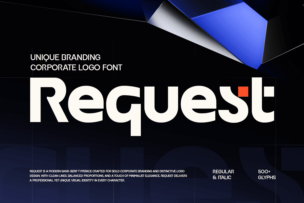
- Multilingual Capabilities: If your agency operates in a global market, ensure the font supports the necessary glyphs and character sets.
- Platform Compatibility: Can the font be embedded on your website without sacrificing load speeds? All the fonts mentioned—from the premium options to the free alternatives like PT Sans—are designed for modern web optimization.
- Scalability: Does the font hold its integrity when blown up on a massive "For Sale" yard sign, and does it remain readable when shrunk to a tiny favicon on a browser tab?
The Free Alternatives: Quality on a Budget
You do not always need a massive budget to achieve high-end branding. The following free fonts offer a professional polish that rivals paid competitors:
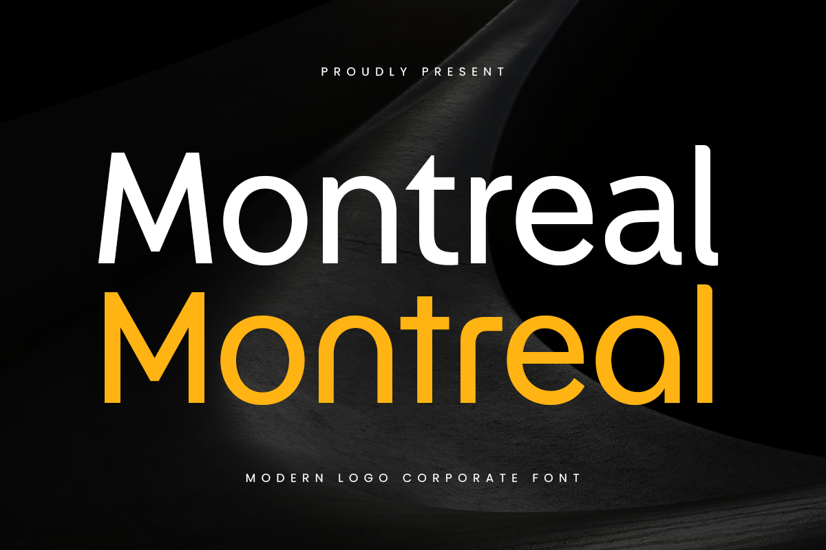
- Rawizard: Excellent for architectural signage.
- Morning Person: Ideal for the "friendly" neighborhood agent brand.
- Mirano: The go-to for upscale, contemporary brochures.
- PT Sans: The gold standard for clean, professional, and free-to-use digital typography.
Conclusion: The Final Word
Your choice of typeface is the silent ambassador of your real estate brand. By moving away from generic, system-default fonts and choosing a typeface that aligns with your specific market—whether that is luxury, commercial, or first-time home buying—you position yourself as a professional who understands the value of detail.
Investing time in the right font is an investment in the perception of your value. In an industry defined by property, the most important space you occupy is the space in your client’s mind. Make sure that space is occupied by a brand that looks, feels, and communicates with absolute clarity.