










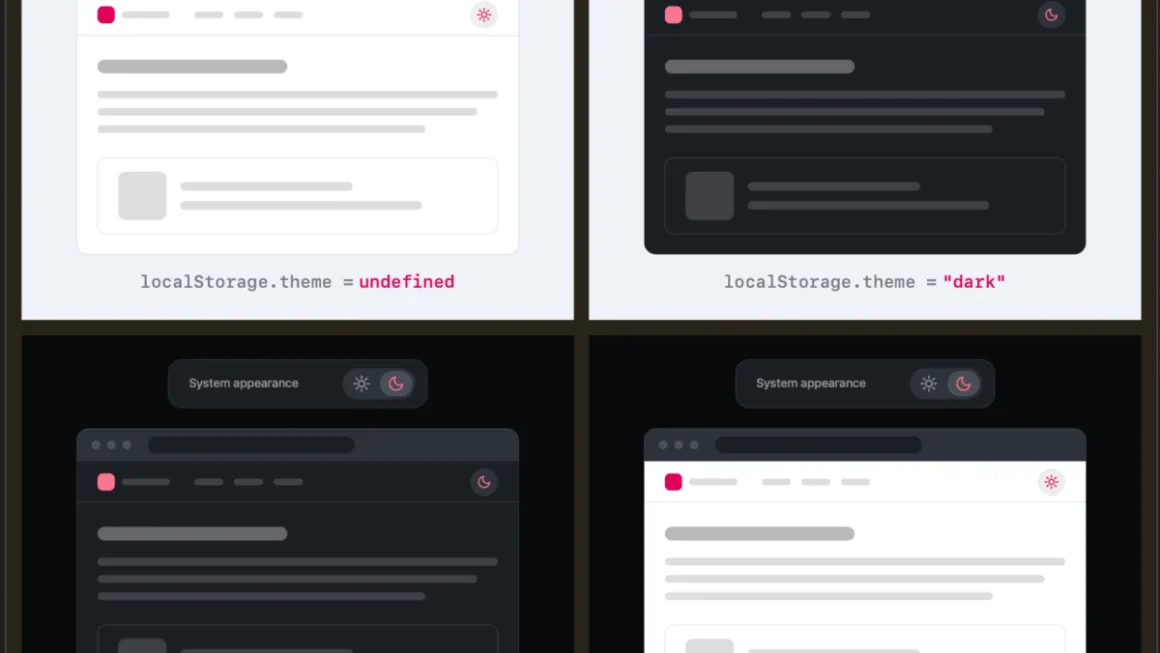
In the ever-evolving landscape of web design, few UI patterns have become as ubiquitous as the light/dark mode toggle. Nestled quietly in the navigation bars of blogs, documentation sites, and massive enterprise applications alike, these little sun and moon icons promise users agency over their visual environment. However, a recent, fiercely debated design discussion sparked […]
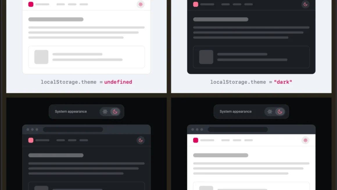
Rethinking the Toggle: Why Web Design Expert Lea Verou Wants to Kill the Three-State Dark Mode Switch
In the world of modern web development, few user interface elements are as ubiquitous—or as deceptively complex—as the dark mode toggle. For years, standard web design practices have gravitated toward a familiar tri-state pattern: Light, Dark, and System. Users are routinely presented with a drop-down menu, a sun-and-moon icon trio, or a segmented control allowing […]