

In the world of visual communication, the most critical design decisions are often those that go unnoticed by the casual observer. While flamboyant headlines and bold imagery capture initial attention, the true test of a designer’s prowess lies in how they handle small-scale typography. Whether you are crafting a high-density dashboard, a complex mobile application, an academic ebook, or a dense print document, the legibility of your body copy and fine print is the cornerstone of a successful user experience.
When text shrinks, the rules of design change. Elements that provide character at large sizes—such as delicate serifs, tight apertures, and decorative flourishes—can quickly transform into illegible noise. This comprehensive guide explores the essential criteria for selecting small-text fonts and provides a curated list of top-tier typefaces that balance aesthetic personality with uncompromising clarity.
The Science of Scale: Why Readability Matters
At its core, typography is a tool for information transmission. When that information is presented in a small footprint, the human eye requires specific visual cues to distinguish between characters. If a typeface is not optimized for such constraints, the reader experiences "visual fatigue," leading to higher bounce rates on websites and decreased engagement in print.
A font’s performance at small sizes is dictated by its "micro-features": the height of its lowercase letters (x-height), the width of its counters (the white space inside letters like ‘o’ or ‘e’), and the consistency of its stroke weight. By selecting fonts engineered with these factors in mind, designers can ensure that their content remains approachable, functional, and visually balanced, regardless of the screen size or printing medium.
Curated Selection: Premium Fonts for Small-Scale Legibility
To help you navigate the vast landscape of type design, we have identified several standout font families that excel in restricted spaces.
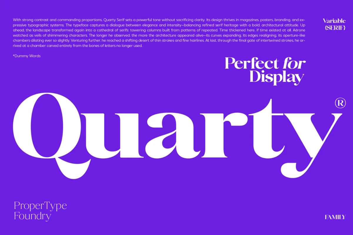
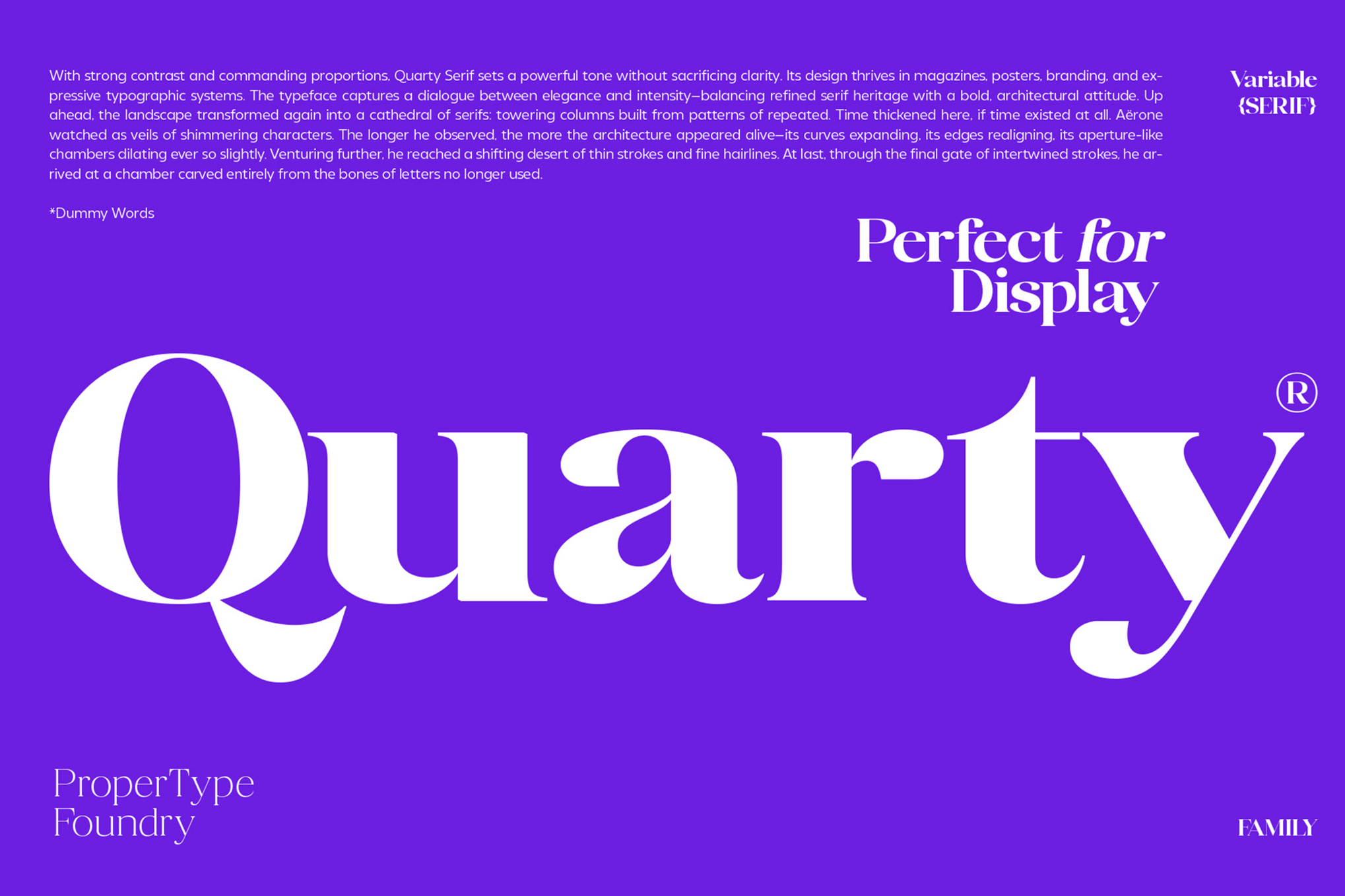
1. Quarty: The Serif for Refinement
Quarty represents a masterclass in modern serif design. By blending geometric structural integrity with graceful, flowing curves, it provides a sophisticated aesthetic that does not sacrifice readability. It is an ideal choice for editorial layouts where a touch of elegance is required for long-form content.
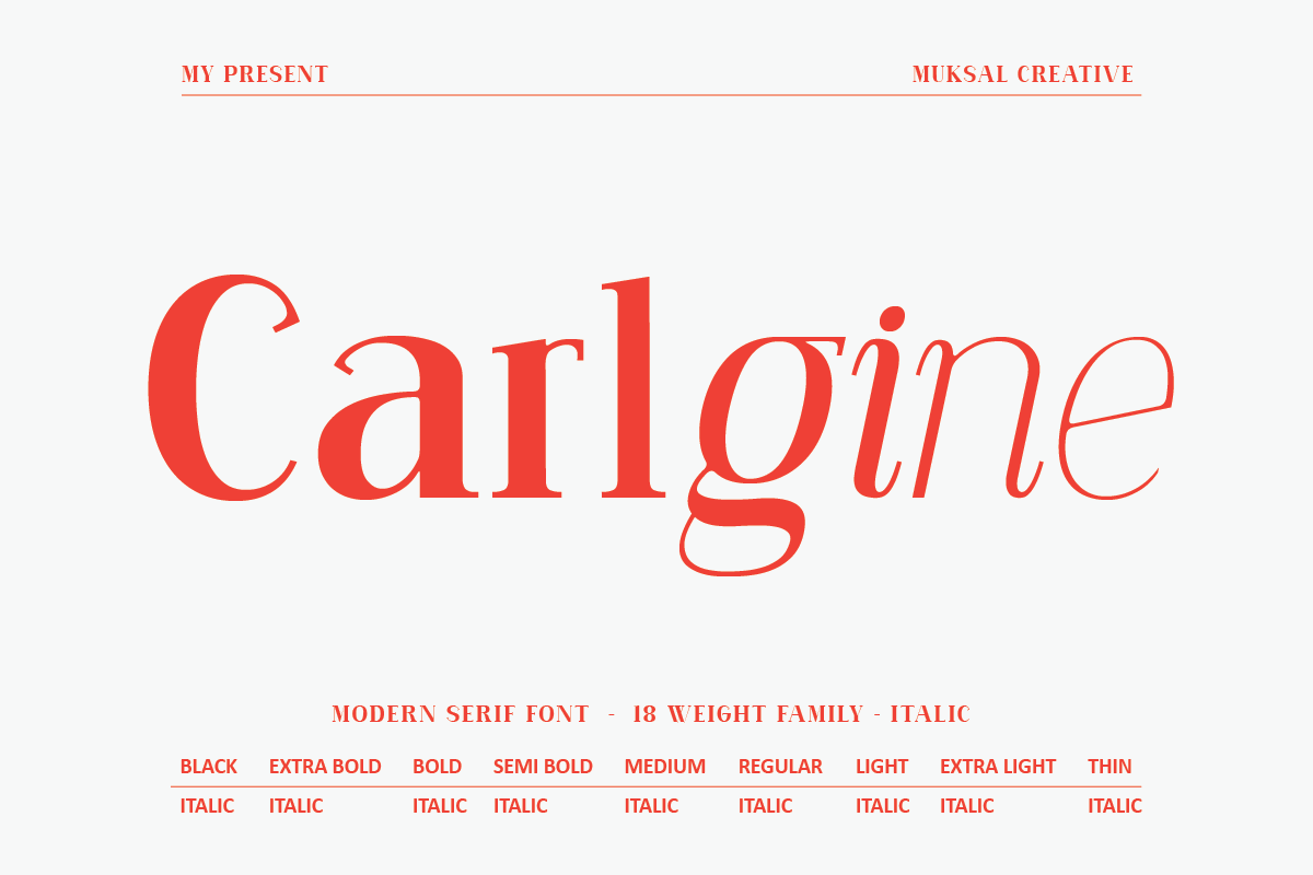
2. Carlgine: The Versatile Workhorse
With an expansive 18-weight family, Carlgine is designed for consistency across complex branding systems. Its ability to maintain legibility from the thinnest hair-line weights to its robust Black variants makes it a reliable asset for developers and designers alike.
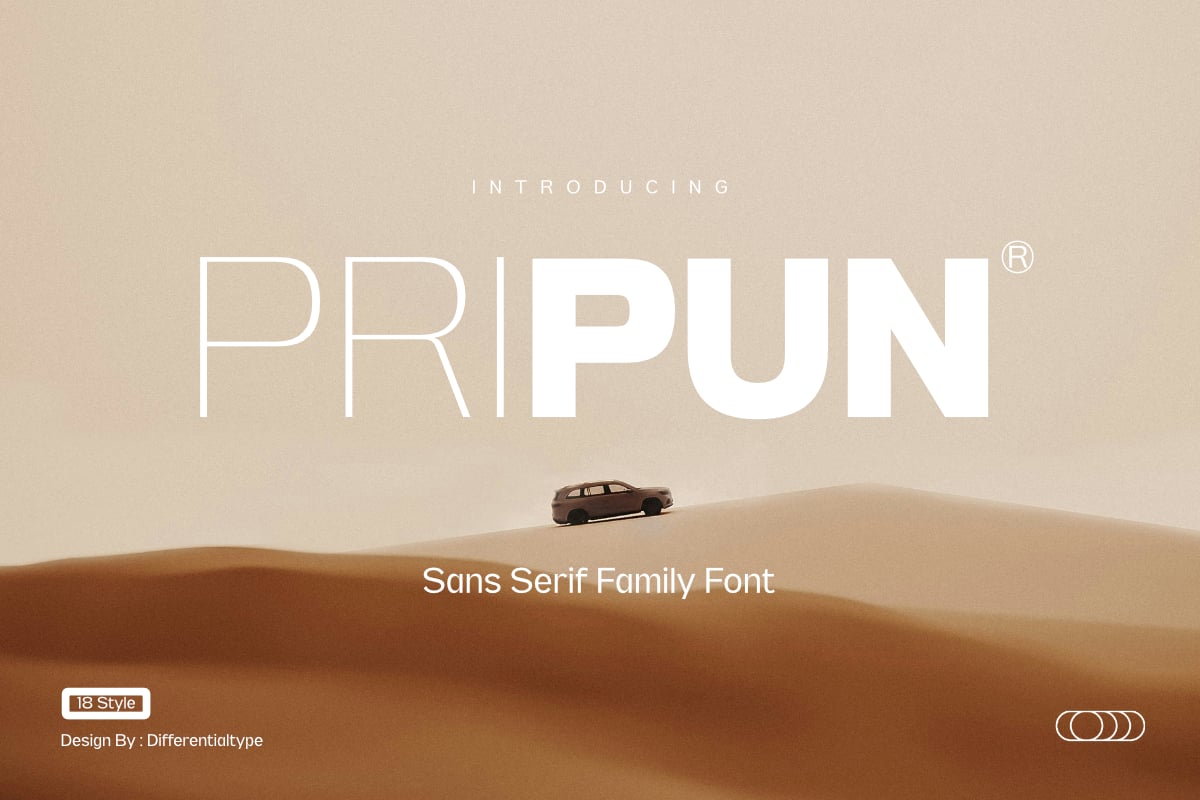
3. Pripun: Precision Sans-Serif
Pripun excels where simplicity is paramount. As a clean, no-nonsense sans-serif, it is built on the principle of geometric precision. Its high-legibility letterforms ensure that even when rendered on low-resolution mobile screens, the distinct shapes of each character remain sharp.
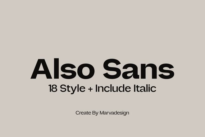
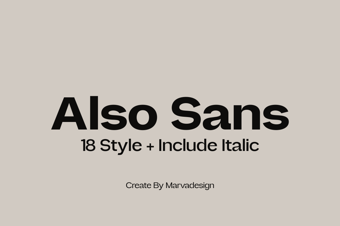
4. Also Sans: Open and Airy
The "open counters" of Also Sans are its defining feature. By creating more breathing room within the characters, this font family mitigates the "blurring" effect that occurs when text is rendered in small, dense blocks. It is a preferred choice for UI designers working on dashboard interfaces.
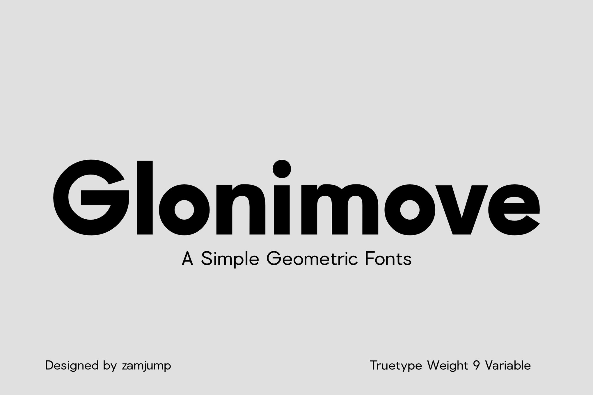
5. Glonimove: Modern Geometric Elegance
Glonimove is for the designer who demands a modern, architectural look. Its geometric roots are tempered by subtle humanistic refinements, making it perfect for signage and print materials where both modernity and legibility are required.
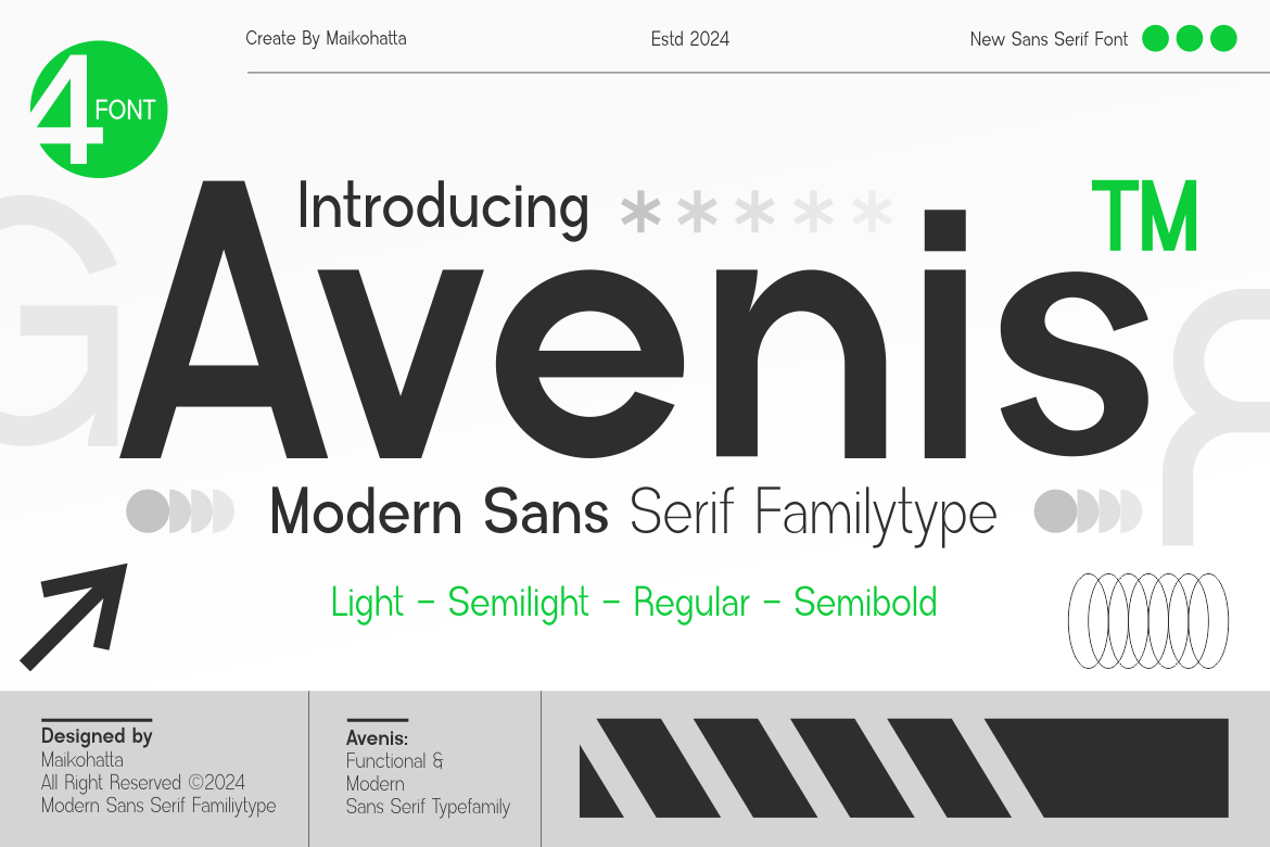
6. Avenis: Contemporary Utility
Avenis offers a neutral, highly readable aesthetic that fits seamlessly into modern digital environments. Its varied weights allow for clear typographical hierarchies, ensuring that users can navigate through small text blocks with ease.
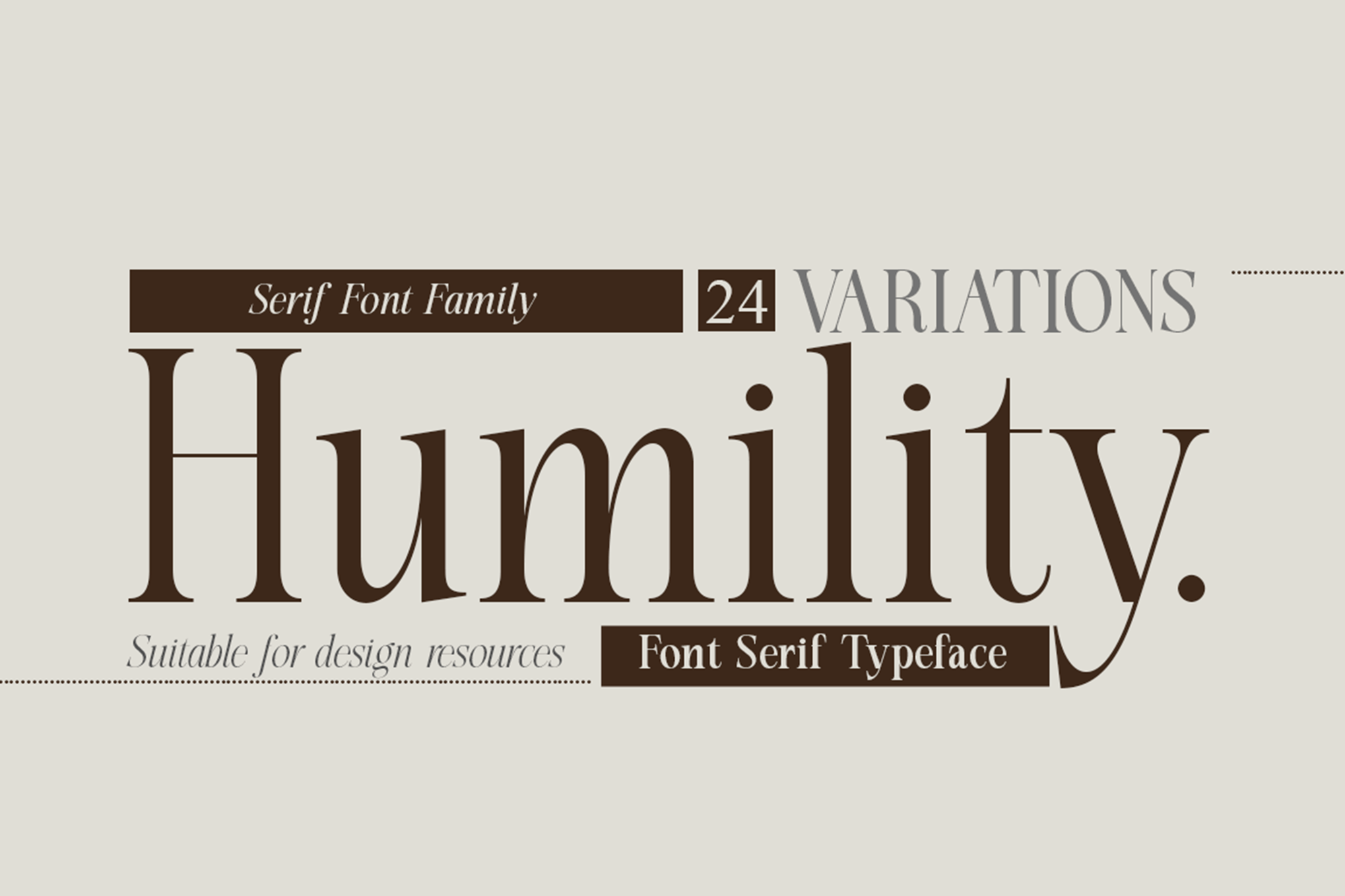
7. Humility: The Classic with a Twist
Humility bridges the gap between traditional serif styles and modern digital requirements. Its sharp, expressive characters hold up remarkably well in print, making it a standout for fashion publications and luxury branding.
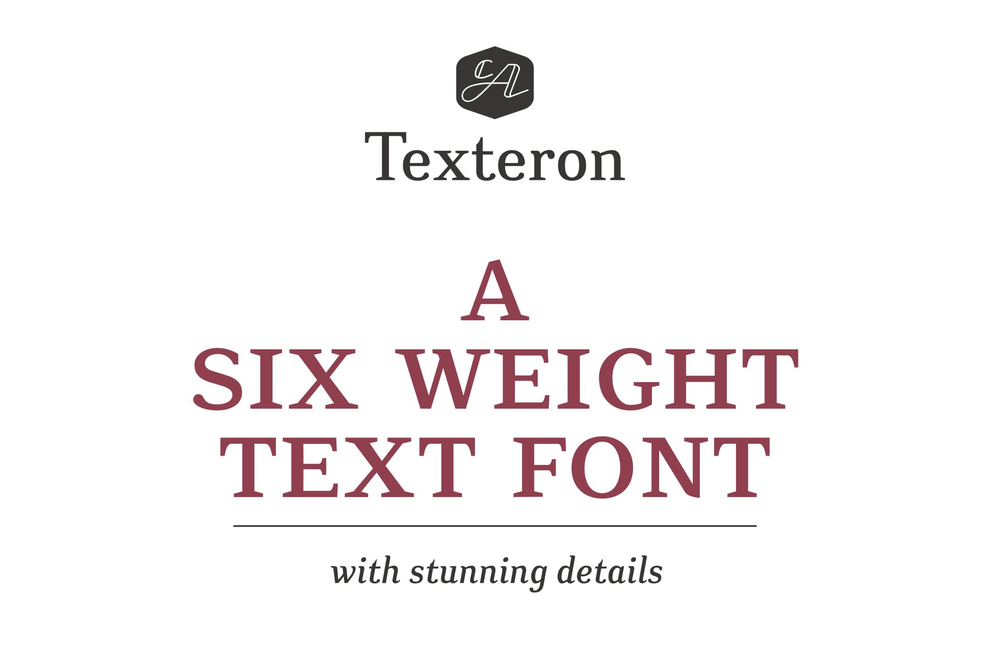
8. Texteron: Bridging Tradition and Modernity
Texteron is a unique hybrid. It respects the classical proportions of historical typefaces while incorporating modern engineering to ensure it doesn’t break down at small point sizes. Its included Small Caps feature is a significant advantage for sophisticated data presentation.
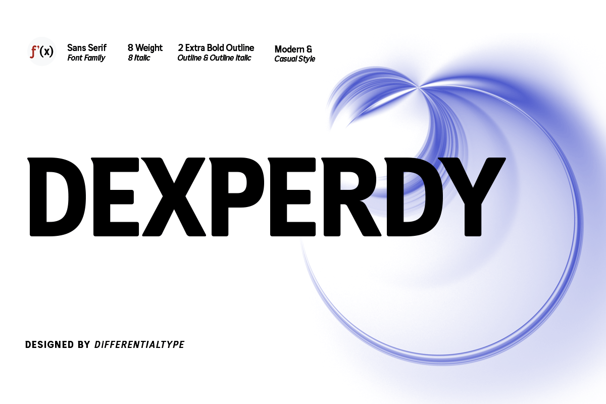
9. Dexperdy: Bold and Impactful
For projects requiring high-impact text in small spaces, Dexperdy offers a bold, authoritative voice. Its extensive range of ligatures and alternates provides the flexibility needed for complex technical documentation.
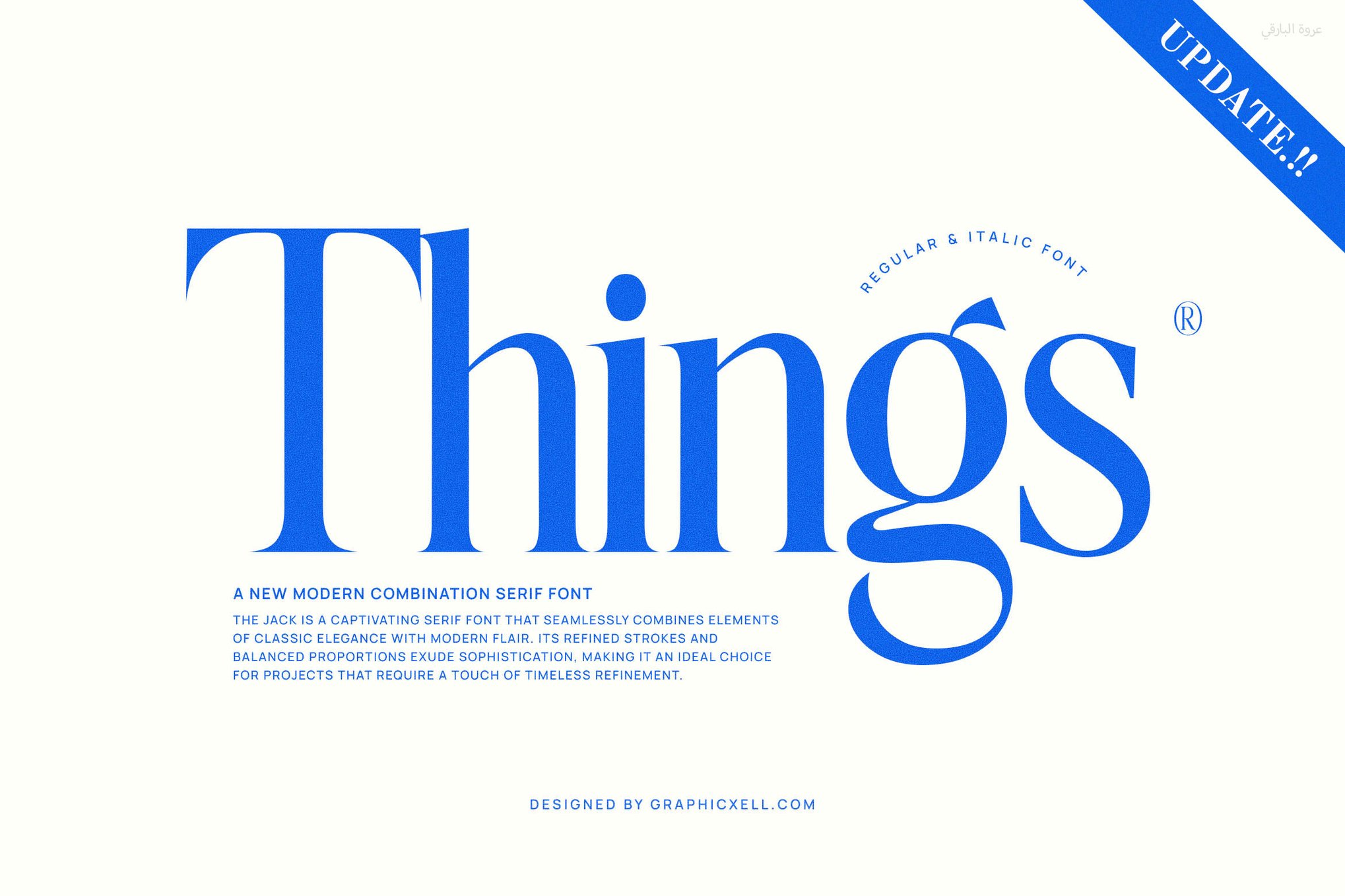
10. Things: Modern Serif Versatility
The "Things" family is a testament to the fact that serifs can be just as functional as sans-serifs. Its refined, clean lines make it a versatile performer for both digital long-form articles and high-quality printed brochures.
Top Free Resources for Small-Scale Typography
Quality typography need not always come with a premium price tag. The open-source community has produced several gems that are perfectly suited for small-text applications.
- Caviler: A narrow, space-saving sans-serif that is excellent for high-density UI elements and footnotes.
- Orbito: Known for its friendly, rounded shapes, this font is ideal for infographics and accessible digital interfaces.
- Gudlak: A professional-grade typeface that handles dense text blocks with grace, maintaining its shape under close scrutiny.
- Groza: A low-contrast font that prioritizes openness, making it a go-to for minimalist digital design.
8 Professional Tips for Selecting Small-Text Fonts
Selecting the right font is a technical process. Follow these industry-standard guidelines to ensure your text performs optimally.
1. Prioritize Clarity Over Personality
In the realm of small text, legibility is the primary directive. While a unique display font might look beautiful in a hero banner, it will likely fail in a sidebar or caption. Reserve expressive fonts for headings and stick to functional, time-tested shapes for body copy.
2. Optimize for x-Height
The x-height—the height of lowercase letters like ‘x’ relative to uppercase letters—is the most significant factor in small-scale readability. A taller x-height makes characters more distinct at lower resolutions, significantly improving reading speed.
3. Mitigate Stroke Contrast
Avoid "didone" style fonts with extreme thin-to-thick stroke transitions. When reduced in size, the thin strokes can disappear entirely, causing the font to appear patchy and fragmented. Opt for fonts with consistent, balanced stroke weights.
4. Evaluate Counters and Spacing
The "negative space" within letters is just as important as the ink itself. Ensure your chosen font has open counters that allow the eye to easily distinguish between an ‘o’, an ‘a’, and an ‘e’.
5. Empirical Testing is Non-Negotiable
Never finalize a font choice based on a 72pt preview. Always test the font at the actual intended size (e.g., 9pt or 12px) in the final layout. If you cannot read it clearly from a normal viewing distance, it is not the right choice.
6. Digital Optimization (Hinting)
If you are designing for the web, look for fonts that have been "hinted." Hinting is a process that adjusts the outline of a font to align with the pixel grid of a screen, ensuring maximum clarity at small sizes.
7. Eliminate Decorative Clutter
Small text is not the place for swashes, excessive ligatures, or complex ornaments. Keep the letterforms clean. If a character has an unusual, stylized shape, it may look charming at scale but confusing at 8pt.
8. Weight Matters: Test the "Optical Size"
A font that looks perfect at 12pt might appear too thin at 8pt. Often, a slightly heavier weight (such as "Medium" instead of "Regular") will read more clearly at very small sizes, as the ink or pixels have more visual weight to remain visible.
Conclusion: The Final Word on Small Text
The choice of typeface is the silent ambassador of your design. When the text is small, you are asking more of your reader’s eyes than at any other time. By selecting fonts that are engineered for the realities of small-scale display—prioritizing x-height, open counters, and balanced stroke weights—you transform your design from a visual challenge into a seamless, professional experience. Whether you choose a premium family like Quarty or a reliable free option like Groza, the key remains the same: balance the soul of the typeface with the rigid requirements of human perception.