







In the ever-evolving landscape of front-end web development, certain properties fade into the background of routine usage, taken for granted by developers rushing to ship modern user interfaces. The CSS border-image property is a prime example of this phenomenon. Far from being a recent innovation, border-image has been part of the web design vocabulary for years. Yet, as front-end craftsmanship matures, developers continually discover new depths in legacy specifications.
Recent technical explorations—such as Andy Clarke’s deep dive revisiting the property—demonstrate that border-image is far from obsolete; rather, it remains an untapped reservoir for creative expression. While standard border styles like solid, dashed, or dotted serve functional purposes, they often leave modern interfaces feeling rigid and uninspired.
The true potential of border-image unlocks when paired with modern CSS layout and animation techniques. By moving beyond static graphical frames and introducing dynamic transitions, developers can craft engaging user experiences where borders appear to draw themselves, pulse with color, or rotate dynamically upon user interaction. This article explores the mechanical foundations, technical challenges, and advanced variations of animating CSS border images to elevate contemporary web design.
Main Facts: Understanding border-image and Its Limitations
At its core, the border-image property allows developers to use an image or a CSS gradient as the border of an element, replacing conventional color definitions. However, working with border images introduces a significant architectural caveat: they do not curve to border shapes.
When an element incorporates border radius (border-radius), standard border images refuse to conform to the rounded corners, breaking the illusion of a seamless frame. For complex animations that travel along the perimeter of an element—such as glowing light effects tracking a card’s boundary—this limitation presents a notable hurdle.
Developers often weigh alternative approaches to achieve similar dynamic border effects. For instance, advanced CSS masking techniques, championed by experts like Temani Afif, offer sophisticated ways to handle complex geometric borders and speed controls. Despite these alternatives, border-image remains exceptionally efficient for specific use cases. Its primary advantage lies in automation: it effortlessly replicates visual designs across all four sides of an element without requiring intricate multi-element nesting.
Furthermore, the property utilizes border-image-slice, a mechanism conceptually similar to background-size and background-position. By slicing a single image or gradient, the browser stretches, repeats, or scales the segments across the entire border box. When animated, this slicing behavior generates fluid, organic visual effects.
Chronology of Modern CSS Animation: From Static Gradients to Houdini Properties
To understand how animated border images became possible, one must examine the chronological evolution of CSS layout and variable interpolation capabilities.
Phase 1: The Static Era of CSS Borders
Historically, CSS gradients could not be animated directly. Because gradients are defined by color stops mapped to numerical percentages (e.g., red 0% to transparent 100%), the browser’s layout engine viewed them as complex data types rather than simple scalar values. Consequently, attempting to transition a gradient property on a pseudo-class like :hover resulted in an abrupt, unrendered jump rather than a smooth frame-by-frame animation.
Phase 2: The Introduction of CSS Custom Properties (Variables)
The advent of CSS custom properties provided a structural organizational tool, but standard variables still suffered from the same interpolation limitations when tied directly to complex graphical functions. The browser still did not know how to mathematically calculate the intermediate states between variable values utilized inside a gradient engine without explicit type definitions.
Phase 3: The CSS Houdini Revolution (@property)
The paradigm shifted with the introduction of the CSS Houdini @property API. By allowing developers to explicitly register custom properties—defining their syntax, initial values, and inheritance behavior—browsers gained the ability to treat custom variables as strongly typed data (such as <percentage>, <angle>, or <number>). This breakthrough opened the door for direct, hardware-accelerated interpolation of CSS variables, making the dynamic animation of gradients and border-image parameters a reality.
Supporting Data and Technical Implementation
Implementing an animated border image requires a methodical assembly of HTML structure, base styling, longhand border-image properties, and registered custom properties.
The HTML Foundation
The underlying markup remains lightweight and semantic, avoiding unnecessary wrapper elements or redundant structural divs:
<div class="card">
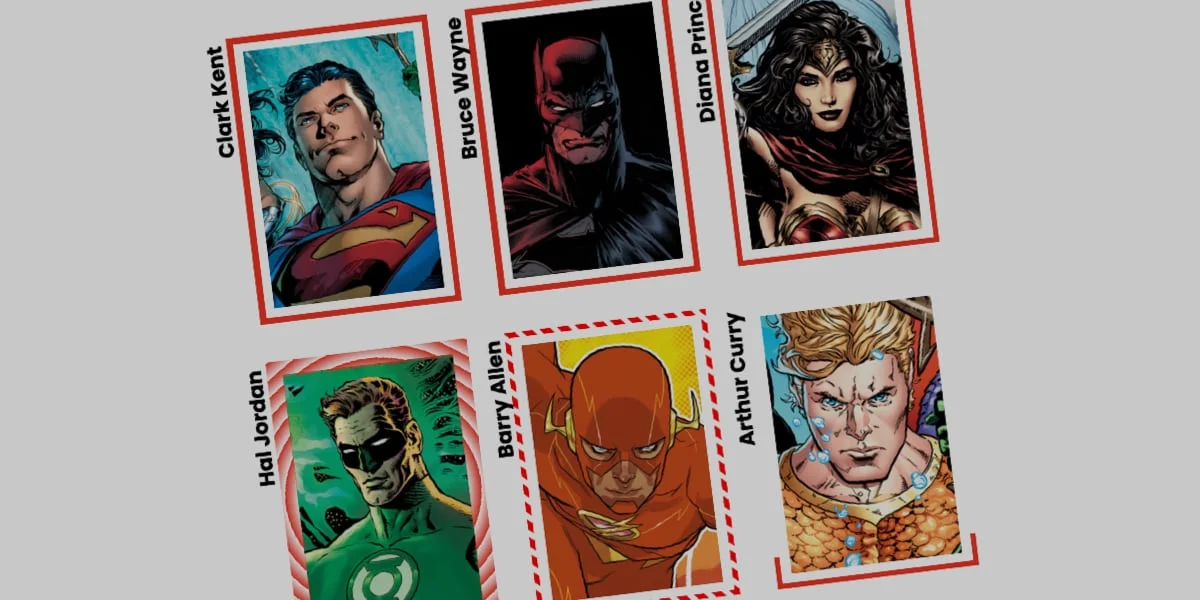
  <strong>Bruce Wayne</strong>
</div>
Base Styling and Longhand Properties
Instead of shorthand syntax, utilizing longhand border-image properties provides granular control over how each parameter interacts with the rendering engine. Consider the following implementation for a card element:
.card
  width: 150px;
  aspect-ratio: 0.69;
  position: relative;
  background: center / 90% no-repeat;
  background-image: url("batman.jpg");

  /* Creates a linear color gradient source */
  border-image-source: linear-gradient(-45deg, red 0%, transparent 0%);

  /* Controls how the gradient is sliced */
  border-image-slice: 1;

  /* Sets the physical thickness of the border */
  border-image-width: 5px;

  /* Pushes the border outward to prevent overlapping */
  border-image-outset: 5px;
In this configuration, the initial gradient source is fully transparent. Because both red and transparent are designated to start at 0%, the browser lacks physical canvas space to blend the color transition. Because transparent is declared second, it takes precedence at the origin point and fills the remainder of the gradient map. The border-image-slice: 1 declaration slices the gradient into 1-pixel increments, ensuring a uniform fill across the entire perimeter.
Registering Custom Properties for Animation
To animate the gradient stops, we register a custom property --p using the @property rule:
@property --p
  syntax: "<percentage>";
  initial-value: 0%;
  inherits: false;
We then integrate this registered variable into our linear gradient:
.card
  border-image-source: linear-gradient(-45deg, red var(--p), transparent 0%);
  border-image-slice: 1;
  border-image-width: 5px;
  border-image-outset: 5px;
  transition: --p 0.4s ease-in-out;

  &:hover
    --p: 100%;
When a user hovers over the card, the custom variable --p transitions smoothly from 0% to 100%. This instructs the browser to expand the red color stop across the entire length of the gradient, creating the visual impression of a glowing border drawing itself around the container in real-time.
Advanced Variations: Conic Gradients and Tiling
Linear gradients represent only the baseline of what is possible. By incorporating conic-gradient, rotational angles, and advanced tiling modes, developers can build intricate, high-end visual experiences.
Implementing Conic Gradients with Repeated Slices
By swapping the linear gradient for a conic gradient and utilizing border-image-repeat: round, the browser attempts to fit a whole number of image tiles along the border perimeter, subtly stretching or compressing them as needed to prevent awkward clipping:
@property --n
  syntax: "<number>";
  initial-value: 1;
  inherits: false;


@property --a
  syntax: "<angle>";
  initial-value: 0deg;
  inherits: false;


.card
  border-image-source: conic-gradient(from var(--a), red var(--a), transparent 0%);
  border-image-width: 5px;
  border-image-slice: var(--n);
  border-image-repeat: round;
  transition-property: --n, --a;
  transition-duration: 0.6s;

  &:hover
    --n: 20;
    --a: 360deg;
In this advanced variation, hovering over the element triggers a simultaneous transition of two registered properties: --n (the slicing depth) and --a (the rotational angle). The slice value scales from 1 up to 20, increasing the thickness of the individual repeating segments while the conic gradient completes a full 360-degree rotation. The result is a dynamic, rotating light effect that adds depth and polish to UI components.
Official Responses and Industry Best Practices
As browser vendors continue to optimize CSS Houdini and layout engines, industry consensus surrounding advanced styling techniques has matured.
Performance Considerations
Web performance engineers emphasize that while @property animations leverage GPU acceleration effectively in modern engines (such as Chromium-based browsers and Safari), developers must remain mindful of layout thrashing on lower-end mobile devices. Restricting transitions strictly to explicitly registered custom properties (transition-property: --n, --a) ensures that the browser does not trigger unnecessary full-page repaints, restricting computation strictly to the affected element’s paint phase.
Progressive Enhancement
Because @property and advanced border-image animations rely on cutting-edge specification support, official design guidelines recommend adopting a progressive enhancement strategy. Browsers that do not yet fully support Houdini property interpolation will gracefully fall back to the initial static values defined in the stylesheet, ensuring that interface usability remains completely intact regardless of the user’s browser environment.
Implications for the Future of User Interface Design
The ability to dynamically animate CSS border images carries profound implications for the future of web design systems and component libraries.
- Reduced Dependency on Heavy Assets: Historically, achieving complex animated borders required heavy animated GIF files, multi-layered DOM nodes, or complex JavaScript canvas wrappers. Native CSS border image animations eliminate these performance bottlenecks, keeping Document Object Models clean and bandwidth consumption minimal.
- Design System Flexibility: Design systems can now incorporate highly customized, brand-aligned micro-interactions directly into core UI components (such as buttons, input fields, and card containers) using pure, maintainable stylesheets.
- Heightened User Engagement: Subtle visual cues—such as a border that illuminates upon focus or traces a path on hover—subtly guide user attention, improving overall navigational intuitiveness and providing immediate tactile feedback in digital spaces.
Conclusion
The CSS border-image property is far more than a legacy relic; when combined with custom property registration, it transforms into a powerful instrument for modern interface design. By looking past initial limitations, experimenting with longhand properties, and embracing the power of CSS Houdini, developers can push the boundaries of what is possible on the web—turning ordinary borders into extraordinary interactive experiences.