








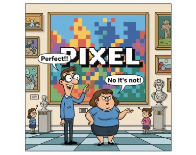
It is 2026. We inhabit an era defined by radical technological leaps, where artificial intelligence automates the mundane, spatial computing redefines our physical environment, and the web has evolved into an omnipresent, hyper-fluid ecosystem. Yet, despite this rapid transformation, the professional vocabulary of web design remains tethered to a legacy concept that feels increasingly like an anchor on a high-speed vessel: "Pixel Perfect."
Amit Sheen, a leading voice in modern front-end development, argues that this term—once the gold standard of digital craftsmanship—has become a misleading, vague, and ultimately counterproductive mantra. As we look at the current landscape of the web, it is time to dismantle the myth of static perfection and redefine what excellence looks like in a multi-device, fluid world.
A Chronology of a Rigid Mindset
To understand why the industry clings to "pixel perfection," one must look to the medium’s origins. The term did not emerge from the web; it was a stowaway from the late 1980s and 90s, when GUI design software first allowed designers to mimic the rigid constraints of the print industry.
In the world of print, perfection is absolute. Once a file is sent to the press, every dot of ink is fixed. When designers transitioned to the early web, they carried this "printed page" mentality with them. The objective was binary: the website had to be an exact, coordinate-by-coordinate replica of a static Photoshop mockup.
- 1990s (The Era of Control): Developers utilized table-based layouts, nested deep into the code, and employed 1×1 pixel "spacer GIFs" to force elements into specific locations. The web was designed for a single, uniform resolution—usually 800×600 pixels—because it was the only way to guarantee a consistent visual output.
- 2000 (The First Crack): John Allsopp’s seminal article, A Dao of Web Design, challenged this dogma. He argued that forcing the web into the constraints of print was a "ritual" that ignored the inherent fluidity of the medium.
- 2010 (The Responsive Shift): The industry saw the release of the Pixel Perfect Precision (PPP) handbook, which attempted to codify the concept. Ironically, this same year saw the explosion of Responsive Web Design (RWD), which effectively rendered the "fixed-size" philosophy obsolete.
- 2026 (The Current Reality): Despite years of technological progress, the term persists, even as we build for foldable phones, smart watches, and spatial interfaces. We are using a 1990s term to describe 2026-era complexity.
The Mirage of Specificity: Why the Concept Fails
The primary critique leveled against "pixel perfection" is that it lacks technical specificity. When a project manager or client demands a "pixel-perfect" implementation, they are rarely providing a set of requirements. Instead, they are expressing a feeling of aesthetic unease.
The Multi-Surface Reality
The "standard screen size" is a myth. Today, we design for an infinite variety of viewports, pixel densities, and aspect ratios. A layout that appears "perfect" on a high-end 27-inch monitor will, by definition, fail when viewed on a mid-range Android device or a foldable screen that changes shape mid-session. When the canvas is in constant motion, a static implementation is not just impossible—it is a logical fallacy.

The Dynamics of Content
Static mockups are snapshots, not reality. Real-world content is volatile. Localization is the most common example: a label that fits perfectly within a button in English will inevitably overflow or break when translated to German, or when rendered in CJK languages requiring different font metrics. If a design is built to be "pixel-perfect" based on a single English string, it is inherently fragile. It is a house of cards that collapses the moment the content changes.
The Price of Perfection: Technical Debt
Clinging to pixel-perfect ideals is more than an aesthetic choice; it is an act of accruing technical debt. To force elements into exact positions that the browser’s natural layout engine doesn’t support, developers often resort to "magic numbers."
These are arbitrary overrides—such as margin-top: 13px or left: -1px—sprinkled throughout the CSS to force an element into place for one specific browser at one specific resolution. This practice creates a brittle, unmaintainable codebase. It turns the CSS from a set of logical instructions into a series of visual hacks, making the design difficult to refactor or automate.

Redefining Perfection: Accessibility and Intent
If "pixel perfection" is dead, what replaces it? The industry is moving toward a standard of Design Intent.
True perfection in 2026 is measured by accessibility and robustness. If a layout is so rigid that it breaks when a user increases their browser font size or enables high-contrast mode, it is not perfect—it is broken. Accessibility is the baseline of quality.
Furthermore, we are moving away from designing "pages" toward building "systems." In a component-based architecture, a button or a card must work in isolation, within a header, or inside a grid. The goal is to ensure that the soul of the design remains intact, regardless of the container.

The Shift to Design Tokens
Design tokens act as the bridge between design and code. By agreeing on a token like --spacing-large instead of a static 32px, designers and developers sync the logic of the design. This allows the value to be fluid and reactive, ensuring that the relationship between elements remains consistent even if the underlying pixel values shift to accommodate new devices.
The Death of the "Handover"
The traditional "handover"—where a designer tosses a static file over a wall to a developer—is a relic. Modern tooling has shifted the workflow to living design systems.
When a designer defines a component today, they are not just drawing a box; they are defining its constraints, its responsive behavior, and its relationship to the surrounding context. The dialogue between team members has evolved from the pedantic ("Why is this three pixels off?") to the strategic ("How does this component behave when the container shrinks?").

Implications for the Future
As we look toward the future of the web, the implications of this shift are profound:
- Increased Engineering Efficiency: By abandoning magic numbers and embracing fluid units like
remandclamp(), teams can build faster and maintain codebases with significantly less technical debt. - Universal Inclusivity: Designs that prioritize intent over fixed positions are inherently more responsive, naturally supporting assistive technologies and varied user settings.
- Collaborative Ownership: When designers provide "recipes" (rules and constraints) rather than "photos" (static mockups), the final product becomes a collaborative achievement rather than a source of inter-departmental friction.
Conclusion: Embrace the Chaos
The web was never meant to be a static gallery of frozen pixels. It was born to be a messy, unpredictable, and gloriously fluid medium. Trying to force it into the mold of print is akin to trying to put a leash on a hurricane.
In the current landscape, perfection is not a fixed coordinate. It is a promise: the promise that no matter who is looking, or what device they are looking through, the integrity of the experience remains. It is time to bury the term "pixel perfect." Let us leave the centimeters to the architects and the spacer GIFs to the digital museums. Stop counting pixels. Start building intent. The modern web demands nothing less.