







Despite being supported by over 94% of modern browsers, CSS Container Queries remain one of the most underutilized and misunderstood features in modern front-end development. While media queries have been the bedrock of responsive design for over a decade, the industry is currently at an inflection point. As web components become more modular and reusable, the traditional reliance on the global viewport as the sole source of "responsive truth" is proving to be a bottleneck.
To build truly resilient interfaces, developers must shift their mindset from "page-level responsiveness" to "component-level responsiveness."
The Evolution of Responsiveness: A Brief Chronology
The concept of the "responsive web" was solidified in 2010 by Ethan Marcotte. At the time, the primary challenge was ensuring that a single website could adapt to the burgeoning variety of mobile and tablet screens. Media queries—a technology that allowed CSS to apply styles based on the browser’s width—became the industry standard.
For years, this served us well. However, as design systems matured, we began building highly reusable components—cards, sidebars, and widgets—that were intended to be dropped into various contexts. A card might look great in a wide, full-page grid, but when that same card is moved into a narrow sidebar or a nested dashboard panel, it often breaks.
The developer community spent years lobbying for a way to query the parent container rather than the browser window. The CSS Working Group eventually responded with the Container Queries specification. While the feature has been available in stable browser releases for some time, adoption has been sluggish. According to the 2025 State of CSS survey, while 86% of developers are aware of the feature, fewer than 42% are actively implementing it in production environments.
The "Viewport Proxy" Fallacy
To understand why container queries are superior for component design, one must first recognize the fundamental limitation of media queries. When a developer writes @media (min-width: 1024px), they are asking the browser a single, specific question: "How wide is the screen?"

The browser provides this answer, but it is a "proxy." It tells you nothing about the amount of space actually allocated to a specific element. If you place a component inside a layout that is only 300 pixels wide on a 1920-pixel desktop monitor, the media query will still trigger its "desktop" styles because the viewport remains wide. This leads to the all-too-familiar sight of text overlapping, images distorting, or elements overflowing their parent containers.
As Kevin Powell, a prominent educator in the CSS space, famously noted at SmashingConf Amsterdam 2026, "Media queries are dumb. They don’t know very much." They are excellent for macro-layouts—such as shifting from a one-column mobile navigation to a two-column desktop header—but they lack the granularity required for modern, component-driven architecture.
Supporting Data and the Fragmented Web
The necessity for container queries is driven by the sheer fragmentation of the modern web. Recent data suggests there are now over 2,300 unique viewport sizes in active use. Designing for these via media queries is an exercise in futility. It is impossible to account for every permutation of device width, window resizing, and split-screen multitasking.
When we rely on the container rather than the viewport, we offload the decision-making process to the component itself. The component asks, "How much space is available for me in this specific spot, right now?" If the container is 450px wide, the card adapts accordingly. If the container is moved to a sidebar and shrinks to 200px, the card automatically collapses to its mobile-optimized state, regardless of the screen size of the device.
Implementing Container Queries: A New Standard
The implementation of container queries requires a two-step approach: defining the container and querying it.
1. Defining the Container
You must explicitly declare an element as a container.

.card-wrapper
  container-name: card;
  container-type: inline-size;
The container-type: inline-size property tells the browser to monitor the horizontal width of the element. Once defined, any child element can react to this container.
2. Writing the Query
Instead of the @media keyword, we use @container.
@container card (min-width: 450px)
  .card
    display: flex;
    flex-direction: row;
This logic is entirely encapsulated. The card no longer needs to know if it is on a phone, a tablet, or a 4K monitor. It only needs to know that its immediate parent is at least 450 pixels wide.
Advanced Use Cases: Beyond Basic Layouts
Container queries also unlock capabilities that were previously reliant on heavy JavaScript interventions.
Fluid Typography
Traditionally, developers used clamp() with viewport units (vw) to scale font sizes. However, this caused text to scale based on the screen, not the container. Using container units (cqi – container query inline), we can create truly fluid typography:
.card-title
  font-size: clamp(1rem, .5rem + 3cqi, 2rem);
This ensures that if a card is placed in a narrow sidebar, the text remains readable, whereas if it is placed in a full-width section, the text scales up proportionally to the card’s size.

Flexbox Wrap Detection
One of the most persistent issues in CSS is knowing when flex items have wrapped to a new line. Media queries are "blind" to this internal layout event. However, by using a container query on a flex item, we can detect when the parent container has enough space for a specific configuration. As the items wrap, the container’s size changes, triggering the query and allowing for a graceful transition from a stacked layout to a horizontal one.
Potential Pitfalls and Best Practices
While powerful, container queries are not a "drop-in" replacement for every use case. There are critical technical caveats:
- The Infinite Loop: A container cannot query itself. If you attempt to set
container-typeon an element and then use a@containerrule to style that same element, you risk circular dependency logic. Always ensure you are querying a parent wrapper. - Size Collapse: Querying
container-type: size(which tracks both height and width) can lead to elements collapsing to 0px if they do not have an explicit height, as the browser ignores the content within when calculating the container’s size. Stick toinline-sizeunless you have a specific requirement for vertical dimension tracking. - Custom Properties: Currently, you cannot use CSS custom variables (e.g.,
--breakpoint-lg) inside a container query. This is due to the potential for recursive style cycles.
Implications for Future Web Development
The move toward container queries signals a broader industry shift toward "intrinsic design." We are moving away from the era where we dictated layout based on arbitrary device breakpoints. Instead, we are entering an era of "content-aware" design.
For development teams, this requires a change in documentation and component libraries. Style guides should no longer define components by "mobile/tablet/desktop" states, but rather by their "minimum functional width."
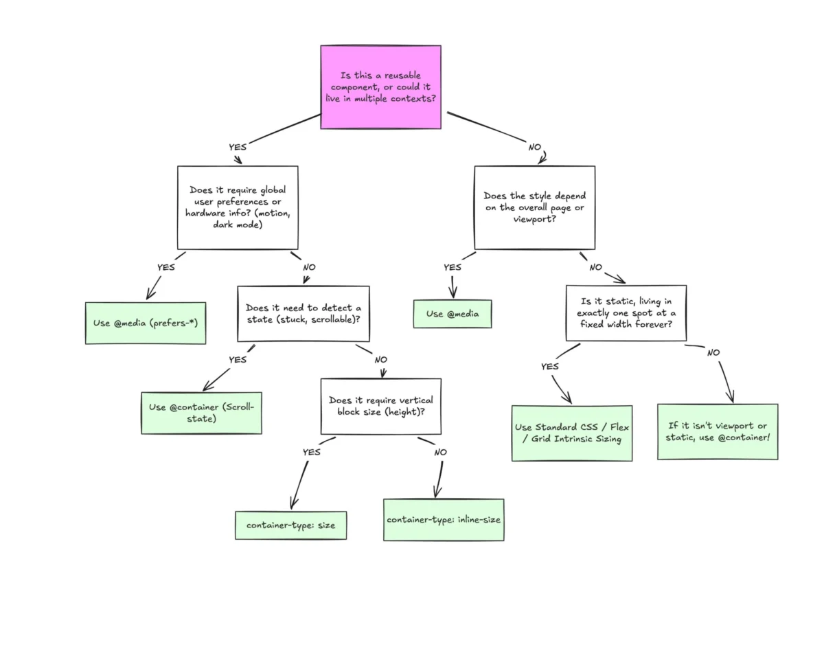
Summary: When to use which?
- Use Media Queries for: Macro-layouts, global navigation, full-page themes (e.g.,
prefers-color-scheme), and system-level overrides. - Use Container Queries for: Reusable components, widgets, cards, navigation menus within containers, and any element intended to live in multiple layout contexts.
The transition to container queries is not just a technical upgrade; it is a fundamental shift in how we conceive of the web. By decoupling our components from the viewport, we create more robust, maintainable, and truly responsive applications. The tools are ready; it is now up to the development community to adopt this paradigm and finally leave the "viewport proxy" era behind.