In the hyper-competitive world of real estate, the first point of contact between a property and a potential buyer is rarely the building itself—it is the visual branding that frames the listing. Whether it is a high-end luxury brochure, a sleek digital advertisement, or the logo on a brokerage’s storefront, your choice of typography serves as the silent ambassador of your business. It is the primary vehicle for conveying trust, professionalism, and, ultimately, the value of the property you represent.
Good real estate design is an exercise in immediate perception. Research in consumer psychology suggests that buyers make split-second decisions about the legitimacy and "premium" nature of a service based on visual cues. A font is not merely a collection of letters; it is a design element that dictates the tone of your communication. By selecting the right typeface, you bridge the gap between a simple listing and a compelling brand narrative.
The Strategic Importance of Typeface in Property Marketing
Why does font choice matter so much in an industry driven by square footage and location? Because real estate is an emotional purchase. Clients are not just buying a structure; they are buying a lifestyle.
Establishing Brand Authority
For established firms, a classic, refined serif font can suggest longevity, reliability, and expertise. Conversely, for boutique firms or tech-forward brokerages, a clean, geometric sans-serif font signals innovation, speed, and modern market mastery.
Enhancing Readability and Clarity
Real estate marketing often involves cramming a significant amount of data—pricing, square footage, amenities, and contact information—into a limited space. A typeface that loses legibility when scaled down to a brochure or a mobile screen can cost you a lead. The best real estate fonts are designed to balance aesthetic flair with extreme clarity.
Creating Cohesion
A cohesive brand identity is built on consistency. When your logo, your property flyers, your email signatures, and your website all utilize the same family of typefaces, you create a sense of trust. It tells the client that you are meticulous, detail-oriented, and professional—traits they want in the person handling their largest financial transaction.
Chronology of Trends: From Traditional Print to Digital Dominance
The history of real estate typography has evolved alongside the medium. In the mid-20th century, print newspaper listings dictated a reliance on high-contrast, bold, serif fonts that could withstand the low-quality paper of broadsheets. These fonts were designed to be "loud" to compete for attention in a cluttered page.
As the industry transitioned to glossy magazines and, subsequently, the digital age, the requirements shifted. The late 2000s saw a surge in minimalist design. As high-resolution photography became the industry standard, the text had to recede into the background to allow the imagery to breathe. Today, we are in an era of "Adaptive Branding," where fonts must be equally effective on a 65-inch digital signage screen in a lobby and a 4-inch smartphone screen in a client’s pocket.
Supporting Data: The Psychology of Font Selection
Marketing studies indicate that "font personality" significantly influences brand recall. A 2021 survey of luxury home buyers found that marketing materials using clean, sans-serif fonts were associated with "modernity and efficiency," while materials using serif fonts were perceived as "established and trustworthy."
Furthermore, data on conversion rates for digital property listings suggest that sans-serif fonts with higher "x-heights" (the height of the lowercase letters) result in a 15% higher retention rate for property details. This is because these fonts reduce the cognitive load required to process information, allowing the buyer to focus on the property features rather than struggling to decode the text.
Premium Typefaces for Modern Real Estate
To help you elevate your brand, we have curated a selection of top-tier fonts that blend aesthetic appeal with corporate utility.
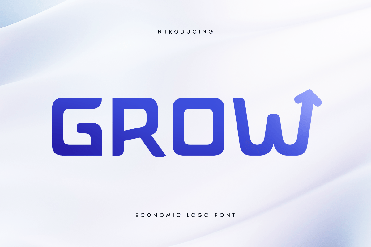
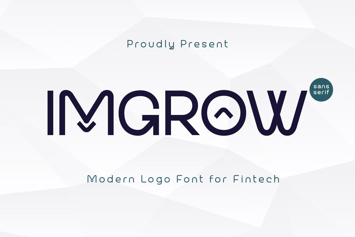
1. Grow: The Economic Logo Choice
Grow is a versatile typeface designed for the modern business world. It blends elegance with practicality, making it a standout choice for agencies seeking to build a brand identity from the ground up. It offers unique character sets and robust multilingual support, ensuring that your logo remains legible and stylish across diverse markets.
2. WALTON: Elegant Sans-Serif Sophistication
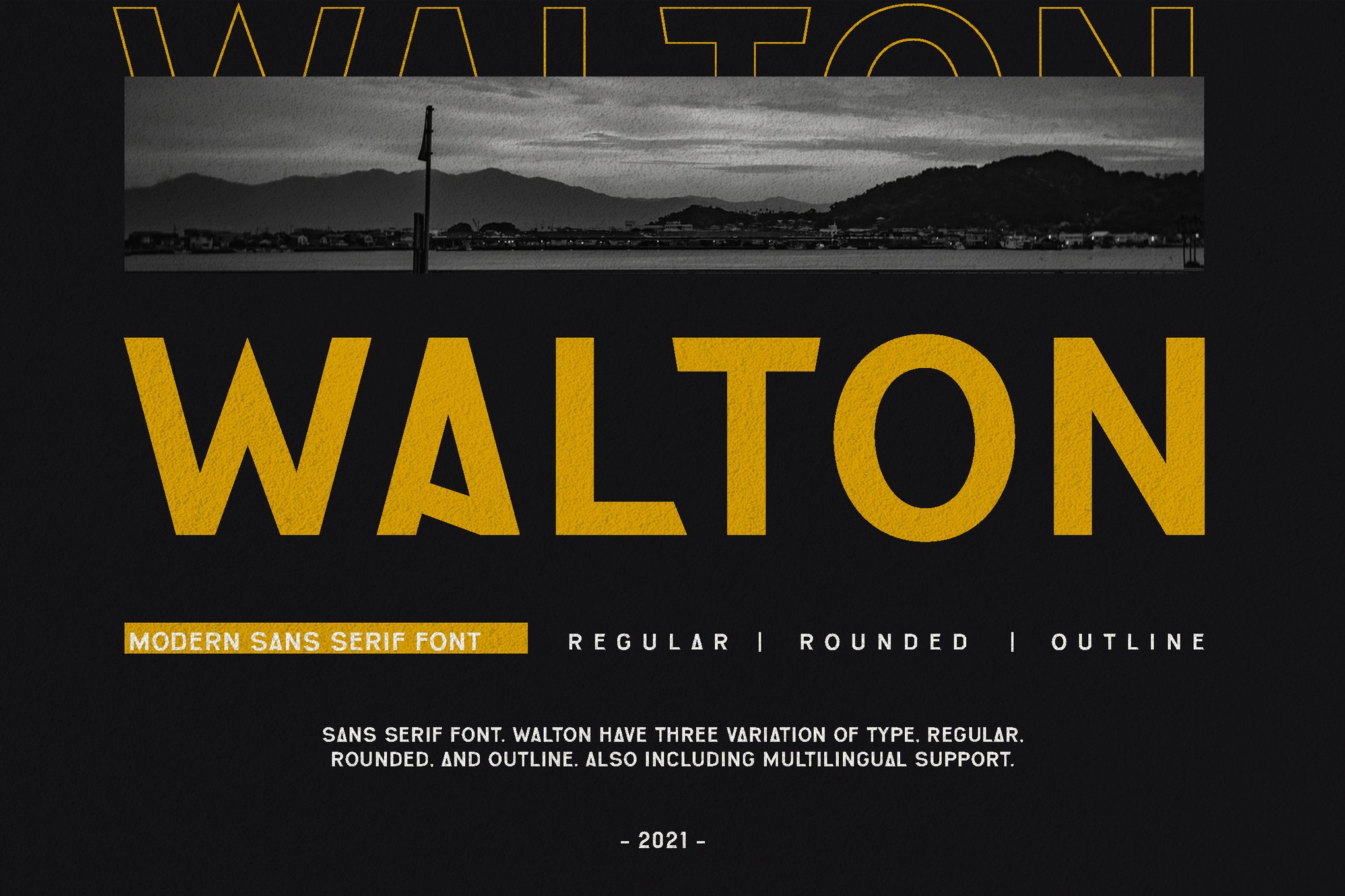
WALTON is a masterclass in modern sans-serif design. It is specifically engineered to pair with high-end architectural photography. Its clean, open structure allows for sophistication without distraction, making it the perfect choice for high-end residential listings where the property needs to take center stage.
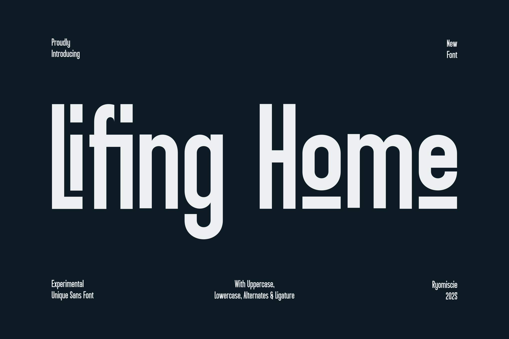
3. Welfare: The Minimalist’s Choice
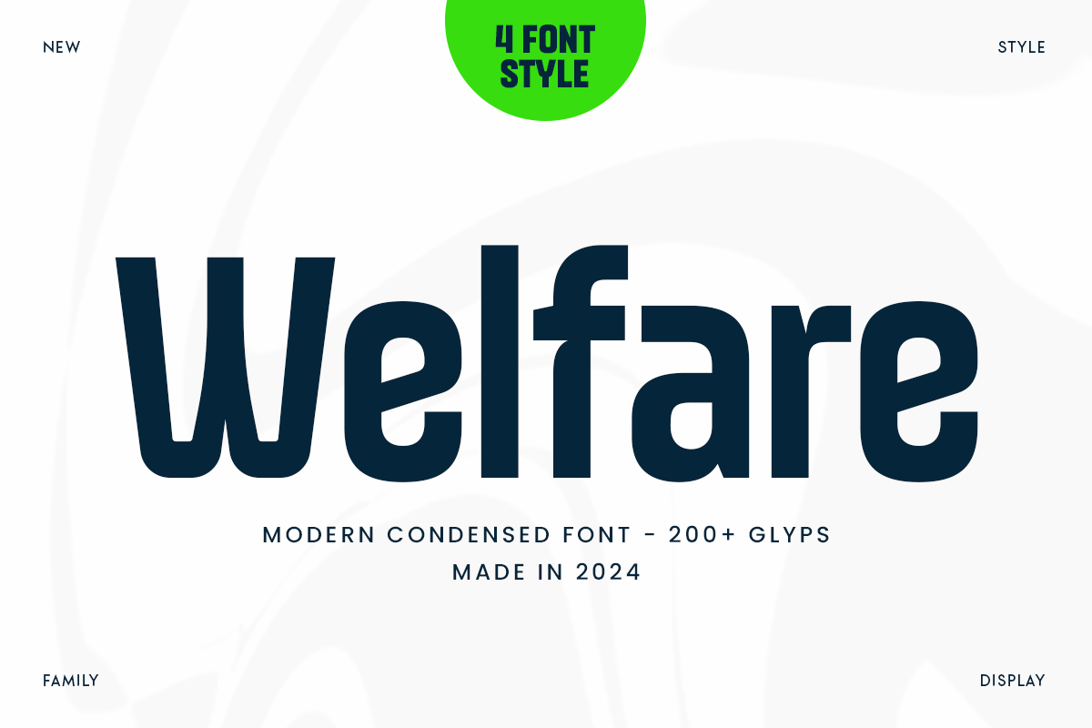
For those who favor a condensed look, Welfare is a powerhouse. It is designed for projects where space is at a premium but style cannot be sacrificed. With four distinct styles, it provides the flexibility needed for both bold, impactful headlines and detailed, readable body text in brochures.
4. Cash Flow: Professional Versatility
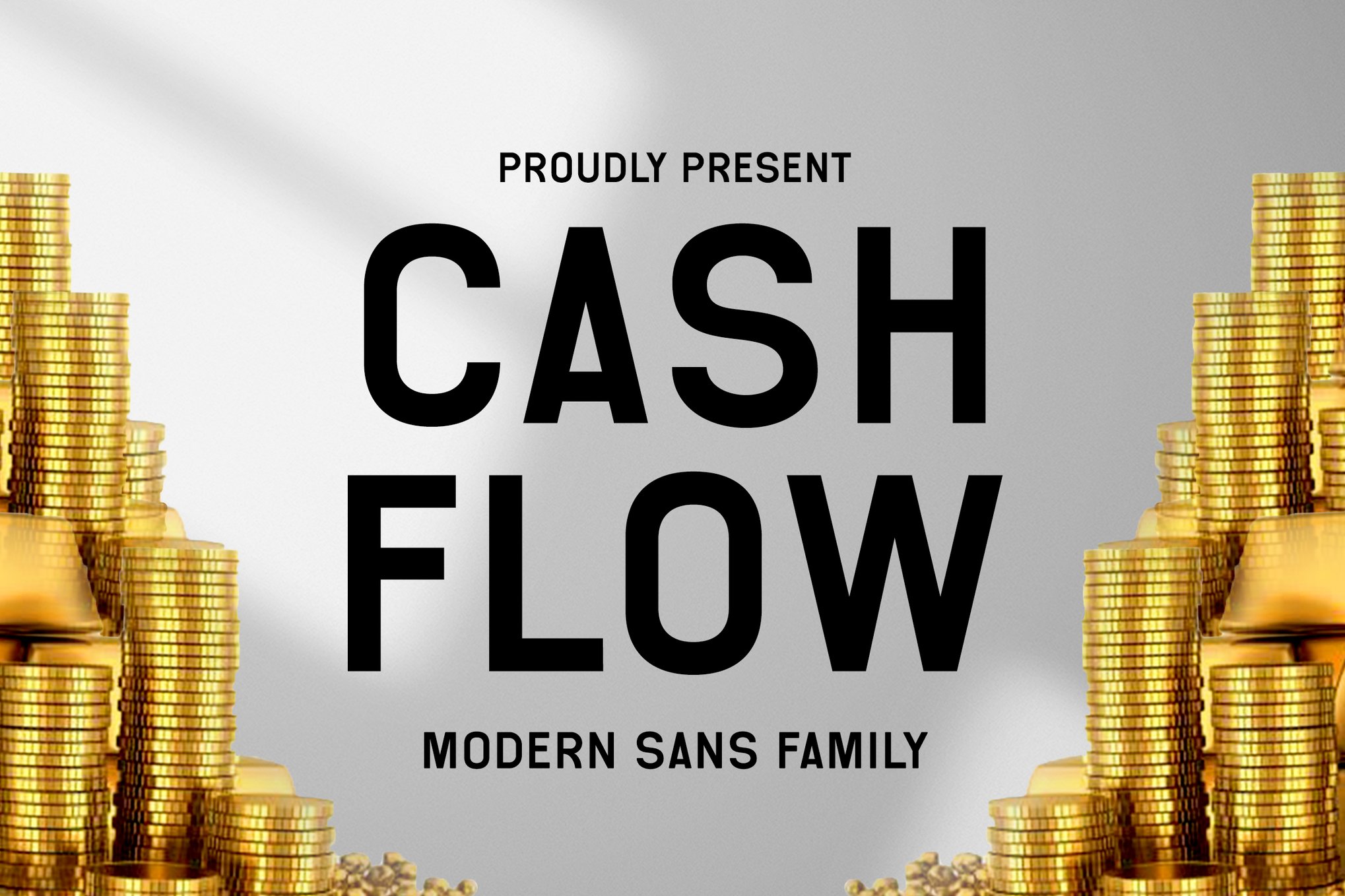
As the name suggests, Cash Flow is designed with the business of real estate in mind. It is an elegant, highly legible typeface that transitions seamlessly from print advertisements to digital newsletters. Its sophisticated aesthetic works particularly well for investment-grade property marketing.
5. Random: Modern Corporate Authority
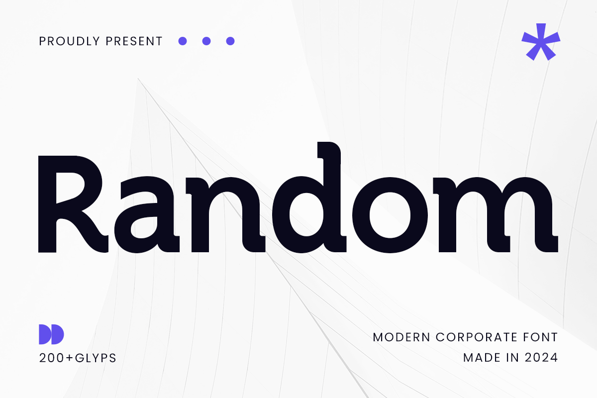
Random is the go-to font for agencies that want to project authority and efficiency. It is sleek and contemporary, making it ideal for corporate presentations, white papers on market trends, and modern website interfaces.
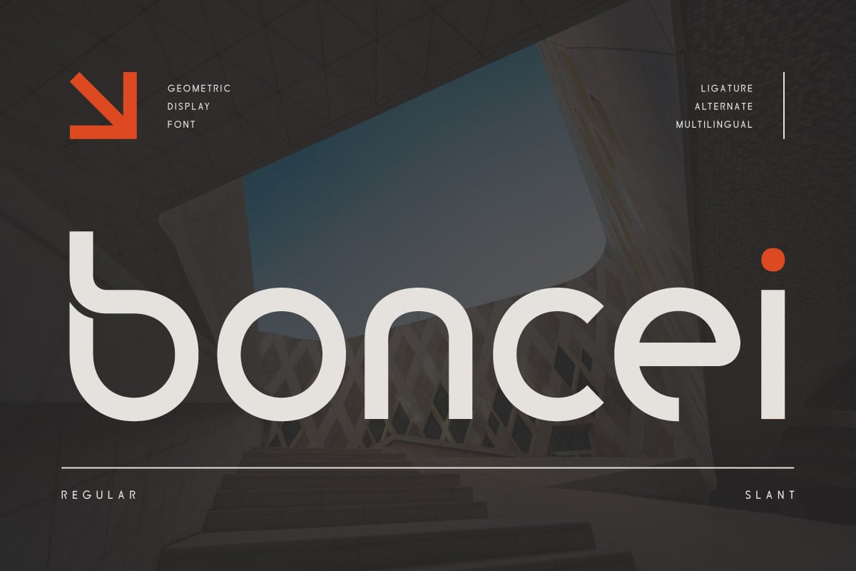
6. Boncei: Geometric Precision
Boncei relies on balanced, geometric shapes to convey reliability. It is a favorite among startups and tech-integrated brokerages. Because it supports over 85 languages, it is an excellent choice for international firms looking to maintain a consistent brand voice globally.
The Role of Free Fonts in Boutique Marketing
Not every firm has the budget for enterprise-grade font licensing. Fortunately, the open-source community provides high-quality alternatives that are more than capable of holding their own in a professional environment.
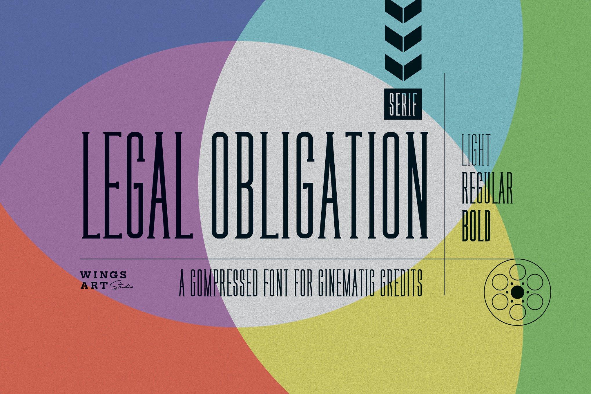
Rawizard: The Architectural Standard
Rawizard features strong, vertical lines and balanced spacing that mimic the structure of architecture itself. It is a fantastic free option for property signage where you need to project stability and strength.
Morning Person: The Welcoming Aesthetic
In the residential sector, you want to appear approachable. Morning Person offers open, friendly shapes that make listings feel less like a transaction and more like an invitation to a new home.
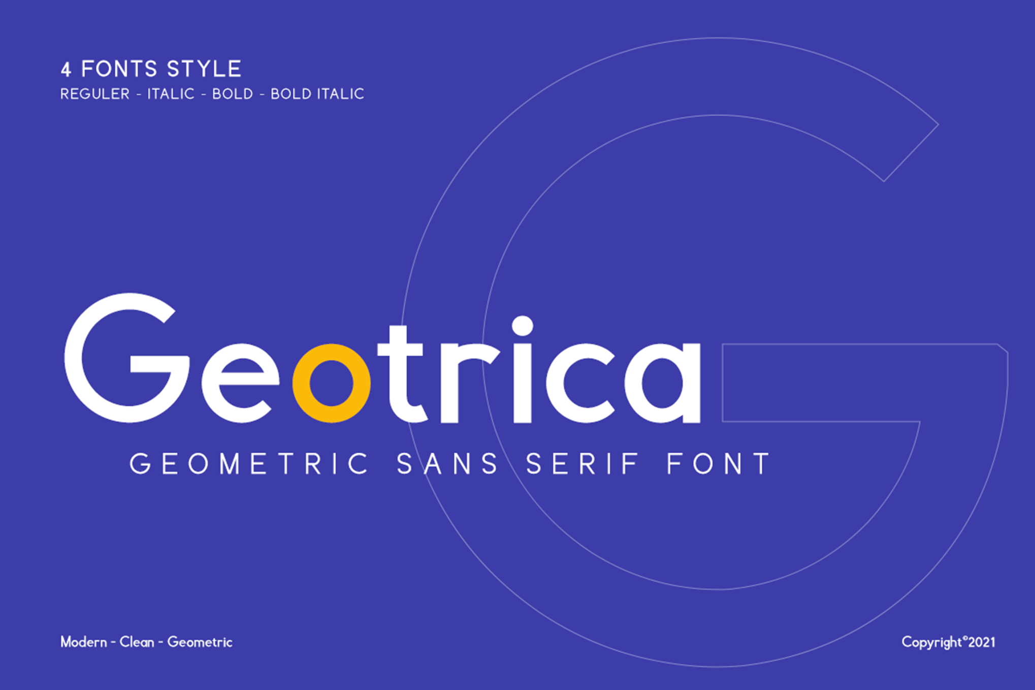
Mirano: Contemporary Elegance
Mirano provides a high-fashion look for a zero-dollar price tag. Its smooth curves and geometric precision make it an ideal choice for luxury condo branding and boutique agency logos.
PT Sans: The Industry Workhorse
PT Sans is perhaps the most reliable free font available. Its neutrality makes it perfect for long-form descriptions. When you have a complex property with a long history or list of features, PT Sans ensures that the reader stays engaged until the end of the text.
Official Perspectives: What Designers Say
"Typography is the voice of the brand," says Maria Valez, a leading design consultant for high-end real estate firms. "If you are selling a $20 million estate, you don’t use a font that looks like it belongs on a child’s birthday invitation. You use a font that suggests gravity, history, and class. The typography must match the price point of the product."
Industry experts emphasize that a font’s "weight" is just as important as its style. Using a bold weight for headers and a light weight for body text creates a visual hierarchy that guides the reader’s eye, a crucial technique for keeping potential buyers engaged with your marketing materials.
Implications for Future Branding
As the real estate industry continues to lean into augmented reality (AR) and virtual reality (VR) tours, the next frontier for font design is screen-readability in 3D environments. We are moving toward a future where typefaces must be rendered in real-time within digital walk-throughs. The fonts that will succeed are those that maintain their structure under various lighting conditions and viewing angles.
Furthermore, as personalization becomes the key to marketing, we expect to see more "variable fonts"—typefaces that allow for real-time adjustments in width and weight to match the specific layout of a customized property brochure.
Conclusion: Making the Final Choice
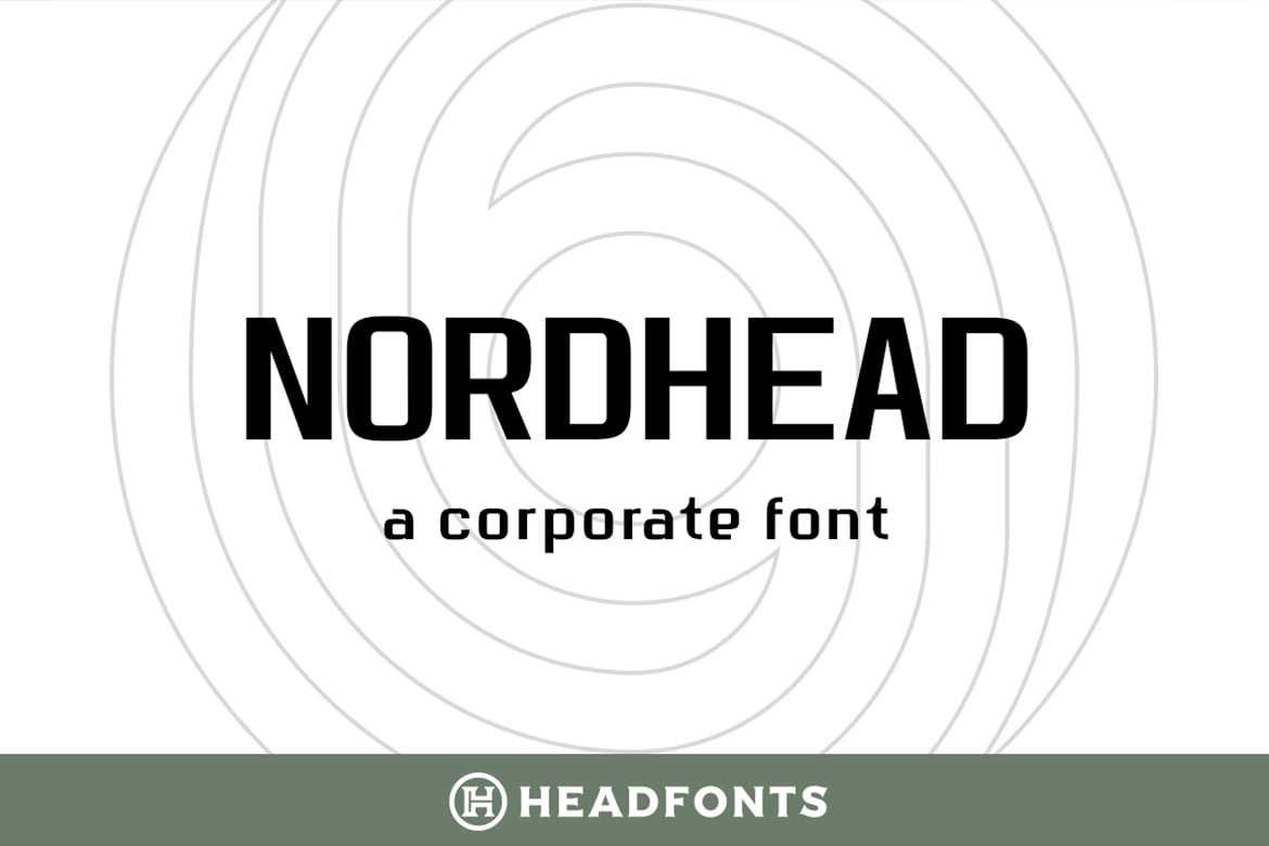
Choosing a font for your real estate brand is not just a design decision; it is a business strategy. Whether you opt for the bold, modern lines of Gunty or the classic, refined elegance of Nordhead, your choice will dictate how the market perceives your agency.
Remember:
- For Luxury/High-End: Choose refined, classic serifs or elegant, thin-stroke sans-serifs.
- For Startups/Tech: Choose geometric, bold, and clean sans-serifs.
- For General Listings: Prioritize high-legibility fonts like PT Sans or Welfare.
By investing time in selecting a typeface that aligns with your specific brand identity, you are not just making your materials "look good"—you are building a foundation of trust that will convert leads into clients and clients into advocates for your brand. In the end, the right font does more than tell your story; it makes your story unforgettable.