
In the vast, ever-evolving landscape of digital design, the quest for emotional resonance has led to a fascinating resurgence of "kawaii" aesthetics. Derived from the Japanese word for "cute" or "lovable," the kawaii movement has transcended its origins in pop culture to become a foundational element of contemporary branding, user interface design, and creative storytelling. At the heart of this visual revolution are kawaii fonts—typefaces characterized by their bubbly letterforms, rounded edges, and inherent playfulness.
The Evolution of Cute: Defining the Kawaii Aesthetic
The term "kawaii" encapsulates more than just a visual style; it represents an emotional state of comfort, warmth, and innocence. In typography, this manifests through specific structural choices. Designers behind these fonts often eschew the sharp, aggressive angles of traditional serif or modernist sans-serif typefaces in favor of soft, organic curves.
These fonts serve a specific purpose: they act as a bridge between a brand and its audience, stripping away the intimidation factor often associated with high-fashion or corporate design. By incorporating pastel-ready forms and whimsical embellishments, these typefaces communicate accessibility, joy, and a approachable, human-centric personality. Whether used in children’s product packaging, stationery, or digital social media assets, the goal remains the same: to evoke an immediate, positive reaction.
Chronology: From Subculture to Design Staple
While the concept of "cute" has existed in Japanese culture for centuries, the formalized "kawaii" aesthetic began its meteoric rise in the 1970s. During this era, Japanese youth began experimenting with rounded, decorative handwriting, rejecting the rigid penmanship taught in schools. This rebellion against formality laid the groundwork for what would eventually become the digital typefaces we see today.
- 1970s–1980s: The "Marui-ji" (round writing) phenomenon gains popularity in Japanese high schools, setting the stage for bubbly, non-traditional typography.
- 1990s: As the internet begins to emerge, the globalization of Japanese pop culture—led by icons like Hello Kitty and early anime imports—brings the visual language of kawaii to the West.
- 2000s: The rise of digital design tools allows font creators to digitize these handwritten styles, making them accessible to graphic designers globally.
- 2010s–Present: Kawaii fonts move beyond "cute" niches, finding homes in mainstream branding, gaming, and app interfaces that prioritize a friendly user experience.
Supporting Data: Why "Cute" Sells
The efficacy of kawaii typography is not merely anecdotal; it is rooted in color psychology and cognitive design. Research indicates that rounded shapes are processed by the human brain more favorably than angular shapes. Angularity is often associated with danger or threat, while rounded forms suggest safety, comfort, and playfulness.
When businesses incorporate these fonts into their branding, they are tapping into the "baby schema" (Kindchenschema)—a set of physical features that trigger a caretaking response in humans. By utilizing "bubble-like" letterforms, designers can subconsciously encourage consumers to engage with the product as something safe, friendly, and non-threatening. This is particularly effective in competitive markets like children’s media, food and beverage, and hobbyist stationery, where the primary objective is to cultivate a loyal, emotionally connected community.
Spotlight on Premium Kawaii Typefaces
To master this aesthetic, designers rely on high-quality, versatile assets. Below is an analysis of some of the most prominent fonts currently defining the genre:
Kaboom: The Energetic Choice
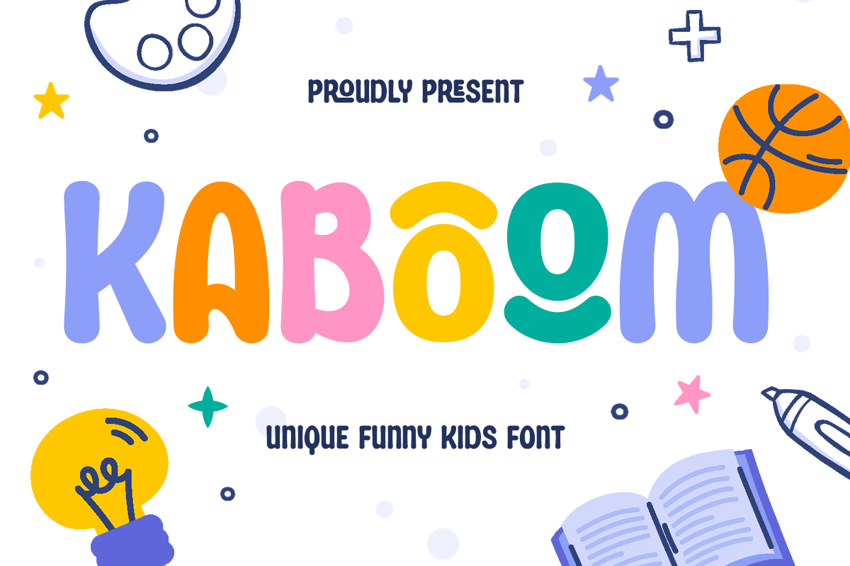
KABOOM is a standout for projects requiring high-impact playfulness. Its bold, rounded letterforms are engineered to be readable at any size, making it a favorite for cartoon titles and game interfaces.
Mocha Mochi: Modern Sophistication
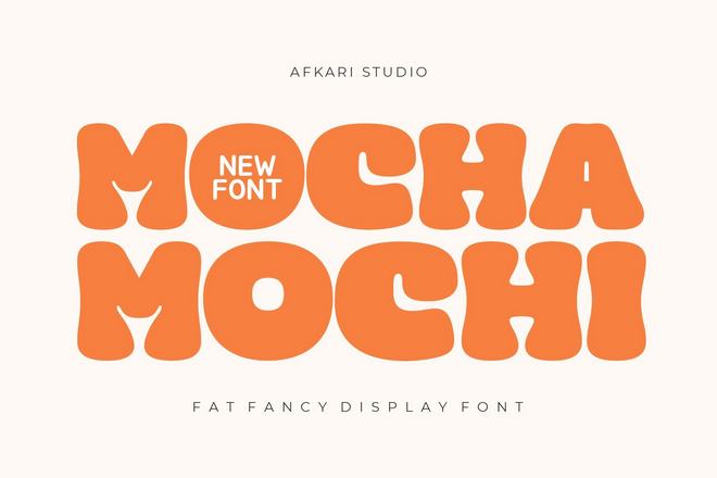
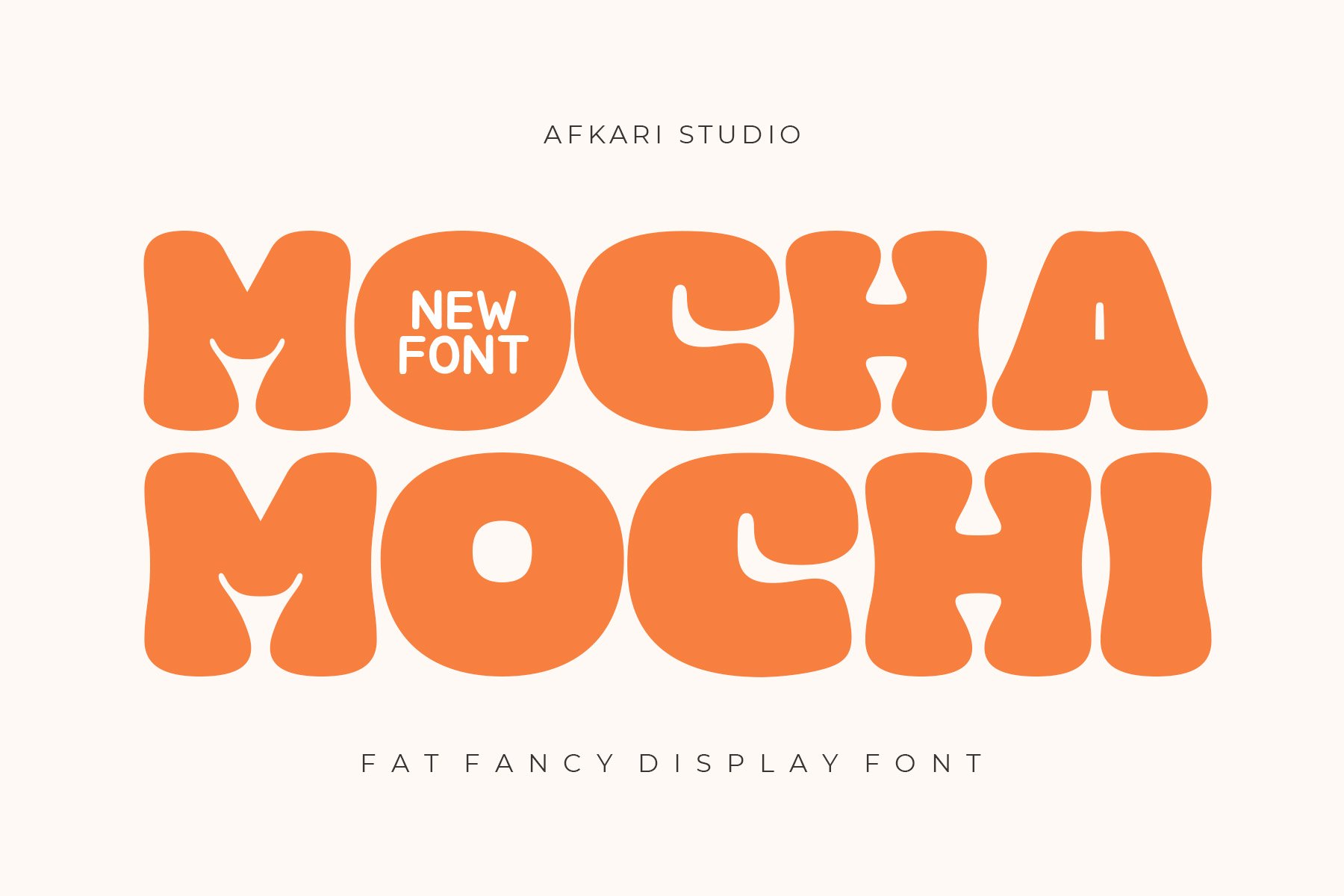
Inspired by the tactile softness of Mochi sweets and the warmth of a coffee house, this font balances "fat" display characteristics with a sleek, modern finish. It is the go-to choice for brands looking for a premium "cute" look.
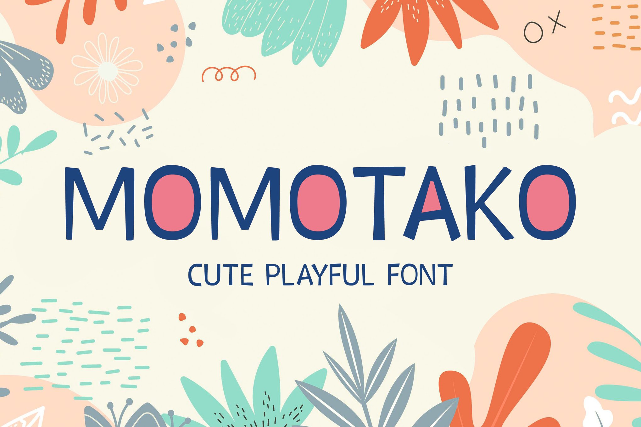
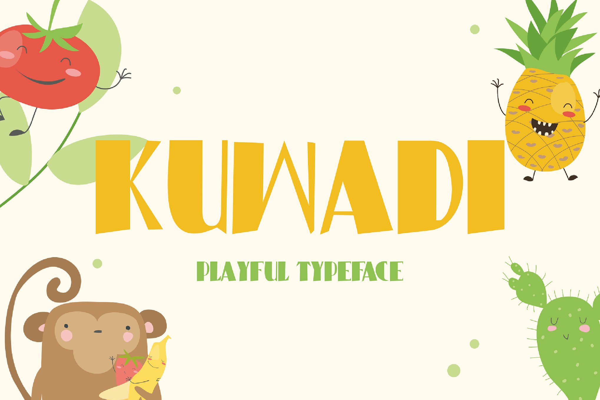
Momotako & Kuwadi: The Essence of Childhood
Both Momotako and Kuwadi excel at capturing the wonder of early education. With their bubble-like curves, these fonts are perfect for party invitations and books, where readability for younger readers is paramount.
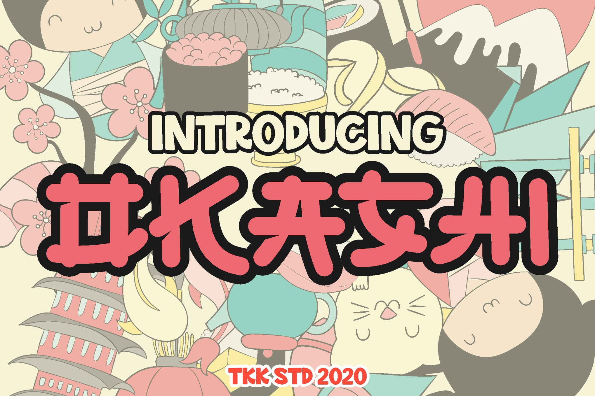
OKASHI & GAYANA: Faux-Japanese Flair
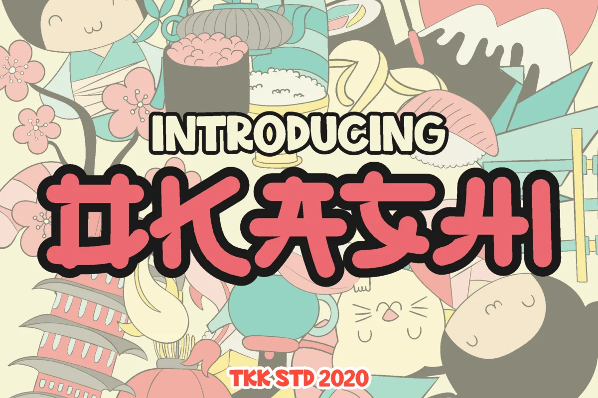
For designers seeking the distinct look of Tokyo snack packaging or manga titles, these fonts offer a "faux-Japanese" aesthetic. They provide a structural nod to Eastern calligraphy while maintaining the readability and bounce required for global markets.
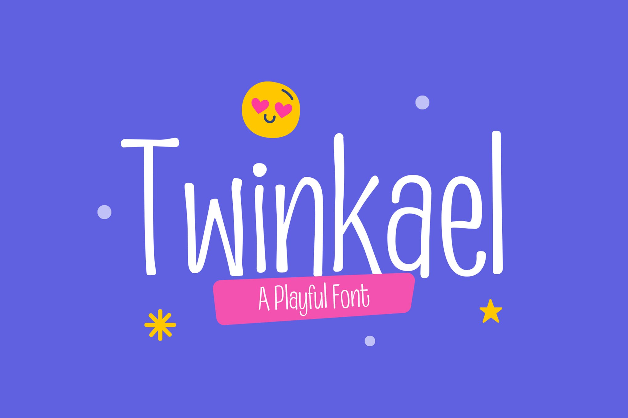
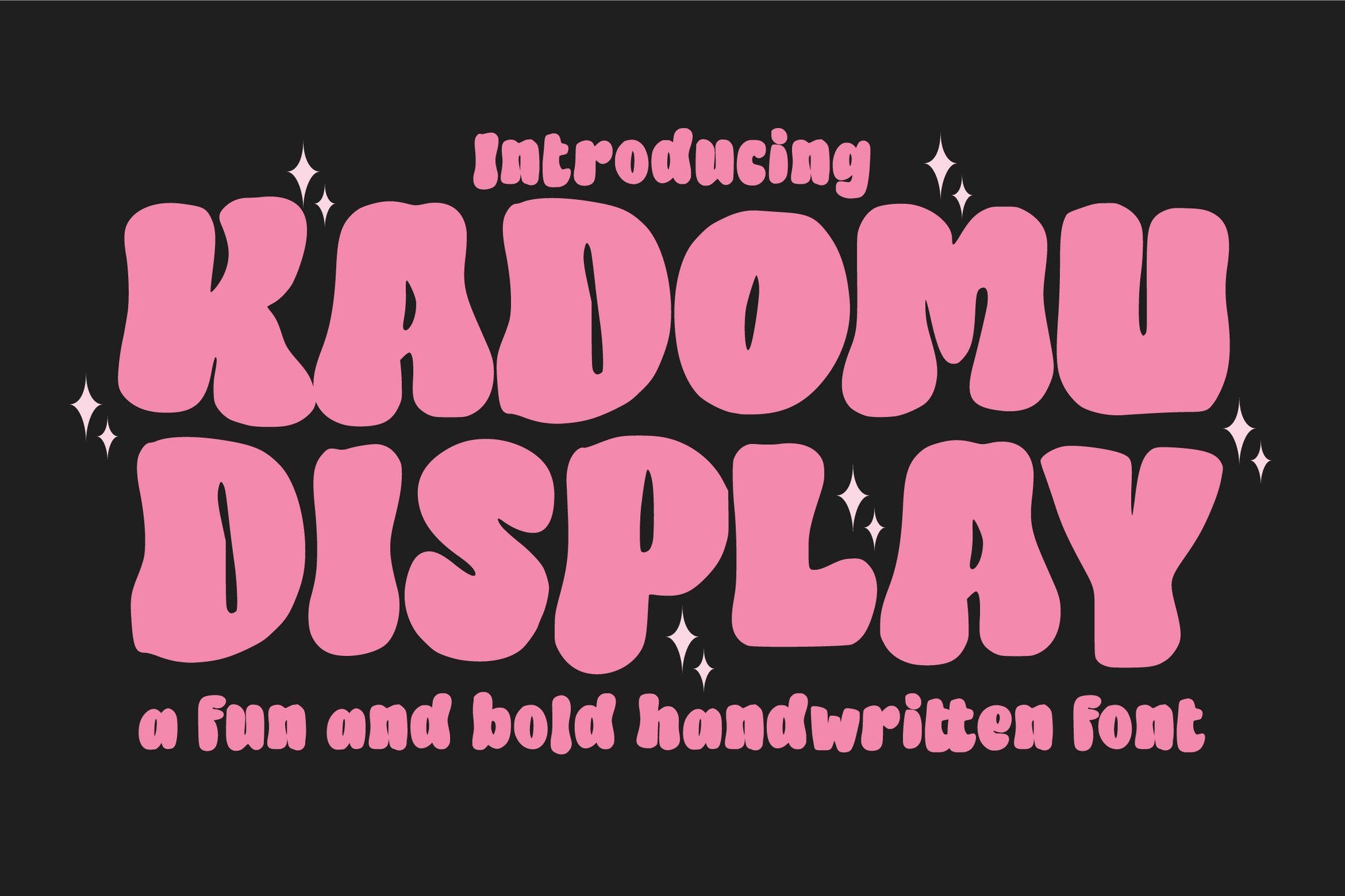
Twinkael & Kadomu: Dynamic and Bouncy
These typefaces utilize a "bouncy" baseline, where letters sit slightly above or below the horizontal axis. This movement creates a dynamic, hand-drawn feel that prevents the design from feeling overly static or rigid.
Calli Cat & WARNAI: The Creative’s Palette
For those wanting to push boundaries, Calli Cat (with its layered functionality) and WARNAI (with its multiple styles, including brush and line) offer modularity. These are essential for designers who want to create a custom, multi-textured visual identity.
Official Industry Responses: A Shift in Brand Strategy
Major corporations have taken note of this trend. In recent years, we have seen a significant shift in how brands communicate, with a move away from the "minimalist-sterile" look of the mid-2010s toward a more "human-centered, whimsical" aesthetic.
Industry experts argue that this is a direct response to the "digital fatigue" experienced by modern consumers. As the digital world becomes increasingly crowded, brands are turning to typography to inject personality into their platforms. By adopting kawaii-inspired fonts, companies—even those outside the toy or candy sectors—are finding ways to appear more empathetic, approachable, and "human."
Implications for Future Design Trends
The long-term implication of the kawaii typography movement is a more flexible approach to corporate identity. We are moving toward an era where the rigid rules of professional design are being softened by the inclusion of decorative, playful elements.
The Rise of "Hybrid" Branding
Designers are increasingly pairing kawaii display fonts with sophisticated, clean serif bodies. This hybrid approach—using a cute font for a header and a serious one for the body text—allows brands to maintain their professionalism while simultaneously showing a "softer" side.
Accessibility and Multi-Platform Utility
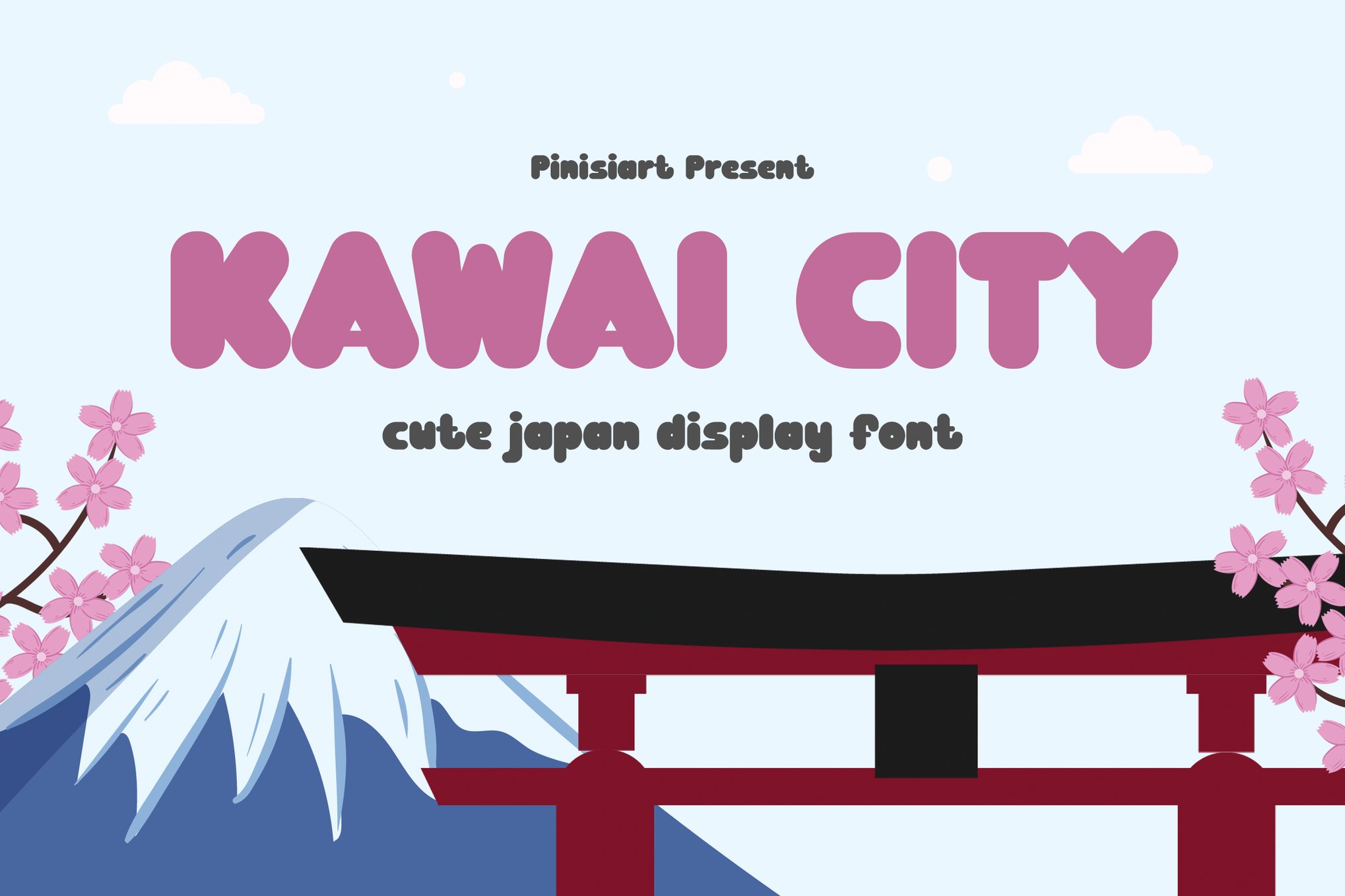
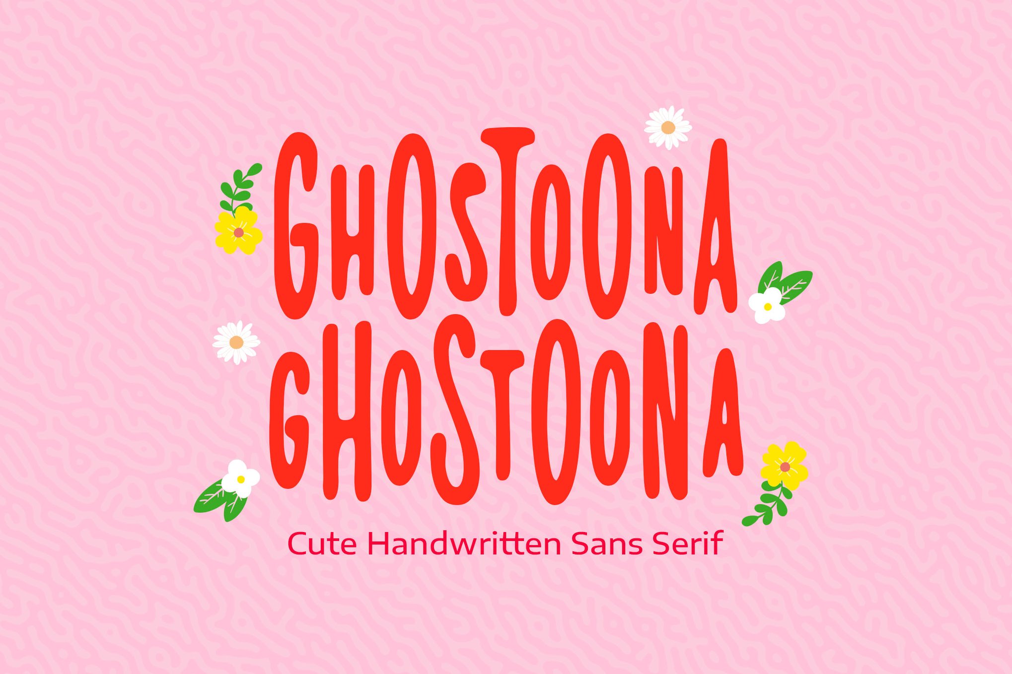
As seen with fonts like Kawaii City and Ghostoona, the technical support for these fonts has improved significantly. Developers are now providing comprehensive packages that include OTF, TTF, and WOFF formats, ensuring that these fonts perform flawlessly across websites, mobile apps, and high-resolution print media.
The Sustainability of "Cute"
Some critics argue that the kawaii trend is a passing fad. However, the data suggests otherwise. As long as technology continues to feel cold or impersonal, there will be a sustained human desire for the warmth and comfort associated with these designs. The "cute" aesthetic is not just a style; it is an antidote to the harshness of modern digital life.
Free Resources and Community Growth
The accessibility of this aesthetic is bolstered by a thriving community of independent designers who offer high-quality, free-for-personal-use fonts. Resources such as:
- Free Kawaii Font Family: Perfect for social media creators and personal bloggers.
- Mochibop: A brilliant example of a "duo" font, allowing for easy pairing.
- BabyKawaii: Specifically designed for the delicate nature of infant and child-focused content.
- Kareo Star: Adds a touch of magic with its subtle, starry decorative accents.
These resources ensure that the barrier to entry remains low, allowing amateur designers and small business owners to compete with larger entities in creating professional, heartwarming content.
Conclusion: Designing for Joy
The journey through the world of kawaii typography reveals a simple truth: design has the power to shift our emotional state. Whether it is a bold, bubbly header or a delicate, handwritten-style body font, the choice of typeface is the most powerful tool a designer has to communicate "kindness" and "joy."
As we look to the future, the integration of these fonts into our daily digital interactions will likely continue to grow. By prioritizing readability, playfulness, and emotional resonance, the kawaii movement is redefining the standards of modern design, proving that sometimes, the most effective way to grab someone’s attention is not to shout, but to invite them in with a bit of sweetness.
For designers looking to begin their journey, the key is to start with a clear understanding of the project’s goal. Whether you choose the energetic punch of Kaboom or the delicate elegance of Michi Kohaku, remember that the typeface is the voice of your brand. Choose a voice that makes people smile, and you will have mastered the true spirit of the kawaii aesthetic.