







In the realm of user-interface (UI) and user-experience (UX) design, Steve Krug’s seminal book Don’t Make Me Think remains the ultimate guiding light. Krug posits that every time a website forces a user to pause, decode interface elements, or ask questions like “Where do I click?” or “What does this mean?”, the shopper experiences a micro-hesitation.
Individually, these moments seem harmless. Cumulatively, however, they chip away at a shopper’s intrinsic motivation to buy. Krug often describes this phenomenon as a "reservoir of goodwill"—a finite pool of mental energy and patience that drains with every single uncertainty a customer encounters on a digital storefront. When that reservoir finally runs dry, the consumer simply abandons the cart and leaves the site entirely.
While much attention is paid to major conversion hurdles—such as unexpected shipping costs or complicated checkout forms—lesser-known friction points frequently lurk in product details, pricing structures, and quantity selections. Textual or visual ambiguities regarding how much product a user is actually buying can instantly stall a transaction.
To combat this, leading direct-to-consumer (DTC) and e-commerce brands are implementing intuitive visual cues and clever copywriting to eliminate the need for mental math. By making quantities, portions, and outcomes instantly transparent, these companies are preserving customer goodwill and driving higher conversion rates.
Main Facts: The Psychology of E-Commerce Friction
The core thesis of modern conversion rate optimization (CRO) is straightforward: cognitive load kills sales. When a consumer visits an online store, they are looking for a frictionless path from intent to purchase. Anything that requires active calculation—such as converting ounces to servings, deciphering whether a listed price is for a single unit or a bulk case, or estimating how long a consumable product will actually last—introduces friction.

Modern e-commerce pioneers are addressing this by rethinking how product options are presented. Instead of relying on traditional, sterile drop-down menus filled with abstract numbers (e.g., "12-pack" vs. "24-pack"), innovative brands are contextualizing these choices. They leverage human psychology, mapping quantities to real-world scenarios, visual portion sizes, and outcome-based naming conventions.
By removing the burden of counting and decoding, these businesses ensure that the user’s brain remains focused on desire and value rather than logistics and arithmetic.
Chronology: The Evolution of Digital Friction and UX Design
To understand why modern brands are putting so much emphasis on effortless quantity selection, it helps to look at how e-commerce interfaces have evolved over the past three decades.
1. The Wild West of Early Web Design (Late 1990s – Early 2000s)
In the infancy of e-commerce, websites were digital catalogs. Simply getting a product online with a static image, a basic price tag, and an "Add to Cart" button was considered a success. Little thought was given to cognitive load. Users were expected to figure out sizing charts, shipping terms, and pack quantities on their own, as digital shopping was still a novelty and consumer patience was remarkably high.
2. The Rise of Usability Science (Mid 2000s – 2010s)
As online shopping grew more competitive, usability experts like Steve Krug, Jakob Nielsen, and Baymard Institute began publishing foundational research on user behavior. E-commerce platforms learned that users don’t read web pages; they scan them. Standardized UX patterns emerged—such as predictable navigation bars, clear call-to-action (CTA) buttons, and simplified checkout flows. However, product page friction—especially regarding complex or consumable goods—remained largely unaddressed.
3. The DTC Boom and the War for Attention (2010s – Present)
The proliferation of direct-to-consumer subscription boxes, artisanal beverage brands, and specialized household goods forced a design renaissance. Brands selling recurring consumables (like dog food, cleaning tablets, and canned drinks) faced a unique challenge: customers hated doing the mental math required to figure out subscription sizes or bulk purchases. This era gave rise to hyper-focused UX micro-copy, contextualized pack sizing, and visual portion mapping designed to eliminate buyer hesitation entirely.
Supporting Data: Why Small Details Dictate Conversion Success
While design trends come and go, empirical data from UX research firms consistently underscores the high cost of cognitive friction.
- Cart Abandonment Rates: According to ongoing benchmark data compiled by the Baymard Institute, the average e-commerce cart abandonment rate hovers near 70%. While high shipping costs and forced account creation are leading culprits, complex checkout and product page confusion consistently rank among the top self-inflicted wounds for online retailers.
- The Power of Readability: Studies in cognitive psychology indicate that when information is easy to process (a concept known in UX as "processing fluency"), users perceive the brand as more trustworthy and the product as higher quality.
- Visual vs. Textual Processing: The human brain processes visual information roughly 60,000 times faster than text. Brands that incorporate visual aids—such as lifestyle scenarios, clear bowl sizes, or distinct container icons—bypass the slower linguistic processing centers of the brain, leading to faster, more confident purchasing decisions.
Real-World Implementations: How Leading Brands Eliminate Doubt
Several innovative brands are currently setting the standard for frictionless product page design. By tackling the "No Counting" rule through various creative mechanisms, they provide clear blueprints for modern e-commerce UI design.
1. Gush: Doing the Math via Occasions
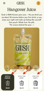
Beverage brand Gush recognized that forcing shoppers to calculate how many juice pouches they need for a gathering creates unnecessary friction. Instead of merely listing "12-pack," "24-pack," and "48-pack," Gush labels its pack sizes by social scenarios: "With a Friend," "With the Crew," and "For the Party."
By embedding the occasion directly into the selector, the brand does the math for the consumer. Shoppers no longer have to guess how many pouches constitute a party supply; they simply select the social scenario that matches their plans, transforming a logistical calculation into an emotional decision.
2. Waju: Clarifying Unit Definitions
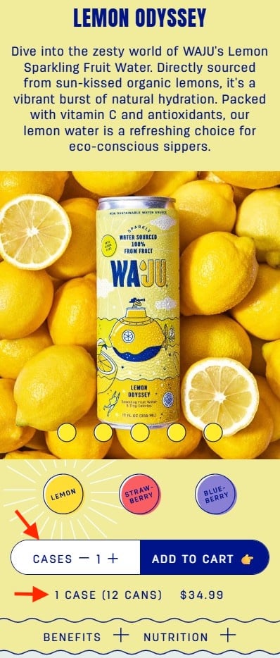
Bulk purchasing often introduces ambiguity. Does a quantity of "1" refer to a single can or an entire case? Beverage brand Waju eliminates this ambiguity entirely on its mobile product page.
The quantity selector explicitly uses the word "Cases," and directly beneath it, a clear explanatory line reads: "1 case (12 cans), $34.99." Furthermore, the quantity field is set against a high-contrast white background that stands out against the page design, ensuring that mobile shoppers scanning the screen on-the-go cannot possibly misinterpret what they are buying.
3. Blueland: Intuitive, Outcome-Based Product Naming
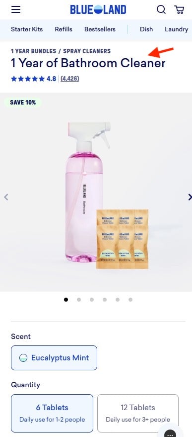
Cleaning product innovator Blueland tackles cognitive load not just at the point of the quantity selector, but directly within the product’s title. Rather than selling cleaning tablets by abstract chemical counts or weight metrics, Blueland names its packages based on the outcome and household size.
A prime example is the product title "1 Year of Bathroom Cleaner." Instead of forcing the customer to calculate how many tablets a household of two uses in twelve months, the product title frames the purchase around the desired real-world result. Additional selector options clearly delineate household demographics, such as "6 tablets for daily use by 1–2 people" versus "12 tablets for 3 or more."
4. The Farmer’s Dog: Illustrating Portions Visually
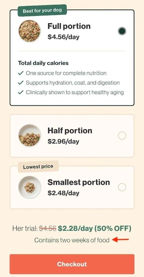
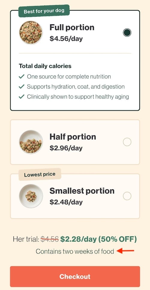
For pet owners, calculating the correct daily amount of fresh dog food can feel like a high-stakes math test. Subscription dog food brand The Farmer’s Dog resolves this dilemma masterfully by utilizing visual portion mapping.
On its portion selector, the brand displays three distinct dog bowls filled to different levels, representing full, half, and smaller portions. Crucially, the pricing is displayed per day rather than per box, aligning precisely with how pet owners think about their dog’s daily feeding routine. A reassuring subheadline underneath the options clarifies: "Contains two weeks of food." At no point does the customer have to convert grams, box counts, or complex totals into usable real-world metrics.
Official Responses and Industry Perspectives
UX designers, conversion rate optimization specialists, and brand founders increasingly view interface clarity as a moral and commercial imperative.
"When a customer has to stop and think about what a product option actually means, you are asking them to do work they didn’t sign up for," notes digital design consultant Elena Vance. "The modern consumer is hyper-distracted. If your product page demands mental exertion, they won’t try to figure it out—they will simply click over to a competitor who makes the purchase effortless."
E-commerce strategists emphasize that as customer acquisition costs (CAC) continue to rise across digital ad channels, brands can no longer afford to squander traffic on poorly optimized product pages.
"Every dollar spent driving traffic to your site is wasted if your UI creates hesitation at the finish line," explains CRO analyst Marcus Thorne. "Brands like Blueland and The Farmer’s Dog prove that empathy in design—anticipating where the customer will feel uncertain and resolving it proactively—is the most powerful lever for improving conversion rates today."
Implications for the Future of E-Commerce
As mobile commerce continues to dominate digital retail, the principles of frictionless design will become even more critical. With smaller screens, shorter attention spans, and less tolerance for confusing layouts, e-commerce stores must adopt a zero-friction mindset.
1. Shift from Features to Outcomes
Future-focused brands will increasingly abandon feature-heavy, jargon-laden product descriptions. In their place, outcome-based naming conventions—such as Blueland’s time-based phrasing or Gush’s occasion-based sizing—will become the gold standard for consumable goods.
2. The Rise of Contextual Micro-Copy
The era of ambiguous drop-down menus is drawing to a close. Retailers will rely more heavily on contextual micro-copy—explanatory helper text directly beneath quantity selectors and pricing tiers—to ensure absolute clarity regarding units, weights, and case contents.
3. Visual-First Decision Making
As demonstrated by The Farmer’s Dog, translating abstract numbers into visual representations (such as bowls, containers, or lifestyle use-cases) will become a primary strategy for lowering cognitive load. By speaking the brain’s native visual language, brands can bypass hesitation and accelerate trust.
Ultimately, the lesson for online retailers is clear: respect the customer’s reservoir of goodwill. By ruthlessly eliminating every hidden question, confusing quantity, and ambiguous label from the user interface, e-commerce brands can transform hesitant browsers into confident, loyal buyers.