








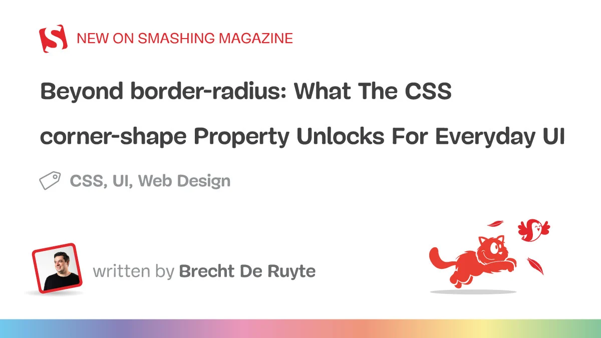
For over fifteen years, the web has existed in a world defined by the "circular arc." When the border-radius property first emerged, it was a liberating moment for developers who had previously spent hours crafting complex, multi-layered background images to achieve simple rounded corners. However, that relief eventually turned into a creative bottleneck. Today, if a designer wants beveled edges, scooped ticket-style cutouts, or the sophisticated "squircle" seen in modern app icons, they are forced into a labyrinth of clip-path hacks, fragile SVG masks, and brittle code that often breaks the moment a padding value is adjusted.
This era of compromise is coming to an end. The introduction of the corner-shape property—a powerful companion to border-radius—is poised to fundamentally change how we craft UI components. By allowing developers to modify the geometry of corners directly, CSS is finally catching up to the expressive freedom long enjoyed by print designers and native mobile app developers.
The Evolution of the Corner: A Chronology
To understand the significance of corner-shape, one must look back at the history of web layout constraints.
- The "Image-Slice" Era (Pre-2010): Developers used "sliding doors" techniques and five separate background images to simulate rounded corners. It was high-maintenance and lacked flexibility.
- The
border-radiusBreakthrough (2010–2025): The arrival ofborder-radiusin CSS3 felt like magic. It standardized the corner-rounding process, but it shackled the web to a singular, circular geometric path. - The Hack Era: To escape the circle, developers turned to
clip-pathand SVG masks. While powerful, these methods introduced major trade-offs: content inside these elements often had its shadows clipped, borders didn’t follow the custom paths, and responsiveness became a nightmare of fixed coordinates. - The
corner-shapeEra (2026–Present): With the introduction ofcorner-shapein Chromium-based browsers (Chrome 139+), the browser now treats corners as a first-class geometric property rather than a hack-induced illusion.
Technical Foundations: How It Works
The corner-shape property does not replace border-radius; it acts as its modifier. In isolation, corner-shape performs no action. However, when paired with border-radius, it dictates the mathematical trajectory of the corner itself.

The Value Set
The property supports several key values that redefine the UI landscape:
bevel: Creates a flat, angled cut, perfect for "ribbon" badges or mechanical-style buttons.scoop: A concave cut that provides a negative, inward-curving aesthetic, ideal for high-end editorial designs.squircle: The industry-standard superellipse, offering a smooth, continuous curvature that feels more "premium" and organic than a standard circle.notch: A sharp, aggressive inward cut, great for status indicators and industrial UI.superellipse(): A functional parameter allowing for precise, fine-grained control over the curve’s curvature, enabling designers to interpolate between a standard round and a complex squircle.
Just like its predecessor, corner-shape supports per-corner declarations. Developers can mix and match styles—for example, corner-shape: round bevel bevel round—to create directional shapes without needing a single pixel of SVG or a complex polygon path.

Implications for Design Systems
The most profound implication of this property is the restoration of the box model’s integrity. Unlike clip-path, which effectively "chops" the element, corner-shape remains part of the border-box. This means that box shadows, backgrounds, and borders automatically follow the shape of the corner.
Visual Hierarchy and Emphasis
In modern UI design, shape is a powerful tool for visual hierarchy. In a pricing page, for instance, a "Most Popular" card can be visually distinguished not just by a different background color, but by a unique scoop corner shape, while the surrounding cards remain consistent with squircle corners. This allows designers to communicate importance through geometry, making the interface feel more intentional and less like a standard grid of rectangles.

The "iOS Effect"
The widespread adoption of squircle corners—popularized by Apple’s design language—has shifted user expectations. Standard circular arcs now look slightly "off" to the trained eye. By enabling developers to implement true superellipses natively in CSS, corner-shape allows web applications to bridge the gap between "web-like" and "app-like" experiences, elevating the perceived quality of a brand’s digital presence.
Progressive Enhancement: The "Two-Tier" Strategy
As of early 2026, browser support for corner-shape is limited to Chromium-based engines. A common pitfall for developers is to either ignore the feature entirely or to build "all-or-nothing" interfaces that fail in browsers without support.

The professional, journalistic approach—and the one advocated by industry experts—is progressive enhancement. Developers should structure their CSS using layers:
@layer base, presentation, demo;

@layer presentation
  /* Baseline: A high-quality, fully functional UI */
  .card  border-radius: 12px;


@layer demo
  @supports (corner-shape: squircle)
    /* Enhancement: A "better" version for modern browsers */
    .card  corner-shape: squircle;
This strategy ensures that the website is accessible and visually appealing in all browsers while offering an "upgraded" experience for users on modern platforms. It avoids the need for intrusive "browser support" banners and ensures the layout never breaks.

Expert Consensus and Future Outlook
While the property is currently a W3C Working Draft, its arrival has been met with significant enthusiasm from the frontend community. The ability to create complex, responsive shapes without the fragility of legacy hacks is a massive win for maintainability.
"We have moved from manual image slicing to property-based styling," says one leading web architect. "Every step in this evolution has removed a category of workarounds. corner-shape is the next logical step in giving developers the tools to translate high-fidelity design into robust, performant code."

The future of corner-shape likely includes wider cross-browser adoption, including Firefox and Safari. As the spec matures, we can expect to see more specialized shapes and potentially more control over the transition between curve types.
Conclusion: A New Standard for Digital Craft
The transition from border-radius to corner-shape is more than a syntax update; it is a shift in how we think about web components. It empowers developers to use geometry as a functional element of design rather than a static constraint.

By adopting a progressive enhancement workflow, developers can start using these tools today to provide a "better" experience for modern browsers while ensuring the "good" experience remains accessible to all. As the web continues to evolve, corner-shape stands as a testament to the ongoing maturation of CSS, proving that even after decades, the language remains capable of delivering transformative, creative, and highly efficient solutions for the modern internet.
The era of the "simple circle" has passed. The era of the "intentional curve" has officially begun.