







SAN FRANCISCO — In the ever-evolving landscape of frontend web development, certain foundational technologies are often pushed aside in favor of the latest framework or third-party library. Among these is the CSS border-image property—a tool long treated as a static utility for swapping out standard, uninspired solid or dashed lines for custom graphics. However, a recent wave of technical experimentation is proving that this mature feature, when paired with modern CSS capabilities, can breathe vibrant new life into user interfaces.
Industry experts are revisiting border-image not just as a static styling option, but as a dynamic engine for creating fluid, high-performance animations. By combining longhand border-image properties with CSS Houdini custom properties, developers can now achieve complex border animations that were previously thought to require heavy JavaScript or convoluted pseudo-element workarounds.
Main Facts: The Intersection of Performance and Creativity
The core innovation behind animating border-image lies in overcoming one of CSS’s historic limitations: the inability to directly transition or interpolate gradient stops. Traditionally, attempting to animate a gradient results in an abrupt visual snap rather than a smooth transition, because browsers cannot natively calculate the intermediate states of percentage-based gradient stops.
By registering custom properties using the @property rule—a standard brought by CSS Houdini—developers can explicitly define the syntax, initial values, and inheritance behavior of variables. This transforms percentage stops and angles into animatable values.
Key technical pillars of this approach include:
- Efficiency: Unlike complex multi-element layouts or heavy SVG stroke-dasharray manipulations,
border-imagehandles replication and scaling automatically across all four sides of an element. - Control via Slicing: The
border-image-sliceproperty allows fine-tuned extraction of image segments, comparable tobackground-sizeandbackground-position. - Spatial Independence: Properties like
border-image-widthandborder-image-outsetallow developers to position the animated frame precisely relative to the underlying content box, preventing visual collisions with element backgrounds.
Chronology: The Evolution of Border Styling and Houdini
Understanding how we arrived at animated border images requires tracing the progression of layout styling standards over the past decade.
Phase 1: The Static Era of Borders
When CSS3 introduced rounded corners (border-radius) and box shadows, web design shifted away from complex image sprites sliced up in Photoshop. However, styling the actual border line remained limited to basic color fills, dashes, and dots. The introduction of border-image allowed designers to map external graphics onto element boundaries, but adoption stalled due to a critical limitation: border-image graphics do not naturally curve to match border-radius.
Phase 2: Workarounds and Masking Techniques
As developers sought more engaging micro-interactions, alternative approaches emerged. Ingenious methods utilizing CSS masks—popularized by web performance experts like Temani Afif—allowed for intricate border effects. Yet, these methods often required deep nesting, complex clip-paths, or redundant markup structures to achieve alignment across varying screen resolutions.
Phase 3: The CSS Houdini Revolution
The introduction and widespread browser support of the @property rule changed the equation. By allowing developers to instruct the browser on how to treat custom variables mathematically, transitioning complex data types—such as angles in conic gradients and numeric values in border slices—became native, hardware-accelerated operations. This opened the door for border-image to step out of static design and into full-fledged animation workflows.
Supporting Data: Technical Implementation Breakdown
To implement an animated border image, developers must carefully orchestrate several properties. Below is an examination of how standard elements are transformed into dynamic UI components.
1. The Markup Foundation
The underlying HTML remains remarkably lightweight, requiring no additional wrapper elements or decorative DOM nodes:
<div class="card">
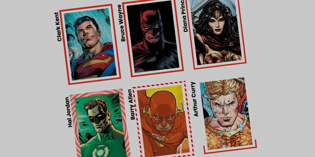
  <strong>Bruce Wayne</strong>
</div>
2. Establishing Base Styles
The layout relies on standard dimensions, positioning, and a background image. Rather than applying a standard border, a linear gradient is mapped to the border source:
.card
  width: 150px;
  aspect-ratio: 0.69;
  position: relative;
  background: center/90% no-repeat;
  background-image: url("batman.jpg");

  /* Defines a linear color gradient as the border source */
  border-image-source: linear-gradient(-45deg, red 0%, transparent 0%);

  /* Controls how the gradient is carved */
  border-image-slice: 1;

  /* Sets the physical thickness of the border */
  border-image-width: 5px;

  /* Pushes the border away from the content box */
  border-image-outset: 5px;
3. Registering the Custom Property
To animate the gradient transition, a custom property --p is registered, instructing the rendering engine to treat it as a percentage:
@property --p
  syntax: "<percentage>";
  initial-value: 0%;
  inherits: false;
By binding this custom property to the gradient source and updating it on user interaction (:hover), the browser smoothly interpolates the color stop from 0% to 100%, creating the visual effect of a border drawing itself around the card:
.card
  border-image-source: linear-gradient(-45deg, red var(--p), transparent 0%);
  transition: --p 0.4s ease-in-out;

  &:hover
    --p: 100%;
4. Advanced Variations with Conic Gradients
Developers are not restricted to linear transitions. By utilizing conic-gradient, alongside properties like border-image-repeat: round, complex geometric patterns can be tiled and animated simultaneously.
By registering multiple custom properties—such as --n for slice depth and --a for rotational angle—designers can produce expansive color wheels that rotate and expand upon hover:
@property --n
  syntax: "<number>";
  initial-value: 1;
  inherits: false;


@property --a
  syntax: "<angle>";
  initial-value: 0deg;
  inherits: false;


.card
  border-image-source: conic-gradient(from var(--a), red var(--a), transparent 0%);
  border-image-width: 5px;
  border-image-slice: var(--n);
  border-image-repeat: round;
  transition-property: --n, --a;
  transition-duration: 0.6s;

  &:hover
    --n: 20;
    --a: 360deg;
Official Responses and Expert Perspectives
Frontend architects and design system engineers have weighed in on the resurgence of border-image animations, noting both their power and their current limitations in production environments.
"The ability to animate CSS properties that were once static constants fundamentally changes how we approach micro-interactions," notes a leading CSS working group contributor. "However, developers must remain mindful of progressive enhancement. While browser support for
@propertyis robust across modern engines, fallback states for legacy environments are essential."
Performance benchmarks indicate that because these animations rely on CSS Houdini and GPU acceleration rather than JavaScript timer loops, frame rates remain stable at 60fps even under heavy DOM loads. However, design system teams caution against over-animation. While glowing, expanding, and self-drawing borders elevate brand experiences on marketing pages and dashboard cards, excessive motion can degrade user focus in data-dense application interfaces.
Implications for Future Web Design
The mastery of animated border-image properties signals a broader shift toward native, CSS-driven UI engineering. As specifications continue to mature, the dependency on heavy JavaScript animation libraries for structural UI enhancements is steadily decreasing.
Design System Scalability
For enterprise design systems, adopting tokenized, Houdini-powered border animations means consistency can be maintained globally via configuration files. A single design token update can propagate complex, synchronized border transitions across thousands of components without requiring deep refactors of component logic.
Accessibility and User Preferences
As implementations grow in complexity, developers are reminded to respect user motion preferences. Integrating media queries such as prefers-reduced-motion ensures that dynamic border effects gracefully degrade into static, accessible states for users sensitive to rapid visual shifts:
@media (prefers-reduced-motion: reduce)
  .card
    transition: none;
Ultimately, revisiting foundational features like border-image highlights an enduring truth in web development: mastering native platform capabilities often yields cleaner, more efficient, and more creative solutions than inventing external workarounds. As the web community continues to experiment with these techniques, the humble border is shedding its static past to become a dynamic canvas for modern digital design.