







Nearly a decade after its initial introduction to the web platform, the native HTML <dialog> element remains a cornerstone of modern web development. Yet, despite its longevity, front-end developers frequently find themselves consulting documentation for its nuanced behaviors, styling quirks, and accessibility requirements.
This comprehensive guide explores the structural mechanics, styling paradigms, state management, and modern features of the <dialog> element, providing a definitive reference for developers aiming to build robust, accessible web interfaces.
Main Facts: What is the Native <dialog> Element?
The HTML <dialog> element is a built-in browser component designed to represent a dialog box or interactive sub-window, such as a dismissible alert, inspector, sub-task, or form submission wizard.
Before its widespread adoption, developers relied on complex, third-party JavaScript libraries and deeply nested <div> elements to achieve modal functionality, manually managing focus states, ARIA attributes, and background inertness. The native <dialog> element standardizes this behavior directly within the browser engine, offering two distinct operational modes:
- Non-Modal Popups (
show()): Functions similarly to a traditional popover or tooltip. It does not block interaction with the rest of the page and remains on the normal document layer. - True Modals (
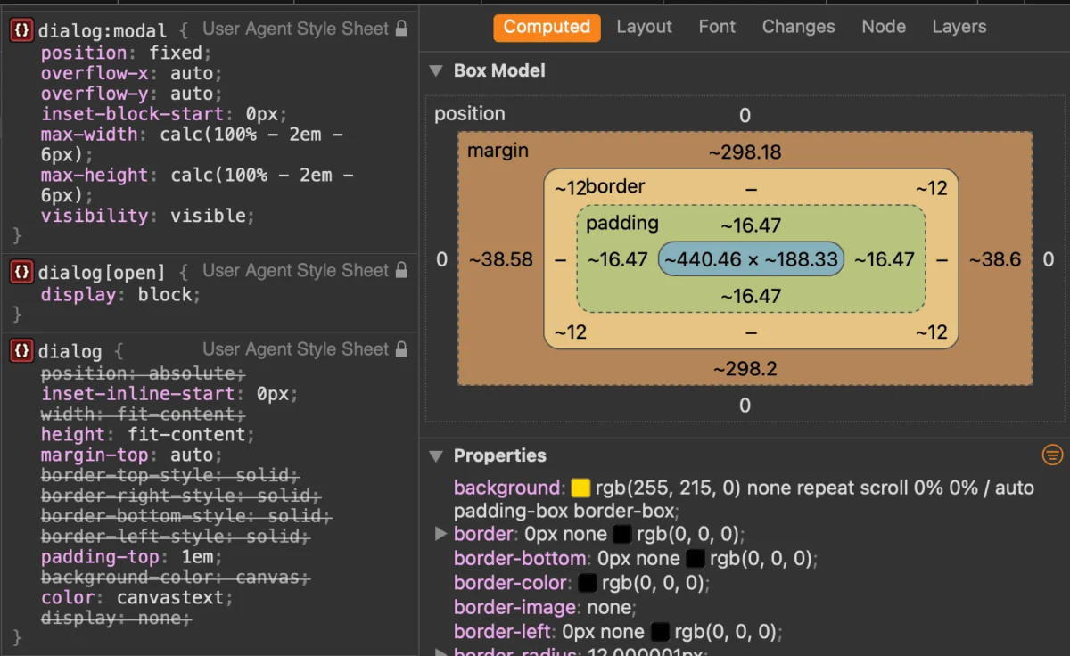
showModal()): Elevates the element to the browser’s "top layer," centers it within the viewport, automatically generates an interactive backdrop (::backdrop), locks background content using innateinertbehavior, and listens for theEsckey to close.
Chronology: The Evolution of Web Modals
To understand the current state of web dialogs, it helps to examine how developers have historically approached overlay UI patterns:

- The Div-Soup Era (Early 2000s): Developers used absolute positioning, high
z-indexvalues, and complex JavaScript event listeners to create custom overlays. These implementations routinely suffered from accessibility flaws, trapping keyboard focus incorrectly and failing screen reader announcements. - Library-Driven Overlays (2010s): Frameworks like jQuery UI and Bootstrap popularized robust JavaScript plugins that automated focus management and background dimming, though they added substantial payload weight to websites.
- Standardization and HTML5 (Mid-2010s): The
<dialog>element specification was introduced, bringing native semantics to browsers. However, early fragmentation in styling the::backdropand controlling open/close animations slowed initial adoption. - Modern CSS Enhancements (Present Day): Recent browser milestones—including Safari’s support for the
:openpseudo-class, the introduction of@starting-stylefor smooth entry animations, and emerging experimental features like invoker commands—have transformed the<dialog>element into a fully customizable, declarative web primitive.
Core Implementation and Markup Mechanics
Basic Marking Up
At its simplest, a dialog requires a triggering mechanism and the element itself:
<button id="dialog-button">Open Dialog</button>
<dialog id="dialog">
  <p>This is a native dialog box.</p>
</dialog>
By default, the dialog is closed. While developers can technically apply the open attribute (<dialog open>) to render it visible immediately, this is rarely useful outside of debugging. Instead, programmatic control via JavaScript is preferred.
Modals vs. Pop-ups: show() vs. showModal()
Invoking the dialog via JavaScript requires selecting the elements and calling the appropriate method:
const dialogButton = document.querySelector('#dialog-button');
const dialog = document.querySelector('#dialog');

dialogButton.addEventListener('click', () =>
  // Opens as a non-modal pop-up
  // dialog.show();

  // Opens as a true modal with a backdrop and focus trapping
  dialog.showModal();
);
Using showModal() is the recommended approach for user-interruption flows because it automatically establishes a backdrop, centers the component, and registers keyboard events such as the Esc key.
Closing Mechanisms
Dialogs can be dismissed through several avenues:

- The
EscKey: Handled natively by the browser when usingshowModal(). - Programmatic JavaScript: Invoking the
.close()method.const dialogClose = document.querySelector('#dialog-close'); dialogClose.addEventListener('click', () => dialog.close(); ); - Declarative HTML (Zero JavaScript): Placing a form with
method="dialog"inside the element allows buttons to close the dialog automatically upon submission.<dialog id="dialog"> <form method="dialog"> <button type="submit">Close Dialog</button> </form> </dialog>
Supporting Data: Emerging Standards and Declarative Control
Invoker Commands
An evolving web standard currently moving through browser implementations is invoker commands. This feature allows developers to control dialogs declaratively entirely within HTML, eliminating boilerplate JavaScript event listeners:
<button command="show-modal" commandfor="my-dialog">Show Dialog</button>

<dialog id="my-dialog">
  <p>Controlled entirely via declarative attributes.</p>
  <button command="close" commandfor="my-dialog">Close Dialog</button>
</dialog>
Developers who still need to listen to these interactions via JavaScript can hook into native command events:
const dialogs = document.querySelectorAll("dialog");

dialogs.forEach(dialog =>
  dialog.addEventListener("command", event =>
    if (event.command == "show-modal")
      // Logic executed when dialog is opened modally
     else if (event.command == "close")
      // Logic executed when dialog is closed

  );
);
Official Recommendations: Accessibility and Focus Management
Accessibility is a primary justification for utilizing native HTML elements over custom JavaScript widgets. However, proper implementation requires careful attention to button labeling and focus assignment.
Labeling Icon-Only Close Buttons
Developers frequently use an "X" or an SVG icon for close buttons. Screen readers cannot reliably interpret raw symbols, requiring visually hidden text combined with aria attributes:
<dialog id="form-dialog">
<button id="form-close">
<span class="visually-hidden">Close modal</span>
<span aria-hidden="true">×</span>
</button>
</dialog>Managing Initial Focus
When a modal opens, the browser automatically shifts focus to the first focusable element inside the dialog—which is often the close button in the top-left or top-right corner. While efficient, this can lead to accidental closures if a user presses the Space key immediately upon opening. If the dialog contains form fields or primary call-to-action links, consider explicitly managing initial focus using the tabindex attribute to prioritize interactive form elements over the close button.

Implications: Inertness, Layout, and Styling
Innate Inertness
When a modal dialog is active, the underlying page content automatically becomes inert. This means text selection, background button clicking, form inputs, and tab navigation are disabled across the rest of the document without requiring manual manipulation of ARIA attributes.
Styling the Backdrop
The default styling for the native ::backdrop pseudo-element is exceptionally subtle—often rendering a barely visible tint over the viewport. Developers can customize this layer to enforce branding, increase contrast, or apply background filters:
dialog::backdrop
  background-color: rgba(0, 0, 0, 0.6);
  backdrop-filter: blur(4px);
Handling Scrollbars and Viewport Stability
Opening a modal can cause layout shifts if scrollbars disappear from the main document. To prevent unexpected width adjustments, developers should enforce stable scrollbar gutters:
dialog
  &[open]
    scrollbar-gutter: stable;
Furthermore, preventing background scrolling while a modal is open can be achieved cleanly via modern CSS or layout containment:
body:has(dialog[open])
  overflow: hidden;
Smooth Entry and Exit Animations
Animating dialogs historically required complex JavaScript hacks because elements with display: none cannot transition opacity smoothly. The introduction of the @starting-style at-rule solves this architectural limitation:

@starting-style
  dialog:open
    opacity: 0;
    transform: scale(0.95);


dialog
  opacity: 0;
  transform: scale(0.95);
  transition: opacity 0.3s ease, transform 0.3s ease;

  &[open]
    opacity: 1;
    transform: scale(1);
Dialog vs. Popover: Choosing the Right API
A frequent architectural question involves deciding between the Dialog API and the Popover API. While they appear superficially similar, their underlying accessibility semantics diverge significantly:
- Popovers lack innate focus trapping, do not automatically make background content
inert, and require developers to manually assign appropriate ARIA roles. They are best suited for non-modal UI components like tooltips, dropdown menus, and floating preference panels. - Dialogs provide complete focus management, automatic background inertness, and top-layer rendering out-of-the-box. They are best suited for high-priority user interactions requiring explicit acknowledgment or data entry.
Summary
The native HTML <dialog> element bridges the gap between performance, developer ergonomics, and universal accessibility. By understanding its foundational states, leveraging modern CSS features like @starting-style, and respecting accessibility best practices, developers can build lightweight, resilient, and beautiful interactive overlays without relying on heavy external dependencies.