
There is an undeniable, magnetic pull to the aesthetic of the late 20th century. For designers and gamers alike, the bold, blocky typography of 1980s and 1990s arcade cabinets represents more than just a font—it is a cultural touchstone. Whether it is the high-contrast glowing neon hues of a Tron machine or the crisp, monochromatic pixelated edges of an early Nintendo title, these typefaces serve as a bridge to a golden era of digital entertainment. Today, this "coin-operated" aesthetic is experiencing a massive revival, appearing everywhere from high-end branding and indie game development to social media content and streetwear design.
The Digital Renaissance: Why Arcade Fonts Matter
The resurgence of pixel art and 8-bit typography is not merely an act of blind nostalgia. It is a deliberate aesthetic choice that balances minimalism with high-impact visual storytelling. In an era where high-definition graphics and hyper-realistic rendering dominate the landscape, there is a refreshing, human quality to the constrained geometry of pixel fonts.
These typefaces communicate speed, playfulness, and technical heritage. For a creative professional, integrating an arcade font into a project—be it a logo, a poster, or a UI element—is a shortcut to establishing an emotional connection with an audience that grew up in the arcades of the eighties and nineties. By blending the raw, utilitarian roots of early computing with the polish of modern design software, these fonts have evolved into a sophisticated tool for visual communication.
A Chronology of the Pixel: From Cabinets to Canvases
The history of arcade typography is inextricably linked to the hardware limitations of the era.
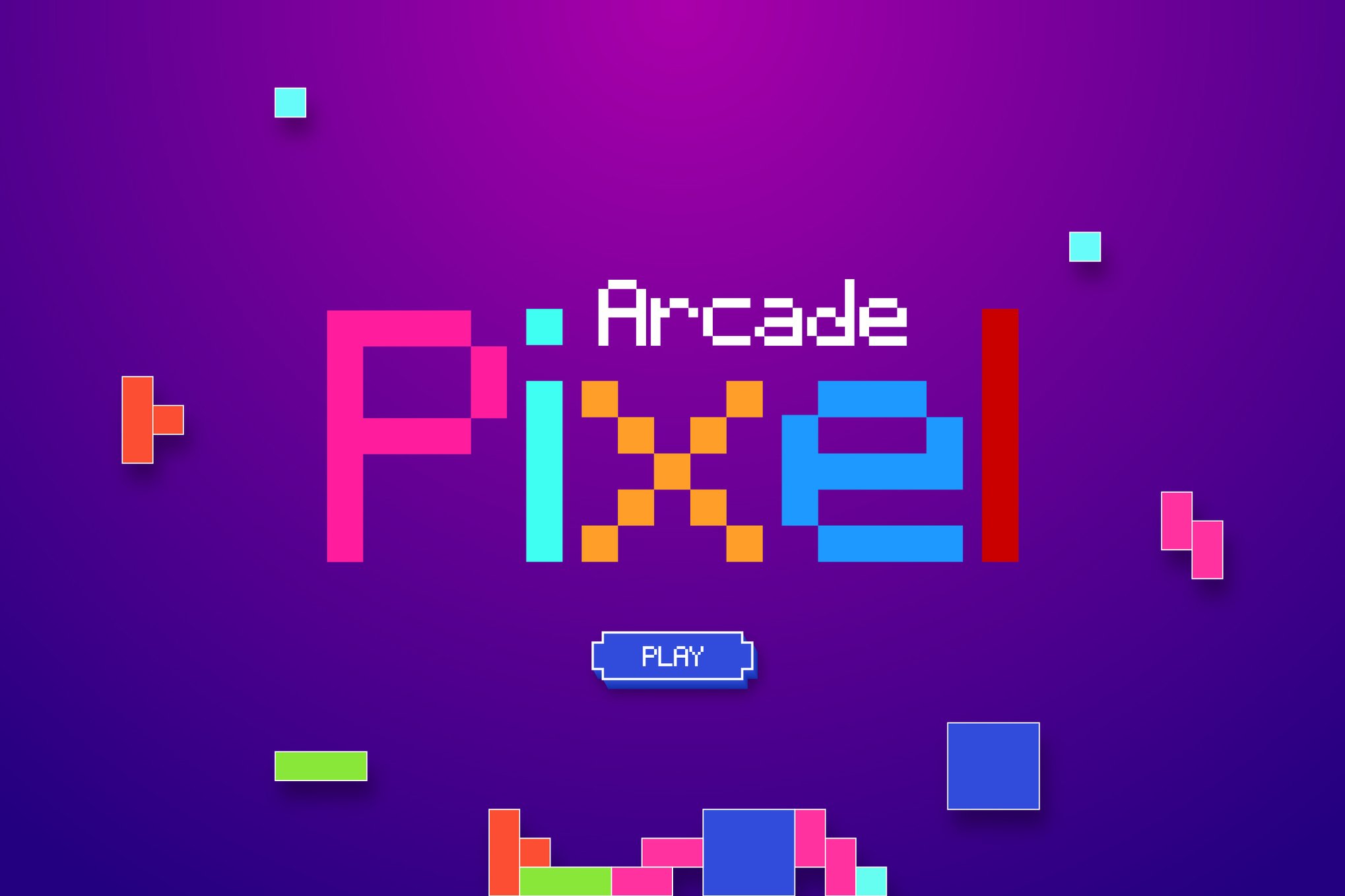
- The 1970s (The Birth of the Bit): Early arcade titles like Pong and Space Invaders relied on primitive character sets. Typography was dictated by the grid; letters were built block-by-block, with no room for curves or subtle serifs.
- The 1980s (The Golden Age): As technology advanced, so did the fonts. Games like Pac-Man, Galaga, and Donkey Kong introduced distinct color palettes and heavier, bolder character designs meant to grab the attention of passersby in loud, crowded arcades.
- The 1990s (The Transitional Era): The move toward 16-bit and 32-bit consoles saw typography become more decorative. Shadowing, gradients, and stylized "speed" effects were added to match the faster gameplay.
- The 2020s (The Digital Revival): Today, we are seeing a "remastering" of these classic styles. Modern designers are taking the limitations of the past and expanding them into versatile, multilingual font families that offer the nostalgic look with the functional benefits of contemporary typography.
Supporting Data: The Anatomy of a Modern Arcade Font
When selecting an arcade font for a professional project, designers look for more than just a "retro" look. The current marketplace, which includes both free and premium options, focuses on three key pillars:
1. Versatility of Format
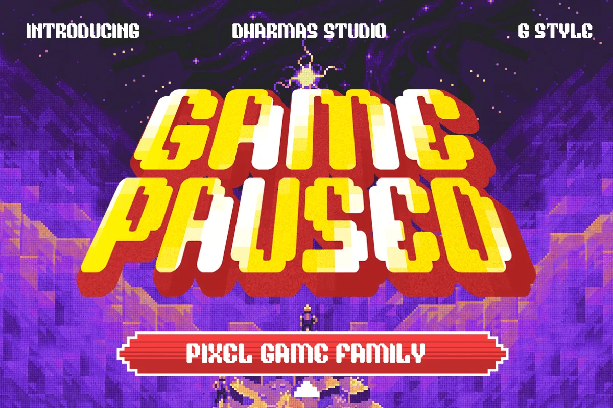
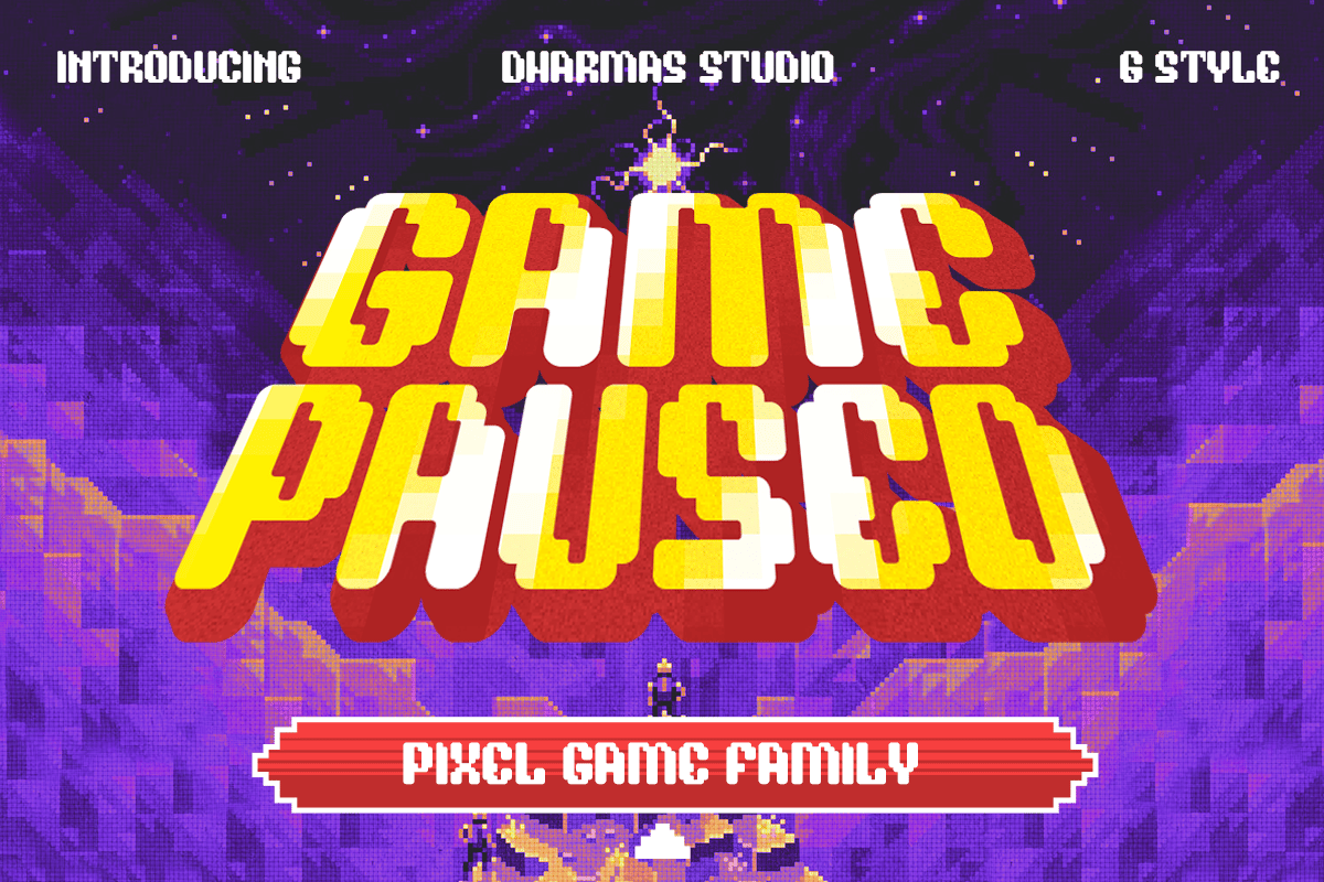
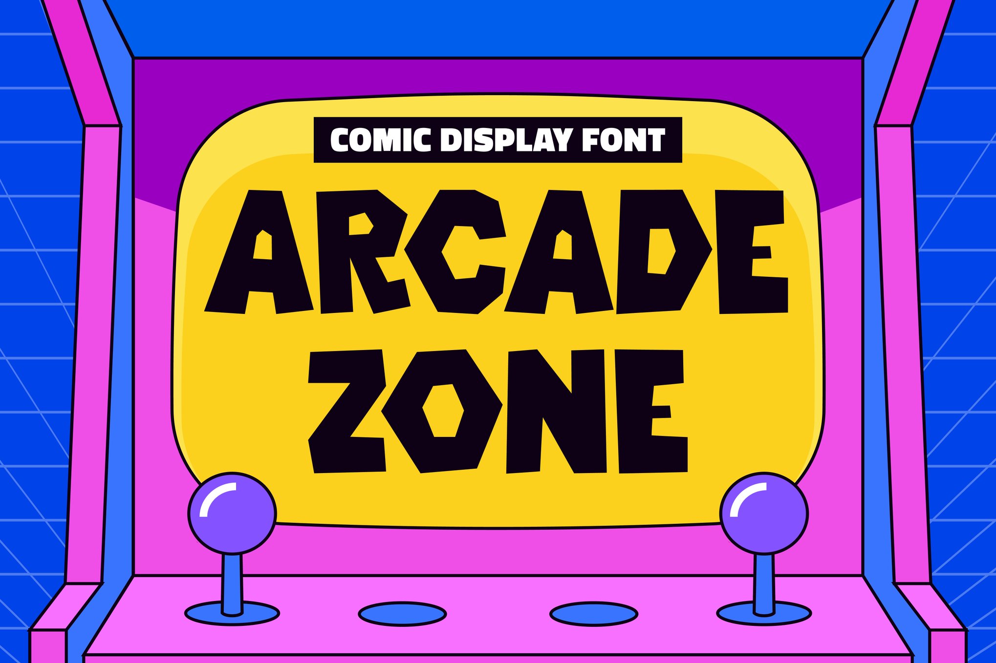
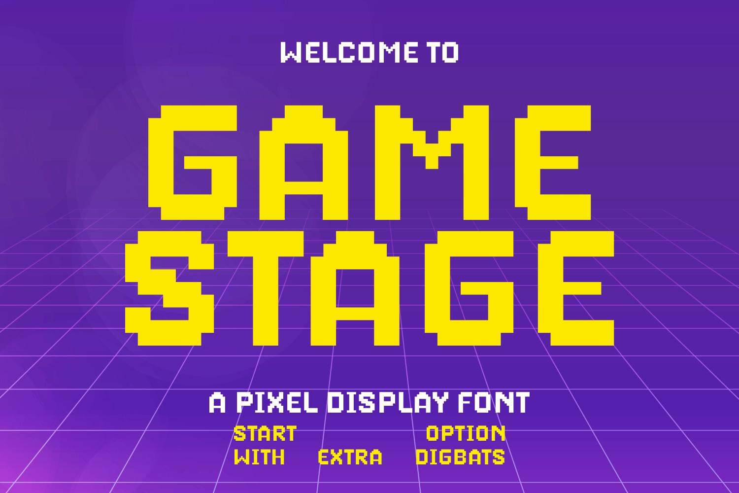
Modern arcade fonts, such as Game Paused or Arcade Zone, are no longer limited to a single bit-depth. They are typically provided in OTF, TTF, and WOFF formats. This allows them to function seamlessly across print media (posters, merchandise) and digital interfaces (websites, streaming overlays).
2. Stylistic Diversity
The current generation of arcade-inspired fonts has expanded beyond the standard "block." We now see:
- Layered Styles: Many fonts, like Game Paused, offer sub-styles such as "Extrude," "Slant," and "Outline," allowing designers to build depth without manually manipulating the text.
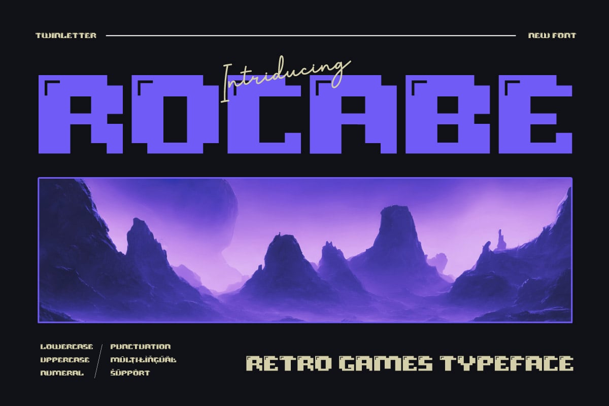
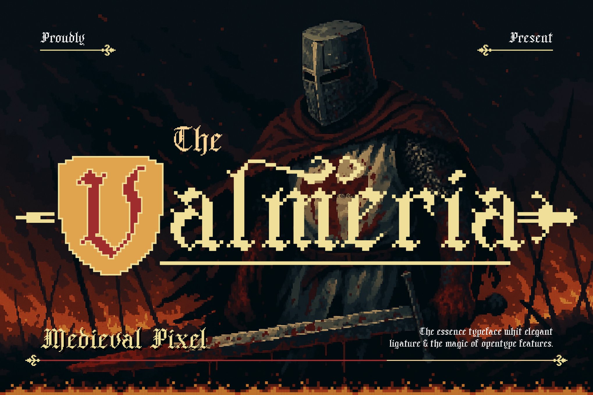
- Hybrid Aesthetics: Some fonts, such as Valmeria, blend the pixelated structure with other genres, like medieval blackletter, proving that the 8-bit aesthetic is highly malleable.
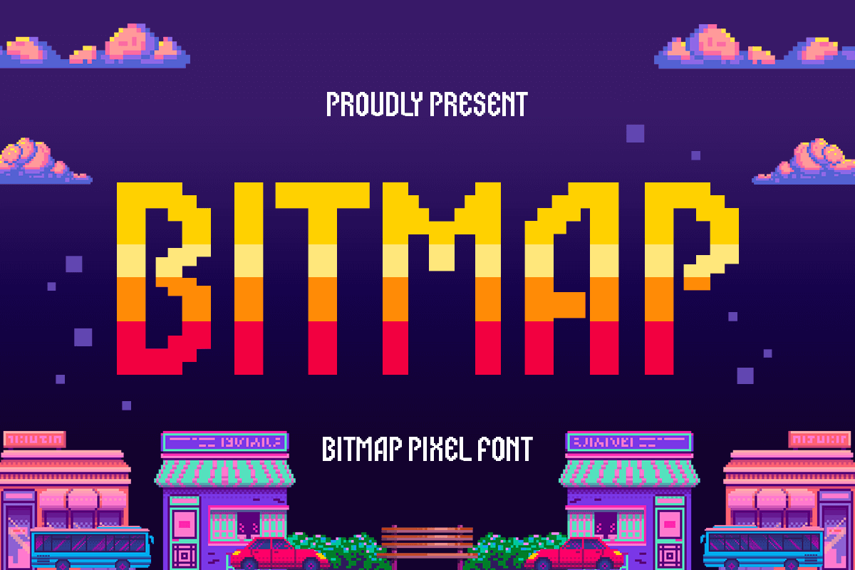
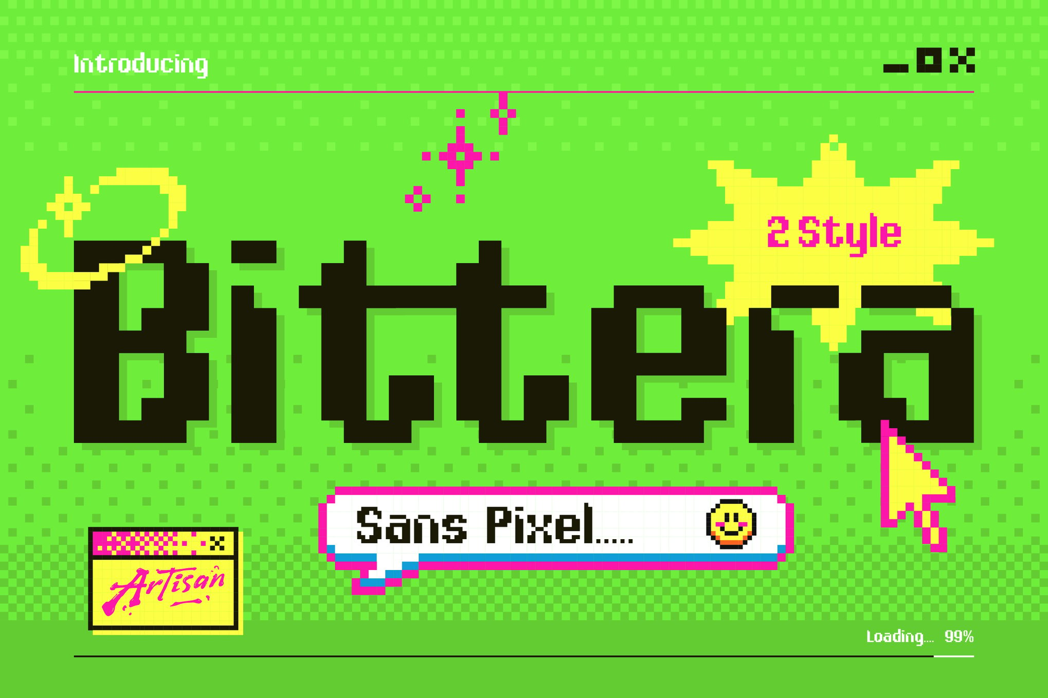
- Functional Modernity: Fonts like Bitmap and Bittera focus on readability, ensuring that while the "vibe" is old-school, the text remains legible on modern high-resolution mobile screens.
3. Multilingual and Glyphic Support
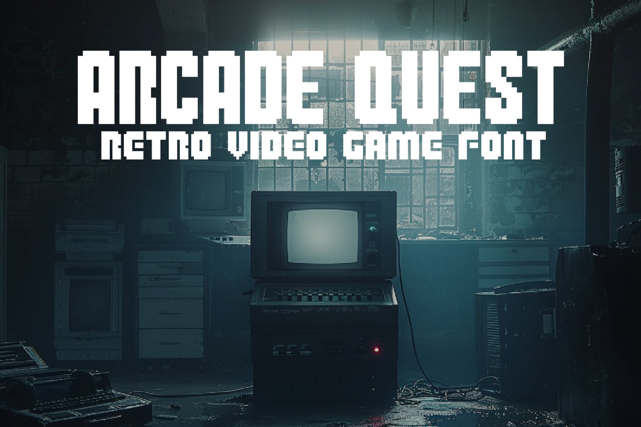
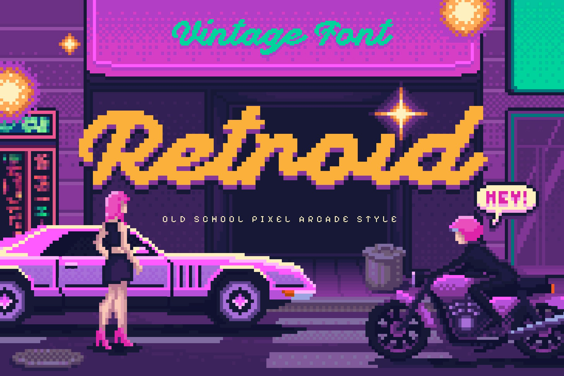
One of the major shifts in font design over the last decade is the inclusion of extensive character sets. Designers are no longer restricted to the English alphabet. Many of the fonts featured in current collections—such as Arcade Quest and Retroid—now include full punctuation, numerals, and support for multiple languages, making them viable for global branding campaigns.
Categorizing the Collection: Premium vs. Free
The market for arcade fonts is divided into two primary sectors, each serving a specific need within the design community.
Premium Options: Professional Grade Assets
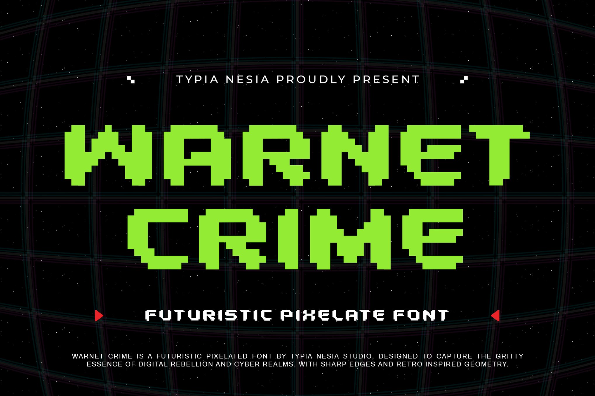
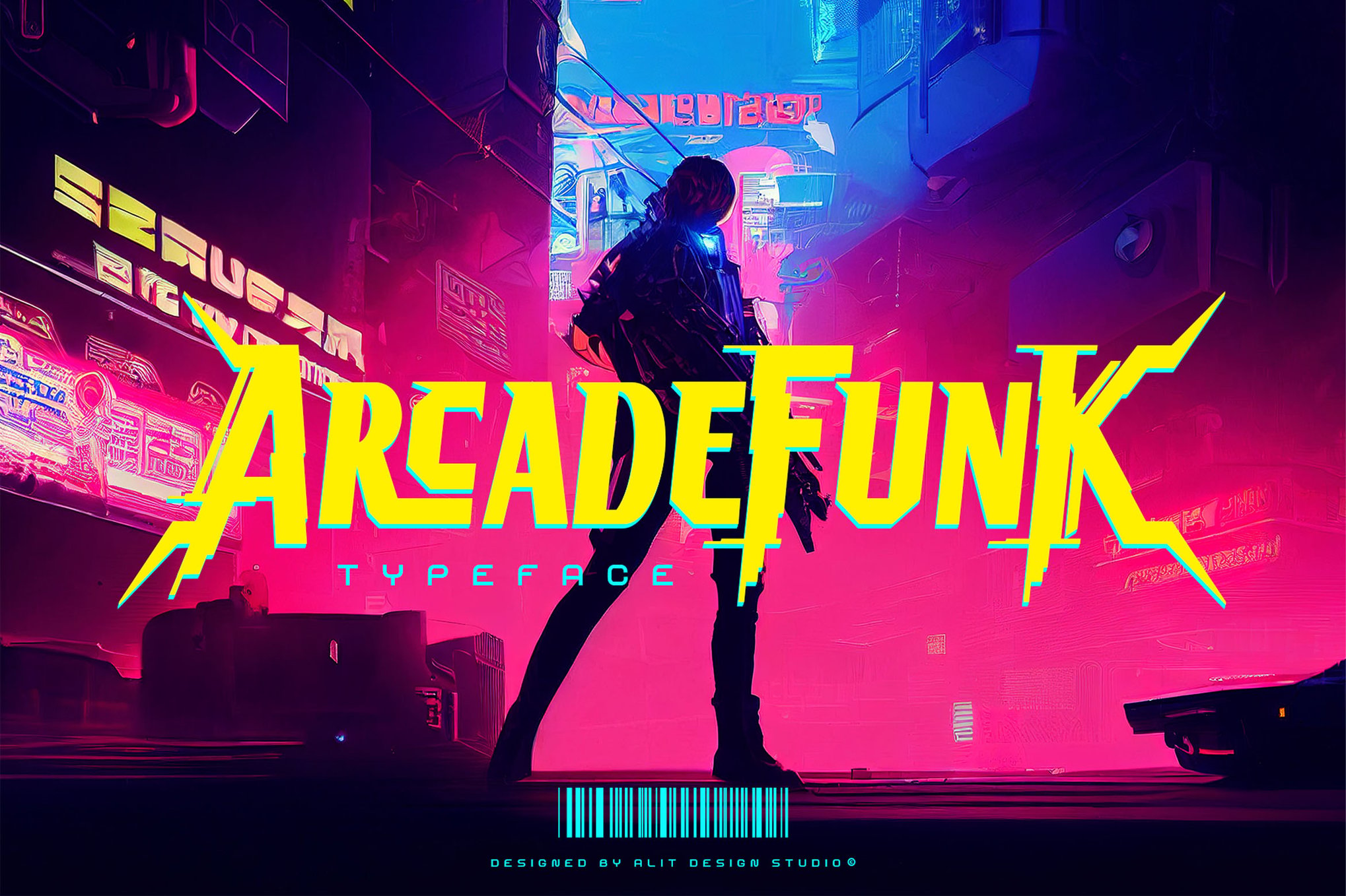
Premium fonts like Arcade Funk or Warnet Crime are often the choice for professional branding. These typefaces typically feature:
- Advanced Kerning: Better spacing between characters, which is crucial for large-format displays.
- Special Glyphs: Decorative elements, such as the "stylistic doodles" found in Game Stage, which add a unique flair to headers.
- Commercial Licensing: Providing the peace of mind required for corporate branding, game development, and high-stakes marketing campaigns.
The "Free-to-Use" Ecosystem
Resources like Cyber Bytes, Digital 808, and Start Signal occupy a vital space for students, independent developers, and content creators. These fonts are often distributed by community-driven platforms (such as BeFonts). They offer an accessible entry point for those looking to inject energy into YouTube thumbnails, personal blogs, or amateur game mods without the overhead cost of commercial licensing.
The Implications for Modern Brand Identity
The adoption of arcade typography by mainstream brands is a testament to the power of retro-futurism. We see tech companies using pixel fonts to signal "innovation" and "digital-first" mentalities, while lifestyle brands use them to evoke a sense of rebellious, youthful energy.
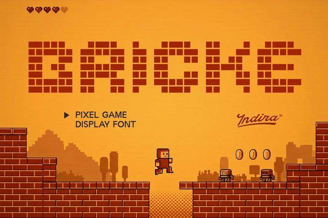
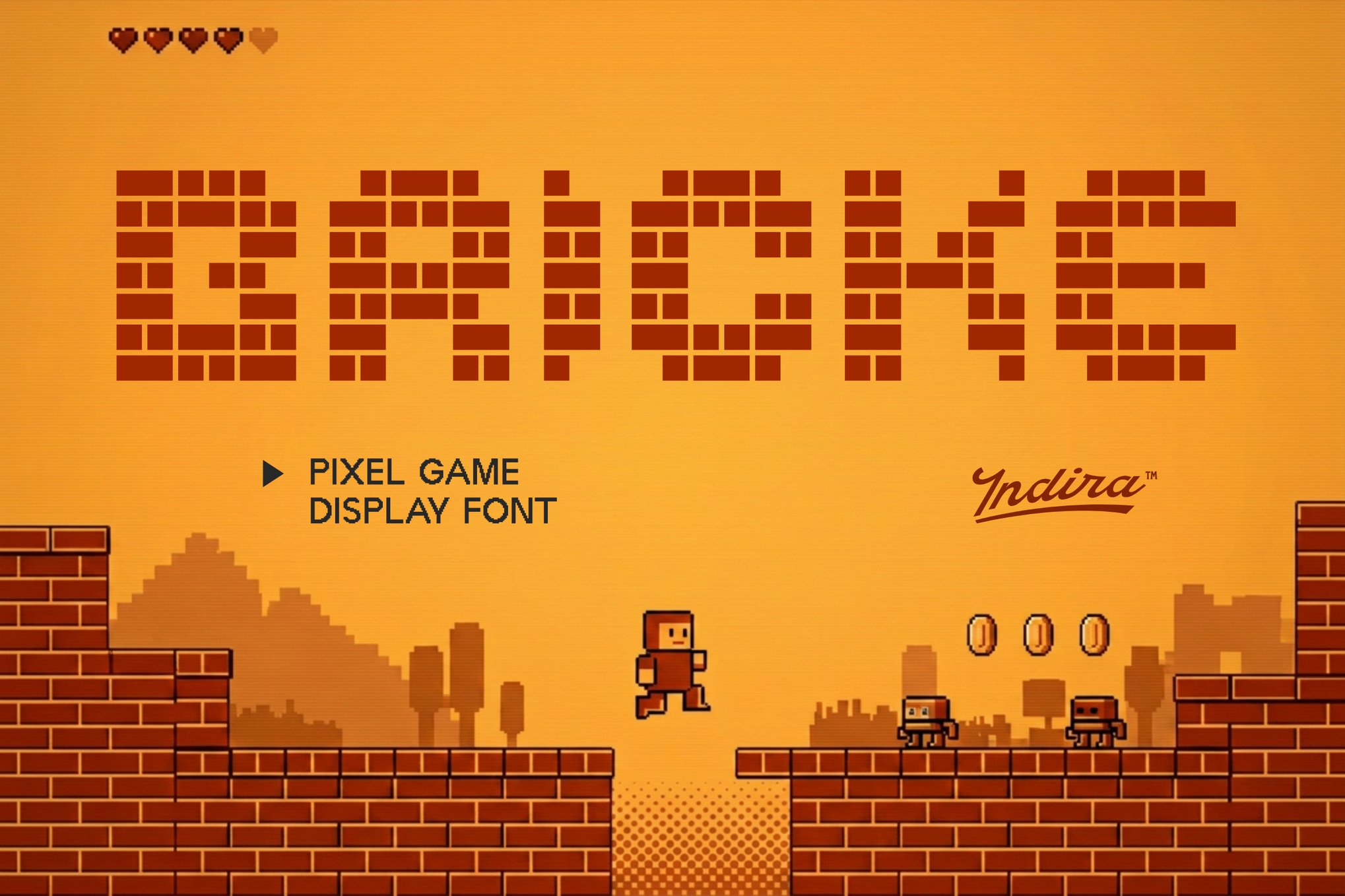
The implication is clear: the pixel is no longer a sign of technical limitation; it is a mark of cultural currency. By using a font like Alpharush or Pixel Bricke, a brand is effectively communicating that it understands its roots, respects its history, and is not afraid to break the rules of modern, clean-cut minimalism.
Expert Insight: How to Use These Fonts Effectively
Design experts emphasize that "less is more" when working with arcade typography. Because these fonts are inherently bold and visually "loud," they function best as display faces—used for titles, headlines, or logos.
- Pairing: Combine a heavy, blocky pixel font with a clean, modern sans-serif (like Montserrat or Inter) for body text to maintain readability.
- Color Theory: Arcade fonts thrive on high-contrast color palettes. Think neon pinks against black, or electric blues against dark grays.
- Application: Don’t limit yourself to gaming. The "brutalist" edge of fonts like Arcade Funk makes them surprisingly effective in music posters, streetwear branding, and editorial layouts for tech-centric magazines.
Conclusion: The Game Never Ends
The enduring appeal of the arcade font lies in its ability to synthesize a specific moment in history into a single, cohesive visual language. Whether you are building a fully immersive 8-bit game world or simply looking to add a "pop" of 90s nostalgia to a social media banner, these typefaces remain the most effective tool in the designer’s arsenal.
As digital design continues to evolve, the pixel will undoubtedly remain a cornerstone of our visual vocabulary. By leveraging the collection of fonts discussed here—ranging from the raw, free-to-use classics like Game City to the highly polished premium sets like Arteche—creators can ensure that their work not only stands out but also resonates with the timeless, playful spirit of the arcade.
The era of the pixel is far from over; in many ways, it is just beginning. Every time we select one of these fonts, we are hitting the "Continue" button on a legacy that defines the very intersection of technology and art.