








In 2010, Ethan Marcotte published a seminal article on A List Apart that fundamentally fractured the status quo of web development. Titled "Responsive Web Design" (RWD), the piece introduced a methodology that allowed websites to fluidly adapt to the varying screen sizes of the emerging smartphone era. Fifteen years later, in 2025, we find ourselves at a curious crossroads. While we still use the term "Responsive Web Design," the reality of how we build for the web has undergone a tectonic shift—a quiet, often invisible evolution that has moved us away from manual orchestration toward an algorithmic, browser-native future.
A Chronology of Layout: From Tables to Algorithms
The history of web design can be measured in eras of control. In the late 1990s and early 2000s, developers relied on HTML tables to force content into rigid, pixel-perfect grids. When the limitations of this "table-slaying" era became apparent, we pivoted to float-based layouts. This period was characterized by "hacking" the browser, forcing elements to behave in ways they weren’t strictly designed for.
The arrival of RWD in 2010 provided a lifeline: fluid grids based on percentages and the then-revolutionary media queries. For the first time, developers could define breakpoints, dictating how a site should look at 320px, 768px, and 1024px. However, this was an era of micromanagement. Developers were effectively acting as traffic controllers, manually signaling to the browser exactly how to render every pixel.
The true breakthrough occurred several years later with the native implementation of Flexbox and CSS Grid. These were not just new features; they were systemic changes that allowed for two-dimensional, complex layouts that could wrap, expand, and contract without explicit, constant intervention.
Defining the New Standard: Intrinsic Web Design
At the 2019 An Event Apart conference, Jen Simmons introduced the term Intrinsic Web Design (IWD). Defined by the Merriam-Webster dictionary as "belonging to the essential nature or constitution of a thing," IWD represents the maturation of our craft. If RWD was about telling the browser what to do at specific points, IWD is about understanding the intrinsic capabilities of the browser and allowing it to handle the heavy lifting.

IWD bridges the long-standing divide between print-style design and digital flexibility. By combining the two-dimensional control of grid systems with the fluid, wrapping nature of content-aware layouts, developers can finally achieve complex, sophisticated designs without fighting the medium.
Why IWD Remained Invisible
It is a paradox of the industry that IWD never gained the household status of RWD. This is likely because the transition was not a disruptive "break" but a steady evolution. As Flexbox and Grid became standard, developers adopted them intuitively. We didn’t announce a new era; we simply stopped using float hacks. We traded the revolutionary rhetoric for the steady, reliable progress of writing better CSS.
The Browser as a Mentor, Not a Subject
Perhaps the most significant shift in modern web development is the changing relationship between the developer and the browser. For years, the developer-browser dynamic was one of micromanagement. We assumed we knew better than the browser, constantly debugging and patching for every edge case.
However, as Heydon Pickering and Andy Bell have argued, this approach is fundamentally flawed. Modern browsers are highly sophisticated engines with over 35 years of experience in rendering content. They possess information that a developer never will: the user’s specific hardware constraints, battery levels, connection stability, screen resolution, and accessibility preferences.
The Shift to Declarative Design
Jeremy Keith has noted the migration from imperative design—where we define the "how"—to declarative design, where we define the "what." This shift is analogous to the current revolution in AI: we define the inputs, set the constraints, and allow the system to determine the optimal output.
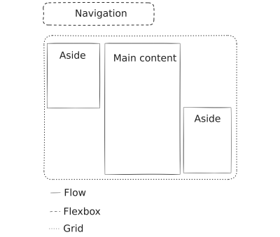
Unlike a "black box" AI, however, the browser is governed by open, predictable web standards. By defining semantic HTML and utilizing native layout systems, we provide the browser with the context it needs to render the page beautifully, regardless of whether the user is browsing on a massive 8K display or a resource-constrained smart device.
Implementing the Modern Toolkit
To take RWD to its logical extreme, developers must adopt a more holistic, declarative strategy. This involves several key pillars:
- Semantic HTML: The foundation remains the text document itself. By using meaningful markup, we ensure that content is accessible and readable even when CSS or JavaScript fails to load.
- Fluid Typography and Spacing: Using CSS functions like
clamp(), we can create typographic systems that scale fluidly between minimum and maximum constraints, ensuring legibility across all viewports. - Progressive Enhancement: This 20-year-old philosophy remains the gold standard. By using features like the
@view-transitionAPI, we opt into advanced capabilities where they exist, while ensuring the site remains functional where they don’t. - Logical CSS: By moving away from "physical" properties (left, right, top, bottom) in favor of "logical" properties (start, end, inline, block), we ensure that our layouts are inherently internationalized and adaptable to different writing directions.
Implications: A Mental Shift in Thinking
The most difficult hurdle for many developers is the mental shift required to embrace this "unknown." We are conditioned to think in pixels—the "1rem = 16px" myth is particularly pervasive. Yet, in a truly responsive web, we must relinquish this control.
When we stop trying to force concrete pixel values, we start thinking in ratios. We define a base size, and everything else is a proportional relationship to that base. This is not just a stylistic choice; it is an accessibility necessity. When a user changes their system-level font size, a site built on ratios will scale gracefully. A site built on hard-coded pixels will break.
Empowering the User
Ultimately, this evolution is about shifting power back to the user. By building in a "dialogue" with the browser—respecting user preferences for dark mode, reduced motion, and custom font sizes—we create a web that is more inclusive and resilient.

We are no longer trying to solve every problem for every user. We are providing a resilient, flexible structure that allows the browser to present our content in the way that best serves the individual. When we accept that we cannot possibly know everything about the user’s environment, we finally start building for the web as it was intended to be: universal, adaptable, and inherently accessible.
In 2025, the "True Way" is no longer about forcing the browser to obey our commands. It is about becoming the browser’s mentor, setting the stage, and trusting the engine to deliver the performance that the user deserves. Responsive design has not died; it has simply grown up.