






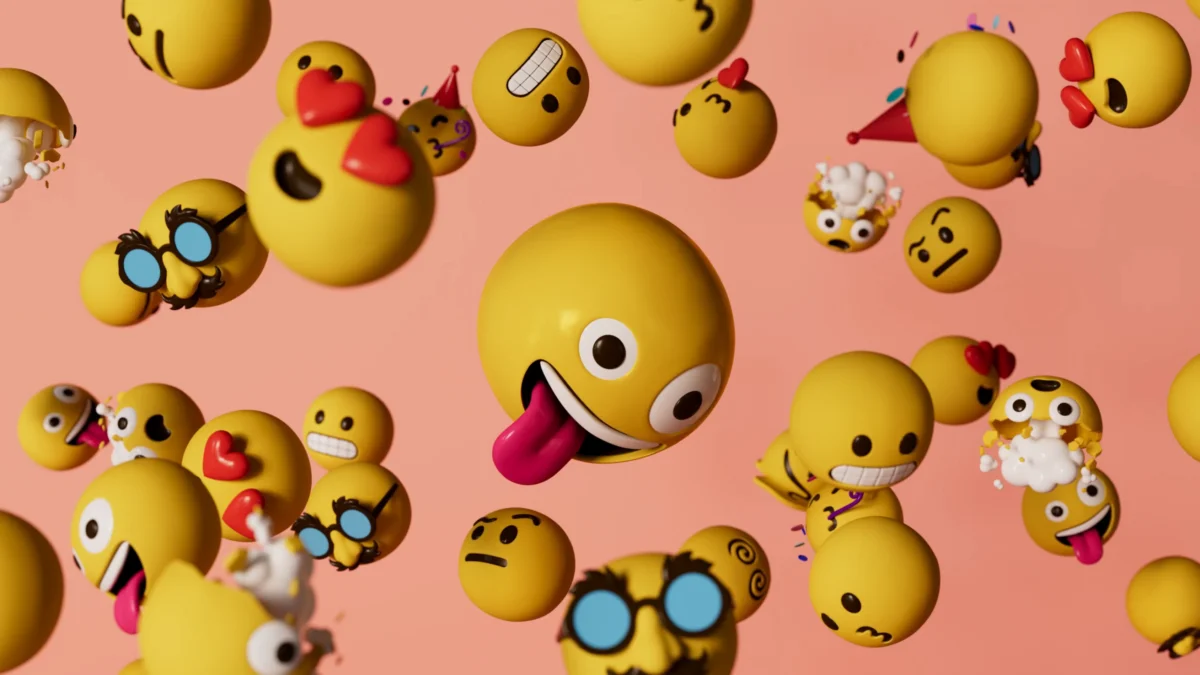
In the modern digital lexicon, emoji have transcended their origins as simple Japanese pictographs to become a fundamental pillar of human communication. They bridge the gap where text fails, conveying tone, nuance, and emotion in a fraction of a second. Today, Google is fundamentally evolving this language. Following an initial teaser in May 2026, the tech giant has finally provided an exhaustive look into the creation, design, and philosophy behind its ambitious Noto 3D emoji collection—a project that seeks to harmonize the digital and physical worlds through a massive, open-source library of 3,977 characters.
The Evolution of the Pictograph: Main Facts
Google’s Noto 3D project is not merely an aesthetic refresh; it is a masterclass in UX (User Experience) engineering and visual psychology. For years, users have relied on flat, 2D representations of objects, animals, and faces. While these served their purpose, Google recognized that the transition to 3D provided an opportunity to improve accessibility and emotional clarity.
The core premise of the Noto 3D project was to elevate the existing emoji set to a new dimension without sacrificing the instant recognizability that makes emoji effective. Google’s design team deliberately avoided the trap of hyper-realism. Instead, they focused on "universal legibility." By stripping away complex textures and extraneous anatomical details, the team ensured that every character remains readable across different screen sizes, lighting conditions, and operating systems.
A Chronological Journey: From Concept to Deployment
The road to Noto 3D was paved with rigorous testing and iterative design.
- May 2026: Google officially announced its intention to move toward a 3D-first emoji design language, sparking curiosity about how the brand would maintain consistency across its massive ecosystem.
- Summer 2026: Throughout the intervening months, Google’s design teams engaged in deep-dive research into how the human brain processes facial geometry.
- September 17, 2026: The official design deep-dive was published, revealing the technical challenges of 3D translation and announcing that the entire library of 3,977 characters would be released as an open-source asset.
- Late 2026 and Beyond: The rollout phase has commenced, with Noto 3D assets beginning to appear across Google’s suite of Android products and web services.
The Science of Expression: Supporting Data and Design Hurdles
The transition from 2D to 3D is fraught with "hidden" challenges that the average user rarely considers. Google’s research, led by UX Engineer Dr. Alexander Robertson, uncovered fascinating insights into how we perceive digital emotions.
The Psychology of Minimalist Geometry
One of the most significant findings in the Noto 3D development process was that hyper-realistic features can actually hinder communication. According to Dr. Robertson, high-fidelity anatomical details—such as complex iris textures or deep nostril shading—create "cognitive friction." When a face becomes too detailed, the brain spends more time processing the anatomy rather than the intended emotion.
By keeping facial geometry minimal, Google ensures that the "micro-expressions" remain clear. The team discovered that even minor changes in eyebrow tilt or the angle of a wink could radically alter the meaning of a message, shifting it from a friendly tease to an aggressive statement. Maintaining this clarity while adding a third dimension was the project’s primary technical hurdle.
The "Poodle Paradox" and Structural Translation
Translating 2D icons into 3D objects often exposed inherent flaws in the original 2D designs. A notable example cited by the design team is the poodle emoji. In its original 2D form, the perspective only required the depiction of three legs to represent the animal successfully. When translated into a 3D model, however, the absence of the fourth leg became glaringly obvious and anatomically incorrect. The team had to re-imagine the "physical" existence of these characters, often having to "build" parts of the emoji that were previously left to the viewer’s imagination. This shift from 2D silhouettes to 3D creatures meant that many characters required a complete overhaul to ensure they looked "correct" from all angles.
Official Responses and the Open-Source Commitment
Perhaps the most significant aspect of the Noto 3D release is Google’s decision to make the entire collection open-source. In a statement reflecting the company’s philosophy, the design team emphasized that emoji are a communal language.
"A design system only feels alive when people can actively tear it apart and remix it," the team stated in their official design blog. "Emoji don’t belong to anyone. They belong to the people who use them."
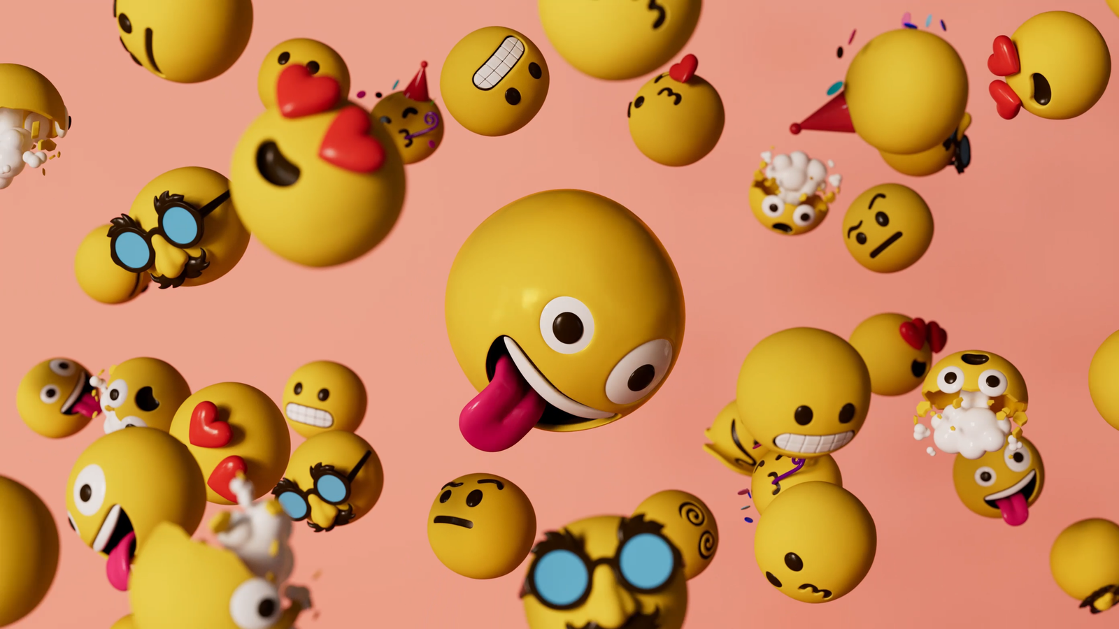
By handing over the keys to the library via GitHub, Google is inviting developers, artists, and creators to take these 3,977 characters into environments Google could never have predicted. This is a rare move for a major tech conglomerate, signaling a shift toward community-driven design standards. By ensuring that these assets are freely available, Google is not just updating its own products; it is raising the bar for the entire digital communication landscape.
Implications for the Future of Digital Communication
The rollout of Noto 3D has several far-reaching implications for both the tech industry and the casual user.
1. Unified Visual Standards
As Android continues to dominate a significant portion of the global smartphone market, the Noto 3D library will provide a consistent visual "dialect." By creating a standardized, high-quality set of 3D assets, Google reduces the fragmentation that often occurs when emoji are rendered differently across various apps and services.
2. The Democratization of Design
By open-sourcing the collection, Google is effectively subsidizing the design costs for smaller developers. A startup building a messaging app no longer needs to commission custom emoji sets to look professional; they can utilize the industry-leading Noto 3D library, ensuring that their users have access to expressive, modern, and accessible icons from day one.
3. Accessibility and Inclusivity
The focus on "universal readability" is not just about aesthetics; it is an accessibility play. High-contrast, clearly defined, and emotionally distinct emoji are easier for users with visual impairments to identify. By simplifying the geometry, Google is making digital communication more inclusive for a wider demographic of users.
4. Setting a New Industry Benchmark
Competitors like Apple and Microsoft have their own design languages for emoji. Google’s move to make Noto 3D open-source creates a competitive pressure that may force other tech giants to justify their own design choices. Will they follow suit in making their assets more accessible, or will they continue to gate-keep their visual identities?
Conclusion: The Living Language of Pixels
Google’s Noto 3D project is a testament to the fact that even the smallest digital elements require massive amounts of thought, research, and technical rigor. By prioritizing emotional clarity over unnecessary graphical flair, Google has successfully modernized the emoji, ensuring they remain relevant in an increasingly visual world.
As the rollout continues, users across the globe will begin to see these 3D characters appearing in their notifications, chat threads, and emails. They are more than just pictures; they are the result of a scientific approach to human emotion, translated into a format that belongs to everyone. Whether you are sending a simple "thumbs up" or a complex emotional reaction, the work behind Noto 3D ensures that your message is read, understood, and felt exactly as intended.
For those interested in exploring the library, the full gallery is available on the Google Fonts GitHub repository. The future of digital expression is here, and it is three-dimensional.