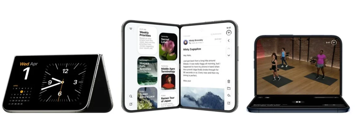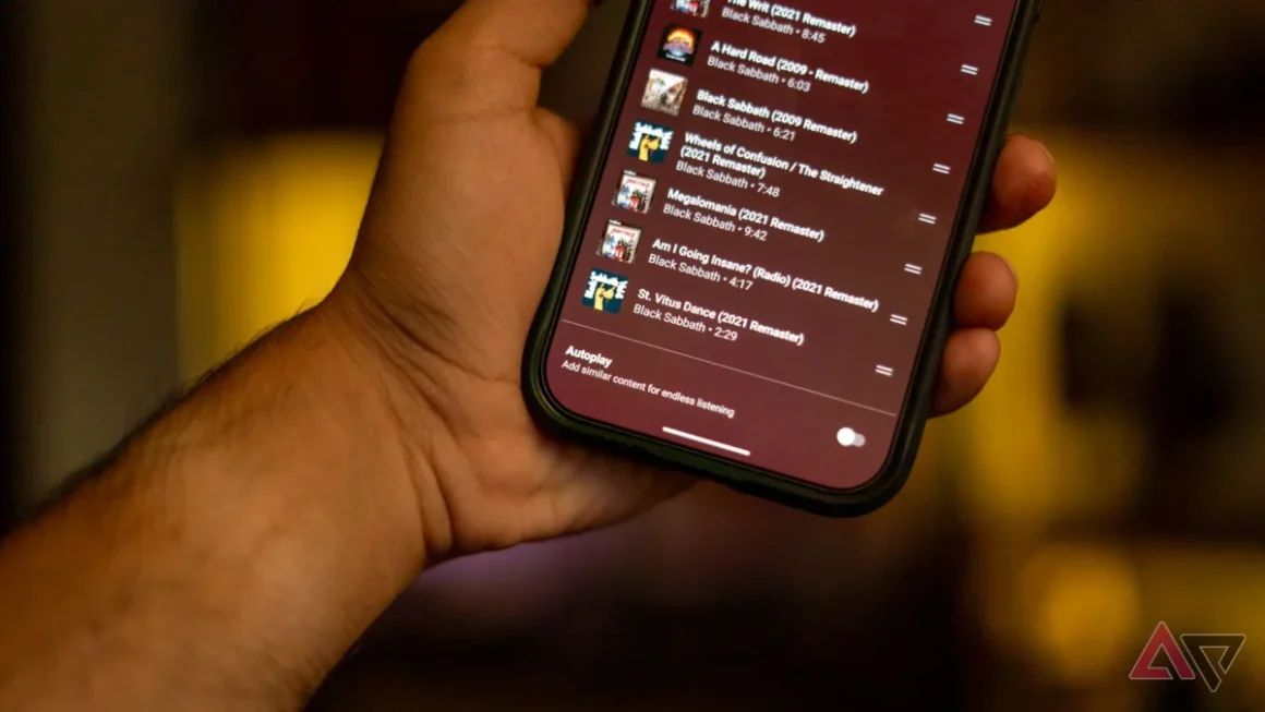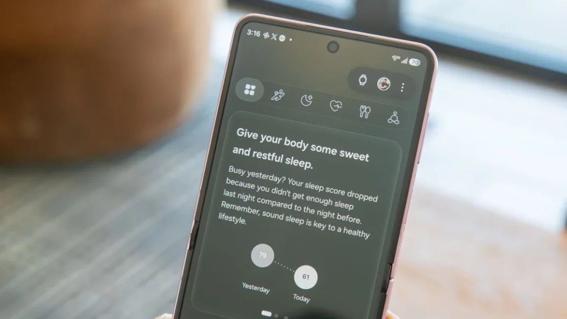


For years, the design philosophy governing Google’s suite of applications on iOS has been a delicate balancing act. The company has sought to maintain a distinct "Google" identity—characterized by its Material Design principles—while simultaneously respecting the rigid, polished aesthetic requirements of Apple’s Human Interface Guidelines. Today, that balance is shifting. As "Liquid Glass" celebrates its first anniversary, Google is aggressively rolling out this translucent, depth-focused design language across its iOS portfolio, marking the most significant visual overhaul for the platform since the transition to Material 3.
Main Facts: The Transition to Liquid Glass
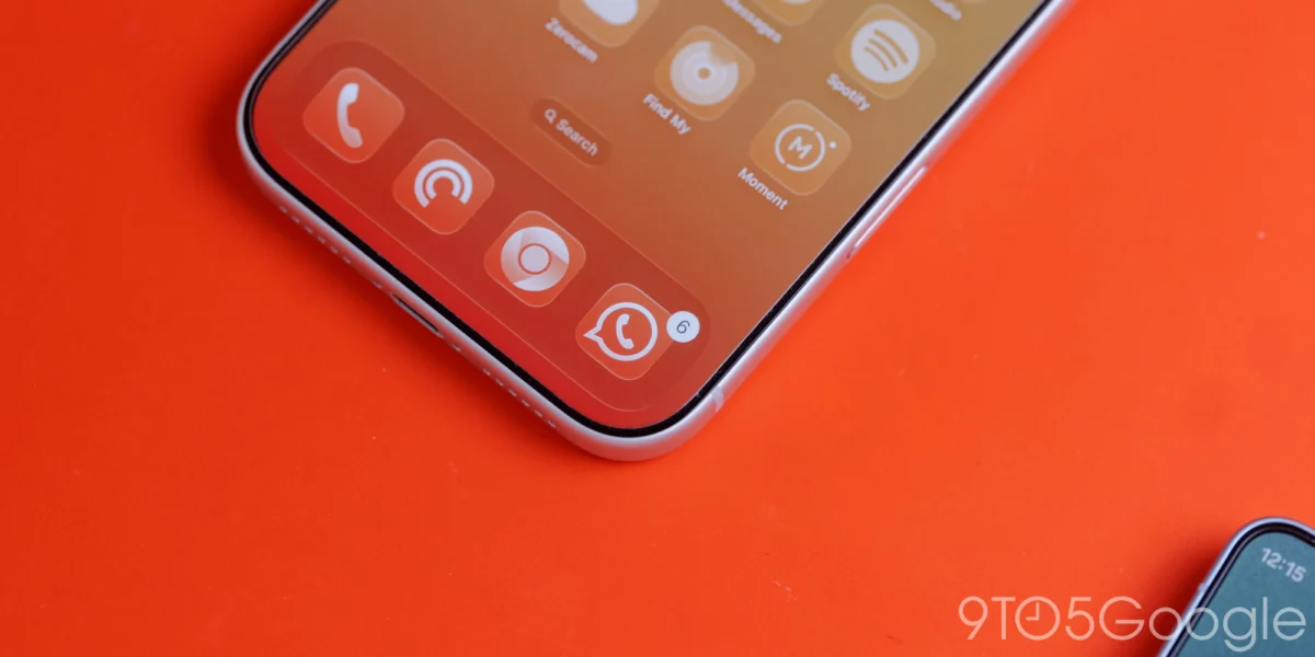
The core of this update centers on the implementation of "Liquid Glass," a visual design paradigm that replaces solid, opaque backgrounds with a sophisticated, frosted, and translucent material. This change is not merely cosmetic; it is a fundamental shift in how Google apps occupy space on an iPhone. By allowing the content behind navigation bars, floating action buttons (FABs), and headers to bleed through with a blurred transparency, Google is aiming to create a more immersive and layered user experience.
The rollout is currently manifesting most clearly in Google Photos (version 7.94) and Google Health. In Google Photos, the iconic floating bottom navigation bar—previously a static, solid block—has been transformed into a dynamic, semi-transparent element. Users now have access to variable translucency settings, offering a "Default" view and a "More clear" option. This allows the underlying imagery to subtly influence the interface, bridging the gap between functional UI elements and the personal content users cherish.
Furthermore, Google has extended this treatment to its top-bar buttons and the navigation elements within the Google Health application. Even the "Ask Coach" floating action button has received a frosted glass treatment, signaling that Google is committed to applying these depth-heavy textures across every touchpoint of its iOS ecosystem.
Chronology: From Material Design to Liquid Glass
To understand the gravity of this update, one must look at the progression of Google’s design language over the last decade.
The Material Design Era (2014–2020)
Google’s initial foray into a unified design language, "Material Design," was revolutionary. It introduced the concept of digital "paper" and "ink," relying on shadows and elevation to define hierarchy. On iOS, however, this often felt incongruous. Google apps looked like "Android apps living on an iPhone," which often alienated users who preferred the native look and feel of iOS.
The Shift to Material 3 (2021–2024)
With the introduction of Material 3, Google began focusing on "Expressive" design. This included larger, bolder typography, more rounded corners, and the introduction of Dynamic Color on Android. While these changes made Google apps more modern, the iOS versions remained largely flat and opaque, missing the "depth" that defines the modern iOS aesthetic.
![Google combines Material 3 Expressive & Liquid Glass on the iPhone [Gallery]](https://9to5google.com/wp-content/uploads/sites/4/2026/03/Liquid-Glass-dock-on-iPhone-17-Pro-Max.jpg?quality=82&strip=all&w=1600)
The Liquid Glass Milestone (2025–2026)
One year ago, Google introduced Liquid Glass, a design language specifically engineered to provide the "depth" that Material 3 lacked on non-Android platforms. By leveraging the hardware acceleration of modern iPhones, Google began experimenting with real-time blurring and translucency. The update to version 7.94 of Google Photos represents the culmination of this year-long experimental phase, moving Liquid Glass from a niche design element to a standard requirement for all Google-branded iOS applications.
Supporting Data: Why Translucency Matters
The move toward Liquid Glass is backed by extensive user interface research conducted by Google’s design teams. In modern mobile computing, "contextual awareness" is the goal.
- Visual Hierarchy: By allowing content to show through navigation bars, the UI feels less "heavy." Users are constantly reminded of the content they are browsing, which reduces the perceived barrier between the navigation tools and the user’s photos or documents.
- Color Tinting: In Dark Mode, the default blue accent color of the tab indicator is now influenced by the blur effect of the Liquid Glass, creating a cohesive visual harmony that was previously impossible with solid backgrounds.
- Hardware Efficiency: Contrary to popular belief, modern iOS devices are highly optimized for these types of blur effects. The Metal API allows Google to render these translucent layers with minimal battery impact, ensuring that the "premium" look does not come at the cost of device performance.
While the adoption is widespread, it is not yet universal. Applications like Google Docs, Sheets, Slides, and Keep remain the final holdouts of the older Material Theme design language. However, the recent, successful transition of Google Tasks serves as a blueprint for the remaining apps, indicating that a total migration is likely to be completed by the end of the fiscal year.
Official Responses and Strategic Intent
While Google has not released a formal "manifesto" regarding the Liquid Glass transition, internal documentation and design blog posts suggest a clear strategic pivot. The goal is to move away from the "platform-agnostic" approach and toward a "platform-native" hybrid.
Google acknowledges that iOS users hold a high standard for visual polish. By adopting Liquid Glass, the company is signaling that it is no longer content with being an "outsider" on the iPhone. It wants its apps to feel like they belong on iOS, effectively competing with Apple’s own native offerings in terms of visual fluidity and aesthetic appeal.
When questioned about the potential for "Dynamic Color"—a hallmark of Android’s Material You—on iOS, Google representatives have been notably hesitant. The current consensus is that without deep, system-level access to the iOS wallpaper and color palette, a true "Dynamic Color" implementation would feel forced and inconsistent. Consequently, Google is focusing on the "Liquid Glass" translucent aesthetic, which complements the existing iOS system look without needing to override the user’s OS-level color preferences.
Implications: What This Means for the Future
The shift toward Liquid Glass carries significant implications for the future of the Google-Apple relationship and the user experience at large.
![Google combines Material 3 Expressive & Liquid Glass on the iPhone [Gallery]](https://9to5google.com/wp-content/themes/ninetofive/dist/images/google-preferred-source-badge-dark.png)
1. The Death of the "Android Look" on iOS
For years, Google apps were easily identifiable by their solid, colorful, and sometimes jarring design choices. With Liquid Glass, Google is embracing the "glassmorphism" trend that Apple itself popularized with iOS 7 and refined throughout the years. This convergence makes the transition between native Apple apps (like Photos) and Google apps (like Google Photos) much less jarring.
2. A Call for Unified Design
By phasing out the legacy Material Theme, Google is simplifying its development cycle. Maintaining two disparate design systems—one for Android and one for iOS—is expensive and error-prone. By aligning the "look and feel" of the UI elements (like the FAB and navigation bars) across platforms, Google can streamline its design team’s workflow, allowing them to focus on feature parity rather than visual styling.
3. The Ceiling of Customization
The most interesting takeaway from this update is what it doesn’t include. By explicitly ignoring Dynamic Color for iOS, Google is showing a mature understanding of its ecosystem. It recognizes that Apple’s "walled garden" prevents certain types of deep-system integration. Rather than trying to force a square peg into a round hole, Google is choosing to optimize the feel of the apps (translucency, blur, motion) while leaving the color scheme and theming to the OS level. This is a pragmatic, professional move that benefits the end-user by maintaining the stability and reliability of the iOS experience.
4. User Expectations
As users become accustomed to these new visual standards, the pressure mounts on the remaining holdouts. The discrepancy between an updated app like Google Photos and an outdated one like Google Keep will become increasingly apparent. This creates a "design debt" that Google must resolve to maintain its reputation for premium software. We can expect a rapid series of updates to the Workspace suite in the coming months as the company seeks to finalize the Material 3 transition.
Conclusion
Google’s adoption of Liquid Glass is more than a simple aesthetic update; it is a declaration of maturity in the iOS space. By embracing the translucent, depth-based design language that defines the modern iPhone experience, Google is effectively removing the last major friction point for its users.
While the company remains firm in its decision to omit Android-specific features like Dynamic Color, it is leaning into the strengths of the iOS platform to create a more fluid, modern, and cohesive interface. As the rollout continues across the remainder of the Google Workspace suite, users can expect a more unified and premium experience that finally bridges the gap between Google’s ambitious design language and the refined aesthetic of the iPhone. The "Liquid Glass" era is here, and it is changing the way we interact with our favorite Google services, one pixelated layer at a time.