








In the world of modern web development, few user interface elements are as ubiquitous—or as deceptively complex—as the dark mode toggle. For years, standard web design practices have gravitated toward a familiar tri-state pattern: Light, Dark, and System. Users are routinely presented with a drop-down menu, a sun-and-moon icon trio, or a segmented control allowing them to explicitly declare their allegiance to one of these three options.
However, prominent web standards expert and developer Lea Verou is sparking a major industry debate by arguing that this tri-state paradigm is fundamentally flawed. In a pair of widely discussed essays, Verou contends that the standard three-state persistent dark mode toggle is an unnecessary cognitive burden. Instead, she advocates for a streamlined, two-state UX pattern—or, ideally, abandoning persistent toggles altogether in favor of native browser controls and system defaults.
Her arguments have sent ripples through the front-end development community, igniting intense discussions on blogs, code repositories, and social platforms regarding how websites handle color schemes, user intent, and minimalist design.
Main Facts: The Core Arguments Against Tri-State Toggles
At the heart of Verou’s thesis is a simple, minimalist principle: Less UI that accomplishes the same goal as more UI is generally a better design.
When websites include a persistent dark mode toggle in their header or navigation bar, they are typically implementing a three-state control:
- Light Mode (Force light regardless of OS settings)
- Dark Mode (Force dark regardless of OS settings)
- System / Auto (Match the operating system’s current theme)
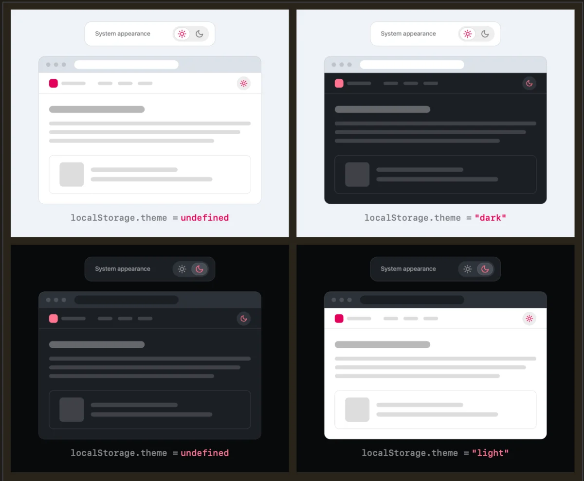
Verou argues that the "System" option is redundant clutter. According to her analysis, a well-designed two-state control can effortlessly express all three logical states without requiring a dedicated third button.
The mechanism operates on a straightforward logic flow:
- Default State: By default, the website has no explicit user preference stored. It simply respects the visitor’s operating system settings via media queries (
prefers-color-scheme). - The Override: If the user dislikes the current system-dictated appearance, they click the toggle once to apply an override. That specific choice is then securely cached in the browser’s
localStoragefor all future sessions.
By removing the explicit "System" option from the visible interface, developers can reduce visual noise, eliminate cognitive dissonance, and streamline navigation bars without losing any core functionality.
Chronology: How the Dark Mode Debate Evolved
To understand how the industry arrived at this UX crossroads, it helps to look at the timeline of web personalization and color scheme implementation:
- The Early Era of Fixed Themes: For decades, websites were predominantly designed with light backgrounds and dark text. Web designers dictated the aesthetic, and users had little to no control over the color scheme outside of browser-level plugins.
- The Rise of Operating System-Level Themes: As mobile and desktop operating systems introduced native dark modes (spearheaded by macOS, iOS, Windows, and Android), developers gained access to the
prefers-color-schemeCSS media query. This allowed websites to automatically adapt to the user’s OS preference without requiring a manual website switch. - The Proliferation of Persistent Toggles: To satisfy power users who wanted a dark operating system but a light web browsing experience (or vice versa), developers rushed to add manual toggles to their sites. The tri-state model quickly became the default template across modern frameworks and component libraries.
- August 2026 – The Verou Intervention: Lea Verou publishes her landmark blog post, "Dark Mode Toggles and Good Two-State UX," challenging the necessity of the tri-state switcher. The post immediately generates heavy engagement across web development communities.
- August 6, 2026 – Community Feedback & Discussion: Developers weigh in across platforms like Bluesky and CSS-Tricks, debating the edge cases of state management, user intent, and browser-level defaults.
- Mid-August 2026 – The Follow-Up Analysis: Responding to community pushback and edge-case scenarios, Verou publishes a follow-up essay summarizing the debate, reinforcing her core guidelines, and clarifying when—if ever—a tri-state control remains appropriate.
Supporting Data and Technical Edge Cases
While Verou’s minimalist approach appeals to aesthetic purists, engineering teams naturally gravitate toward the edge cases. One of the primary technical questions raised during the community debate involved state persistence and reversion.
The Reversion Dilemma
Consider the following user journey:
- A visitor arrives at a website where their system preference is currently set to Light.
- The user clicks the toggle to switch the site to Dark.
- Later, the user changes their mind and toggles the site back to Light.
The technical question arises: What should localStorage record when a user toggles back to the state that matches their system preference? Does it save an explicit override for "Light," or does it clear the localStorage value entirely to revert to a dynamic "System" state?
According to Verou, this edge case is largely irrelevant because theme switching is inherently tangential to the user’s primary intent for visiting the website. Users do not visit a documentation site, e-commerce store, or news outlet to play with color schemes; they visit to read, buy, or learn.
As Verou notes:
"Remember, this control is entirely tangential to the actual user goal for visiting the website. Even if their intent were to pin light instead of reverting to System (light), this is something they would only notice once these diverge, i.e. the OS switches to dark. At that point, fixing it is a single click away. It’s such an easy fix, that there is no point in dwelling on it further."
When is a Tri-State Control Actually Appropriate?
Despite her skepticism toward universal tri-state headers, Verou concedes that there are isolated scenarios where three distinct states are genuinely required. Her guidance highlights two specific conditions:
- Ambiguous Default Contexts: When the default state cannot be reliably inferred from the system environment, or when the application deals with multi-layered contextual themes (e.g., app-specific themes versus global OS themes).
- Strict Compliance or Enterprise Requirements: Applications where users must explicitly lock in a setting for accessibility, brand compliance, or session-specific continuity across multiple disparate devices where OS settings do not sync.
Official Responses and Developer Community Reactions
The development community’s reaction to Verou’s proposals has been remarkably passionate, reflecting broader frustrations with modern web bloat.
Front-end engineers and UI/UX designers chimed in to discuss the psychological weight of persistent navigation elements. Placing a persistent, multi-item widget in a primary navigation bar introduces cognitive friction. Every extra icon, dropdown arrow, or text label demands micro-processing power from the user’s brain.
A particularly compelling perspective emerged from developer Chris Coleman, who highlighted a deeper philosophical issue regarding browser behavior and user autonomy:
"All I ever wanted was for my OS to be dark, not every website I look at. It was a huge leap by the browser vendors to tie all web content to that system preference. Anyway, I think the light/dark preference should be in the browser, and what you propose seems perfectly in line with that."
This perspective shifts the blame away from individual website creators and points toward browser vendors. If web browsers eventually incorporate granular, native preference controls—allowing users to dictate default behaviors per domain or globally at the user-agent level—individual websites could safely purge custom dark mode toggles from their headers altogether.
Broader Implications for Web Design and Accessibility
The debate sparked by Lea Verou’s essays goes far beyond a simple buttons-versus-menus argument. It touches upon several critical pillars of modern web development:
1. Reducing Cognitive Load in Navigation
Navigation bars are prime real estate. Every pixel dedicated to utility toggles—search bars, language selectors, profile avatars, and theme switchers—takes away focus from the primary content. By collapsing a three-state toggle into a seamless two-state override (or eliminating it entirely), developers create cleaner, less distracting layouts.
2. Respecting User Intent
Web design must constantly balance active user choices with passive environmental preferences. When developers rely too heavily on explicit manual configuration, they place administrative labor onto the user. A robust system-first fallback model respects the user’s pre-configured operating environment while offering a frictionless escape hatch for those with specific visual needs.
3. The Ultimate Solution: No Toggle at All?
In her follow-up publication, Verou takes her argument to its logical conclusion: The absolute best dark mode toggle is often no toggle at all.
By relying entirely on robust CSS media queries (prefers-color-scheme), developers can deliver a fully automated, lightning-fast experience that requires zero JavaScript state management, zero localStorage calls, and zero visual clutter in the navigation bar. For sites that truly must offer manual overrides, Verou’s two-state pattern remains the gold standard for minimalist design.
Conclusion
Lea Verou’s critique of the traditional tri-state dark mode toggle serves as a timely reminder that web development often accumulates design patterns out of habit rather than necessity. By critically evaluating how users interact with color scheme controls, designers can strip away redundant UI elements, reduce cognitive friction, and build cleaner, more intuitive web experiences.
Whether developers choose to adopt the two-state override pattern or phase out persistent toggles in anticipation of native browser-level controls, one thing is certain: the era of the cluttered, three-option theme switcher is facing a well-deserved reckoning.