








In the realm of digital and print design, the most critical battle for attention is often fought in the smallest spaces. Whether it is a footnote in a dense legal document, a label on a complex mobile dashboard, or the body text of a refined editorial spread, the ability to maintain legibility at reduced sizes is the hallmark of a master typographer. When text shrinks, the margin for error evaporates; a font that appears elegant at 48 points can quickly devolve into a chaotic blur at 8 points.
This guide explores the essential criteria for selecting small-text fonts and provides a curated list of professional-grade typefaces—both premium and free—that prioritize clarity without sacrificing aesthetic personality.
The Core Principles of Micro-Typography: Why Size Matters
Readability is not merely about whether a user can identify a letter; it is about how effortlessly the eye can traverse a line of text. At small scales, the human eye struggles to distinguish between similar glyphs, such as the "e," "o," and "c," or the "l," "I," and "1."
Chronology of Design Evolution
Historically, type design was governed by the limitations of the printing press and the physical properties of lead type. As we transitioned to digital displays, the challenge shifted from ink-bleed to pixel-grid rendering. Today, modern type design incorporates "hinting"—instruction sets that tell a font how to align with a pixel grid—to ensure that even at 9 or 10 pixels, the integrity of the character form remains intact.
Supporting Data: The Anatomy of a Legible Font
To ensure your content remains approachable, designers should prioritize fonts with:
- Large x-Heights: The height of the lowercase "x" relative to the capital letters. A higher x-height makes characters appear larger and more open.
- Open Counters: The white space inside letters like "o," "p," and "a." If these are too closed, they fill in at small sizes, causing visual noise.
- Uniform Stroke Widths: High-contrast fonts (with extremely thin hairlines and thick stems) often suffer from "dropout," where the thin parts of the letter disappear entirely when rendered on lower-resolution screens.
Premium Font Families for Small-Scale Mastery
For professional projects where brand identity and precision are paramount, investing in a high-quality font family is essential.
1. Quarty: The Serif Specialist
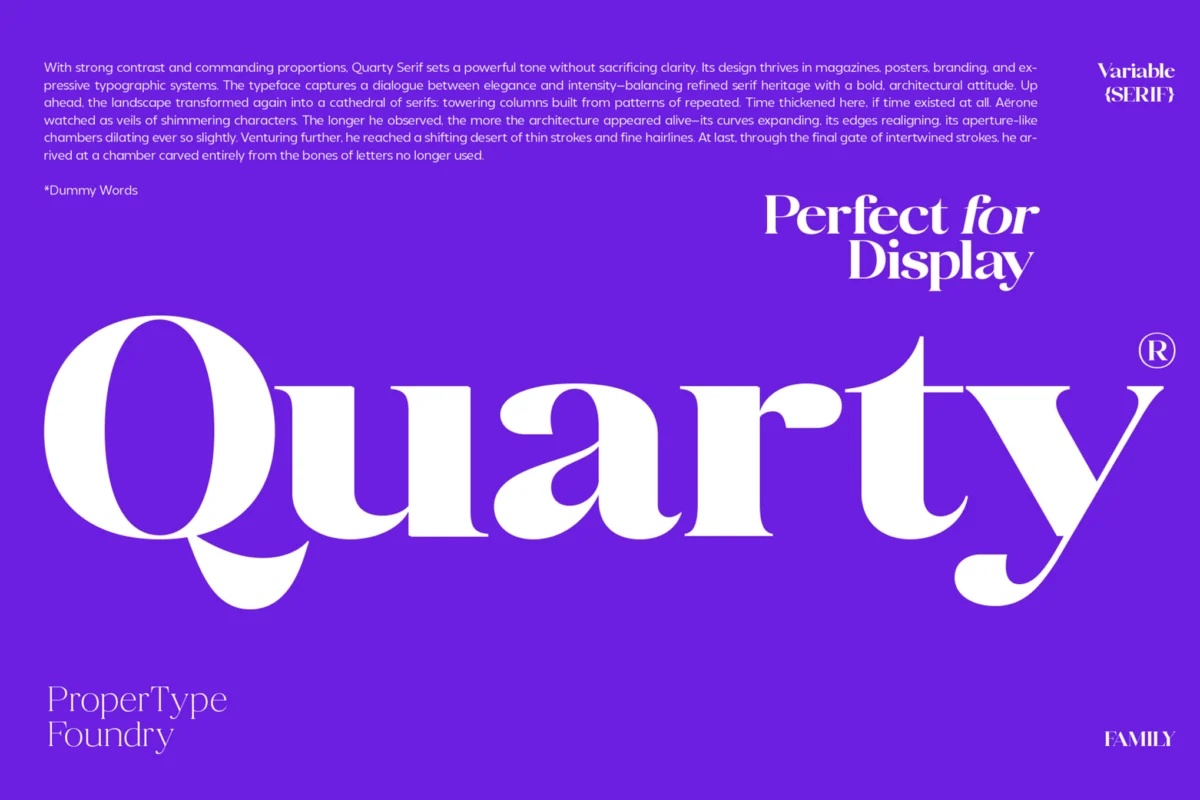
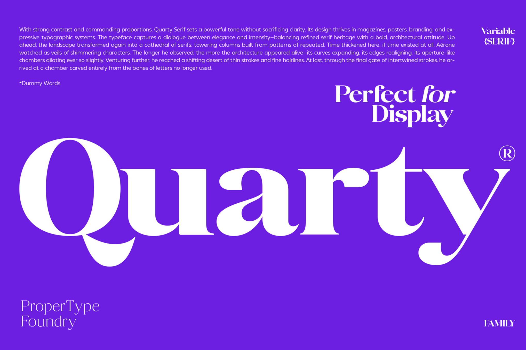
Quarty is a triumph of balance. By blending geometric structure with graceful, organic curves, it retains a sophisticated character even when reduced to fine print. It is particularly effective for high-end editorial layouts where you need the prestige of a serif font that doesn’t sacrifice performance.
2. Carlgine: The Versatile Workhorse
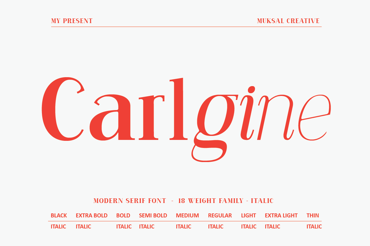
With an expansive 18-weight family, Carlgine provides the designer with surgical control. From its "Thin" weights, which remain remarkably crisp, to its "Black" weights for emphasis, this serif family is designed for professional branding that must scale from a billboard to a business card.
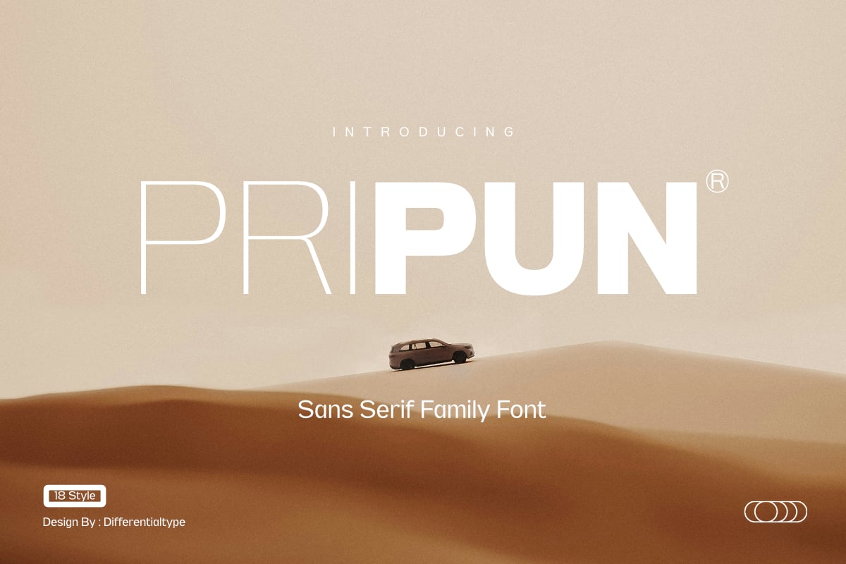
3. Pripun: The Sans-Serif Benchmark
Pripun stands out as a clean, highly legible sans-serif. Its precision-engineered letterforms ensure that each character is distinct, making it an ideal candidate for dense data visualization or complex dashboard interfaces where clarity is non-negotiable.
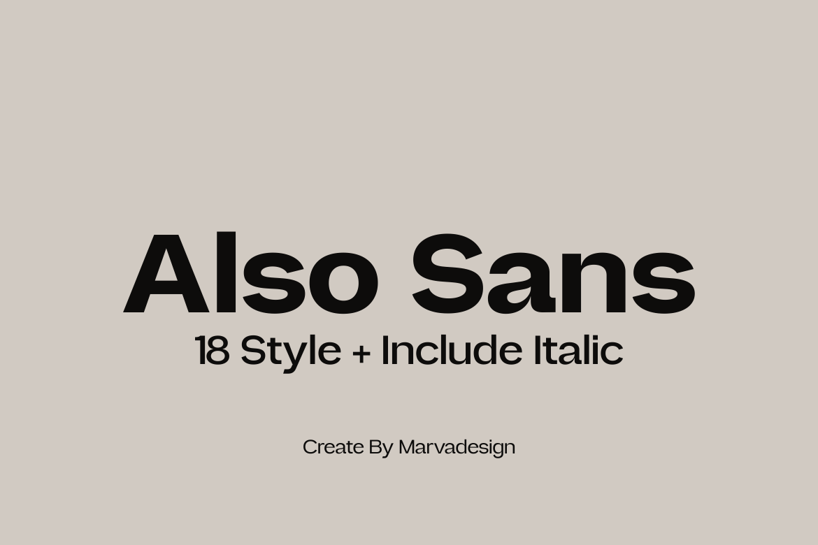
4. Also Sans: Simplicity in Form
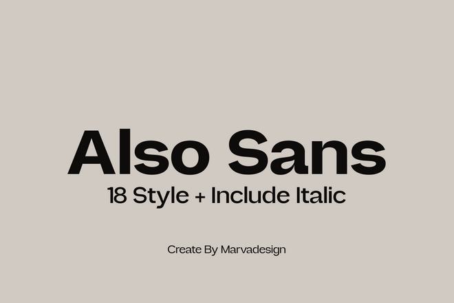
Also Sans is built on the philosophy of open, airy shapes. Its generous counter-spaces allow for excellent legibility, preventing the "clumping" effect that often plagues sans-serifs at small sizes.
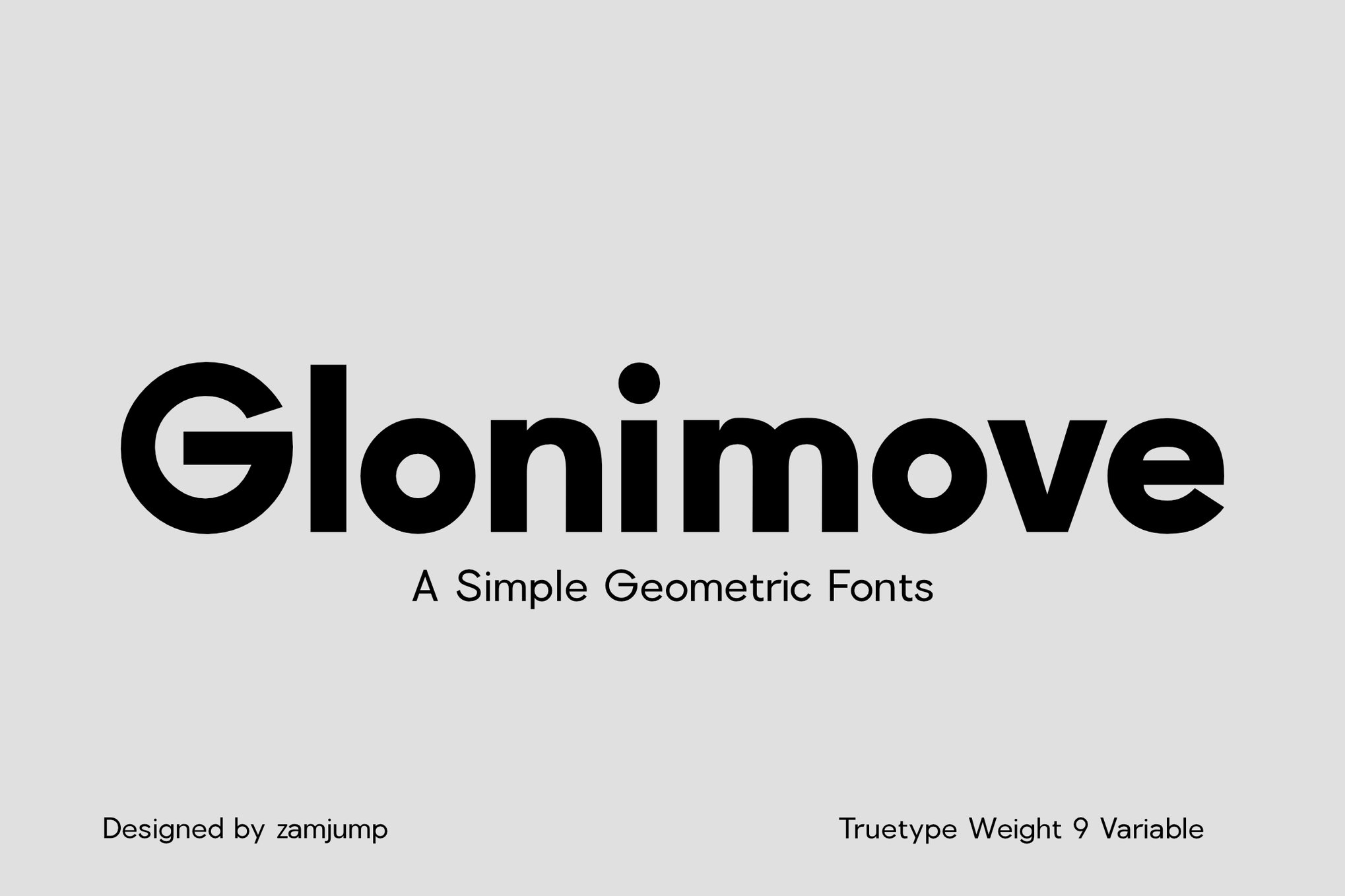
5. Glonimove: Modern Geometric Precision
Geometric fonts can be notoriously difficult to read at small sizes, but Glonimove subverts this by applying subtle adjustments to its curves. It is a perfect choice for tech-forward brands looking for a clean, modern aesthetic.
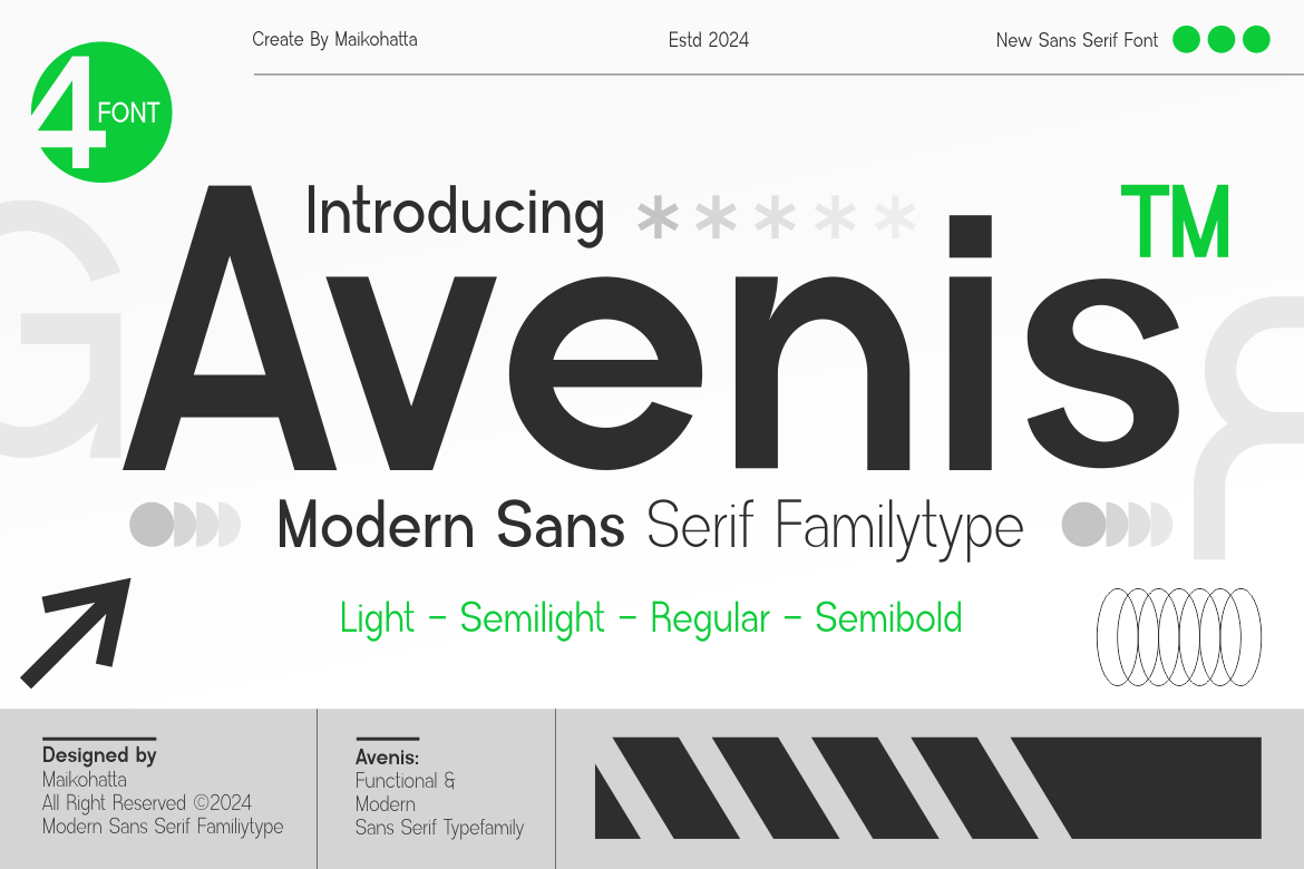
6. Avenis: The Modern Standard
Avenis offers a neutral, highly readable profile. It is the ideal "workhorse" typeface for long-form content where the reader should focus on the message rather than the font’s personality.
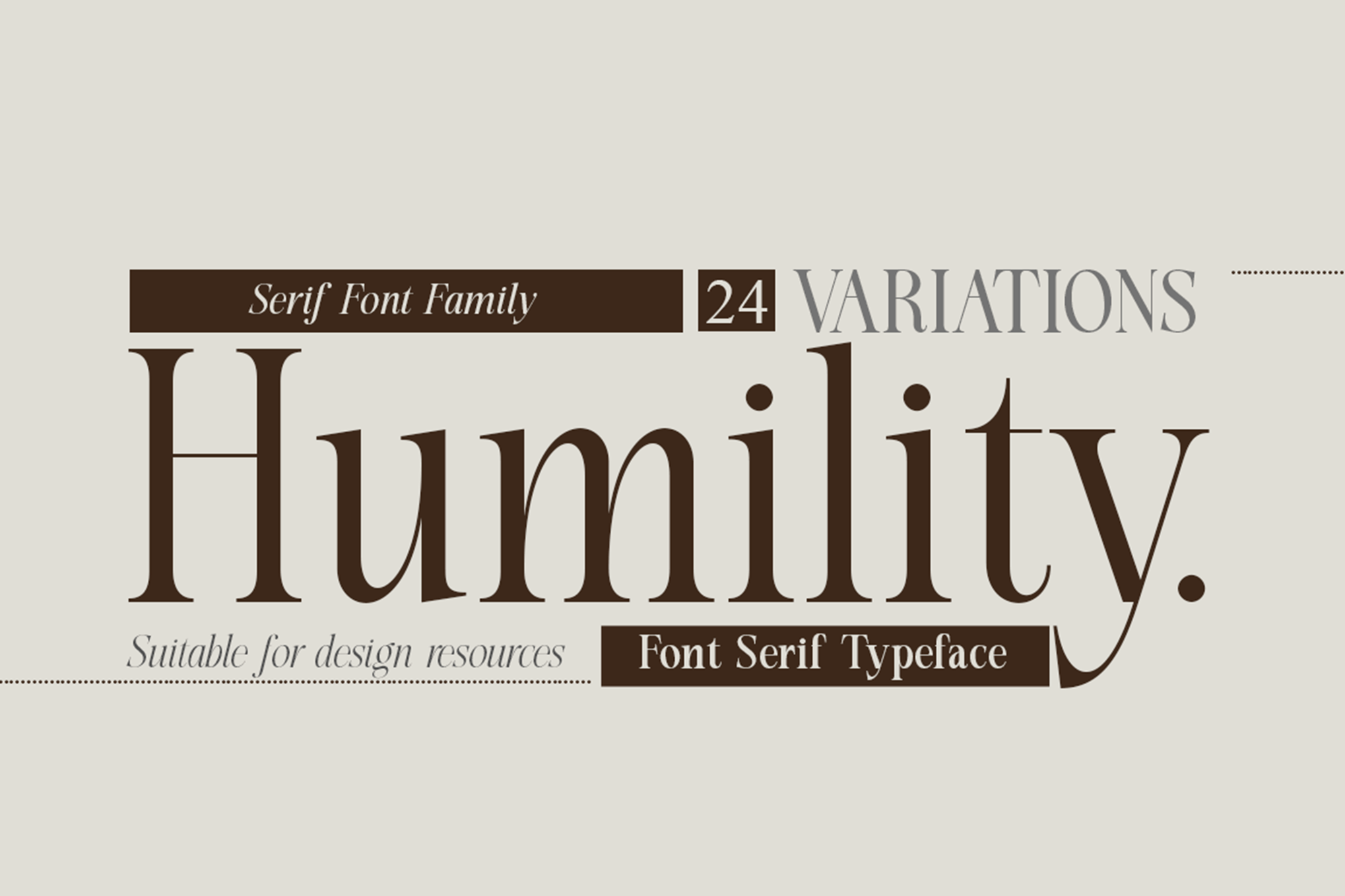
7. Humility: A Vintage Flair
For projects requiring a touch of character, Humility brings a classic serif sensibility to small text. It performs exceptionally well in fashion publications or creative branding where a "classic" feel is required without losing readability.
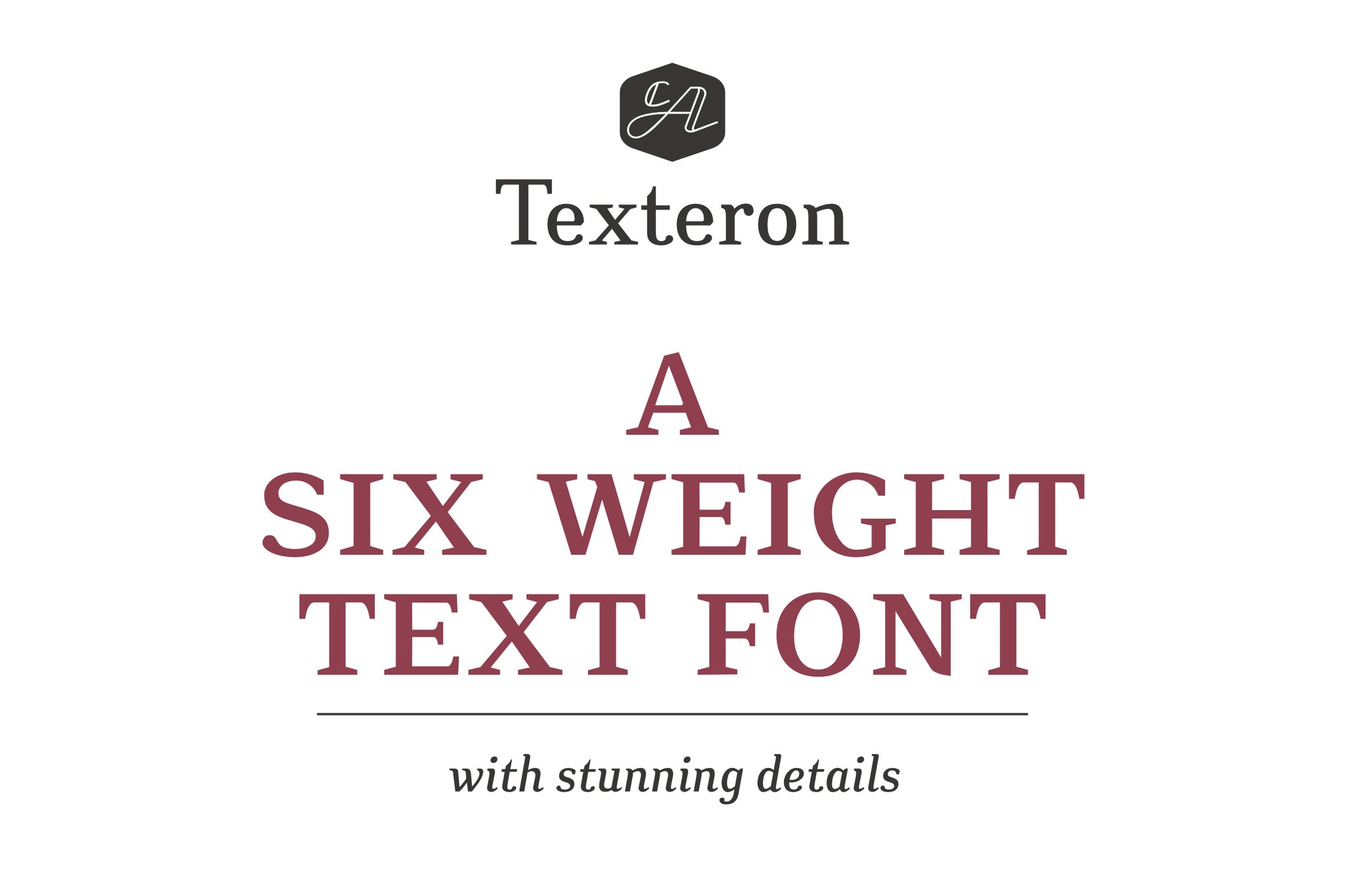
8. Texteron: The Traditionalist
Texteron merges classical type-design principles with modern technical requirements. Its inclusion of small caps and distinct italic weights makes it a superior choice for professional publishing.
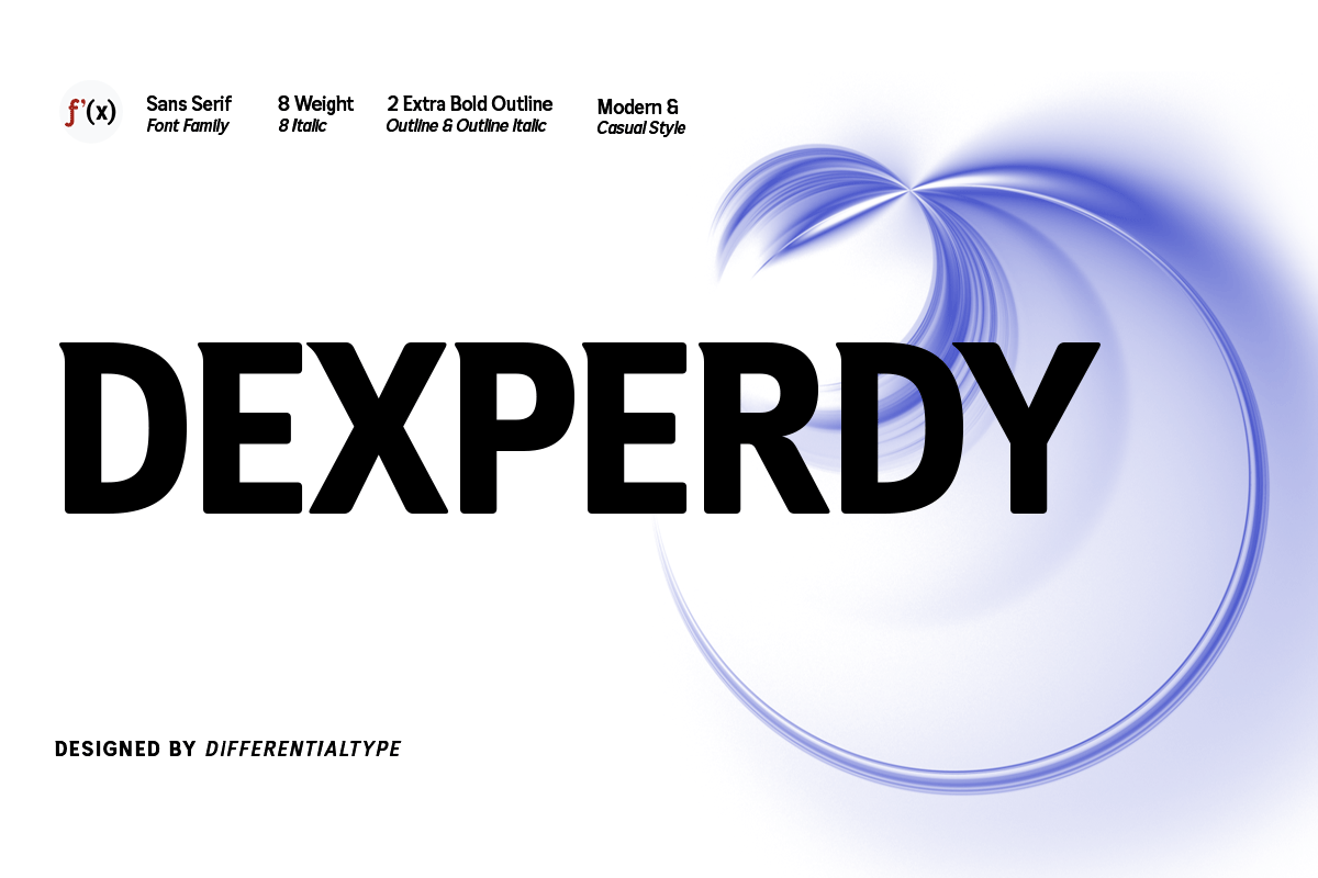
9. Dexperdy: Bold and Impactful
Dexperdy proves that a font can be bold and legible simultaneously. Its eight weights allow for a robust hierarchy, ensuring that even at small sizes, headers and sub-labels remain distinct.
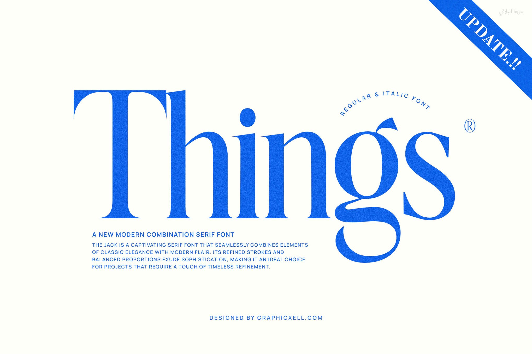
10. Things: The Elegant Modern Serif
Things provides a bridge between traditional editorial elegance and modern digital requirements. It is particularly well-suited for high-density web content.
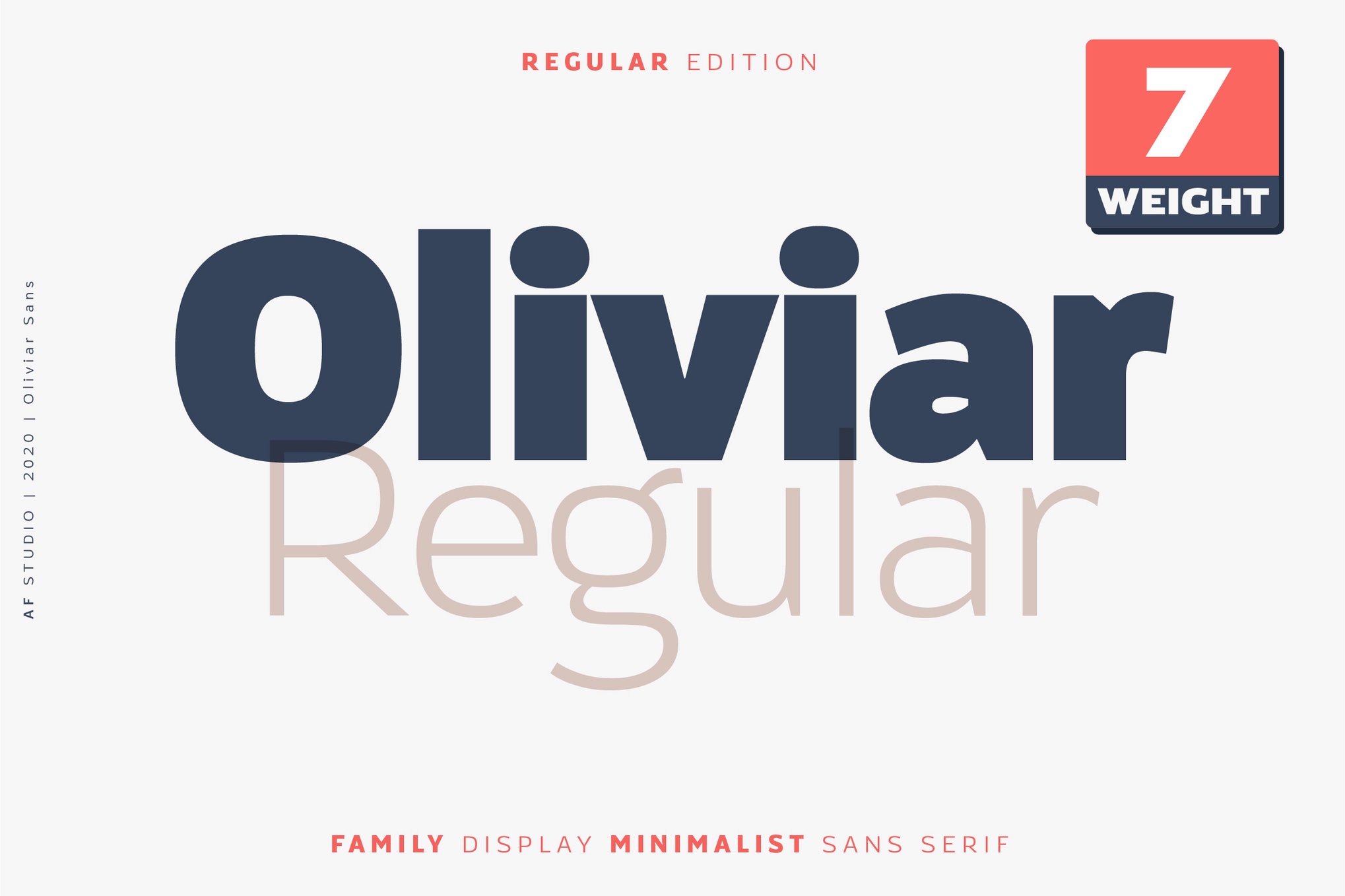
11. Oliviar: The Humanist Sans
Oliviar incorporates subtle humanistic influences into a geometric framework, resulting in a font that feels approachable yet professional.
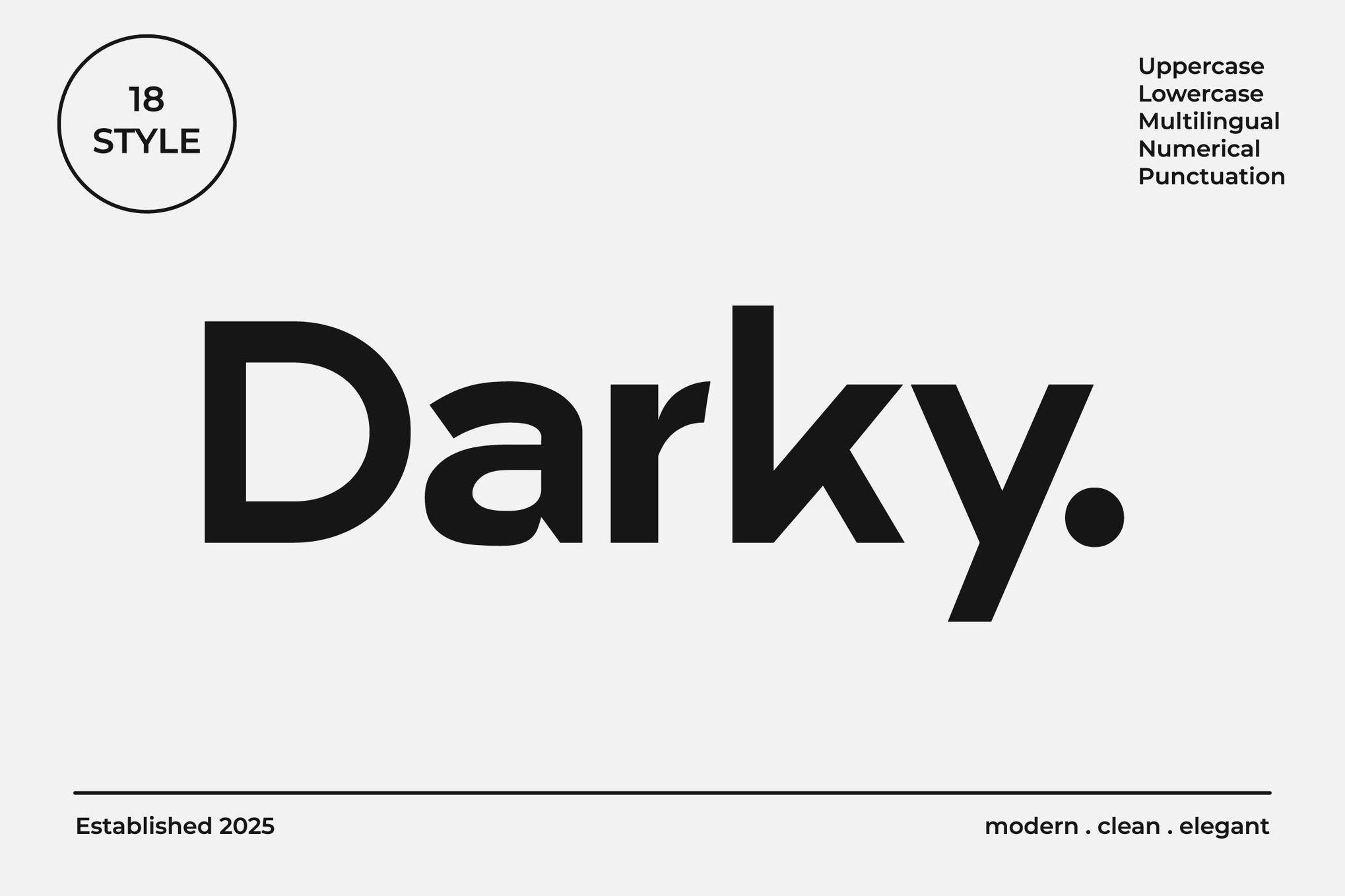
12. Darky: Minimalist Perfection
Darky is the epitome of "less is more." Its clean lines make it an excellent choice for social media graphics and minimalist interface design.
13. Venzia: Casual yet Classic
Venzia offers a slightly softer touch, making it a favorite for invitations and blog headers that need to feel accessible.
14. JUST Sans: Dynamic Typography
JUST Sans is a bold, modern choice that excels in UI/UX design. Its outline variations provide a unique aesthetic layer for interactive elements.
15. Midland: Luxury Redefined
Midland is designed for high-end applications, providing a level of refinement that works well in luxury magazine layouts and premium stationary.
16. Hurst: Narrow and Efficient
When space is at a premium, Hurst’s narrow proportions allow you to fit more text into a confined area without sacrificing legibility.
17. Vistol: The Neo-Grotesque
Vistol is a masterclass in low-contrast design, specifically tested to remain readable down to 4pt in print.
18. Raela Pro: Geometric Versatility
Raela Pro’s 18-weight range ensures that no matter the background or density of the layout, a readable weight is available.
19. Clayo: The Contemporary Standard
Clayo provides a sleek, modern look that fits perfectly into the contemporary digital landscape.
Free Alternatives: Quality Without the Price Tag
Professional design does not always require a massive budget. These four free fonts are industry favorites for their exceptional performance:
- Caviler: An excellent narrow sans-serif that maintains its shape and spacing under tight constraints.
- Orbito: Known for its rounded, friendly geometry that is highly readable on screens.
- Gudlak: A crisp, modern typeface that holds up well in dense blocks of text.
- Groza: Features wide, open counters that make even the smallest footnotes feel spacious and legible.
Expert Recommendations: 8 Tips for Choosing Small Text
To ensure your design is bulletproof, follow these professional guidelines:
- Clarity Over Personality: If the text is small, choose a font that is readable first. Save the "personality" fonts for your headlines.
- Optimize for x-Height: A tall x-height is your best friend when scaling down.
- Reject High Contrast: Avoid fonts with paper-thin hairlines; they disappear in low-resolution environments.
- Prioritize Spacing: Ensure your font has adequate "tracking" or letter spacing to avoid characters bleeding together.
- Real-World Testing: Never judge a font on a large monitor. Test it at the size it will actually appear in the final product.
- Digital Optimization: For web and mobile, look for fonts with specific screen-optimized hinting.
- Remove Decorative Clutter: Strip away excessive ligatures or ornamental swirls that might look messy at 10px.
- Weight Matters: A slightly heavier weight often reads better on screens than a "Regular" or "Light" weight, which can look faint against high-contrast backgrounds.
Implications for Future Design
As wearable technology and ultra-high-density mobile displays become the norm, the role of micro-typography will only grow in importance. Designers who master the art of the "small" will be the ones who define the readability of the future. By selecting from these curated, high-performance font families, you ensure that your design remains clear, professional, and impactful, no matter the scale.