




In the ever-evolving landscape of web design, few UI patterns have become as ubiquitous as the light/dark mode toggle. Nestled quietly in the navigation bars of blogs, documentation sites, and massive enterprise applications alike, these little sun and moon icons promise users agency over their visual environment. However, a recent, fiercely debated design discussion sparked by web standards expert Lea Verou suggests that designers might be overcomplicating things.
Verou has challenged the industry standard of utilizing a clunky three-state picker—Light, Dark, and System—arguing instead for a streamlined, minimalist two-state approach. The discourse has struck a nerve within the front-end development and UI/UX communities, forcing developers to reconsider how they handle user preferences, reduce cognitive load, and respect user intent.
Main Facts: The Core Debate Over Theme Switchers
At the heart of the debate is a fundamental question of interface efficiency: Why force users to manually select a "System" default option when a well-designed two-state control can naturally handle all necessary scenarios?
Traditionally, developers implement a tri-state dropdown or segmented button control offering:
- Light Mode
- Dark Mode
- System Preference
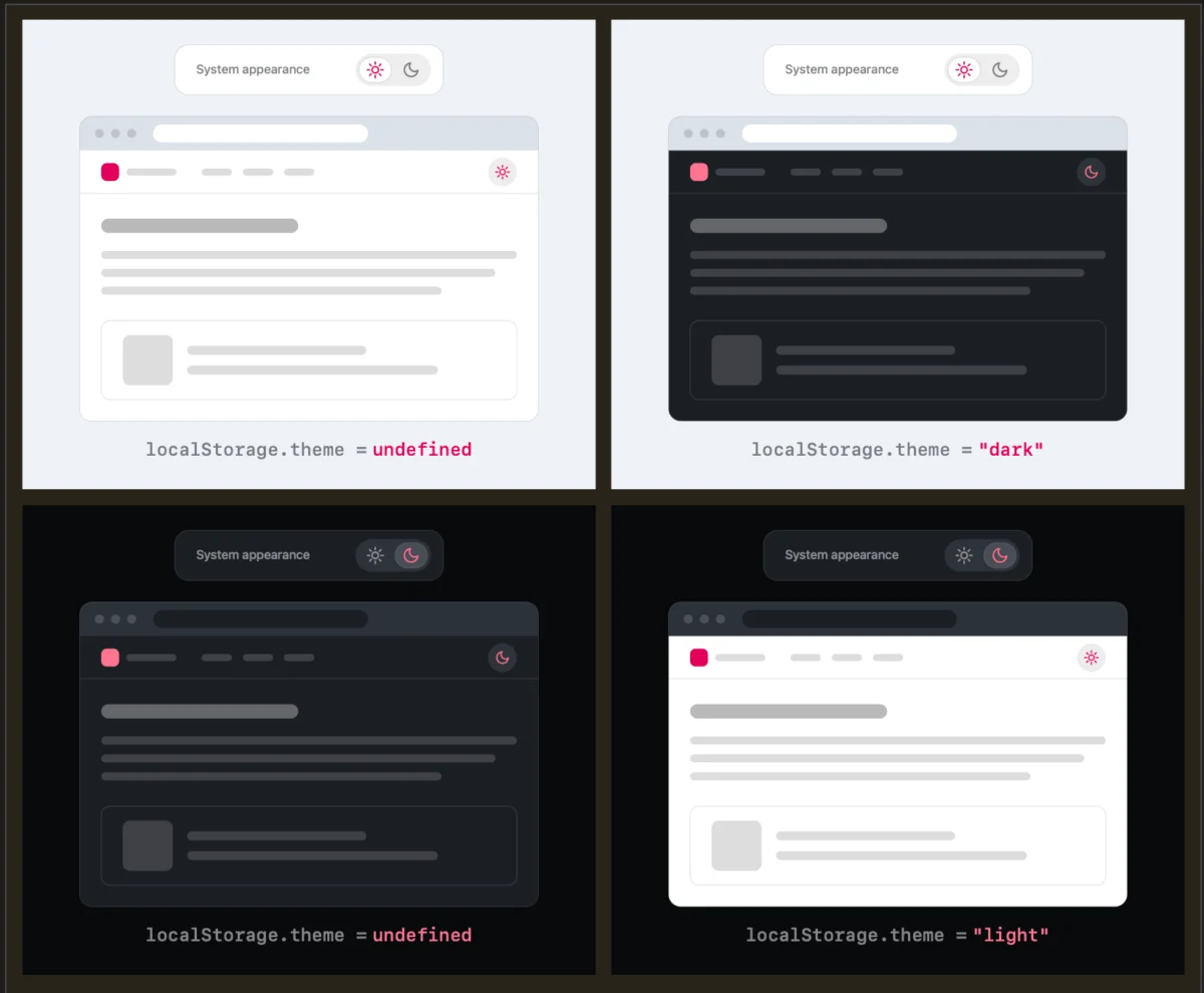
Verou’s proposal strips this down entirely. By default, a website should look to the user’s operating system or browser settings to determine whether to display a light or dark theme. If the user wishes to change the theme, they interact with a simple two-state toggle (e.g., switching from light to dark). That explicit choice is then saved locally—typically via localStorage—to override the system preference for future visits.
If the user never touches the toggle, the website gracefully falls back to whatever the system dictates. According to UI purists, this eliminates redundant UI elements, reduces visual clutter in high-traffic areas like headers and navigation bars, and simplifies the code required to manage state.
Chronology: How the Discussion Unfolded
The conversation surrounding theme toggles gained significant traction following a sequence of online discussions and deep-dive blog posts:
- Initial Pushback: Lea Verou published an initial critique challenging standard light/dark mode implementations, arguing that three-state options introduce unnecessary friction and cognitive overhead. Her arguments were illustrated with clear structural scenarios showing how state management behaves under different user actions.
- Community Engagement: The post immediately resonated across developer communities on platforms like Bluesky and CSS-Tricks, where engineers debated the nuances of state persistence, browser-level controls, and edge cases involving
localStorage. - The Follow-Up Synthesis: Following the flurry of feedback, Verou published a second blog post summarizing the community’s response. This follow-up clarified that the two-state guidance specifically targets persistent UI elements—such as toggles permanently pinned to a main site navigation—rather than deep settings menus.
Supporting Data and UX Mechanics: How Two States Manage Three Realities
To understand why a two-state control can successfully manage three distinct outcomes, one must examine how state inheritance and user overrides work in practice.
The Logic of the Override
When a user arrives at a website for the first time, the site reads the CSS prefers-color-scheme media query. If the user’s OS is set to dark, the site renders in dark mode. If light, it renders in light. At this stage, zero user interface controls have been engaged, and no override exists in localStorage.
The moment a user manually clicks the toggle to switch themes, they create an explicit preference. This action writes a value (e.g., theme: 'dark') to the browser’s localStorage. From that point forward, the site ignores system-level changes and honors the user’s explicit choice.
Addressing the Edge Case: Toggling Back
A common concern raised during the debate involves what happens when a user toggles a theme back to match their original system preference. For instance, if a user starts on a Light system preference, manually overrides it to Dark, and later decides they want it to match their system again, how does the interface respond?
Critics worried this might leave an ambiguous or undefined state within localStorage. However, UX advocates dismiss this as a non-issue. As Verou points out:
"Remember, this control is entirely tangential to the actual user goal for visiting the website. Even if their intent were to pin light instead of reverting to System (light), this is something they would only notice once these diverge, i.e. the OS switches to dark. At that point, fixing it is a single click away. It’s such an easy fix, that there is no point in dwelling on it further."
When Are Three States Actually Necessary?
While Verou advocates for the removal of tri-state pickers in persistent headers, she outlines specific scenarios where a three-state control remains appropriate:
- Dedicated Settings Panels: Inside an account preferences page or application settings menu where users expect granular control over every aspect of their UI experience.
- Complex Software Environments: In heavy web applications (like code editors or design tools) where users might want a theme that permanently decouples from the OS due to lighting conditions in their physical workspace.
Official Responses and Community Perspectives
The design community’s reaction has been largely supportive, though nuanced. Many front-end developers expressed relief at having permission to simplify their navigation bars. Header real estate is valuable, and every icon added increases cognitive dissonance for the visitor.
However, the conversation also opened up broader architectural debates about where theme preferences should live.
In a widely shared post on Bluesky, developer Chris Coleman highlighted a deeper systemic issue:
"All I ever wanted was for my OS to be dark, not every website I look at. It was a huge leap by the browser vendors to tie all web content to that system preference. Anyway, I think the light/dark preference should be in the browser, and what you propose seems perfectly in line with that."
This perspective shifts the blame away from website creators and points toward browser vendors. If browsers offered a universal, native configuration allowing users to dictate how individual sites handle color schemes, the burden on individual web designers would disappear entirely. Until browser manufacturers adopt such native features, however, developers must rely on smart client-side solutions.
Implications for Modern Web Design
The movement toward simplified dark mode controls carries several vital implications for designers, developers, and product managers:
1. Reduction of Cognitive Friction
Every element placed in a website’s navigation bar demands a fraction of the user’s attention. By eliminating redundant options—such as a dedicated "System" button when the system is already acting as the passive default—designers create cleaner, more focused user interfaces. Less UI almost always translates to a smoother user experience.
2. Prioritizing User Intent
Websites are rarely visited for the sole purpose of testing a theme toggle. Visitors come to read articles, purchase products, or use software tools. Theme switching is a secondary, supportive utility. Designing controls that get out of the way until needed respects the primary goal of the visitor.
3. The Ultimate Solution: No Toggle at All?
Perhaps the most radical takeaway from the discussion is that the best theme toggle might be no toggle at all.
By letting the system default gracefully handle the heavy lifting, and trusting that modern operating systems accurately reflect user preferences, many content-driven websites can remove the toggle entirely. For platforms that choose to retain a switch, adhering to the minimalist two-state override pattern ensures that those who truly need customization can access it without cluttering the interface for everyone else.
As web development matures, the trend toward minimalism continues to prove that sometimes, designing a better user experience is simply a matter of knowing what to leave out.