In the early days of the web, the design industry faced a recurring friction point: print designers attempting to transplant their static, tactile sensibilities onto the fluid, interactive medium of the browser. It was a common, albeit often disastrous, professional crossover. Today, we are witnessing a similar phenomenon. As the digital economy pivots from simple marketing and e-commerce websites toward complex SaaS (Software as a Service) ecosystems, many designers are operating under the false assumption that traditional web design principles are universally applicable.
They are not. While traditional websites are often destination-based—designed to inform or convert a visitor in a single, fleeting interaction—digital products are continuous, habitual, and deeply embedded in the user’s workflow. According to industry expert Paul Boag, this fundamental shift in usage frequency requires a radical departure from conventional design methodologies. To succeed in the modern product landscape, designers must abandon the "launch and leave" mentality in favor of a model defined by constant, iterative evolution.
The Frequency Gap: Understanding the Core Distinction
The defining characteristic that separates a modern digital product from a standard website is the frequency of user interaction. If one were to analyze their top ten most-visited digital destinations, the vast majority would inevitably be functional tools—social media interfaces, project management dashboards, or CRM platforms.
This isn’t merely a difference in traffic patterns; it is a fundamental shift in the psychological contract between the user and the interface. When a user visits a brochure site, they are a traveler, passing through to gather information. When they log into a SaaS platform, they are an operator, utilizing a workspace. This shift in role necessitates a shift in design philosophy.

Why Usage Frequency Alters the Design Calculus
When interaction is infrequent, users are generally forgiving of minor UI quirks or non-intuitive navigation. The cognitive load is low because the interaction is transient. However, in high-frequency digital products, the design must account for two psychological phenomena: the compounding effect of friction and the solidification of procedural knowledge.
The Aggravation of Compounded Friction
In a high-frequency environment, even the smallest UI flaw becomes a significant point of failure. A clunky button placement that a visitor to a marketing site might never notice will, for a daily user, become a source of profound, repetitive irritation. This "death by a thousand cuts" is the primary driver of churn in the SaaS world. If an interface forces a user to click twice when once would suffice, or if a layout is inconsistent, that friction multiplies by the number of times the user performs the task, eventually eroding their trust in the product.
The Fragility of Procedural Knowledge
As users interact with a product repeatedly, they stop "thinking" about the interface. They develop what cognitive scientists call procedural knowledge—the ability to perform a complex task automatically, similar to driving a car or touch-typing.
This is the holy grail of UX: the interface becomes an extension of the user’s intent. However, this familiarity is a double-edged sword. Any change to the interface—even a change intended to improve performance—can disrupt this procedural flow. To a user who has built their muscle memory around a specific layout, a redesign is not an "upgrade"; it is an obstacle.
Diagnosing and Eliminating Friction
Because friction is the silent killer of user retention, product teams must become obsessive about its detection and removal. This is not a task for a single design phase; it is an ongoing requirement of the product lifecycle.
The Diagnostic Toolkit
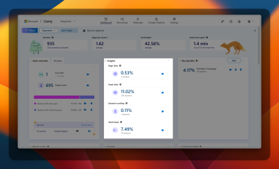
To identify where users are struggling, teams should move beyond subjective opinions and embrace quantitative and qualitative data. Tools like Microsoft Clarity have become industry standards for this purpose. These platforms allow designers to track:
- Rage-clicking: When users repeatedly click an element that isn’t responding.
- Excessive scrolling: An indicator that the information architecture is failing to provide answers quickly.
- Dead ends: Moments where user navigation simply stops.
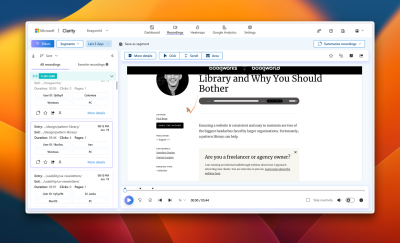
By utilizing heat maps and session recordings, designers can see exactly where the "happy path" breaks down. If the data is ambiguous, the next logical step is formal usability testing. Whether conducted in a lab or remotely, observing a user navigate a task in real-time provides the context that raw data often lacks.
Testing: From Prototypes to Production
The approach to testing must be proportional to the complexity of the change. For micro-adjustments—such as changing a call-to-action color or refining copy—A/B testing is the gold standard. It provides clear, statistically significant data on which version minimizes friction.
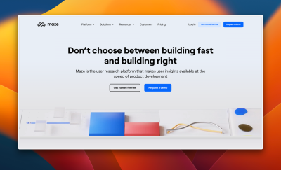
However, A/B testing is not a panacea. For larger feature rollouts or architectural shifts, the cost of developing a "testable" version is often prohibitive. In these cases, the industry standard is to utilize low-fidelity prototypes for remote, unmoderated testing via platforms like Maze. This allows for rapid iteration without the heavy lifting of full-scale development. If the prototype fails to guide the user, the team can pivot before a single line of production code is written.
Navigating the "Change Paradox"
Once a friction-reducing solution is developed, the most difficult phase begins: implementation. Introducing improvements inevitably threatens the user’s hard-won procedural knowledge. When an interface element moves, the user loses their muscle memory, leading to an immediate, often vocal, backlash from the user base.
Stakeholders, witnessing this immediate drop in sentiment or a spike in support tickets, often panic. They may demand an immediate reversion to the old design. This is a critical moment for the design team. The team must proactively manage stakeholder expectations, framing the disruption as a temporary "adaptation period" that will pay dividends in long-term efficiency.
To mitigate this, designers should employ:
- Progressive disclosure: Introducing changes in small, manageable waves rather than a complete UI overhaul.
- Contextual tooltips: Using subtle, non-intrusive overlays to guide users to the new location of familiar tools.
- Phased rollouts: Releasing changes to a small cohort of "power users" who can provide feedback before the broader user base is impacted.
Implications for the Future of Product Design
The divide between traditional web design and digital product design is no longer a professional nuance; it is an existential requirement for businesses. As software becomes more central to daily life, the "always-on" nature of product design will only intensify.
The successful digital product team of the future is one that accepts that the work is never finished. A digital product is not a static object; it is a living organism that must adapt as user behaviors and technical requirements shift. By focusing on the removal of friction and respecting the sanctity of the user’s procedural knowledge, designers can create products that don’t just survive the transition to high-frequency usage but thrive within it.
In the final analysis, the difference lies in the mindset. Traditional web design is about the first impression. Digital product design is about the thousandth impression. For those who can master the art of continuous, data-informed iteration, the potential to build truly indispensable tools is greater than ever before.