







In the modern landscape of front-end web development, the tension between absolute styling freedom and rapid development velocity has driven a massive shift toward headless UI architecture. Among the tools leading this revolution is React Aria Components, developed by the design systems team at Adobe. Offering a robust library of accessible, behavior-first components that function seamlessly across mouse, touch, and keyboard interactions, React Aria has quickly become a cornerstone for developers building inclusive applications.
However, the "headless" paradigm comes with an inherent trade-off. Because these components ship with strictly zero styles and zero animations by default, out-of-the-box implementations can feel jarring. Popovers snap abruptly into existence, modals pop open without warning, and dropdown menus materialize with zero transition, easing, or polish.
While this unstyled, utilitarian approach is perfectly acceptable for internal enterprise dashboards and low-visibility developer tools, it falls short for customer-facing digital products. In competitive consumer markets, fluid motion is no longer just decorative eye candy—it is a critical UX signal that communicates software quality, maintains spatial orientation, and guides user focus.
Fortunately, React Aria was engineered with extensibility in mind. The library provides clear, elegant integration pathways for adding everything from simple CSS fades to complex physics-based spring animations.
Main Facts: The Anatomy of Headless Motion
To successfully animate React Aria Components, developers must first understand how the underlying library handles state transitions. Unlike traditional UI libraries that bundle heavy animation logic directly into the component code, React Aria delegates visual transitions entirely to the developer, offering powerful lifecycle hooks in return.
The core challenge of animating unmounting components—such as modals, popovers, and menus—is timing. When a user closes a modal, the component must remain in the Document Object Model (DOM) long enough for its exit animation to play out. If a component is destroyed instantly upon triggering a close state, the visual transition is abruptly cut off.
React Aria solves this architectural hurdle by automatically injecting native data attributes—specifically [data-entering] and [data-exiting]—into overlay components when they mount and unmount. Furthermore, the library intelligently defers the removal of the element from the DOM until the browser or animation engine signals that the exit sequence has concluded.
Developers can leverage two primary tracks to style these states:
- Zero-Dependency CSS Transitions and Keyframes: Utilizing native browser styling capabilities mapped directly to React Aria’s data attributes.
- Advanced JavaScript Motion Libraries: Integrating dedicated orchestration engines—such as Motion (formerly Framer Motion)—via wrappers like
motion.create()to achieve spring physics, complex multi-step orchestrations, and gesture-driven interactions.
Chronology: The Evolution of Accessible Web Animation
Tracing how web developers reached this current juncture reveals a steady march toward decoupling behavior from presentation.
The Era of Monolithic UI Frameworks (Early 2010s)
In the early days of React and component-driven development, UI libraries like Material-UI or Bootstrap shipped with everything baked in: structure, strict accessibility rules, rigid visual styling, and hard-coded animations. Customizing a transition meant fighting against opinionated CSS-in-JS solutions or overwriting deep internal library state.
The Headless Revolution (2020–2023)
As design systems matured, teams realized that styling was too contextual to be pre-packaged. Headless libraries emerged to solve the hardest part of web development—accessibility (ARIA compliance, keyboard navigation, screen reader support, focus trapping)—while leaving the CSS completely open. Libraries like Radix UI, Headless UI, and React Aria decoupled logic from design. Yet, animation remained an afterthought, often forcing developers to build custom wrapper components just to handle enter/exit lifecycles.
The Modern Integration Standard (Present Day)
Today, libraries like React Aria have matured to natively support lifecycle indicators (data-entering, data-exiting), while modern animation ecosystems like Motion have lowered the friction of bridging declarative React state with buttery-smooth physics engines. Developers no longer have to choose between bulletproof accessibility and high-end cinematic polish; they can seamlessly layer animations on top of rock-solid behavioral foundations.
Supporting Data: Choosing the Right Approach
When architecting a design system or scaling a front-end codebase, choosing the correct animation strategy prevents performance bottlenecks and reduces unnecessary bundle bloat.
| Approach | Ideal Use Cases | Performance Overhead | Dependencies |
|---|---|---|---|
| CSS Transitions | Simple fades, scale-ins, slide-overs, basic dropdowns. | Negligible (handled by the browser compositor) | Zero dependencies |
CSS @keyframes |
Asymmetric enter/exit timings (e.g., slow fade-in, fast snap-out). | Negligible (optimized via GPU layers) | Zero dependencies |
Motion (motion.create) |
Spring physics, drag gestures, shared layout animations, complex orchestrations. | Moderate (requires JavaScript runtime evaluation) | motion package |
1. Implementing CSS Transitions with Data States
For the vast majority of application overlays—such as popovers, modals, modal overlays, trays, and menus—a lightweight CSS transition is all that is required.
React Aria overlay components automatically expose [data-entering] and [data-exiting] states. By writing targeted CSS selectors, you can dictate how the component behaves as it enters or leaves the viewport:
.react-aria-Popover
  transition: opacity 200ms ease, translate 200ms ease;


.react-aria-Popover[data-entering],
.react-aria-Popover[data-exiting]
  opacity: 0;
  translate: 0 -8px;
In this implementation, when a popover is triggered, the browser smoothly transitions its opacity from 0 to 1 and its vertical position from -8px to its natural layout position over 200 milliseconds. When dismissed, the [data-exiting] attribute is flagged, playing the exact same transition in reverse before React Aria safely removes the node from the DOM. This requires zero JavaScript animation overhead and adds zero extra dependencies to your project bundle.
2. Fine-Tuning with CSS Keyframes
If your design system requires asymmetric easing—such as a decelerating entry coupled with a swift, accelerating exit—CSS @keyframes provide superior control:
.react-aria-Popover[data-entering]
  animation: popover-enter 200ms cubic-bezier(0.16, 1, 0.3, 1);


.react-aria-Popover[data-exiting]
  animation: popover-exit 150ms cubic-bezier(0.7, 0, 0.84, 0);


@keyframes popover-enter
  from
    opacity: 0;
    translate: 0 -8px;


@keyframes popover-exit
  to
    opacity: 0;
    translate: 0 -4px;
Note: Data-entering and exiting states are reserved for conditionally mounted overlay components. Non-overlay components—such as Button, Switch, or Slider—remain persistent in the DOM. For those interactive elements, standard CSS transitions should be applied directly to pseudo-classes like :hover, :focus, or React Aria data attributes such as [data-pressed] and `[data-selected].
3. Scaling Up to Spring Physics with Motion
When your product demands tactile, organic motion—such as spring-based modal bounces, drag-to-dismiss sheet gestures, or complex layout transitions—CSS alone hits a functional ceiling. This is where dedicated animation libraries like Motion become essential.
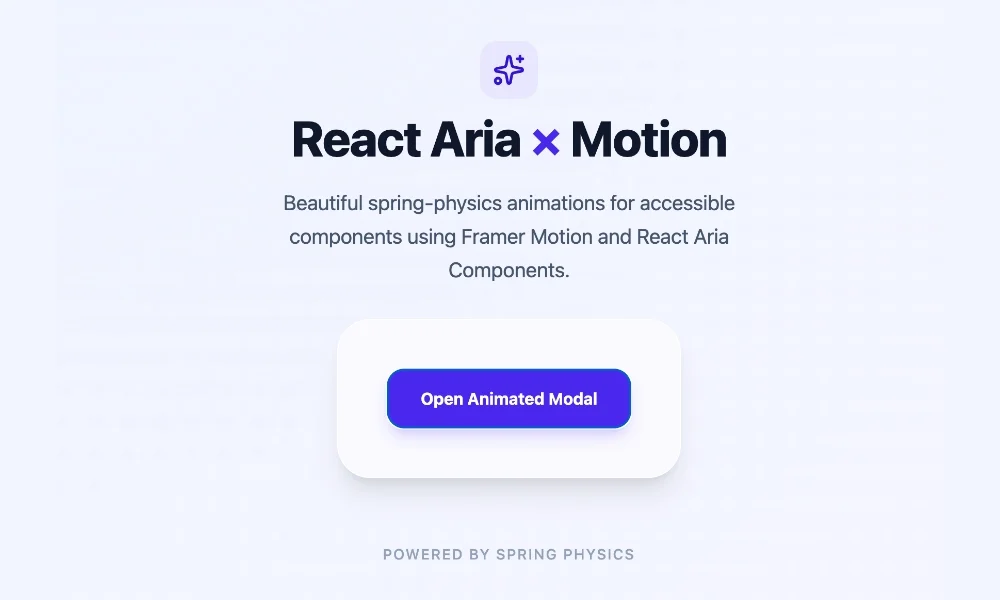
Motion integrates smoothly with React Aria via the motion.create() utility function, which wraps any headless React Aria component into an animation-aware component.
First, install the package:
npm install motionNext, wrap your target React Aria components:
import  motion  from "motion/react";
import  Modal, ModalOverlay  from "react-aria-components";

const MotionModal = motion.create(Modal);
const MotionModalOverlay = motion.create(ModalOverlay);
You can then orchestrate complex enter and exit sequences using Motion’s initial, animate, exit, and transition props wrapped inside an AnimatePresence boundary:
import  AnimatePresence, motion  from "motion/react";
import  DialogTrigger, Button, Modal, ModalOverlay  from "react-aria-components";
import  useState  from "react";

const MotionModal = motion.create(Modal);
const MotionModalOverlay = motion.create(ModalOverlay);

function AnimatedModal()
  let [isOpen, setOpen] = useState(false);

  return (
    <>
      <Button onPress=() => setOpen(true) className="px-4 py-2 bg-blue-600 text-white rounded-lg">
        Open Modal
      </Button>

      <AnimatePresence>
        isOpen && (
          <MotionModalOverlay
            isOpen
            onOpenChange=setOpen
            className="fixed inset-0 z-10 bg-black/50 flex items-center justify-center"
            initial= opacity: 0
            animate= opacity: 1
            exit= opacity: 0
            transition= duration: 0.2
          >
            <MotionModal
              className="w-full max-w-lg rounded-2xl bg-white p-6 shadow-2xl"
              initial= scale: 0.9, y: 20
              animate= scale: 1, y: 0
              exit= scale: 0.9, y: 20
              transition=
                type: "spring",
                bounce: 0.3,
                duration: 0.4

            >
              <div slot="title" className="text-xl font-bold text-gray-900">
                Spring-Animated Modal
              </div>
              <p className="mt-2 text-gray-600">
                This component enters with dynamic spring physics and exits smoothly, driven by Motion and React Aria.
              </p>
              <Button onPress=() => setOpen(false) className="mt-4 px-4 py-2 bg-gray-200 rounded-lg">
                Close
              </Button>
            </MotionModal>
          </MotionModalOverlay>
        )
      </AnimatePresence>
    </>
  );
In this setup, AnimatePresence manages the unmounting lifecycle, ensuring that the exit prop animations fully execute before the DOM node is purged, while React Aria maintains core accessibility features like focus trapping and screen reader announcements.
Official Responses and Industry Best Practices
Leading design engineers and accessibility advocates emphasize that animation should never compromise inclusivity. According to documentation and guidelines from the React Aria team, developers must always respect user agent settings regarding motion reduction.
When implementing custom CSS transitions or JavaScript animations on top of React Aria components, engineers are strongly encouraged to wrap their motion rules in CSS media queries targeting user preferences:
@media (prefers-reduced-motion: reduce)
  .react-aria-Popover,
  .react-aria-Modal
    animation: none !important;
    transition: none !important;
Failing to respect prefers-reduced-motion can trigger vestibular disorders, dizziness, or nausea for sensitive users. Because React Aria prioritizes universal accessibility out of the box, developers bear the responsibility of ensuring their visual enhancement layers adhere to the same high standards.
Furthermore, performance audits conducted across popular component libraries demonstrate that sticking to native CSS transitions for simple UI states yields significantly lower CPU overhead on lower-end mobile devices compared to heavy JavaScript-driven animation loops.
Implications: The Future of Headless Styling
The successful synthesis of React Aria and advanced animation engines points toward a mature future for front-end architecture. We are moving past the false dichotomy where developers had to choose between rigid, pre-styled UI kits that were painful to customize, and raw, unstyled primitives that required reinventions of basic design patterns.
By leveraging React Aria’s built-in lifecycle attributes (data-entering, data-exiting), developers gain a powerful bridge into the styling layer. They can build design systems that are:
- Fully Accessible: Inheriting Adobe’s gold-standard WCAG-compliant keyboard navigation, focus management, and ARIA attribute mapping.
- Visually Distinct: Free from the "bootstrap look," allowing teams to express unique brand identities through bespoke CSS or sophisticated physics engines.
- Performant: Loading only the JavaScript necessary for user interactions while offloading visual presentation to the browser’s GPU compositor wherever possible.
Ultimately, animating React Aria components proves that headless architecture does not mean sacrificing aesthetic quality. With just a few lines of CSS or a strategic wrapper from Motion, developers can transform utilitarian, accessible primitives into delightful, production-grade customer experiences.