

In the digital age, where social media feeds and ephemeral stories dominate our daily interactions, the printed yearbook remains a timeless artifact—a physical testament to a year of growth, camaraderie, and achievement. For graphic designers, educators, and student editors, the task of assembling a yearbook is both a monumental undertaking and a creative opportunity. Whether you are a novice designer or an experienced professional, mastering Adobe InDesign is the key to transforming a collection of disparate snapshots into a cohesive, narrative-driven publication.

This article provides an in-depth walkthrough of the essential techniques for building a high-quality yearbook layout, from conceptualizing the cover to managing complex photo grids and typography.

The Foundation of Professional Yearbook Design
A successful yearbook is more than just a scrapbook; it is a meticulously organized visual document. To create a layout that stands the test of time, one must balance aesthetic flair with structural integrity. By utilizing Adobe InDesign’s advanced features—such as Paragraph Styles, Parent Pages, and sophisticated path manipulation—designers can maintain consistency across hundreds of pages.

If you are operating under tight deadlines or lack the resources for a custom design from scratch, high-quality, pre-built yearbook layout templates are an excellent starting point. These assets allow you to focus on content curation while relying on professional-grade typography and grid systems that ensure a polished, print-ready result.

Phase 1: Designing the Iconic Cover
The cover is the gatekeeper of your yearbook. It must capture the spirit of the academic year at a single glance.

The Photoshop Preparation
Before opening InDesign, utilize Adobe Photoshop to create the backbone of your cover. Start with a document measuring 8.75 x 11.25 inches (inclusive of bleed). Set your workspace to Grayscale with a 300 Resolution to ensure optimal print quality.

Begin by arranging torn paper edge assets on the canvas to create a textured, organic base. Beneath these layers, arrange a selection of high-impact student and school life photography. To integrate these images seamlessly, use Layer Masks to trim any overflow.

Adding Texture and Depth
To give your cover a vintage or "lived-in" aesthetic, incorporate a halftone grayscale texture. Set the texture layer to "Linear Burn" for a high-contrast finish. To further enhance the visual depth, add a solid black Color Fill layer set to "Overlay" at 50% opacity, followed by a Brightness and Contrast adjustment layer (Brightness set to 79). Save this file as a PSD, as it will serve as the centerpiece of your InDesign cover page.

Phase 2: Building the InDesign Framework
With your cover assets prepared, transition to Adobe InDesign to establish the document structure.

Document Setup and Global Settings
Create a new InDesign document sized at 8.5 x 11 inches. Configure your document with 24 pages, 0.5-inch margins, and a 0.125-inch bleed. The bleed is critical; it ensures that your background images and colors extend to the very edge of the final trimmed paper.

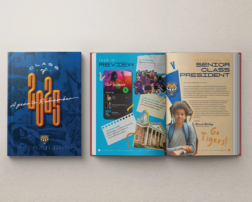
Once the document is open, place your PSD cover. To create a professional look, set the Opacity to 70% and the Blending Mode to "Overlay." Complement this with a custom deep blue swatch (C100, M70, Y10, K55) placed behind your collage, providing a grounding anchor for your design.

Advanced Typography and Effects
For your headline—typically "Class of [Year]"—use high-contrast typography like Glendale or Michigan Signature. A large, bold font like NexusBold set at 390 pt creates immediate visual impact.

Do not settle for flat text. Utilize the Effects panel to add:

- Drop Shadow: To create separation from the background.
- Inner Shadow & Glow: To give the letters a tactile, embossed quality.
- Bevel and Emboss: To simulate a metallic or 3D finish.
- Basic Feathering: To soften the edges and integrate the text into the photographic elements.
Phase 3: The Internal Narrative and Table of Contents
A functional yearbook requires a clear roadmap. On Page 2, design a Table of Contents that mirrors the font choices used on the cover.

Utilizing Parent Pages
To save time and ensure uniformity, use "Parent Pages" (formerly Master Pages). Create a "Footer" layer in your Layers panel. On the A-Parent spread, add a text box for the school name and a marker for the "Current Page Number" (Right-click > Insert Special Character > Markers > Current Page Number). By automating these elements, you ensure that every page of your 24-page spread maintains professional alignment without manual intervention.

Phase 4: Creative Spreads and Editorial Flair
The pages following the TOC are where the true storytelling happens.

The Principal’s Letter and Text Wrap
When placing the principal’s letter, incorporate doodle line patterns to add a youthful, energetic flair. To make the principal’s photo pop, use the Pen Tool (P) to trace around the subject, then use the Pathfinder panel to subtract the background. Once the image is masked, use the Text Wrap feature set to "Wrap around object shape" with a 0.3125-inch offset to create a clean, professional flow of text around the portrait.

The "Year in Review" and Award Sections
Use a mix of shapes (Ellipse, Rectangle) and typography to highlight significant events, such as top songs or school achievements. For the "Awards and Superlatives" section, use the Rectangle Frame Tool (F) to create uniform grids. Apply a subtle light-blue stroke and a black drop shadow to these frames to make them appear as individual "cards" on the page.

Phase 5: Efficient Photo Management
As the yearbook grows, managing hundreds of photos becomes the primary challenge.

Mastering the Photo Grid
In InDesign, you can create a multi-image grid in seconds. Select the Rectangle Frame Tool, drag out a frame, and use the arrow keys while dragging to subdivide the frame into a grid. This is the most efficient way to handle faculty headshots or class lists. Once the grid is set, use File > Place to import your photos in bulk.

The Implications of Professional Design
The investment in a high-quality yearbook layout goes beyond mere aesthetics. A professionally designed book functions as a historical record. When the layout is clean, the typography is legible, and the photos are properly masked and balanced, the book becomes a cherished keepsake rather than a disposable item.

Furthermore, leveraging modern tools like hardcover book mockups allows editors to visualize the final product long before it hits the printing press. This ensures that the physical dimensions, spine width, and finish meet expectations.

Creative Yearbook Alternatives
If your team is seeking variety, consider these specialized templates:

- School Yearbook Template (INDD, Canva): Designed for maximum flexibility, allowing for easy transitions between digital and print formats.
- Yearbook Brochure Template (INDD, Canva): A colorful, modern approach perfect for smaller publications or event-specific recaps.
- School Yearbook (INDD): A robust, 25+ page professional suite containing everything from cover designs to complex photo collages.
- Digital Yearbook Template (INDD, Canva): Tailored for modern educational institutions that wish to host their yearbooks online.
Conclusion
Designing a yearbook is a journey that requires patience, technical skill, and a keen eye for detail. By adhering to the principles outlined above—using parent pages for consistency, employing text wraps for dynamic layouts, and utilizing high-quality assets to enhance the visual narrative—you can create a publication that truly honors the community it represents. Remember that every design choice, from the font selection to the placement of a doodle, contributes to the overall memory of the academic year. With the right tools and a clear plan, your yearbook will serve as a definitive, beautiful record for years to come.