





In the world of graphic design, few visual languages carry the weight, history, and visceral impact of Japanese warrior aesthetics. Often described as "cinematic," samurai-inspired typography has transcended its origins in feudal Japan to become a cornerstone of contemporary branding, gaming, and digital media. By blending the raw, unpredictable energy of traditional brushwork with modern, clean-lined precision, these fonts offer designers a toolset that is simultaneously aggressive, sophisticated, and deeply atmospheric.
The Evolution of the Warrior Aesthetic in Typography
To understand the current demand for these typefaces, one must look at the intersection of traditional Shodo (Japanese calligraphy) and modern digital artistry. Historically, the samurai were not just warriors; they were patrons of the arts, deeply involved in tea ceremonies, poetry, and calligraphy. The brushstrokes used in their era were extensions of the spirit—deliberate, powerful, and lacking hesitation.
Today, typography designers are digitizing that "spirit." By incorporating "handcrafted" textures, jagged, sword-like edges, and the fluid motion of ink-on-paper, these fonts allow brands to convey honor, discipline, and lethal precision. Whether it is an esports team looking for an aggressive logo or a film production company crafting a title sequence for a historical epic, the samurai aesthetic provides an immediate, shorthand connection to the legendary status of the Japanese warrior.
Chronology: From Ancient Brush to Digital Vector
The journey of the "Samurai Font" is a narrative of technological adaptation:
- Pre-20th Century (Traditional Roots): Typography was strictly manual. Calligraphers used animal-hair brushes and sumi ink. The philosophy of Ichi-go ichi-e (one time, one meeting) meant that every brushstroke was unique, imperfect, and final.
- Late 20th Century (The Anime Boom): As Japanese media began to permeate Western culture, the demand for "orientalized" fonts surged. Early digital iterations were often rudimentary, characterized by simple, blocky shapes that attempted to mimic brush pressure.
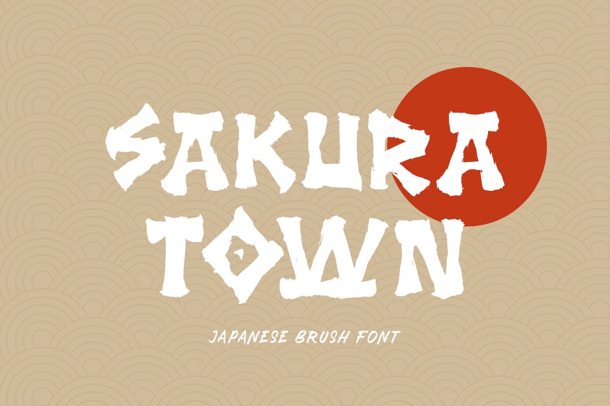
- 2010–2020 (The Era of Texture): Advances in design software allowed for high-resolution scanning of physical brushstrokes. This led to a boom in "authentic" brush fonts that preserved the grit, splatter, and drying-ink effects of real calligraphy.
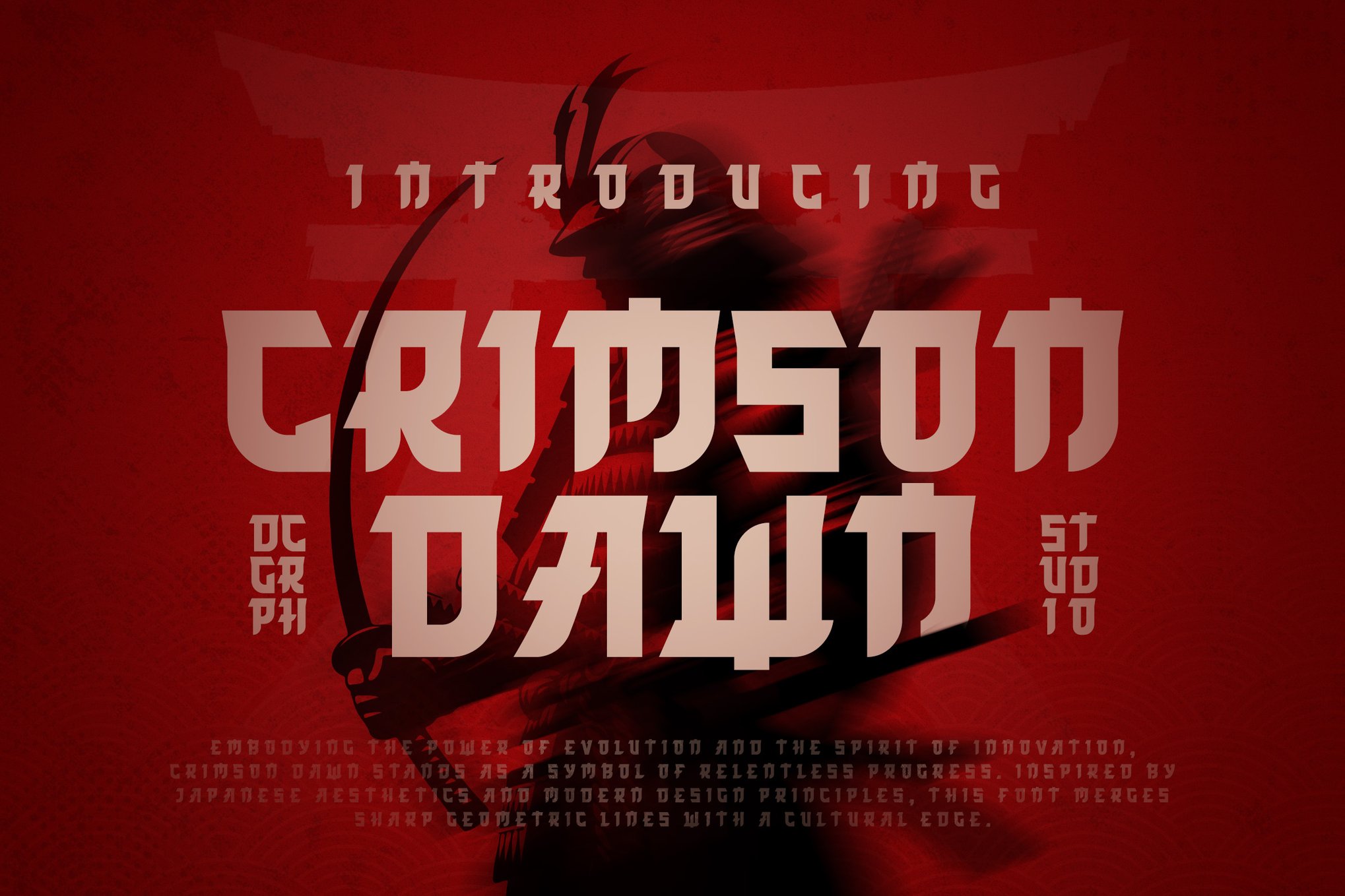
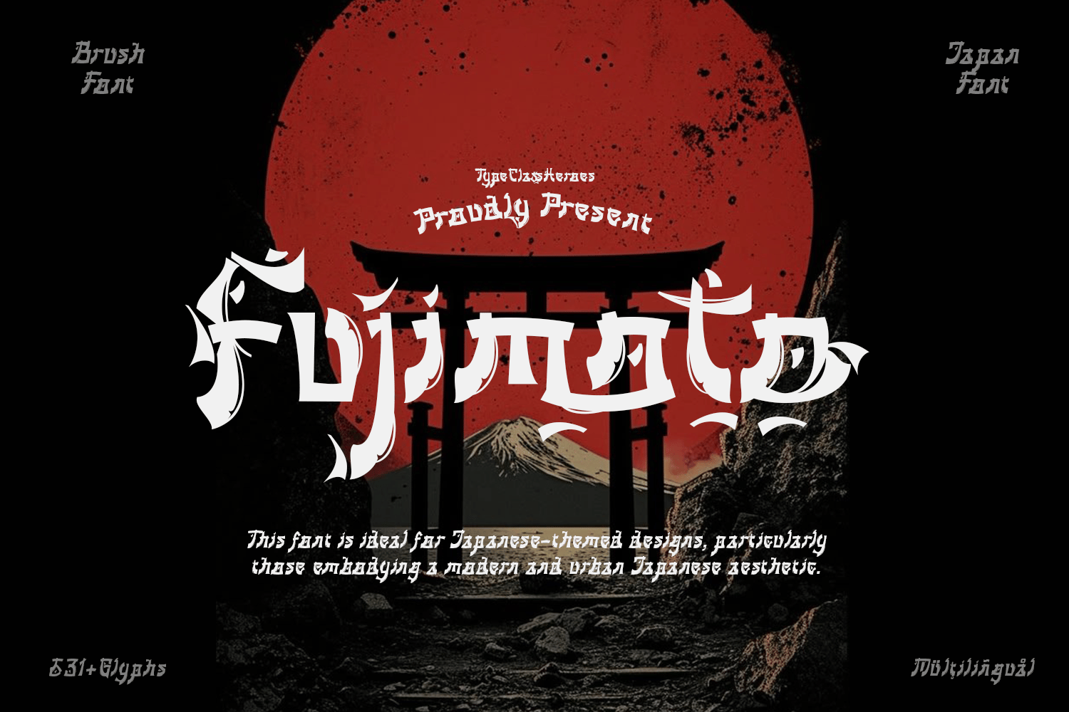
- Present Day (The Hybrid Era): Modern fonts like Fujimoto or Henshin represent a synthesis. They combine Latin character structures with Japanese kanji logic, creating a hybrid that is both readable for Western audiences and visually evocative of the East.
A Curated Selection: The Top Samurai-Style Typefaces
For designers seeking to capture this aesthetic, the market currently offers a wide array of options, ranging from sharp, modern display fonts to rugged, calligraphic masterpieces.
The Modern Heavyweights
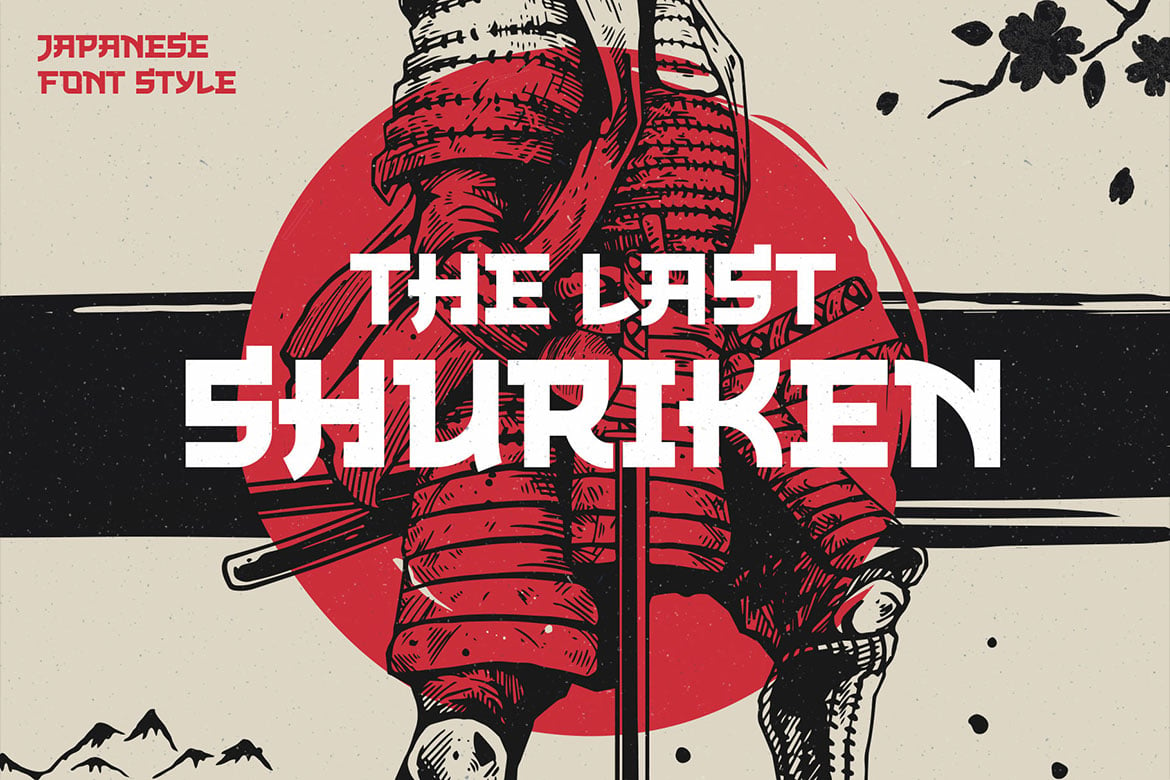
- The Last Shuriken: A dynamic, all-caps powerhouse. It leans heavily into the "modern Japanese" vibe, borrowing from the aesthetics of high-energy food branding and anime. It is the perfect choice for logos that need to be aggressive yet legible.
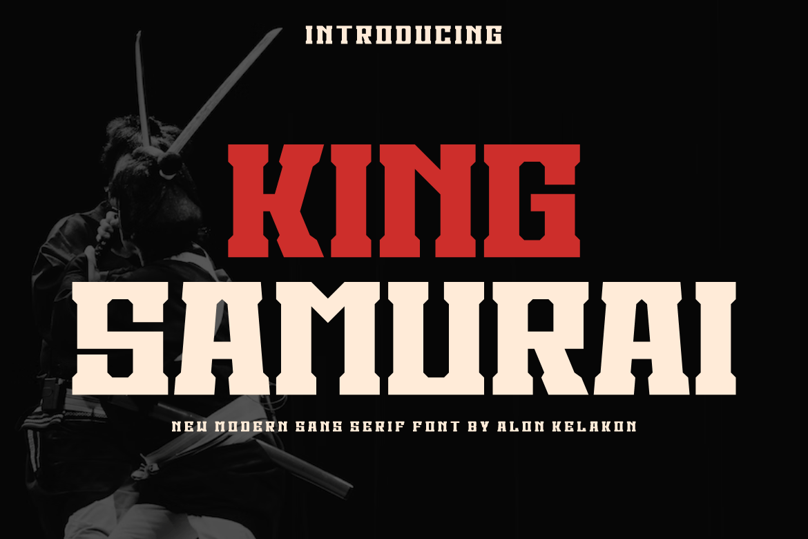
- King Samurai: This font breaks the mold by being a bold, modern sans-serif. It captures the strength of a katana’s edge without relying on the typical brush texture, making it an excellent choice for corporate branding that wants to evoke tradition with a contemporary, high-fashion twist.
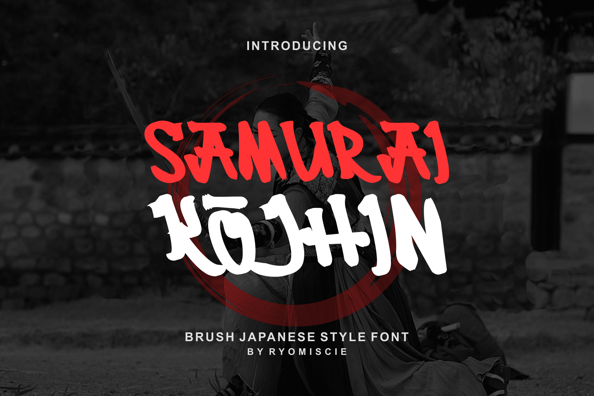
- Henshin: Arguably one of the most expressive fonts in this category. It uses high-contrast, razor-sharp edges that mimic the silhouette of a blade. It is highly recommended for martial arts posters and gaming UI elements where the typography needs to feel "dangerous."
The Calligraphic Classics
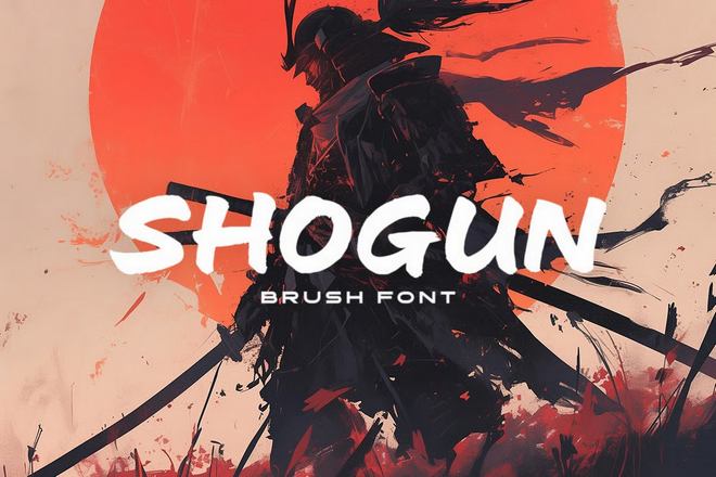
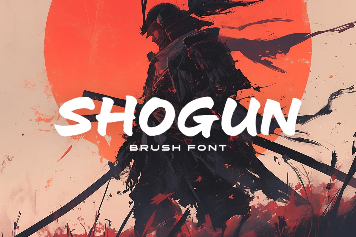
- Shogun: Inspired by the elegance of the feudal era, Shogun is a wide, sweeping brush font. It brings a sense of nobility and sophistication to any layout. It works exceptionally well in large-scale headlines where the fluid motion of the letters can truly shine.
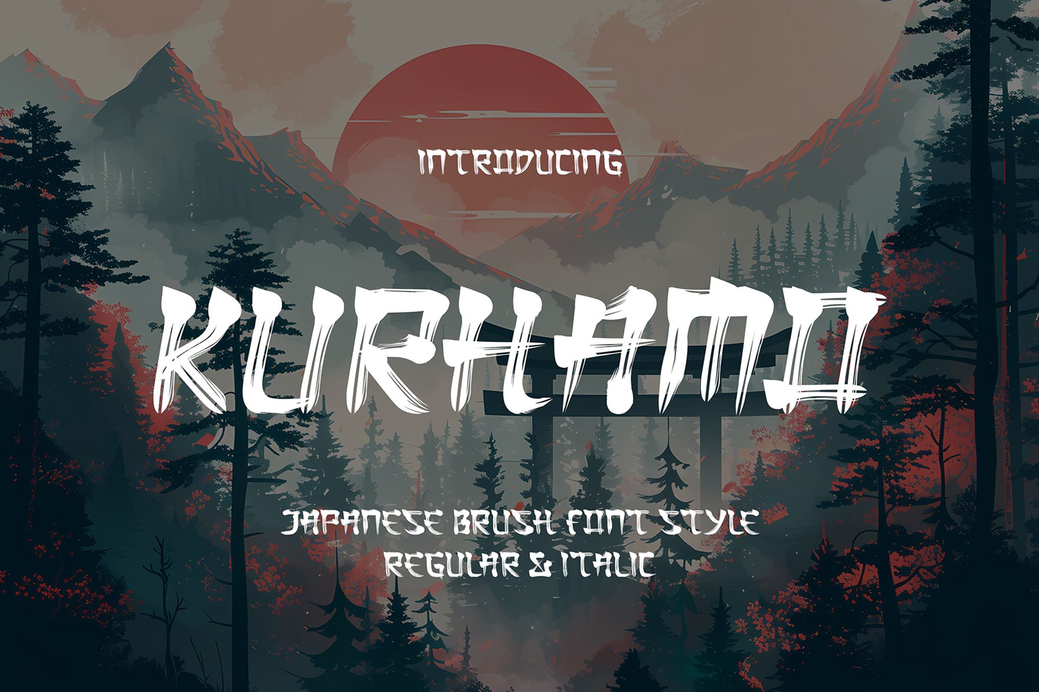
- Kurhamo: Available in both Regular and Italic, this font is the gold standard for those seeking "cultural sophistication." Its graceful letterforms mimic the fluidity of a master calligrapher’s hand, making it ideal for high-end restaurant menus or boutique packaging.
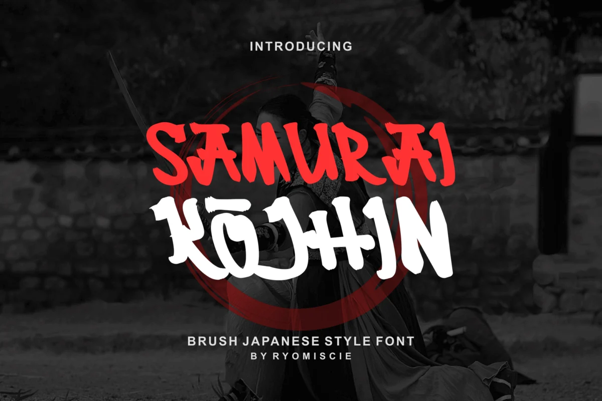
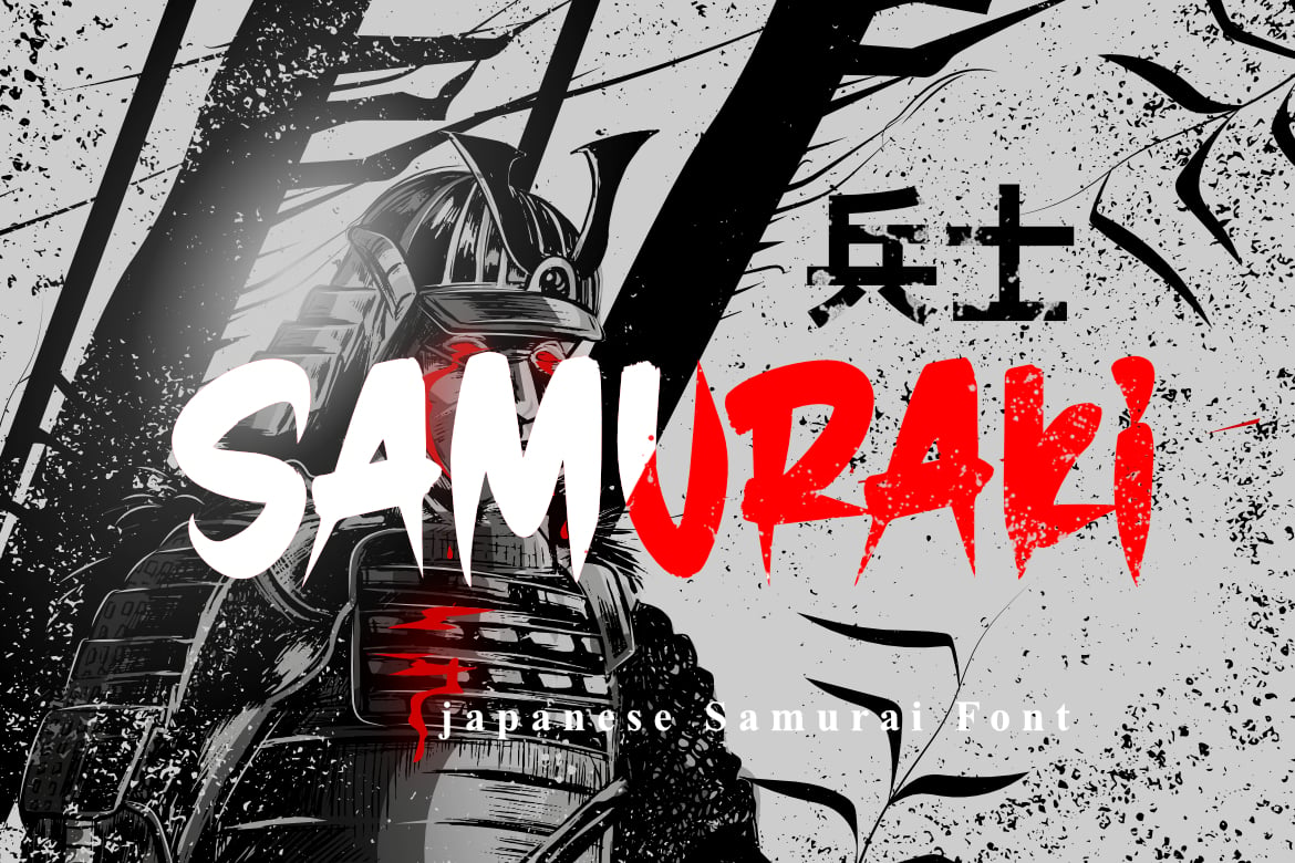
- Samuraki: An all-rounder that provides both uppercase and lowercase support. Its balance makes it highly versatile for flyers and promotional material that requires a balance between "warrior energy" and clear communication.
Supporting Data: Why Texture Matters in Branding
Psychological studies in design have long suggested that "organic" textures—like the grit found in brush fonts—create a subconscious sense of trustworthiness and human craftsmanship. In a digital world dominated by sterile, geometric sans-serifs, the "Samurai" category provides a necessary contrast.
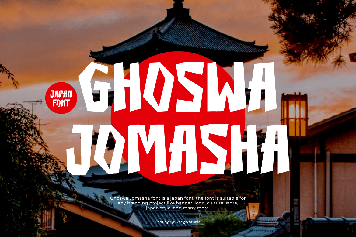
According to recent market trends, the use of display fonts with "handmade" qualities has seen a 30% increase in the gaming and merchandise industries. This is because these fonts do not just communicate words; they communicate a "vibe." A logo written in Ghoswa Jomasha feels like it has a history, whereas a logo in a generic font feels like it was generated by a machine.
Official Perspectives: The Designer’s View
We spoke with a lead branding consultant in the gaming industry regarding the shift toward these fonts:
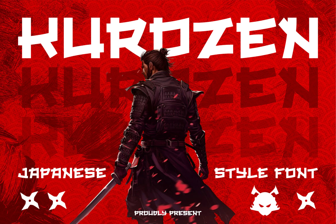
"When we develop assets for a game like ‘Ghost of Tsushima’ or even a modern fighter, we aren’t just looking for letters. We are looking for the ‘clash of steel.’ A font like ‘Ninja’ or ‘Kurozen’ provides that instant narrative context. It allows us to set the tone before the user has even read a single sentence of copy. It’s about creating an atmosphere of tension and precision."
The Strategic Implications for Your Design Work
When implementing these fonts, designers must consider the hierarchy of the project. Because samurai-style fonts are inherently decorative and high-impact, they should be used strategically:
- Headline Dominance: These fonts are rarely suited for body text. Their strength lies in their ability to draw the eye. Use them for titles, book covers, and hero sections on websites.
- Pairing Strategy: Pair your samurai font with a neutral, highly legible sans-serif (such as Inter or Helvetica). The contrast between the "aggressive" samurai font and the "passive" modern font creates a balanced composition that remains readable.
- Cultural Sensitivity: As with any design inspired by a specific culture, usage should be respectful. The goal is to evoke the aesthetic of the warrior—honor, strength, and discipline—rather than to create a caricature.
Accessible Options: Free vs. Premium
Not every project requires a massive licensing budget. For those just starting out or working on personal passion projects, several "Free for Personal Use" fonts offer high-quality results:
- Samurai Shadow: Excellent for cinematic depth; the shadow effect gives the letters a 3D, weight-heavy look.
- Takashi Japan: A beautiful blend of clean, modern structure and Eastern influence.
- Shirouga: The go-to for an authentic, "raw" ink-brush appearance.
- Gunbai: Best for bold, blocky, and commanding statements.
Conclusion
The resurgence of samurai-inspired typography is more than a trend; it is a testament to the timeless appeal of the Japanese warrior aesthetic. Whether you are crafting a brand identity that requires a touch of ancient authority or designing a poster that needs to scream with the energy of a sword fight, these fonts provide the perfect bridge between the past and the future.
As we look forward, the continued development of OpenType features—such as ligatures that connect letters as if they were drawn in a single, unbroken stroke—will only make these fonts more powerful. Designers who master the art of using these typefaces will find that they have a distinct advantage: the ability to command attention, convey power, and tell a story that resonates with the history of the blade.