Every font carries a subtext—a silent narrative that speaks before a single word is read. Serifs evoke heritage and trust, sans serifs project modern clarity, and scripts offer a bespoke, human touch. In the high-stakes world of visual identity, the selection of a typeface is not merely an aesthetic choice; it is a foundational business decision. A logo is the primary handshake between a brand and its audience, and the typeface chosen to represent that brand serves as the tone of voice for that interaction.

To help designers navigate this complex landscape, we have curated a comprehensive collection of over forty premier logo fonts. This guide is designed to help you demonstrate deep brand empathy to your clients, ensuring your designs are not only visually arresting but strategically sound.
The Evolution of Brand Typography: A Chronology of Style
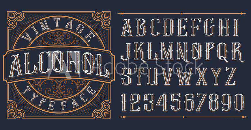
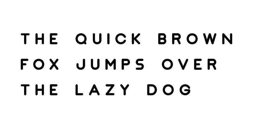
The history of logo design is essentially a history of typography. In the early 20th century, brands relied on ornate, hand-drawn lettering to signal quality. As the Industrial Age progressed, the need for scalability—from a storefront sign to a small newspaper advertisement—pushed designers toward the clean, geometric clarity of early sans serifs like Futura.
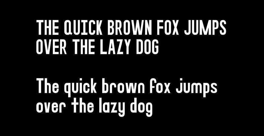
By the late 1990s, the digital revolution democratized font creation, leading to an explosion of experimental, "grunge," and abstract styles. Today, we are in the era of "flexible branding." Modern logos must function across a dizzying array of platforms, from the microscopic space of a social media avatar to the massive scale of a billboard. Consequently, the contemporary trend has shifted toward high-readability geometric fonts, balanced by a resurgence in expressive, handcrafted scripts that provide a necessary human counterpoint to sterile digital environments.
The Strategic Checklist: How to Choose a Logo Font
Choosing a typeface that "looks good" is the baseline; choosing one that "performs" is the mark of a professional. Before finalizing a selection, every designer should run their candidate font through this strategic filter:
- Legibility at Scale: Does the font maintain its structural integrity when reduced to 16 pixels for a favicon?
- Brand Alignment: Does the "personality" of the font match the core values of the brand? (e.g., Avoid playful scripts for high-stakes financial services).
- Versatility: Does the font family include enough weights (Regular, Bold, Light, Condensed) to build a cohesive brand system for future marketing materials?
- Cultural Context: Does the typeface carry historical baggage or associations that might conflict with the client’s market position?
Quick-Reference: Top Recommendations for 2026
If you are facing a tight deadline and need an immediate, high-impact solution, the following table serves as a curated starting point for various brand archetypes:
| Category | Recommended Font | Best For | Why Choose It |
|---|---|---|---|
| Minimal | Nord | Tech & Fashion | Seven weights ensure maximum flexibility. |
| Geometric | JUST Sans | Corporate/Architecture | Balanced shapes work across large systems. |
| Monogram | Augor | Luxury/Creative | Distinctive, high-impact letterforms. |
| Script | Rossa | Beauty/Hospitality | Refined, readable, and personal. |
| All-Caps | Stag | Sports/Tech | Provides authority and visual weight. |
| Brush | Quick Silver | Streetwear/Youth | Energetic, hand-painted aesthetic. |
| Display | Fritz | Friendly/Consumer | Expressive while retaining clarity. |
| Vintage | Brewisten | Food/Heritage | Retro character perfect for badges. |
| Handwritten | Southwave | Lifestyle/Cafes | Relaxed, approachable feel. |
| Futuristic | Lequire | SaaS/Fintech | Modern, forward-thinking geometry. |
Deep Dive: Categorical Analysis
The Minimalist Movement
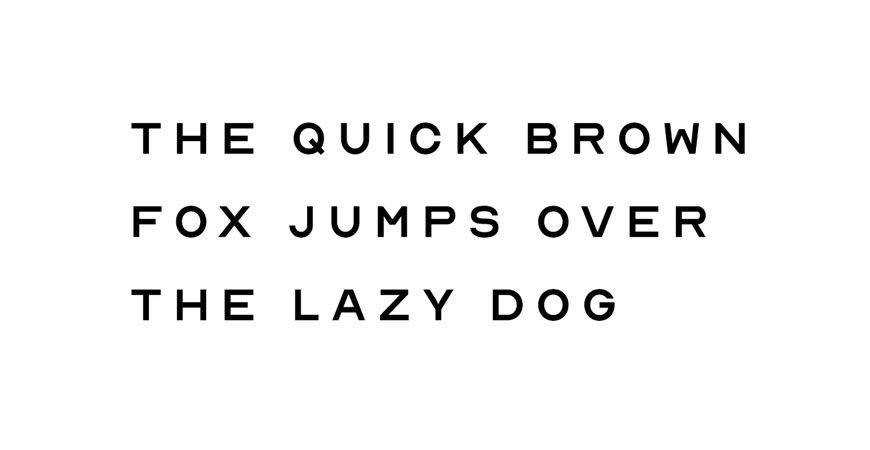
Minimalist typefaces remain the gold standard for law firms, financial institutions, and healthcare providers. These industries require an aura of stability and absolute clarity. Typefaces like Jaquel and Impulse leverage geometric principles to provide a clean, uncluttered brand image that signals competence and efficiency to the consumer.
The Power of the Monogram
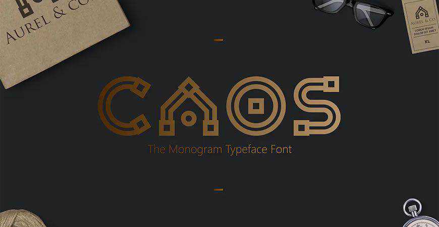
Monograms are the hallmark of tradition. For luxury brands, law firms, and educational institutions, a monogram font like CAOS or Augor acts as a seal of authenticity. These fonts are designed to be recognizable even when stripped of the full brand name, making them invaluable for luxury apparel and stationery.
Script Fonts: The Human Touch
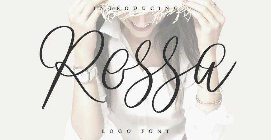
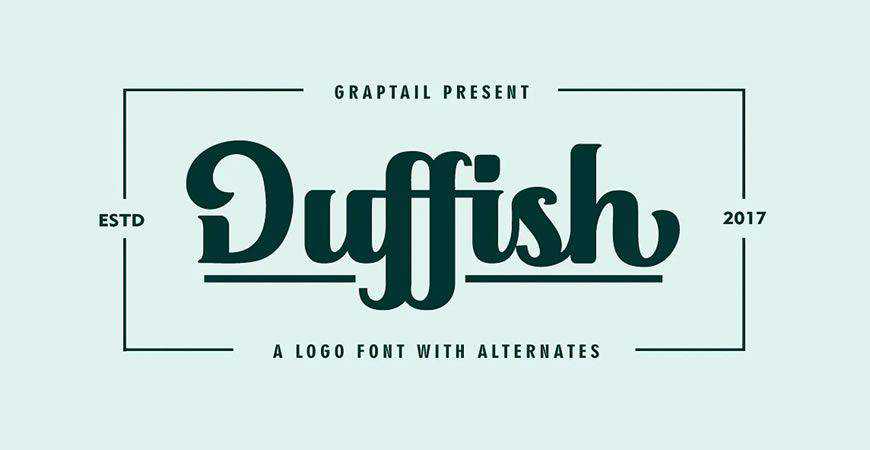
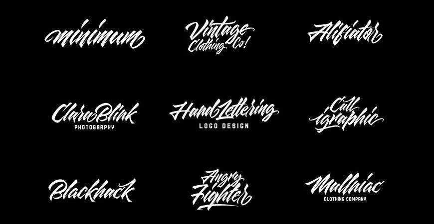
In an increasingly automated world, the "hand-crafted" look is a powerful differentiator. Scripts like Rossa, Duffish, and Maqin Larisa offer a personal connection. By utilizing Gothic-inspired ligatures or natural handwriting flows, these fonts allow lifestyle brands to build intimacy with their audience.
Modern & Futuristic Aesthetics
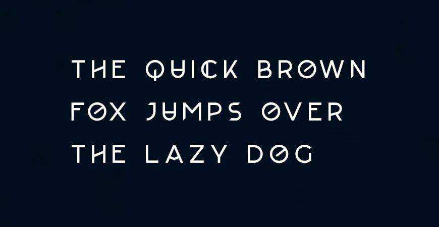
For fintech, SaaS, and gaming brands, the future is the primary market. Fonts like Lequire and Artis eschew traditional serifs for sharp, non-traditional angles and unique negative space. These fonts communicate innovation and disruption, telling the user that the brand is operating at the cutting edge of technology.
Supporting Data: The Importance of Licensing
A common pitfall for emerging designers is the misunderstanding of font licensing. It is a critical legal reality: a "free for personal use" download is not a license for commercial identity.
When you design a logo, you are creating a commercial asset. Using a font without the appropriate commercial license exposes your client to legal risk, including cease-and-desist orders or copyright litigation. Always verify the EULA (End User License Agreement) on the foundry’s website. Paid licenses generally offer broader protection and often include updates or technical support that free fonts lack. Never assume; confirm the rights with the creator before the final delivery of the brand package.
Implications for the Creative Industry
The impact of typography on consumer psychology is well-documented. Studies suggest that consumers are more likely to trust information presented in professional, consistent typography. For the designer, this means that your choice of font is a proxy for your client’s professionalism.
If you choose a font that is poorly kerned or illegible at small sizes, you are not just hurting the brand—you are damaging your reputation as a design expert. Conversely, a well-researched, perfectly paired typeface creates a "halo effect" where the consumer perceives the quality of the product to be higher simply because the logo was designed with care and precision.
Conclusion: Crafting the Future
Typography is the silent engine of design. Whether you are building a brand from the ground up or refreshing a long-standing identity, the font you choose will serve as the bedrock of all future communications.
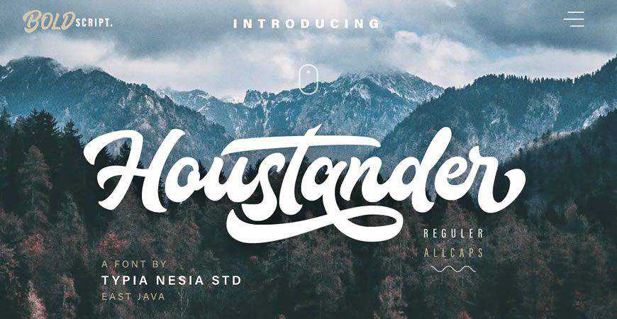
We have traversed the spectrum from the stark, professional lines of minimalist sans serifs to the emotive, unbridled energy of brush-style graffiti fonts. As you move forward into your next project, remember that the most effective logo is the one that best communicates the "soul" of the business. Bookmark this guide to ensure that when the blank page stares back at you, you have the tools to make an immediate, lasting impact. The first impression is the only one that truly lasts—make sure your typography is telling the right story.