






For over a decade, web developers have lived in a world defined by the "rounded corner." Since the inception of the border-radius property, our interfaces have been limited to a singular geometric constraint: the circular arc. While this provided a necessary evolution from the days of complex, image-heavy CSS, it left designers yearning for more. To achieve anything beyond a basic curve—such as beveled edges, scooped ticket stubs, or the elusive "squircle"—developers were forced to rely on fragile hacks like clip-path, complex SVG masks, or brittle pseudo-element configurations.
Today, that paradigm is finally shifting. The introduction of the corner-shape property, currently emerging in modern browser engines, marks the most significant leap in CSS box decoration since the release of border-radius itself.
The Evolution of Corner Geometry
To understand the magnitude of this change, one must look at the historical trajectory of web design. In the early 2000s, creating rounded corners was a Herculean task. It required a "five-image" technique: four corner images and a central body background, all meticulously positioned. If a client requested a change in radius, the entire set of graphics had to be regenerated.
The arrival of border-radius was a watershed moment. It allowed us to move away from binary, boxy layouts toward the softer, more approachable aesthetics that define modern web design. However, this convenience came with a rigid limitation: it only allowed for circular or elliptical rounding.

As design trends evolved toward the "premium" look popularized by hardware manufacturers—specifically the smooth, non-circular curves of the squircle found on smartphone app icons—the web fell behind. Attempting to force a squircle using standard CSS often resulted in "hacks" that broke easily. If a developer used clip-path to create a custom shape, they would quickly find that borders, shadows, and backgrounds would not follow the clipping area. If they used SVG masks, the code became unmanageable, un-animatable, and inaccessible.
The Technical Breakthrough: corner-shape
The corner-shape property, now appearing in the CSS Borders and Box Decorations Module Level 4, is not a replacement for border-radius, but rather its long-awaited partner. It functions by modifying the mathematical curve generated by border-radius. Without a border-radius value, corner-shape remains inert. Together, they allow developers to define the type of curve at the intersection of a box’s sides.

The property supports several key values:
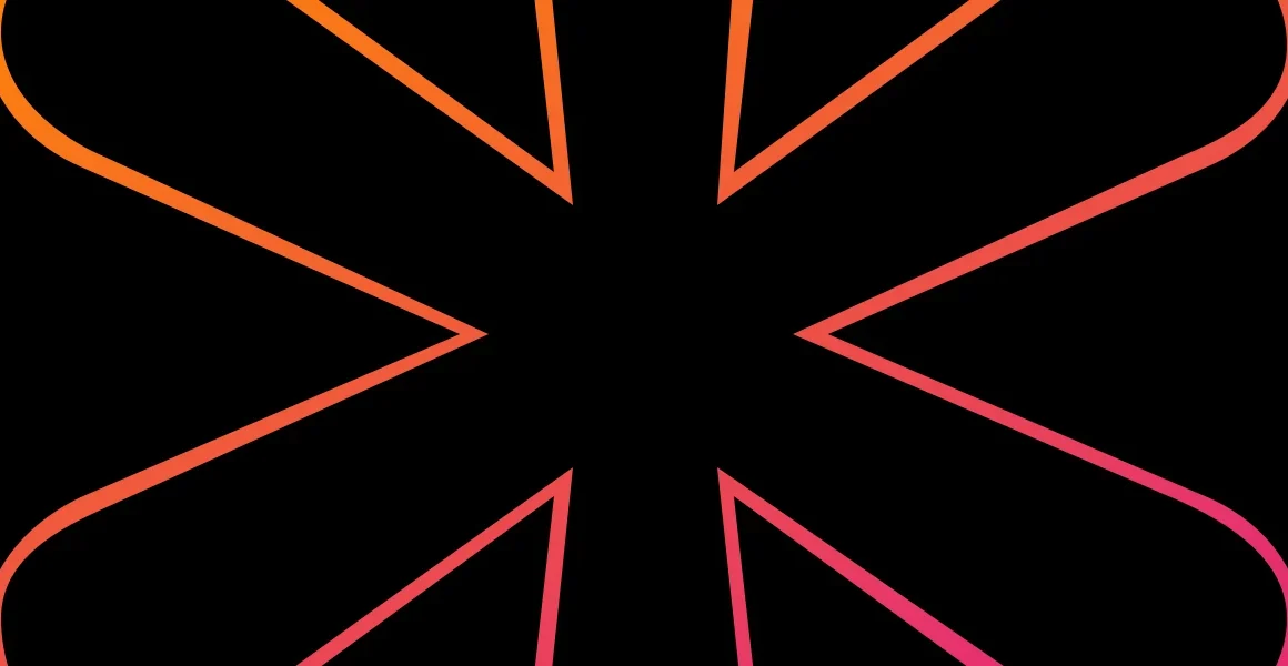
round: The default behavior (circular arc).bevel: Creates a flat, angled cut, reminiscent of a chamfered edge.scoop: Produces a concave, inward-curving edge, perfect for ticket-style UI or organic shapes.squircle: The holy grail of modern UI, creating the continuous-curvature "superellipse" look found in high-end design systems.notch: A sharp, mechanical inward cut.
Furthermore, it supports the superellipse() function, which allows for fine-grained numeric control over the curvature, enabling designers to bridge the gap between a standard circle and a pure square.

Progressive Enhancement: The "Good and Better" Philosophy
As of March 2026, browser support for corner-shape is primarily centered in Chrome 139 and other Chromium-based engines. This raises the perennial question of how to deploy new features without alienating users on other browsers.
The industry consensus, and the approach advocated by forward-thinking developers, is to embrace progressive enhancement. This does not mean creating "broken" fallbacks or displaying "your browser is outdated" warnings. Instead, it involves building a robust, high-quality baseline using standard border-radius techniques, and then using the @supports at-rule to layer on the enhanced shapes for browsers that can render them.

Implementation Pattern:
@layer base
  /* Polished, universal styling */
  .card
    border-radius: 12px;
    background: var(--surface-color);


@layer demo
  @supports (corner-shape: squircle)
    /* The enhanced, premium experience */
    .card
      corner-shape: squircle;
This strategy ensures that the interface remains functional and aesthetically pleasing for all, while offering a superior, high-fidelity experience to those with modern browsers.
Practical Applications in Modern UI
The versatility of corner-shape extends far beyond mere decoration; it is a tool for visual hierarchy.

1. E-commerce and Ribbon Badges
Traditionally, "Sale" or "New" badges required complex clip-path math. By using corner-shape: bevel, developers can now create dynamic, ribbon-like badges that adjust their shape based on the text length, with borders and shadows that adhere perfectly to the new geometry.
2. Button and Tag Systems
Buttons are the primary interactive elements of the web. By applying different corner-shape values to various button types—such as bevel for primary actions and scoop for secondary tags—designers can communicate functionality through shape language, a tactic previously reserved for expensive native mobile applications.

3. Editorial and Testimonial Cards
The scoop value is particularly powerful in editorial layouts. Pairing scooped corners with serif typography creates an organic, high-end feel that mimics print design. By alternating these shapes within a grid, designers can create a sense of movement and variety that would have previously required hundreds of lines of complex CSS.
The Strategic Implications for Design Systems
The integration of corner-shape into CSS suggests a fundamental shift in how we approach component libraries.

- Consistency: Because
corner-shaperespects the box model, shadows and borders are no longer "cut off" as they were withclip-path. This makes it a viable candidate for production-grade design systems. - Performance: By replacing complex SVG masking and image-based workarounds with a native CSS property, we are reducing the browser’s paint cost and improving overall rendering performance.
- Animation: Unlike
clip-path,corner-shapeproperties are animatable via theirsuperellipse()equivalents. This allows for smooth, fluid transitions between states (e.g., a button that shifts frombeveltosquircleon hover), adding a level of polish that feels remarkably "native."
Official Stance and Future Outlook
The W3C working draft for the CSS Borders and Box Decorations Module Level 4 confirms that corner-shape is intended to be a long-term part of the CSS specification. While Safari and Firefox have yet to announce implementation timelines, the adoption by the Chromium project—which powers a massive majority of global web traffic—is a clear signal that this property is here to stay.
Industry experts suggest that corner-shape will likely become as ubiquitous as border-radius within the next 24 to 36 months. As design systems catch up, we can expect to see a new era of "geometric expressionism" on the web, where the rigid box is finally, and gracefully, broken.

Conclusion
We have traveled a long road from the "five-image" era to the current day. Each iteration of CSS has sought to provide more power with less overhead. With corner-shape, we are finally closing the gap between the complex, refined visuals of native applications and the dynamic, responsive world of the web.
The professional takeaway is clear: do not wait for universal support to begin experimenting. By building on a foundation of solid, accessible design and using corner-shape as an elegant enhancement, developers can lead the charge in defining the next generation of web aesthetics. The future of the web is not just responsive—it is shapely.