







Despite being supported by over 94% of modern browsers, CSS Container Queries remain one of the most underutilized and misunderstood features in the front-end developer’s toolkit. While the industry has spent over a decade perfecting responsive design via the "macro" lens of media queries, a fundamental shift is occurring: the move toward component-driven architecture.
To understand why adoption remains at a puzzling 41.4%—according to the 2025 State of CSS survey—we must first deconstruct our reliance on the viewport. Container queries are not merely a "new way to do media queries"; they represent a paradigm shift in how we build resilient, modular, and truly adaptive interfaces.
The Chronology of a Responsive Evolution
The history of responsive web design (RWD) is inextricably linked to the emergence of the smartphone. When Ethan Marcotte coined the term in 2010, the challenge was singular: how to make a page designed for a desktop monitor look acceptable on a mobile screen. Media queries became the industry standard for this task. By "looking outward" at the browser window, developers could trigger layout changes—collapsing navigation, stacking grids, and resizing typography—based on the device’s width.
For years, this was sufficient. However, as web design evolved into a component-based ecosystem (pioneered by libraries like React, Vue, and Web Components), a contradiction emerged. Developers began building highly reusable components—like cards, widgets, and sidebars—that were intended to function in diverse contexts. A card might appear in a full-width blog feed, a narrow sidebar, or a complex dashboard grid.
Media queries, however, are "dumb" in this context. They only know the width of the browser window. If a card is placed in a 300px-wide sidebar on a 1920px-wide desktop monitor, a media query geared toward a "desktop" layout will fail to trigger, leaving the card cramped and broken. The industry spent years clamoring for a solution that allowed components to "look inward" at their parent container. Container queries were the answer, finally arriving in browsers to solve the "component context" problem.

Supporting Data: The Adoption Gap
The disconnect between capability and usage is stark. While 86% of developers are aware of container queries, less than half have integrated them into their production workflows. This discrepancy is highlighted by the advocacy of industry leaders like Kevin Powell, who noted at SmashingConf Amsterdam 2026 that container query adoption has been "terrible."
The data suggests that the barrier is not technical complexity, but cognitive inertia. Because the syntax of @container mirrors @media, developers often mistakenly treat them as identical tools. This leads to common pitfalls, such as attempting to query an element’s own container directly or misusing size queries, which can lead to unexpected layout collapses. The 2,300+ unique viewport sizes tracked in recent studies serve as a final indictment of the old way of doing things: trying to account for every possible screen size via media queries is an impossible, infinite game of whack-a-mole.
The Fundamental Shift: Macro vs. Micro Layouts
To master modern CSS, developers must distinguish between "macro" and "micro" layouts.
Macro Layouts (The Viewport)
Media queries are, and will remain, the premier tool for macro layouts. They are designed to manage the global structure of a page. If you are changing the entire site navigation from a horizontal bar to a hamburger menu, or switching from a two-column grid to a single column, media queries are your tool. They look at the browser window and ask, "What is the global state of the user’s viewport?"
Micro Layouts (The Container)
Container queries are designed for micro layouts—the internal logic of components. When a component is responsible for its own responsiveness, it doesn’t care about the screen size; it only cares about the space available to it. By using container-type: inline-size, a developer tells the browser: "This element is the boss of its own layout." If the parent container is wide, the component expands; if it is narrow, it gracefully adapts.

The Mechanics of Adaptation: Fluidity and Logic
One of the most powerful applications of container queries is in the realm of fluid typography and internal state detection.
Fluid Typography
Traditionally, fluid typography relied on viewport units (vw, vh), which scaled text relative to the screen. This created issues when a component was moved to a different part of the page. By using container units (cqi, cqw) in conjunction with the clamp() function, developers can now create text that scales relative to the component. A headline inside a small sidebar will now shrink proportionately to its container, rather than ignoring the sidebar’s boundaries.
Flexbox Wrap Detection
Perhaps the most impressive feat of container queries is their ability to act as a proxy for internal state. Standard CSS cannot detect if flex items have wrapped to a new line. Historically, this required heavy JavaScript to monitor ResizeObserver events. Today, by nesting a container query inside a flex container, you can apply styles precisely when a component has "enough room" to expand, effectively bridging the gap between layout and content.
Official Guidance and Best Practices
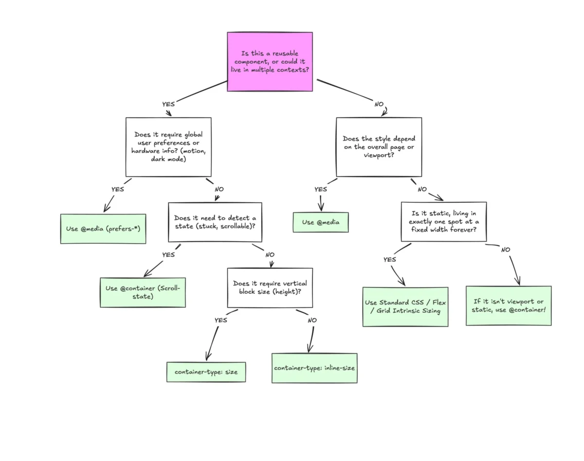
While container queries are powerful, they are not a replacement for every media query. Experts recommend a "separation of concerns" approach.
- Don’t Query the Self: A common mistake is attempting to query the container for its own styling. This creates an infinite loop. Always ensure the styling logic is applied to a descendant of the container.
- Prefer
inline-size: When definingcontainer-type, stick toinline-sizeunless you have a specific, advanced use case forsize. Queryingsize(which includes block/height) can cause the element to collapse to 0px because the browser ignores the content’s height during calculation. - The Logic of Placement: Use the following heuristic:
- If the styling depends on the entire page state (e.g., global navigation, device orientation), use
@media. - If the styling depends on the component’s specific context (e.g., cards, widgets, sidebars), use
@container.
- If the styling depends on the entire page state (e.g., global navigation, device orientation), use
Implications for the Future of Web Development
The implication of widespread container query adoption is a more modular, resilient web. As we move away from "page-centric" design, we are entering the era of "component-centric" systems.

When a component is truly autonomous, it becomes portable. Developers can build a library of UI elements that can be dropped into any template—be it a CMS, a landing page, or an enterprise dashboard—without the fear that the CSS will break because the viewport size has changed. This is the holy grail of front-end development: "write once, render anywhere, adapt everywhere."
Furthermore, as we look toward the future, the introduction of container style queries (which allow for querying computed styles rather than just dimensions) will further remove the need for brittle class-based logic.
Conclusion
The "terrible" adoption rate of container queries is a temporary hurdle in the history of CSS. Like Flexbox and Grid before them, container queries are suffering from the "familiarity trap"—the false belief that because we have a tool that works "well enough," we do not need a better one.
However, the evidence is clear: the modern web is too fragmented for viewport-only responsiveness. By embracing the container, developers move closer to a design system that is truly flexible, where components respect their environment rather than competing with it. It is time to stop looking outward at the screen and start looking inward at the component. The future of the web is contained, modular, and—above all—responsive.