







Every typeface carries a silent narrative. When a consumer glances at a brand, they aren’t just reading the company name; they are interpreting a complex visual language of curves, weight, and spacing. Serif fonts evoke timeless authority, sans serifs project modern efficiency, and script faces whisper personal intimacy.

For graphic designers and brand strategists, the selection of a logo font is the most critical decision in the creative process. A logo must function as the anchor of a brand’s entire identity—it must be scalable, legible, and evocative. To assist you in this endeavor, we have curated a comprehensive guide featuring over forty of the finest logo fonts designed to bridge the gap between abstract brand values and tangible design.
The Evolution of Brand Typography: A Chronology
The history of logo design has evolved alongside human technology. In the early 20th century, brands relied on hand-lettered calligraphy to establish prestige. As the industrial age matured, designers shifted toward clean, geometric sans-serifs, a trend that hit its peak with the rise of corporate modernism in the 1960s and 70s.
Today, we are in the era of "variable identity." Brands no longer need a single, static logo; they need responsive typefaces that perform equally well on a massive billboard or a 16-pixel favicon. From the resurgence of 70s-inspired display fonts to the cutting-edge, abstract geometry of the current tech landscape, the chronology of logo design shows a clear trajectory: moving toward versatility without sacrificing personality.
Strategic Selection: A Professional Checklist
Choosing a font is not merely about aesthetic preference; it is a strategic business decision. Before settling on a typeface, designers should evaluate the following criteria:
- Legibility at Scale: Will the font remain recognizable when shrunk to fit a social media avatar?
- Brand Alignment: Does the "voice" of the font match the company’s mission? (e.g., a law firm requires stability; a creative agency requires flair).
- Versatility: Does the font family include enough weights (Light, Regular, Bold, Black) to support a full brand system?
- Licensing Compliance: Does the license cover commercial use, including trademarking the logo?
Essential Font Recommendations: Where to Begin
If you are struggling to narrow down your choices, we have identified ten top-tier recommendations categorized by their distinct design utility:
| Category | Recommended Font | Best For | Why Choose It? |
|---|---|---|---|
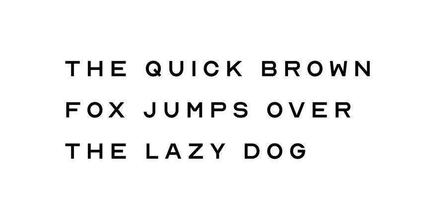
| Minimal | Nord | Tech/Fashion | Seven weights for extreme flexibility. |
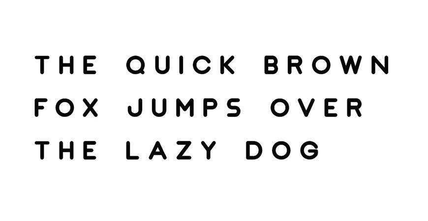
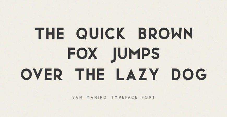
| Geometric | JUST Sans | Corporate | Balanced shapes for large systems. |
| Monogram | Augor | Luxury | Distinctive uppercase for iconic marks. |
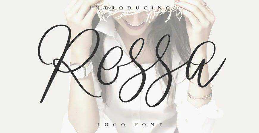
| Script | Rossa | Beauty/Hospitality | Refined, readable handwriting. |
| All-Caps | Stag | Sports/Tech | Powerful, bold presence. |
| Brush | Quick Silver | Streetwear | Energetic, hand-painted aesthetic. |
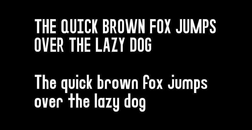
| Display | Fritz | Creative/Friendly | Rounded forms with high clarity. |
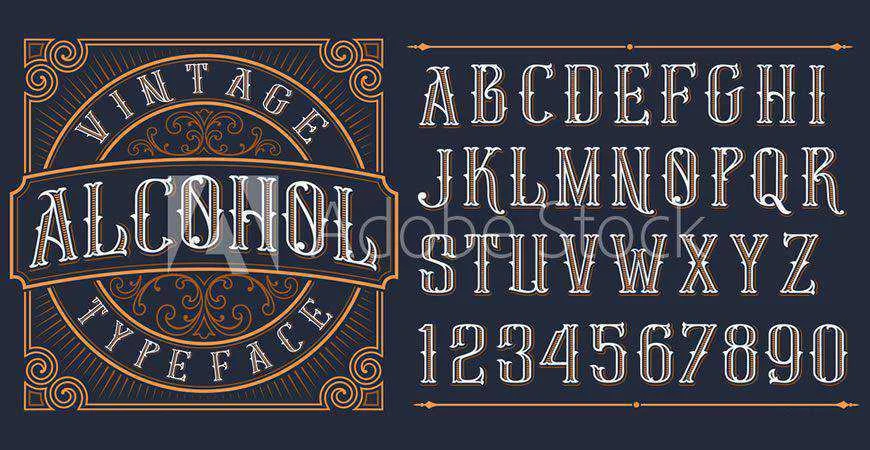
| Vintage | Brewisten | Food/Retail | Retro charm for heritage branding. |
| Handwritten | Southwave | Lifestyle | Relaxed, approachable, authentic. |
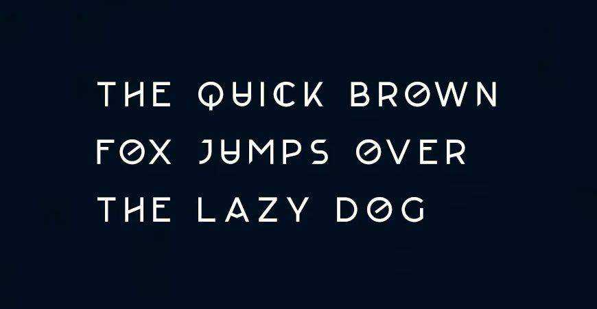
| Futuristic | Lequire | SaaS/Fintech | Innovative, sharp, modern lines. |
Deep Dive: Categorized Typeface Styles
Minimal and Geometric: The Foundation of Trust
Minimalism remains the gold standard for industries requiring high levels of consumer trust, such as finance, law, and healthcare. Fonts like Jaquel and Impulse leverage geometric principles to provide a clean, uncluttered look. Nord stands out here, offering a sophisticated elegance that feels premium, while JUST Sans provides a highly versatile character set that excels in complex corporate branding.
The Monogram: Elegance in Tradition
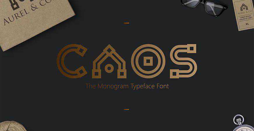
For legacy brands or luxury boutiques, the monogram is the ultimate symbol of sophistication. CAOS offers a structural approach to the monogram, allowing designers to pull individual symbols out of the letterforms to use as stand-alone brand icons. Augor follows a similar path, providing a minimalist, high-end feel that communicates status through simplicity.
Script and Handwritten: The Human Element
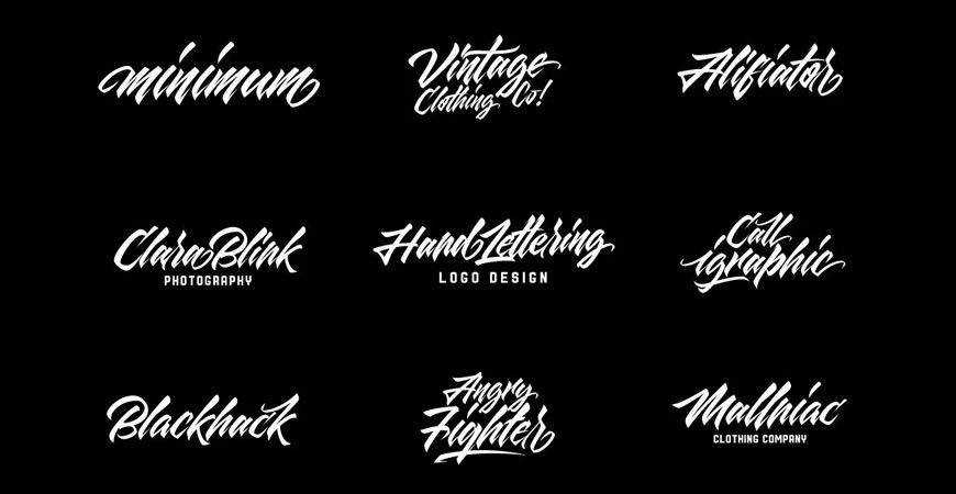
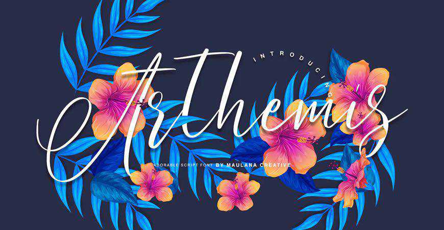
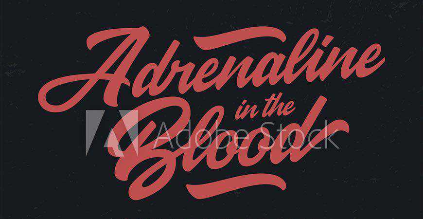
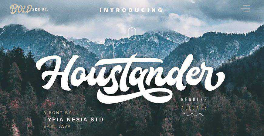
In a digital-first world, consumers crave the "human touch." Rossa and Arthemis bring a handcrafted, calligraphic quality that works beautifully for boutique brands or personal ventures. For those seeking a grittier, more youthful feel, Quick Silver and Adrenaline in the Blood provide a brush-stroke aesthetic that feels spontaneous and urgent.
Futuristic and Abstract: Looking Ahead
Technology brands often opt for fonts that suggest motion and innovation. Lequire and Artis occupy this space, utilizing unique, non-traditional shapes to signal forward-thinking. Meanwhile, Aqume and Humanica represent the "abstract" category, where typography borders on art, making them perfect for avant-garde design agencies.
The Legal Reality: Navigating Licensing
A common pitfall for new designers is the misunderstanding of font licenses. Many fonts available for "free download" are strictly restricted to personal, non-commercial use.
- Personal Use: Prohibits use on any materials meant for profit, including client work.
- Commercial License: Necessary for any logo that represents a business.
- Embedding/Distribution: Many licenses prohibit the sharing of the font file itself, meaning you cannot send the font to your client as part of the brand asset package.
Always audit the EULA (End User License Agreement) on the provider’s website. If you are designing for a client, ensure the license covers their specific industry and scale of operation.
Implications for Brand Identity
The impact of your typography choice cannot be overstated. Research in cognitive psychology indicates that consumers form a subconscious opinion about a company within milliseconds of seeing their logo. If your font is "off-brand"—for instance, using a whimsical, bubbly script for a security firm—the disconnect will create friction in the customer’s mind.
A well-chosen font acts as a psychological shortcut. It tells the customer, "We are professional," "We are creative," or "We are reliable" before they ever read a word of your marketing copy.
Conclusion: Crafting the Future
Designing a logo is a journey of synthesis. You are taking a company’s values and condensing them into a single, visual expression. By utilizing this collection of fonts—from the structural precision of geometric faces to the raw emotion of brush-style scripts—you are equipped to handle any brief that crosses your desk.
Remember: the best logo doesn’t just represent the brand; it embodies it. As you move forward into your next project, bookmark this guide, stay mindful of licensing, and continue to prioritize the delicate balance between form and function. Your client’s brand identity starts with the first letter you set. Make it count.