







In the ever-evolving landscape of web design, few UI patterns have become as ubiquitous as the light/dark mode toggle. Typically tucked neatly into a website’s navigation bar or header, these little sun and moon icons offer users the ability to flip between a bright, high-contrast daytime aesthetic and a muted, eye-friendly night theme.
For years, standard implementation practices have favored a three-state control scheme: Light, Dark, and System. This triad allows visitors to either lock in a specific aesthetic preference or instruct the website to inherit the global appearance settings of their underlying operating system.
However, a spirited debate currently sweeping through the web development community is challenging this convention. Spearheaded by prominent developer and UI/UX researcher Lea Verou, a growing movement is arguing that the standard three-state toggle is unnecessarily cluttered. Instead, Verou advocates for a streamlined, highly intuitive two-state control that leverages smart defaults and persistent storage, igniting a broader conversation about cognitive load, user intent, and minimalist interface design.
The Core Argument: Why Three States May Be One Too Many
To understand the controversy, one must look at how users actually interact with websites. When a visitor lands on a webpage, their primary goal is rarely to fiddle with the site’s color scheme. Theme selection is entirely tangential to the user’s core intent—whether they are reading an article, purchasing a product, or checking documentation.
Despite this, millions of websites proudly display a clunky tri-state menu or a multi-option dropdown just to handle color preferences. Verou’s critique, detailed extensively in her recent writings on the subject, argues that websites do not need to explicitly present a "System" option when a well-designed two-state control can effortlessly manage all three scenarios (Light, Dark, and System default).
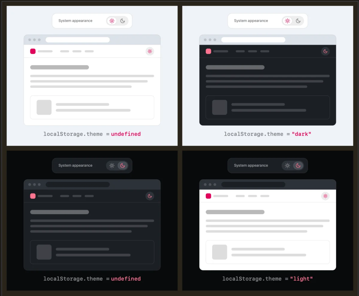
How the Two-State Logic Operates:
- No User Override (
localStorageis empty): The website gracefully defaults to matching the visitor’s system settings (respecting theprefers-color-schemeCSS media query). - First Interaction: If the user dislikes the current default (for instance, the system is in dark mode, but they prefer a light background for this specific site), they click the toggle once to apply an override.
- Persistence: That preference is instantly saved to the browser’s
localStorage. From that moment on, the site honors the user’s explicit choice, bypassing the system settings entirely.
In essence, the system acts as the baseline state until the user explicitly expresses a desire for change. Proponents of this approach argue that stripping away the redundant "System" button slashes visual clutter from persistent navigation bars without sacrificing granular control.
Chronology of the Debate: From a Bluesky Spark to a Full-Scale Design Discourse
The conversation did not happen in a vacuum. It unfolded across social web platforms and developer blogs, quickly gathering momentum as industry professionals weighed in on the nuances of interface ergonomics.
- Early August 2026: Lea Verou publishes her initial architectural thoughts on modern dark mode toggles, challenging the necessity of visible tri-state configurations in persistent UI elements.
- Mid-August 2026: The discussion spills over onto Bluesky, where frontend developers and UX designers dissect the implications of browser-level preferences versus site-level overrides.
- Late August 2026: Responding to community feedback, edge cases, and pushback regarding state persistence, Verou publishes a comprehensive follow-up blog post summarizing the debate, further cementing the boundaries of when a two-state control is appropriate—and when exceptions apply.
As the debate matured, designers began probing deeper into edge cases. For instance, what happens if a user starts with a Light system preference, toggles the site to Dark, and later wants to revert back to matching their system? Does toggling back create a new override preference, or does it clear the localStorage value to restore the system fallback?
Verou dismisses these anxieties as over-engineered edge cases. Because theme switching is secondary to the user’s actual journey on the site, minor discrepancies are easily remedied. As she notes, if a user’s manual override eventually diverges from their operating system settings, fixing it is merely "a single click away."
Supporting Data and Psychological Considerations: Cognitive Dissonance in Navigation
From a psychological standpoint, every interactive element introduced into a user interface demands a fraction of the visitor’s cognitive bandwidth. Navigation bars are prime real estate; they are designed to guide users smoothly through a digital space.
When designers cram three or more options into a persistent color scheme toggle, they introduce unnecessary visual noise. This contributes to micro-instances of cognitive dissonance—subconscious friction where the brain has to process choices that bear little relevance to the task at hand.
Furthermore, community discussions have highlighted a fascinating disconnect between operating system preferences and web behavior. As developer Chris Coleman noted in a widely shared Bluesky thread during the debate:
"All I ever wanted was for my OS to be dark, not every website I look at. It was a huge leap by the browser vendors to tie all web content to that system preference."
This sentiment underscores a vital UX reality: forcing web content to blindly follow global OS settings can sometimes alienate users who want compartmentalized visual experiences. However, if browser vendors eventually migrate deeper color-preference controls natively into browser settings rather than operating systems, the need for site-specific persistent toggles diminishes even further. In an ideal future, websites might not need a toggle at all, leaving the heavy lifting entirely to native browser defaults.
Exceptions to the Rule: When Do Three States Still Make Sense?
While the two-state override model is being widely praised as the superior pattern for persistent navigation bars, Verou and her peers acknowledge that context matters. There are specific scenarios where a tri-state control remains not only valid, but functionally superior:
- Complex Application Settings Dashboards: In a dedicated user preferences panel, settings page, or account dashboard, transparency is paramount. Users expect to see explicitly defined states (Light, Dark, System) so they can audit and manage their configurations deliberately, rather than relying on implicit toggle behavior.
- High-Stakes Accessibility Environments: For software or portals tailored heavily toward users with visual impairments, neurodivergence, or specialized contrast needs, explicit clarity trumps minimalism. In these contexts, leaving a user guessing whether a toggle is overriding their system or just reflecting it can lead to frustration.
Industry Implications and Future Best Practices
The shift toward streamlined dark mode toggles signals a broader maturation in modern web design. For years, the industry suffered from "feature bloat," where developers added UI controls simply because they were technically possible or because standard component libraries (like Bootstrap or Tailwind UI templates) shipped with them out of the box.
By critically evaluating patterns like the three-state toggle, the design community is returning to a foundational principle: every pixel on a screen must earn its right to be there.
For web developers and UI/UX designers looking to audit their current projects, the takeaways from the Verou-led debate are clear:
- Audit Persistent Navigation: Check if your header features a cluttered three-state dropdown or segmented button control for themes.
- Embrace Implicit Defaults: Allow your site to naturally inherit system preferences via CSS (
color-scheme: light dark;), reserving local storage saves strictly for explicit user overrides. - Reduce Cognitive Load: Remember that less UI often translates to a cleaner, more professional, and more focused user experience.
As the digital ecosystem continues to iterate, the humble dark mode toggle serves as a potent reminder that even the smallest interface elements benefit from rigorous, user-centric scrutiny.