



Every dystopian narrative—whether it manifests in the silver-screen sprawl of a neon-drenched metropolis or the crumbling, brutalist architecture of a post-collapse society—relies on a fundamental visual language to communicate its reality. Before a single line of dialogue is spoken, the audience is informed by the environment, and nowhere is that environment more codified than in the choice of typography.
In the world of design, fonts are not merely conduits for information; they are atmospheric tools. A typeface can signal the crushing weight of an authoritarian regime, the jagged rebellion of an underground resistance, or the flickering, corrupted logic of a machine-dominated future. As creators continue to build expansive, imaginative worlds for gaming, cinema, and digital media, the demand for "dystopian typography"—typefaces defined by angular structures, industrial grit, and glitch-infused aesthetics—has reached an all-time high.
The Semiotics of Dystopia: Why Font Choice Matters
The psychology behind dystopian design is rooted in the "uncanny." We are drawn to visuals that feel familiar yet fundamentally wrong. When a designer selects a typeface for a project, they are looking for specific cues:
- Oppression: Thick, monolithic strokes that feel immovable and cold.
- Fragmentation: Distorted, glitch-heavy shapes that suggest a society breaking down.
- Technological Decay: Angular, machine-like forms that imply a world run by malfunctioning AI or outdated hardware.
These fonts are bold enough to anchor a title sequence, yet textured enough to serve as the backbone for complex, immersive layouts. To understand how these tools are shaping modern creative work, we must examine the current landscape of professional and experimental type design.
A Chronology of Influence: From Sci-Fi Roots to Digital Realism
The evolution of these typefaces traces a clear path through the history of speculative fiction. In the late 20th century, dystopian typography was heavily influenced by the "high-tech, low-life" aesthetic of cyberpunk literature. The goal was to mimic the look of primitive computer interfaces and propaganda posters from totalitarian regimes.
As we moved into the 2010s and 2020s, the focus shifted toward "distressed" typography—fonts that appear to have survived a nuclear winter or a digital plague. Today, we are seeing a synthesis: high-definition, razor-sharp digital aesthetics blended with the raw, chaotic energy of decay. This shift has birthed a new generation of display fonts that are not just readable, but experiential.
Curating the Future: Top-Tier Dystopian Typefaces
For designers tasked with building a world, the selection of a primary typeface is the most critical decision. Below is an analysis of the most influential dystopian fonts currently dominating the design market, categorized by their structural intent.
1. The Heavyweights: Bold and Authoritarian
These fonts are designed for dominance. They are the "state-sanctioned" lettering seen on propaganda banners or the corporate logos of dystopian mega-conglomerates.
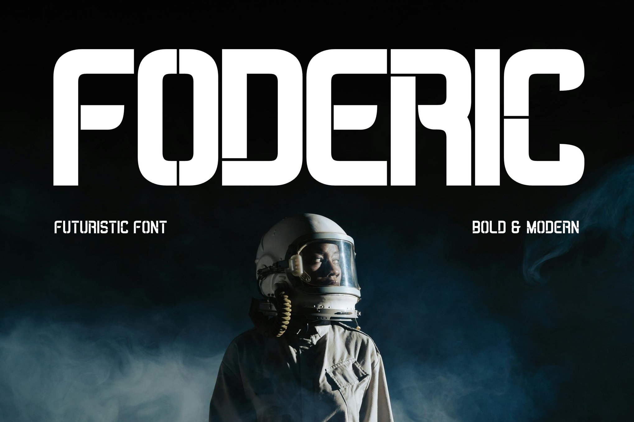
- Foderic: A multifunctional powerhouse. Its edgy, sharp appeal makes it the gold standard for projects that require a sense of immediate, overwhelming authority. It supports a full Latin character set, making it versatile for global design campaigns.
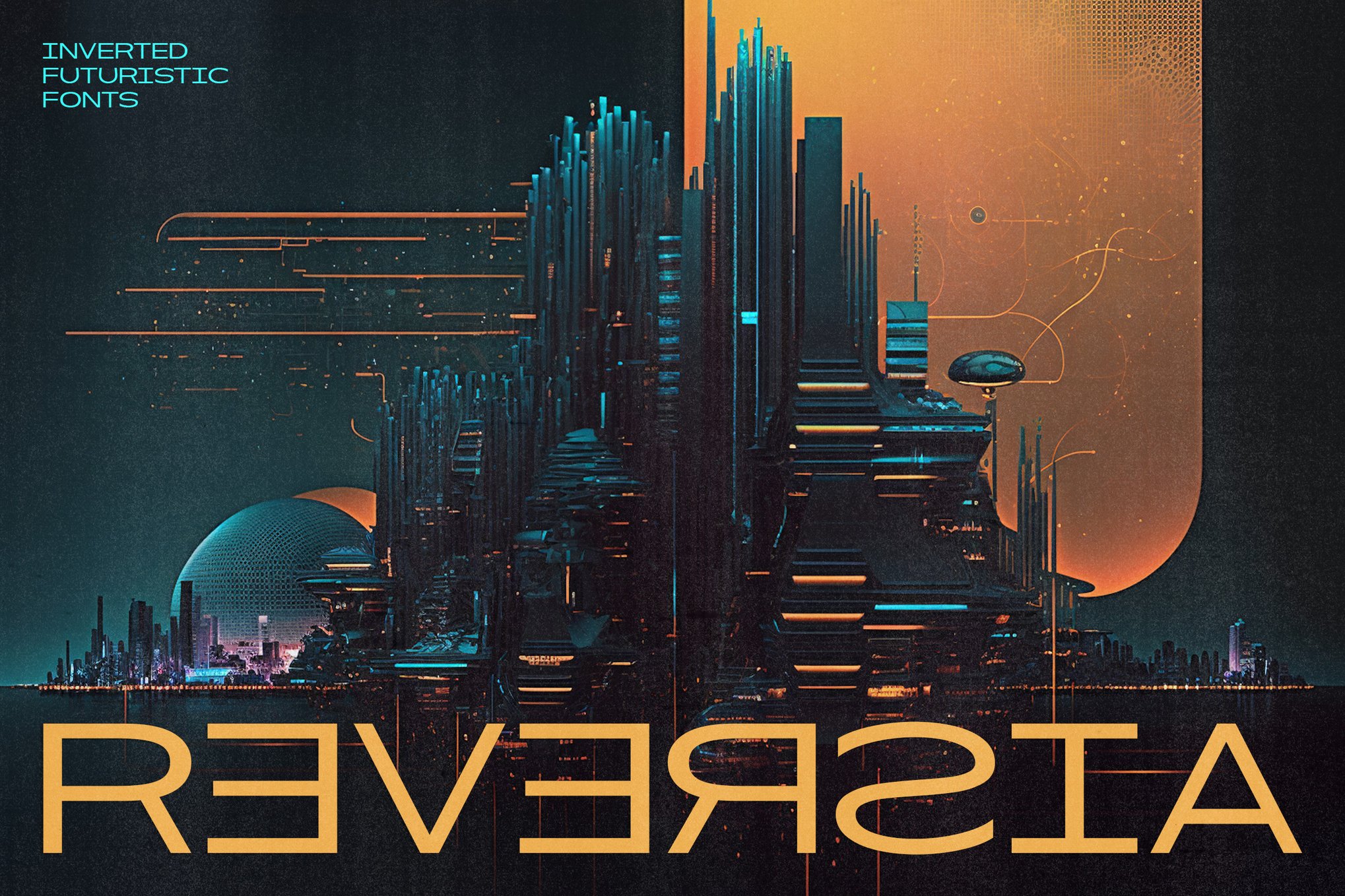
- Reversia: This font takes an "expanded" approach, literally pushing the boundaries of traditional character spacing. It is a bold, brave choice for designers who wish to disrupt the viewer’s expectations of legibility.
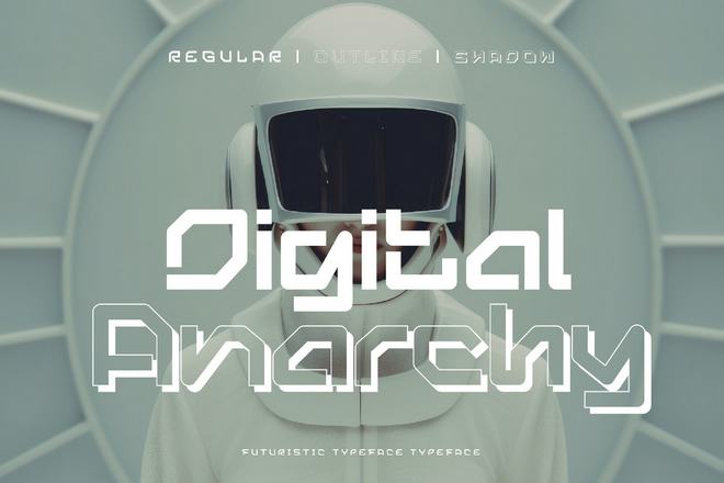
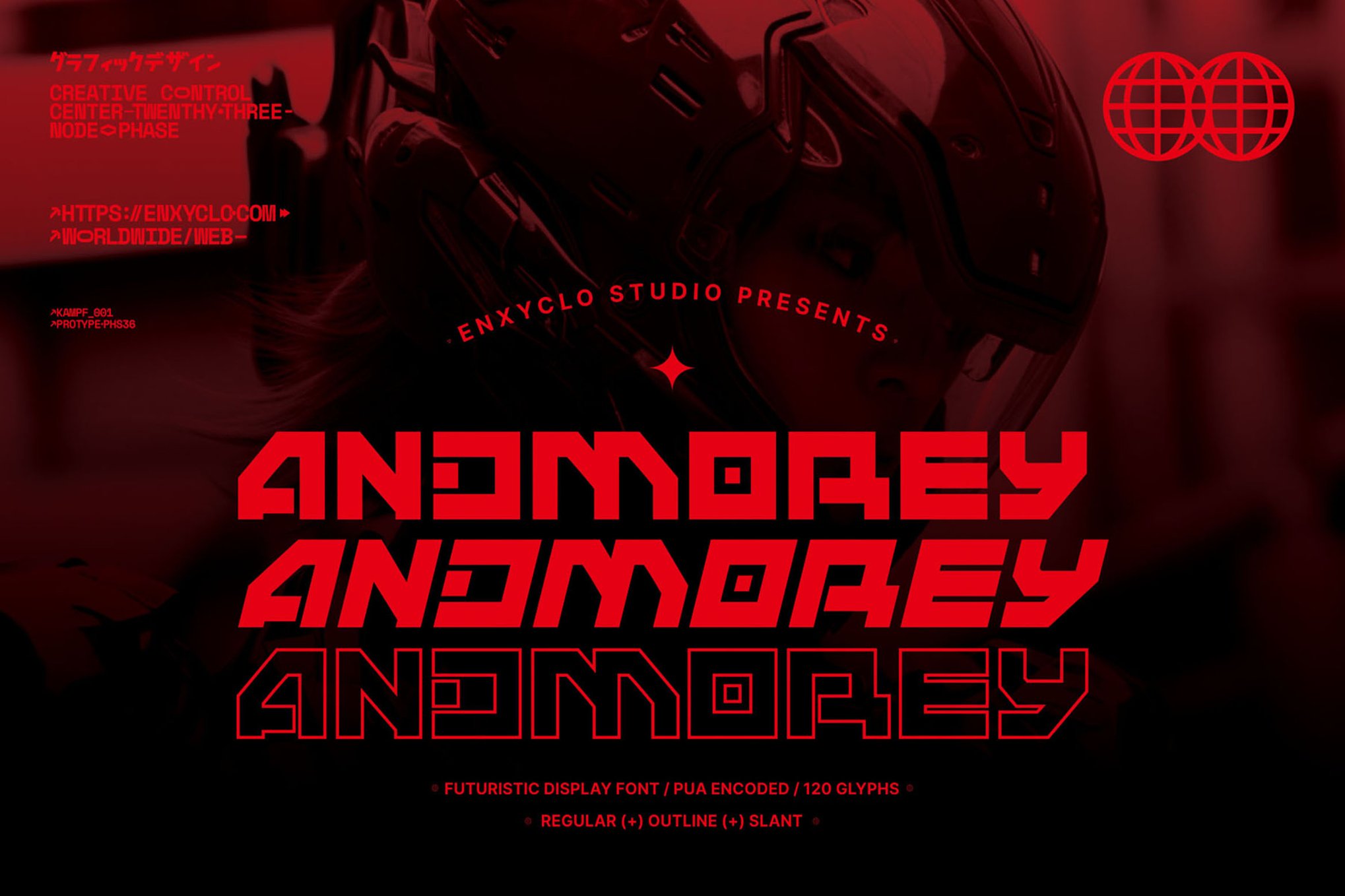
- Andmorey: With 360 unique glyphs, this is a masterclass in versatility. By offering regular, outline, and slant variations, it allows for a cohesive branding language across disparate media, from physical posters to digital interfaces.
2. The Tech-Centric: Glitch and Geometry
When a project demands a connection to a futuristic, albeit broken, technology, these fonts bridge the gap between human design and machine output.
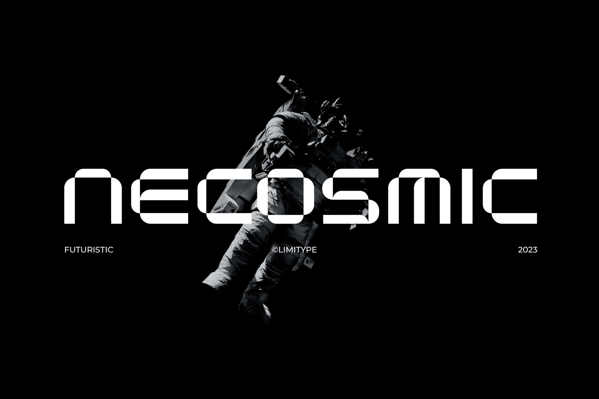
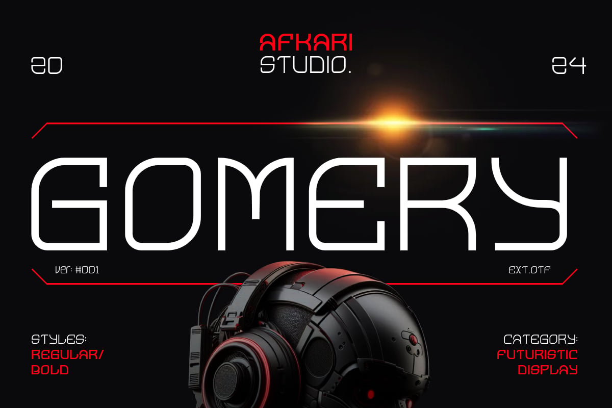
- Gomery: Fusing geometric precision with striking curves, Gomery feels like a UI font for a sophisticated but cold operating system. Its inclusion of unique ligatures makes it particularly useful for high-end digital branding.
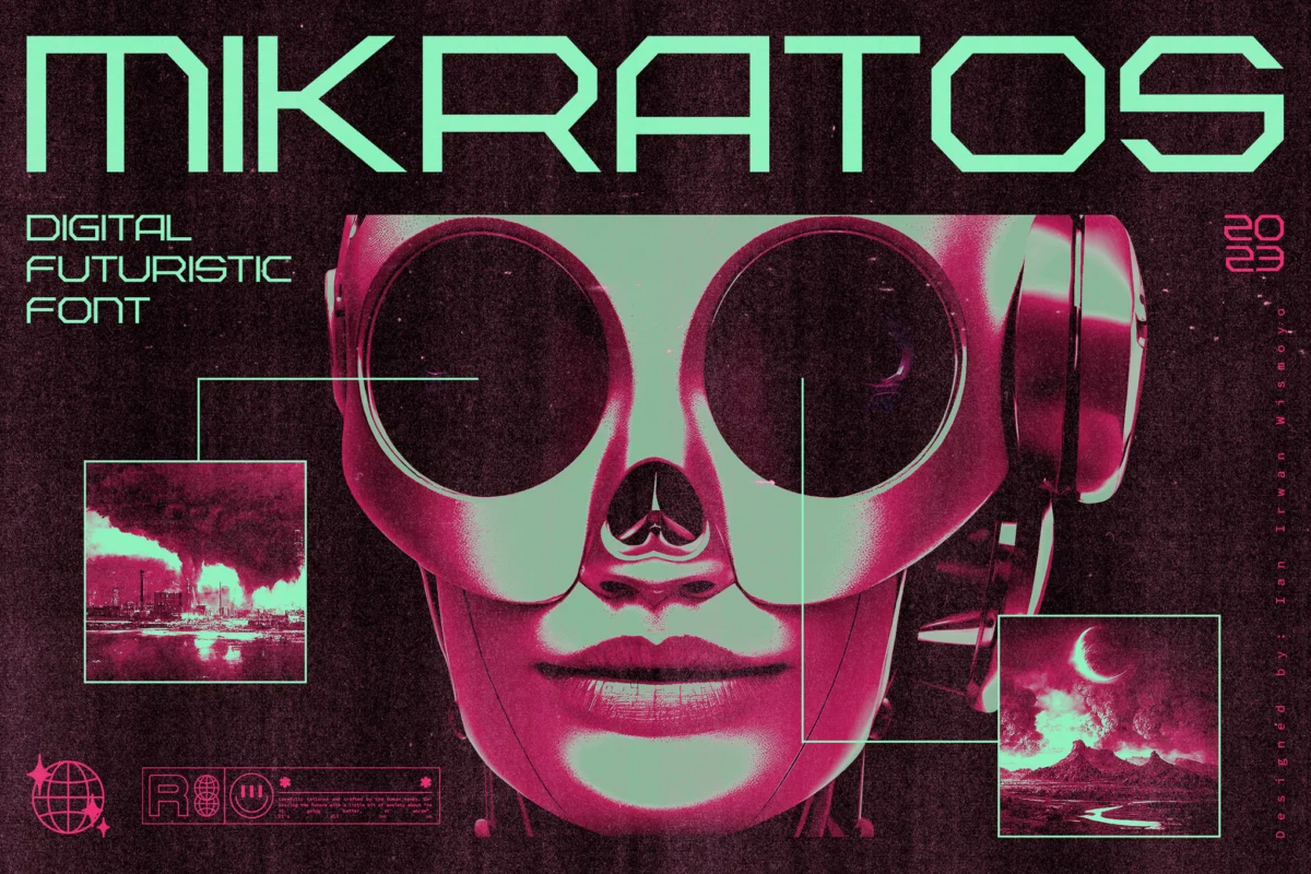
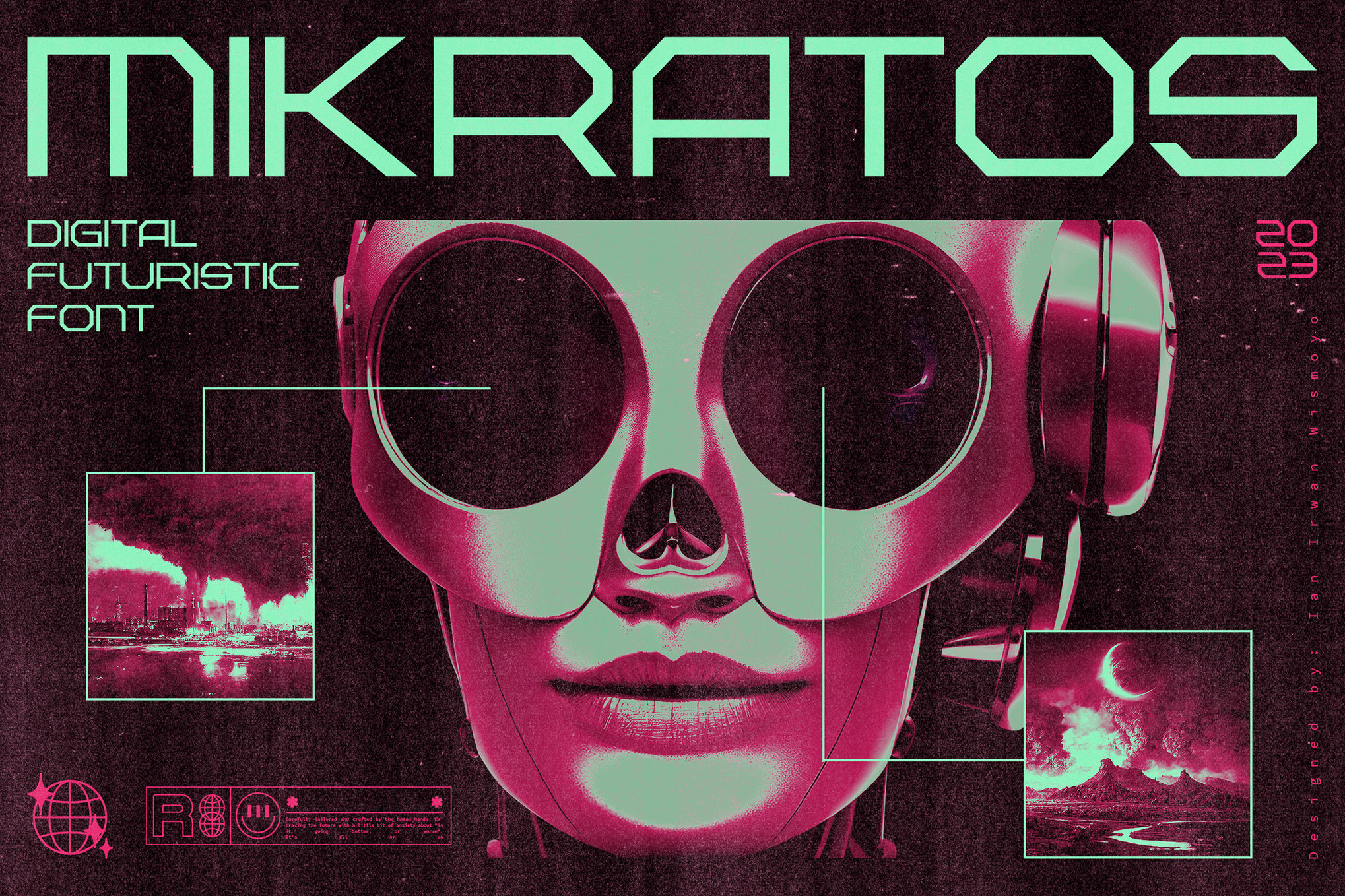
- Mikratos: Bridging the gap between 1980s retro-futurism and modern minimalism, this font is the go-to for music videos and album art. It evokes the nostalgia of early gaming while maintaining a clean, contemporary edge.
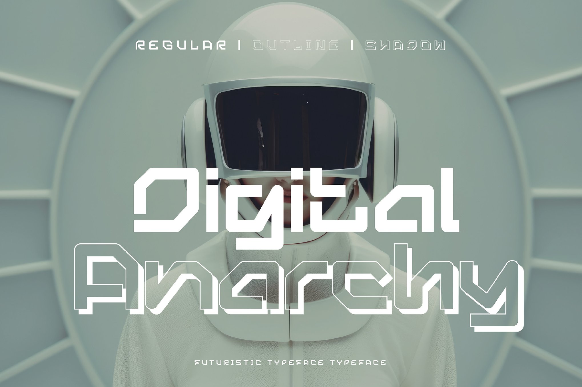
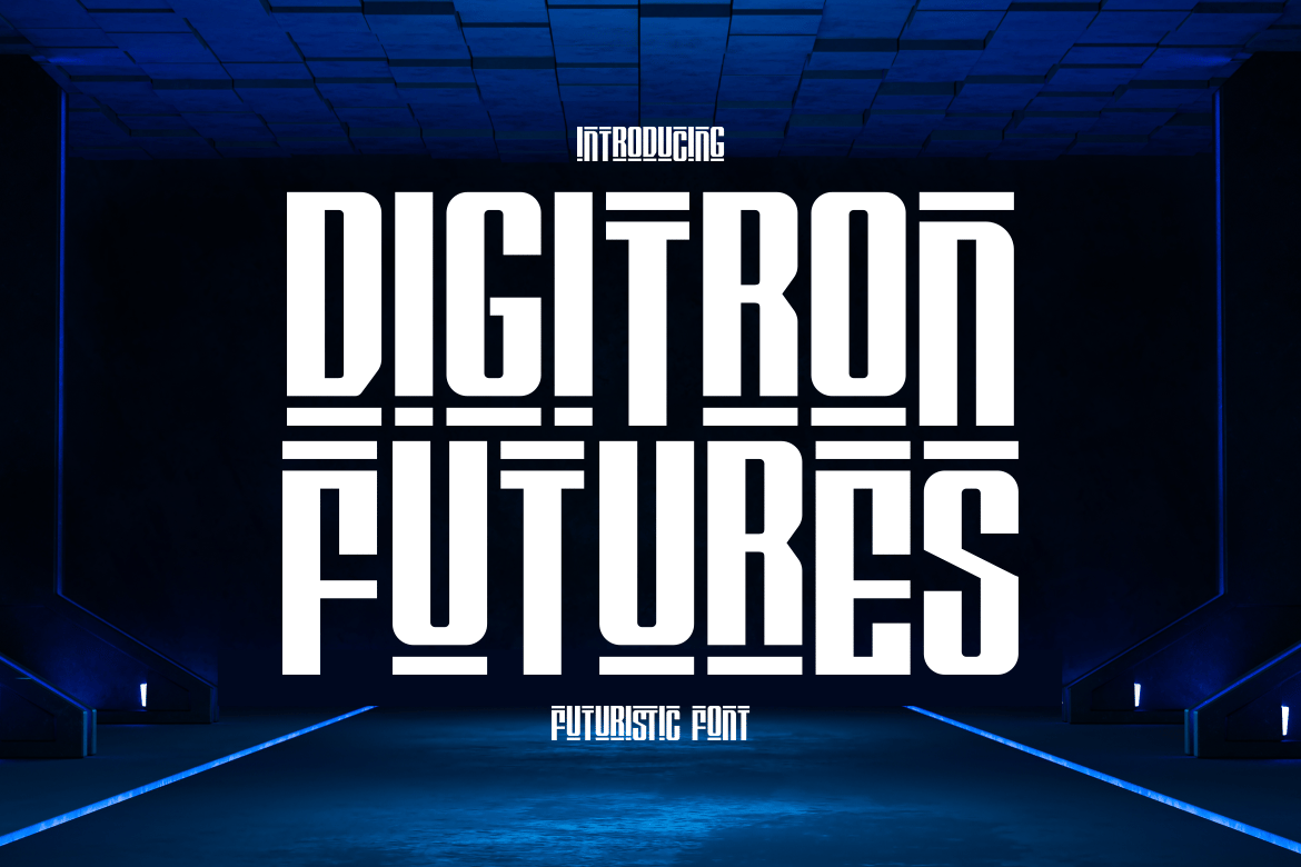
- Digitron Futures: Meticulously crafted for high-impact layouts, this font feels like a direct export from a sci-fi thriller’s tactical display. It is ideal for tech startups looking to lean into a "visionary" brand identity.
- Fear Robot: This font channels the "gritty vitality" of a machine uprising. It is sleek, precise, and carries a weight that is perfect for gaming interfaces where the UI must feel both advanced and dangerous.
3. The Minimalists: The "New Order" Aesthetic
Sometimes, the most terrifying dystopia is one that appears clean, efficient, and perfectly organized.
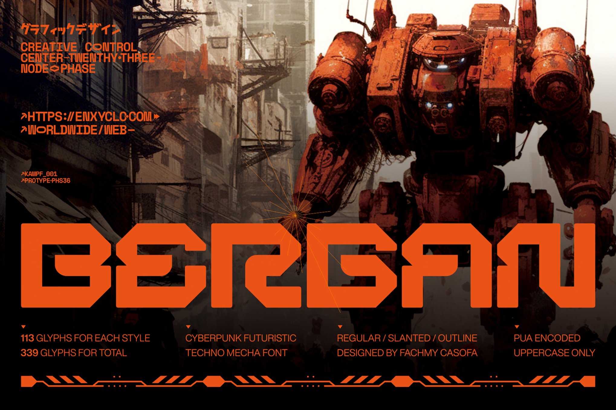
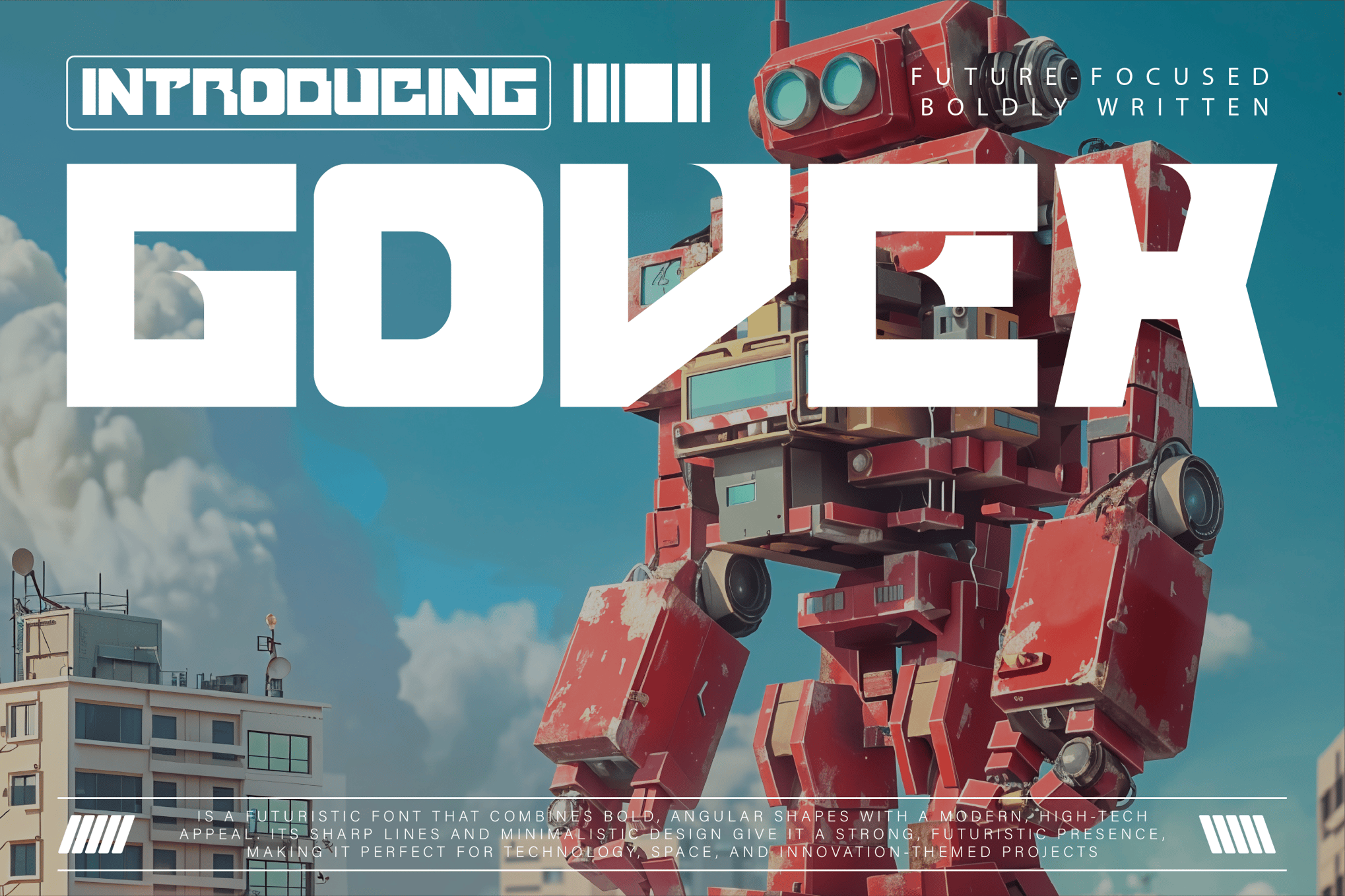
- Govex: Minimalist and angular, Govex is the typeface of choice for space-exploration or innovative dystopian narratives. It conveys a sense of sterility—the perfect visual accompaniment to a world where individuality has been purged.
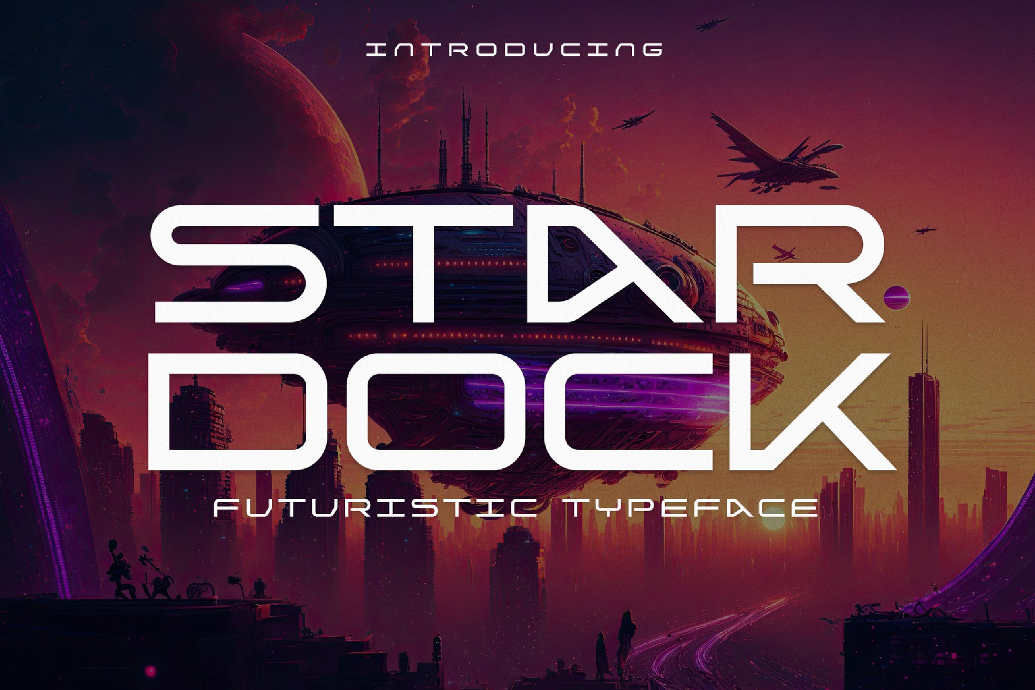
- Stardock: With its smooth, clean lines, Stardock is a staple for AI-themed design. It feels like the font that would be used on the manual for a synthetic human.
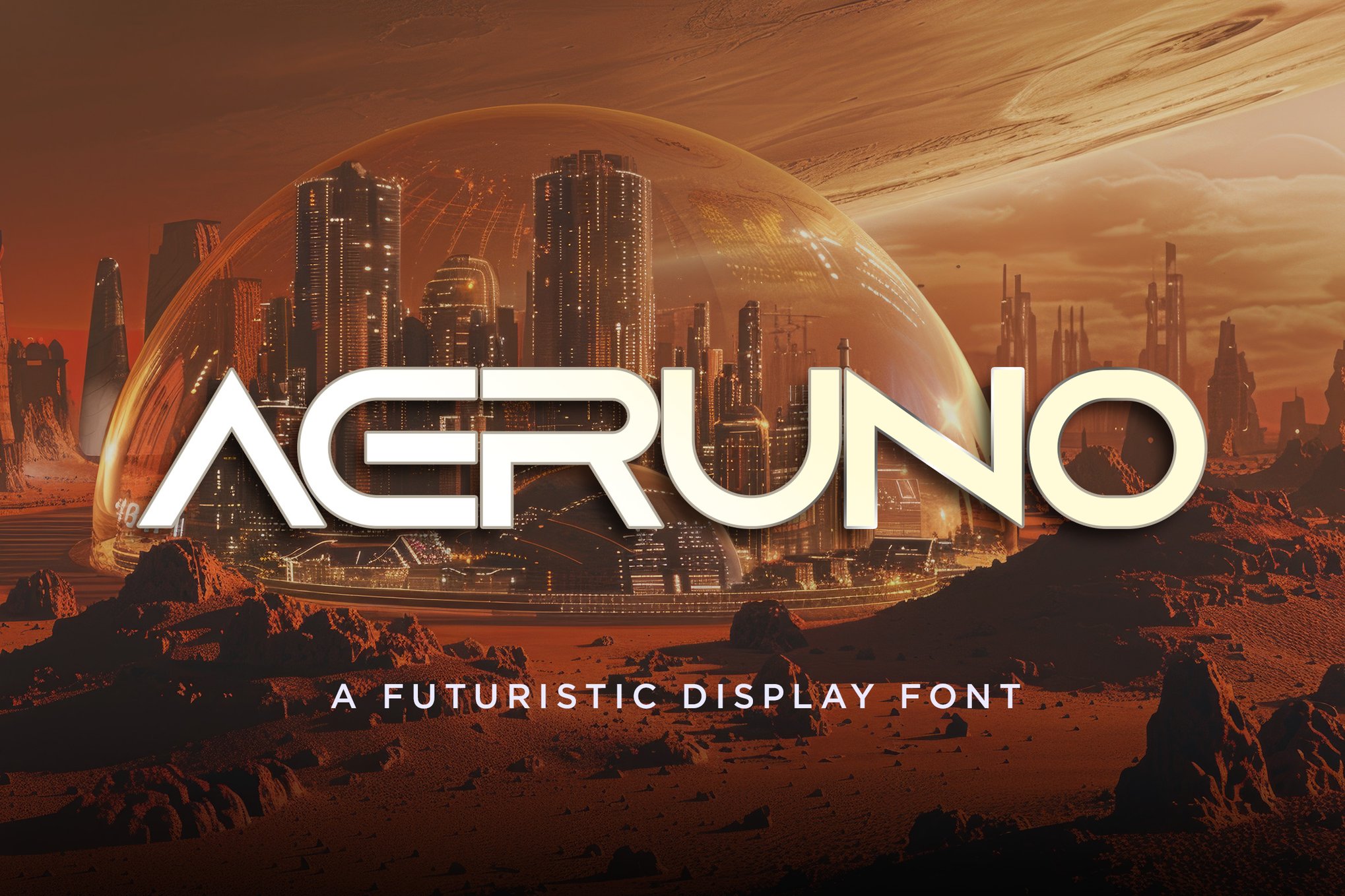
- Aeruno: A modern sans-serif at its core, but with a slight, subtle distortion that gives it a contemporary "dystopian edge." It is arguably the most readable of the lot, making it ideal for body copy within a larger, dark design system.
Supporting Data: The Commercial Viability of "Dark" Design
The market for these typefaces is not merely a niche interest for sci-fi enthusiasts; it is a burgeoning sector of the creative economy. According to recent industry trends, there has been a 40% increase in the usage of "display-heavy" fonts in marketing materials for industries ranging from cybersecurity to high-end apparel.
The appeal lies in the visceral response. Consumers are increasingly drawn to "edgy" branding that challenges the status quo. By utilizing a dystopian-inspired font, a brand can subconsciously align itself with themes of revolution, technological superiority, and forward-thinking disruption. The inclusion of formats like WOFF2 and OTF in modern font packages ensures that these aesthetics translate perfectly from static print to dynamic web environments.
Official Perspectives: The Designer’s Dilemma
We spoke with several freelance typographers regarding the rise of this trend. The consensus is clear: the modern designer is looking for "narrative in a box."
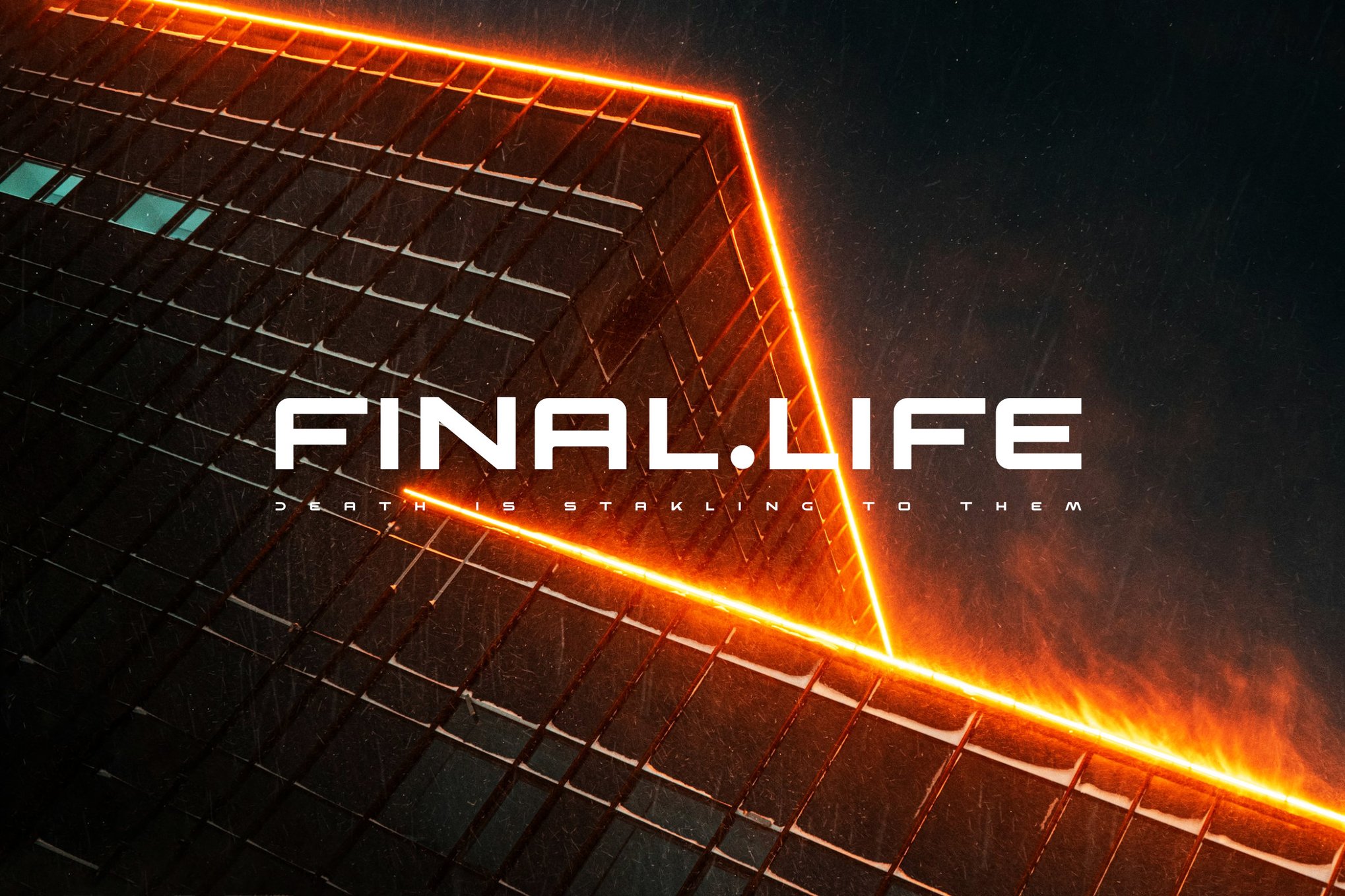
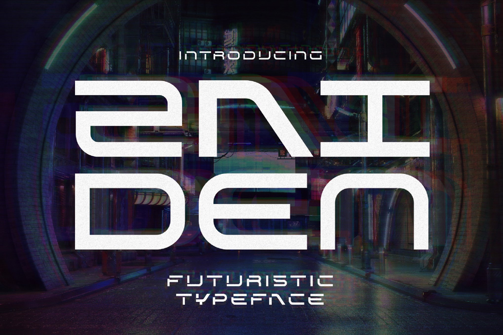
"When a client asks for a ‘dystopian’ look, they aren’t just asking for a font," says one industry lead. "They are asking for a shortcut to a specific emotional state. If I use Zaiden for a book cover, I’m not just presenting a title; I’m telling the reader that the world inside this book is a cold, calculated, and high-stakes environment."
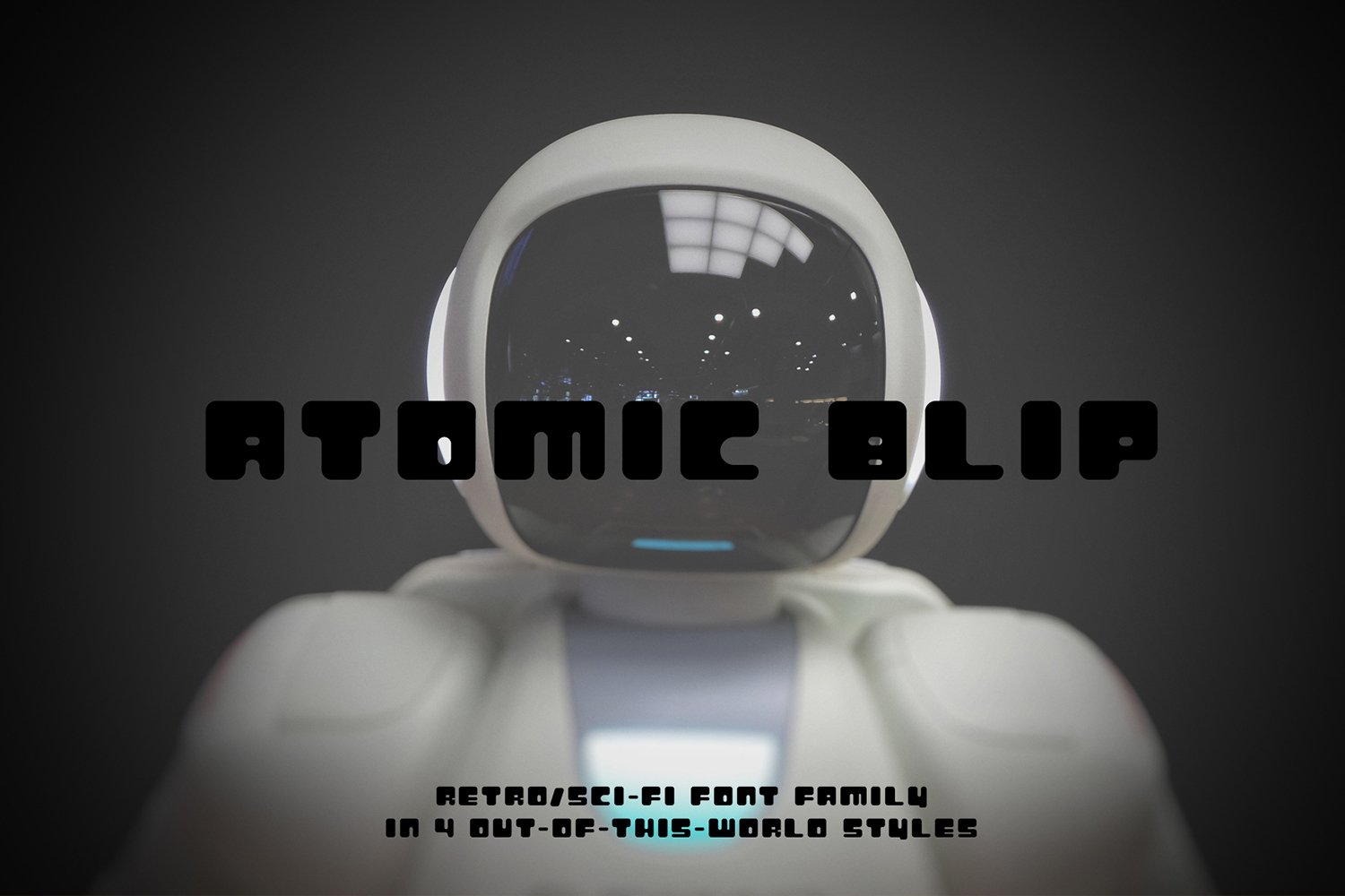
Designers are also praising the increased inclusion of "extras." Packages like Atomic Blip—which provides high-resolution PSD and AI assets alongside the font files—are becoming the industry standard. Designers no longer want just the alphabet; they want the entire graphic ecosystem.
Implications: The Future of Visual Dystopia
As we look toward the next decade, the line between "dystopian" design and "mainstream" design will continue to blur. The angular, aggressive, and tech-heavy aesthetic of these fonts is becoming the visual shorthand for "the future."
However, there is a responsibility inherent in this design language. By normalizing the aesthetics of oppression and decay, designers are participating in a cultural dialogue about our own trajectory. Are these fonts a warning, or are they a preview?
Whether you are designing a logo for a sustainable tech startup or building the interface for a revolutionary video game, the typeface you choose will dictate the reality your audience inhabits.
Resource List: Where to Find Your Next Asset
For those looking to integrate these styles into their own projects, the following resources represent the best of both worlds—premium, full-featured typefaces and high-quality, free-to-use alternatives:
- For Professional Projects: Foderic, Gomery, and Andmorey remain the most flexible, offering deep support for multilingual and ligature-heavy designs.
- For Personal/Experimental Projects:
- Navex: Offers a great industrial, cut-out look for free.
- Death Craft: Essential for any post-apocalyptic or horror-themed project.
- Cybloc: A perfect, free-to-use entry point into the cyberpunk aesthetic.
- Qwenser: A bold, high-impact display font that rivals many premium offerings.
The architecture of your world is waiting. Choose your font carefully—it is the first thing your audience will see, and the last thing they will forget.