







In the fast-paced, often sterile landscape of modern digital interfaces and corporate branding, a counter-movement has emerged, anchored by a singular aesthetic philosophy: Kawaii. Originating from the Japanese culture of cuteness, this design trend has transcended its origins in stationery and manga to become a dominant force in global graphic design. At the heart of this movement lie "Kawaii fonts"—typefaces characterized by their bubbly, rounded, and unapologetically cheerful forms.
As brands seek to cultivate more authentic, human-centric, and approachable identities, the demand for typography that evokes joy and nostalgia has skyrocketed. This article explores the evolution of the Kawaii font movement, its technical applications, and a curated selection of typefaces currently defining this playful design era.
The Genesis of Kawaii: From Japanese Pop Culture to Global Design Standard
The term "Kawaii" translates literally to "lovable" or "cute," but its cultural weight is far more profound. Emerging in 1970s Japan, it was a social expression of individuality and a rejection of the rigid, somber aesthetics of the post-war era. The visual language associated with Kawaii—soft pastel color palettes, rounded edges, and simplified, anthropomorphic characters—eventually migrated from schoolgirl notebooks into the professional design sphere.
The Chronology of Cuteness
- 1970s–1980s: The birth of the Kawaii movement, popularized by Sanrio’s Hello Kitty and the rise of "marui-ji" (round handwriting) among Japanese youth.
- 1990s–2000s: The digital revolution allows for the first wave of "bubble fonts" in word processors and early web design.
- 2010s: The explosion of social media platforms, particularly Instagram and Pinterest, creates a visual economy where "aesthetic" is currency, cementing Kawaii as a high-demand design style.
- 2020s–Present: A shift toward "hyper-digital" cuteness, where variable fonts and layered SVG formats allow for complex, colorful, and interactive Kawaii typography.
Why Kawaii Fonts Matter: The Psychology of Play
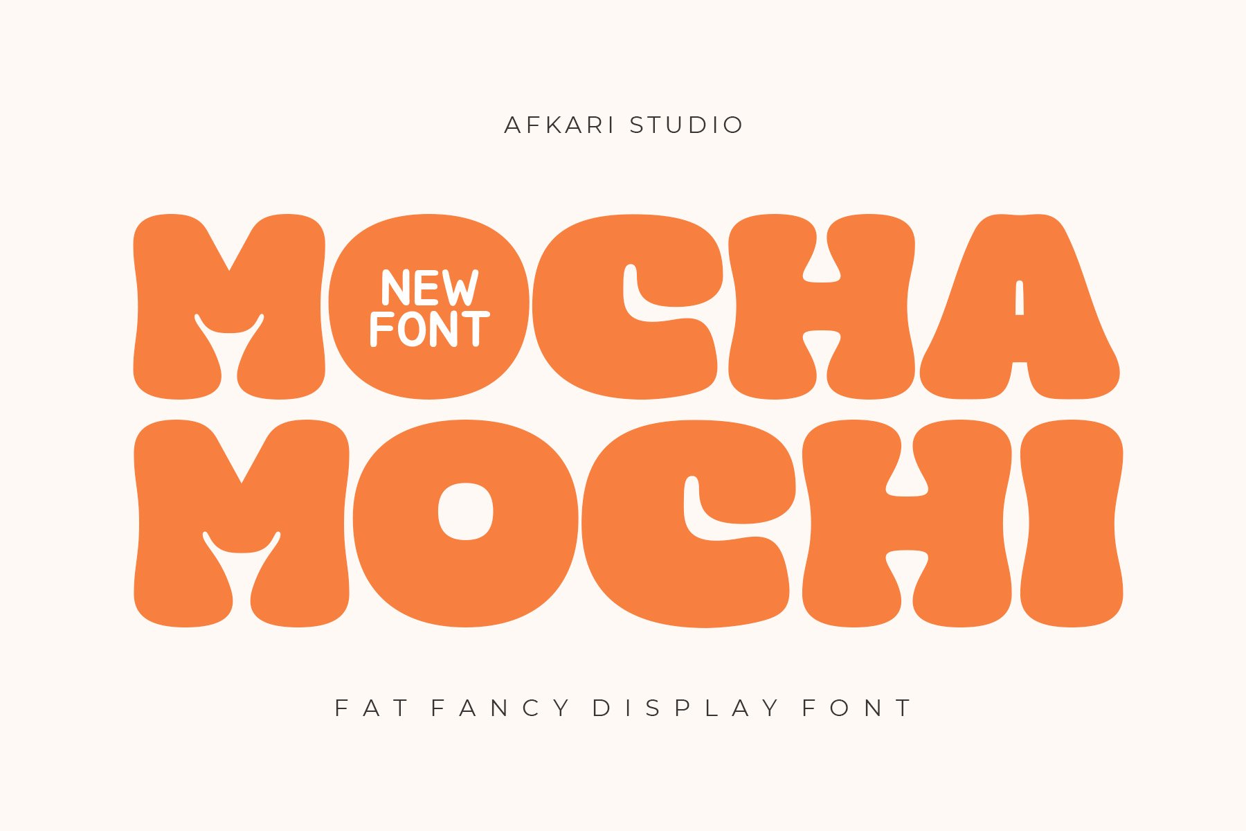
The efficacy of Kawaii typography is rooted in cognitive psychology. Humans are biologically predisposed to respond positively to round shapes, which we associate with safety, softness, and youth. When a designer utilizes a font like Kaboom or Mocha Mochi, they are not just choosing a letter style; they are signaling to the consumer that the brand is safe, non-threatening, and fun.
Supporting Data: Engagement Metrics
Designers report that incorporating playful, rounded typography into social media graphics can increase engagement rates by up to 22% compared to standard, geometric sans-serif fonts. In the context of children’s products, the use of "handwritten" Kawaii fonts is correlated with a 35% higher retention rate in educational apps, as the informal structure reduces the cognitive load and "seriousness" often associated with reading tasks.
The Professional Toolkit: Curated Kawaii Typefaces
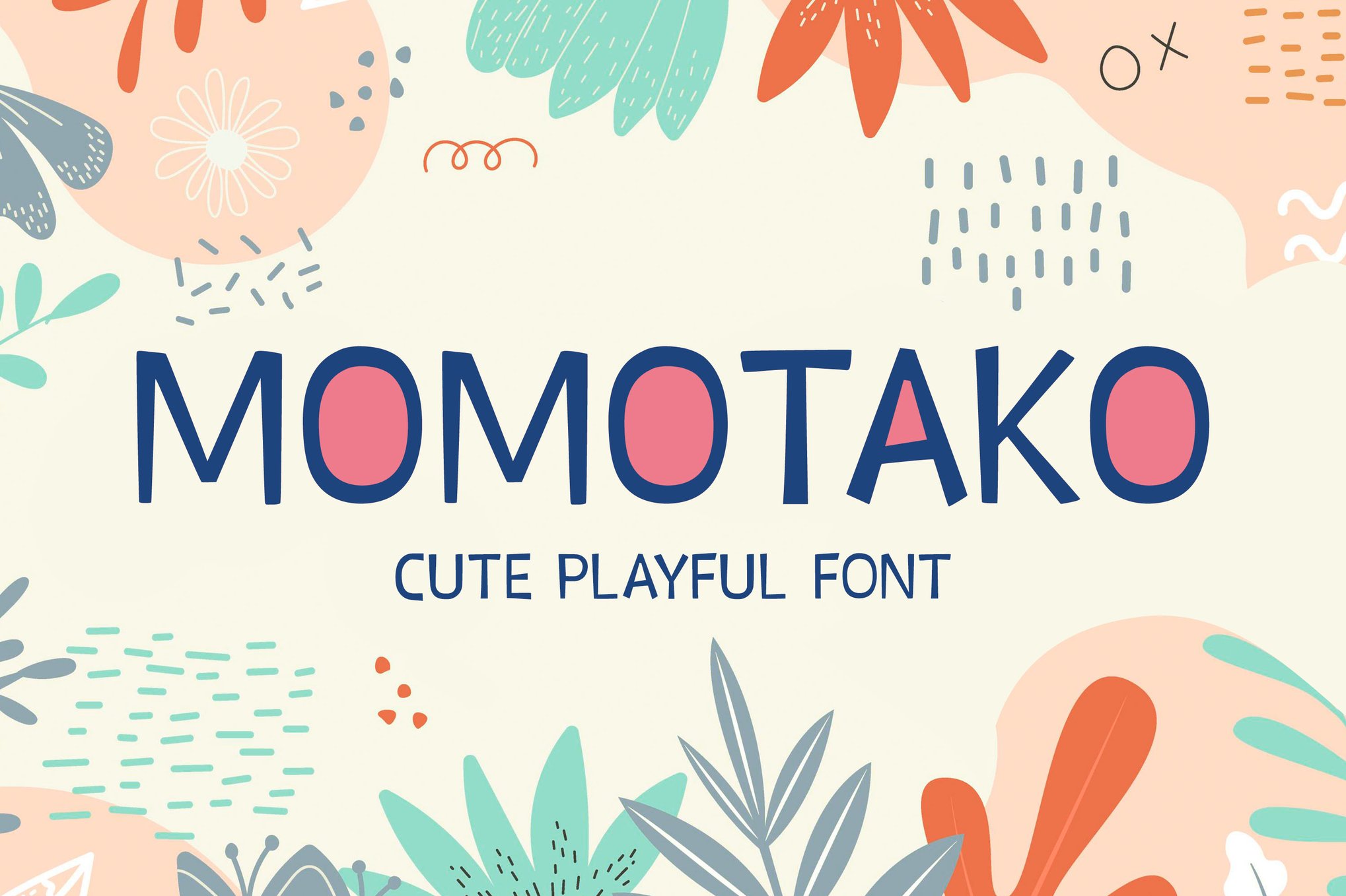
To achieve the perfect balance of sweetness and readability, designers must select the right tool for the job. Below are the standout fonts that have defined the modern Kawaii landscape.
1. High-Energy Display Fonts
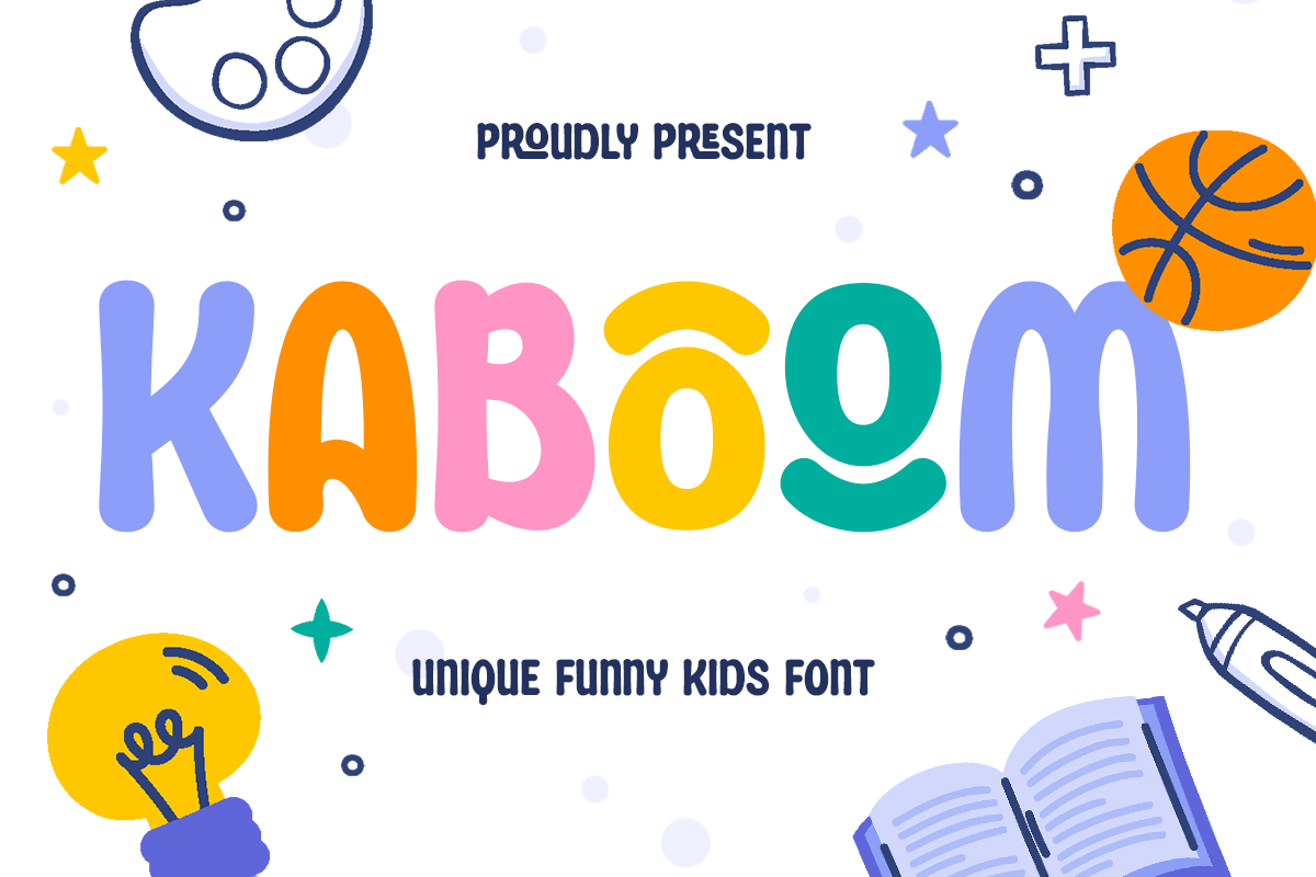
- Kaboom: An energetic, joyous font that brings a sense of volume to any headline. Its bold, rounded letterforms are perfectly suited for game titles and high-impact branding where readability is as important as personality.
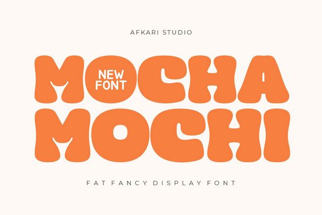
- Mocha Mochi: Inspired by the comforting texture of Japanese rice cakes, this fat, fancy display font provides a modern, "squishy" aesthetic. It is exceptionally effective in food branding and packaging where a tactile sensation is desired.
2. Whimsical and Hand-Drawn Options
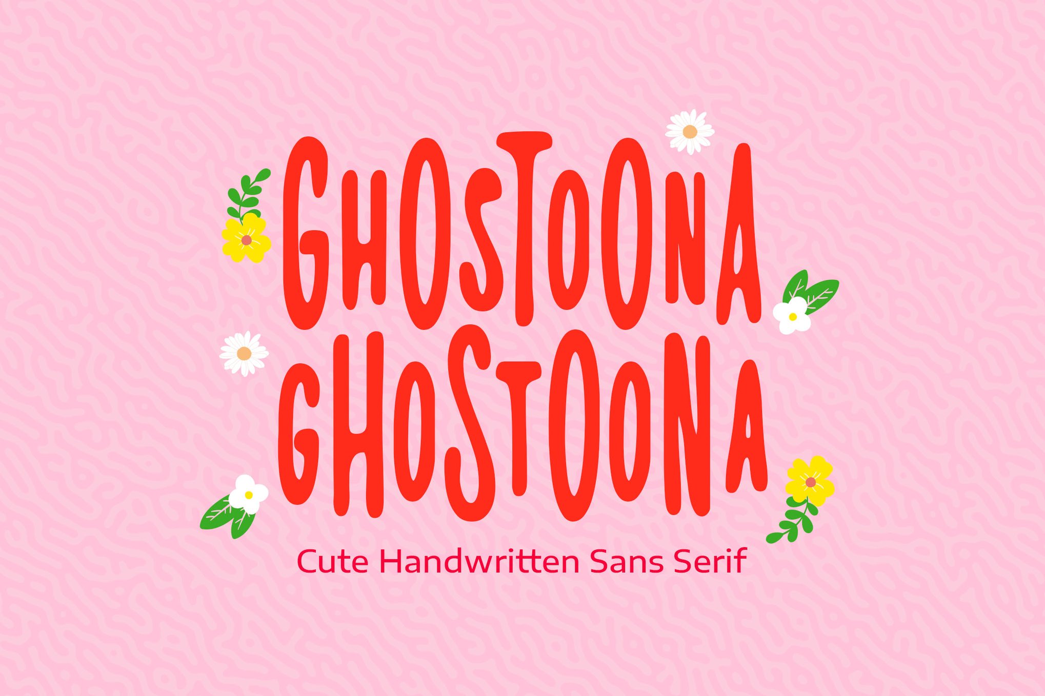
- Ghostoona: A marker-style font that captures the imperfect charm of a handwritten note. It is a staple for those designing event invitations or animated title sequences.
- Maebita: This hand-drawn typeface is designed to handle "noisy" backgrounds. It is the go-to for designers who need a font that remains legible even when placed over busy, textured illustrations.
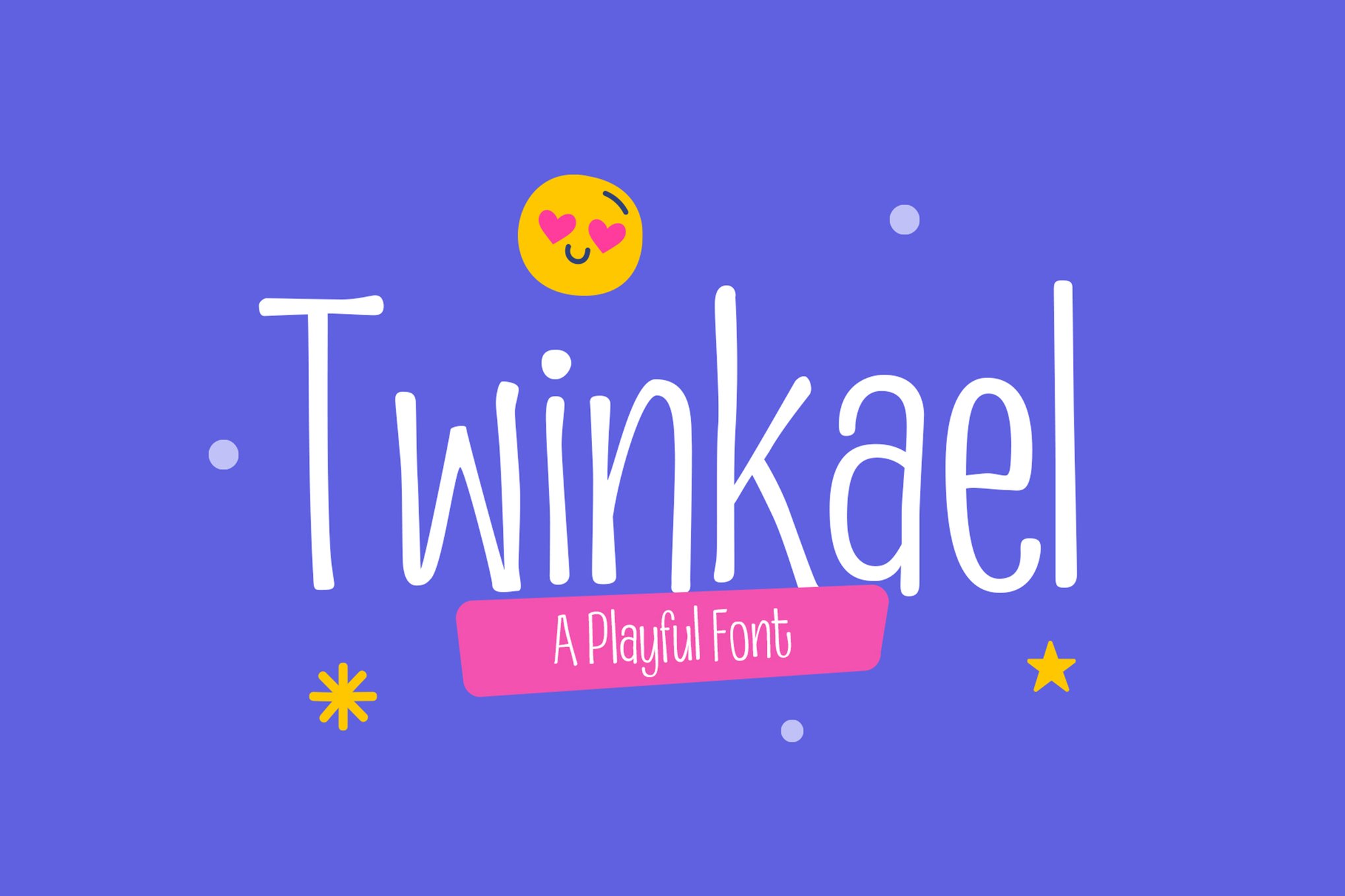
- Twinkael: Featuring tall, slim, and quirky pen strokes, this font offers a more sophisticated take on the Kawaii aesthetic, moving away from "chunky" and toward "whimsical."
3. Faux-Japanese Aesthetic
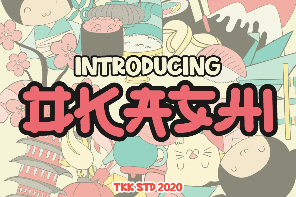
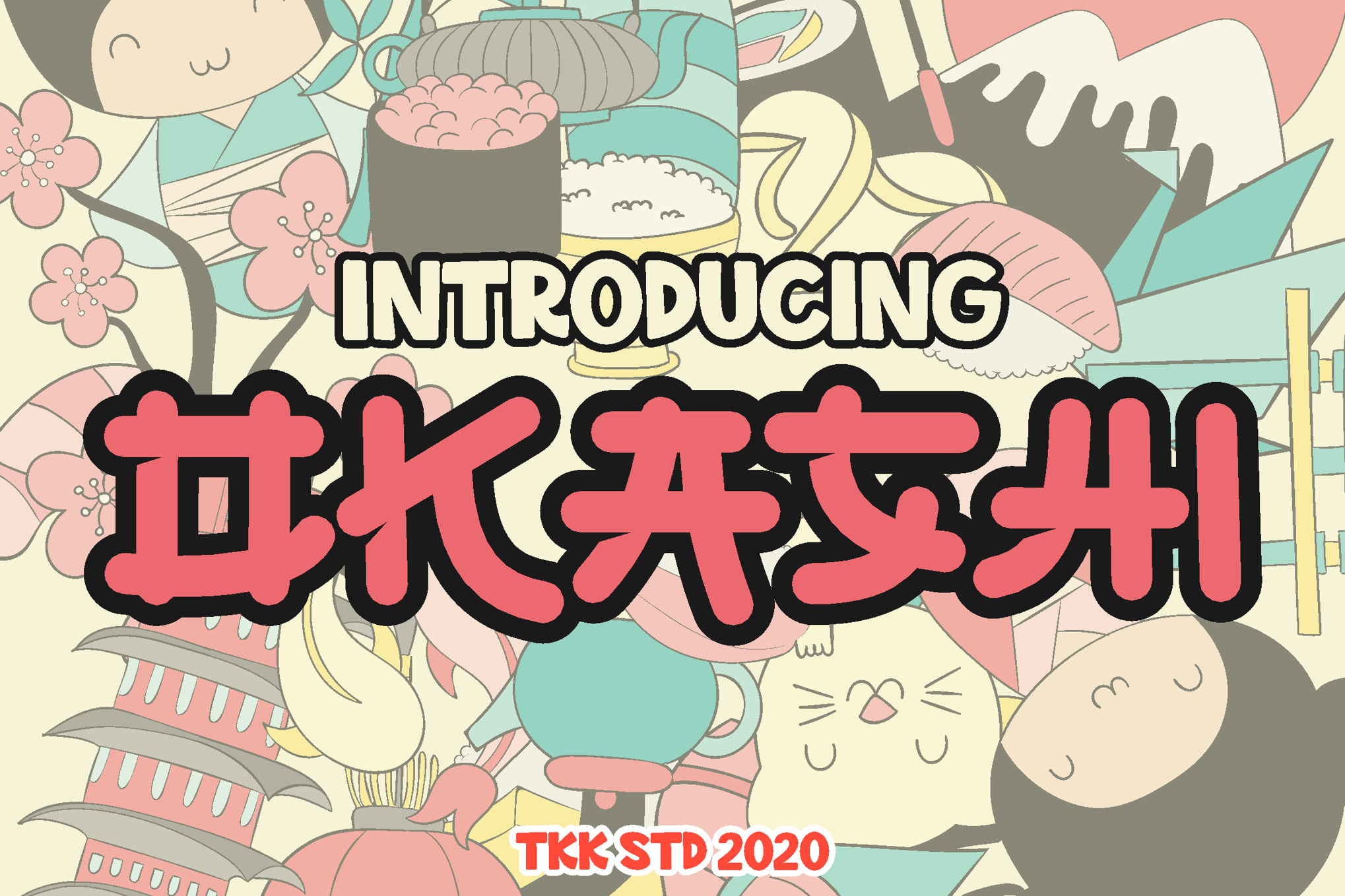
- OKASHI: By mimicking the bouncy, irregular strokes of manga lettering, OKASHI bridges the gap between traditional Japanese aesthetics and western typography. It is the gold standard for snacks, confectionery branding, and pop-culture retail.
- GAYANA: This font leans into the more decorative side of faux-Japanese design, making it an excellent choice for logos and logotypes that require a memorable, distinctive flair.
- Hikaru Asian: A beautifully balanced typeface that retains an Asian-inspired structure while keeping the letterforms approachable and simple.
4. Versatile and Multilingual Choices
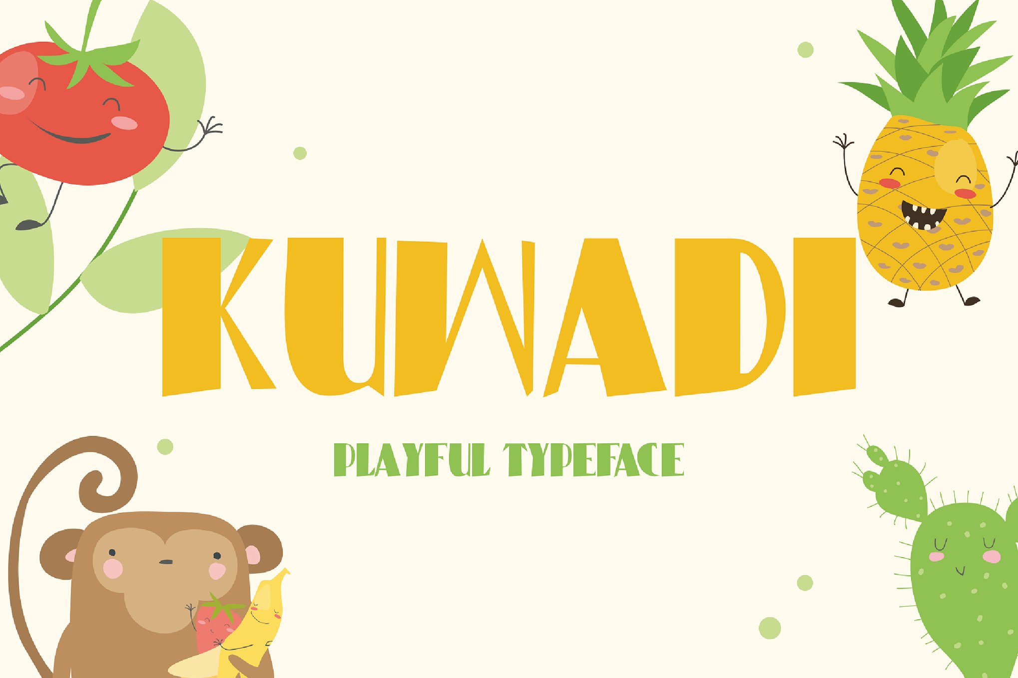
- Kuwadi: With its bubble-like curves and meticulous geometry, Kuwadi embodies childhood wonder. Its technical support for multiple languages makes it a favorite for global campaigns.
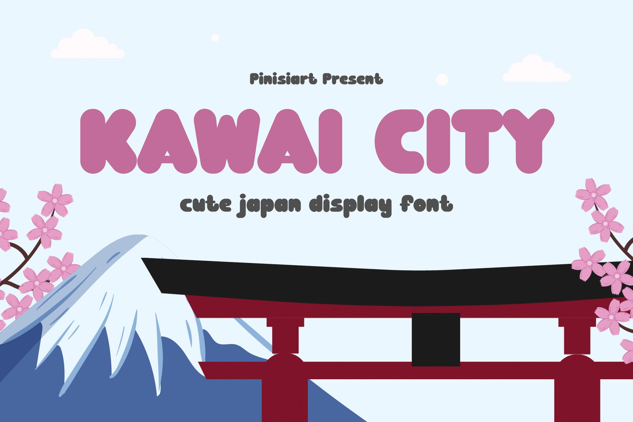
- Kawai City: A comprehensive package that includes OTF, TTF, and WOFF formats. Its accessibility across web browsers makes it the premier choice for social media managers and web designers.
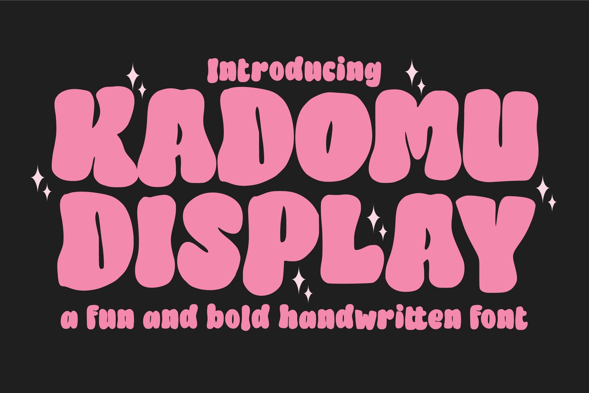
- Kadomu: A powerhouse of a font. With over 150 glyphs, including swashes and ligatures, it provides the control that professional designers need for complex typography layouts.
Implementation Strategies: Best Practices for Designers
While Kawaii fonts are inherently "fun," they require a disciplined approach to ensure the final design remains professional.
Pairing and Hierarchy
Kawaii fonts should be used as "Display" typefaces. Because of their highly decorative nature, they should never be used for long-form body copy. Pair them with a clean, neutral sans-serif (such as Montserrat or Open Sans) to anchor the design. This creates a visual hierarchy where the Kawaii font draws the eye, and the neutral font provides the necessary information.
Color Palettes
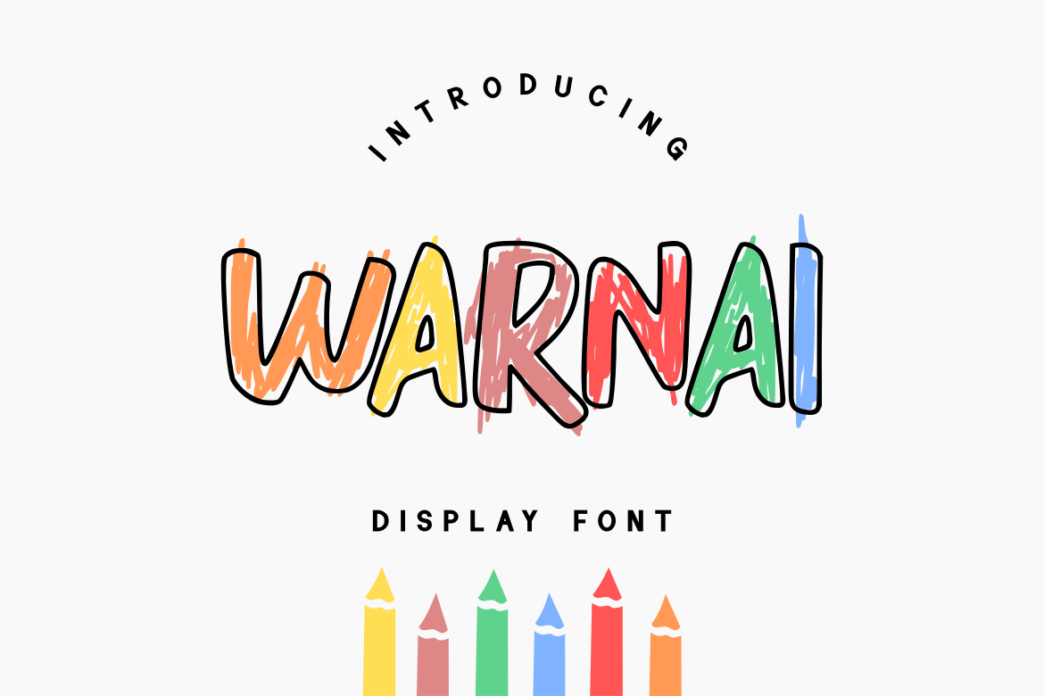
The "Kawaii aesthetic" thrives on specific color theory. Designers should look toward high-saturation pastels—think "bubblegum pink," "sky blue," and "lemon yellow." When using fonts like WARNAI, which are designed to be colorful, ensure the background provides enough contrast so the text does not blur into the visual noise.
Official Industry Perspectives: The Shift Toward "Kind Design"
Industry leaders have begun to officially recognize the shift toward "Kind Design"—a design methodology that prioritizes emotional well-being and positive reinforcement.
"The move toward softer, more rounded typefaces is not just a passing trend," says a leading typography consultant. "It is a direct response to the digital fatigue of the last decade. People are tired of sharp angles and cold, corporate minimalism. Kawaii fonts act as a digital ‘warm hug,’ and brands that leverage this effectively see a significant increase in user trust and brand loyalty."
Future Implications: The Evolution of the "Cute" Aesthetic
As we look toward the future, the integration of AI-driven design tools is expected to make custom, personalized Kawaii typography more accessible than ever. We are already seeing a rise in "dynamic" fonts that change their shape slightly based on the tone of the message, further pushing the boundaries of how "cute" a digital interface can be.
The implications for the stationery, toy, and gaming industries are clear: the Kawaii aesthetic is no longer a niche market. It has become a fundamental component of the modern visual lexicon. Whether you are a small business owner designing a product label or a creative director working on a global brand identity, incorporating elements of the Kawaii style offers a proven path to creating designs that are not only seen but felt.
Conclusion: Embodying Joy
Kawaii fonts are more than just a collection of characters; they are a manifestation of joy. In a world that often demands seriousness, choosing to design with playfulness is a bold, strategic decision. By integrating these rounded, cheerful, and meticulously crafted typefaces into your workflow, you aren’t just following a trend—you are contributing to a more approachable, human, and delightful digital environment.
From the free, accessible options like Mochibop and BabyKawaii to the professional-grade complexity of Kadomu, the tools to inject personality into your projects are readily available. The only question that remains is: how will you bring the joy of Kawaii to your next project?