
In an era dominated by pixel-perfect precision and sterile, minimalist branding, a growing movement of designers is turning back the clock—or perhaps, grabbing a pair of scissors. The rise of cut-out and collage fonts has become one of the most compelling trends in modern visual communication. These typefaces, which mimic the tactile, chaotic, and deeply personal aesthetic of zines, ransom notes, and paper art, offer a refreshing antidote to the ubiquity of clean, corporate design. By embracing imperfection, designers are injecting a sense of raw humanity and rebellious energy into everything from high-fashion magazine spreads to underground music posters.
The Evolution of the Cut-Out Aesthetic
The origins of the collage font trace back to the mid-20th-century avant-garde, particularly the Dadaist movement and the punk rock revolution of the 1970s. During these periods, the "cut-and-paste" method was a tool of subversion; it was a way for artists and activists to communicate without the high costs of professional typesetting.
Today, this aesthetic has been digitized and elevated. What was once a limitation of the DIY movement—using whatever scraps of paper were available—has become a deliberate design choice. Modern type foundries have captured this "mismatched" spirit, creating sophisticated, OpenType-enabled fonts that allow designers to layer textures, vary character sizes, and simulate the physical resistance of scissors meeting paper. This evolution has shifted the style from a niche punk-rock staple to a versatile tool in the modern creative’s arsenal, essential for projects that demand high emotional resonance.
Curating the Collection: Premium and Free Resources
For designers looking to integrate this tactile energy into their work, the market currently offers a diverse range of options, from highly polished bitmap typefaces to free, experimental display fonts.
Premium Selections: Professional-Grade Personality
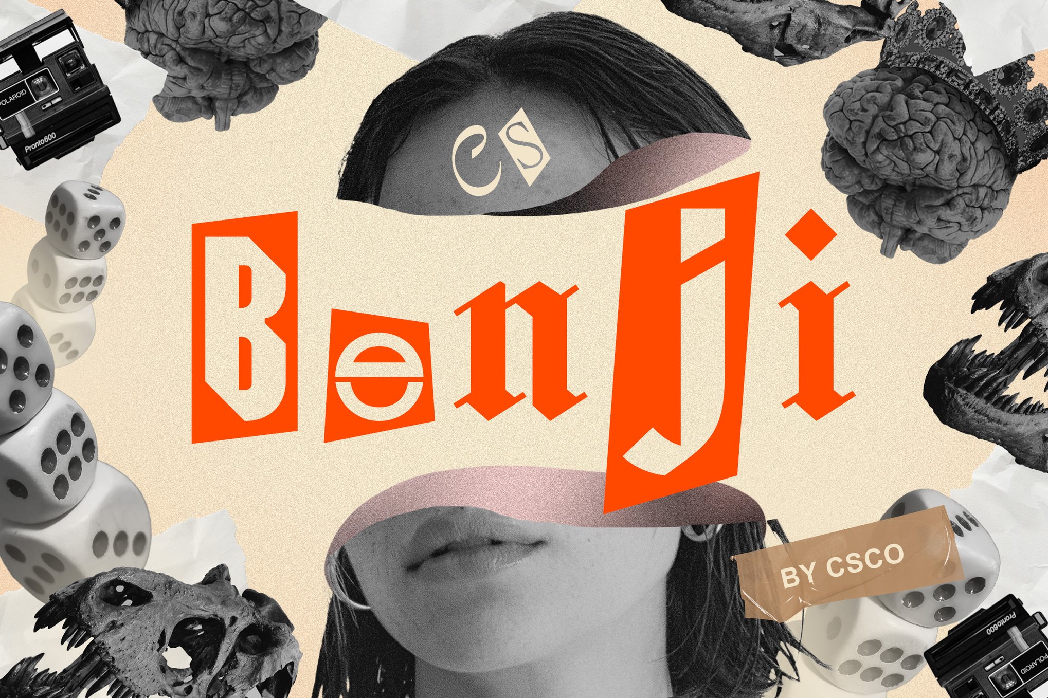
- Benji: A masterclass in the ransom-note aesthetic, Benji utilizes unconventional letterforms and gritty textures to create a look that feels both dangerous and undeniably cool. It is the premier choice for urban branding.
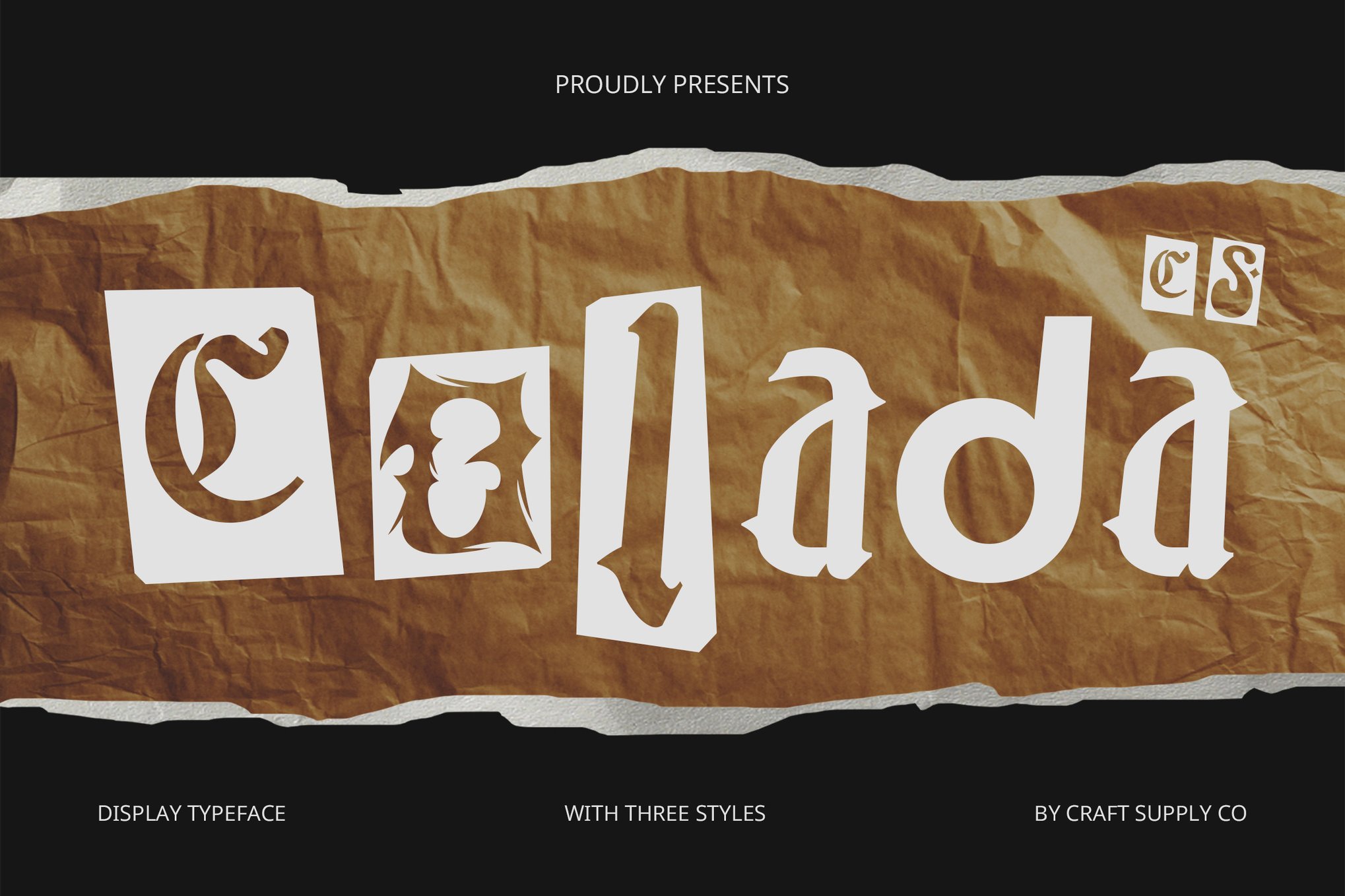
- Colada: For those seeking a more whimsical approach, Colada provides a lively mix of shapes and sizes. It is perfectly suited for event posters and children’s media, where a sense of "joyful chaos" is required.
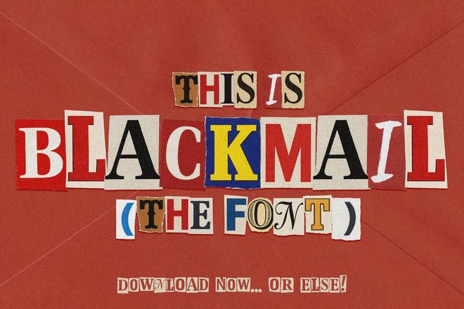
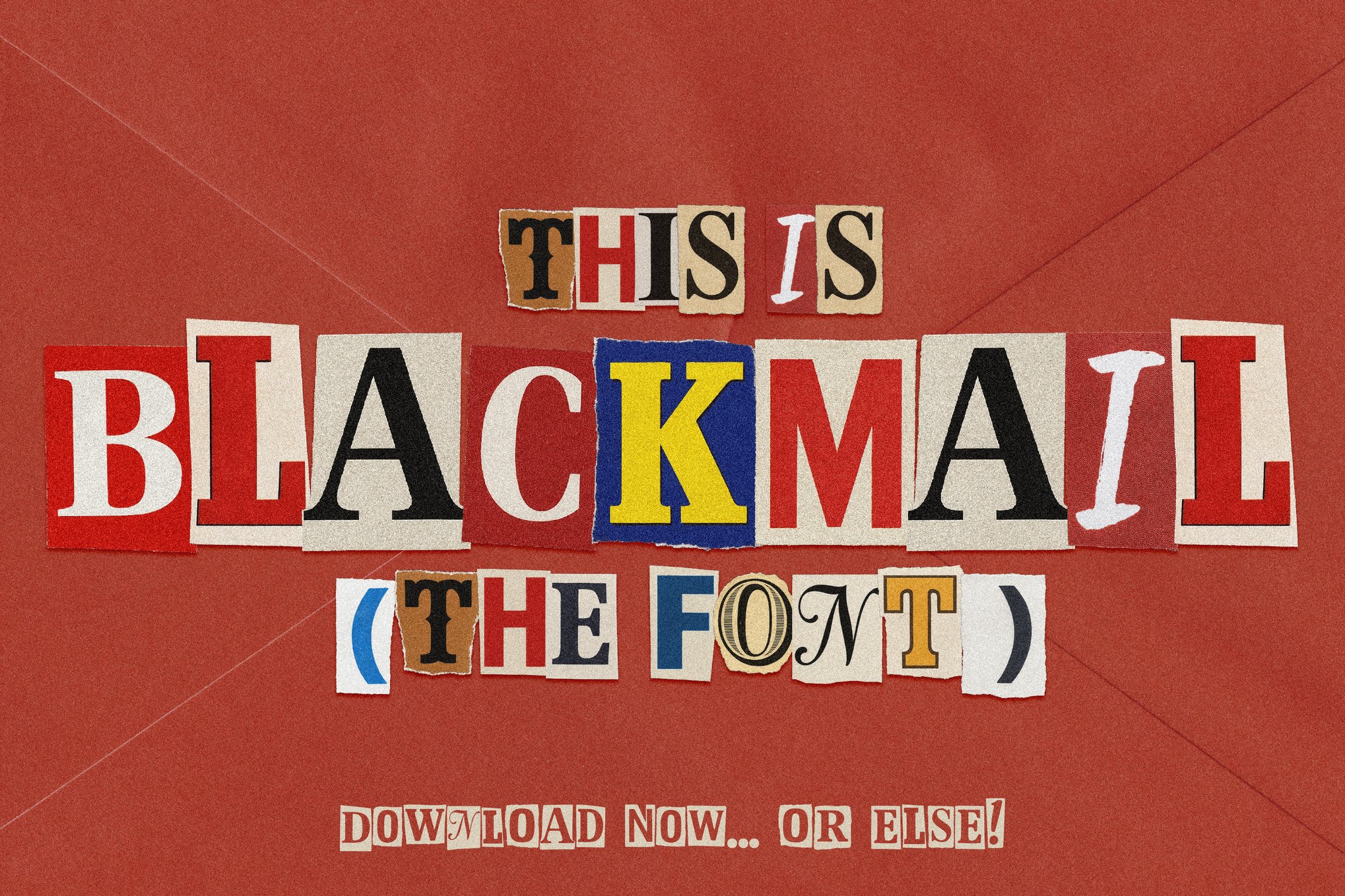
- Blackmail: This font duo offers a complete package, including a color-filled bitmap version for immediate impact and a clean vector version for scalability. Its versatility makes it a go-to for thriller book covers and crime-themed media.
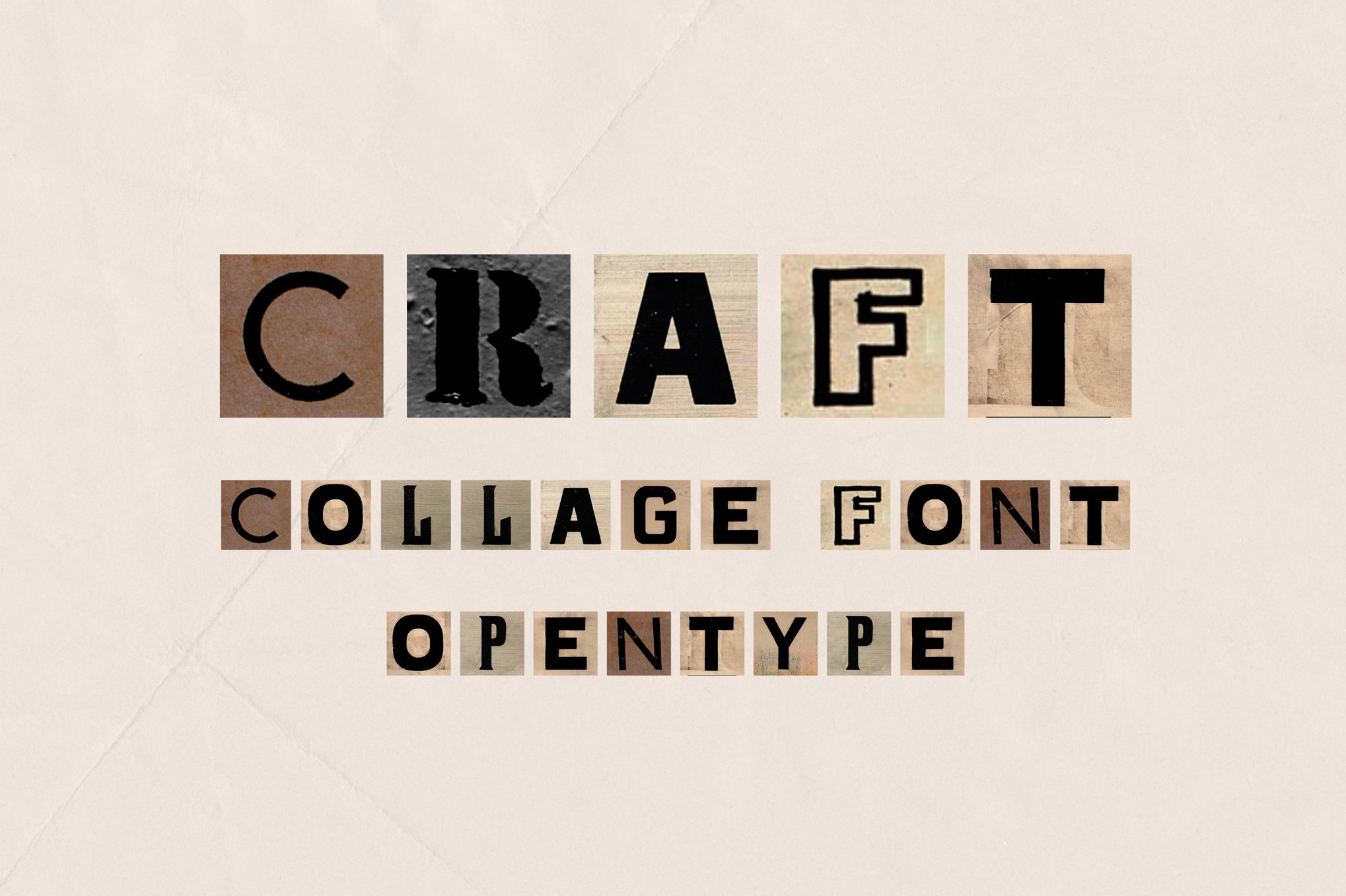
- Craft: A triumph of OpenType SVG technology, this font brings the authentic look of newspaper clippings to life, though it requires modern software like Photoshop CC or Procreate 5 to fully leverage its layered capabilities.
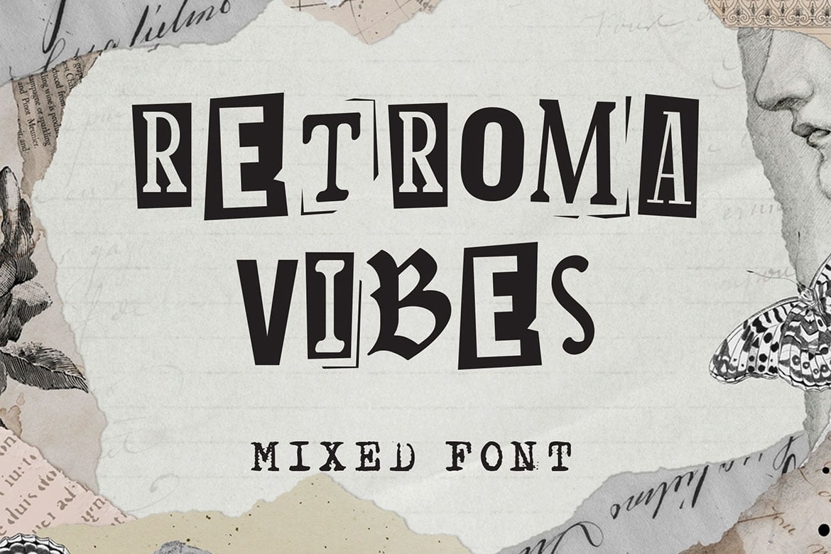
- Retroma Vibes: True to its name, this font blends multiple styles—including blackletter and condensed serif—to mirror the eclectic nature of a vintage scrapbook.
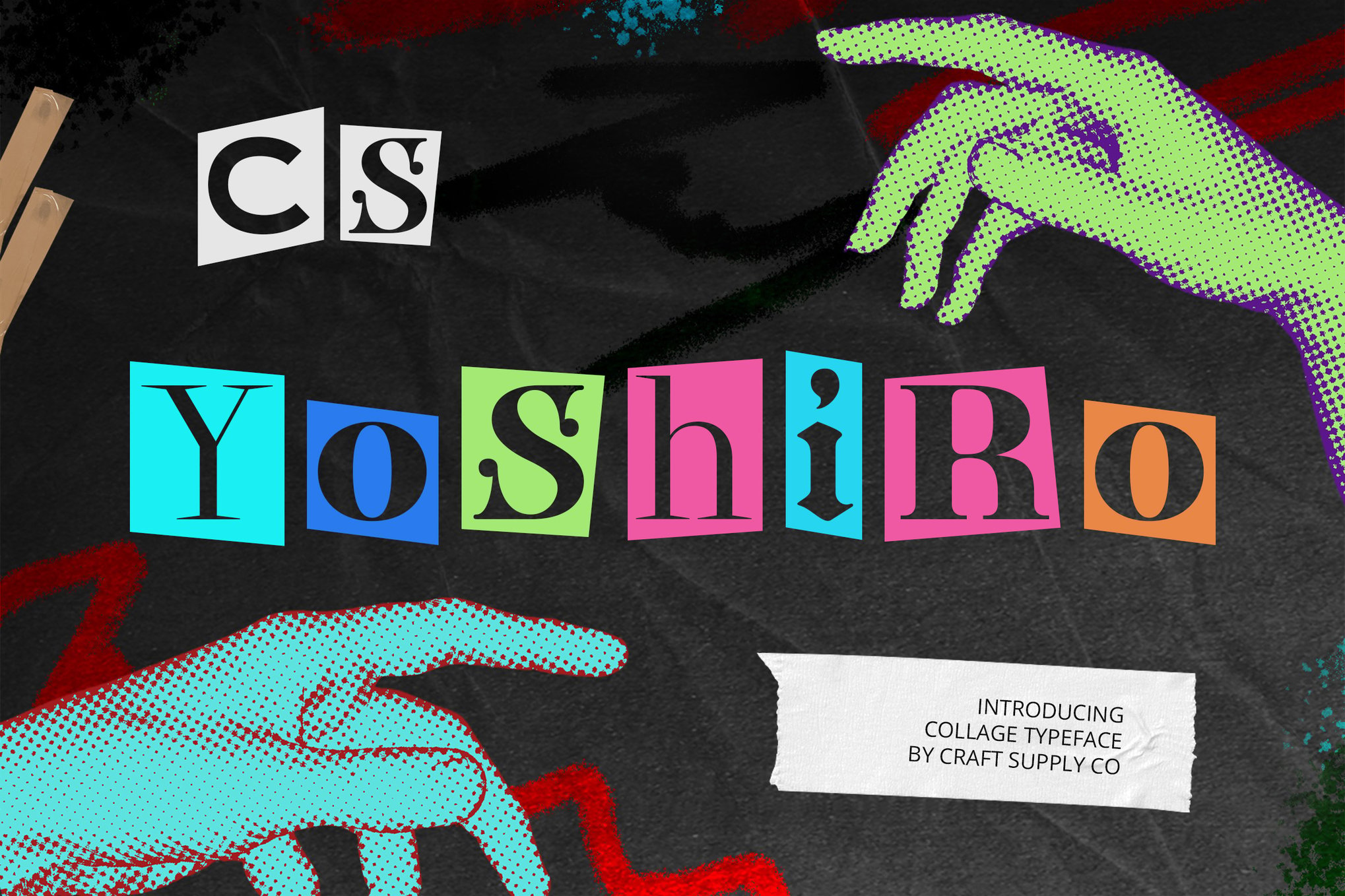
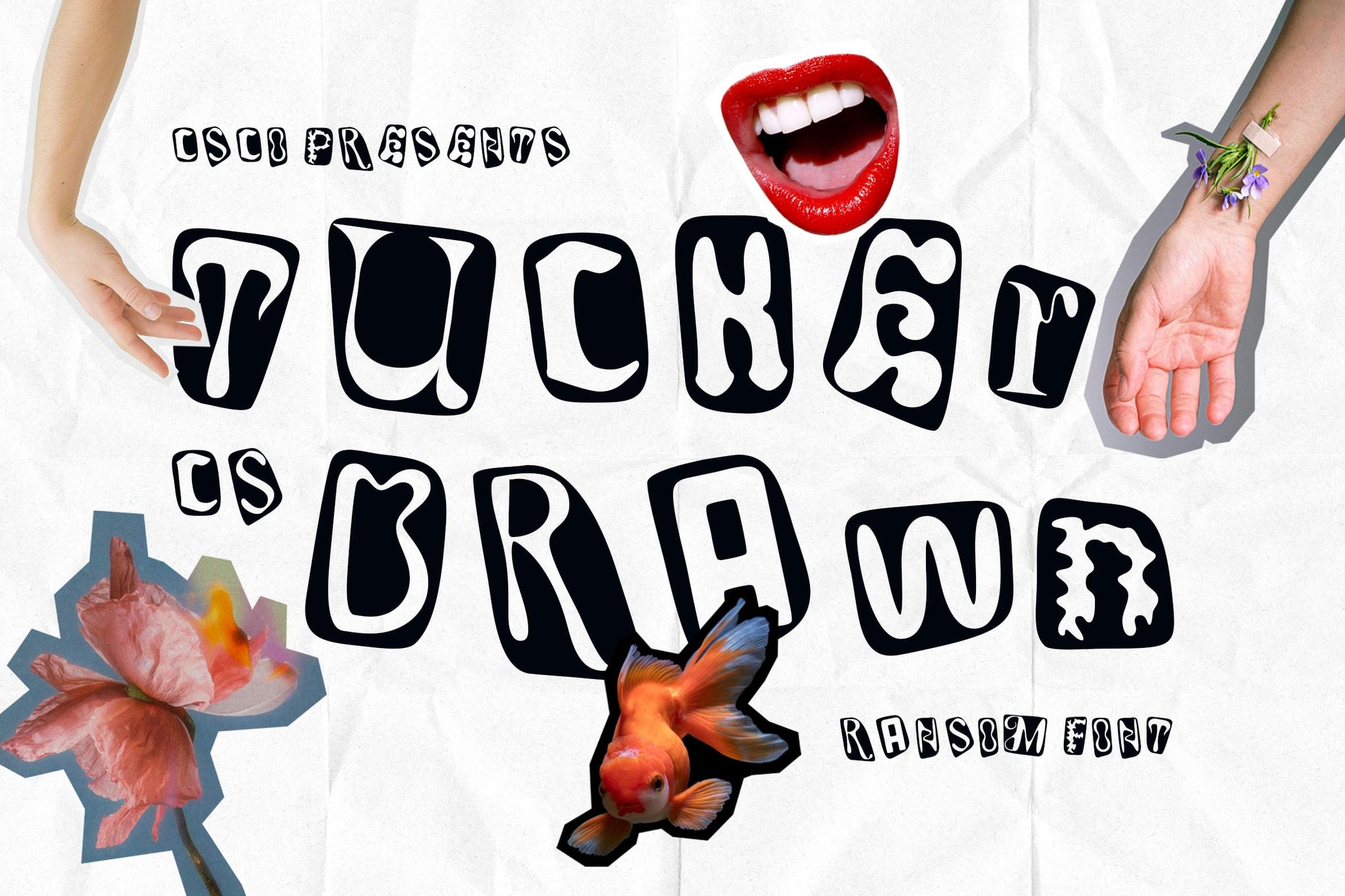
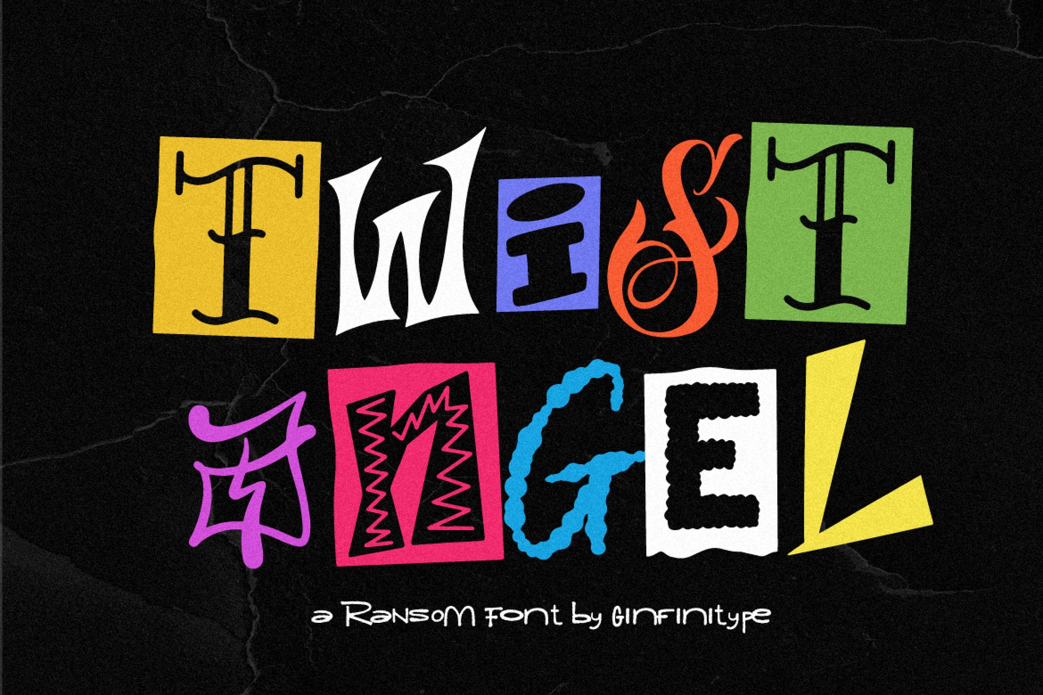
- Yoshiro, Tucker Drawn, and Twist Angel: These three fonts share a common DNA of hand-drawn authenticity. They are ideal for designers who want to strip away the "digital" feel of their work, replacing it with the warmth of a hand-cut silhouette.
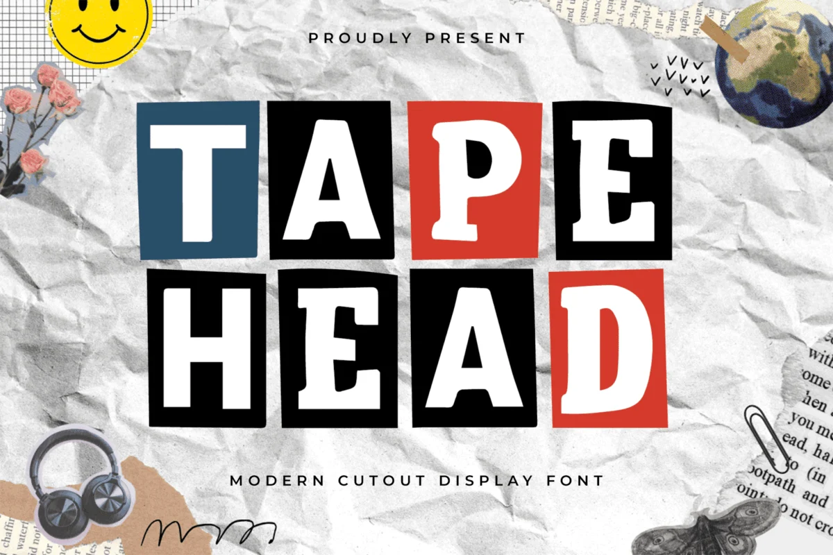
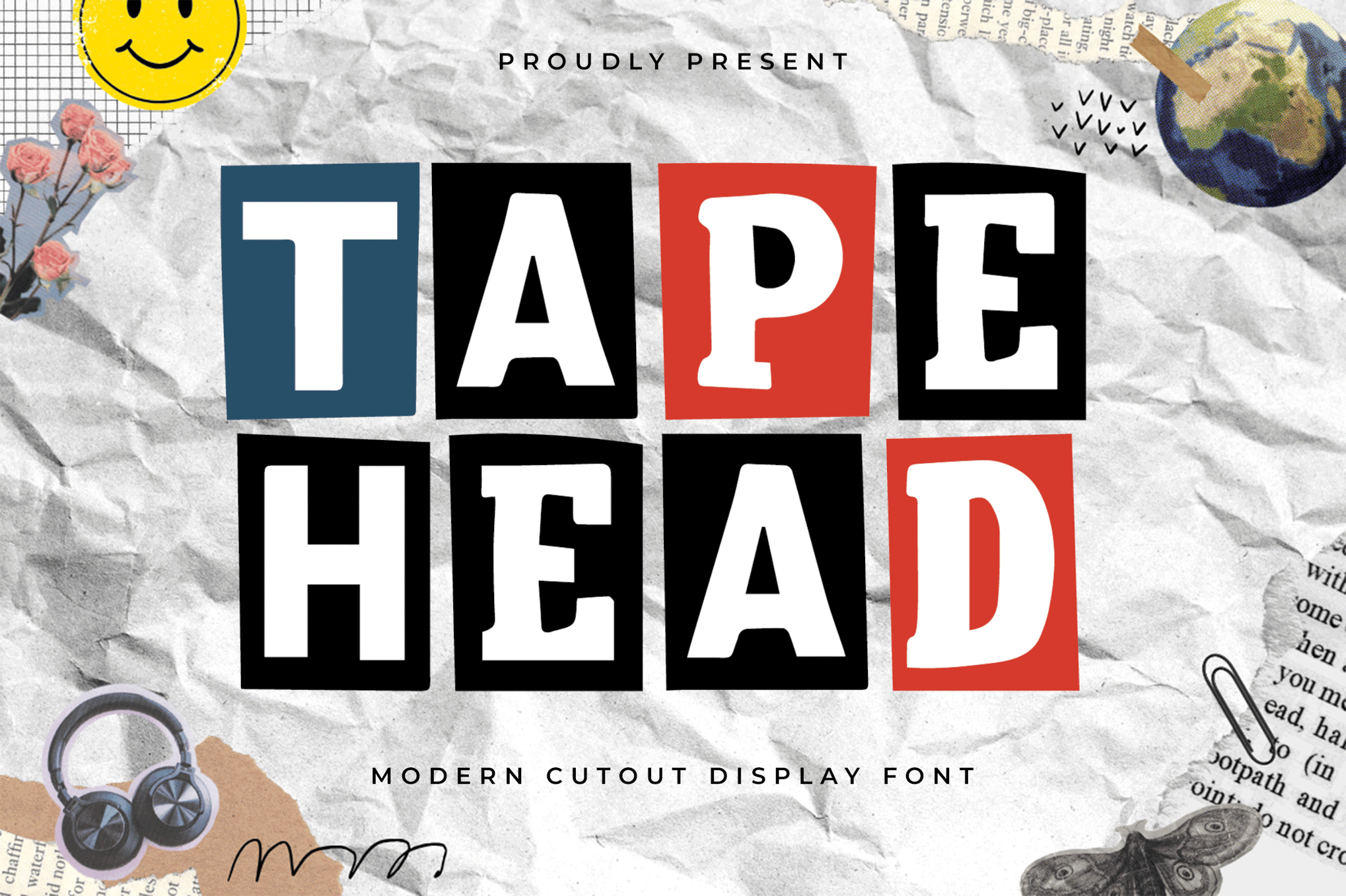
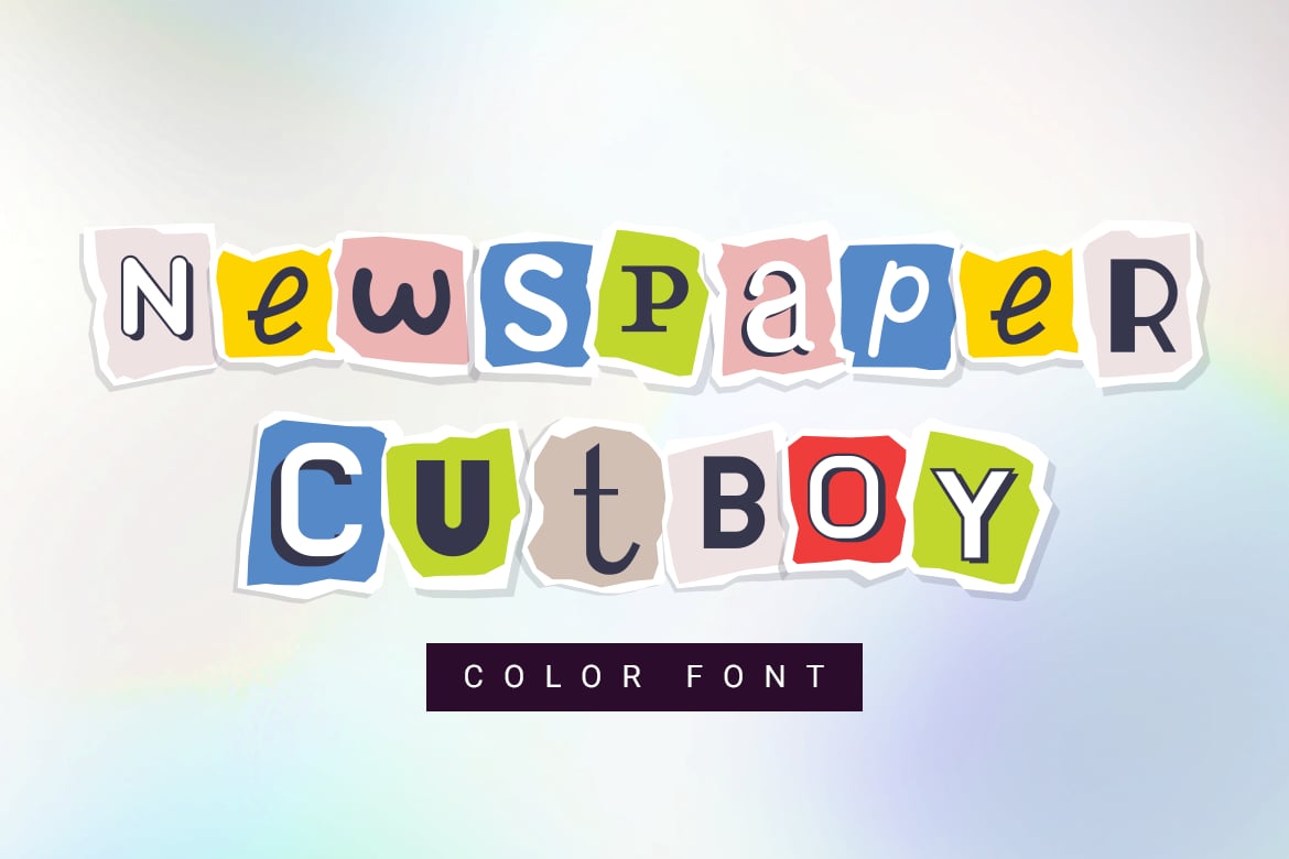
- Tapehead & Newspaper Cutboy: These fonts lean into the "disruptive" side of the aesthetic. Newspaper Cutboy, in particular, stands out for its inclusion of multiple alternates per letter, allowing for a truly custom, non-repeating look.
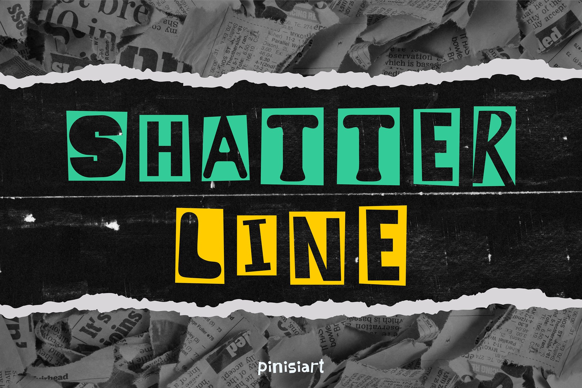
- Shatter Line: This is the quintessential "punk" font. It captures the spirit of graffiti tags and urban street culture, perfect for festivals and apparel that need to command attention.
- Anika & Colada Drawn: These fonts emphasize the "sketchy" nature of collage, providing a soft, artistic edge that feels less like a ransom note and more like an illustrative piece of art.
The Best Free Resources
The accessibility of this style is bolstered by a strong community of free-to-use fonts. Dirty Punk offers a gritty, high-contrast look perfect for younger demographics. Ranger Drawn provides a unique, adventurous twist on the collage theme. CS Libra and Goenka Drawn round out the list, offering vibrant, punchy alternatives that are ideal for personal projects, school zines, or experimental creative portfolios.
Technical Implications: Achieving the "Tactile" Look
While these fonts are designed to be "messy," using them effectively is a technical challenge. It is not enough to simply select the font; the designer must engage with the medium.
Supporting data from recent design trends suggests that the most successful projects using these fonts are those that treat the typography as a primary visual element rather than secondary copy. Because these fonts are inherently "busy," they demand a hierarchy. When used in professional branding, they are almost always paired with highly readable, minimalist sans-serif fonts to ground the design.
Furthermore, the shift toward "color fonts" (OpenType SVG) has changed the landscape. Unlike traditional fonts, which are single-color vectors, these new formats allow for transparency, multiple textures, and even gradients within a single character. This mimics the actual process of overlapping paper scraps, providing a depth that was previously only achievable through hours of manual masking in image editing software.
Professional Perspectives on Design Strategy
Industry experts emphasize that the "cut-out" trend is a direct reaction to the "perfect" digital world. In a recent interview, a lead creative director noted: "We are seeing a fatigue toward perfectly aligned, grid-based layouts. Brands want to look human again. They want to look like they have a pulse. Cut-out fonts are the fastest way to convey that the brand is not a machine—it’s a group of people who are willing to get their hands dirty."
This shift has significant implications for how we define "readability." In traditional design, legibility is the absolute king. In the world of collage typography, expression often sits on the throne. Designers are now encouraged to experiment with kerning, rotation, and even "glitching" the characters to break the monotony of the digital page.
Eight Pillars for Masterful Execution
To avoid the pitfalls of visual clutter, designers should adhere to a set of best practices when working with these distinctive fonts:
- Embrace the Flaws: The beauty of these fonts lies in their unevenness. If you find yourself trying to "fix" a wonky letter, stop. Those quirks are the features, not the bugs.
- The Rule of Contrast: Pair your collage header with a clean, neutral body font (like Helvetica or Inter). This keeps the design grounded and ensures the viewer doesn’t get overwhelmed.
- Color Restraint: Limit your palette to two or three colors. Because the shapes themselves are complex, adding a rainbow of colors can quickly turn a design into a visual headache.
- Analog-Digital Synergy: Don’t just rely on the font. Add real-world textures—scanned paper, tape, or ink splatters—in the background to give your digital work a physical, tactile weight.
- Hierarchy is Key: These fonts are for the "shout," not the "whisper." Use them for headlines, call-to-action buttons, or main titles. Never use them for paragraphs of body text.
- Create Rhythmic Scale: Vary the size of your letters. By alternating large and small, you create a visual rhythm that guides the reader’s eye across the page.
- Contextual Alignment: Ensure the font matches the brand’s "voice." A punk-rock ransom font might not be the right choice for a high-end law firm, but it is perfect for a music festival or a lifestyle brand targeting Gen Z.
- Bring it to Life: In digital formats, use motion. Even a slight, flickering animation of the letters can make the design look like it was assembled by hand in real-time.
The Future of "Messy" Typography
As we look ahead, the popularity of cut-out and collage fonts shows no sign of waning. As artificial intelligence begins to generate perfectly clean, symmetrical images with ease, the "human touch"—the slightly off-center, the hand-cut, the imperfect—will become even more valuable as a signifier of authenticity.
The movement toward these fonts is more than just a passing trend; it is a fundamental shift in how we perceive the relationship between the designer and the page. By choosing fonts that feel like they have a history, a story, and a physical origin, designers are reclaiming the power of the tangible. Whether you are creating a zine that echoes the underground culture of the 1970s or a modern digital campaign that needs to stand out in a sea of sterile ads, these fonts offer a path to genuine, disruptive, and memorable communication. The scissors are out, the glue is drying, and the design world is all the better for the chaos.