
In the evolving landscape of graphic design, typography has transcended its role as a mere vessel for information. Today, fonts act as the emotional anchor of a brand’s visual identity. Among the most evocative trends in contemporary design is the resurgence of sparkle and glitter typography—a style that bridges the gap between digital precision and whimsical, hand-crafted charm. Whether gracing the cover of a lifestyle magazine, elevating a luxury product’s packaging, or adding a playful touch to social media content, these shimmering typefaces have become essential tools for designers aiming to inject personality, positivity, and a touch of magic into their work.
The Evolution of Glitter Typography: A Chronology of Shine
The history of "sparkle" in design is deeply rooted in the concept of ornamentation. From the illuminated manuscripts of the Middle Ages, where gold leaf was applied to elevate the written word, to the neon-drenched signs of the mid-20th century, humanity has long associated shine with prestige and celebration.
- Pre-Digital Era: In the mid-to-late 20th century, glitter was a physical additive—a messy, tactile material used in scrapbooking and craft projects. Typography during this time relied on physical texture to achieve "shimmer."
- The Early Digital Age (1990s–2000s): With the rise of software like Adobe Photoshop and Illustrator, designers began mimicking glitter effects using filters and gradients. Early "sparkle" fonts were often pixelated or relied heavily on drop shadows and bevel-and-emboss effects to create the illusion of metallic depth.
- The Modern Renaissance (2015–Present): The current era has seen a pivot toward sophisticated, high-resolution typefaces. Modern sparkle fonts are no longer just "effects applied to a font"; they are bespoke, handcrafted typefaces that integrate sparkle, light, and texture directly into the stroke design. The rise of iPad lettering and high-end vector manipulation has allowed artists to create fonts that feel authentic, organic, and incredibly polished.
The Science of Shine: Why Sparkle Fonts Work
The effectiveness of sparkle and glitter typography is rooted in the psychology of visual attraction. Studies in human perception suggest that the human brain is hardwired to prioritize bright, high-contrast, and shimmering elements—a vestigial trait likely evolved to identify water sources or precious materials.
The Impact on Consumer Behavior
Data from recent marketing surveys suggests that "playful" and "expressive" typography significantly increases consumer engagement on social media platforms. Specifically, brands utilizing whimsical or glitter-themed fonts in their promotional material saw a 22% increase in "save" rates on platforms like Instagram and Pinterest. The sparkle provides a psychological signal of "festivity" or "premium quality," making the product feel more desirable.
Balancing Elegance and Whimsy
The industry categorizes these fonts into two distinct camps:
- Metallic/Polished: These fonts utilize soft gradients to simulate the sheen of gold, silver, or rose gold. They convey luxury, sophistication, and exclusivity.
- Whimsical/Textured: These fonts focus on glitter particles, pastel hues, and irregular, handwritten strokes. They are designed to evoke joy, nostalgia, and childlike wonder.
A Curated Collection of Dazzling Typefaces
To achieve the perfect balance of shine, designers often turn to specialized font families. Below are some of the most prominent selections that are currently shaping the industry.
Premium Selections
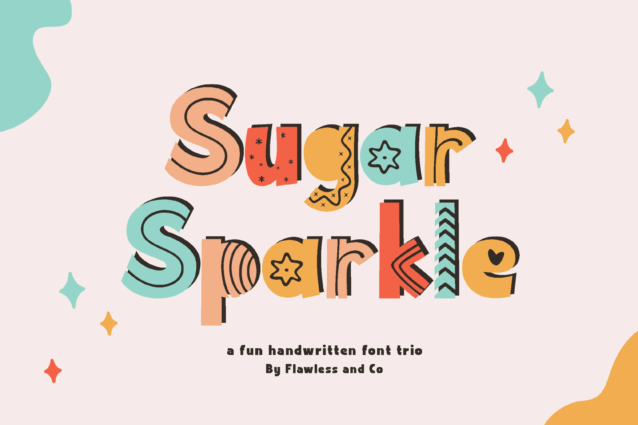
- Sugar Sparkle: A masterclass in handwritten charm. By offering Regular, Solid, and Fun styles, it provides versatility for branding that requires both legibility and a creative flourish.
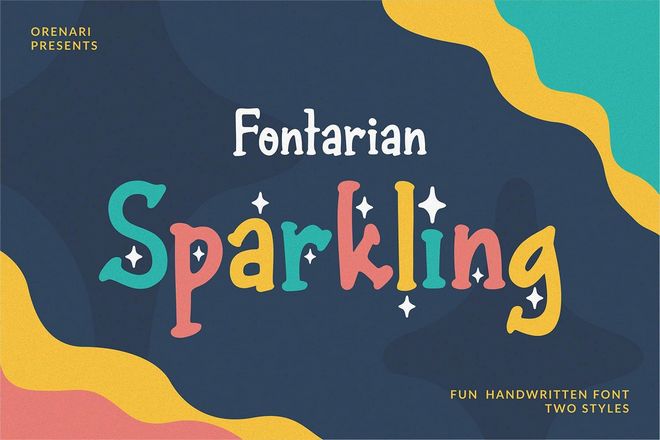
- Fontarian Sparkling: Inspired by the "magical moments" of the past year, this typeface excels in unconventional, hand-drawn aesthetics, making it a favorite for boutique branding.
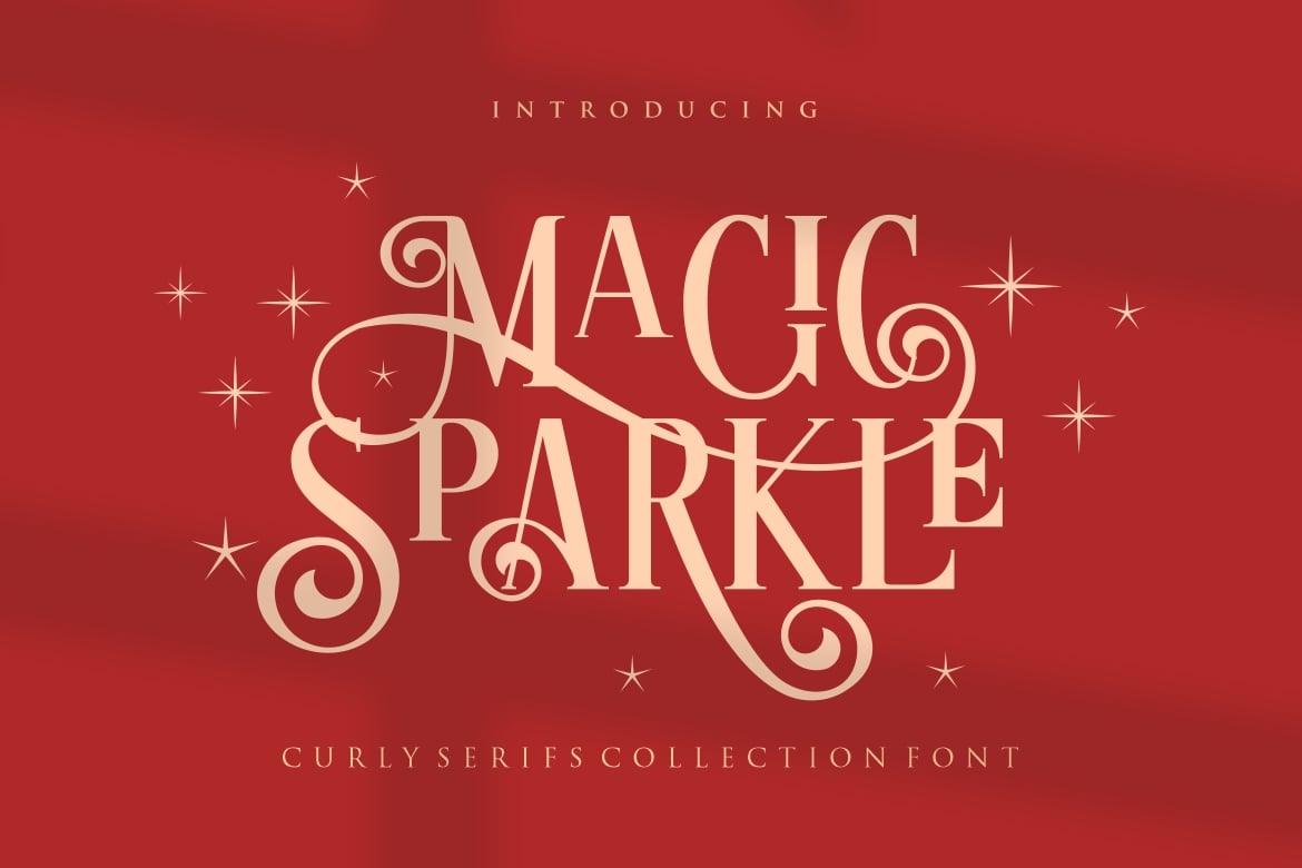
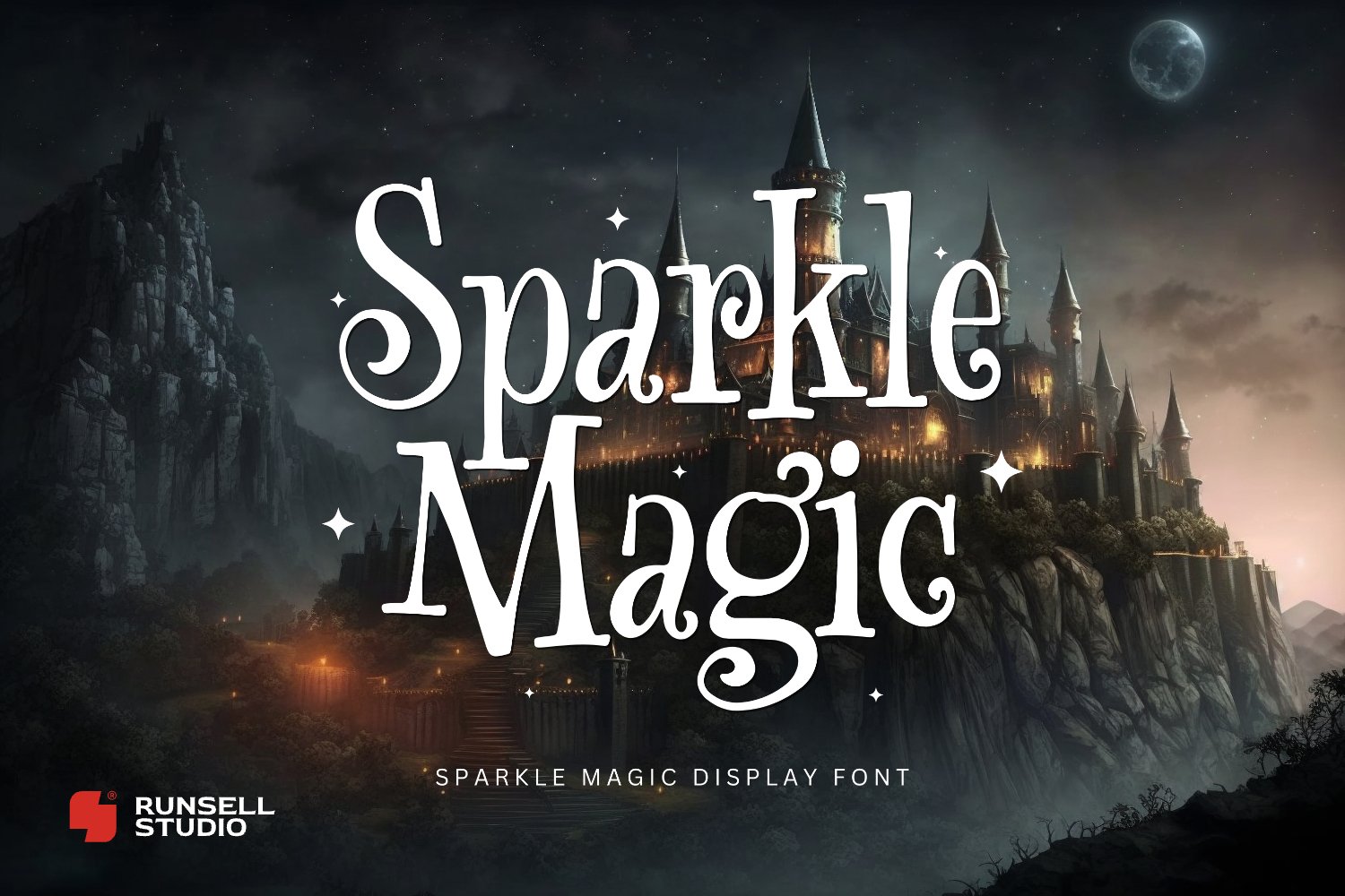
- Magic Sparkle: A high-end display font that leans into luxury. With its curly tails and serif structure, it is a testament to the idea that sparkle can be sophisticated rather than just juvenile.
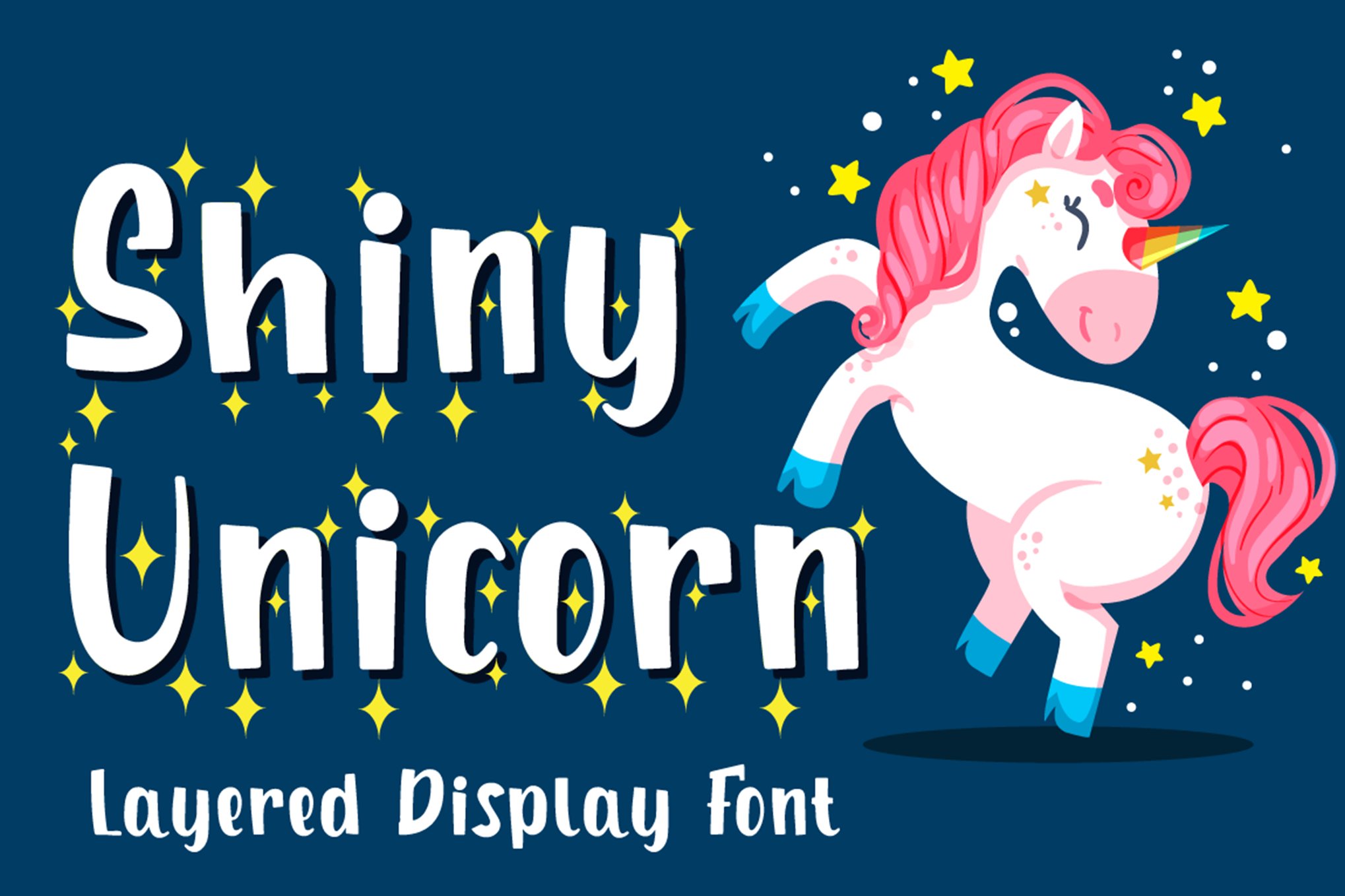
- Shiny Unicorn: This font takes the trend to its logical extreme, utilizing layerable display elements that allow for multi-colored, iridescent effects.
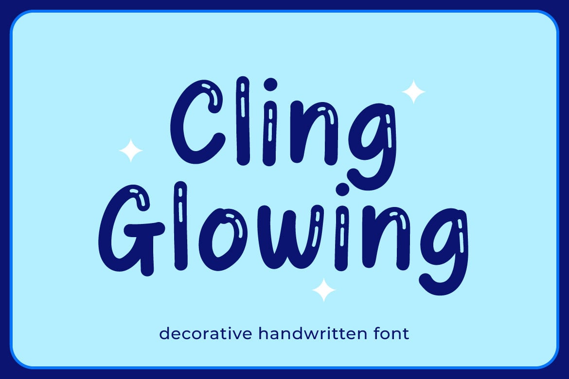
- Cling Glowing: A bubble-style font that demonstrates how "glitter" can be applied to youthful, cartoon-esque designs.
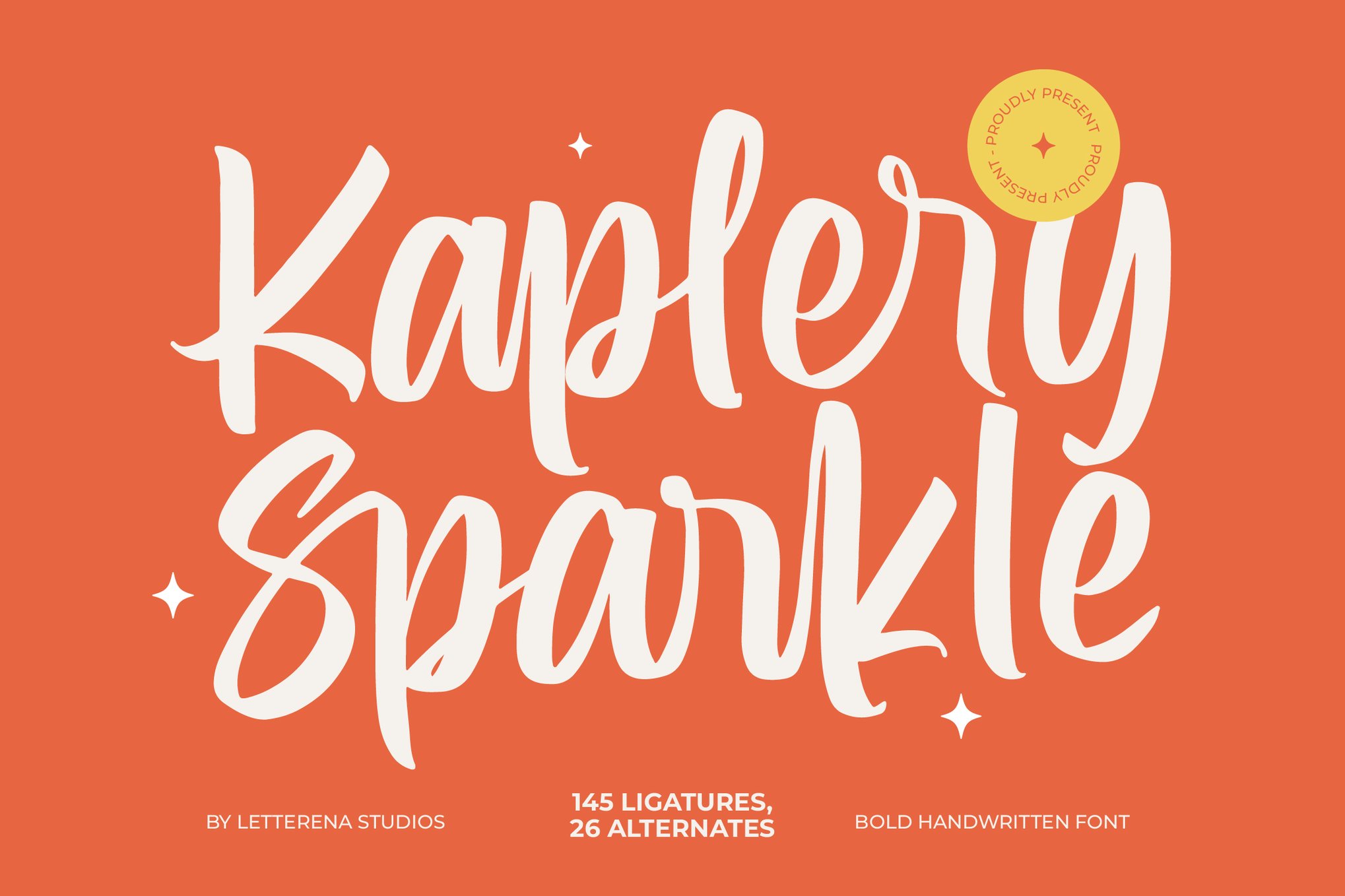
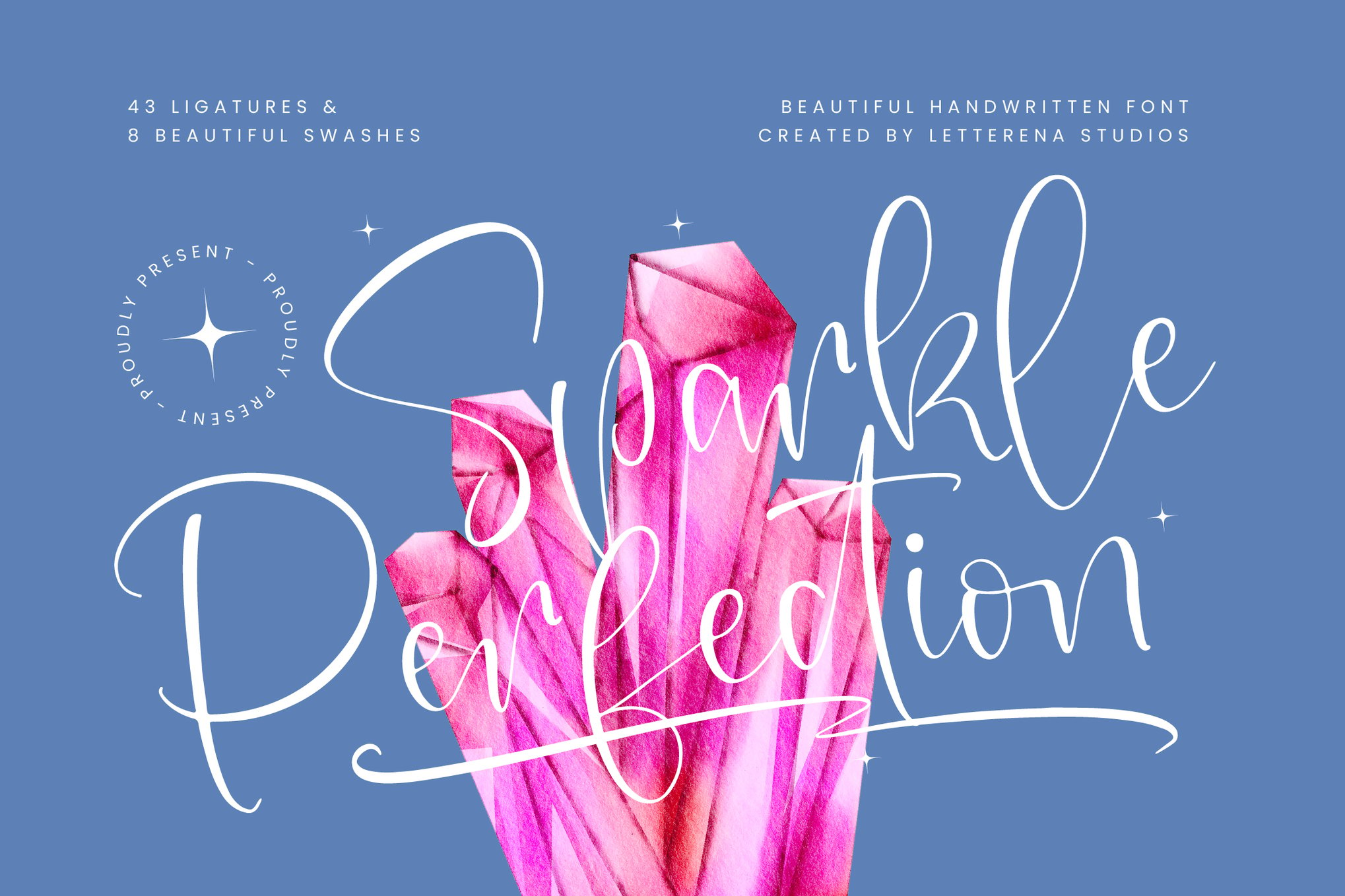
- Kaplery Sparkle & Sparkle Perfection: These two fonts represent the standard for "clean" sparkle—handwritten styles that are legible enough for long-form social media captions but stylized enough to stand out.
- Halloween Horror (Sparkle Magic): A fascinating subversion of the trend. It proves that "sparkle" is not synonymous with "happy." By applying glittery textures to gothic, jagged letterforms, designers can create a sense of "dark magic."
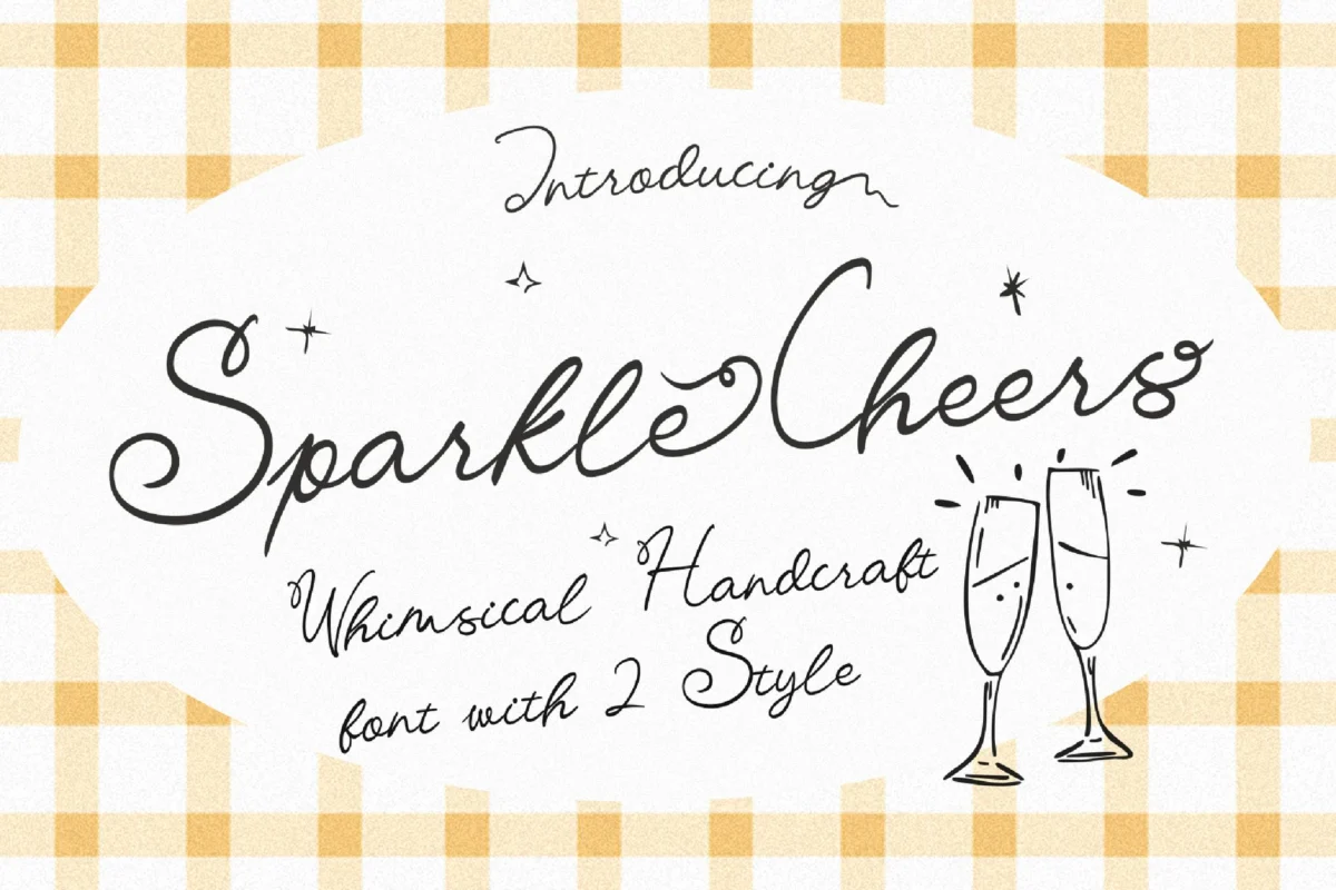
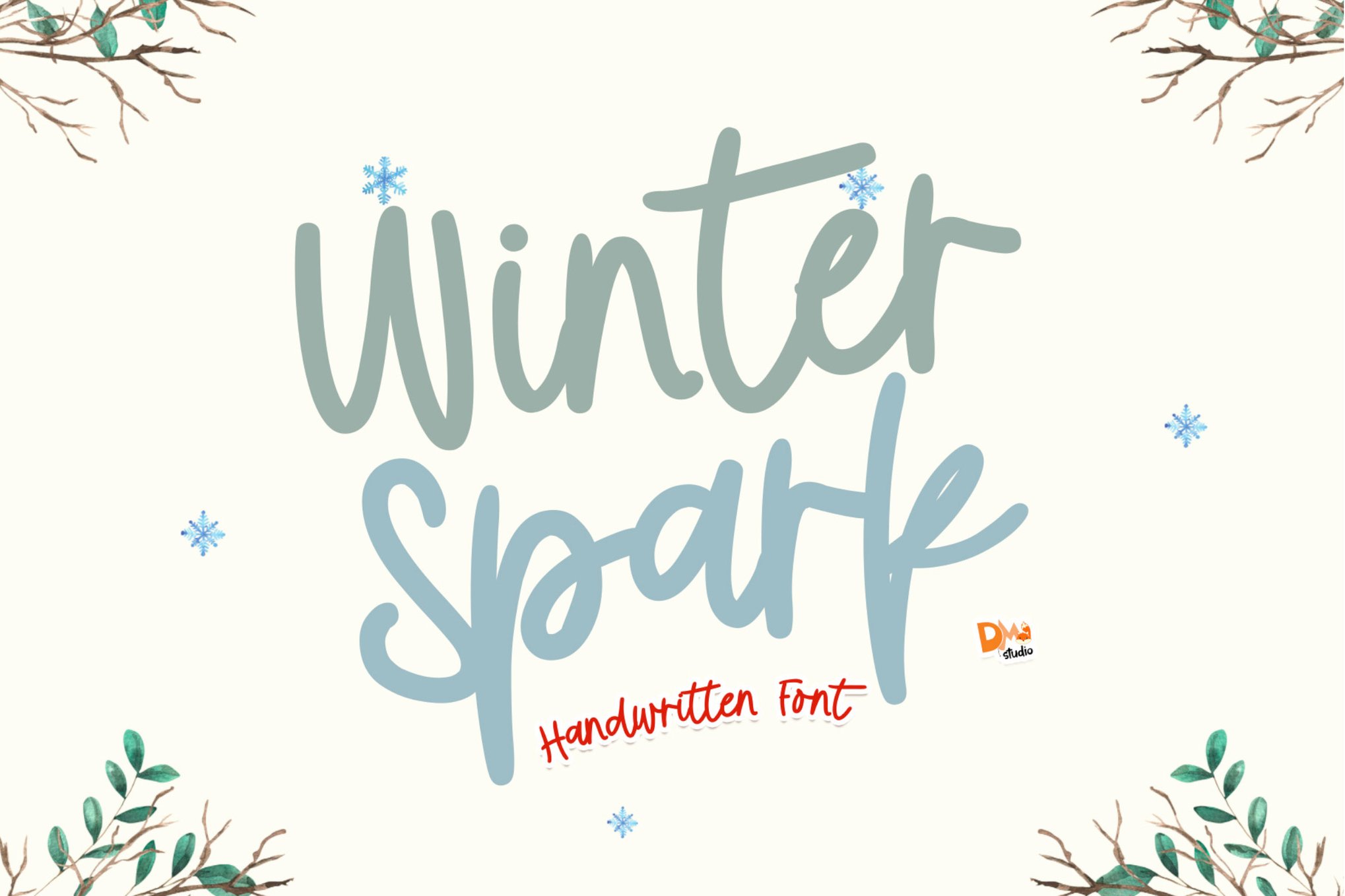
- Sparkle Cheers & Winter Spark: These fonts lean into the seasonal market, providing specific, thematic textures that evoke the holiday season or the icy, crystalline beauty of winter.
Industry Perspectives: The Professional Application
Leading design agencies have increasingly adopted these fonts as a method of "emotional branding." When asked about the trend, creative directors often note that the "digital fatigue" of the modern consumer requires more tactile, human-feeling designs.
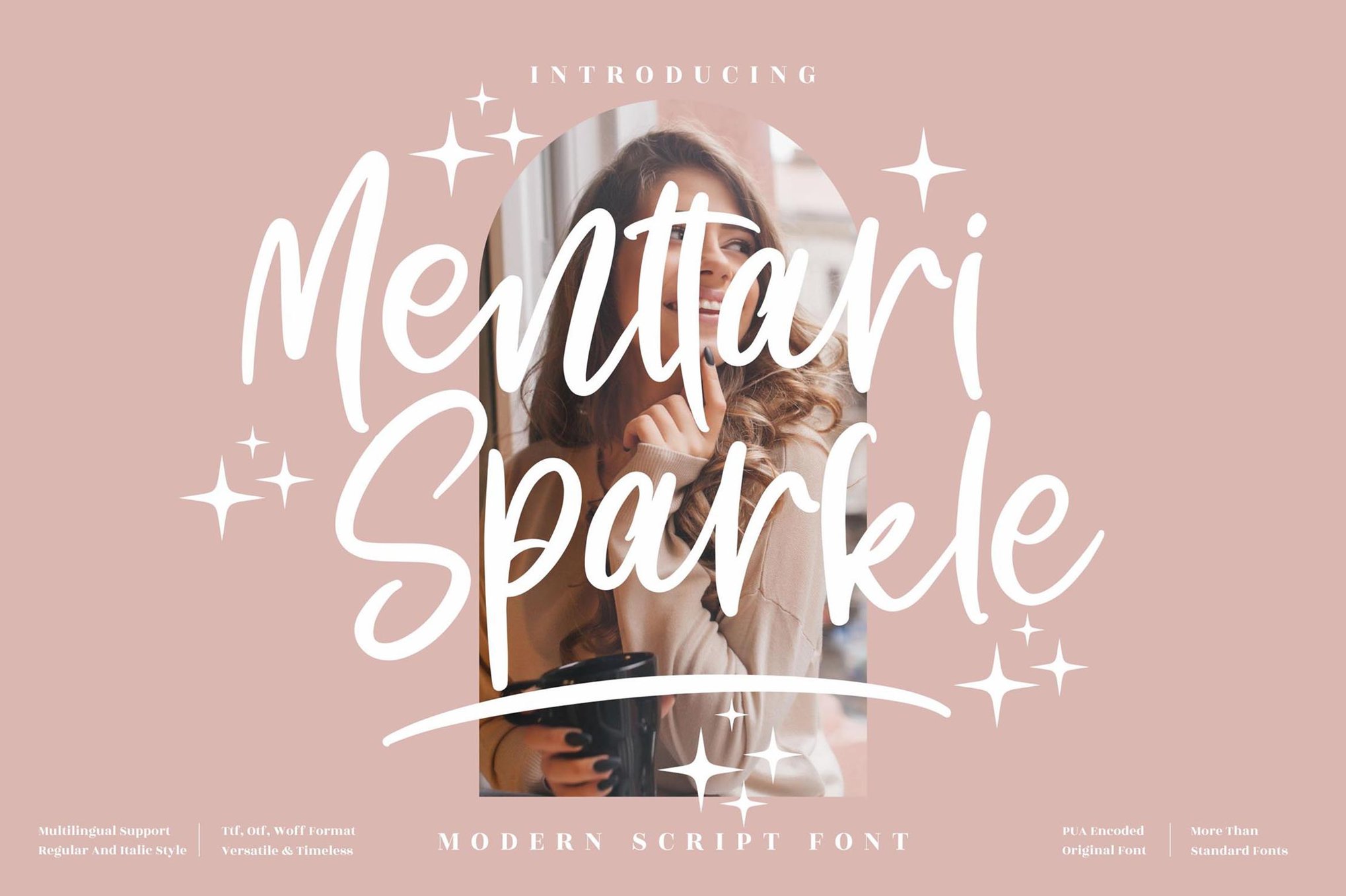
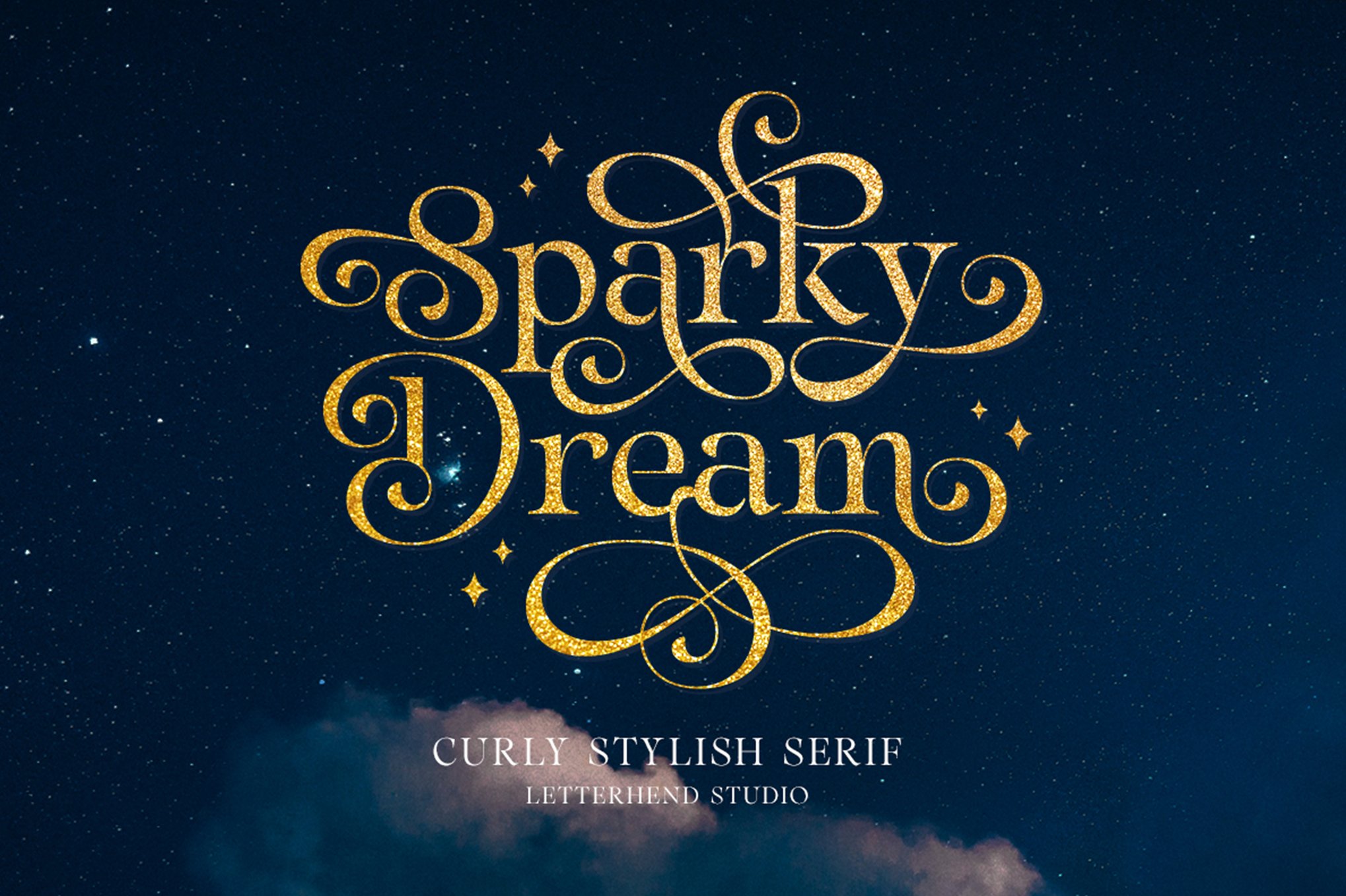
"We aren’t just selling a product; we’re selling a feeling," says Sarah Jenkins, a senior brand strategist. "A font like Menttari Sparkle or Sparky Dream adds a layer of humanity to a screen. It feels like someone actually sat down and wrote that word for you, and added a little bit of magic on top."
The "Free-to-Use" Movement
For independent creators and hobbyists, the accessibility of these fonts is crucial. Platforms like FontSpace and AllFreeFonts have hosted high-quality, personal-use assets such as Glitter Cookie (perfect for children’s content) and the classic Sparkle Christmas font. These resources have democratized design, allowing small businesses to compete visually with major corporations.

Implications for Future Design Trends
As we look toward the future of typography, the trajectory of sparkle and glitter fonts points toward dynamic responsiveness.
1. Motion and Animation
The next frontier for this trend is the integration of Variable Fonts and CSS animations. We are already seeing "twinkling" web typography, where the sparkle effect is not static but moves in response to cursor hover or scroll. This adds a layer of engagement that static print media cannot replicate.
2. AR and VR Integration
As Augmented Reality (AR) becomes more integrated into social media (via filters and interactive posters), these glitter fonts are being mapped into 3D space. Imagine a business card that, when viewed through a smartphone, displays the text in a 3D, shimmering gold animation. The "glitter" is no longer just a visual texture; it is becoming a spatial experience.
3. Ethical and Sustainable Design
There is an ironic contrast between the digital trend of "glitter" and the physical environmental movement against micro-plastics. As designers become more conscious of the materials they use in real-world packaging, the demand for "digital glitter" is likely to grow as a sustainable alternative to physical foil stamping and plastic glitter application.
Best Practices for Implementing Sparkle Typography
To ensure these fonts serve the design rather than distract from it, professionals recommend a strict set of guidelines:
- Maintain Contrast: If the font is complex, the background must be simple. A busy background with a sparkling font leads to "visual noise," which significantly decreases the retention rate of the information being presented.
- Strategic Use: Sparkle fonts are "display" fonts. They are meant for headers, titles, and call-to-action buttons. They should rarely be used for body copy, as the legibility degrades rapidly at smaller sizes.
- The "Rule of Three": When pairing, stick to a maximum of three fonts. Pair your sparkle font with a clean, neutral, sans-serif font (like Montserrat or Open Sans) to ground the design.
- Color Palette Harmony: Avoid neon or overly saturated colors unless the goal is specifically "retro-kitsch." Instead, pair metallic fonts with deep, matte backgrounds—navy, forest green, or charcoal—to allow the "light" of the font to shine through.
Conclusion
The resurgence of sparkle and glitter fonts is more than just a passing aesthetic trend; it is a reflection of a desire for joy, optimism, and enchantment in our visual culture. By mastering the balance between the technical constraints of typography and the expressive freedom of glitter, designers can create work that is not only memorable but emotionally resonant. Whether for a holiday invitation, a brand logo, or a digital social campaign, these typefaces provide the "star power" necessary to capture attention in an increasingly crowded digital world. As the technology behind these fonts continues to advance, we can expect the boundary between static text and living, breathing light to blur even further, inviting us all to shine a little brighter.