







In the world of digital and print design, the most critical battles for user attention are often won at the smallest scale. Whether it is a footnote in an annual report, a button label in a complex dashboard, or fine print in a mobile application, readability is the primary arbiter of success. When typography shrinks, it loses its ability to rely on decorative flourishes or intricate details. Instead, it must lean on the fundamental principles of legibility: balance, spacing, and structural integrity.
As design systems become increasingly complex, the demand for typefaces that maintain character clarity at reduced sizes has skyrocketed. Designers are moving away from purely aesthetic choices, prioritizing fonts that offer robust performance under the constraints of limited pixel real estate. This guide explores the essential criteria for selecting small-text fonts and presents a curated selection of typefaces that bridge the gap between high-utility functionality and visual personality.
The Evolution of Small-Scale Typography: A Brief Chronology
The history of small-text typography is intrinsically linked to the history of printing technology. In the era of movable type, punchcutters had to meticulously carve letterforms that would not "clog" or disappear when printed on rough paper with limited ink control.
- The Gutenberg Era (1450s): The earliest typefaces were essentially imitations of handwriting, often ornate and heavy. They were not designed for long-form reading at small sizes, leading to the development of more standardized Roman faces.
- The Transitional Period (18th Century): Innovators like John Baskerville increased the contrast between thick and thin strokes. While beautiful at larger sizes, these fonts presented the first real challenges for "small text" applications, as thin serifs risked vanishing on the press.
- The Industrial Revolution: The rise of advertising demanded bold, high-impact display fonts. However, it also necessitated the creation of "agate" type—extremely small fonts used for classified ads and stock market listings, marking the first formal attempt at designing specifically for density.
- The Digital Revolution (1980s–2000s): The birth of screen-based design introduced the "pixel grid." Early fonts had to be manually hinted so that their shapes would align with the rigid pixel squares of CRT monitors.
- The Modern Era (2010s–Present): With the advent of Retina displays and variable font technology, the focus has shifted toward "optical sizing." Modern typefaces are now engineered to adjust their internal geometry automatically as the point size decreases, ensuring that the character remains readable regardless of the display environment.
Supporting Data: Why Size Matters
Research in cognitive psychology and typography confirms that the human eye processes text based on word shapes and character recognition. When font sizes drop below 10pt (or 14px on screens), the "threshold of recognition" is tested.
Data suggests that:
- X-Height Influence: Typefaces with larger x-heights (the height of the lowercase ‘x’ relative to the capital letters) show a 15–20% increase in reading speed at small sizes.
- The Contrast Paradox: While high-contrast fonts (like Didones) are elegant in headlines, they suffer from a "break-down" effect at 8pt, where the thin hairlines disappear, leaving only the thick stems and rendering words illegible.
- Screen Rendering: Studies on font-weight indicate that on low-density screens, a "Medium" weight often outperforms a "Regular" or "Light" weight, as it provides enough mass to avoid pixel-aliasing artifacts.
Premier Small-Text Typefaces
The following families have been curated for their ability to maintain structural integrity when scaled down.
The Serif Selections
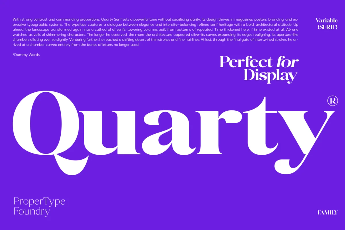
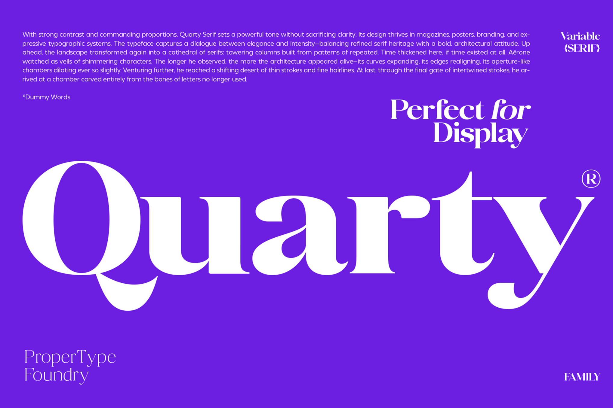
- Quarty: A refined serif that masterfully blends geometric shapes with graceful curves. It is particularly effective in editorial layouts where personality is required alongside dense blocks of information.
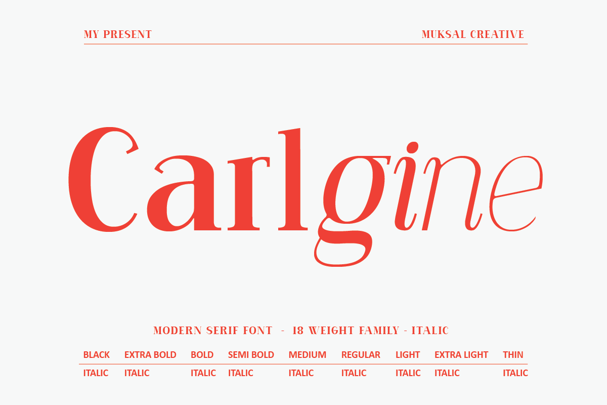
- Carlgine: Offering 18 distinct weights, Carlgine is an workhorse. Its extreme versatility, from Thin to Black, makes it a top contender for branding projects that require consistency across both massive titles and tiny disclaimers.
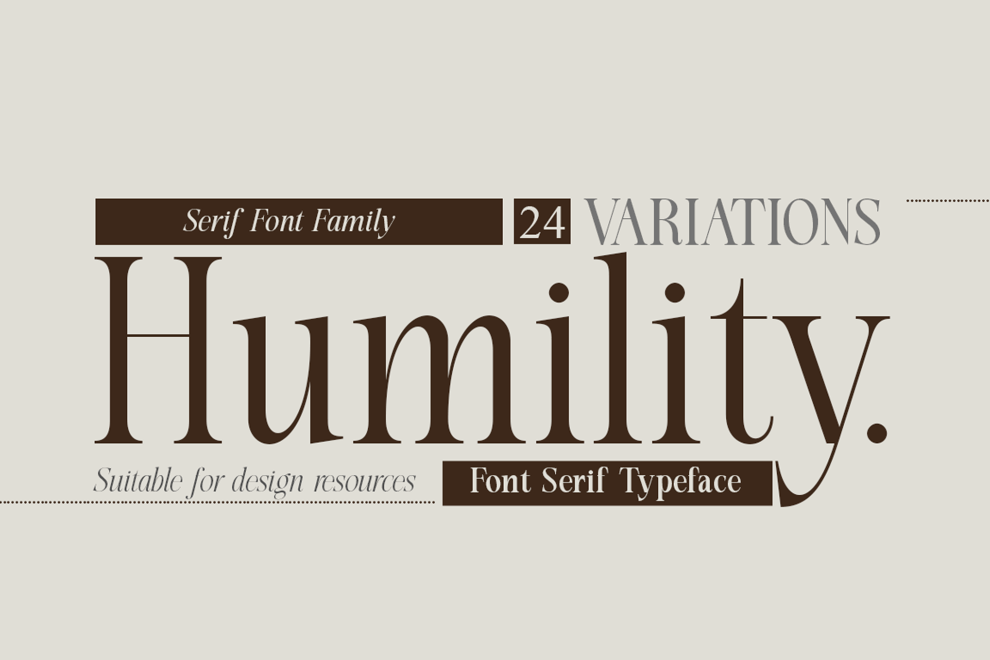
- Humility: With its vintage flair and sharp, expressive characters, Humility proves that a font can be decorative and functional. It is a favorite for fashion publications that need to convey luxury in fine print.
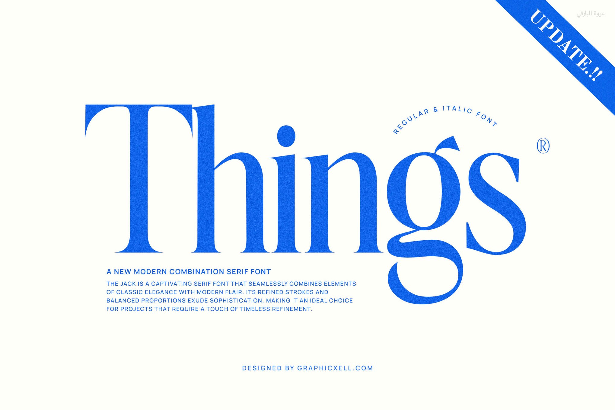
- Things: A modern serif that strikes a delicate balance between traditional legibility and contemporary aesthetics. It is highly recommended for digital publications.
The Sans-Serif Powerhouses
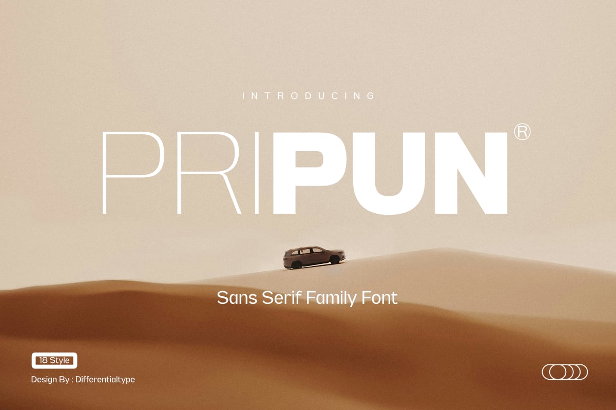
- Pripun: A clean, precise sans-serif that excels in interface design. Its geometric foundation ensures that it looks "at home" in modern, tech-focused applications.
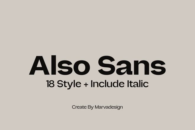
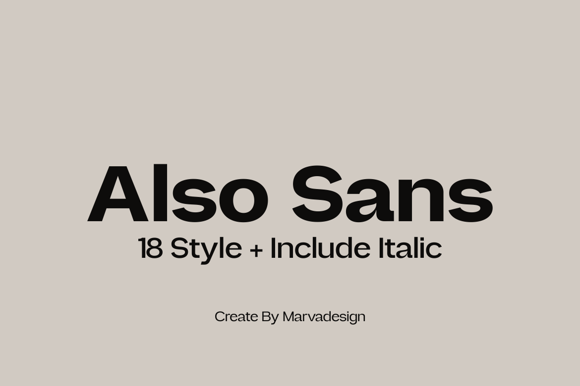
- Also Sans: Built with open counters, this typeface prevents the "blurring" effect that occurs when characters are packed tightly together.
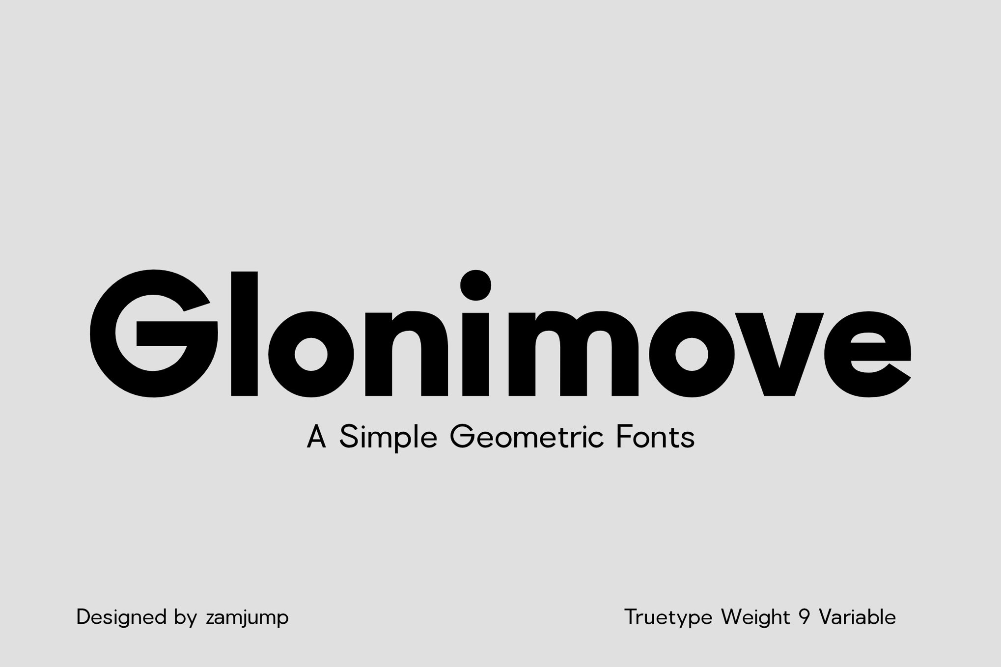
- Glonimove: For designers who prefer a minimalist, geometric approach, Glonimove’s 9 variable weights provide unparalleled control over hierarchy.
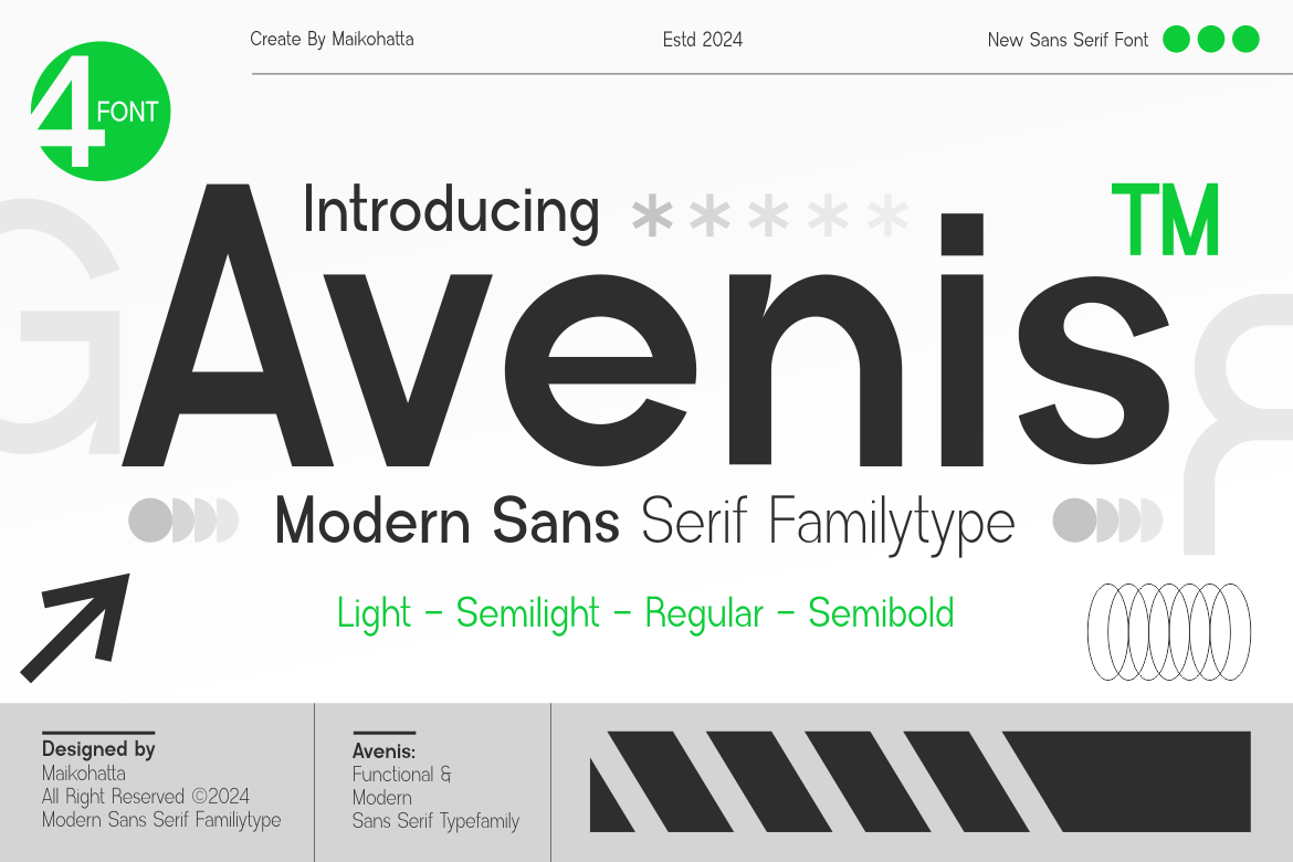
- Avenis: This family is designed for the modern web, providing excellent clarity on both high-definition and standard displays.
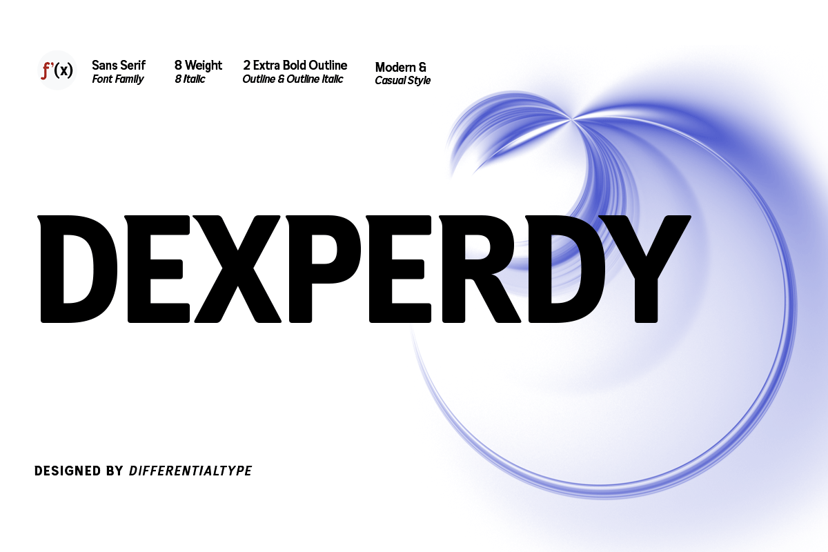
- Dexperdy: A bold family designed for impact. It is ideal for call-to-action buttons where text must be readable at a glance.
- Oliviar: Incorporating humanist influences, Oliviar feels less "robotic" than standard geometric sans-serifs, making it excellent for long-form reading.
- Venzia: Its oblique styles are particularly well-engineered, retaining readability even when italicized at small scales.
- JUST Sans: A modern, highly versatile pair that works exceptionally well for UI/UX design.
- Midland: A luxury sans-serif that feels elevated, making it perfect for high-end branding materials.
- Hurst: Known for its narrow footprint, Hurst allows for more character density per line without sacrificing the white space inside the letters.
- Vistol: A Neo-grotesque masterpiece. Having been tested in print down to 4pt, it is arguably the most reliable choice for heavy-duty professional documentation.
- Raela Pro: With support for over 260 languages, it is the global standard for multi-lingual design systems.
- Clayo: A sleek, contemporary typeface that feels right at home in modern graphic design portfolios.
Professional Perspectives: The Expert View
In industry interviews, lead type designers often emphasize that "designing for small text is an exercise in subtraction." By stripping away unnecessary ornamentation, the designer is forced to focus on the "skeleton" of the letter.
"The biggest mistake," notes one prominent typographer, "is assuming that a font that looks good at 72pt will look good at 8pt. A font is not a static object; it is a fluid entity that responds to its environment. At small sizes, you are not designing for beauty; you are designing for the rapid cognitive processing of information. If the user has to stop and decipher a character, you have failed."
Implications for Future Design Systems
As we move toward a future defined by wearable tech and augmented reality (AR), the need for legible, small-scale typography will only intensify. Interfaces on smartwatches, AR glasses, and heads-up displays require typefaces that can be read in milliseconds under less-than-ideal lighting conditions.
Designers should look toward the integration of Variable Fonts. Because variable fonts allow for the continuous adjustment of weight and width within a single file, they are the future of responsive typography. A system that can dynamically increase its x-height or stroke thickness as a user zooms in or out will become the industry standard for accessibility and UX.
8 Essential Rules for Small-Text Success
To ensure your typography remains functional, adhere to these eight foundational rules:
- Prioritize Clarity: When space is at a premium, legibility must override all other aesthetic considerations.
- Optimize X-Height: Larger x-heights facilitate faster recognition of lowercase letterforms.
- Moderate Contrast: Avoid fonts with paper-thin hairlines that disappear at low resolutions.
- Maximize Counters: Open, airy interior spaces prevent letters from bleeding into each other at small scales.
- Test at Scale: Never test a font in the size you are designing for; always view it at 100% zoom on the intended output medium.
- Screen-Specific Hinting: If designing for web, ensure your font has high-quality hinting data for clean rasterization.
- Limit Flourishes: Decorative ligatures and excessive swashes should be reserved for display headers.
- Weight vs. Contrast: If a font is too light, it will wash out. A slightly heavier weight often increases readability without compromising the design’s intent.
By selecting the right typeface and applying these principles, designers can transform the "fine print" from a necessary nuisance into a polished, professional, and highly effective component of the overall user experience.