







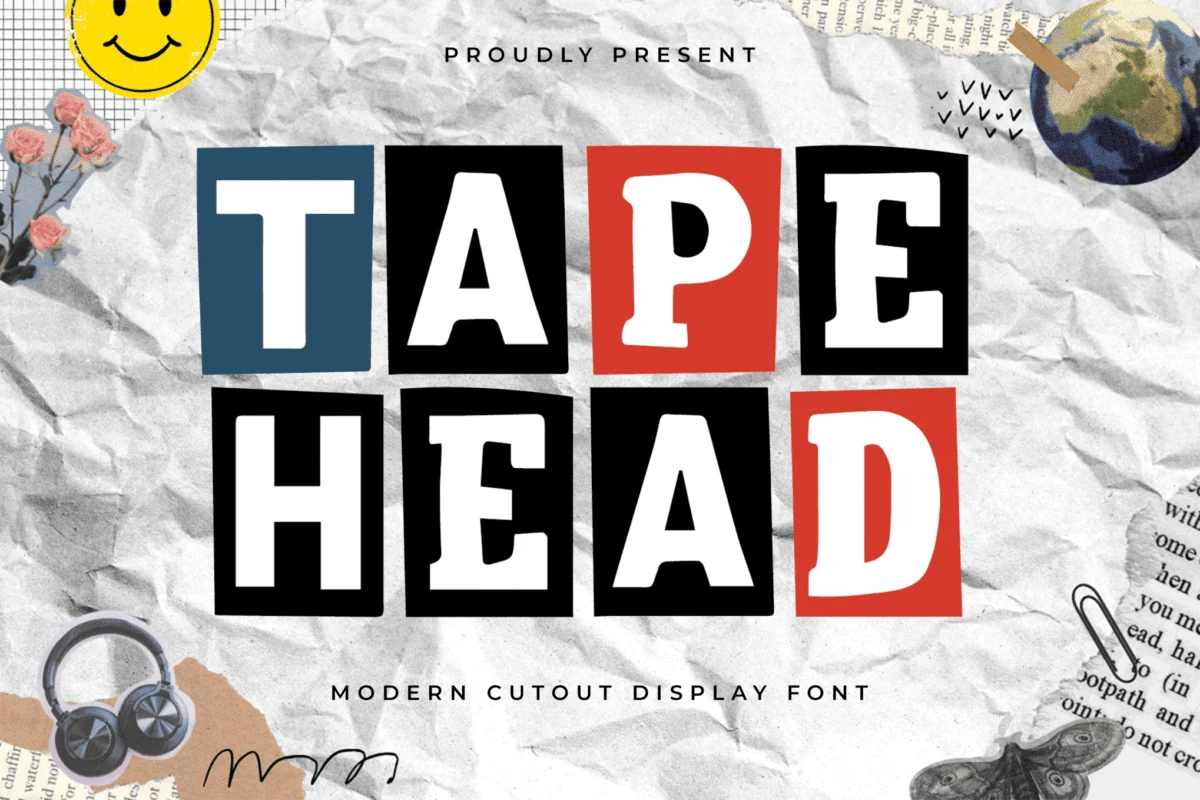
In the world of graphic design, where digital perfection is the standard, there is a growing movement toward the tactile, the messy, and the profoundly human. Enter the collage font—a design aesthetic that mimics the chaos of zine culture, the urgency of ransom notes, and the rhythmic beauty of mismatched paper scraps. These typefaces are no longer just tools for scrapbooking; they have become essential assets for modern editorial layouts, high-fashion branding, and rebellious social media campaigns.
Whether you are looking to inject a sense of raw, unpolished energy into a music festival poster or seeking to bring a touch of nostalgia to a digital magazine, the right cut-out font acts as the cornerstone of your visual narrative. This guide explores the evolution of this style, showcases the industry’s top contenders, and provides the professional insights needed to master this trend.
The Evolution of the Cut-Out Aesthetic
The origins of collage typography are rooted in the 20th-century avant-garde movements, most notably Dadaism and punk rock. By repurposing existing print media—snipping letters from newspapers and magazines to form new messages—designers bypassed the constraints of traditional typesetting. This act was inherently political and disruptive; it was about reclaiming the written word from the polished, corporate presses of the day.
Today, this "ransom note" aesthetic has been translated into sophisticated, high-resolution digital fonts. Modern type designers have painstakingly digitized the essence of paper, glue, and scissors, allowing designers to achieve that authentic "handmade" look without the need for a scanner or a messy desk.
Curated Collection: The Best Modern Collage Fonts
The marketplace for typography has responded to this demand with a wave of creative, high-quality display fonts. Below is a breakdown of the most impactful typefaces currently defining the genre.
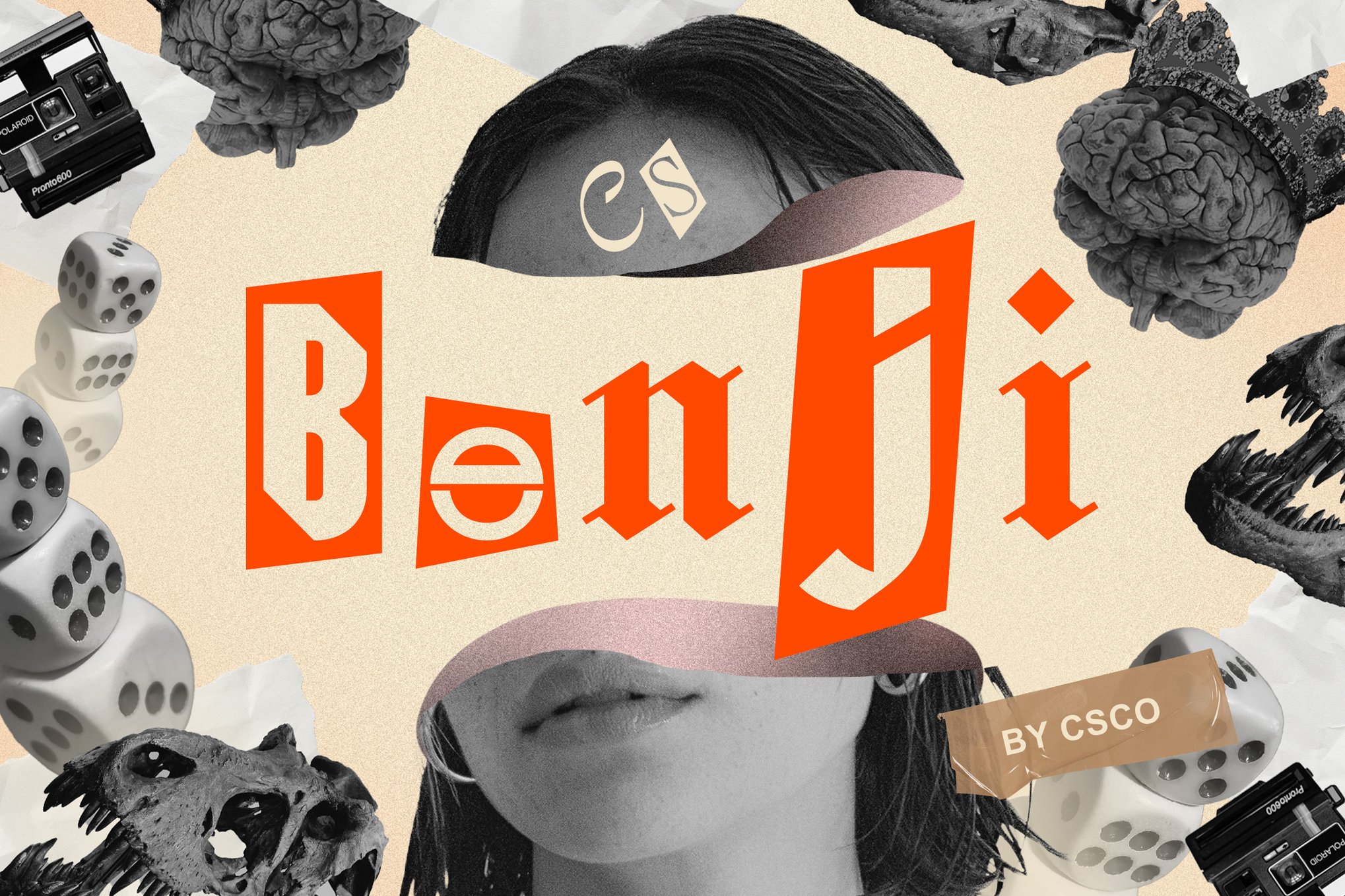
1. Benji: Modern Collage at Its Peak
Benji is the definitive choice for designers looking to balance chaos with readability. Inspired by the sharp, jagged edges of torn paper, this typeface feels inherently urban and rebellious. It is particularly effective for branding music venues or art galleries, where the goal is to signal a departure from the status quo.
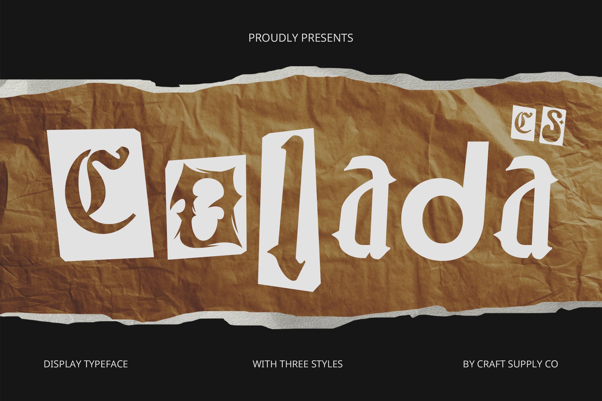
2. Colada: The Joy of Mismatched Geometry
Colada takes a more playful approach. By utilizing varying letter heights and widths, it creates a visual "rhythm" that feels like a choreographed dance of typography. It is an excellent selection for children’s brands or event posters where the goal is to evoke curiosity and excitement.
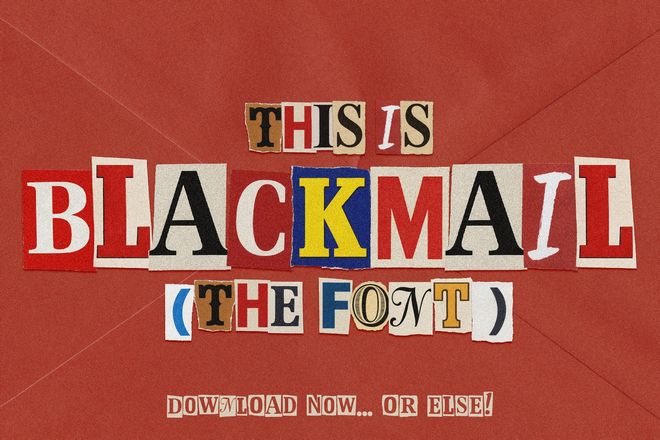
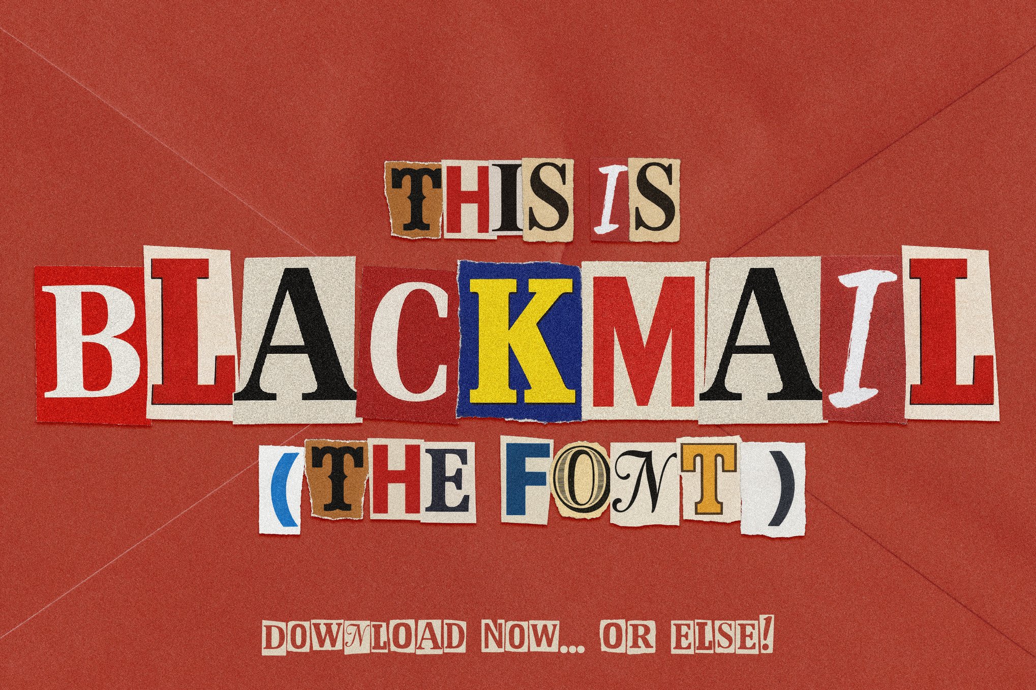
3. Blackmail: The Definitive Ransom Duo
When the project calls for grit, Blackmail is the industry standard. This font duo offers both a bitmap version—which captures the actual color and texture of ink-on-paper—and a vector version for cleaner, scalable applications. It is the go-to for thriller book covers, crime-themed podcasts, and underground fashion labels.
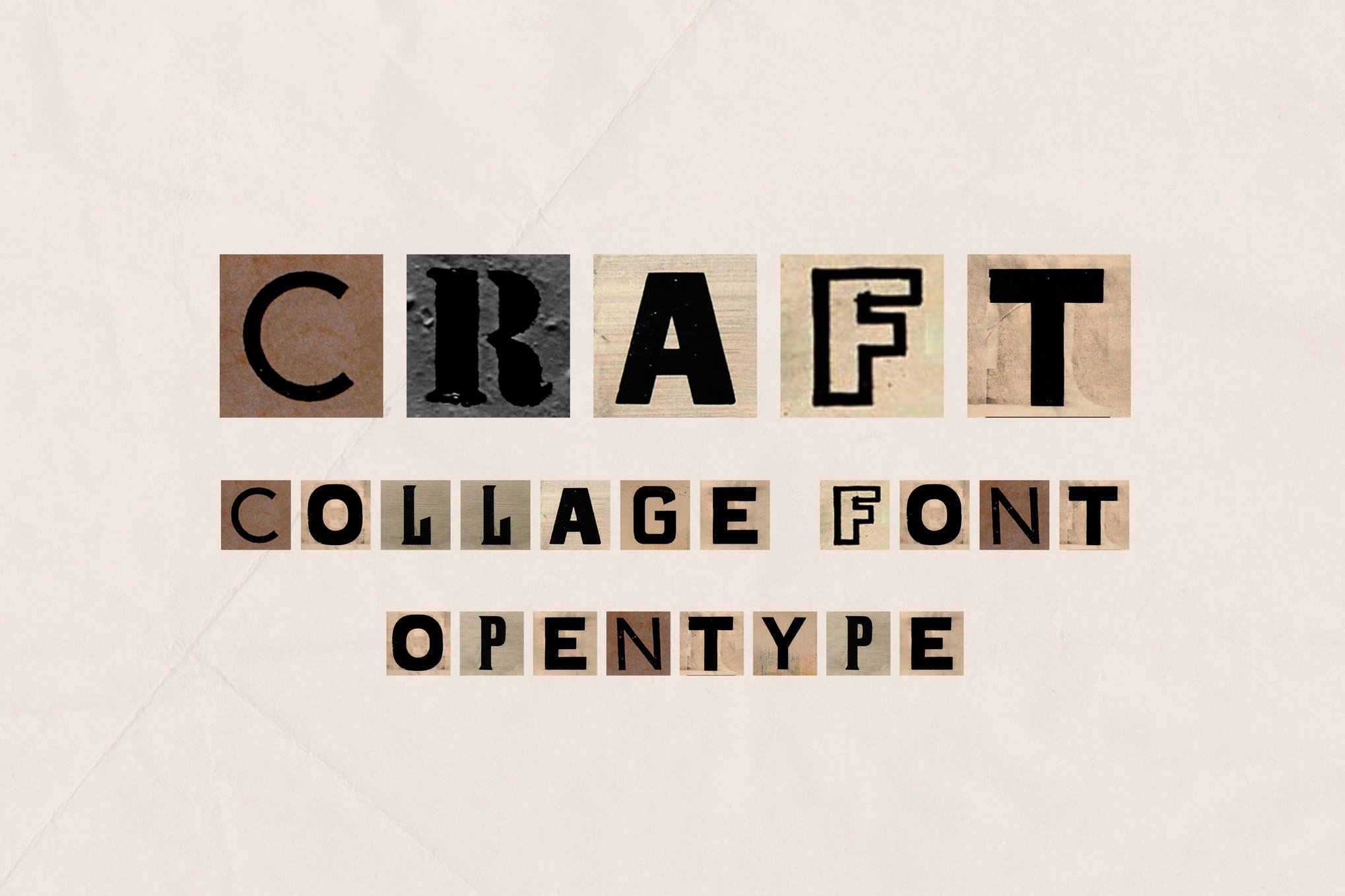
4. Craft: The Digital Tribute to Analog
Craft is an OpenType SVG font that captures the specific texture of newsprint. It is best suited for high-end digital design work where the software (such as Photoshop CC or Procreate) can handle complex textures. It turns every headline into a piece of art that feels like it was lifted directly from a 1970s zine.
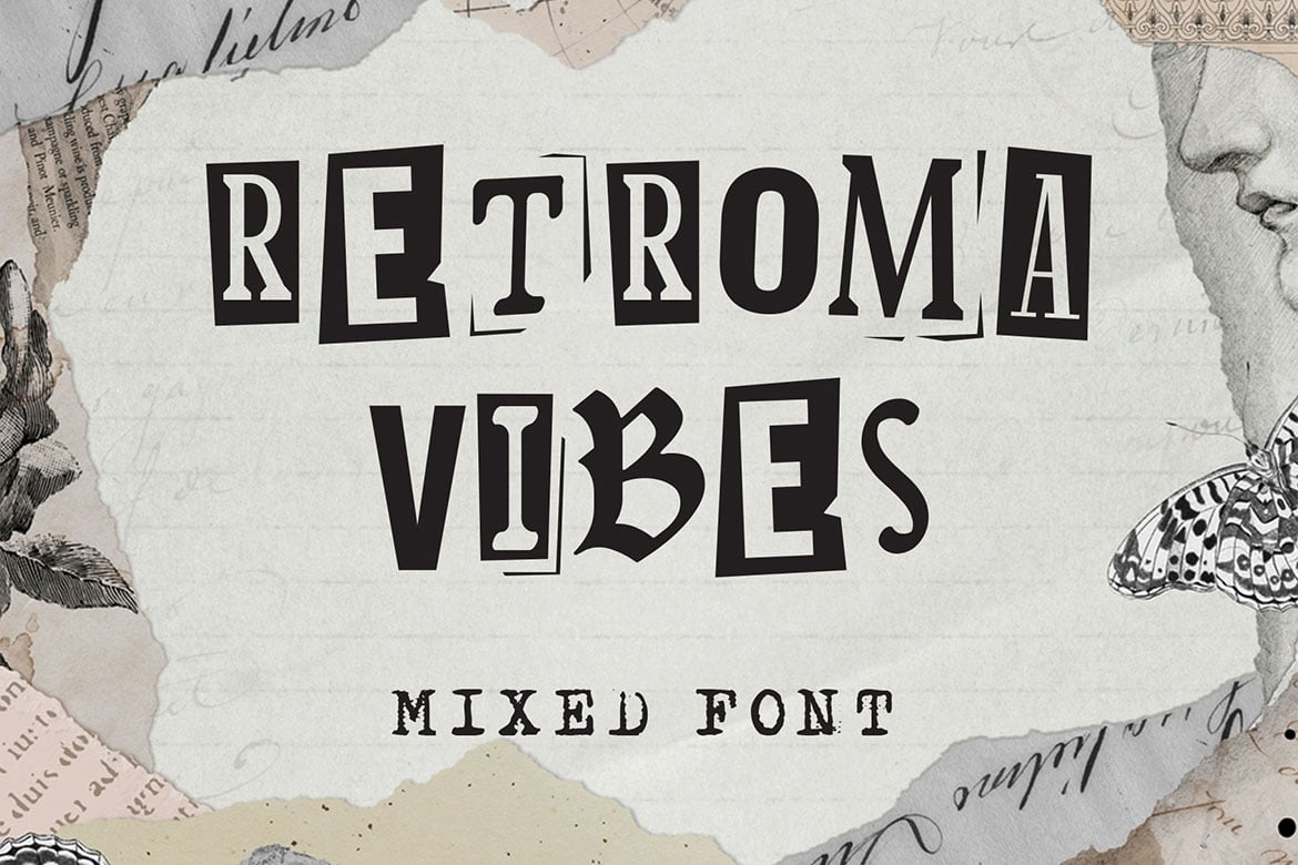
5. Retroma Vibes: A Multi-Style Hybrid
Retroma Vibes is a masterclass in variety. It mixes sans-serifs, condensed serifs, and blackletter scripts within a single character set. This provides the designer with immense flexibility; you aren’t just buying a font, you are buying a library of aesthetic choices that can be toggled to create a truly bespoke look.
Free Resources: Accessible Creativity
Not every project requires a paid license. For students, personal bloggers, and hobbyists, there are several high-quality, free alternatives that still deliver that authentic cut-out punch:
- Dirty Punk: A quintessential zine-style font, perfect for DIY aesthetics.
- Ranger Drawn: Offers a more hand-sketched, organic feel compared to the standard "paper-cut" look.
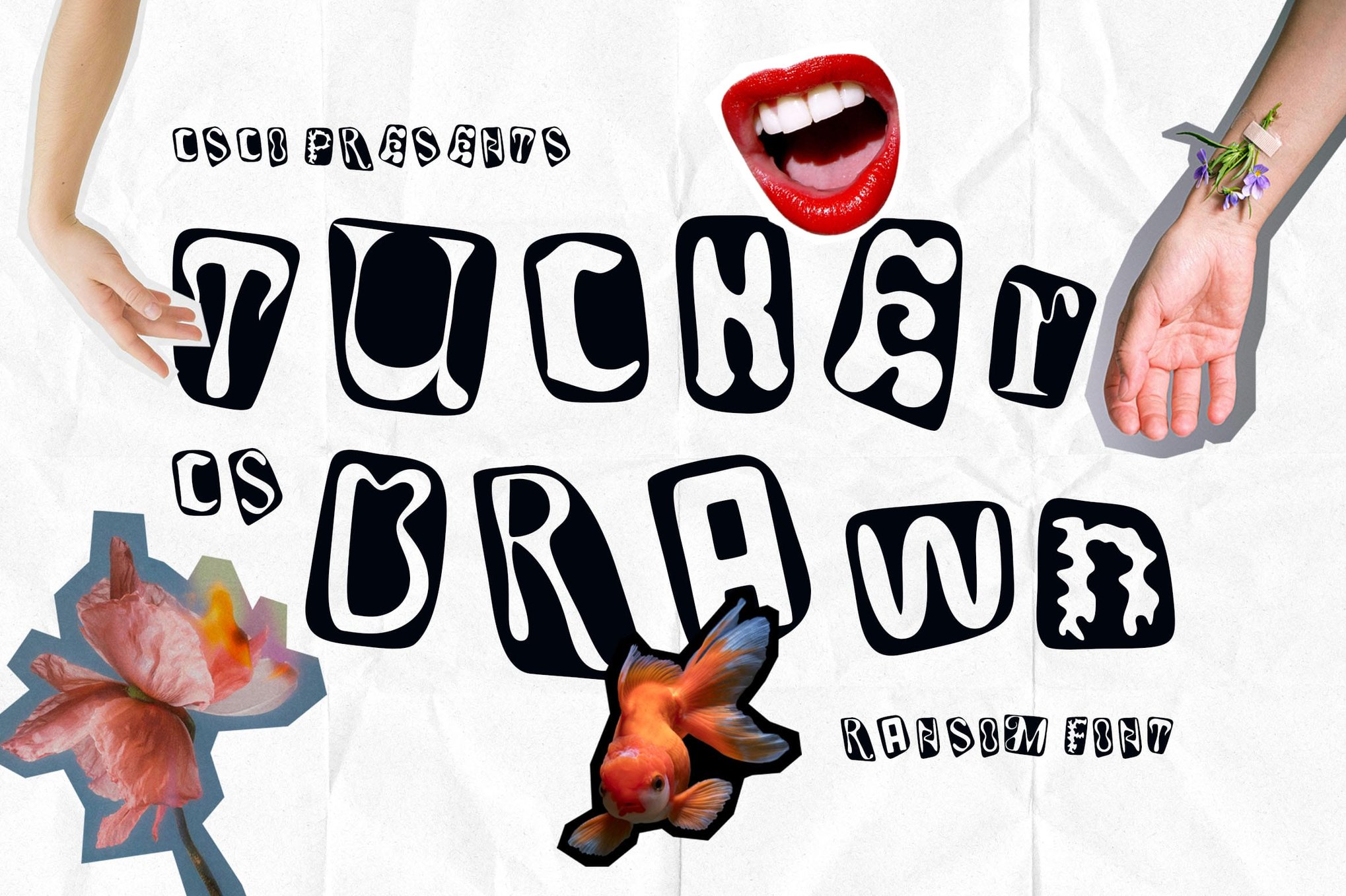
- CS Libra: Excellent for those who want a balanced, legible, yet distinct ransom-note style.
- Goenka Drawn: A vibrant, bold choice for projects that need to feel youthful and approachable.
The Professional’s Playbook: 8 Strategies for Success
Using a collage font effectively requires more than just picking a bold headline. To ensure your design remains professional while retaining its rebellious spirit, consider these strategic rules.
I. The "Embrace the Flaw" Philosophy
The greatest mistake a designer can make with these fonts is trying to "fix" them. If the kerning looks a little loose or a letter feels slightly misaligned, let it be. The charm of this aesthetic lies in its humanity. Trying to make a collage font look "perfect" destroys its soul.
II. The Balance of Hierarchy
Because these fonts are visually loud, they should rarely be paired with other decorative typefaces. Instead, pair them with a clean, minimalist sans-serif for body copy. This allows the headline to scream while the body text does the heavy lifting of communication.
III. Palette Discipline
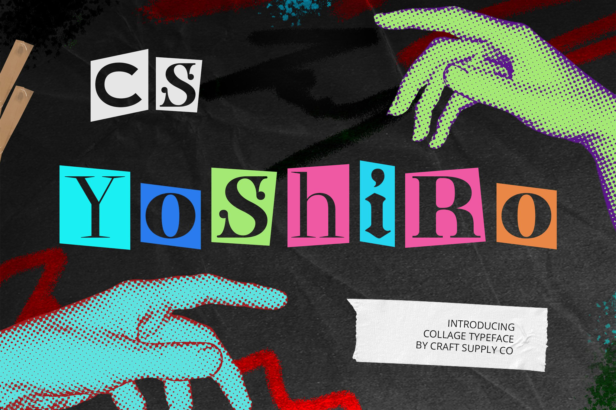
Chaos is a design choice, not a mistake. When using these fonts, limit your color palette to two or three high-contrast colors. This prevents the design from becoming illegible and ensures that the viewer’s eye is directed exactly where you want it.
IV. The Power of Textural Layers
Digital design often lacks the "tooth" of physical paper. To bridge this gap, overlay your text with subtle noise, grain, or paper-texture masks. This added layer of depth makes the typography feel like it is physically part of the composition rather than a flat sticker on top of it.
V. Strategic Focal Points
Collage typography is a headline tool, not a paragraph solution. Use these fonts to anchor a poster, a cover, or a hero image on a website. They serve as the "hook"—the first thing the user sees that signals the personality of the brand or content.
VI. The Rhythmic Scale
Varying the size of your letters is a classic trick of the trade. If your font supports alternate characters, use them to break up repetitive shapes. By alternating between large and small glyphs, you create a sense of movement that leads the eye across the page.
VII. Contextual Relevance
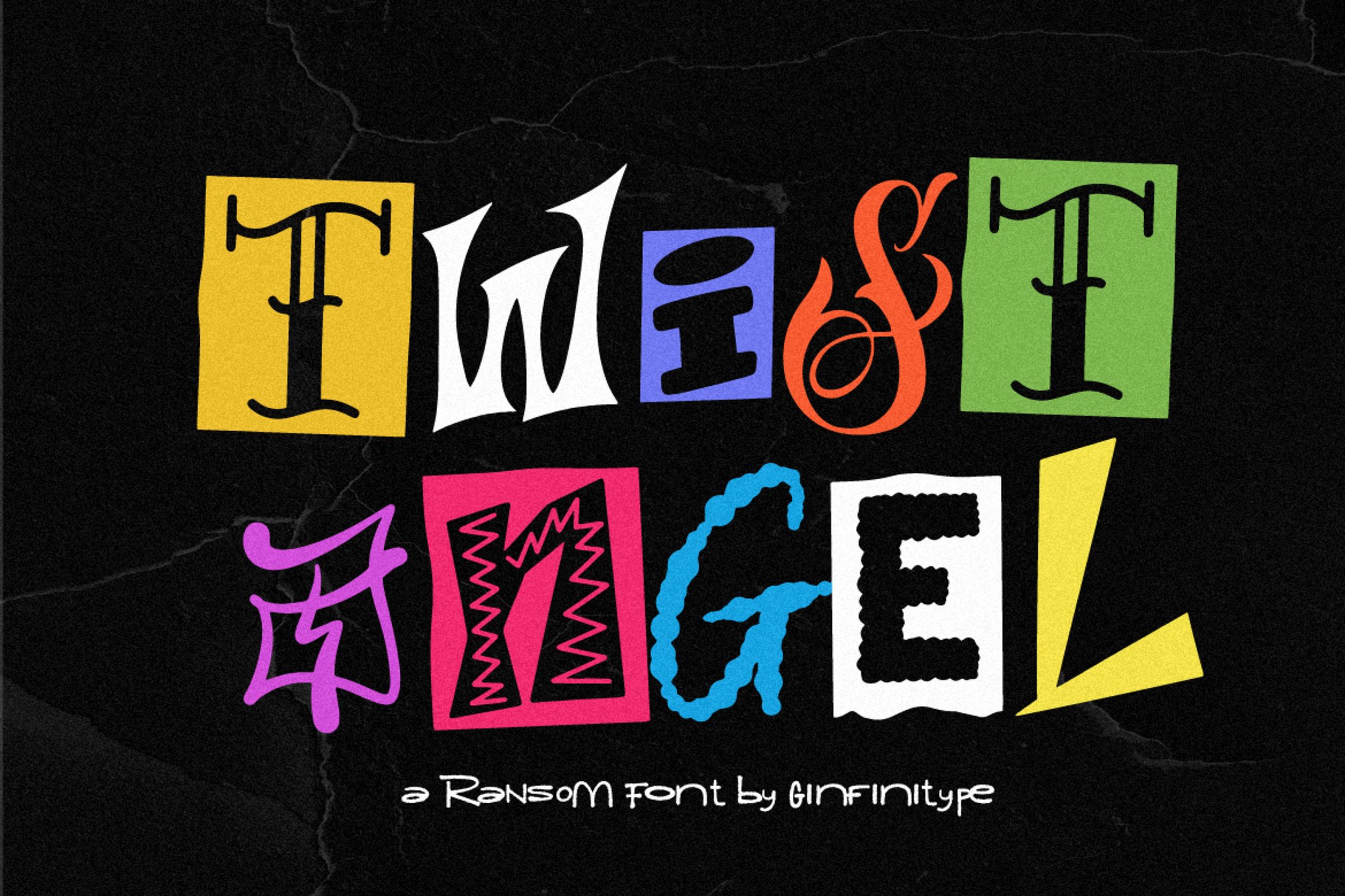
Understand the story you are telling. A ransom-note style font is perfect for a punk rock album cover but may be highly inappropriate for a luxury spa brand. Ensure that the "rebellious" nature of the typeface aligns with the underlying message of your project.
VIII. Motion as a Modern Enhancer
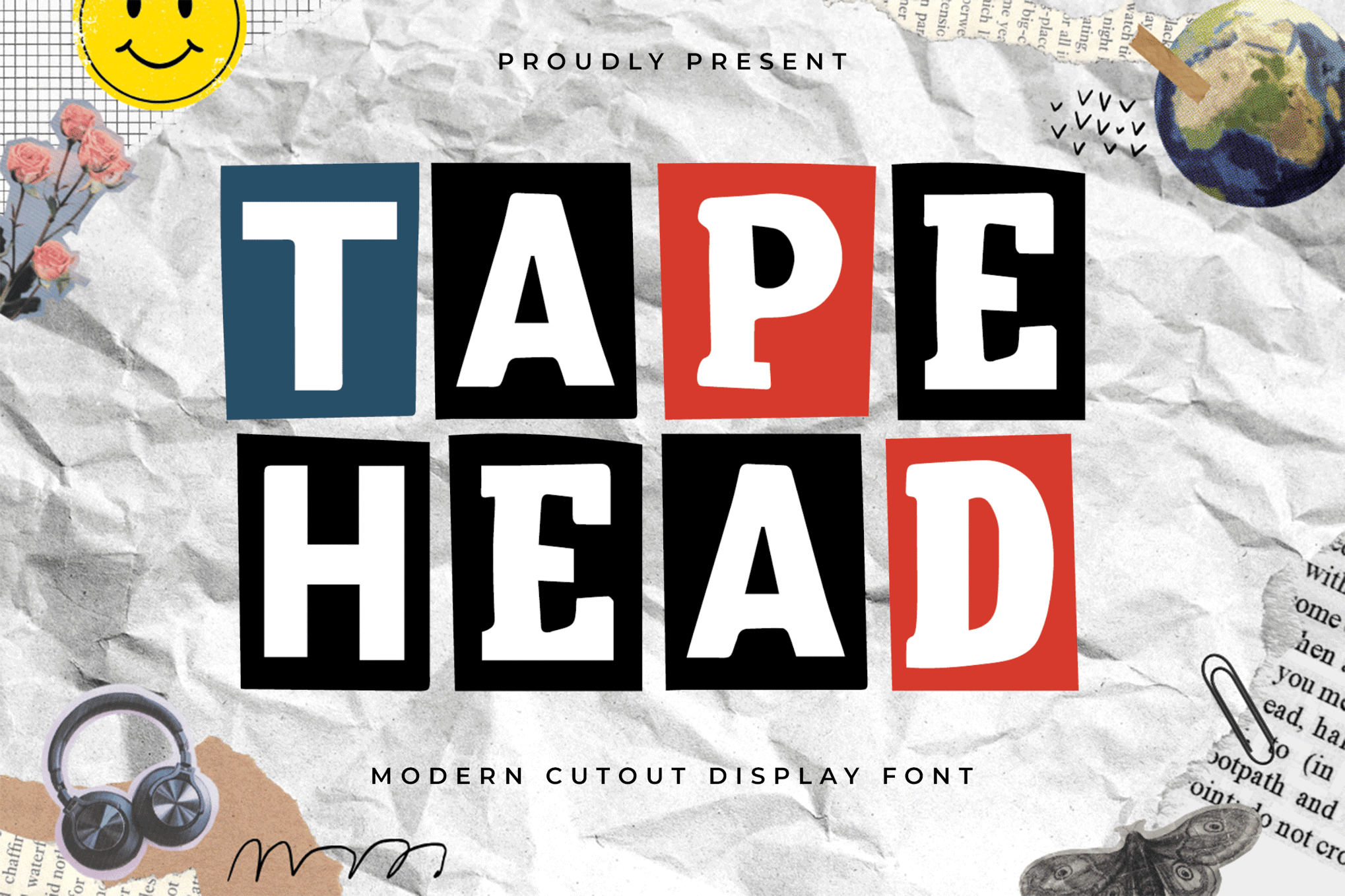
For digital interfaces, don’t leave the text static. Even a subtle, 2-frame "wiggle" animation—mimicking the shift of paper on a scanner—can make the typography feel alive. It bridges the gap between old-school craft and new-school digital interaction.
Implications for Future Design
The resurgence of collage typography reflects a broader cultural fatigue with the "clean" aesthetic that has dominated the web for the past decade. As AI-generated content becomes more prevalent, the value of the "human touch"—even when simulated through digital fonts—increases.
Designers who master the art of the collage font are not just following a trend; they are participating in a long-standing tradition of visual storytelling that values imperfection, personality, and raw expression. Whether you are crafting a brand identity that needs to stand out in a saturated market or designing a zine that demands to be held, these fonts provide the tools to make your voice heard—loudly, messily, and unapologetically.
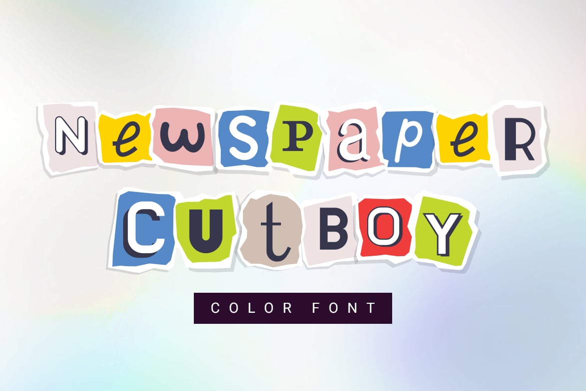
As we move forward, we can expect to see these fonts evolve, perhaps incorporating even more dynamic, multi-colored SVG features and interactive capabilities. However, the core principle will remain the same: the most powerful design is the one that feels like it was made by human hands, for human eyes. Keep experimenting, keep breaking the rules, and most importantly, keep your scissors sharp—both literal and digital.