








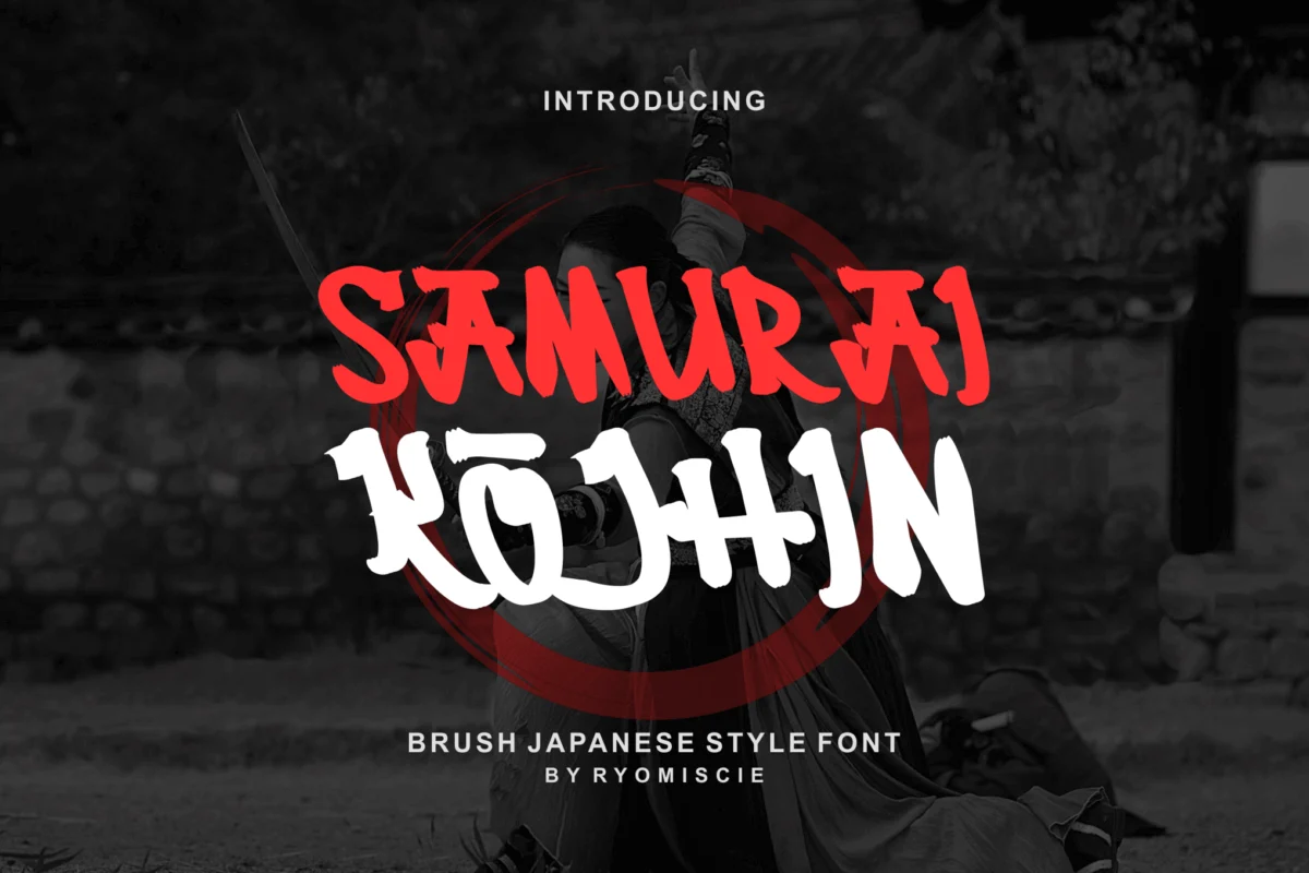
In the world of visual communication, few aesthetics command the immediate authority and cinematic gravitas of Japanese-inspired typography. Often referred to as "samurai fonts," these typefaces serve as a bridge between the storied traditions of feudal Japan and the high-octane demands of contemporary graphic design. By blending the raw, visceral energy of traditional shodo (calligraphy) with modern digital precision, these fonts offer designers a powerful toolkit for evoking themes of honor, conflict, resilience, and cultural sophistication.
Whether you are crafting a high-stakes esports logo, an atmospheric film title, or a brand identity for a high-end restaurant, the right samurai font can provide the "soul" of the project. This guide explores the evolution of this genre, the technical nuances that define it, and a curated selection of the finest typefaces currently available for professional use.
The Anatomy of a Warrior: Defining the Samurai Aesthetic
The hallmark of a high-quality samurai font lies in its ability to mimic the fluid yet aggressive nature of a katana stroke. Unlike standard serif or sans-serif fonts, these display typefaces are deeply rooted in the physical act of painting with ink.
The Brush-Stroke Philosophy
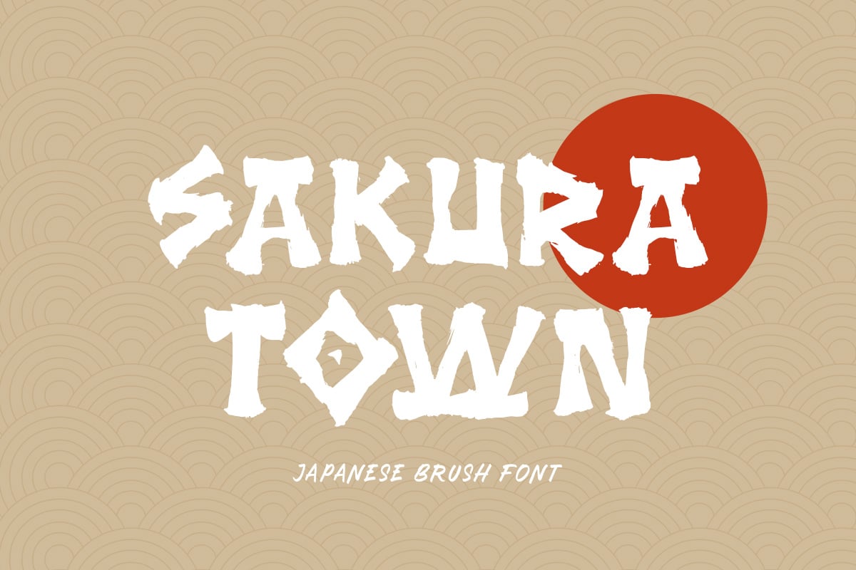
The most iconic samurai fonts prioritize the "handcrafted" feel. Designers utilize rough textures, frayed edges, and varying stroke weights to simulate the movement of a brush loaded with sumi ink. This is not merely an aesthetic choice; it is a narrative one. The varying thickness—often referred to as hane (the kick at the end of a stroke) and uroko (the triangular scales or tips)—mimics the precision of a master calligrapher’s hand.
From Calligraphy to Digital Code
Historically, Japanese calligraphy was a meditative, singular event. Today, font designers must translate this spontaneity into a repeatable, scalable digital format. The best samurai fonts are those that manage to retain the "imperfections"—the splatters, the dry-brush streaks, and the jagged pressure points—without sacrificing legibility or technical performance.
Chronology: The Rise of Eastern-Inspired Design in Global Media
The integration of Japanese-style typography into Western design has not happened in a vacuum. Its popularity has grown in distinct waves, tied closely to global media trends.
- The 1980s–1990s (The Martial Arts Boom): The initial surge in "Asian-style" fonts in the West was largely driven by the popularity of martial arts cinema. During this era, fonts were often clichéd and highly stylized, prioritizing a "look" over genuine cultural connection.
- The Early 2000s (The Gaming Renaissance): As Japanese game developers like Capcom, Square Enix, and Sega took center stage in global gaming, the aesthetic evolved. The demand shifted toward fonts that could withstand the high-energy, fast-paced environment of action games, leading to the development of bolder, more aggressive, and legible display typefaces.
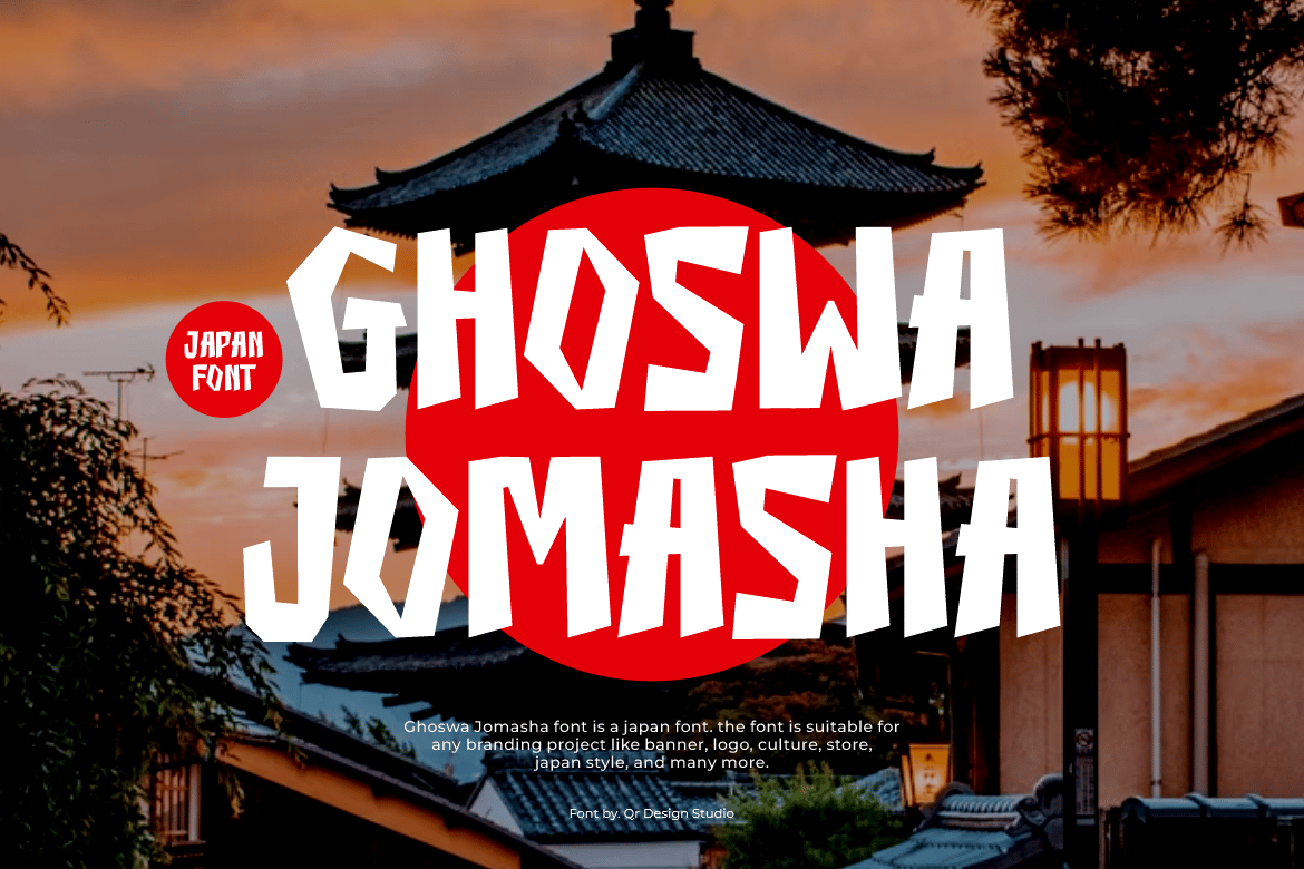
- The 2010s–Present (Cultural Synthesis): In the modern era, there is a greater emphasis on authenticity. Contemporary type designers now balance traditional Mincho (serif) and Gothic (sans-serif) influences with Latin letterforms, resulting in sophisticated, hybrid typefaces that feel at home in modern branding, from high-end sake packaging to streetwear logos.
Supporting Data: Why "Mood" Matters in Branding
Marketing psychology suggests that typeface selection is one of the most critical factors in brand perception. Research consistently shows that typography with "aggressive" or "sharpened" features—the primary characteristics of the samurai genre—tends to activate subconscious associations with:
- Strength and Reliability: Thick, blocky strokes convey durability.
- Exclusivity and Heritage: Calligraphic elements suggest a history of craftsmanship.
- Intensity and Speed: Slanted or "brushed" terminals create a sense of forward motion.
For designers, this means that a samurai font is not just "decoration"; it is a strategic tool for establishing brand authority. When a company in the tech, gaming, or hospitality sector utilizes these fonts, they are signaling a commitment to precision, tradition, and bold action.
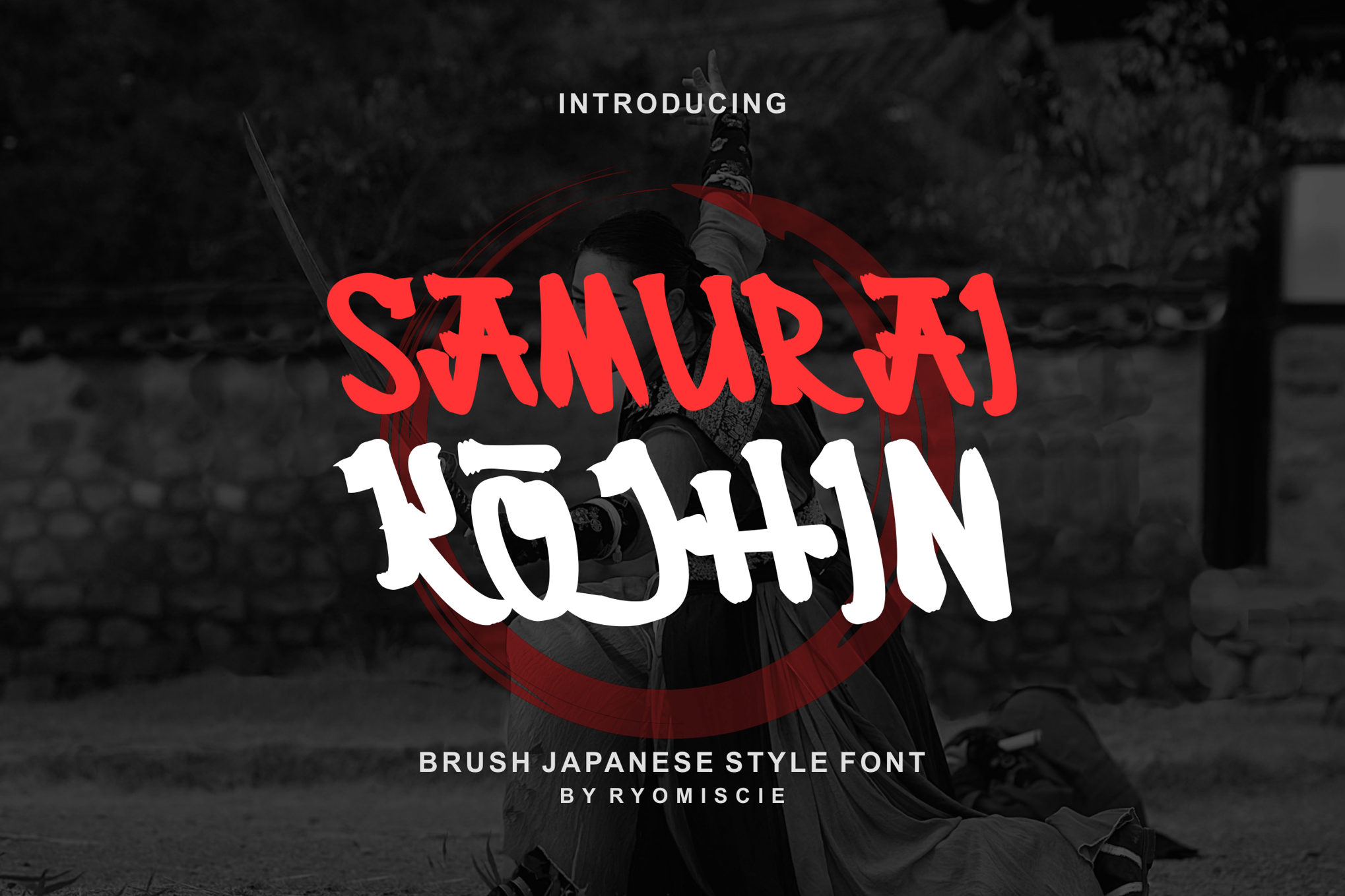
Curated Collection: Professional-Grade Samurai Typefaces
Selecting the right font requires balancing readability with the desired level of "grit." Below are some of the most versatile options currently shaping the industry.
1. The Last Shuriken: The Modern Standard
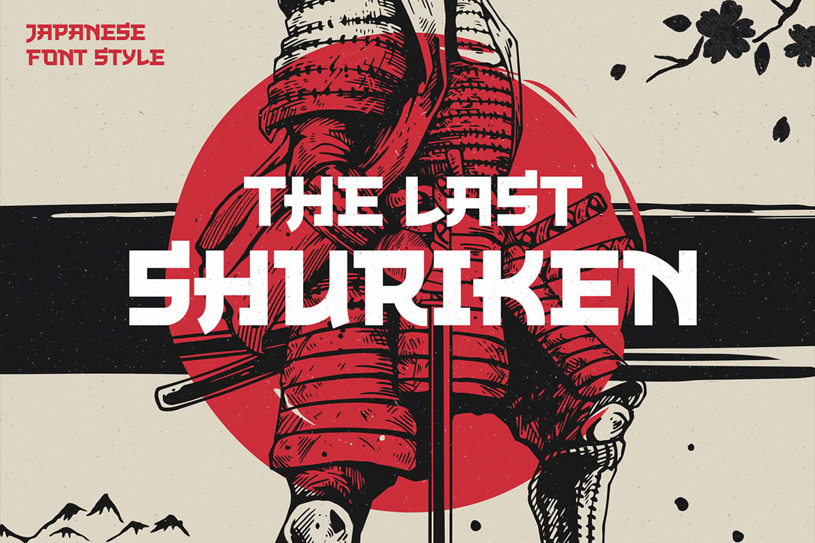
The Last Shuriken is a masterclass in balance. It leans into the modern Japanese food and anime market, featuring a uniform cap height that makes it exceptionally readable in logo design. Its stylistic alternates allow designers to customize the flow of the text, making it a favorite for posters that need to balance impact with clarity.
2. Samuraki: The All-Rounder
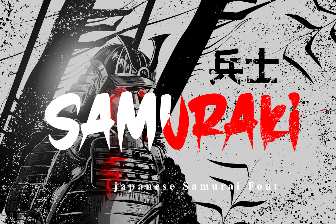
If your project requires a full suite of characters, Samuraki is an essential addition to your library. It is a premium, multi-format typeface that includes full support for numbers and punctuation. Its strength lies in its versatility; it is just as effective on a minimalist flyer as it is on a complex, layered piece of digital art.
3. Shogun: The Artistic Brush
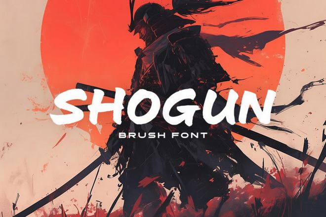
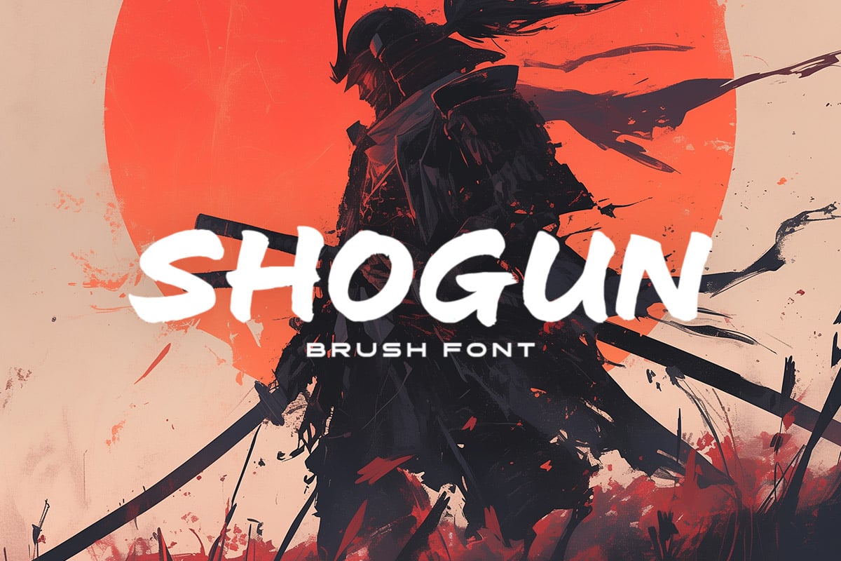
Shogun captures the elegance of traditional culture. It is wider than most competitors, giving it a more "open" and sophisticated feel. It is highly recommended for branding projects that wish to evoke the spirit of the Shogunate era without appearing overly aggressive or cartoonish.
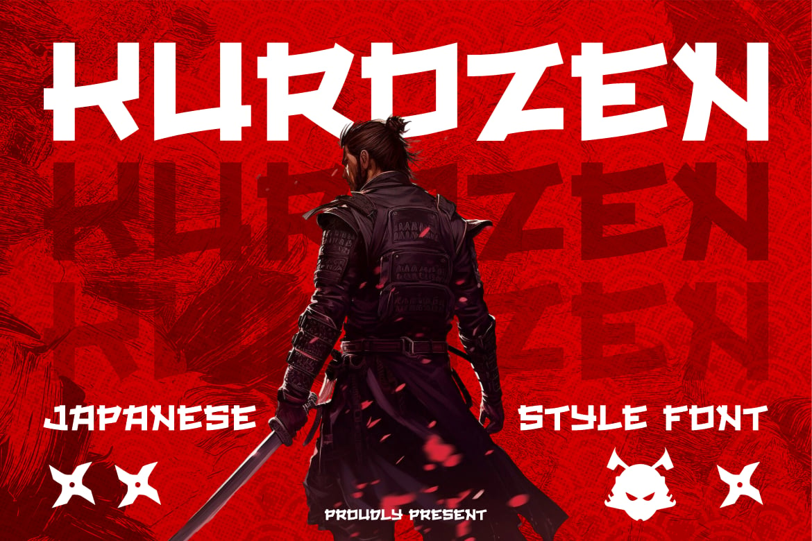
4. Kurhamo & Fujimoto: The Calligraphic Purists
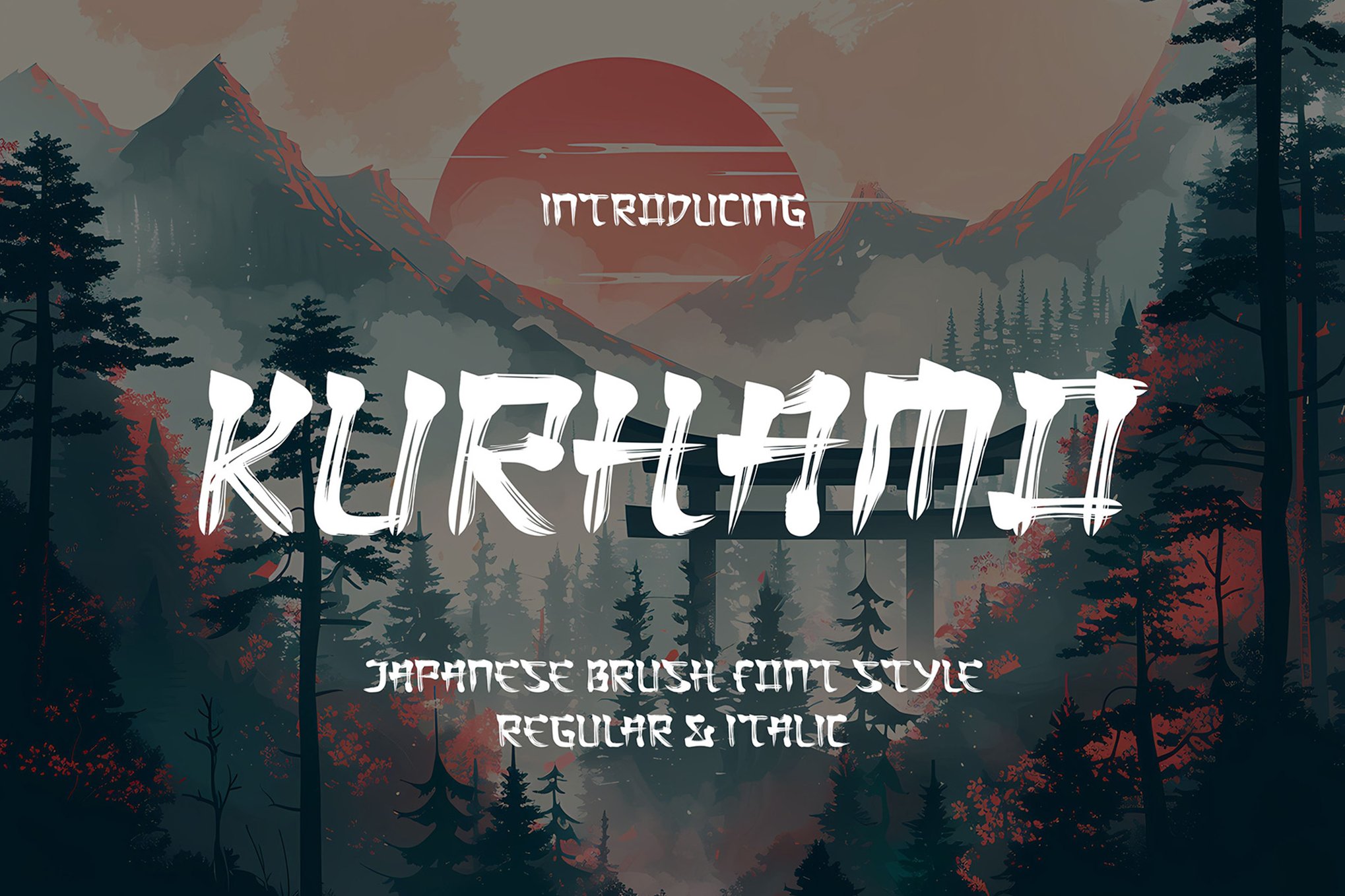
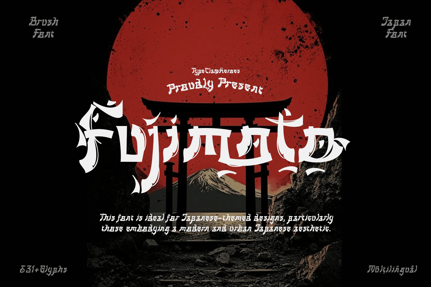
For those who prefer the grace of traditional calligraphy, Kurhamo and Fujimoto are the gold standards. Fujimoto, in particular, is a standout for its use of Mincho-style stroke contrast. It is a bridge between the Latin alphabet and the structure of Kanji, making it perfect for high-fashion or luxury brand applications.
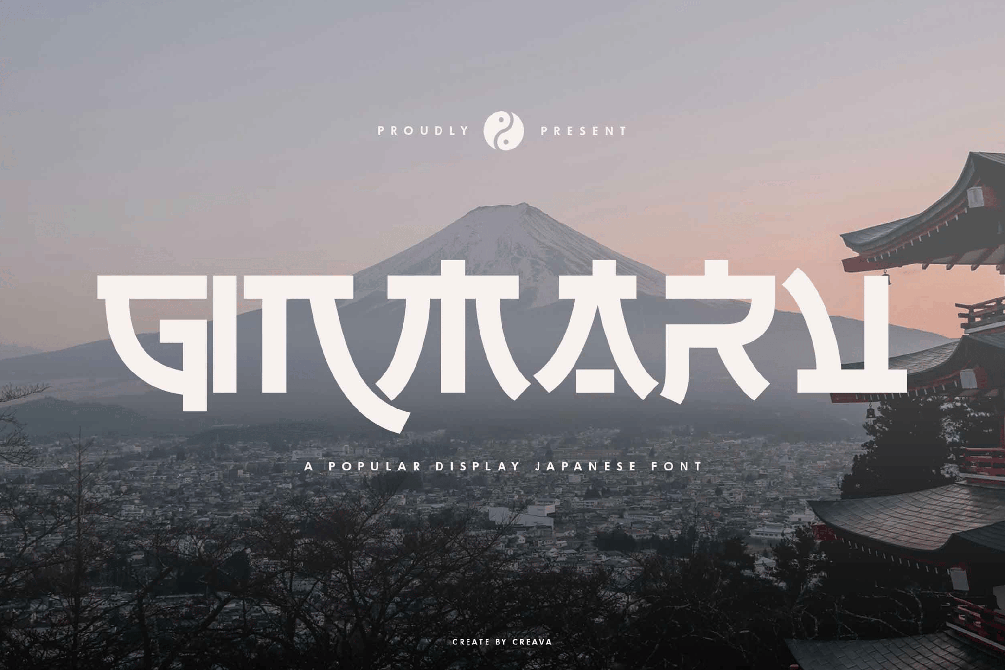
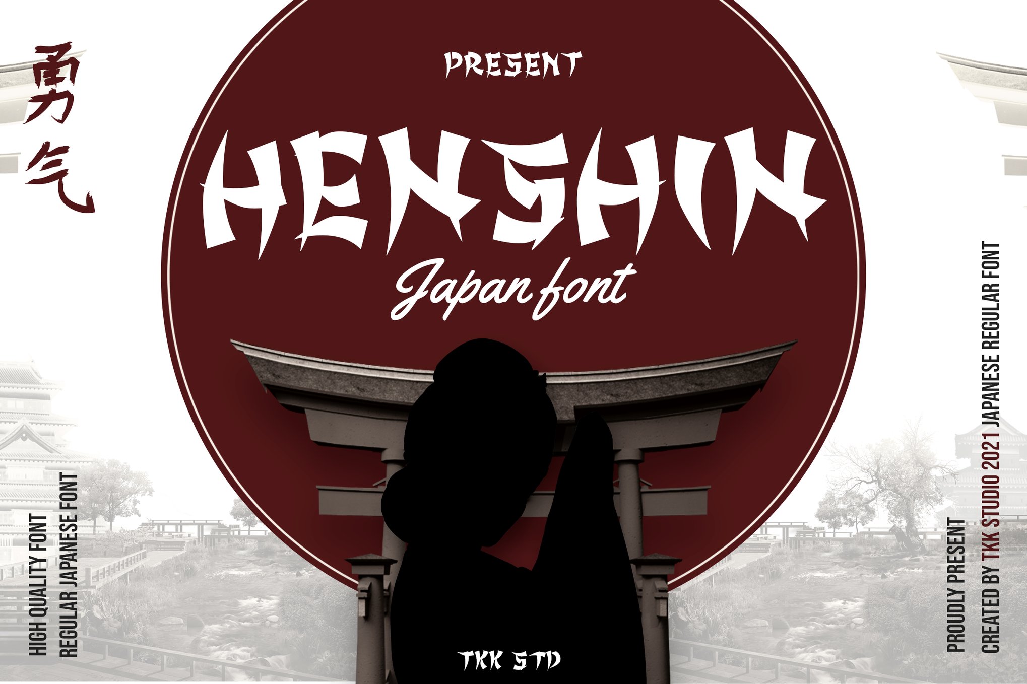
5. Henshin: The Aggressive Choice
When the design demands "fierce energy," look to Henshin. With sharp, katana-like strokes and high contrast, this font is designed to be seen. It is the go-to for martial arts posters, gaming branding, and any project that needs to stop the viewer in their tracks.
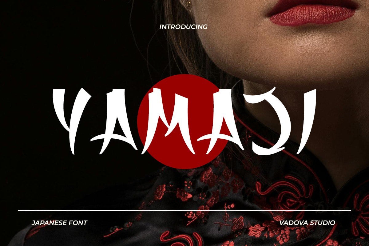
Implications for Future Design Trends
As we move deeper into the 2020s, the "samurai aesthetic" is becoming less of a niche trend and more of a staple in the designer’s toolkit. We are seeing a shift away from the "faux" Orientalism of the past toward a more nuanced, respectful, and technically advanced use of these styles.
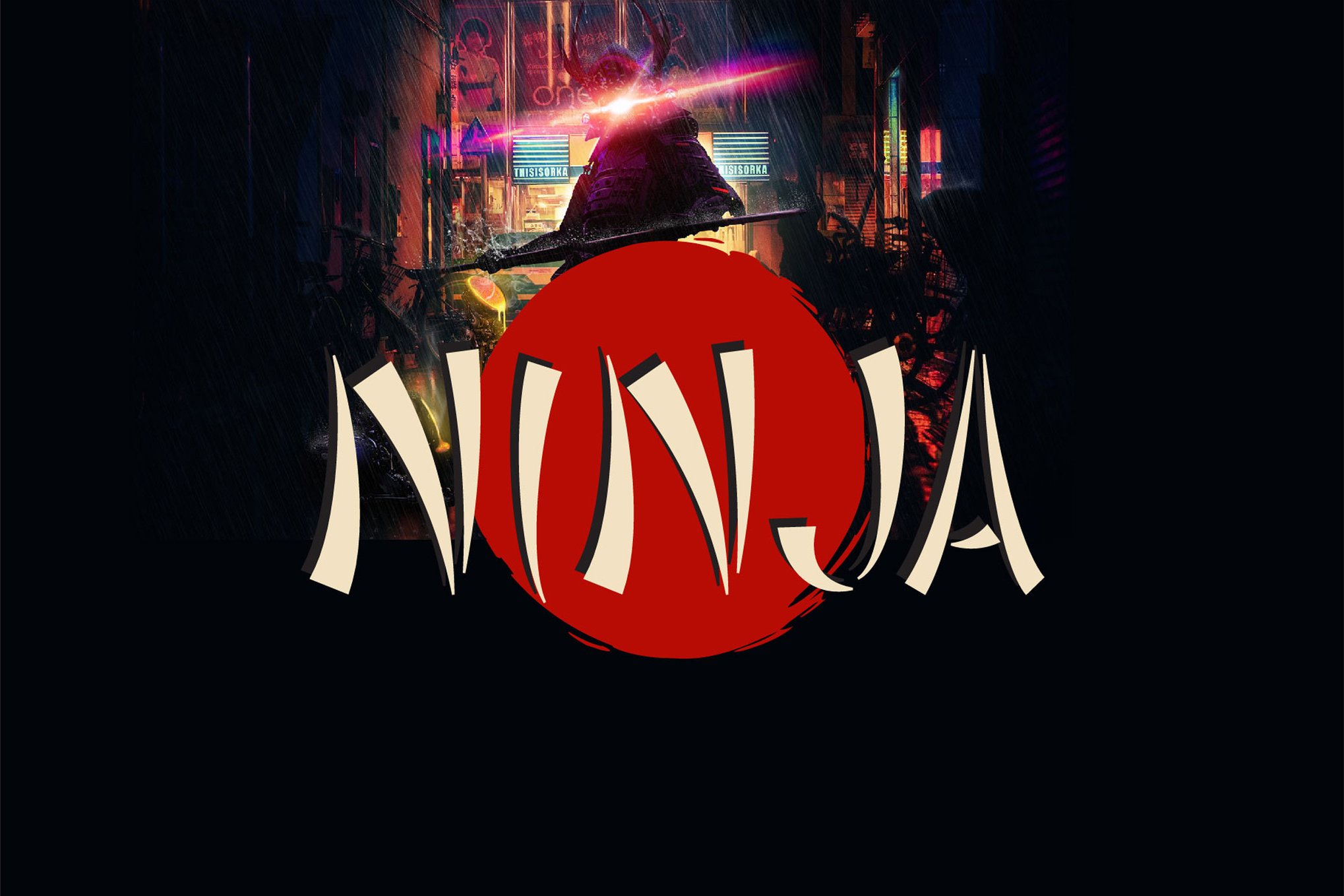
The Role of Technology
The rise of variable font technology means that designers will soon have even more control over the "brush intensity" of their samurai fonts. Imagine a slider that allows you to increase or decrease the "splatter" or "roughness" of a font in real-time, allowing for a bespoke look that feels uniquely handcrafted for every single project.
Cultural Responsibility
As with all design that draws from specific cultural heritages, the use of samurai-inspired fonts comes with a responsibility to understand the roots of the style. The most successful modern designs are those that use these fonts to celebrate the history of the samurai—their discipline, their philosophy, and their artistry—rather than merely utilizing them as a visual shortcut for "action."
Conclusion: Crafting Your Own Narrative
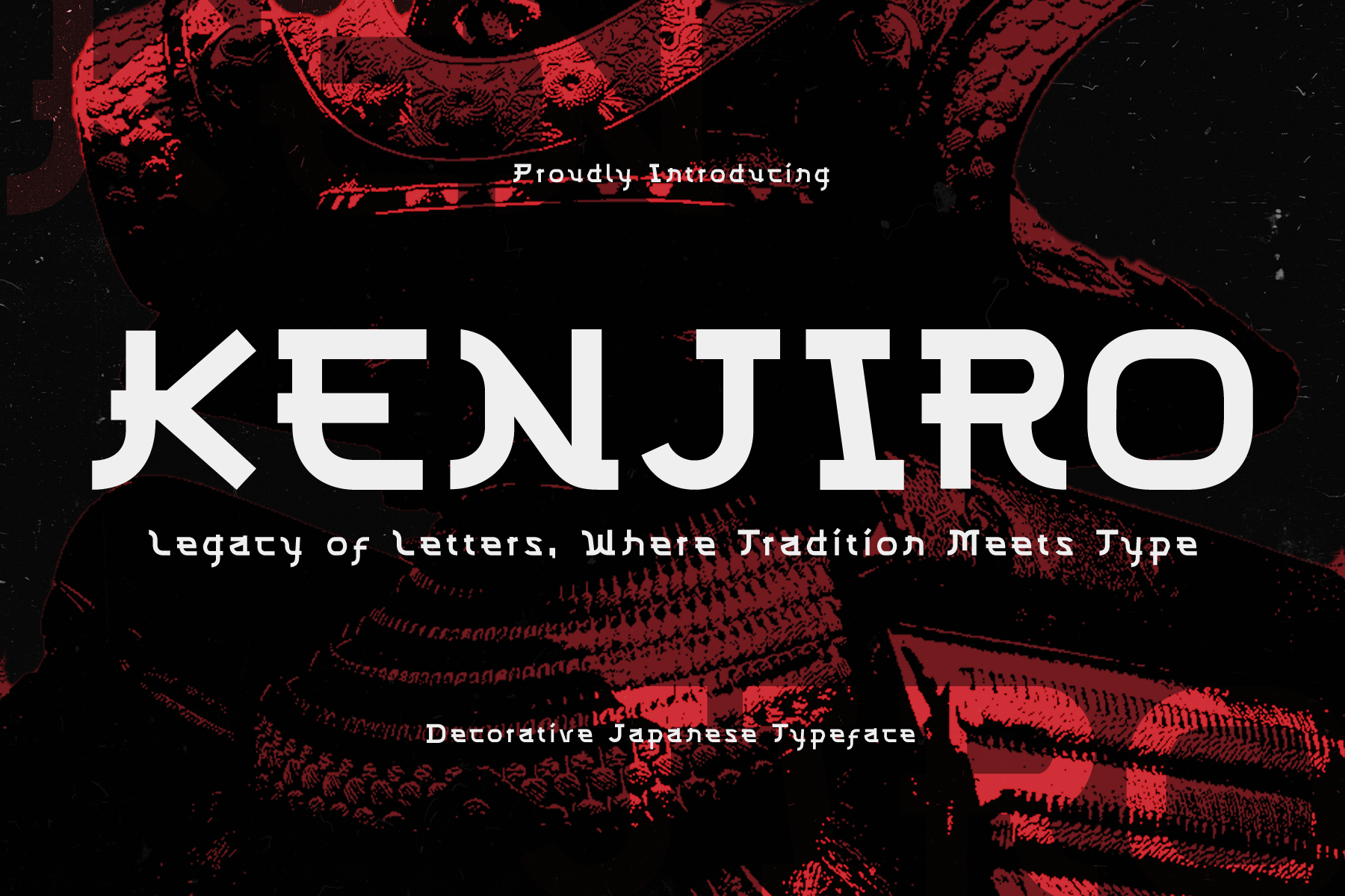
Whether you are a seasoned professional or an emerging designer, the world of samurai typography offers an endless canvas for experimentation. From the raw, unpolished energy of Shirouga to the refined, architectural grace of Kenjiro, these fonts provide the weight, the history, and the visual punch necessary to elevate any project.
When choosing your next typeface, consider not just the look, but the story you want to tell. Are you aiming for the stoic silence of a warrior in meditation, or the lightning-fast intensity of a duel? By choosing a font that aligns with the emotional core of your brand, you ensure that your design doesn’t just stand out—it strikes true.
Quick Reference Guide for Selection:
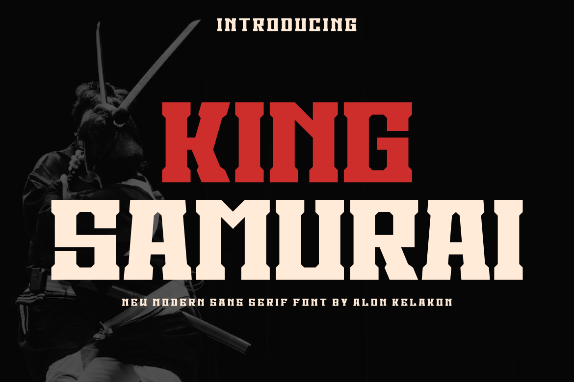
- For Esports/Gaming: Choose Henshin or King Samurai for their bold, high-contrast, aggressive silhouettes.
- For Luxury/Fashion: Opt for Fujimoto or Kurhamo for their elegant, calligraphic, and sophisticated lines.
- For General Branding: Samuraki or The Last Shuriken offer the best balance of readability and thematic flair.
- For Budget-Conscious Projects: Start with Samurai Shadow or Gunbai for high-impact, free-for-personal-use options that do not compromise on power.
The blade is yours to wield—choose the right edge for your design.