







The rapid evolution of the web platform shows no signs of slowing down. As we navigate the complexities of modern interface design, developers are increasingly moving away from "hacks" and toward native, performant solutions. The latest installment of What’s !important brings together a collection of groundbreaking techniques, ranging from boundary-aware styling to the long-awaited refinement of the <select> element. This report explores the technical shifts currently redefining how we build for the browser.
Main Facts: The Modern CSS Toolbox
The landscape of front-end development is currently undergoing a paradigm shift. We are witnessing the maturation of CSS container queries, the emergence of more sophisticated layout models, and a renewed focus on the accessibility of native components.
Key takeaways from the current industry discourse include:
- Boundary-Awareness: The adoption of the
view()function is transforming how elements react to their specific containers rather than the global viewport. - Layout Evolution: "Grid lanes"—formerly referred to as masonry layouts—have reached a critical stage of implementation, though accessibility remains a significant hurdle.
- Time-Based Context: Leveraging the Temporal API alongside
color-mix()allows developers to build "living" interfaces that mirror the user’s natural environment. - Standardization: The CSS Working Group is actively revisiting historical design choices, leading to community-driven initiatives like "FixCSS" that propose more semantic property naming.
Chronology of Developments
The past few weeks have seen a flurry of activity in the developer community. Here is the timeline of recent critical updates:
- July 1st: Preethi Sam publishes an in-depth exploration of boundary-aware styling using
view(), setting a new standard for responsive component design. - July 3rd: David Bushell introduces a robust solution for full-bleed CSS, utilizing modern container query units to solve one of the web’s oldest layout headaches without triggering unwanted overflow.
- July 5th: Dan Holloran and Manuel Matuzović engage in a vital debate regarding the accessibility of grid lane layouts. This prompted a follow-up discussion on using
reading-flowto maintain semantic order in complex grids. - July 7th: Jake Archibald publishes his findings on the "Goldilocks" approach to
<select>element sizing, offering a roadmap for implementing the new customizable<select>controls effectively. - July 10th: Google I/O 2026 concludes, with Bramus and Una Kravets presenting a comprehensive overview of 35 emerging web platform features, signaling a major push toward native UI capabilities.
Supporting Data and Technical Innovations
The Rise of Boundary-Aware CSS
Historically, CSS has been "viewport-centric." If an element needed to react to its environment, it was tethered to the browser window. Preethi Sam’s work with the view() function changes this dynamic, allowing elements to query their position and size relative to their immediate parent container. This allows for fluid, localized styling that remains consistent even when components are moved across different parts of an application.
The Grid Lanes Accessibility Challenge
The "Grid Lanes" layout (often compared to the Pinterest-style masonry aesthetic) has long been a holy grail for developers. While technically achievable, it presents a challenge for screen readers and keyboard navigation. Manuel Matuzović’s recent critique highlights that without proper implementation, these grids can break the expected "reading flow" of a page. The industry is now looking toward the reading-flow CSS property as a potential remedy, though testing is still in its infancy.
Fixing the "Full-Bleed" Problem
Full-bleed layouts—where an element spans the entire width of the screen while its container remains constrained—have historically been a source of horizontal scroll bugs. By utilizing container query units, developers can now calculate precise widths that ignore the padding of parent elements. This modern approach effectively kills the "magic number" hacks of the past decade.
Time-Based UI Transitions
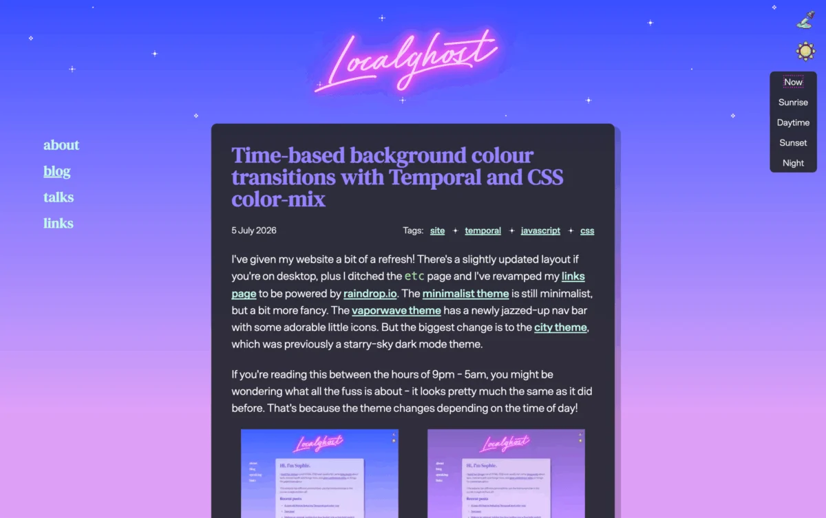
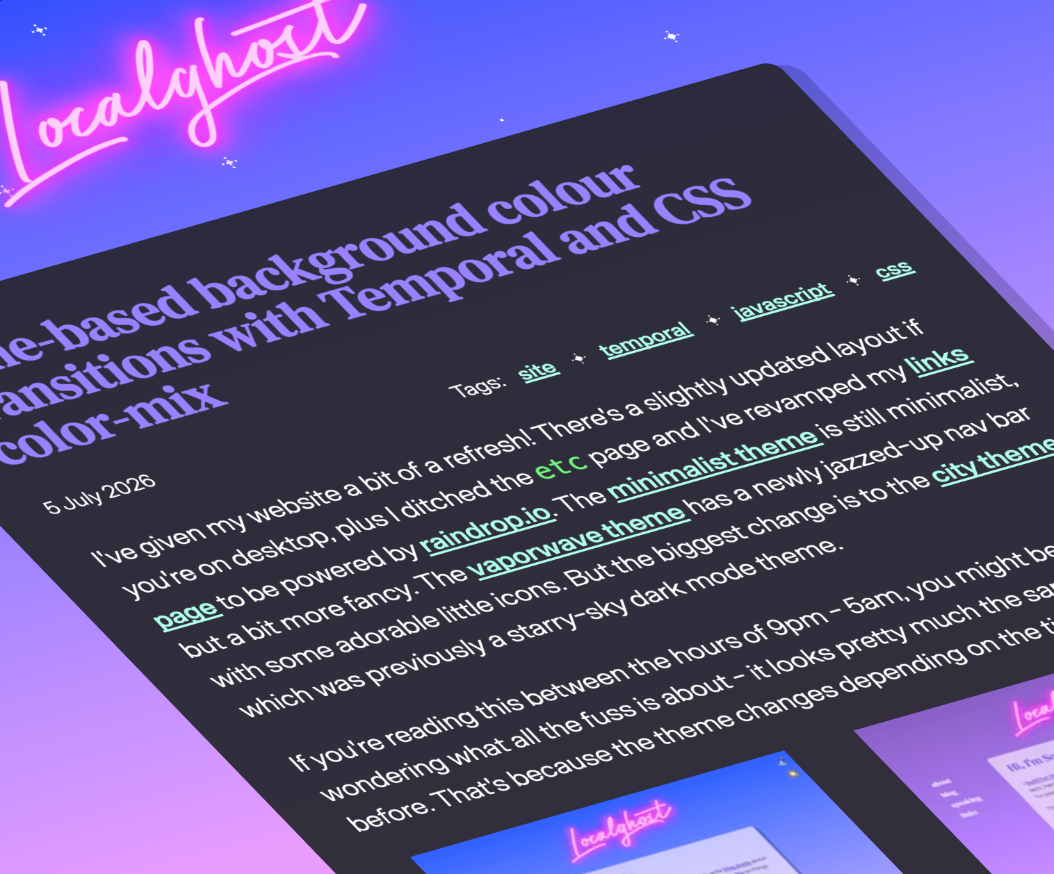
Sophie Koonin’s demonstration of time-based design showcases the power of the Temporal API. By calculating the current time and piping that value into color-mix(), developers can create gradients or backgrounds that shift subtly throughout the day. This provides a level of UX polish previously reserved for native desktop applications like macOS, now available directly in the browser.
Official Responses and Industry Discourse
The CSS Working Group (CSSWG) has maintained an unusually reflective posture lately. A public-facing document from the group recently listed several "regrets" regarding early CSS naming conventions. This transparency has empowered developers like Declan Chidlow to launch projects like FixCSS. While FixCSS is largely a conceptual exercise—proposing that we rename border-radius to corner-radius—it serves a larger purpose: highlighting the need for a more intuitive, future-proof language.
Furthermore, the Google I/O 2026 keynote emphasized that the platform is moving away from polyfills. The goal is to provide developers with native APIs that are "good enough" out of the box, reducing the dependency on heavy JavaScript frameworks to achieve simple UI behaviors.
Implications for Future Development
1. Semantic Accessibility
The ongoing debate regarding grid lanes proves that as layout technology becomes more flexible, we must become more rigorous about accessibility. The industry is moving toward a standard where "visually interesting" layouts must be backed by a logical, accessible DOM structure. The adoption of reading-flow will likely become a requirement for professional-grade design systems.
2. The Death of the "CSS Hack"
We are entering an era where common layout problems—full-bleed, centering, and responsive containers—are solved by native, declarative CSS. This reduces the cognitive load on developers and improves performance, as the browser’s internal layout engine handles these calculations far more efficiently than an injected script.
3. Customizable UI Components
Jake Archibald’s work on the <select> element is indicative of a larger trend: the "un-styling" of the web. For years, native form elements were "black boxes" that could not be styled. The new customizable <select> allows developers to maintain the native accessibility and functionality of the component while fully controlling its aesthetic. This will likely lead to a new wave of design systems that favor native performance over custom-built (and often inaccessible) component libraries.
4. A More Reflective Language
The push for better naming conventions in CSS, as seen in the FixCSS initiative, suggests that the developer community is ready for a "version 2.0" mindset. While we cannot rewrite the history of the web, the willingness of the CSSWG to acknowledge past mistakes provides a clear path forward for future CSS specifications.
Conclusion: Looking Ahead
The past few weeks have demonstrated that the web platform is not just growing; it is maturing. Whether it is the precision of boundary-aware styling or the massive influx of 35+ new platform features unveiled at Google I/O, the tools at our disposal are becoming more capable than ever.
As we look toward the next cycle, the focus for developers should shift from "how do I make this work?" to "how do I make this work for everyone?" The upcoming integration of more accessible grid layouts and the widespread adoption of customizable UI elements will undoubtedly define the next chapter of web development.
Stay tuned to the What’s !important series as we continue to track these developments and provide the context necessary to navigate this rapidly changing landscape. The web is becoming more powerful, more accessible, and—perhaps most importantly—much more logical.