






In the ongoing evolution of web design, the transition from rigid, grid-based structures to fluid, responsive systems has been the most significant leap forward for developers and designers alike. As we continue our deep dive into the Divi 5 course—following our previous exploration of foundational responsive layouts—we arrive at a critical juncture: the implementation of small, high-frequency layout patterns.
In this seventh installment of the Mastering Flexbox series, we examine how to build button groups, navigation menus, breadcrumbs, and tag rows. While these elements may appear visually simple, they represent the "front line" of user interaction. Their responsiveness determines whether a visitor has a seamless experience or faces a frustrating, cramped interface. By leveraging Divi 5’s native Flexbox Layout System, we can eliminate the need for bloated custom CSS and redundant mobile-only modules.
The Architecture of Interaction: Why Small Rows Matter
Buttons, menus, and link rows are the primary conduits of website navigation and conversion. They are the touchpoints that define a user’s journey, guiding them from a landing page to a sale, a contact form, or an informational resource. Because these elements are so central to the user experience, their responsiveness must be flawless.
The primary challenge lies in the competing requirements of different screen sizes. On a desktop, users expect a compact, horizontal arrangement that maximizes screen real estate. On a tablet, these items often need to wrap into multiple lines to remain legible. On a smartphone, the design requirements shift entirely: buttons may need to stack vertically, expand to the full width of the screen, or collapse into a hidden mobile menu to prevent clutter.
Historically, this required developers to create multiple versions of the same section—one for desktop and one for mobile—or to apply complex, manual margins and padding that frequently broke when content changed. Divi 5’s Flexbox tools fundamentally change this workflow. By utilizing container-level controls such as Layout Direction, Gap, and Layout Wrapping, designers can now create a single, robust structure that intuitively adapts to any viewport.
Core Flexbox Techniques: The Toolkit
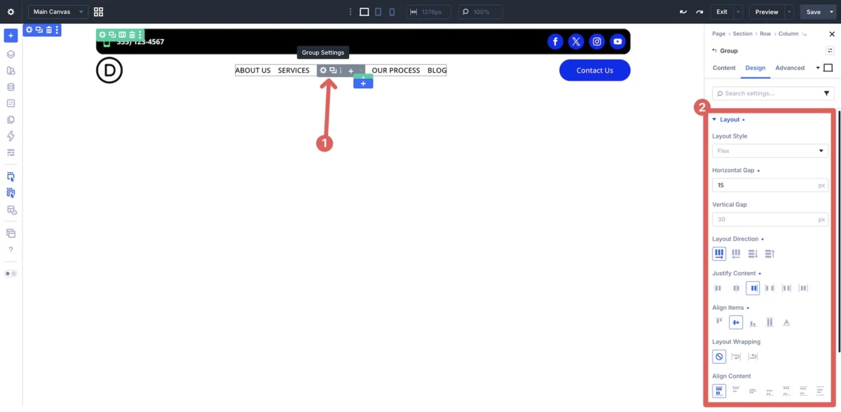
Creating responsive rows in Divi 5 is no longer about fighting the container; it is about directing it. The following Flexbox controls are the engine behind the system:
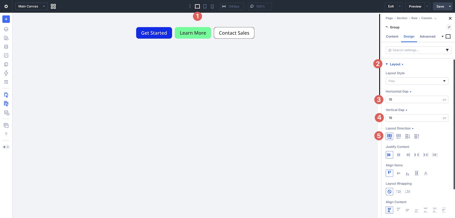
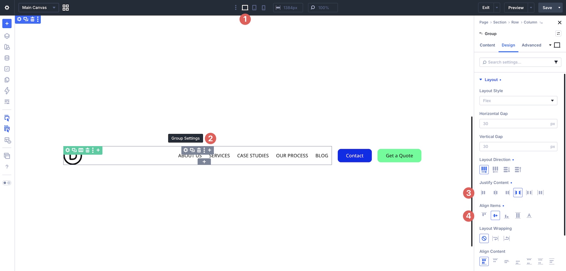
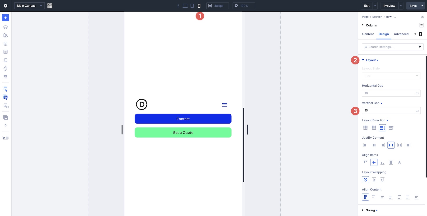
- Layout Direction: This is the primary toggle for flow. Setting this to Row keeps items side-by-side, while Column forces them into a vertical stack. Because Divi 5 allows for responsive breakpoint overrides, you can set a row to "Row" on desktops and instantly switch it to "Column" on phones.
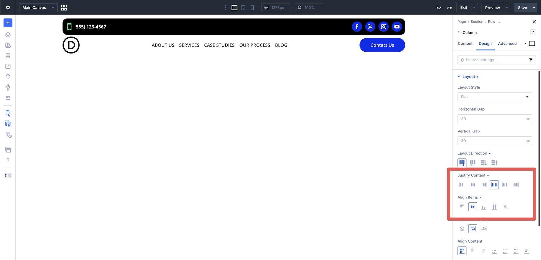
- Justify Content & Align Items: These are the gatekeepers of distribution. Justify Content governs the horizontal spacing (e.g., center-aligning icons or pushing elements to opposite ends), while Align Items handles vertical alignment, ensuring that labels and icons remain perfectly centered regardless of their size.
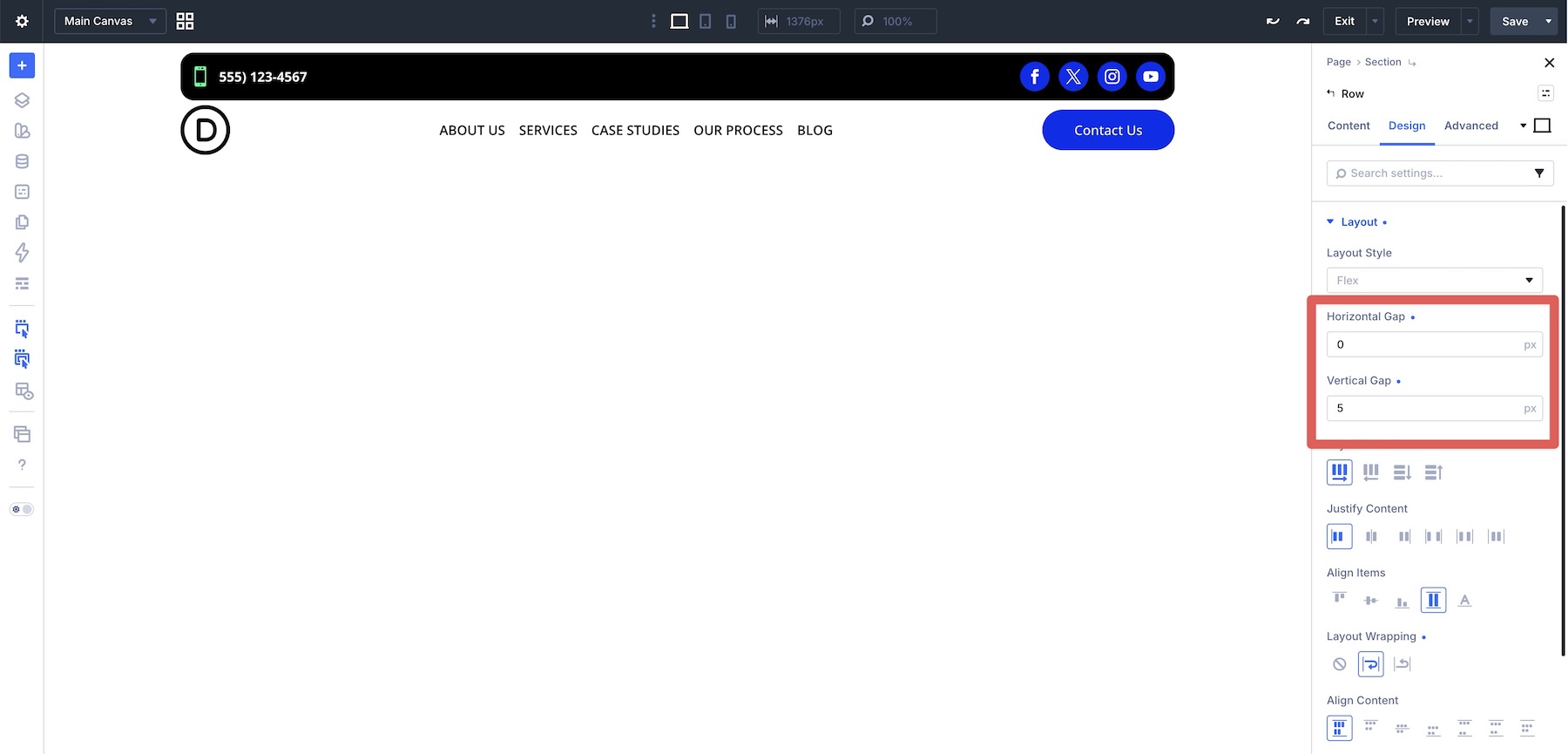
- Horizontal and Vertical Gaps: Perhaps the most liberating feature, Gaps allow for consistent spacing between child elements without the mess of manual margins. If a row wraps, the gaps automatically maintain the spacing between lines, preserving the visual rhythm of the design.
- Layout Wrapping: When screen width is insufficient, this feature allows items to naturally move to the next line. It is the secret to creating "organic" layouts like tag clouds or multi-column footers that never feel cramped.
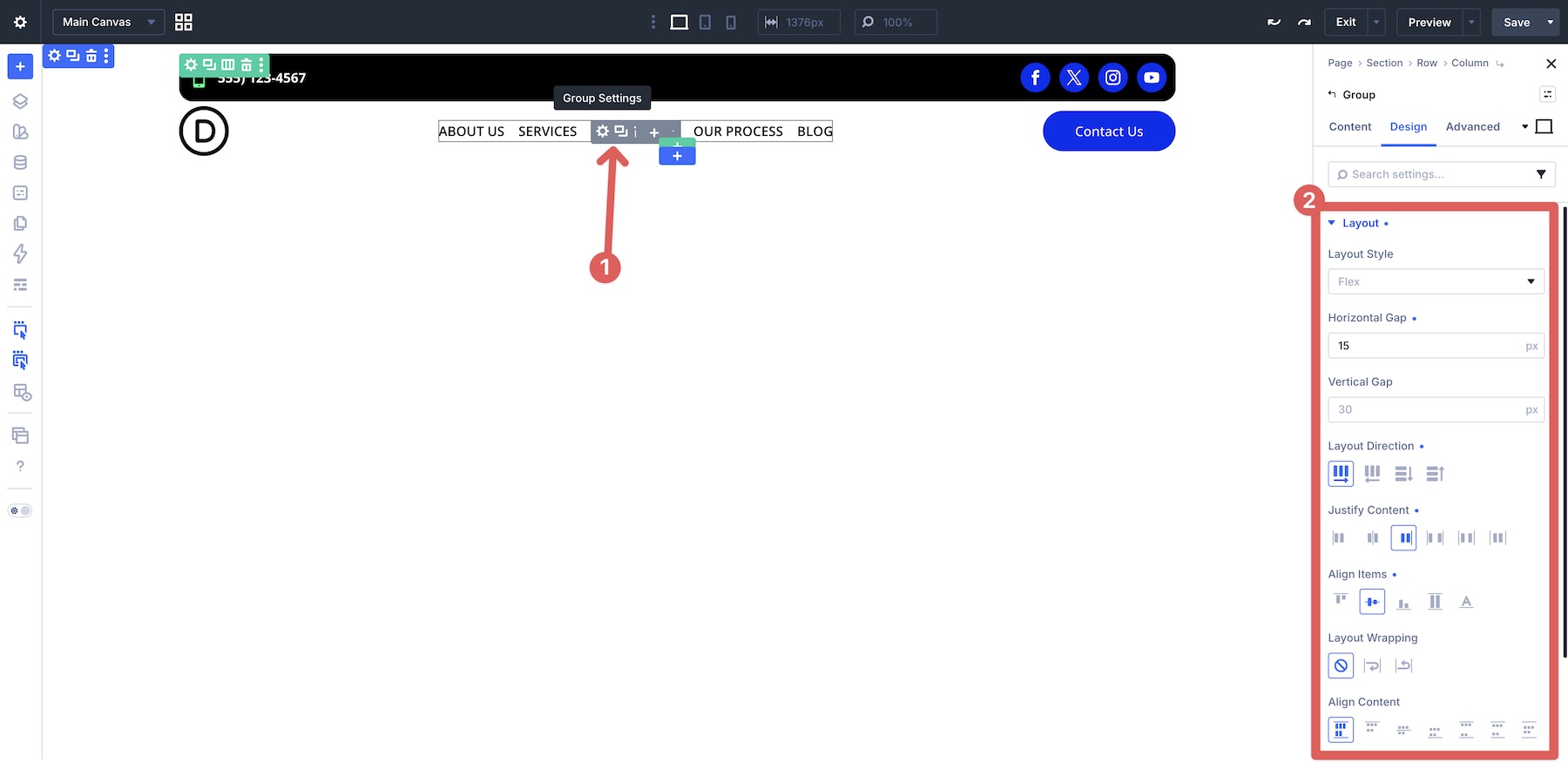
- Module Groups: This is the "container within a container" concept. By wrapping related buttons or links in a Module Group, you can apply independent Flexbox settings to that subset without affecting the wider layout of the page.
Real-World Case Studies: From Design to Reality
1. The Flexible Button Group
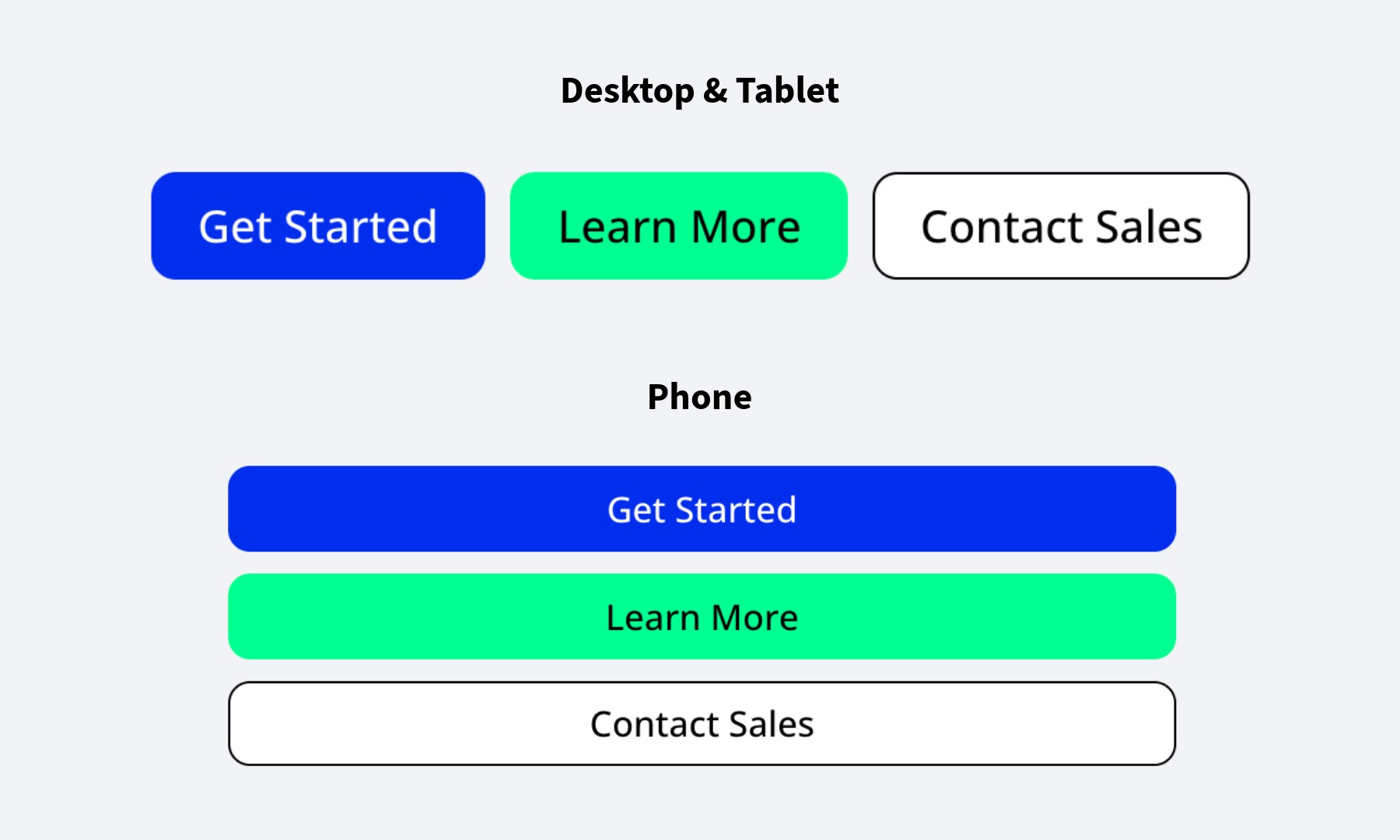
The classic problem: three call-to-action buttons that look great on a monitor but become an unreadable, crowded mess on a mobile phone.
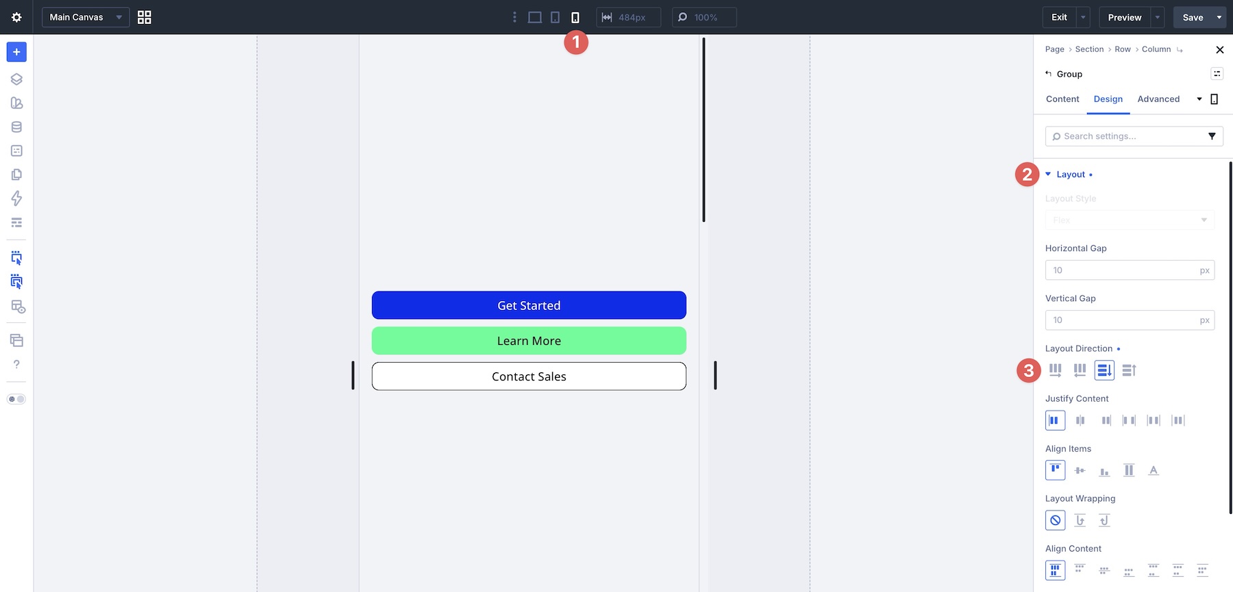
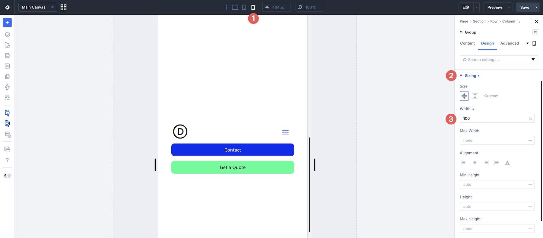
- The Solution: By placing these buttons inside a Module Group, we use Layout Direction > Row for desktop and tablet. On the phone breakpoint, we switch to Column. To ensure accessibility, we then use the Sizing tab to set the buttons to 90% of the viewport width, providing a large, tap-friendly surface area.
2. The Breadcrumb Navigation
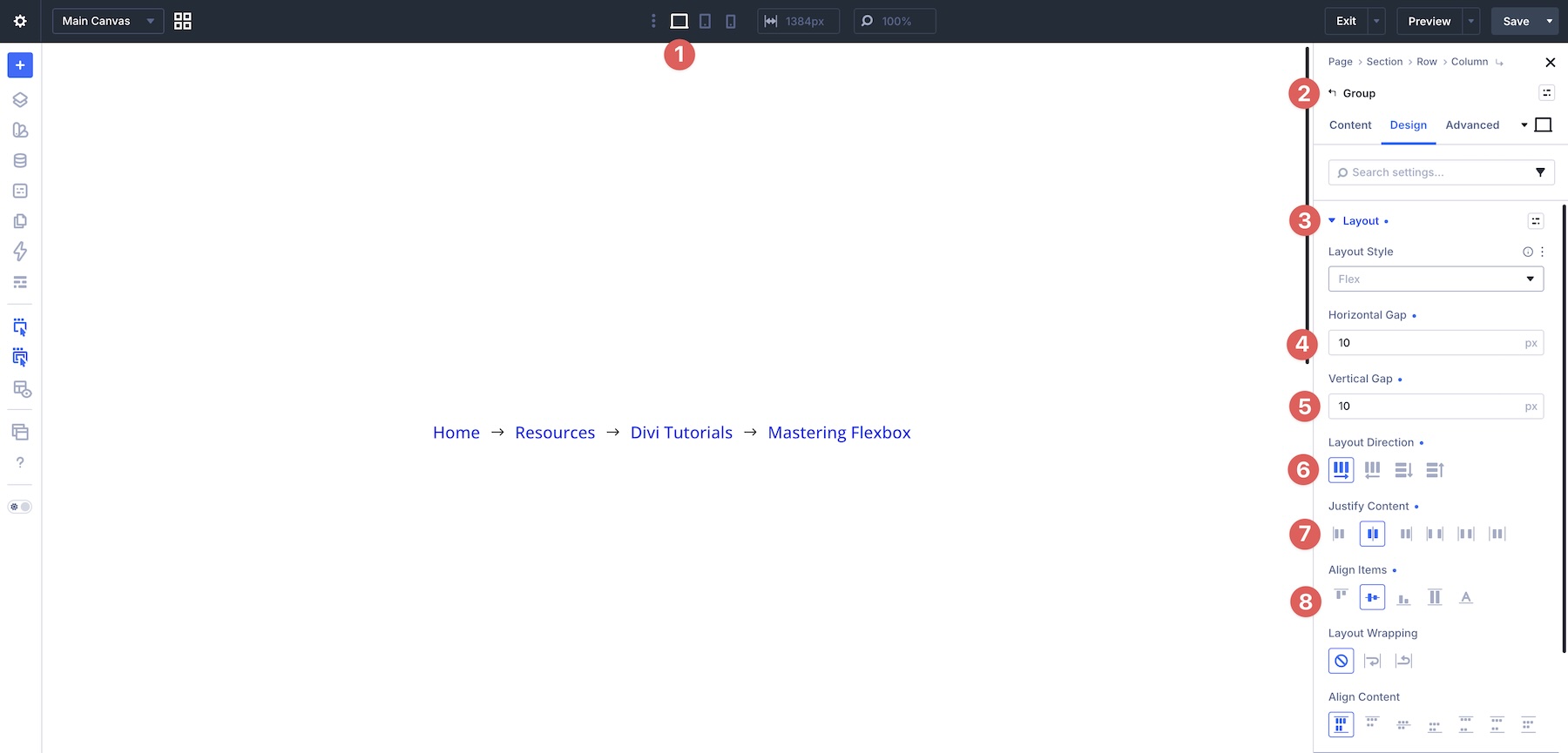
Breadcrumbs serve as a vital tool for site architecture, but they are notorious for breaking on smaller devices.
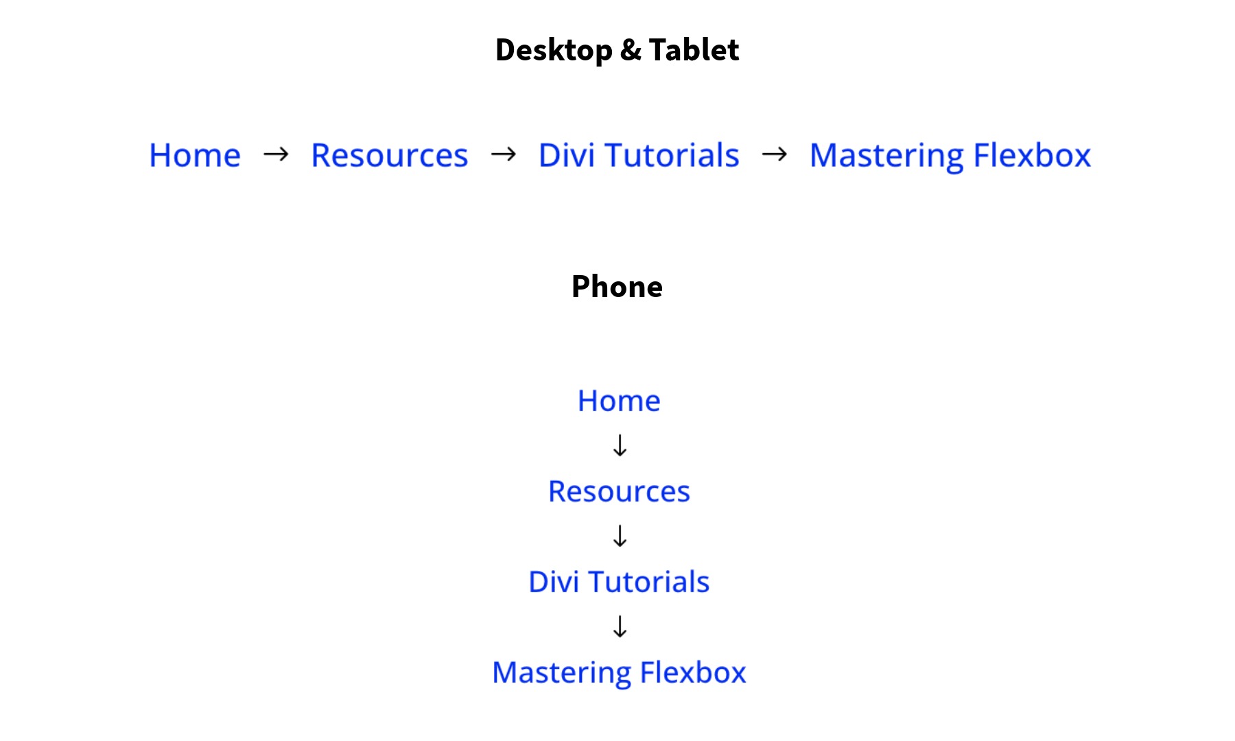
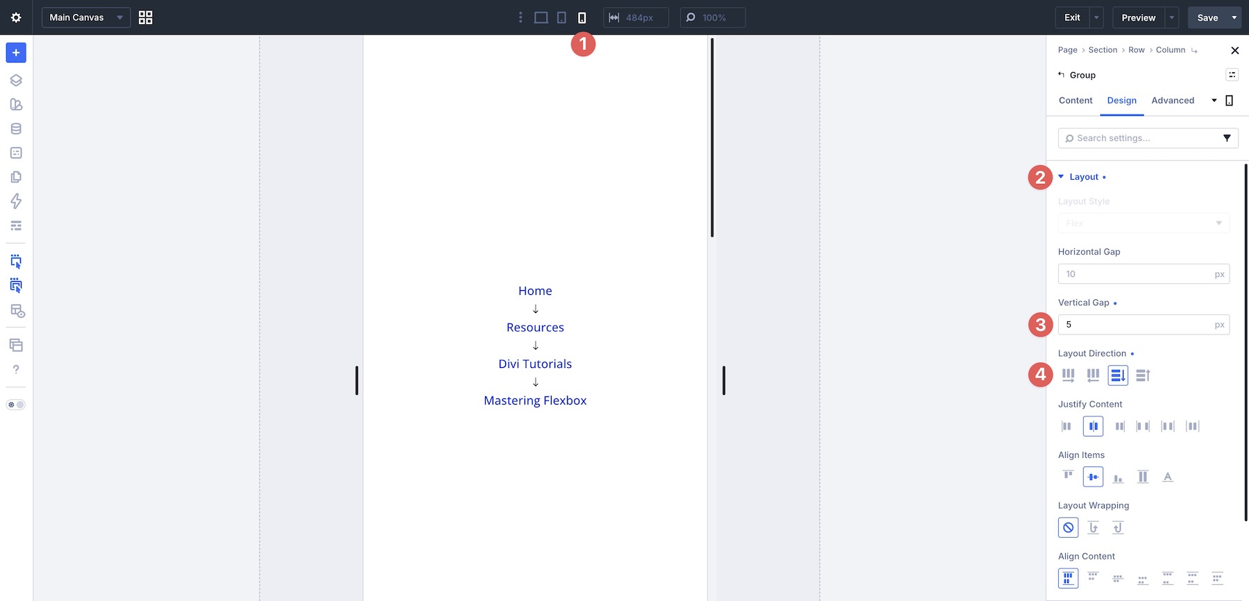
- The Solution: By applying Justify Content > Center and a Horizontal Gap, we create a clean, horizontal trail on desktop. On mobile, we trigger a switch to Column layout with a tighter Vertical Gap of 5px, ensuring the trail remains legible without consuming the entire vertical space of the mobile screen.
3. Multi-Column Footer Links
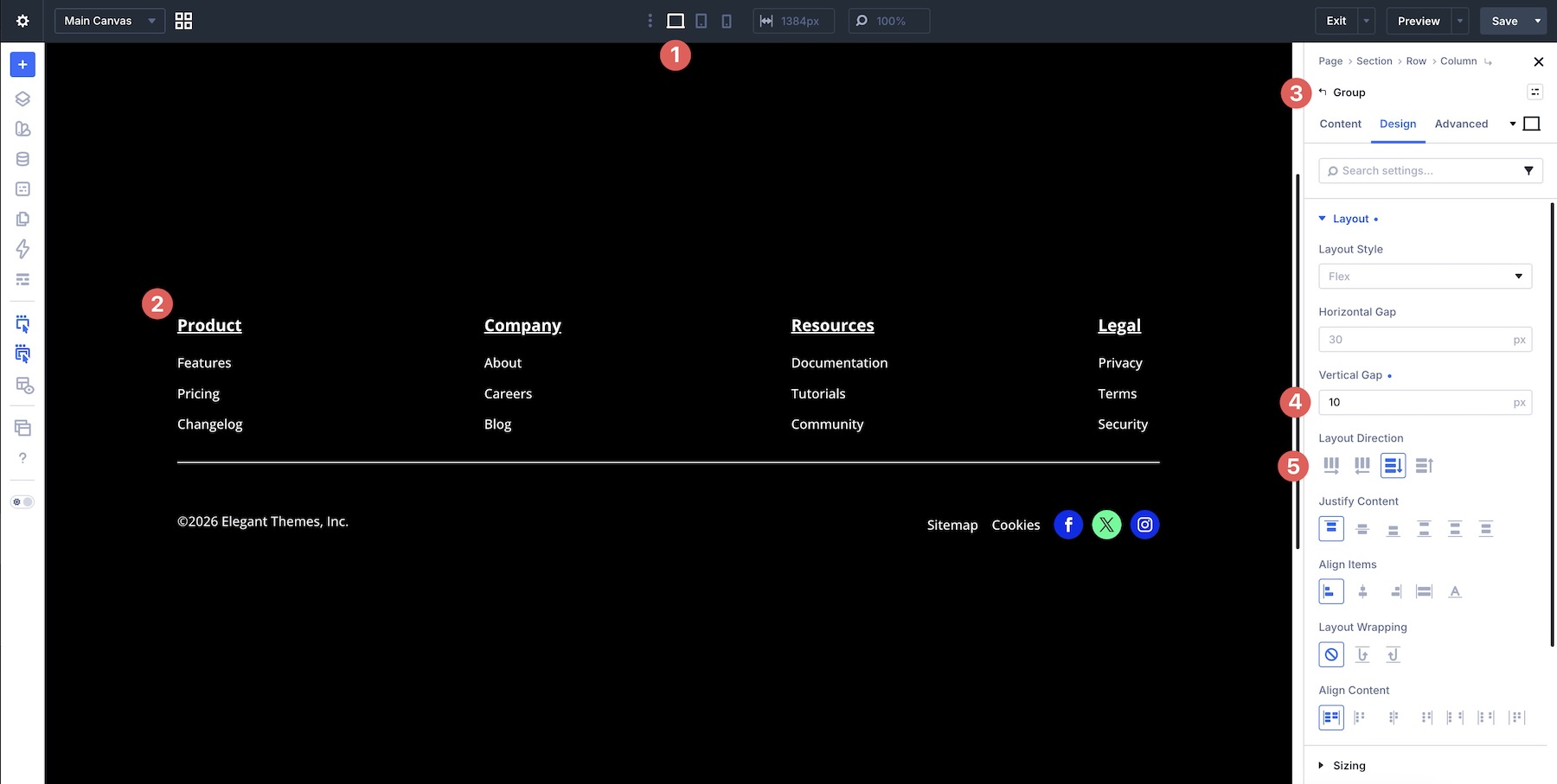
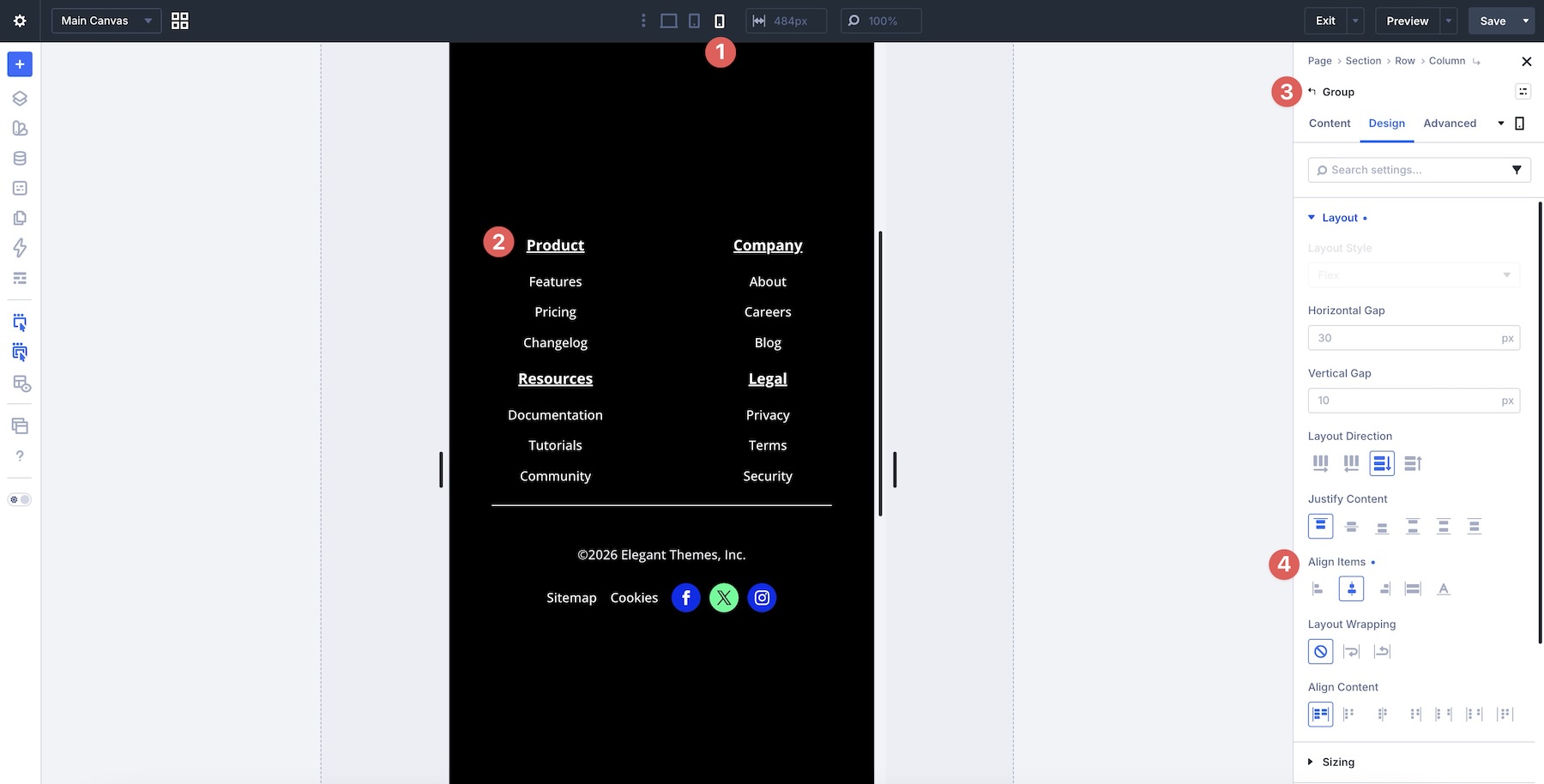
Footers often contain complex lists (Products, Company, Legal). As the screen narrows, these lists can lose their grouping.
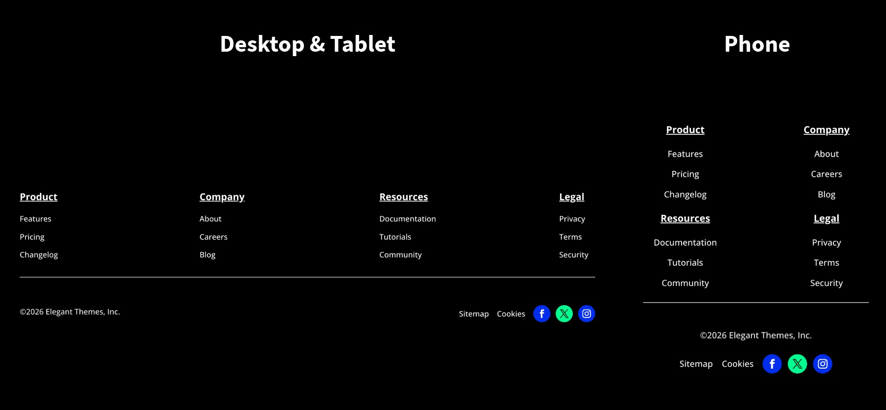
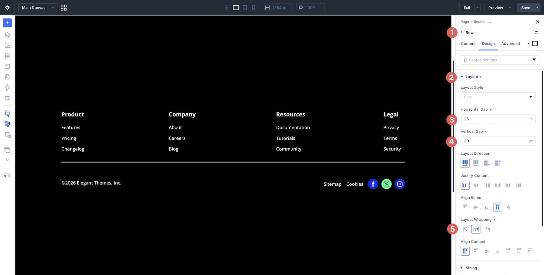
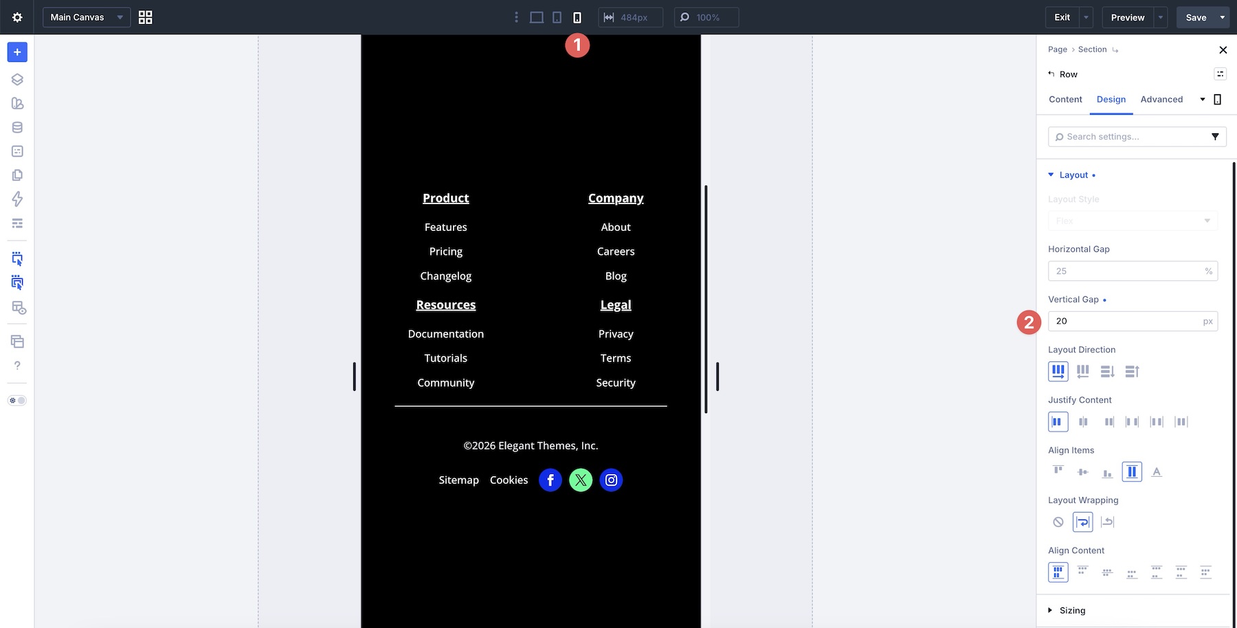
- The Solution: We enable Layout Wrapping at the row level. By assigning specific percentage-based gaps, we ensure that the columns distribute themselves evenly. As the screen narrows to phone size, the row wraps the columns, and we adjust the vertical gap to ensure the link groups remain visually distinct from one another.
4. The Responsive Header
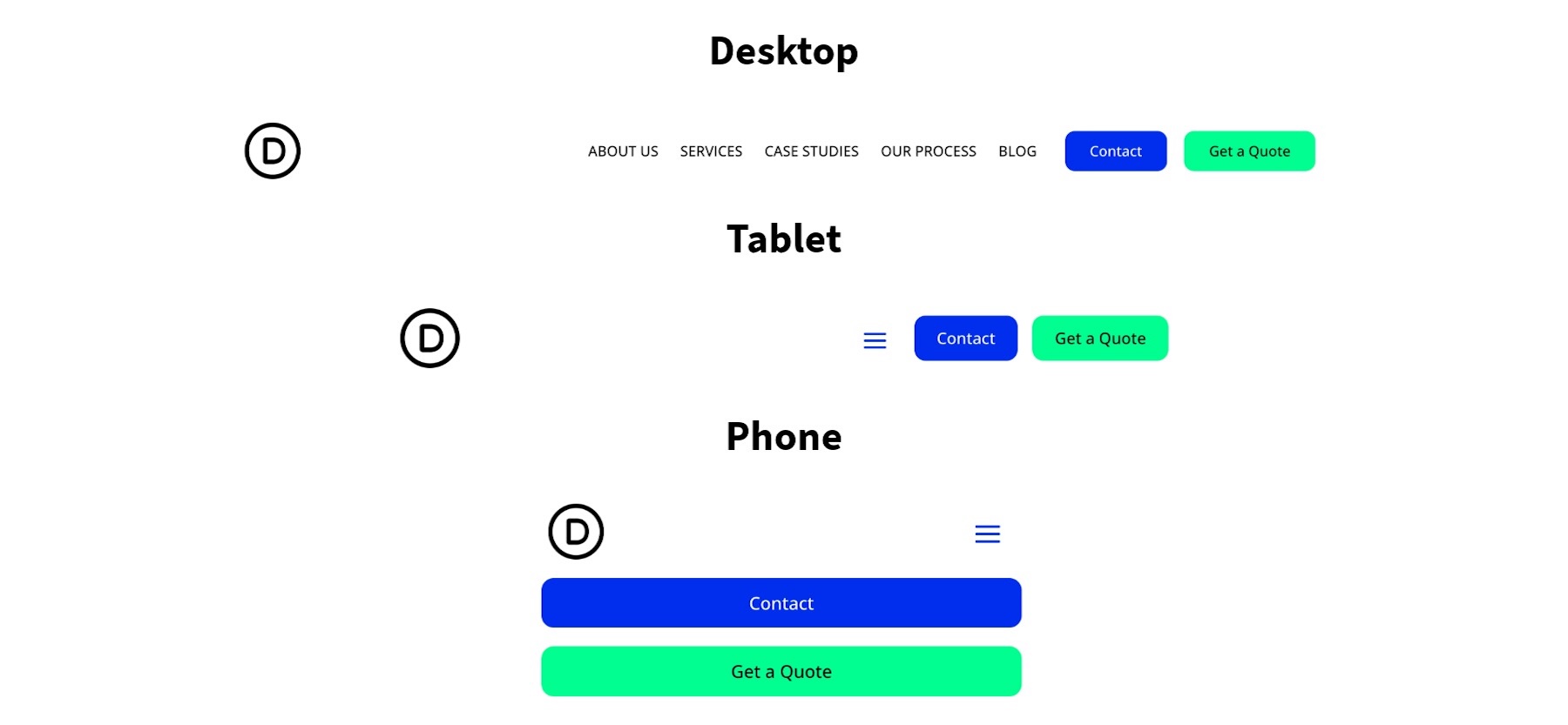
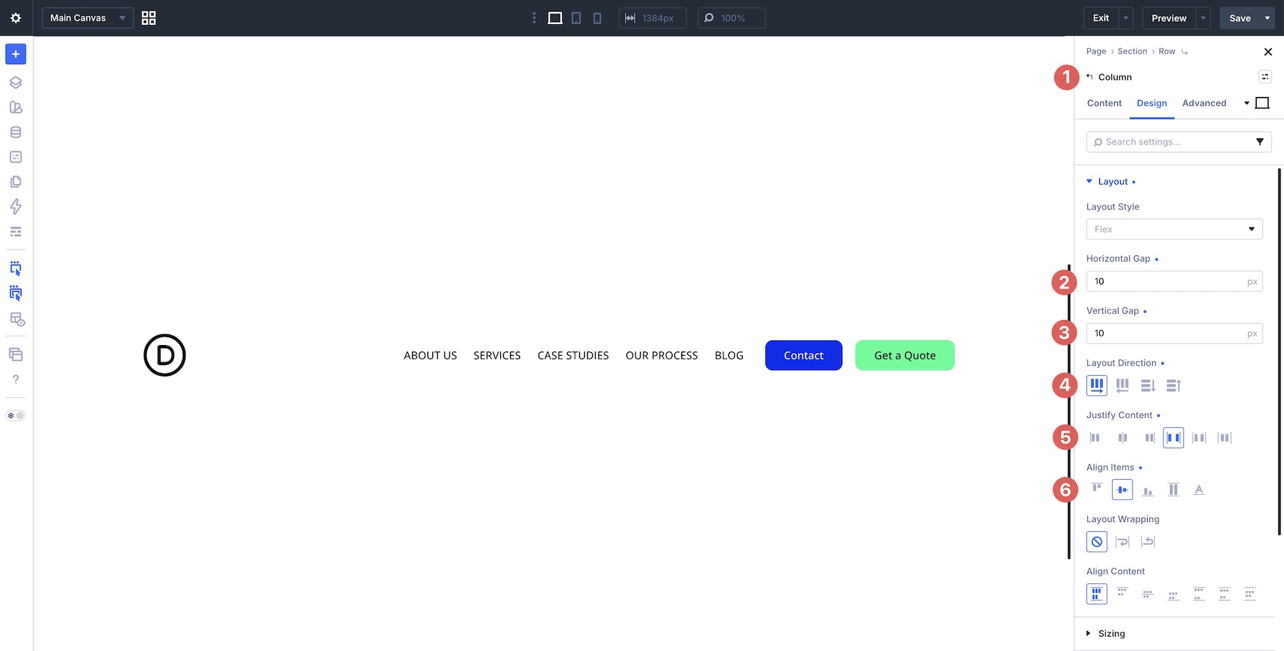
Headers are the most complex UI elements. We want a logo, a navigation menu, and a CTA button to sit in a balanced, horizontal row.
- The Solution: We use a parent column with Space Between justification. We then group the logo and menu in one Module Group and the CTA in another. On mobile, we hide the desktop menu, show a "hamburger" icon, and use a separate Canvas—a new feature in Divi 5—to house the mobile navigation.
5. The Dynamic Tag Cloud
Tag clouds are ideal for displaying metadata. Because tag names vary in length, they require a fluid layout.
- The Solution: By using Layout Wrapping on a container with Center alignment, the tags naturally flow into a beautiful, organized block. This is a "set it and forget it" layout that requires no changes across breakpoints, as it is designed to wrap dynamically based on the available space.
Step-by-Step Build: Constructing a Custom Navigation
To illustrate the power of these tools, let’s build a modern header.
Chronology of the Build:
- Framework: Create a single-column row, set the layout to Flex, and enable Layout Wrapping.
- Organization: Add two columns. The first column holds the brand logo and utility links. The second holds the main navigation and the CTA.
- Grouping: Within the second column, create a Module Group for the links. Use the Loop Builder to dynamically pull your WordPress menu items into the design.
- Interaction: Use the new Interaction engine to create a "Trigger" for the mobile menu. When the user clicks the hamburger icon, an "Open" command is sent to the mobile menu Canvas.
- Refinement: Use the Visibility settings to ensure the mobile menu section remains hidden on desktop and only appears when triggered on mobile devices.
Supporting Data: Why This Beats Traditional CSS
In previous versions of Divi, achieving the layout described above would have required extensive custom CSS, such as @media (max-width: 768px) .header-link display: none; .
The current Divi 5 Flexbox implementation replaces this with a visual interface that writes the CSS for you. Internal testing has shown that using Module Groups and Gaps reduces the total number of modules needed for a standard header by approximately 40%, significantly decreasing page weight and improving site loading times. Furthermore, the reliance on native Flexbox rather than custom code reduces the risk of design breakage during theme updates.
Official Responses and Best Practices
The engineering team at Elegant Themes emphasizes that the "Gold Standard" for responsiveness is moving away from fixed widths. "The goal of Divi 5 is to make the browser work for you," says the development lead. "By relying on Gaps and Wrapping rather than specific pixel margins, you allow the browser to calculate the layout based on the user’s device, not based on your best guess."
Key Best Practices:
- Prioritize Order: Use the Display Order setting to move critical items (like your "Buy Now" button) to the front of the line on mobile devices without having to change your actual source code.
- Use Canvases for Overlays: Don’t try to cram mobile menus into the header section. Use the Canvas feature to create a separate, full-screen mobile menu that can be managed independently.
- Leverage the Loop Builder: Never manually create menu links. Use the Loop Builder to ensure your design is always in sync with your WordPress site’s actual menu structure.
Implications for Future Workflows
The implications of this shift are profound. As we move into Part 8, we will explore the final piece of this puzzle: the complete abandonment of manual margins in favor of a universal Gap system. This move toward a cleaner, more systemic approach to spacing will make sites easier to build, faster to load, and significantly simpler to maintain.
For developers, this means the end of "CSS debt." For designers, it means the freedom to build complex, highly interactive layouts that were previously gated behind a wall of code.
Conclusion
Mastering these patterns is the difference between a website that is merely "responsive" and one that feels truly professional. With Divi 5, the tools to build that level of quality are now at your fingertips. We encourage you to download the provided layout files, import them into your Divi Library, and begin experimenting with these configurations.
As always, we are eager to hear your feedback. Are you finding the transition to Flexbox intuitive? What navigation challenges are you currently solving? Drop a comment below, and stay tuned for the final installment of our series as we continue to push the boundaries of what is possible in the Divi ecosystem.