






Introduction: The Case for Minimalist UI Design
In the ever-evolving landscape of web development and User Experience (UX) design, few debates generate as much quiet passion as the mechanics of light and dark mode toggles. To the average internet user, a sun or moon icon in a website’s navigation bar is a trivial feature. Yet, to front-end engineers and UI architects, these tiny switches represent a micro-battleground concerning cognitive load, state management, and semantic design patterns.
Enter web standards expert and developer Lea Verou, whose recent discourse on dark mode implementation has sparked a wide-reaching industry debate. Verou is challenging a ubiquitous design pattern that has quietly crept into thousands of websites: the persistent, three-state color scheme toggle.
Traditionally, developers have implemented light/dark mode switchers using a tri-state model: Light, Dark, and System (or Auto). Verou argues that this third "System" state is not only redundant in most user interfaces, but actively harmful to the user experience. By trimming the fat and shifting toward a streamlined two-state model—or eliminating the toggle entirely—developers can reduce cognitive friction and build cleaner, more intuitive web applications.
Main Facts: Deconstructing the Tri-State Toggle
The core of Verou’s argument rests on a fundamental principle of human-computer interaction: less interface is generally better, provided it accomplishes the same goals.
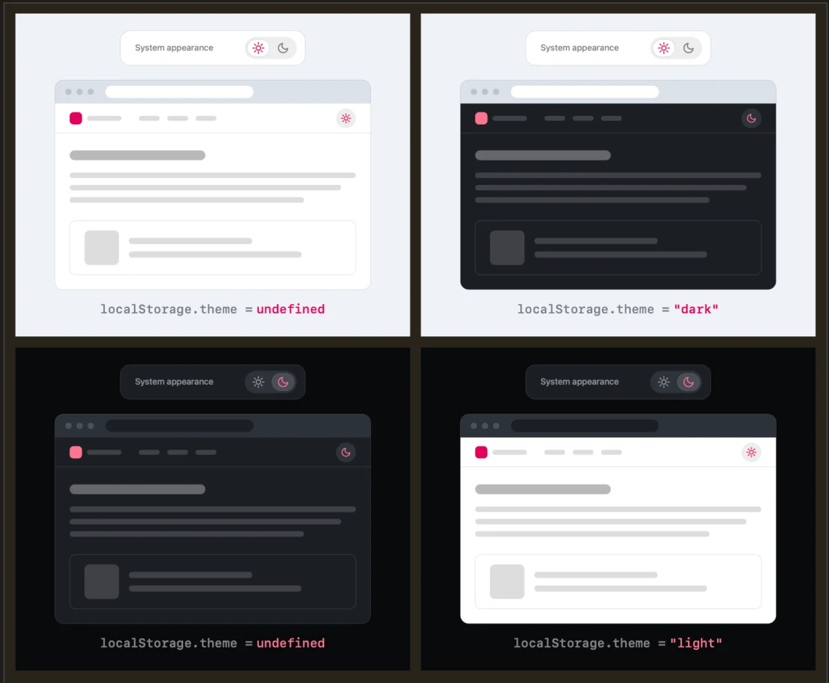
When a website presents a user with a tri-state toggle (Light / Dark / System), it introduces unnecessary complexity. Verou’s research and subsequent proposals advocate for a simpler philosophy: Default to the operating system’s preference, and allow a simple two-state override only when the user explicitly desires a change.
How the Two-State Model Works:
- Initial Visit: The website detects the user’s system preferences (via CSS media queries like
prefers-color-scheme). If the system is dark, the site renders in dark mode. If light, it renders light. No explicit UI toggle is forced upon the user. - The Override: If the user wants a different experience, they interact with a simple two-state control (e.g., clicking to switch from the inherited dark mode to light mode).
- Persistence: Once clicked, that preference is securely stored in the browser’s
localStoragefor future sessions, overriding the system default.
According to Verou, a well-designed two-state control can effortlessly express all three logical scenarios without cluttering the navigation bar with redundant options. As she notes in her foundational post on the subject, users only ever need to apply an override the first time the system and their personal preferences diverge.
Chronology: How the Debate Unfolded
The conversation surrounding modern dark mode toggles has evolved rapidly within the web development community over the past several years, culminating in the recent dialogue initiated by Verou:
- The Rise of Native Dark Mode (2018–2020): Operating systems broadly adopted system-wide dark modes. Browser vendors quickly followed suit, introducing
prefers-color-schemeto allow websites to inherit these settings automatically. - The Over-Engineering Phase (2020–2025): To give users maximum control, developers reflexively added visible, persistent tri-state switchers (Sun, Moon, Desktop/System icons) into website headers and navigation menus.
- August 2026 — The Catalyst: Lea Verou published her critique titled "Dark Mode Toggles and Good Two-State UX," arguing against the necessity of the system-state button in persistent headers.
- Immediate Community Feedback (Mid-August 2026): The blog post went viral across developer communities, drawing extensive commentary on platforms like Bluesky and CSS-Tricks, where designers debated the nuances of state-switching and
localStoragepersistence. - August 2026 — The Follow-Up: Responding to the widespread industry chatter, Verou published a follow-up article summarizing the pushback, clarifying edge cases, and solidifying the boundaries of when persistent UI elements are genuinely useful.
Supporting Data and Technical Nuances
To fully appreciate Verou’s perspective, one must examine the technical mechanics of browser state management and the psychology of user intent.
The Problem of Cognitive Dissonance
Persistent UI elements—those that remain visible in a website’s header or navigation bar as the user scrolls—occupy precious visual real estate. When a header contains a tri-state dropdown or a multi-icon toggle, it introduces unnecessary cognitive friction.
Website visitors rarely arrive with the primary goal of testing or changing a site’s color scheme; their intent is to read an article, purchase a product, or find documentation. Theme switching is entirely tangential to their primary objective. The more options a UI presents, the higher the cognitive load, leading to minor distractions that disrupt the user journey.
The localStorage and Reversal Dilemma
A technical question frequently raised by critics of the two-state approach involves state reversal. Consider this scenario:
- A user visits a site with a Light system preference. The site loads in light mode.
- The user toggles the switch to Dark mode (creating a
localStorageoverride). - Later, the user clicks the toggle back to Light mode.
What happens to the localStorage value? Does it clear out to return to the system default, or does it save an explicit "Light" override?
Verou dismisses this edge case as largely inconsequential. Because theme switching is a secondary, low-stakes action, users do not deeply analyze the underlying code state. If the user’s preference diverges from the system again in the future, fixing it requires nothing more than a single, effortless click. As Verou succinctly puts it: "It’s such an easy fix, that there is no point in dwelling on it further."
Exceptions: When Are Three States Appropriate?
While Verou advocates strongly against tri-state toggles in persistent navigation headers, she acknowledges that three-state controls are not entirely useless. She outlines specific scenarios where a tri-state control remains appropriate:
- Isolated Settings Panels: In dedicated account settings, user preference pages, or operating system control panels where users explicitly configure comprehensive preferences.
- Contexts with Complex Inheritance: Scenarios where previewing all three states simultaneously is a core feature of the application (e.g., software development tools, design systems, or theme builders).
Official Responses and Community Perspectives
The developer community has engaged in a robust debate regarding Verou’s proposals, yielding fascinating insights into how users actually interact with the web.
The Browser-Level Solution Argument
One of the most compelling contributions to the discussion came from developer Chris Coleman via social media channels, who highlighted a deeper philosophical issue regarding operating systems and web browsers:
"All I ever wanted was for my OS to be dark, not every website I look at. It was a huge leap by the browser vendors to tie all web content to that system preference. Anyway, I think the light/dark preference should be in the browser, and what you propose seems perfectly in line with that."
Coleman’s observation touches on a pain point experienced by many power users: an operating system running in dark mode can blind a user with glaring white backgrounds when visiting poorly optimized or bright websites. Conversely, forcing every single website to strictly obey the OS setting strips away granular user control.
If modern web browsers eventually baked granular, per-site or global light/dark overrides directly into their native chrome (rather than forcing developers to build custom UI components), the need for site-specific toggles would evaporate entirely. Until then, Verou’s two-state override model serves as the best bridge between automation and user agency.
Implications for Future Web Design
As the dust settles on Verou’s architectural challenge, what are the practical takeaways for web developers, UX designers, and digital agencies?
- Audit Your Navigation Bars: Development teams should review their current header implementations. If a tri-state dropdown or multi-button color switcher is present, evaluate whether it can be safely reduced to a clean, binary toggle—or removed entirely.
- Trust the System Defaults: Relying on
prefers-color-schemeas the default state respects the user’s environment without demanding unnecessary micro-interactions upon their first visit. - Minimize Cognitive Noise: Every pixel of UI real estate in a navigation header should serve the user’s primary intent. Removing redundant theme controls results in cleaner, more professional interfaces.
- Embrace the Zero-Toggle Future: The ultimate evolution of this design philosophy may be the total elimination of theme toggles on content-heavy sites, leaving color management entirely up to native browser capabilities and smart CSS architecture.
By embracing minimalist UX principles, developers can stop over-engineering trivial features and focus on what truly matters: delivering seamless, distraction-free digital experiences.