
In the modern enterprise, data has become an omnipresent utility, yet it remains fundamentally underutilized. Organizations are awash in performance metrics, sales funnels, and product telemetry, yet weekly reviews often conclude with the same hollow outcome: a room full of nods, a deck full of charts, and a total absence of actionable strategy. We have mastered the art of collecting data, but we have largely failed at the art of conveying it.
Data visualization sits at the volatile intersection of two disciplines that rarely speak the same language: the clinical precision of data science and the user-centric empathy of UX design. When these fields operate in silos, the result is "communicatively inert" dashboards—technically accurate, yet incapable of triggering a decision, a shift in thinking, or a change in direction. To bridge this gap, we must rethink the dashboard not as a repository of information, but as a functional interface designed for human cognitive processing.
The Mirage of Clarity: Why Charts Often Fail
The prevailing orthodoxy in data design is the "data-ink ratio," championed by Edward Tufte. It posits that every mark on a chart should serve the data, not decorate it. While this principle is vital for visual hygiene, it is frequently misinterpreted as a call for radical simplicity. In the real world, a chart is never consumed in isolation. It is read by a person under pressure, in a specific organizational context.

If we strip a chart down to its barest bones, we risk removing the very context a decision-maker requires. The objective is not simplicity for its own sake; the objective is "appropriate complexity."
The Diagnostic Power of Visualization
In 1973, statistician Francis Anscombe famously demonstrated that statistical summaries—means, variances, and correlations—can be identical across vastly different datasets. When viewed as raw numbers, four distinct datasets appeared to be the same. When plotted as scatterplots, their distinct, underlying patterns were instantly revealed.
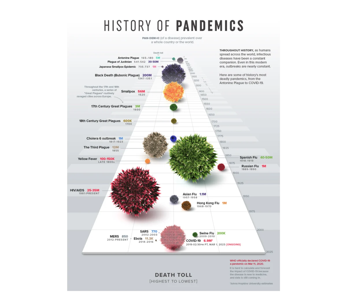
This is the foundational truth of data visualization: it is a diagnostic tool that reveals truths the numbers conceal. However, it is also a communicative tool. The form of the visualization dictates whether the audience walks away with a dry data point or a compelling, actionable narrative. As seen in the Visual Capitalist’s "History of Pandemics," which uses proportional bubble charts to map death tolls, the right design makes the scale of a crisis impossible to ignore, bypassing the need for complex analysis to grasp the core message.

The 80% Rule: Upstream Architecture
In data UX, the most critical work happens before a single chart is rendered. Approximately 80% of a dashboard’s success is determined by the questions asked before the design software is even opened. This "upstream" phase requires a fundamental shift in how teams approach data projects.
Defining the "What" and the "Who"
Most organizations start by pulling whatever data is currently available. This "data-first" approach is fundamentally flawed because it ignores the purpose of the investigation. A "context-first" approach, by contrast, begins with a specific, answerable question.
For instance, rather than asking, "How is the product performing?"—a question too broad to invite specific action—a team should ask, "Which features drive retention among Q1 sign-ups?" This specificity provides a roadmap:

- The Metric: What is being measured?
- The Population: Who is being observed?
- The Implied Action: What are we prepared to change based on this?
Audience Literacy and Accountability
Designing for an audience requires an understanding of two variables: familiarity and accountability. A head of sales and a data analyst look at the same "12% decline" through different lenses. The analyst looks for the source of the anomaly; the executive looks for the impact on the bottom line. Failing to tailor the density of information to the viewer’s level of data literacy and their specific accountability creates friction. A high-density path-exploration graph is a godsend for an analyst conducting a root-cause analysis, but it is an obstacle for an executive who needs a high-level summary to make a budget decision.
From Information to Insight: A Case Study
During a recent project for an enterprise-level SaaS platform, the mandate was to visualize massive amounts of user telemetry. The client wanted an interface that enabled "better performance," but they lacked a definition for what that meant in practice.
The Chronology of Implementation
- Phase One: Defining Mechanics. We had to move beyond the vanity metric of "time spent," which only measures presence, not efficacy. We identified competency scores and certification rates as the true indicators of success.
- Phase Two: Audience Segmentation. We rejected the "shortcut" of simply changing the UI for different roles. Instead, we built distinct narrative arcs. The individual contributor’s dashboard was designed as a "self-directed mirror," while the manager’s interface was designed as a "macro pulse check," prioritizing aggregate performance with the ability to drill down into specific team vulnerabilities.
- Phase Three: The Insight Strategy. We moved away from passive logging. We introduced a "comparison tool" that allowed managers to benchmark team members side-by-side. This was not in the original brief, but it addressed the core operational need: identifying skill gaps before they resulted in project failure.
The Power of Mental Models
To represent multi-dimensional skills, we utilized a radar chart. By mapping eight competency areas across a polar coordinate system, we allowed users to identify their "shape" of proficiency. A balanced polygon signifies stability; a skewed shape instantly highlights an outlier. By assigning consistent colors to specific product areas—a branding choice that became a functional data language—the user was able to process the information without learning a new legend.

The Implications of UX-Led Data Design
The results of this approach were clear. By shifting the dashboard from a passive reporting tool to an active decision-making engine, the organization saw a noticeable rise in engagement. More importantly, the nature of the conversations changed. Managers moved from reactive, post-mortem reviews of "bad months" to proactive, data-informed coaching sessions.
Key Takeaways for the Industry
The integration of UX into data visualization leads to several critical shifts in organizational culture:
- Actionability over Aesthetics: A beautiful chart that leads to no decision is a failure. A functional chart that drives a pivot is a success.
- The End of the "Data Dump": Moving away from comprehensive dashboards toward goal-oriented views reduces cognitive load and accelerates decision-making.
- The Proactive Pivot: Data should be the catalyst for intervention, not just a historical record of what went wrong.
Closing: Designing for the Future
Data visualization is too often treated as the final, decorative step in a project—a "polishing" phase of a spreadsheet. This is a profound misunderstanding of the medium’s potential. When we treat data design as an upstream architectural choice, we stop merely reporting on the past and start shaping the future.

The next time you face a wall of numbers, step away from the tools. Ignore the BI software for an hour. Instead, interrogate the human need behind the data. Ask yourself: Who is this for? What is the specific question they are trying to answer? And what happens to their work when they see this?
When you design with these questions as your foundation, your dashboard ceases to be a passive log of events. It becomes a tool of precision, an engine of strategy, and the most valuable asset in the decision-maker’s arsenal. Data is a message; it is time we started designing it to be heard.