







"Naming is hard." It is a phrase echoed in the hallways of every design studio and the Slack channels of every engineering team globally. While it may seem like a trivial linguistic exercise, the reality is that the language we choose to label our UI components, design tokens, and product features dictates the efficiency of our workflows and the clarity of our communication. When naming fails, confusion reigns—leading to fragmented design systems, misaligned engineering implementations, and ultimately, poor user adoption.
This guide explores the structural, strategic, and creative aspects of naming, providing a blueprint for teams looking to standardize their lexicon and bridge the gap between design and development.

The Problem with Linguistic Ambiguity
At its core, poor naming stems from a lack of constraint. We often gravitate toward names that are either too generic—resulting in a lack of specificity that obscures the component’s function—or too specific, which creates rigid structures that cannot adapt to future product iterations.
The cognitive load of navigating a design system with inconsistent naming is immense. When designers, developers, and product managers speak different "dialects," technical debt accumulates. A button labeled "Submit" in one context and "Primary Action" in another creates friction. By establishing a shared vocabulary, organizations can significantly reduce the "translation time" spent in meetings and code reviews.

Chronology of Naming Evolution
The approach to naming in digital product design has evolved alongside the complexity of the interfaces we build.
- The Early Days (The "Wild West"): In the infancy of the web, naming was largely idiosyncratic. Developers relied on personal preference or basic functional descriptions. This led to massive CSS bloat and unpredictable global styles.
- The Componentization Era: With the rise of React, Vue, and modern design systems, the industry pivoted toward atomic design. This required a shift from naming styles (e.g.,
.blue-box) to naming roles (e.g.,.alert-primary). - The Systems Age (Modern Era): Today, we are in the era of "tokenized" design. Naming is no longer just about HTML classes; it is about building a taxonomy that connects high-level brand decisions to low-level code implementation. Companies like Intuit and Vodafone have pioneered hierarchical systems that allow for multi-brand, multi-theme scalability.
Strategic Frameworks for Naming Things
To move beyond arbitrary naming, teams must leverage proven methodologies.

1. The Power of Thematic Grouping
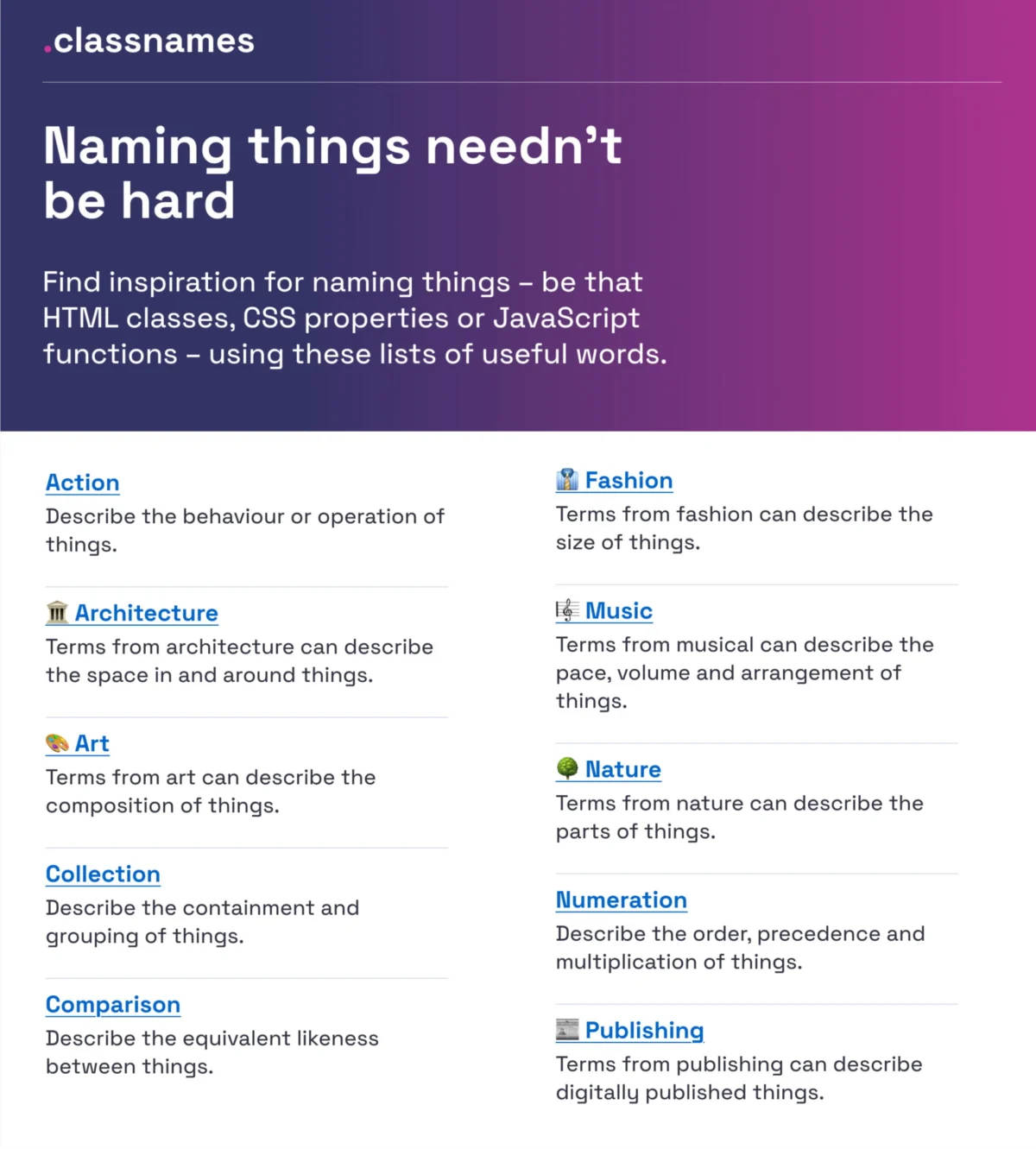
If you are struggling to find inspiration for CSS classes or JavaScript functions, Classnames serves as an essential resource. It provides thematically grouped lists of words that encourage developers to move away from functional descriptions and toward conceptual labels. By drawing from fields like architecture, theater, and nature, teams can build a more evocative and memorable internal language for their components.
2. Standardizing Color Lexicons
Color naming is notorious for causing friction. A "soft-blue-v2" is rarely helpful to a developer. Color Parrot offers a sophisticated solution, providing access to a repository of over 30,000 unique color names. By using a standardized, objective naming convention for colors, teams can avoid the subjectivity that leads to "color soup" in style guides.

3. Structural Best Practices for Layers and Groups
Javier Cuello’s naming best practices highlight a fundamental rule: Effective names should be logical, concise, and decoupled from visual properties.
- Avoid visual labels: Do not name a component "BlueLargeButton." Name it based on its role, such as "PrimaryAction."
- Maintain structure: Use clear hierarchy (e.g., Category > Component > Variant > State).
- Universality: Ensure the name is understood by all stakeholders, not just the person who created the file.
Supporting Data: Scaling with Design Tokens
The challenge of scaling naming reaches its zenith when managing design tokens. A robust token taxonomy is the backbone of any enterprise design system.

The Intuit Case Study
Intuit, the parent company of products like QuickBooks and Mailchimp, faced a significant challenge: how to build a flexible token system that supports a vast array of products with distinct brand identities. Their solution was to move beyond simple "primitive" tokens (like color hex codes) to a semantic, layered taxonomy. By defining tokens based on their intent rather than their appearance, they created a system that allows for global updates across products without requiring manual intervention in every file.
Vodafone’s Taxonomy Map
Vodafone UK’s Variables Taxonomy Map represents the current gold standard for complex organizations. Their system categorizes tokens into four distinct levels:
- Brand: Core identity values.
- Primitives: Fundamental building blocks.
- Semantics: Contextual application (e.g., background-surface-primary).
- Pages: Context-specific overrides.
This structure allows teams to trace the lineage of a token from the high-level brand decision down to the specific screen, ensuring consistency across the entire product suite.
The User Perspective: Naming Features for Adoption
Naming is not merely an internal concern; it is a critical factor in user experience. Erin Gannon’s research on feature naming underscores that low feature adoption is often a failure of discoverability.

Users do not think in "marketing speak." They think in terms of the "jobs-to-be-done." If a feature is named "Synergy Pro," but the user wants to "Export Data," they will never find it. The golden rule for naming features is to tap into the user’s own language. Conduct user interviews, listen to the words they use to describe their problems, and reflect that language in the UI.
Implications for Organizational Health
When a team invests in a thoughtful naming architecture, the implications are profound:

- Reduced Onboarding Time: New team members can navigate the codebase and design files intuitively without needing constant clarification.
- Increased Velocity: By eliminating ambiguity, developers and designers spend less time debating what to call a new component and more time shipping value.
- Better Cross-Functional Collaboration: A shared vocabulary allows for more efficient communication between Product, Design, and Engineering. When everyone refers to a component by its role rather than its appearance, the focus shifts to the purpose of the feature.
Practical Resources for Every Team
If you are looking to audit your own naming conventions, the following tools provide a starting point:
- Component Gallery: An excellent resource for observing how top-tier design systems label their UI components.
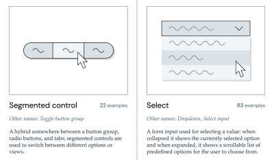
- Name That UI: A visual dictionary that acts as a quick reference for standard component nomenclature.
- Design Token Naming Guide: An interactive tool by Romina Kavcic that helps teams configure their token structure, including roles, states, and categories.
- Onym: For broader product and service naming, this repository offers methodologies and etymological research to help teams brainstorm effectively.
Conclusion: The Language of the Web
The right name is the one that is understood by everyone. It bridges the gap between the designer’s intent and the developer’s implementation. As we continue to build more complex and accessible digital products, the "naming layer" of our design systems will become increasingly vital.

The next time you find yourself stuck at a blank cursor, unsure of what to name a variable or a new component, pause. Look to the existing taxonomies, consider the user’s perspective, and prioritize clarity over cleverness. By refining our language, we don’t just organize our code—we organize our thoughts and, by extension, the experiences we craft for the world.