

In the contemporary digital landscape, where the speed of content consumption is matched only by the demand for high-quality visuals, the role of post-processing has transcended basic correction. Today, professional photographers, graphic designers, and social media content creators rely on sophisticated tools to bridge the gap between a raw image and a compelling visual story. Among these tools, Look-Up Tables (LUTs) for Adobe Lightroom have emerged as the definitive standard for professional color grading.
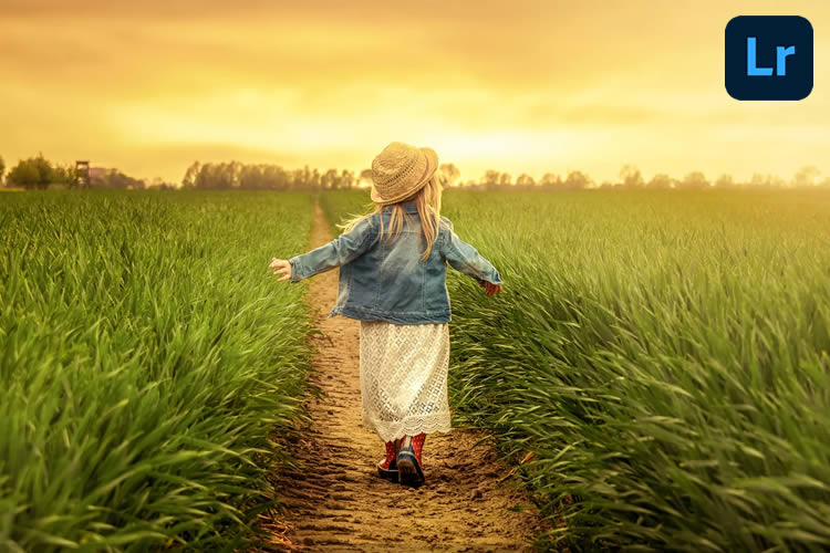
By manipulating color, saturation, luminance curves, and white balance, LUTs serve as a shortcut to aesthetic mastery. They allow creators to convey complex emotions, define specific moods, and even manipulate the perceived "time" of an image. Whether you are aiming for the nostalgic grain of vintage film or the crisp, high-contrast aesthetic of a modern cinematic blockbuster, the right LUT can transform a mundane snapshot into a work of art.
The Evolution of Digital Color Grading: From Manual to Instant
Historically, color grading was a painstaking, manual process requiring deep expertise in color theory and software manipulation. Professionals would spend hours adjusting individual curves, hues, and saturation sliders to achieve a consistent "look." This manual labor often served as a barrier to entry for many budding artists.
However, the introduction of LUTs—mathematical formulas that map one color space to another—has democratized this process. Today, a designer can achieve in a single click what once took an hour of technical adjustment. This shift has fundamentally changed the economics of content creation, allowing for high-volume, high-quality output without sacrificing artistic integrity.

Why LUTs Are Essential in the Modern Toolbox
The utility of a LUT extends far beyond simple "filtering." A well-crafted LUT acts as a foundational base that ensures consistency across a project. For designers and brands, this is critical; it ensures that a series of photos, whether taken at different times of day or in varying lighting conditions, feel like part of a unified narrative.
Furthermore, LUTs provide an invaluable educational framework. By applying a professional preset to a raw image, users can observe how the underlying parameters—such as the split-toning or contrast curves—are adjusted to achieve a specific result. This allows for a deeper understanding of color grading principles, eventually enabling creators to refine and customize these presets for their own unique styles.
Curated Collections: A Deep Dive into Professional Presets
To help you streamline your workflow, we have curated a list of the most impactful Lightroom LUT categories currently available. These collections cater to specific aesthetic goals and are designed to solve common lighting and color challenges.

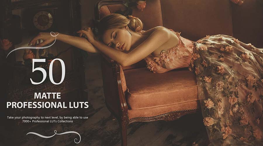
1. The Warmth Aesthetic: Capturing the Glow
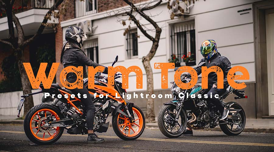
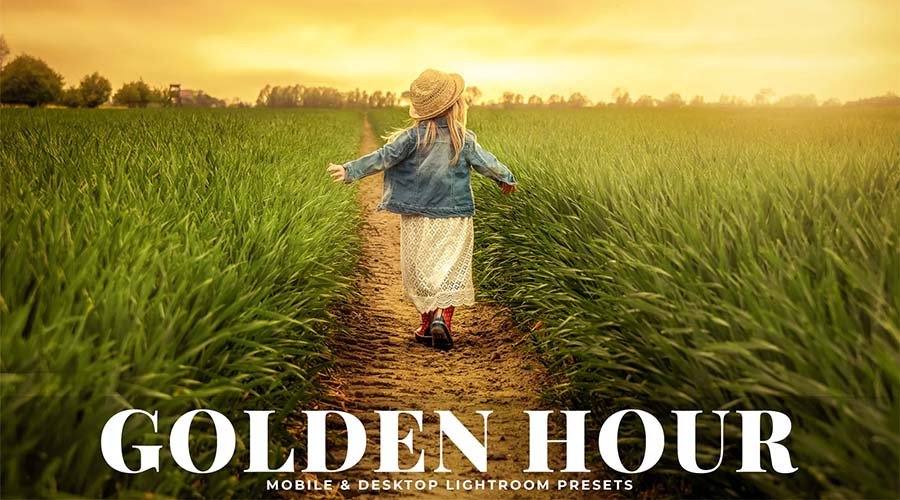
Warm Tone Lightroom presets are designed to emphasize orange, red, and yellow hues. These are indispensable for landscape photographers looking to capture the "golden hour" magic or portrait artists seeking a healthy, sun-kissed glow on their subjects. By subtly lifting the shadows and adding warmth to the highlights, these presets create a welcoming and intimate atmosphere.
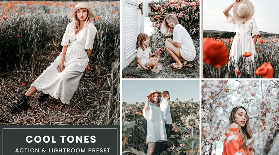
2. Cool Tones: Precision and Professionalism
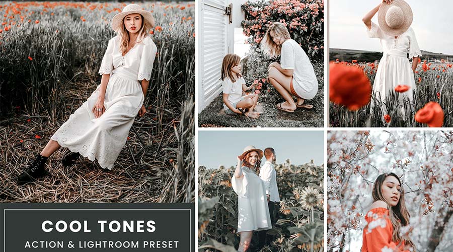
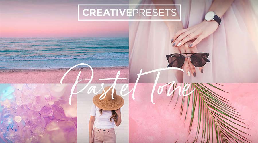
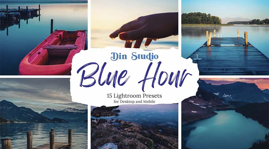
Conversely, Cool Tone LUTs are essential for creating a sleek, modern, and perhaps slightly detached aesthetic. By accentuating blue and teal tones, these presets make subjects "pop" against warmer backgrounds. They are frequently used in commercial photography and architectural shots where clarity and clinical precision are prioritized.
3. Vintage and Film Emulation
The resurgence of film photography has driven a massive demand for "analog" looks. Vintage Film presets replicate the rich, grainy, and color-shifted nature of classic stocks like Kodak Portra or Fuji Velvia. These presets are perfect for editorial projects, lifestyle blogs, and any work requiring a sense of nostalgia, history, or organic warmth.

4. Cinematic Grading: Bringing Hollywood Home
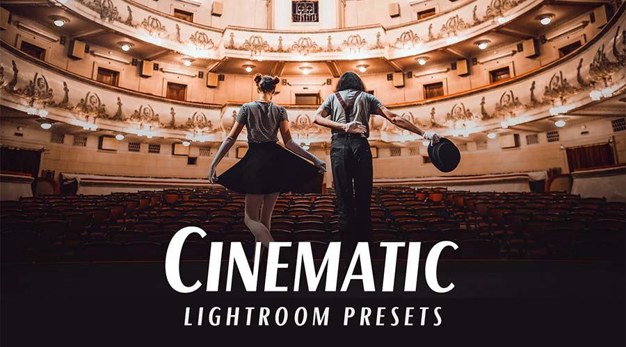
Cinematic presets go beyond simple color shifts; they adjust the entire "dynamic range" of an image. By crushing blacks slightly and introducing specific color casts in the shadows and highlights—a technique known as the "teal and orange" look—these presets allow creators to replicate the dramatic depth seen in feature films.
5. Muted and Desaturated Tones
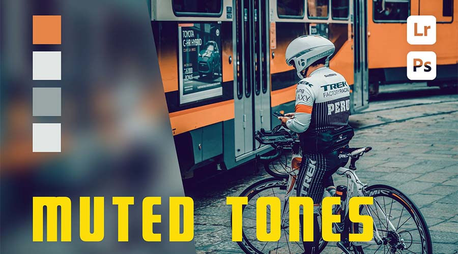
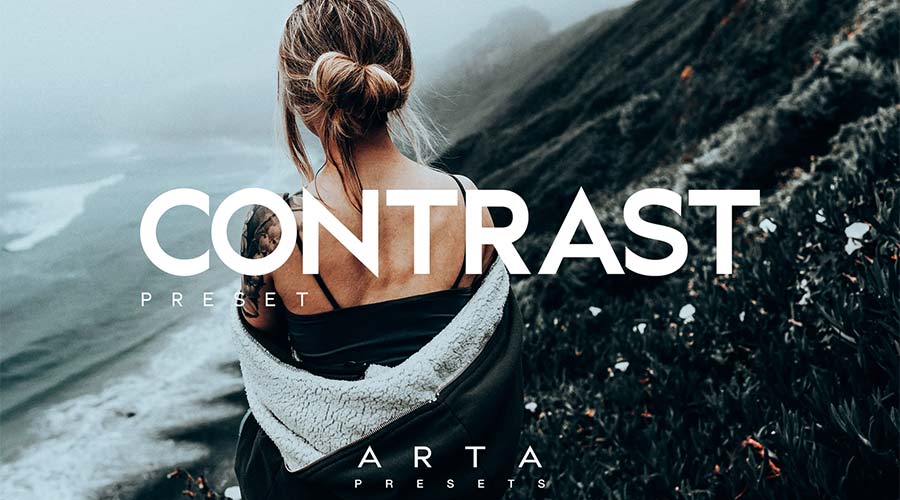
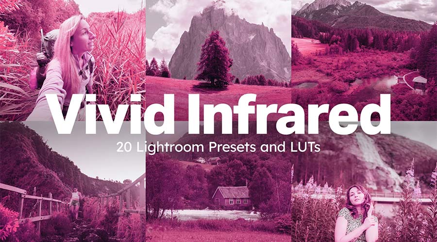
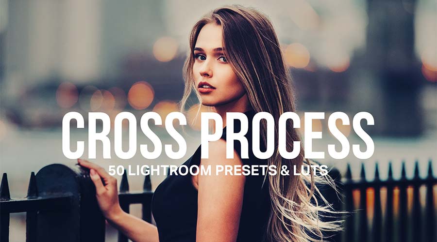
For projects requiring a somber, serious, or high-fashion look, Muted Tone presets are the gold standard. By reducing the saturation of specific colors and flattening the contrast, these LUTs create an understated, "moody" vibe. They are highly effective for urban street photography and editorial fashion spreads.
Seasonal Narratives: Tailoring Your Look by Time of Year
Color is intrinsically linked to our perception of the seasons. Using the wrong color palette can make a summer photograph feel disjointed and confusing.
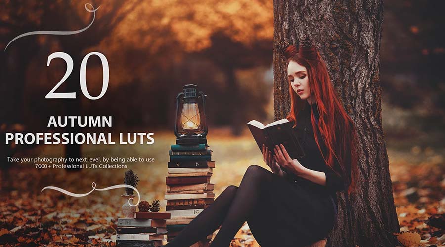
- Autumn: These LUTs lean heavily into burnt oranges, deep browns, and desaturated greens. They effectively simulate the crisp, cozy atmosphere of the harvest season.
- Spring: A collection blooming with potential, these presets focus on pastel yellows, soft pinks, and vibrant, lush greens. They are designed to bring freshness to outdoor nature shots.
- Summer: Intensity is the goal here. These presets boost saturation and warmth, ensuring that beach shots and vacation photos feel vibrant and alive.
- Winter: A sharp, cool, and often high-contrast aesthetic. These presets emphasize whites and icy blues, perfect for capturing the stark beauty of the colder months.
Technical Implications: The Efficiency of One-Click Editing
For the professional photographer, time is the most valuable commodity. The primary implication of using LUTs is the drastic reduction in "time-to-delivery." By automating the baseline color grading, photographers can focus their energy on the more creative aspects of post-processing, such as localized retouching, cropping, and composition.

Furthermore, these tools are highly scalable. Whether you are editing a single portrait for a social media post or batch-processing hundreds of images for a wedding gallery, LUTs provide a repeatable, professional result. This scalability is essential for agencies and freelancers who need to maintain a brand identity while managing large volumes of work.
Integrating LUTs into Your Workflow
To get started, it is recommended to curate a small, versatile library of LUTs rather than hoarding hundreds of random presets. Start by identifying the "mood" of your current body of work. Are you leaning toward the moody, desaturated urban look, or are you creating bright, airy lifestyle content?
Once you have identified your style, ensure that your images are properly exposed before applying the LUT. While LUTs are powerful, they are not magic; a significantly underexposed or poorly white-balanced photo will not benefit from a preset. Treat the LUT as the final flourish—the "seasoning" on a well-cooked meal.

Conclusion
The democratization of professional color grading through Lightroom LUTs represents a significant milestone for the creative industry. These tools offer more than just aesthetic convenience; they provide a gateway to storytelling that was once reserved for those with expensive software and years of formal training.

By experimenting with different tones—from the high-contrast drama of urban desaturation to the gentle, sun-kissed hues of a sunset glow—you can begin to carve out a visual identity that is uniquely yours. Whether you are a professional designer working on a high-stakes campaign or a hobbyist looking to elevate your Instagram feed, the perfect fit for your visual storytelling project is likely just a click away.
Ready to transform your workflow? Explore our comprehensive collection of Lightroom LUTs to find the tools that will help you redefine your visual narrative today.