
In the world of typography, size is more than just a measurement; it is a constraint that dictates the success of communication. As digital interfaces become more complex and print materials strive for higher information density, the challenge of maintaining readability at small sizes has become a critical focus for designers. When text is scaled down—whether for mobile app interfaces, complex data dashboards, footnotes in editorial layouts, or technical manuals—the wrong typeface can render content illegible, frustrating the user and diminishing the impact of the design.
True readability at small scales is not an accident; it is the result of deliberate engineering. Designers must account for the way human eyes perceive letterforms when pixels or ink dots become constrained. This guide explores the essential characteristics of high-performance small-text fonts and provides a curated selection of premium and free resources to elevate your design toolkit.
The Science of Small: Why Readability Matters
When text shrinks, the brain stops processing letterforms as individual artistic expressions and begins to process them as patterns. If a font features excessive flourish, dramatic stroke contrast, or tight internal spaces (known as "counters"), these patterns break down. The result is a "muddy" appearance where letters like ‘e’, ‘o’, and ‘c’ begin to blur together.
Professional designers prioritize fonts that balance personality with "functional clarity." A font that performs well at 8pt or 10pt requires generous apertures, stable stroke widths, and optimized kerning. By selecting typefaces engineered specifically for these constraints, creators ensure that their content remains accessible, professional, and visually balanced regardless of the delivery medium.
A Curated Selection: Premium Fonts for Small-Scale Mastery
For projects that require a unique aesthetic and professional-grade hinting, the following typefaces offer the perfect marriage of form and function.
1. Quarty: The Serif Specialist
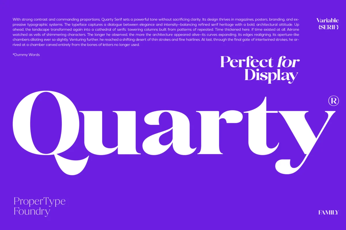
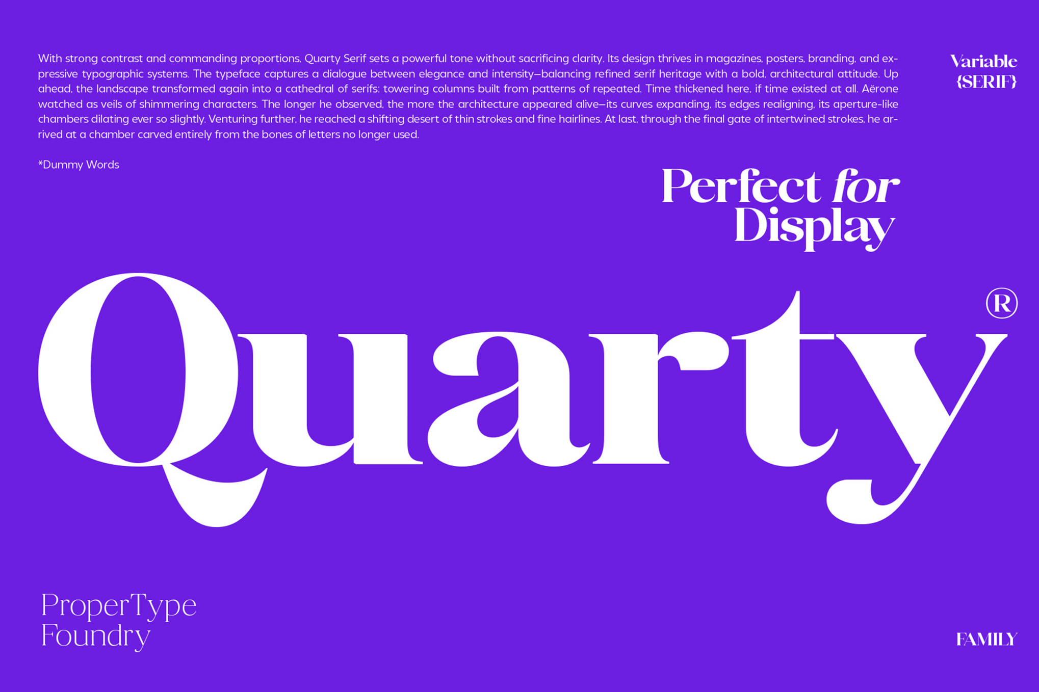
Quarty represents a refined approach to serif design. By blending geometric stability with graceful, subtle curves, it manages to retain a sophisticated character without sacrificing legibility. It is a robust choice for editorial print work where elegance is required at smaller point sizes. The inclusion of extensive ligatures and alternates allows for a high degree of customization in complex layouts.
2. Carlgine: The Versatile Serif
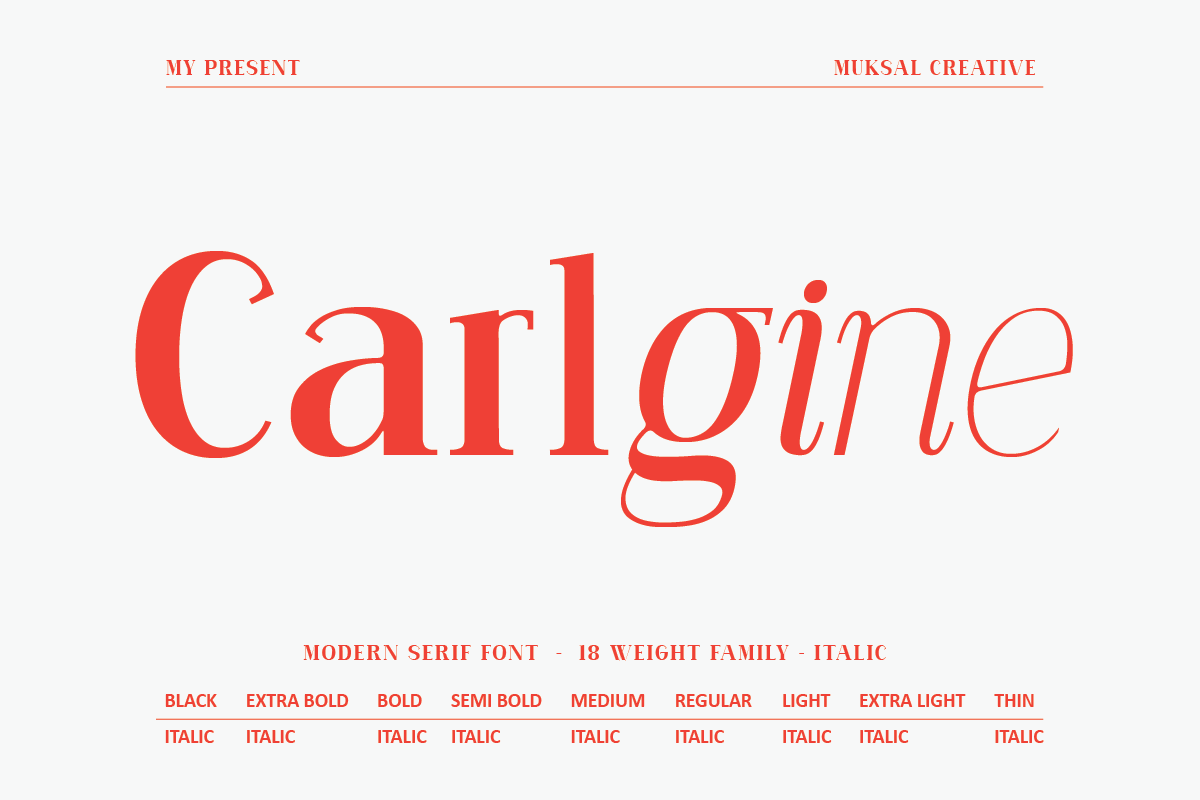
Boasting 18 distinct weights, Carlgine is a workhorse for branding and long-form editorial design. Its versatility allows designers to shift from delicate, thin weights for headlines to heavier, robust blacks for sub-labels. Its support for stylistic glyphs makes it an excellent choice for modern digital publications that require a consistent typographic voice across varying scales.
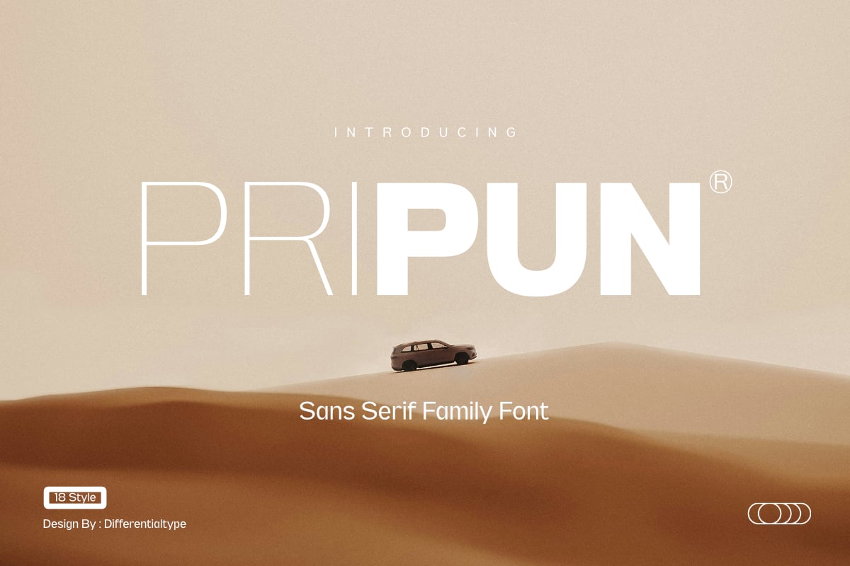
3. Pripun: Precision Sans Serif
Pripun excels in UI/UX environments. As a sans-serif family with 18 styles, it provides the precision needed for modern dashboards and web interfaces. Its letterforms are constructed with a focus on negative space, ensuring that even at very small scales, the text remains crisp and distinct.
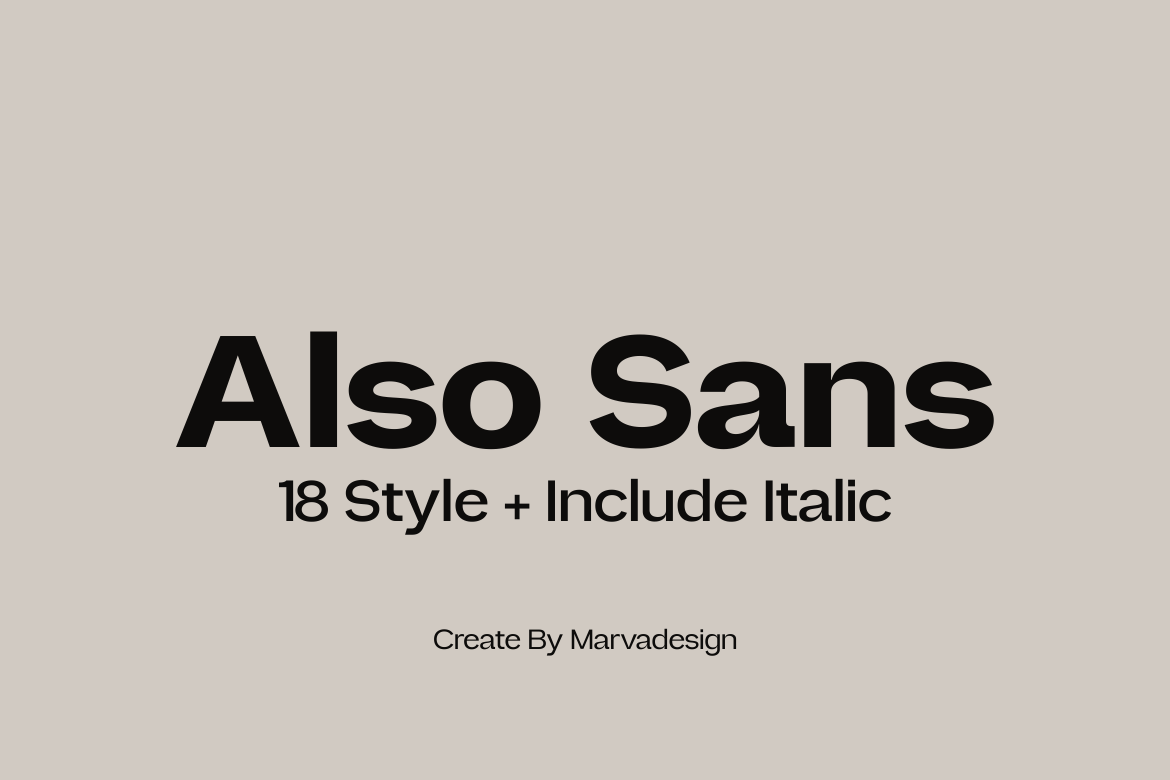
4. Also Sans: Clarity in Simplicity
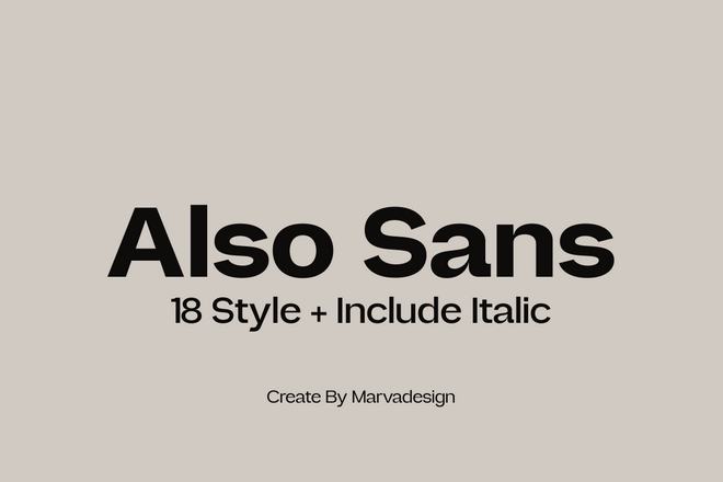
Also Sans is designed for those who value clean, open lines. By utilizing generous counters, it ensures that even at extreme reductions, the characters do not lose their integrity. Its 18-weight structure makes it a go-to for complex brand identities that require adaptability.
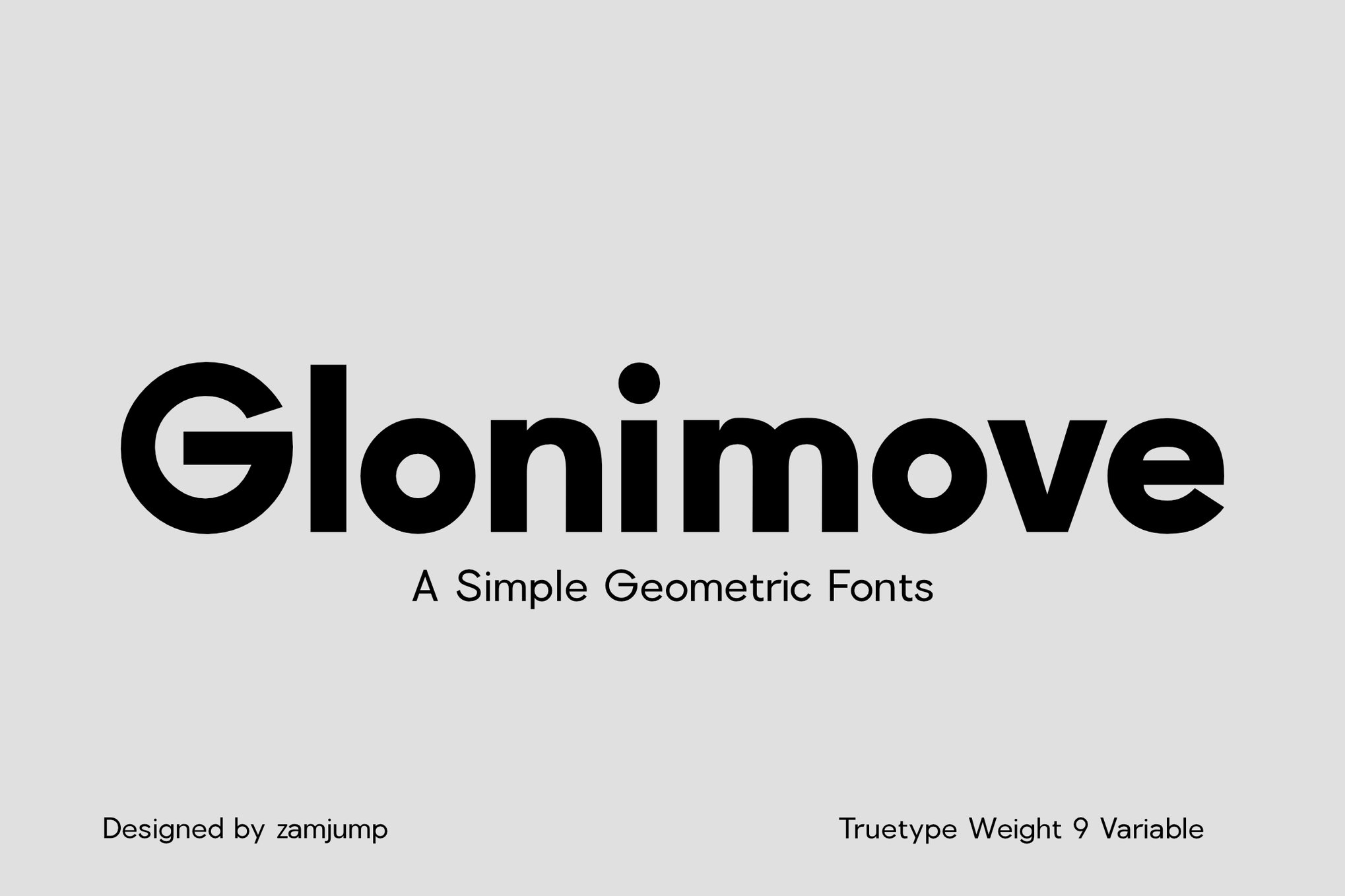
5. Glonimove: Geometric Sophistication
Glonimove leans into modern geometric principles. Its clean lines and balanced proportions make it ideal for signage and mobile applications. It offers nine variable weights, providing designers with the granular control necessary for responsive design systems.
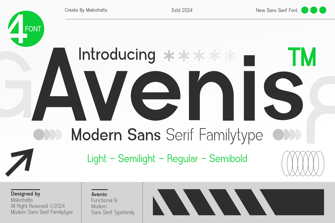
6. Avenis: The Modern Standard
Avenis is built for the contemporary screen. With a focus on modern sans-serif construction, it provides a neutral yet attractive aesthetic. It is particularly effective for digital displays where the user experience depends on quick, effortless scanning of information.
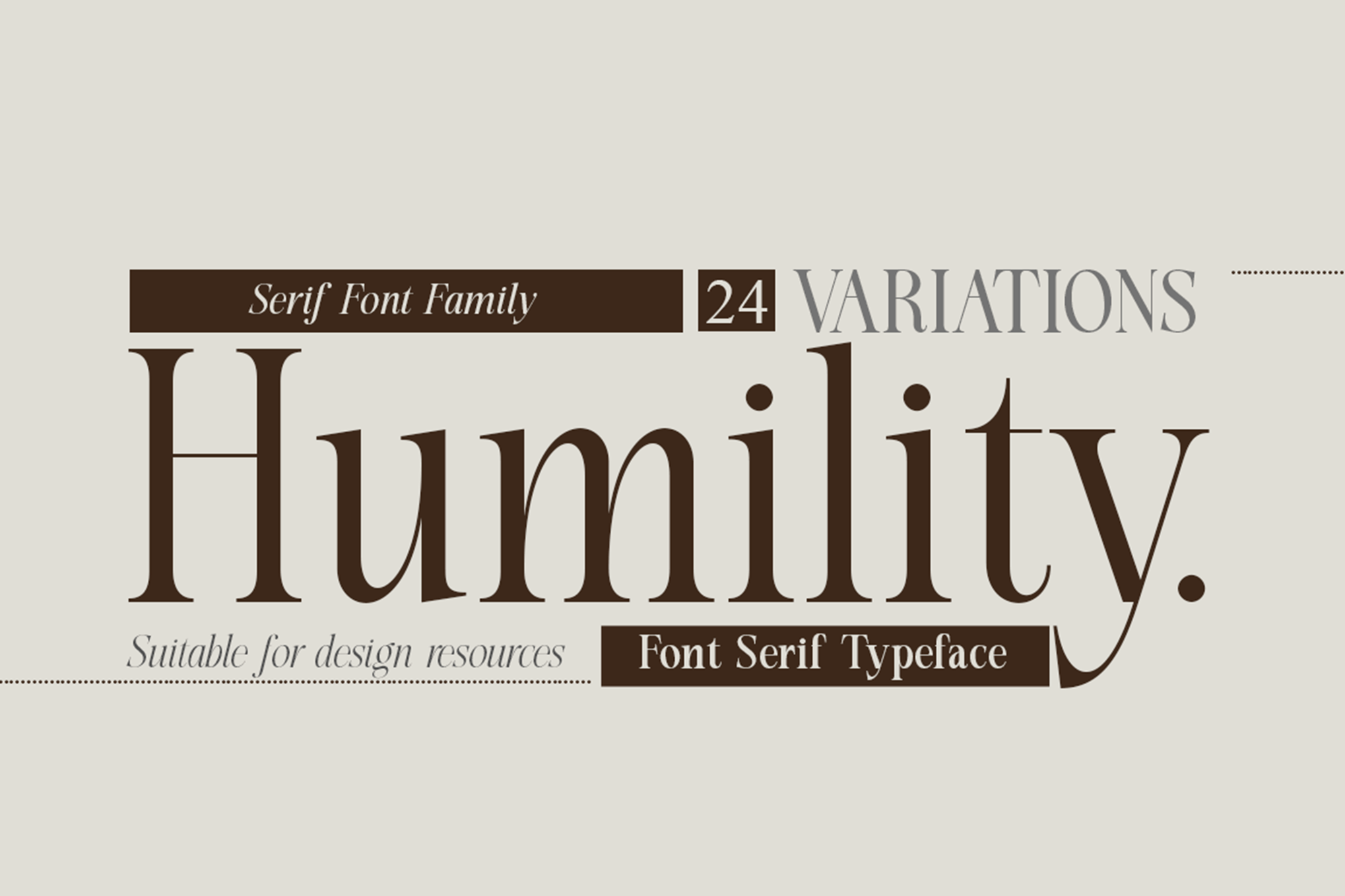
7. Humility: Vintage Elegance
Humility bridges the gap between classic serif tradition and modern, sharp execution. With 24 variations, it is the ultimate tool for fashion-forward editorial layouts. Its ability to maintain distinct serifs even at reduced sizes gives it a "premium" feel that is rare in smaller fonts.
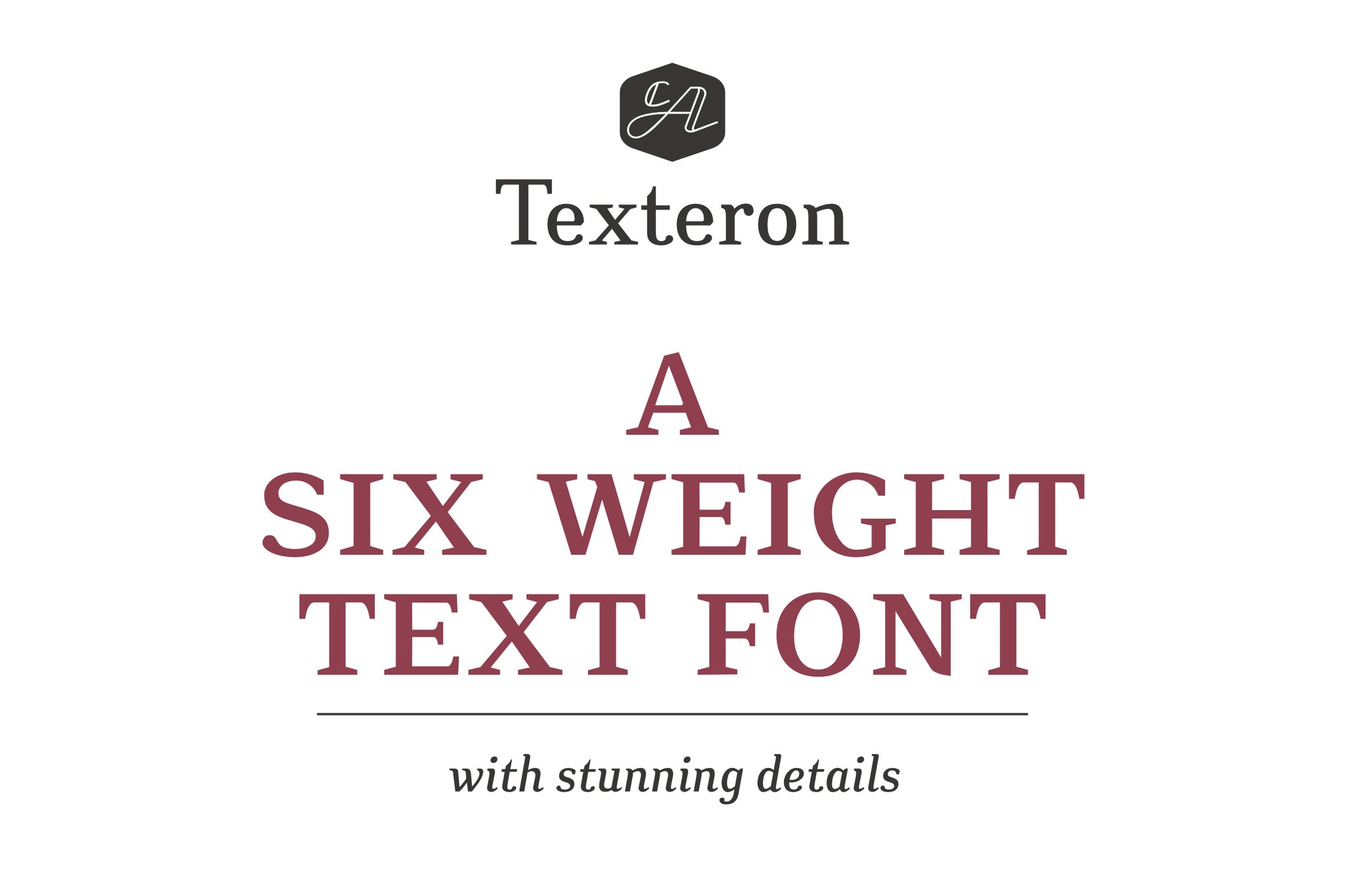
8. Texteron: Traditional Yet Edgy
Texteron offers a unique, creative mix of classical proportions and modern, edgy finishes. It is a fantastic choice for those who need their small text to carry a sense of authority and tradition without appearing dated.
Free Resources: Accessibility Without Compromise
High-quality typography does not always require a massive budget. These open-access fonts provide exceptional performance for designers on a tight timeline.
- Caviler: A narrow sans-serif that excels in tight columns. Its steady spacing prevents the "clustering" effect common in compressed layouts.
- Orbito: Known for its friendly, rounded geometry, this font is perfect for interfaces that require a softer, more approachable tone.
- Gudlak: A crisp, contemporary font that handles dense blocks of text with ease. It is highly recommended for reports and documentation.
- Groza: Offering a low-contrast design, Groza is one of the best free options for footnotes and fine-print details, remaining legible even at 4pt.
8 Expert Tips for Selecting Small-Text Fonts
Selecting the right font is a strategic decision. Follow these guidelines to ensure your text remains functional:
1. Prioritize Clarity Over Personality
While a font may be beautiful, if it is not readable at 8pt, it is failing its primary function. Choose fonts that prioritize legibility, particularly in professional or academic contexts.
2. Look for Large x-Heights
The "x-height" is the height of the lowercase letter ‘x’. A taller x-height makes lowercase letters appear larger and more readable, which is critical when the overall point size is limited.
3. Avoid Extreme Stroke Contrast
Fonts with thin, wispy hairlines are prone to disappearing on screens or printing poorly. Opt for typefaces with balanced, consistent stroke weights to maintain visibility.
4. Check Letter Spacing (Kerning)
Tight spacing can cause characters to "bleed" into one another. Ensure your chosen font has ample breathing room between characters.
5. Test at Real-World Sizes
Never evaluate a font at 72pt. Always test your text at the actual output size—10pt or 12pt—to see how the letterforms hold up under pressure.
6. Opt for Screen-Optimized Fonts
If you are designing for the web, choose fonts with good "hinting." Hinting is a mathematical instruction set that adjusts the display of the font on a pixel grid, preventing blurriness.
7. Minimize Decorative Flourishes
Swashes, tails, and ultra-thin flourishes are the enemies of small-scale legibility. Keep designs clean to allow the brain to process shapes faster.
8. Consider Weight-Contrast
Sometimes, a "Regular" weight might look too thin at a small size. Experiment with a "Medium" or "Semi-Bold" weight; a slightly heavier stroke often improves legibility without sacrificing the design’s intent.
Implications of Typographic Choices
The implications of these choices extend far beyond aesthetics. In the fields of UI/UX design, accessible typography is a requirement for inclusive design. Users with visual impairments or those viewing content on low-resolution displays rely on high-legibility fonts to engage with digital products.
Furthermore, in print media, the wrong choice can increase production costs—requiring larger paper sizes or more expensive printing processes to maintain readability. By investing time into selecting the right typeface from the beginning, designers save time, improve user satisfaction, and create work that stands the test of time.
Conclusion
The pursuit of the perfect small-text font is an ongoing dialogue between art and science. Whether you choose a premium serif like Quarty for its elegance or a free, highly functional sans-serif like Groza for its efficiency, the goal remains the same: to ensure that the message is received, understood, and appreciated, regardless of the size at which it is rendered. As technology continues to push the boundaries of resolution and scale, the designer’s responsibility to maintain clarity remains the cornerstone of effective visual communication.