




In the crowded landscape of digital communication platforms, visual identity is more than just a color palette—it is the subtle architecture of every interaction. For millions of users, Discord is more than a chat app; it is a digital home. Central to this user experience is a carefully curated typographic system that manages to be both highly functional and distinctively "Discord."
If you have ever wondered what gives the platform its clean, modern, and unmistakably friendly aesthetic, the answer lies in its sophisticated approach to font design. Today, Discord relies on a proprietary three-tier system: GG Sans for the product interface, and the Ginto Discord family for branding and marketing. These typefaces are the silent workhorses of the platform, balancing bold brand personality with the rigorous demands of everyday readability.
The Core Typography: A Three-Tier System
As of 2026, Discord’s design language is defined by a deliberate separation between the functional user interface and the outward-facing brand identity. This split allows the company to maintain a "community-first" feel in its app while projecting a bold, authoritative image in its marketing.
1. GG Sans: The Product Interface
GG Sans is the backbone of the Discord user experience. It powers the chat windows, navigation menus, and all in-app text. Launched in late 2022, it was designed specifically to handle the high-density information requirements of a platform where thousands of messages are sent every second. Its primary mandate is legibility—ensuring that text remains crisp and readable, whether on a high-resolution desktop monitor or a compact mobile screen during a late-night gaming session.
2. Ginto Discord: The Branding Workhorse
The Ginto Discord family, which includes the standard Ginto Discord and the more aggressive Ginto Discord Nord, is reserved for brand touchpoints. This is the font used on the website, in social media campaigns, and in official communications. It is characterized by geometric clarity and a slightly playful, human-centered geometry that differentiates it from the sterile, corporate sans-serifs common in the tech industry.
A Chronological Evolution: From Whitney to Proprietary Systems
Discord’s typographic journey reflects the platform’s rapid evolution from a niche tool for gamers into a massive, multi-faceted communication hub.
The Whitney Era (Pre-2021)
In its early days, Discord relied on Whitney, a commercial typeface designed by Tobias Frere-Jones. While Whitney was a reliable, classic choice that served the platform well during its infancy, it was a licensed product. As Discord grew, it faced limitations regarding customization, extended language support, and the need for a truly "ownable" aesthetic. Relying on a third-party font meant that Discord’s visual identity was effectively tied to an external commercial ecosystem.
The First Pivot: Ginto Discord Nord (May 2021)
The first major shift occurred in May 2021, when Discord introduced Ginto Discord Nord as part of a comprehensive brand refresh led by design agencies Studio Koto and AKQA. This move signaled a pivotal shift: Discord was no longer content to use industry-standard fonts. They began building an identity that was entirely unique to their brand, focusing on creating a "friendly" tech vibe that stood out in a market dominated by cold, professional tools.
The Final Transition: The Launch of GG Sans (December 2022)
In December 2022, the transition was completed with the introduction of GG Sans. Named as an abbreviation of the ubiquitous gaming shorthand "good game," the font represented a full break from the past. By replacing Whitney throughout the entire product interface, Discord established a fully custom typography system, ensuring that every letter a user reads in their chat feed is part of a cohesive design language.
Supporting Data: Why Custom Typography Matters
Typography is not just an aesthetic choice; it is a performance metric. In the context of a chat platform, the "performance" of a font is measured by:
- Aperture and Legibility: The design of GG Sans features open counters and clear letterforms that prevent characters from blurring at small sizes—a common issue in long-form, rapid-fire chat threads.
- Weight Flexibility: Because Discord supports a wide array of server-side formatting (bold, italics, code blocks), the font family must be able to maintain its distinct character across different weights without breaking the visual hierarchy of the interface.
- Scalability: The Ginto family used for branding is specifically optimized for scaling. Whether appearing on a small Discord icon in a taskbar or as a massive headline on a marketing banner, the font maintains its geometric integrity.
The "Fun Fact" behind the design is that while GG Sans is a custom-commissioned asset, it was heavily influenced by the community’s desire for a typeface that felt like a "spiritual successor" to the clarity of Whitney, but with the specific, friendly "bouncy" curves that define the modern Discord look.
Official Brand Philosophy
According to official Discord brand guidelines, the combination of Ginto and GG Sans serves a specific psychological purpose. The company states: "The combination of these two typefaces allows our brand voice to flex from bold and playful to clear and informative."
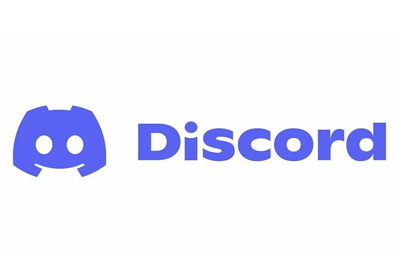
The Discord logo itself uses Ginto Discord Bold. This choice is intentional; it is the most recognizable "brand signal." The font was engineered to be high-impact, ensuring that the brand remains legible even in the most crowded digital spaces, such as mobile app notifications or thumbnail-sized icons. It is designed to be "friendly, modern, and easy to read," effectively stripping away the "tech-bro" coldness often associated with Silicon Valley software.
The Implications for Designers
The most common question from designers is: "Can I use Discord’s fonts?"
The short answer is no. Because GG Sans and the Ginto Discord family are proprietary, they are not licensed for public use. Using them in your own commercial project would constitute a copyright infringement of Discord’s brand assets.
However, the industry has responded by creating high-quality alternatives that capture the "Discord energy." For designers looking to replicate that clean, geometric, and friendly aesthetic, the key is to look for fonts that possess:
- High-x-heights: Essential for readability on screens.
- Geometric Sans-Serif Roots: The core of the modern tech-look.
- Humanist touches: Subtle curves that prevent the text from looking too robotic.
Curated Alternatives for 2026
If you are looking to bring that "Discord vibe" to your projects, consider these professional alternatives available on platforms like Envato:
-
For Ginto Discord Nord styles (Bold/Display):
- Moninger: Offers the same bold, geometric weight that demands attention.
- Grave: Provides a refined, contemporary look for editorial-style headlines.
- Work News: Ideal for condensed, high-impact messaging.
-
For GG Sans styles (UI/Readable):
- Ginseng: A balanced, friendly typeface that scales perfectly from headers to body copy.
- Standerd Grotesk: A neutral, professional choice for interface design.
- Pulse: Offers the rounded, approachable feel that makes chat interfaces feel welcoming.
Frequently Asked Questions
Q: Did Discord change its font?
A: Yes. Between 2021 and 2022, Discord migrated from the licensed Whitney font to a fully proprietary system featuring GG Sans and the Ginto Discord family.
Q: What is the difference between Ginto Discord and Ginto Discord Nord?
A: Ginto Discord Nord is designed for high-impact, large-scale display use (like logos and hero headlines). Ginto Discord is the more versatile, standard version used for supporting copy and branding.
Q: Why does the font matter for chat?
A: In a real-time environment like Discord, a font must be "invisible" enough to allow for fast reading but distinct enough to convey tone. GG Sans was optimized to ensure that long-term usage does not cause eye strain.
Q: Can I use Discord’s fonts for my own branding?
A: No. These are proprietary assets. We recommend using the curated alternatives mentioned above to achieve a similar aesthetic without legal risks.
Conclusion: The Future of Digital Identity
As digital platforms continue to converge, the importance of proprietary typography will only grow. Discord’s shift to custom fonts like GG Sans was a move toward maturity, allowing the company to own its voice entirely. For the creative community, this presents an opportunity to study how typography shapes user behavior and brand loyalty. By understanding the balance between functionality and personality, designers can create digital spaces that feel as welcoming and cohesive as the platform that pioneered this modern typographic standard.