









As the tech world pivots toward the foldable era, Apple’s foray into the segment—the highly anticipated iPhone Duo—has brought with it a unique set of software challenges. While the hardware represents a triumph of industrial design, the user experience on the device’s unique "outer display" has highlighted a growing tension between aesthetic minimalism and functional web accessibility. Apple’s latest initiatives, detailed in recent WebKit communications, suggest that the company is currently grappling with how to optimize the browsing experience without sacrificing the usability of the web.
Main Facts: The Outer Display Challenge
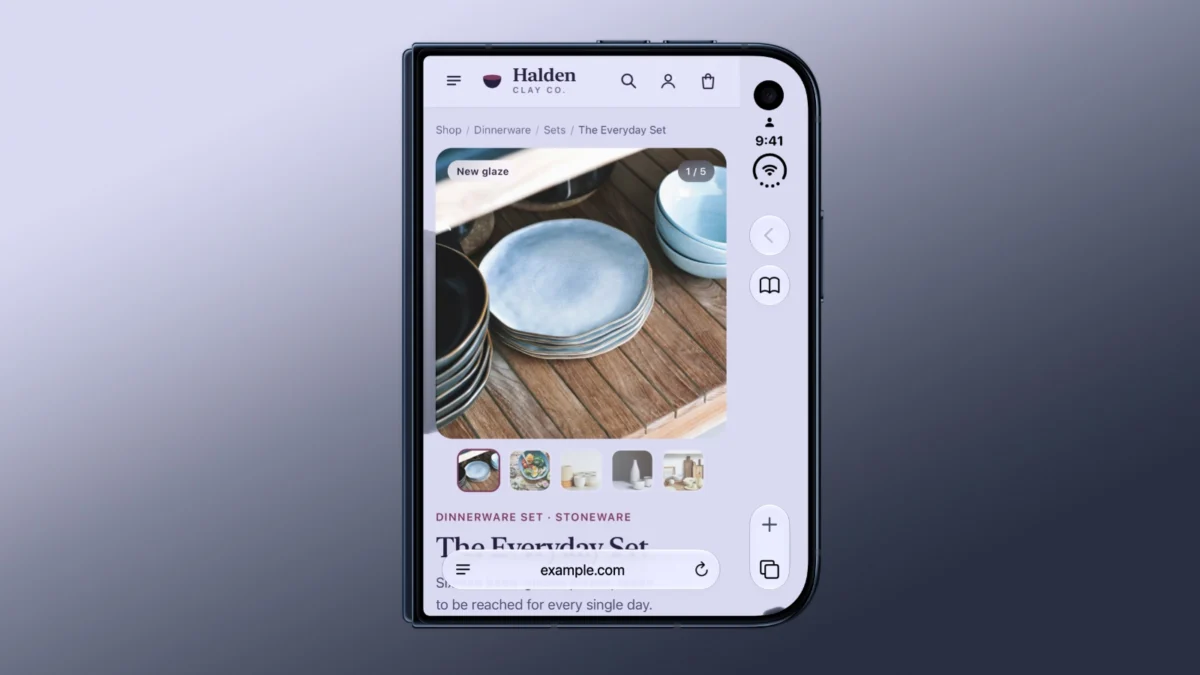
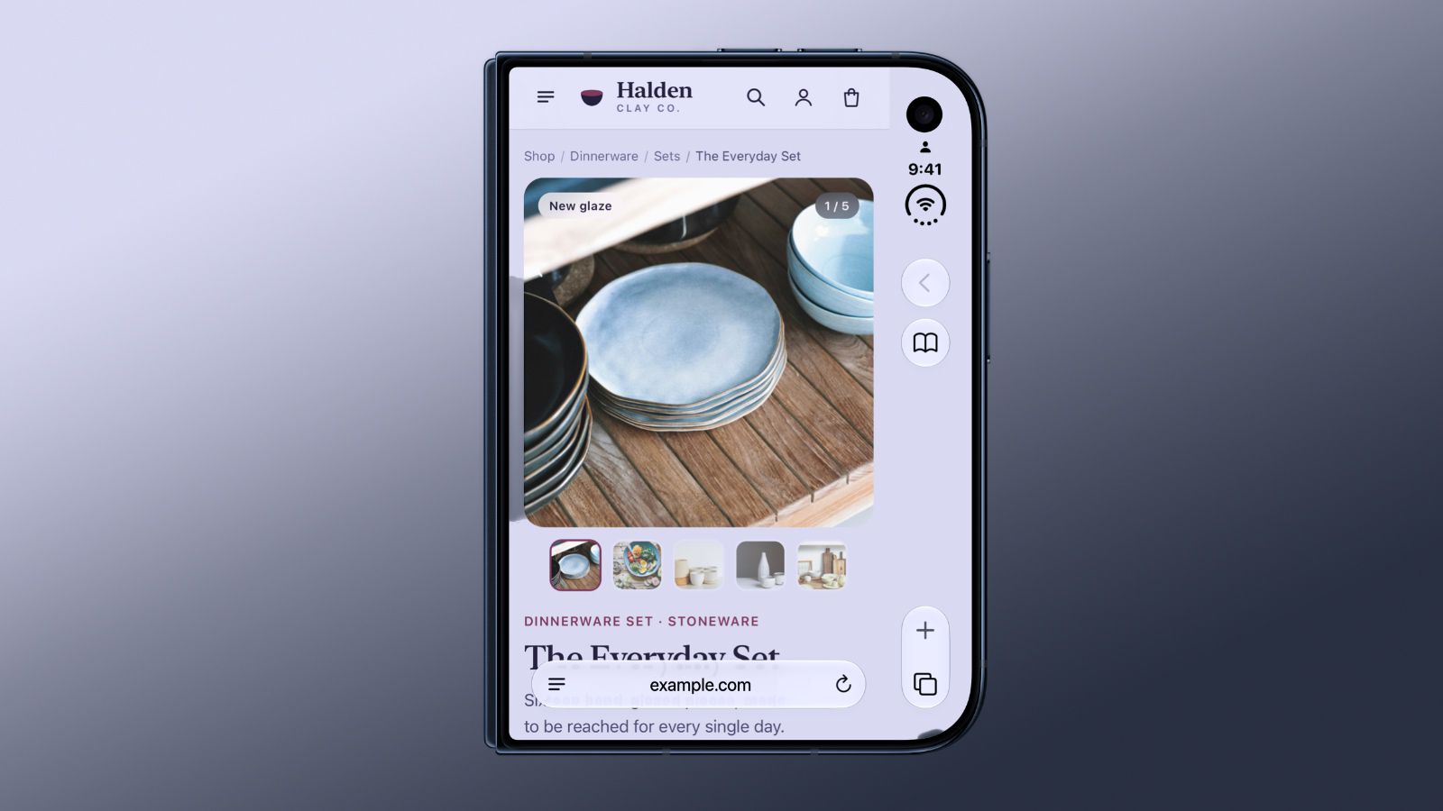
The iPhone Duo, characterized by its distinct form factor, utilizes an outer display that is notably wider and shorter than traditional iPhone screens. To optimize the vertical space for applications and content, Apple designers opted to place the browser’s primary controls—address bars, navigation buttons, and tab managers—along the side of the device rather than at the top or bottom.
Currently, in Safari 27.1, this design choice necessitates a strict boundary. Webpages are confined to the area directly beside these side-mounted controls. To fill the remaining strip of the screen, Safari defaults to using the webpage’s background color. While this keeps the interface clean, it effectively reduces the horizontal width available for content, creating an "inset" browsing experience that some power users find restrictive.
Apple is now exploring ways to allow websites to reclaim this space, effectively enabling them to "bleed" underneath the side-mounted interface elements. However, this is not a simple toggle-on solution. The primary hurdle is ensuring that vital website elements—such as "Buy Now" buttons, navigation menus, or text—do not become obscured or rendered unclickable by the very interface elements designed to help the user navigate.
Chronology of Development
The conversation surrounding the iPhone Duo’s web interface began in earnest as the device moved toward its late-October 2026 launch.
- October 17, 2026: Reports emerge that Apple retail staff have been instructed to steer customers away from walk-in purchases, citing severe supply constraints. This tension sets the stage for a high-pressure product launch.
- October 20, 2026: Apple updates the App Store with screenshots of internal applications, offering the first real-world look at how the company intends to handle the Duo’s unique landscape-oriented interface.
- October 23, 2026: Apple releases the official documentation for Safari 27.1, including a critical WebKit blog post authored by Jen Simmons. The post outlines the current limitations of the browsing experience and hints at future design iterations.
- October 25, 2026: Industry analysts begin analyzing the "feature flags" hidden within the latest Safari build, confirming that Apple is actively testing ways to allow for edge-to-edge rendering on the outer display.
Supporting Data: The viewport-fit Problem
The core of Apple’s research lies in the existing web standard viewport-fit="cover". This attribute, which allows a webpage to expand into areas typically reserved for system UI, is standard practice for notched or rounded-corner iPhones. However, as Jen Simmons noted in the recent WebKit update, the iPhone Duo presents a different geometry that breaks many existing implementations.
Apple’s research indicates that a significant percentage of popular websites are not currently equipped to handle the "cover" property on a device with side-mounted controls. When developers implement this, they are responsible for adding sufficient padding to ensure content remains visible. If a developer fails to account for the space taken up by the side-mounted controls, critical website functionality is effectively hidden under the browser’s interface.
The data suggests that simply flipping a switch to enable full-screen browsing would result in a degraded experience for a majority of the web. Consequently, Apple is investigating a more nuanced approach—perhaps a system that allows headers or background elements to extend to the edge of the display while forcing interactive elements to "snap" into the safe, unobstructed zones.
Official Responses and Engineering Outlook
Apple’s approach to this problem is characterized by caution. The company is historically protective of its user experience, and they are clearly unwilling to allow the web to "break" on their newest flagship device.
Jen Simmons, representing the WebKit team, has been transparent about the ongoing investigation. The goal is to provide developers with greater control over the display area without requiring them to manually account for every possible hardware variation. Apple is exploring a potential middle ground: a "Safe Area" API that would communicate the exact position and size of the side-mounted controls to the browser, allowing the website to dynamically adjust its layout in real-time.
Furthermore, Safari 27.1 introduced a clever feature for when the device is partially folded. When held like a book, the browser automatically switches to a two-page PDF view. This indicates that Apple is leaning into the "posture" of the device, using sensors to adjust the software layout based on how the user is physically interacting with the hardware. These features, currently buried behind experimental feature flags, represent the future of Apple’s browser strategy: an interface that is as malleable as the device itself.
Implications for Developers and Users
The implications of these developments are twofold:
For Web Developers
Developers are currently in a "wait and see" period. While they can experiment with the current folding-posture APIs, they are being cautioned against aggressive design changes until Apple settles on a standard for the side-mounted interface. The shift toward a more dynamic viewport means that the "fixed-width" mentality of the last decade is effectively obsolete for foldable devices. Responsive design must now evolve to include "device-posture awareness."
For the End User
For the average consumer, these software growing pains are part of the "early adopter tax" of the iPhone Duo. While the browser may feel slightly constrained today, the roadmap suggests a move toward a more immersive, truly edge-to-edge experience. The ability to read a document across a fold or browse a website that flows naturally around the device’s physical hardware is the promise of the iPhone Duo.
The Broader Context: A "Major Mistake" or a Necessary Evolution?
The conversation around the iPhone Duo is underscored by the skepticism of industry observers like Mark Gurman, who has been highly critical of the product’s launch. By releasing the device with such limited stock and software that is still being refined, some critics argue that Apple has rushed the process.
However, viewing the Safari 27.1 update through a longer lens, it becomes clear that Apple is not merely fixing a bug—they are architecting a new way for the mobile web to exist. The browser has historically been a static window into the web; on the iPhone Duo, it is becoming a fluid, responsive entity. Whether Apple can successfully navigate the balance between developer freedom and user-experience integrity will likely define the success of their foldable category for years to come.
As of late October 2026, the investigation continues. For now, users can expect a refined, if somewhat conservative, browsing experience, with the promise that future software updates will unlock the full potential of the device’s unique physical landscape. The web is changing, and the iPhone Duo is forcing that change to happen, one pixel at a time.