






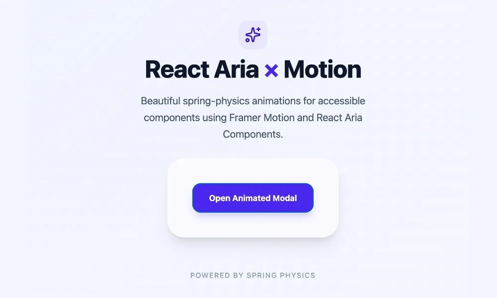
In the modern web development landscape, accessibility and performance often sit at the top of the priority list. Adobe’s React Aria Components has emerged as a premier library for developers who refuse to compromise on either. By providing a collection of headless UI components—such as modals, popovers, and menus—that are fully accessible out of the box, React Aria ensures that applications work flawlessly across mouse, touch, and keyboard interactions.
However, the "headless" nature of these components presents a unique aesthetic challenge. Because they ship with zero pre-defined styles and zero animations, a default implementation can feel stark. Popovers appear instantaneously, and modals snap into view with a jarring lack of transition. While this "raw" functionality is perfectly suited for internal enterprise tools, customer-facing products often require a layer of polish. In professional design systems, motion is not just "eye candy"—it is a critical signal of quality and spatial awareness that guides the user’s eye.
The Core Challenge: Bridging Accessibility and Aesthetics
The central tension in UI development is balancing the performance benefits of a lightweight, headless library with the high-fidelity user experiences expected in modern web apps. React Aria is designed to be a foundation; it handles the complex logic of focus management, ARIA roles, and keyboard navigation. The aesthetic layer is left entirely to the developer.
For developers seeking to implement smooth transitions, the challenge lies in maintaining that accessibility. If an animation library improperly removes a component from the DOM before an exit transition completes, it can break screen readers and focus traps. React Aria solves this by providing native hooks into the component lifecycle, allowing developers to add motion without sacrificing the robust accessibility architecture that makes the library so valuable.
Chronology: From Static Components to Dynamic Interfaces
The evolution of React Aria’s animation support reflects the broader shift in React development. Initially, developers were forced to implement complex, custom logic to sync DOM removal with CSS transition timing. This often led to "flickering" issues where elements would disappear before the exit animation finished.
1. The Data-Attribute Era
React Aria introduced native support for [data-entering] and [data-exiting] states. This was a watershed moment. By baking these attributes directly into the library’s lifecycle, Adobe allowed developers to trigger CSS animations directly from the DOM state.
2. The Integration of Motion
As design trends moved toward physics-based interactions—springs, bounces, and gesture-driven UI—CSS alone proved insufficient. The integration of the Motion library (formerly Framer Motion) via motion.create() provided a seamless pathway for developers to wrap React Aria components. This allowed for the complex choreography of modals and overlays that define the "premium" feel of current SaaS platforms.
CSS Transitions: The Lightweight Powerhouse
For most standard UI requirements, CSS is not only sufficient but preferable. It eliminates the need for JavaScript-based animation libraries, keeping the bundle size small and performance high.
Leveraging Data States
React Aria’s overlay components (including Popover, Modal, ModalOverlay, Tray, and Menu) expose specific data attributes that allow for surgical control over transitions.
When a component enters the DOM, it is tagged with [data-entering]. When it is triggered to close, the library applies [data-exiting]. Crucially, React Aria pauses the actual removal of the element from the DOM until the animation completes, provided the CSS handles the timing.
.react-aria-Popover
  transition: opacity 200ms, translate 200ms;


.react-aria-Popover[data-entering],
.react-aria-Popover[data-exiting]
  opacity: 0;
  translate: 0 -8px;
This simple block creates a professional fade-and-slide effect. Because the browser handles the transition, the CPU overhead is negligible, ensuring that your application remains responsive even on low-end mobile devices.
Advanced Keyframes for Polish
While standard transitions are great for simple fades, @keyframes provide the nuance required for sophisticated UI. By defining distinct entering and exiting keyframes, developers can create asymmetrical animations—for example, a slow, gentle "ease-out" when a menu opens, followed by a crisp, fast "ease-in" when it vanishes. This subtle difference in timing reinforces a sense of responsiveness and intention in the interface.
Supporting Data: When to Choose Which Tool
Choosing the right animation strategy depends on the complexity of the interaction. Below is a framework for deciding between native CSS and JavaScript-driven motion libraries.
| Feature | CSS Transitions/Keyframes | Motion (JavaScript) |
|---|---|---|
| Complexity | Low (Simple Fades/Slides) | High (Physics/Gestures) |
| Bundle Size | Zero additional weight | Requires external dependency |
| Performance | Excellent (GPU accelerated) | Very Good (Optimized) |
| Use Case | Overlays, Tooltips, Menus | Draggable modals, complex layouts |
For non-overlay components like Button or Slider, which remain in the DOM, CSS remains the gold standard. Use [data-pressed] or [data-selected] attributes to trigger state changes, creating an interactive feel that rewards the user for their input.
Official Guidance: Integrating Motion for Complex UI
When a project requires physics-based animations—such as a modal that "springs" into place with a slight bounce—CSS transitions hit their limit. This is where the Motion library becomes essential.
The integration process is straightforward:
- Installation:
npm install motion - Wrapping: Use
motion.create()to transform standard React Aria components into animatable ones. - Orchestration: Utilize
AnimatePresenceto manage the lifecycle of components that are mounting and unmounting.
By wrapping a ModalOverlay in AnimatePresence, developers can define initial, animate, and exit states. The AnimatePresence component acts as a gatekeeper, ensuring that the exit animation is fully rendered before the DOM node is purged.
Implications for the Industry
The shift toward accessible, animated UI signals a maturation in how we build for the web. For years, the "accessible" web was synonymous with "boring" or "static." By decoupling the logic (React Aria) from the presentation (CSS or Motion), developers are no longer forced to choose between the two.
1. Performance-First Design
By providing these hooks, Adobe is encouraging a performance-first mindset. Developers are prompted to start with the simplest solution (CSS) and only introduce heavier dependencies when the design requirements dictate it.
2. Standardizing User Experience
As these patterns become standard, we can expect a more unified experience across the web. Users are becoming accustomed to consistent, smooth transitions. When a modal snaps into place, it feels like a native application; when it fades in, it feels like a modern web interface. Consistency in these micro-interactions builds user trust.
3. Future-Proofing
Because React Aria is built on a foundation of stable, standardized accessibility practices, components animated via these methods are inherently more future-proof. They will work with future browser updates, new CSS properties, and evolving assistive technology, ensuring that your product remains usable for all, regardless of their hardware or software constraints.
Conclusion
Animation is a powerful tool for visual hierarchy and user feedback. By mastering the integration of React Aria with both native CSS and the Motion library, developers can create interfaces that are not only highly accessible but also visually sophisticated.
Whether you are building a simple popover or a complex, physics-driven modal, the path forward is clear: start with the data states provided by React Aria to handle the basics, and reach for Motion when the interaction calls for that extra touch of character. By following these patterns, you ensure that your product remains both functional and delightful—the hallmark of professional web development in the modern era.