






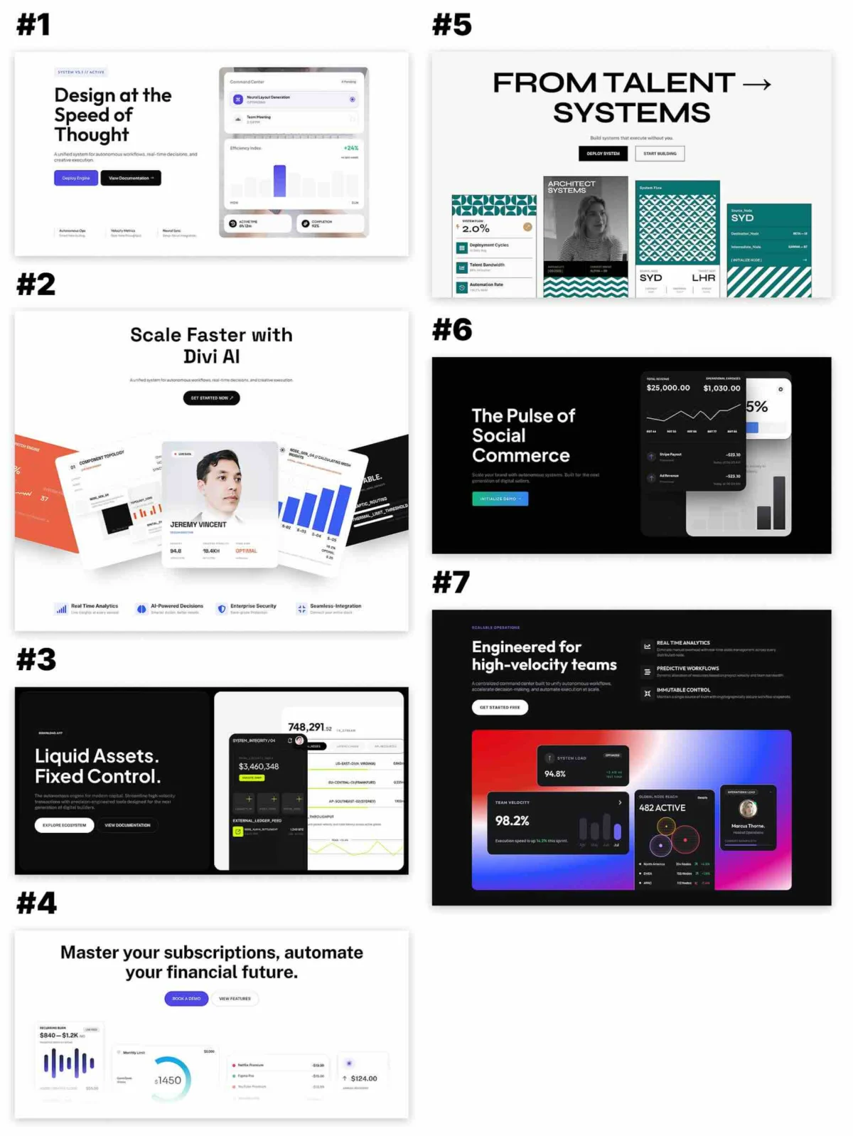
The "hero" section is the digital handshake of the modern web. It is the first point of contact between a brand and its potential customer, and in the competitive landscape of SaaS, software development, and digital agencies, that first impression must be immediate, authoritative, and visually compelling. Recognizing the pivotal role of these sections in shaping user perception, Elegant Themes has released a new, free collection of seven UI-focused Hero Sections designed exclusively for the Divi 5 ecosystem.
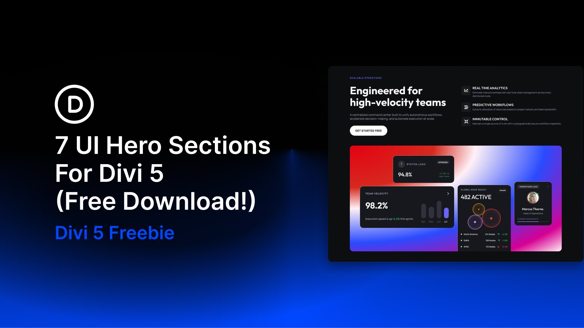
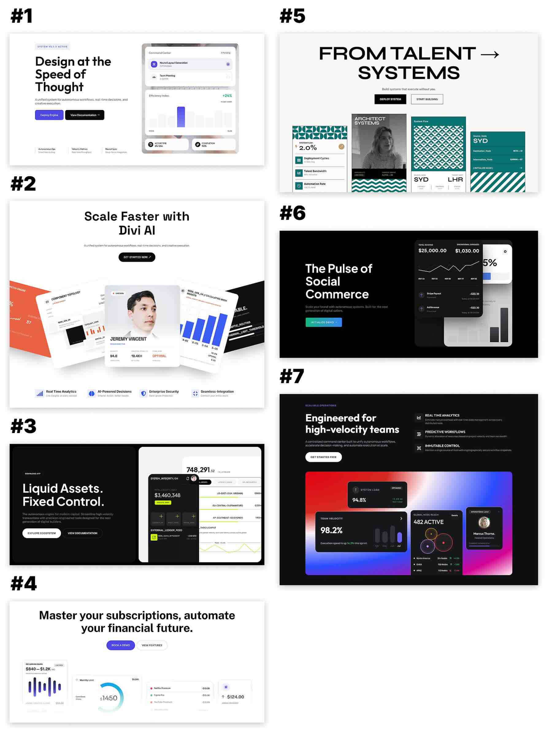
This collection is not merely a set of templates; it is a strategic toolkit designed to help designers and developers establish a sophisticated visual language, clear hierarchy, and professional direction for their landing pages. By leveraging bold, interface-inspired compositions and structured typography, these assets offer a modular pathway to building high-converting digital experiences.
The Core Concept: Why UI-Centric Design Matters
In a digital-first economy, the product is the brand. For software companies, analytics platforms, and creative studios, the ability to communicate functionality through visual storytelling is paramount. The new Divi 5 Hero Pack focuses on "product context"—the art of showing, rather than just telling, what a digital tool can achieve.
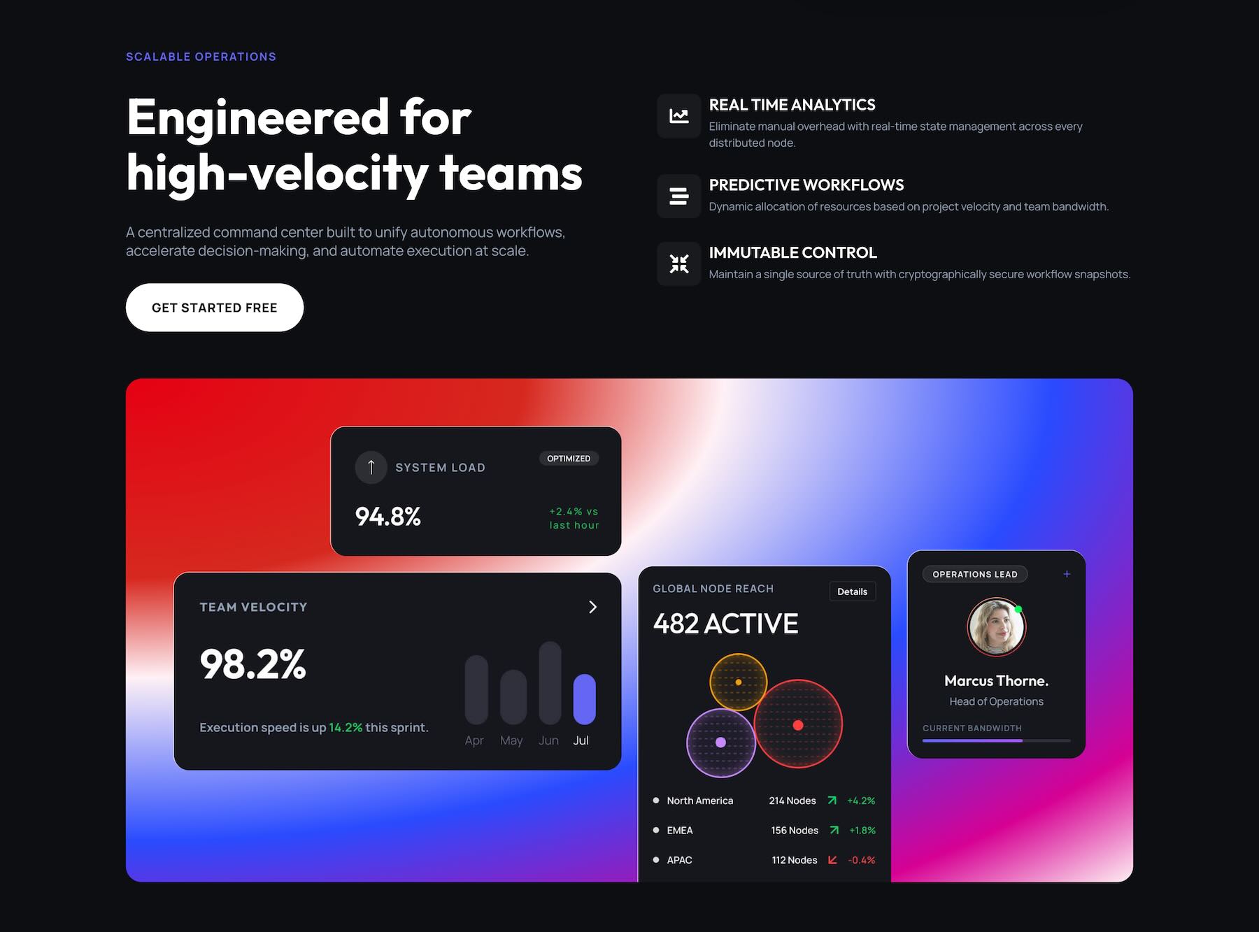
These designs serve as high-fidelity starting points. Whether a project requires a minimalist, single-interface preview or a complex, multi-layered dashboard presentation, this collection provides the architectural framework necessary to build trust instantly. By importing these layouts, users can bypass the "blank canvas" phase and immediately begin tailoring the content to their specific brand requirements.
Chronology: The Evolution of the Divi Hero
The release of these seven sections arrives as a milestone for the Divi 5 platform, which has been architected to handle increasingly complex, performance-driven layouts.
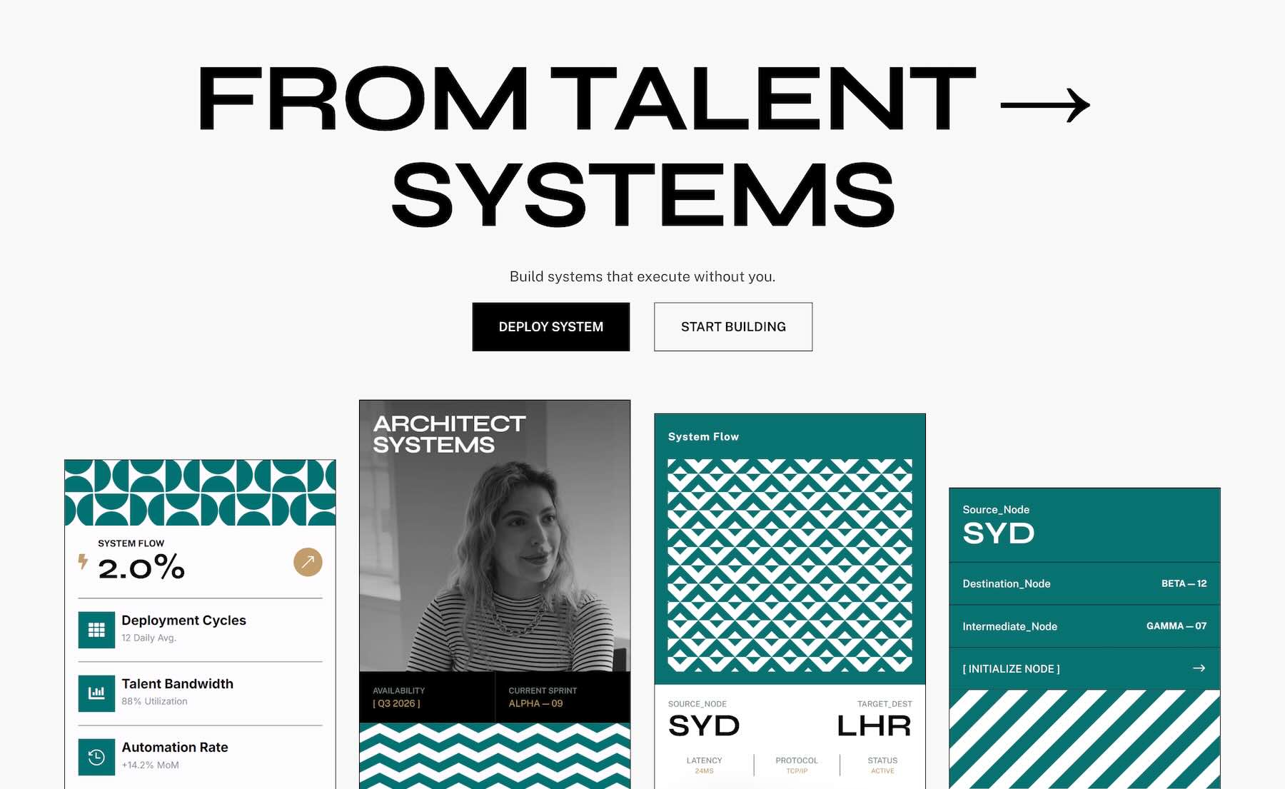
- Initial Concept Phase: Developers identified a gap in the market for "interface-first" designs that prioritize screenshots and dashboard mockups over stock photography.
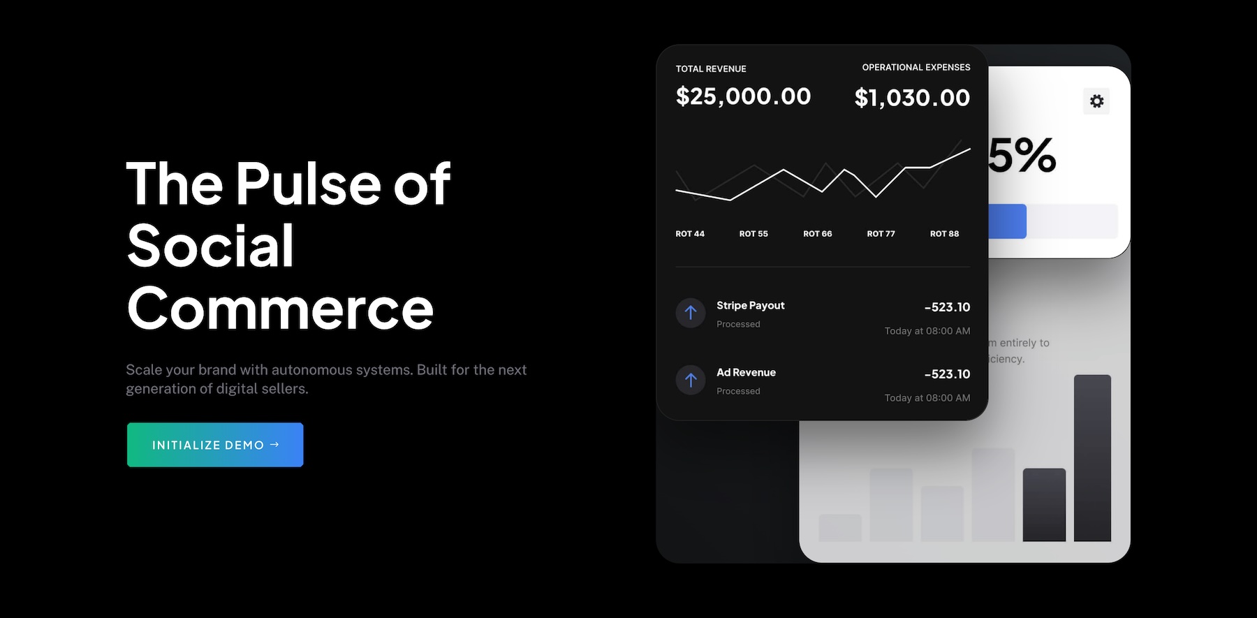
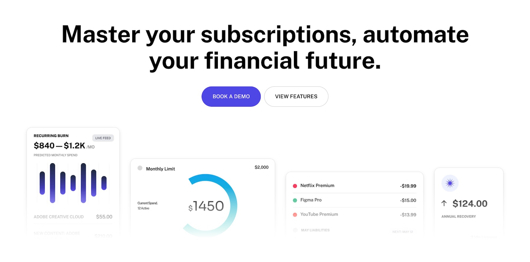
- The Design Sprint: The team focused on creating a variety of layouts, ranging from dark-mode, high-contrast dashboard visualizations to light-mode, editorial-style modular cards.
- Integration Testing: Each section was refined to ensure full compatibility with Divi 5’s Composable Settings, allowing for deeper customization without the need for custom CSS.
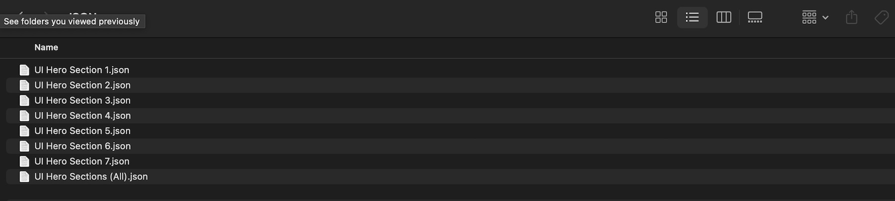
- Final Optimization: The collection was finalized as a set of JSON imports, ensuring that users could choose between individual styles or a comprehensive library update.
Supporting Data and Design Philosophy
The efficacy of these hero sections is backed by modern UI/UX principles. The collection explores two primary methodologies:
1. The Centralized Dashboard Approach
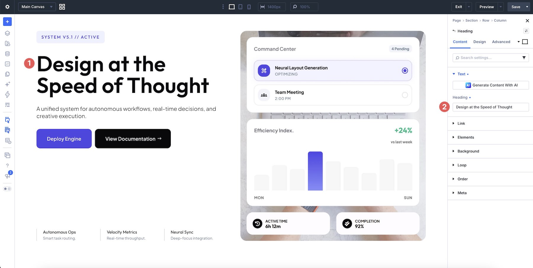
This methodology relies on a singular, high-impact visual. By placing a dashboard-inspired composition at the heart of the hero, the design forces the user to focus on the core functionality of the product. These designs often utilize bright gradients against dark backgrounds to create a "glowing" or "illuminated" effect, which is highly effective for SaaS products and AI-driven platforms.
2. The Modular System
For more complex offerings, a single image may not suffice. The "Modular System" uses multiple cards, panels, and grid-based visuals to break down a product into its constituent parts. This approach is superior for platforms that offer multiple workflows or distinct feature sets, allowing the user to scan the page and understand the value proposition at a glance.
Professional Implementation: A Step-by-Step Guide
To ensure these assets perform effectively, users should adhere to a structured implementation process.
Step 1: Strategic Importing
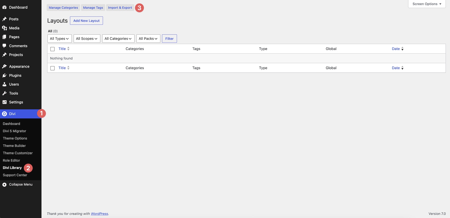
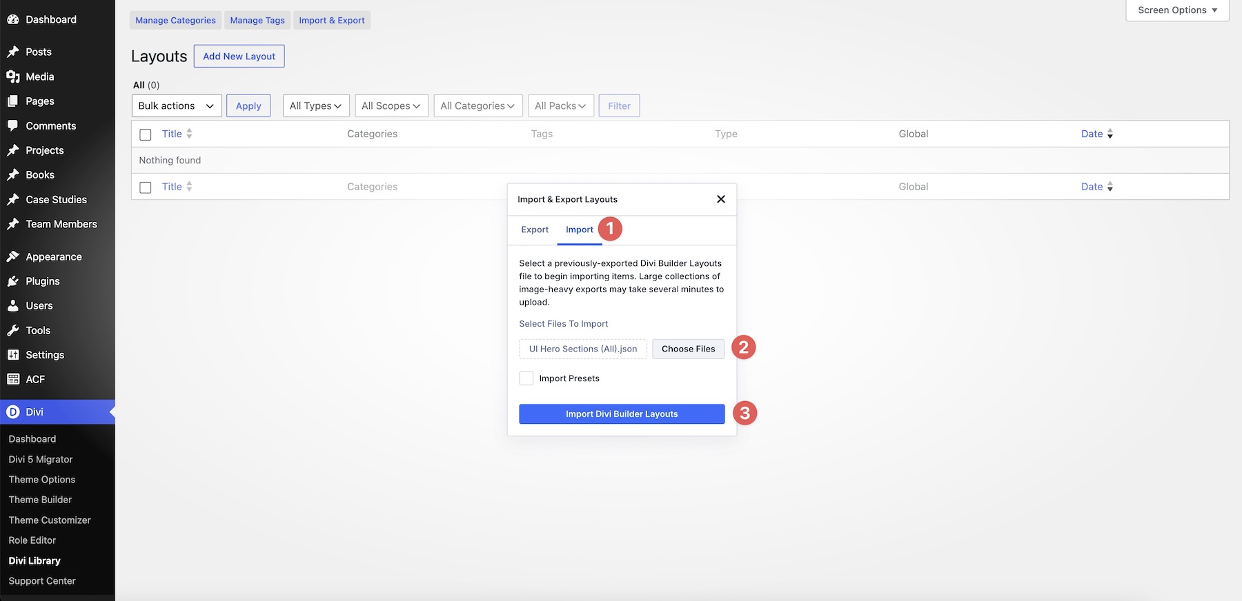
Navigate to the Divi Library in the WordPress dashboard. By selecting the "Import & Export" function, users can import individual JSON files or the entire collection. It is critical to import the JSON file directly, ensuring the library structure remains intact.
Step 2: Strategic Content Replacement
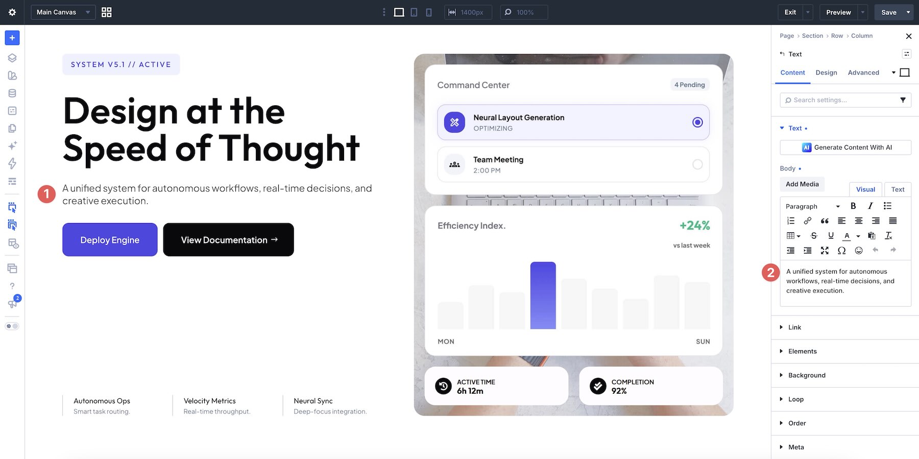
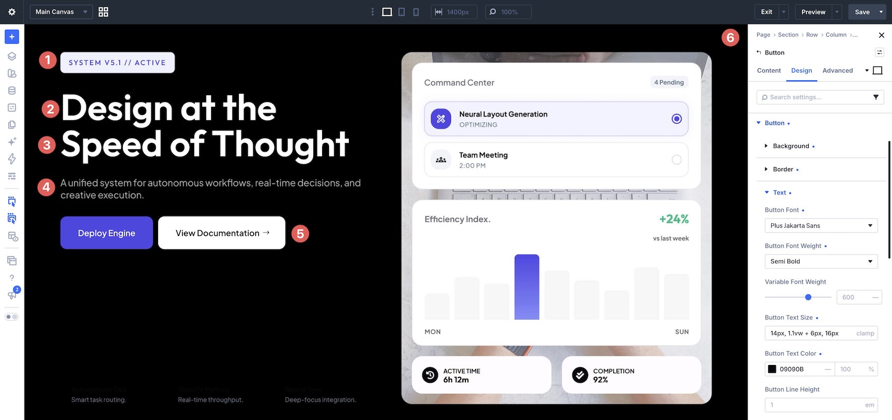
Once the section is loaded into the Visual Builder, the priority must be the copy. The headline should be concise, addressing the user’s primary pain point or desired outcome. When replacing the sample text, it is advised to keep the length consistent with the original design to prevent layout breaking or undesirable wrapping.
Step 3: High-Fidelity Visual Integration
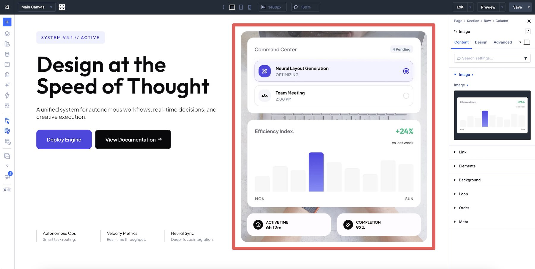
The interface imagery is the defining feature of these sections. Users are encouraged to:
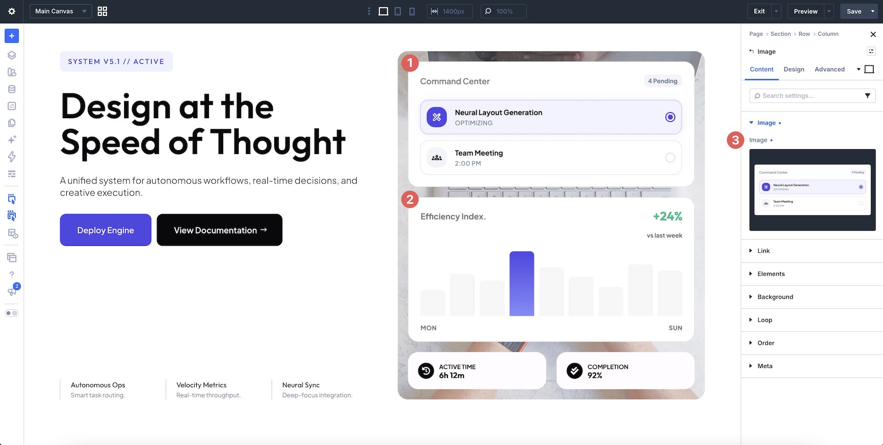
- Use real screenshots of their software to build authentic trust.
- Maintain the aspect ratios of the original placeholders.
- Utilize the Layers panel to manage complex, overlapping UI elements with precision.
Step 4: Refining the "Call to Action" (CTA)
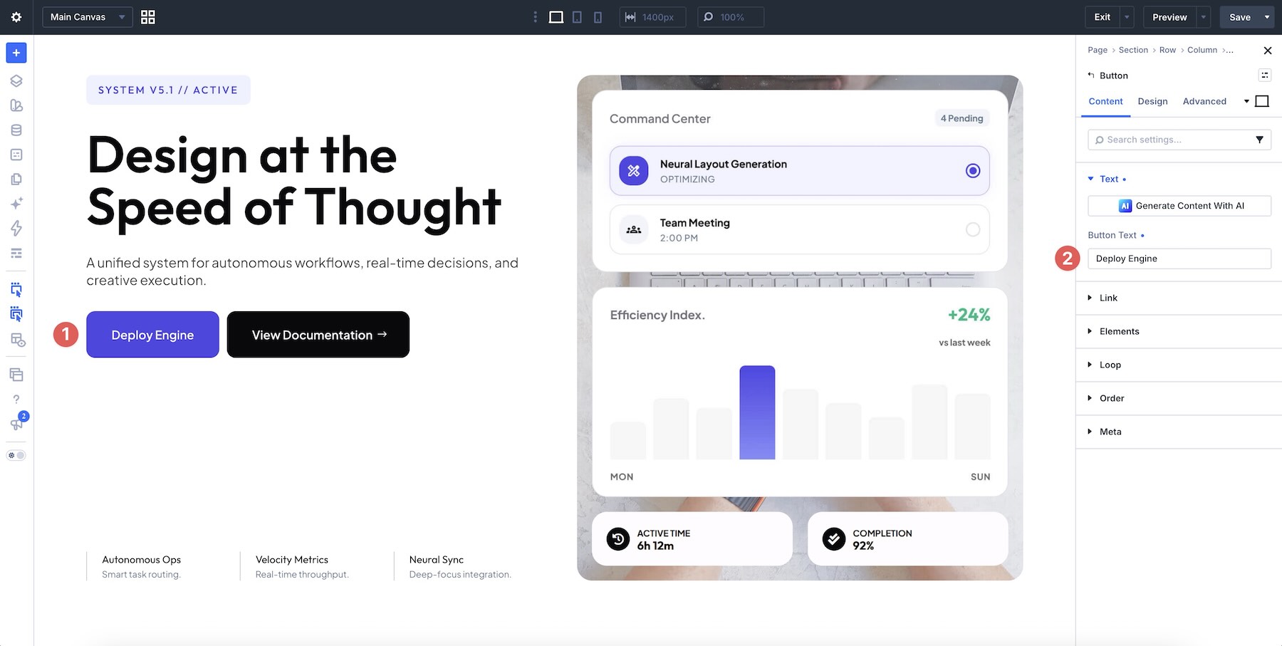
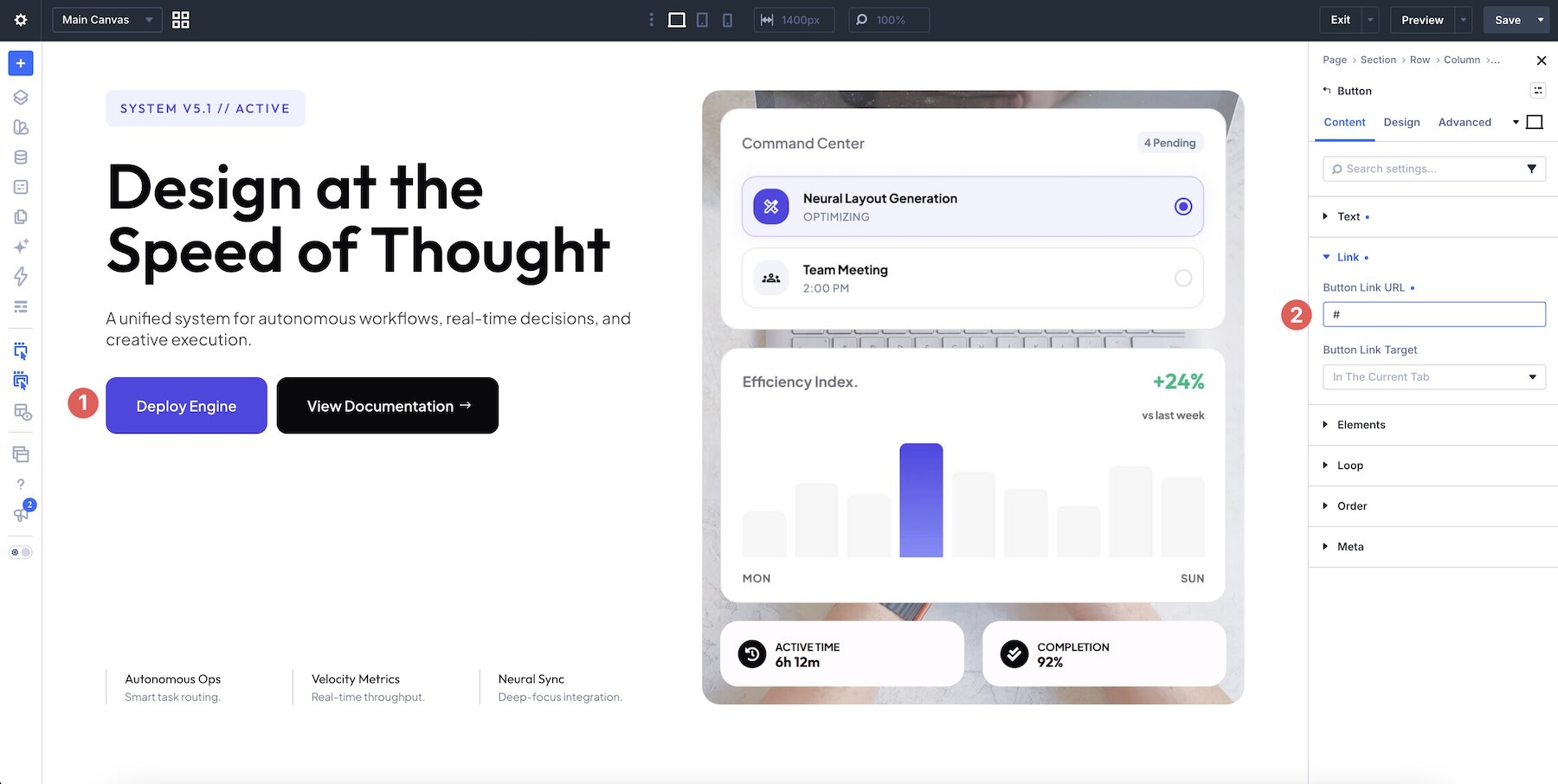
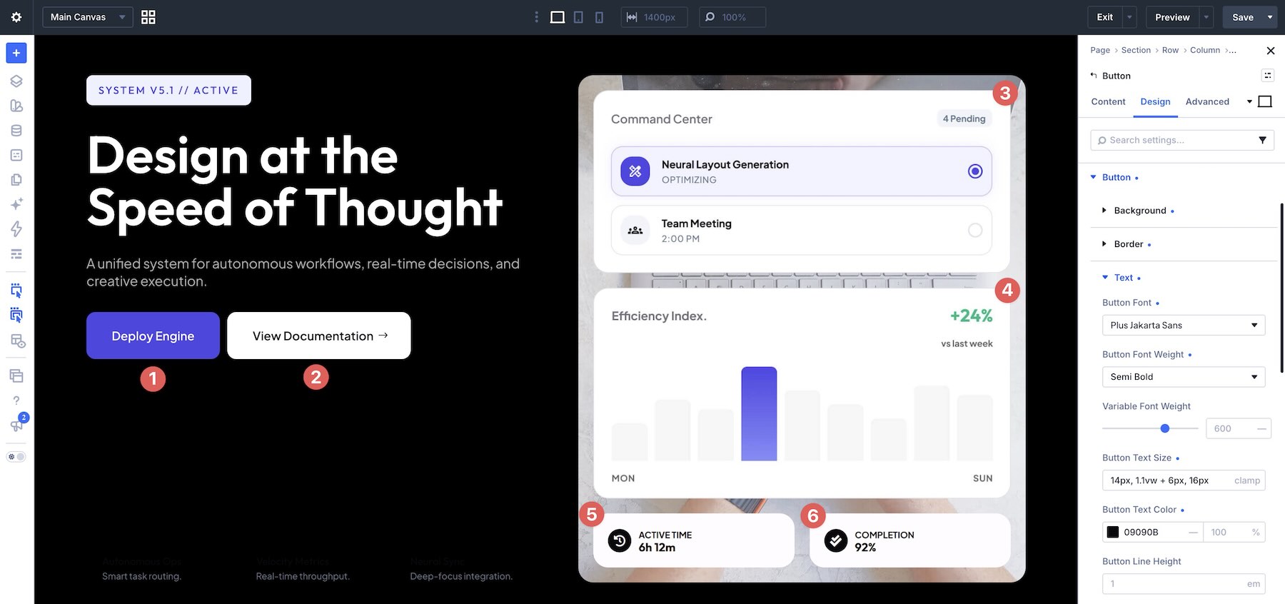
A hero section is useless without a conversion path. The provided buttons should be updated with clear, action-oriented labels—"Start Free Trial," "Book a Demo," or "Explore Features." Furthermore, ensure that the visual hierarchy supports the primary action, using distinct colors or styling to make the main button stand out against secondary links.
Official Guidance: Optimizing for Performance and Clarity
Elegant Themes emphasizes that these designs are "starting points." To maximize their effectiveness, users should follow these professional best practices:
- Prioritize Readability: Never sacrifice legibility for aesthetics. If an interface detail is too small to be understood, remove it. Use larger text elements outside the screenshot to explain key features.
- Contrast is Key: Use borders, subtle shadows, and background panels to separate the product UI from the page background. This creates a "floating" effect that draws the eye directly to the product.
- Responsive Integrity: The most significant challenge with UI-heavy designs is the transition to mobile devices. Users must review the layout across all breakpoints. If a design becomes cluttered on a smartphone, prioritize the core message and the primary CTA, potentially hiding secondary UI elements that do not add critical value on smaller screens.
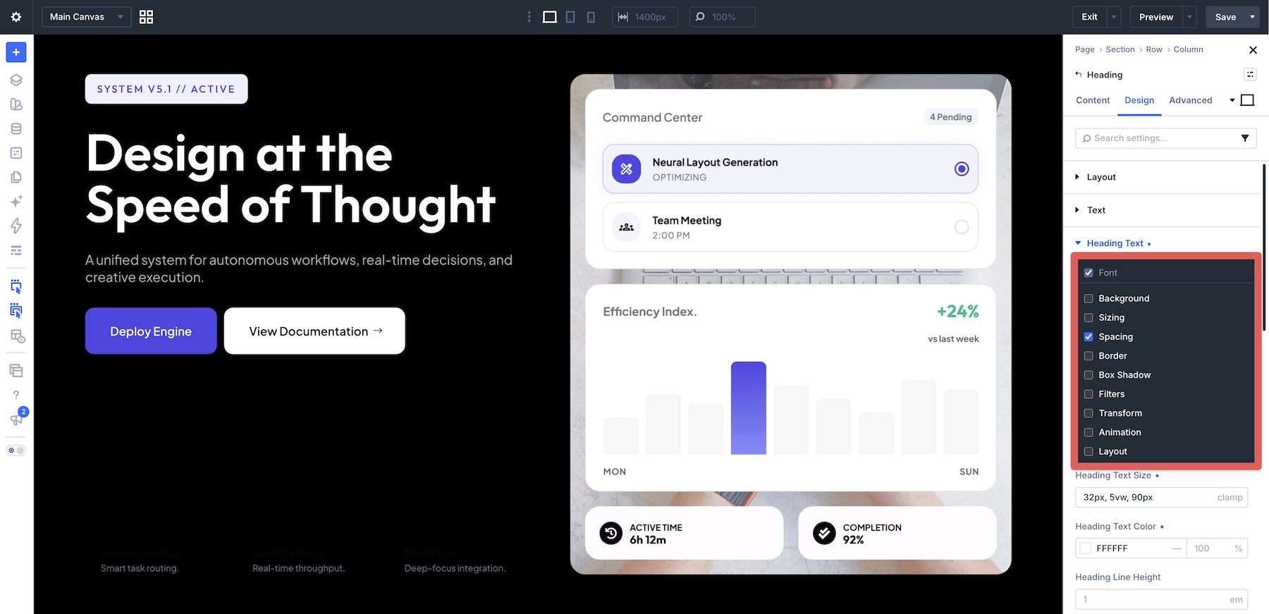
- Design Variables: For agencies managing multiple client projects, saving colors and styles as Design Variables within Divi 5 is essential. This allows for rapid brand adaptation and ensures consistency across the entire website.
Implications for the Industry
The release of this pack has significant implications for web designers and digital product owners. It lowers the barrier to entry for high-end design, effectively democratizing the "software-as-a-service" aesthetic.
By providing a professional, ready-to-use foundation, Elegant Themes is shifting the focus from "how to build a layout" to "how to best showcase a product." For the end-user, this means a faster time-to-market for their websites. For the developer, it means less time spent wrestling with layout structures and more time spent on conversion rate optimization (CRO) and content strategy.
As web standards continue to evolve toward more interactive and data-dense interfaces, having a library of pre-tested, responsive hero sections is a distinct competitive advantage. Whether you are launching a new AI startup, an e-commerce platform, or a consultancy firm, these seven UI Hero Sections provide the necessary scaffolding to project authority and professional excellence in an increasingly crowded digital marketplace.
Conclusion: A Foundation for Growth
The 7 UI Hero Sections for Divi 5 represent a synthesis of modern design trends and practical utility. They are built for those who understand that in the digital world, the first few seconds of a visitor’s experience are the most valuable. By downloading this collection, you are not just getting a set of layouts; you are acquiring a proven framework to help your product stand out, communicate clearly, and convert visitors into long-term users.
Start by importing the collection today, and begin the process of refining your brand’s digital presence with the precision and professionalism that Divi 5 is designed to deliver.