







In the world of design, the most challenging canvas is often the smallest one. Whether it is a dense financial dashboard, a mobile application’s secondary menu, or the fine print of an editorial layout, small-scale typography demands a level of precision that larger display fonts do not require. When screen real estate is at a premium or print space is constrained, the difference between an elegant, user-friendly experience and a frustrating, illegible mess often comes down to a single choice: the font.
Readability is the bedrock of effective communication. When text shrinks, the delicate details of a typeface—the serifs, the stroke contrast, and the negative space—can easily collapse into illegible shapes. This article explores the essential criteria for selecting small-text fonts and presents a curated list of professional-grade and free typefaces that balance aesthetic personality with uncompromising clarity.
The Anatomy of Small-Text Readability
Designers often make the mistake of choosing a font based on its appearance at a high resolution. However, a typeface that commands attention in a hero banner may be completely unreadable when rendered at 8 or 10 points.
To maintain legibility at reduced sizes, a font must possess specific structural traits. These include an open aperture, which prevents counters (the holes in letters like ‘o’, ‘a’, and ‘e’) from clogging up, and a generous x-height, which ensures that lowercase letters have enough vertical presence to be distinguished quickly by the eye. Furthermore, stroke contrast—the variation between thick and thin lines—must be kept to a minimum to prevent thin hairlines from disappearing entirely when rendered on lower-resolution displays.
Top-Tier Serif Fonts for Small-Scale Elegance
Serif fonts are often avoided in small-scale applications due to the fear that the serifs will "bleed" together. However, modern typography has evolved, and several serif families are engineered specifically to retain their structure at microscopic sizes.
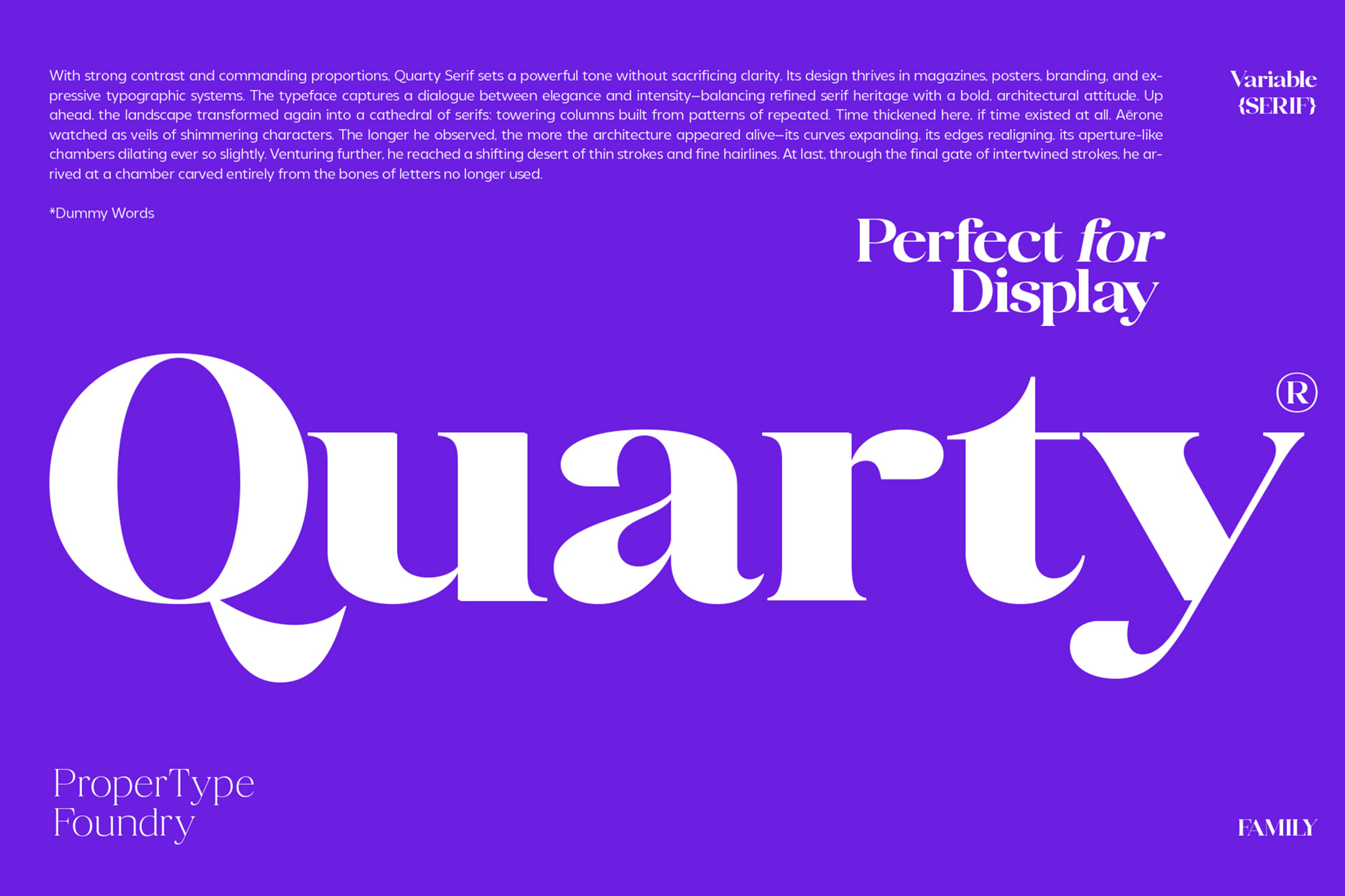
1. Quarty: The Refined Serif
Quarty is a masterclass in geometric-meets-graceful design. It offers a unique balance of sharp angles and soft curves, providing a sophisticated aesthetic that does not sacrifice clarity. Its inclusion of extensive ligatures and alternates makes it a favorite for high-end editorial work where every character must carry its weight.
2. Carlgine: The Versatile Powerhouse
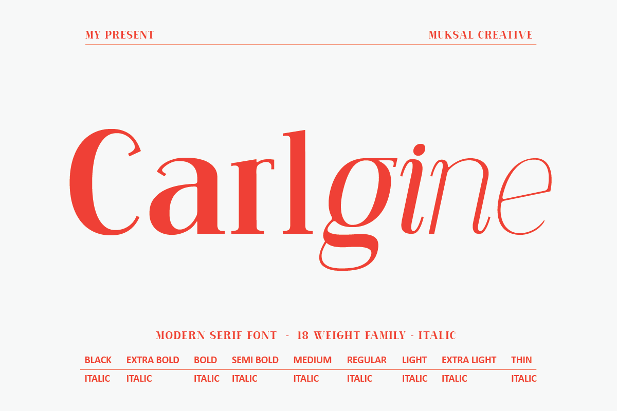
Carlgine brings a level of robustness to the serif category. With 18 distinct weights ranging from a delicate "Thin" to an imposing "Black," it provides designers with the ability to maintain a consistent brand voice across an entire UI hierarchy. Its support for multiple languages and stylistic glyphs ensures it remains highly functional for global digital projects.
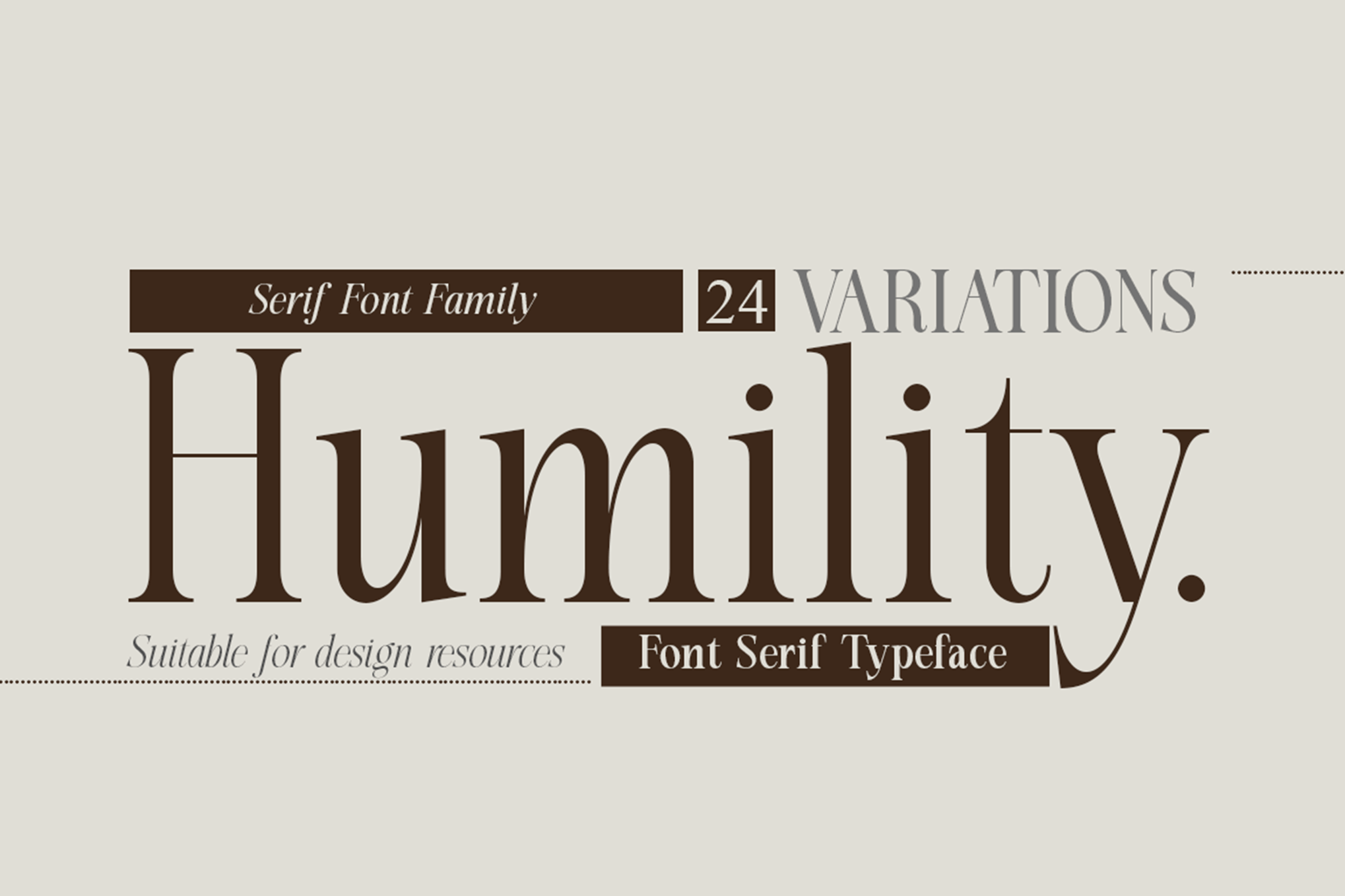
3. Humility: Vintage Flair with Modern Precision
For projects requiring a touch of classic character, Humility is an exceptional choice. It channels a vintage aesthetic without the "clutter" that often accompanies older serif styles. With 24 variations, it is well-suited for fashion publications or boutique branding where the font must feel as premium as the product it describes.
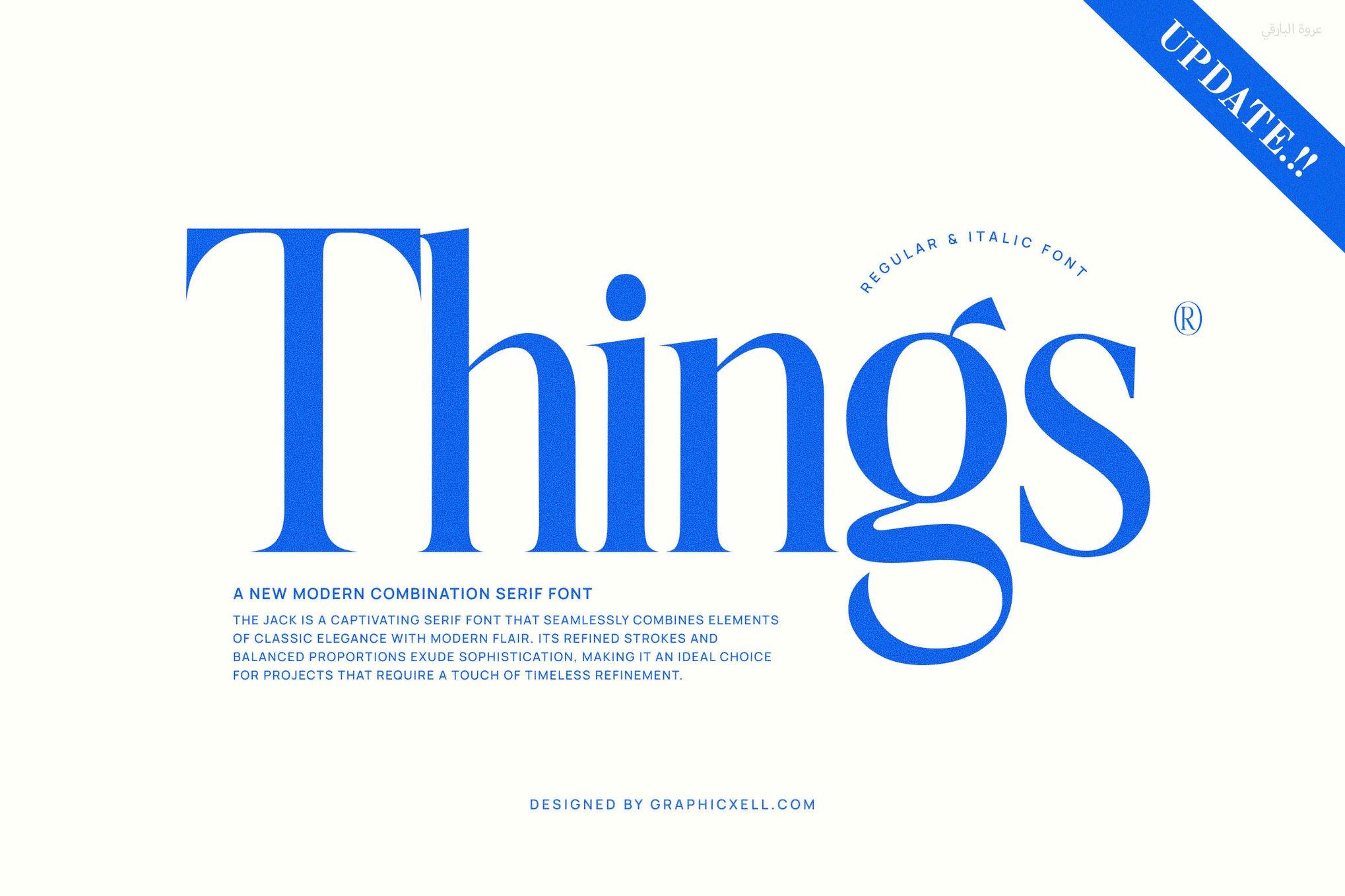
4. Things: The Modern Standard
"Things" is a font family that bridges the gap between historical tradition and modern necessity. Its clean lines are optimized for digital legibility, making it an excellent candidate for long-form reading applications, such as e-books or complex web interfaces, where eye fatigue is a primary concern.
Sans-Serif Solutions for Modern Interfaces
Sans-serif typefaces are the workhorses of the digital age. Their lack of decorative strokes allows for a more open, "breathable" appearance, which is vital for mobile apps and dashboards.
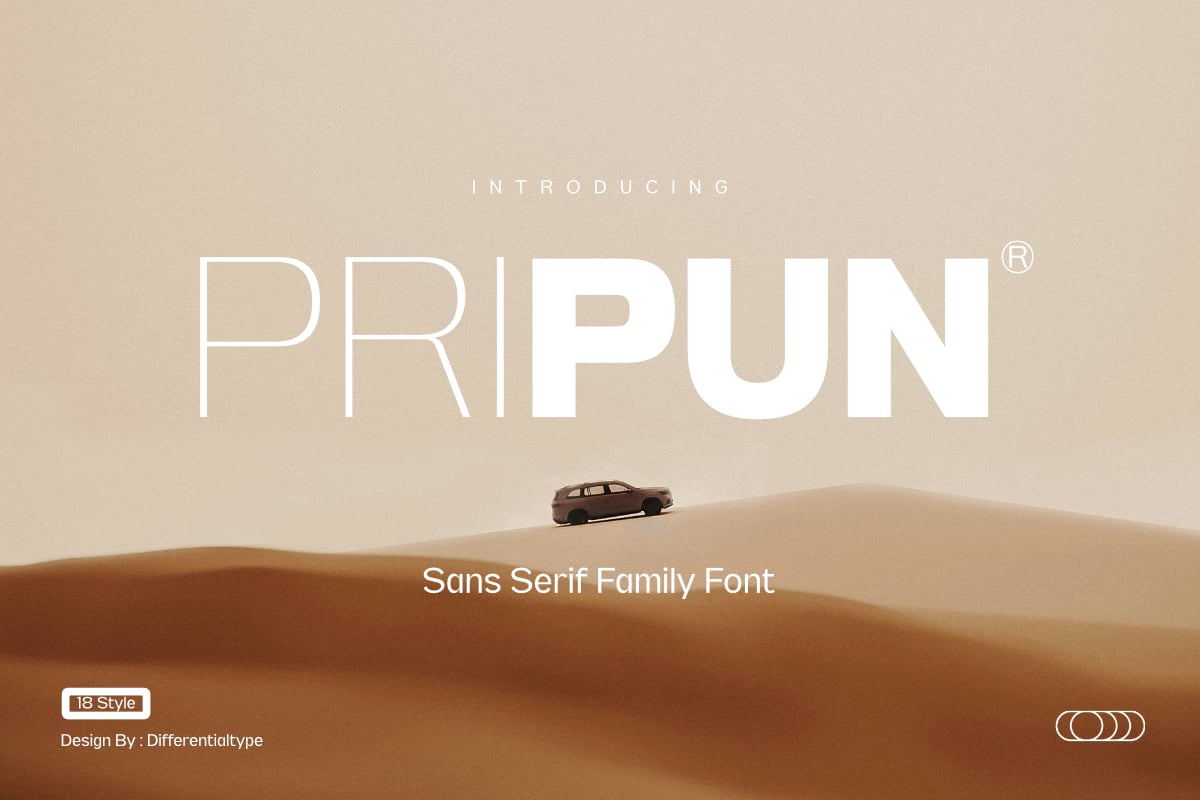
1. Pripun: Precision at Scale
Pripun stands out for its clinical, clean approach. With 18 styles, it provides the granularity needed to build a complex design system. Its letterforms are constructed with mathematical precision, ensuring that whether it is used in a tiny label or a bold sub-header, the character recognition remains instant.
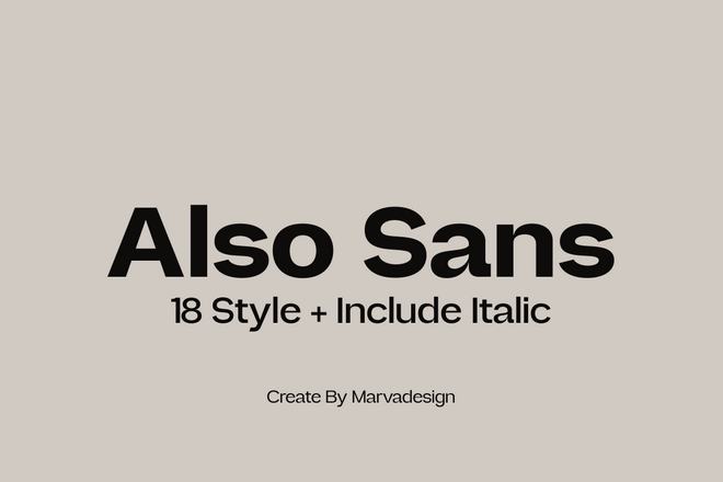
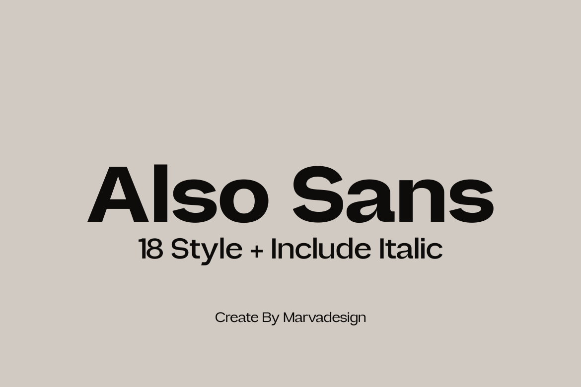
2. Also Sans: Simplicity Defined
True to its name, Also Sans is a simple, effective solution. Its open counters allow it to remain legible even when text is tightly packed, which is essential for mobile data tables or complex information architecture.
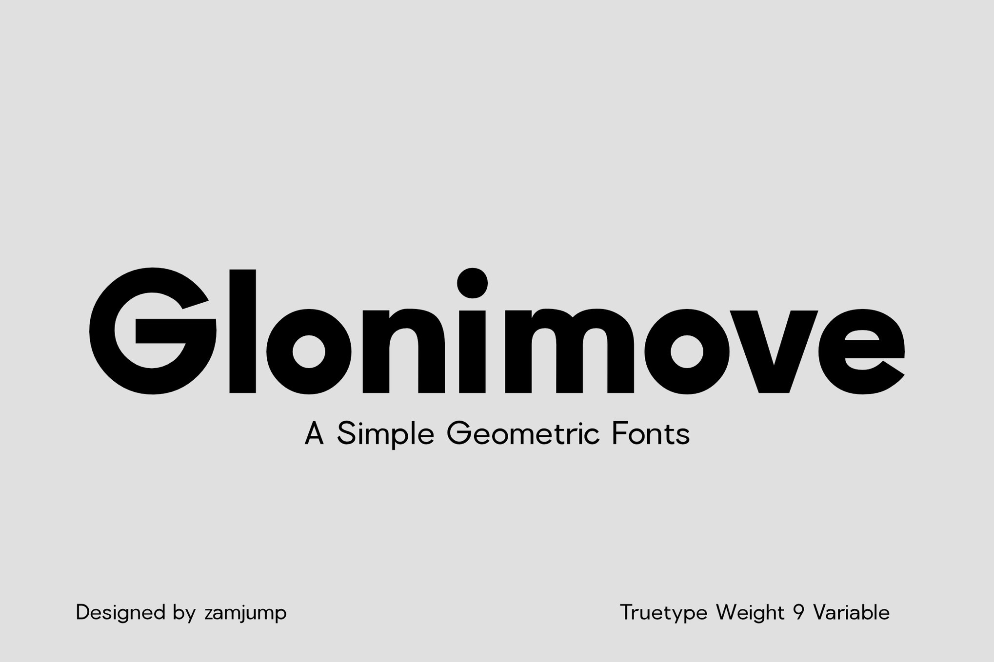
3. Glonimove: Geometric Sophistication
Glonimove leans into the geometric trend but avoids the common pitfalls of being overly stylized. Its variable weights allow for fluid transitions in design, and it functions as a highly reliable typeface for signage and print materials where viewing distances vary.
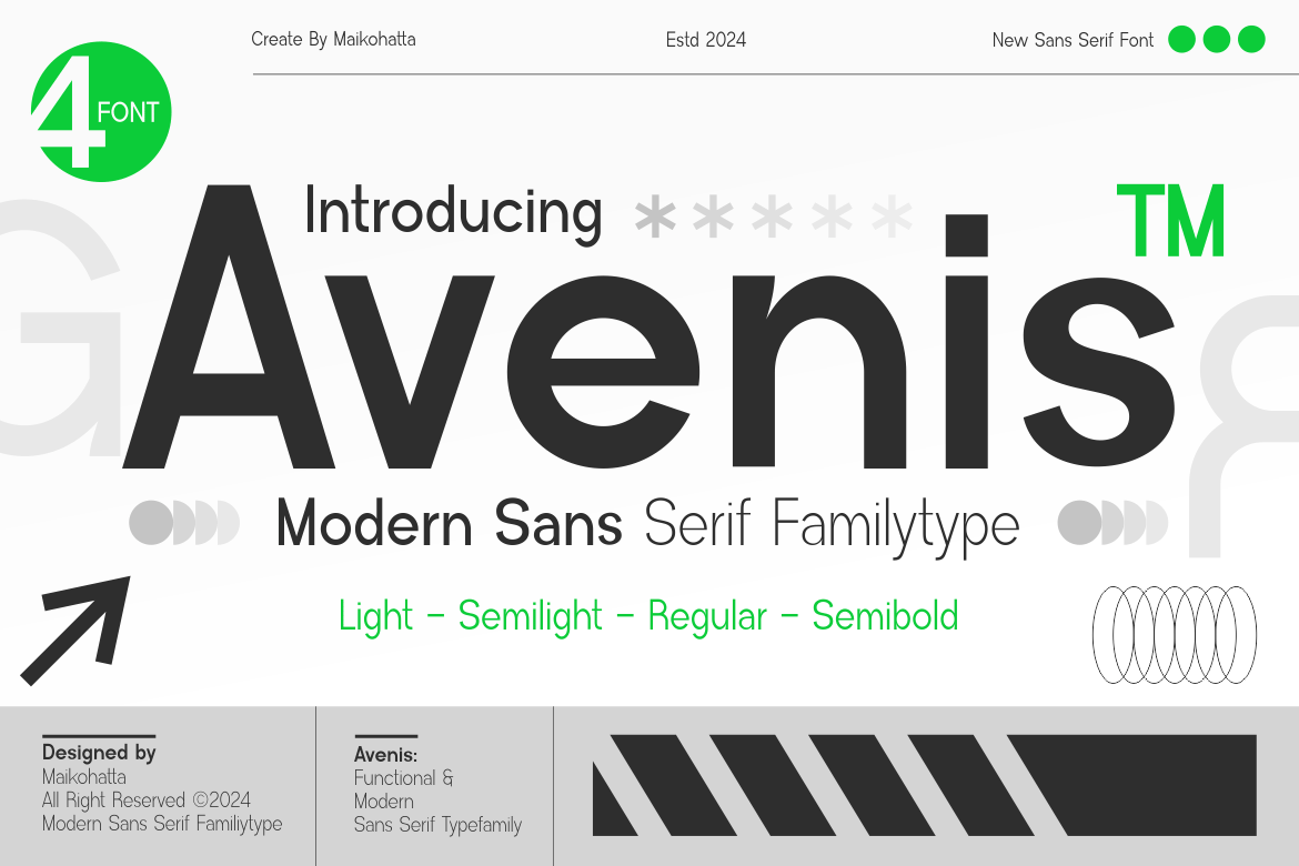
4. Avenis: The Modernist Choice
Avenis offers a contemporary, airy feel. It is particularly effective in light weights, where many other fonts might falter. Its, wide character set and multilingual support make it a go-to for global brands.
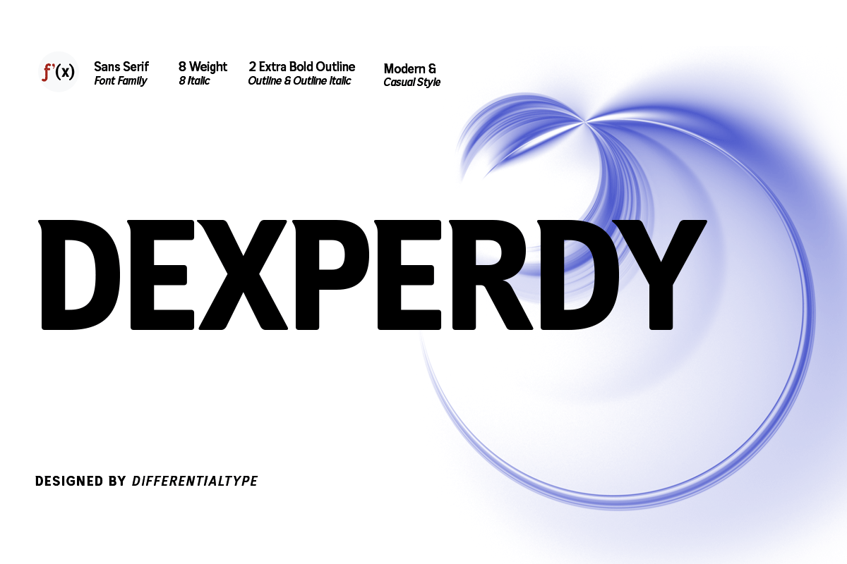
5. Dexperdy: Impact and Readability
Dexperdy is built for impact. It is a bold, assertive sans-serif that maintains its integrity even at the smallest sizes. Its inclusion of ligatures and special alternates allows for creative, high-impact branding that still feels professional.
Essential Best Practices: The 8-Point Guide
Choosing the right font is only half the battle. How you deploy it determines the final result. Follow these eight professional principles to ensure your text remains legible:
1. Clarity is Paramount
At small scales, the eye cannot appreciate "artistic" flourishes. If a font has decorative details that serve no structural purpose, abandon it. Prioritize simple, recognizable letterforms.
2. Maximize x-Height
A font with a large x-height—the height of the lowercase ‘x’ relative to the capital letters—will always outperform a font with a small x-height in a body-copy environment. It effectively makes the text look larger than it actually is.
3. Monitor Stroke Contrast
High-contrast fonts (think Didot or Bodoni) are death to small-text legibility. When scaled down, the thin lines will pixelate or disappear, leaving the reader with only the thick lines, which destroys character identity.
4. Mind the Counters
The "counters" are the white spaces inside letters like ‘o’, ‘p’, and ‘g’. If these are too small, they fill in at small sizes. Always select fonts with open, airy apertures.
5. Test in situ
Never test a font on a 27-inch monitor at 100% zoom. Print your designs at their intended output size, or test them on the physical devices (e.g., a smartphone screen) where the text will appear.
6. Opt for Screen-Optimized Faces
If you are designing for the web, look for fonts that have been "hinted" for screen rendering. These fonts have been adjusted at the pixel level to ensure they snap to a clean grid, preventing the dreaded "blur" associated with small digital text.
7. Avoid Exotic Shapes
While a uniquely shaped ‘g’ or a stylized ‘k’ might look great on a billboard, they are distractions in a paragraph of small text. Stick to standard, legible anatomy.
8. Weight Matters
Sometimes, a font isn’t readable simply because it’s too thin. A "Regular" or "Medium" weight often holds up better at small sizes than a "Light" or "Thin" weight. Experiment with the weight until the text feels solid, not ghostly.
A Selection of High-Quality Free Fonts
For independent designers or those working with limited budgets, the following free-to-use fonts offer professional-grade quality:
- Caviler: A narrow, high-utility sans-serif that is perfect for dense UI layouts.
- Orbito: Features rounded, friendly shapes that are highly approachable for user-facing text.
- Gudlak: Offers a contemporary balance that works well for long-form technical documentation.
- Groza: A low-contrast powerhouse that feels airy and light, making it ideal for mobile application labels.
Implications for Design Systems
In the current landscape of design, where responsive web design and cross-platform consistency are mandatory, the font you choose is more than just an aesthetic choice—it is a functional component of your infrastructure. A poorly chosen font for small text can lead to increased bounce rates, decreased user engagement, and a perception of low quality.
By investing time in selecting a typeface that is specifically engineered for small-scale readability, you are essentially "future-proofing" your design. Whether the user is viewing your content on a high-density 4K retina display or a low-cost mobile device in direct sunlight, the text will remain clear, professional, and readable.
The fonts listed above represent the current gold standard in small-text typography. They have been vetted for their ability to maintain character identity under duress, ensuring that your content—the most important part of your design—is never lost in the noise. When in doubt, return to the fundamentals: prioritize the user’s ability to read over the desire to be visually striking. In the world of small text, clarity is the ultimate form of style.